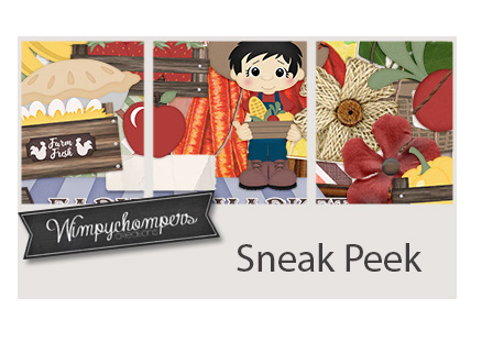
March 18, 2022: Fresh Baked and Scrap-a-Thon Continues!

Happy Friday. Even though our wishlist contest is over, the GingerScraps Scrap-A-Thon is in full swing and it’s not too late to join! There are so many amazing prizes and rewards, you won’t want to miss it!

Forum link to Scrap-A-Thon : https://forums.gingerscraps.net/forumdisplay.php?2205-Scrap-A-Thon-2022

Don’t forget. Spend $10 in the store and get this great kit for free!

We’re starting to see a lot of Spring in our designer previews.

How are your challenges going? Are you trying to do them all this month as part of the Scarp-a-Thon? The kit below is your reward for completing ten challenges.

Tutorial Tuesday: Individual Style

Making Magic with Brushes

Yes, it’s the third Tuesday of March already. It’s a sad day here, as our daughter said goodbye to her furbaby Lucy this morning. We knew this day was coming, and tried to prepare, but it’s not that simple, is it? I’ll be working on a tribute layout later as my therapy, and seeing all the amazing ways our GingerScrappers have created magic with this month’s Challenge Brush has given me some inspiration.

When I chose these layouts to show you, I was looking for uniqueness, and I had a lot to choose from. Each layout will be linked to the Gallery; the GingerScraps user names are your links so if you’re inclined, you can pop over and give them some praise. But first, let’s talk about the Challenge. This year, the host for our Brush Challenge is Alexis Design Studio. She’s brilliant with creating brushes, so we’re all very lucky she’s giving them away! The Challenge is to use the brush she provided (free) on a layout, and there are some very creative ways to use brushes. Let’s have a look.

This layout by wendeeds is filled with shamrocks. I had to look hard to see the brush – it’s behind the journaling! I thought she’d used patterned paper.

Here, pippin has turned the brush into confetti and it’s showering the couple with luck.

I love how Rhewko has blended the brush into her background and added a touch of gold leaf to it. It’s both subtle and obvious.

Here, jcfdelaware has overlaid the brush with her photo mask, blending them. The little boy blowing on the dandelions is blowing the brush’s shamrocks into the universe.

Look at the tone-on-tone beauty of this layout from ysgbo! The brushes are randomly positioned, with the layout divided diagonally. The upper right are embossed and the lower left are debossed. Brilliant!

Dannisa has the brush repeating and gradually shrinking, with the shamrock pouf overlapping and creating a cloud of parachutes.

My eyes went right to this layout in the album. The way Grace has turned one of her photos into a pencil sketch is lovely, and who isn’t drawn to sunflowers right now? But it’s the way the brush seems to mingle with the paper scatter that is the real genius here.

The way barbaraj has duplicated the brush is clever; it looks like she die-cut them from paper and carefully positioned each tiny piece.

Macsandy makes the brush an integral part of her background, and has pulled the green from other aspects of her background to create a seamless image. Using a black-and-white photo was a great idea.

For her layout, Effie4037 used the brush in a very subtle way. I like that she chose to echo the mint green from her border paper rather than the more traditional green of her title strip. The brush ties her photos together and grounds them to the background beautifully.

The way willow‘s brush explodes into the layout makes it so hard to know where the brush ends and her photo begins. Great choice to invert the colour where the brush extends into the central gray paper strip too!

To me, the brushwork on garrynkim‘s layout looks like a stencil applied with a very gentle hand.

At first, I thought Jill had put her layout into the wrong album. So I took a closer look. The brush is there… russet and blended into the old wood background and providing a landing pad for that gorgeous cluster.

At first glance, you might think this layout from PixyGirl has popcorn on it. But it’s the brush, in white and with a pearl glued to many of the shamrocks.

Tsubasa went to a lot of trouble to blend the brush into her photo. Look carefully at how she’s lightened the main part of the photo, framed that focal seedhead and then augmented the blowing seeds with the brush. Amazing!

By blending the brush into this dreamy, soft watercolour paper, wvwendy has really added oomph to her layout.

I saved this version from linweb for last. She used it very cleverly to create a St Patrick’s Day card and I LOVE it!!

I hope you’ve gotten some flashes of inspiration from this stroll through the Gallery. I know I did!

PDF Version: https://bit.ly/3KKY6Oz

$1.00 Bake Sale & $2.00 Tuesday Now OPEN at GingerScraps!

Who is ready for some AMAZING deals? We have the $1.00 Bake Sale AND $2.00 Tuesday happening NOW!

Bake Sale


Celebrate St. Patrick’s Day and the Luck of the Irish with us here at GingerScraps as we host our annual WIN YOUR WISH LIST CONTEST!!

Visit the forum for all the details : https://forums.gingerscraps.net/showthread.php?62537-Are-You-Feeling-Lucky-WIN-YOUR-WISH-LIST-CONTEST!!!-2022

The GingerScraps Scrap-A-Thon is in full swing and it’s not too late to join! There are so many amazing prizes and rewards, you won’t want to miss it!

Forum link to Scrap-A-Thon : https://forums.gingerscraps.net/forumdisplay.php?2205-Scrap-A-Thon-2022

Don’t forget. Spend $10 in the store and get this great kit for free!

March 11, 2022: Fresh Baked and Scrap-a-Thon Continues!

Celebrate St. Patrick’s Day and the Luck of the Irish with us here at GingerScraps as we host our annual WIN YOUR WISH LIST CONTEST!!

Visit the forum for all the details : https://forums.gingerscraps.net/showthread.php?62537-Are-You-Feeling-Lucky-WIN-YOUR-WISH-LIST-CONTEST!!!-2022

The GingerScraps Scrap-A-Thon is in full swing and it’s not too late to join! There are so many amazing prizes and rewards, you won’t want to miss it!

Forum link to Scrap-A-Thon : https://forums.gingerscraps.net/forumdisplay.php?2205-Scrap-A-Thon-2022

Don’t forget. Spend $10 in the store and get this great kit for free!

There are so many great new kits in the store this week!

KEY LIME DIGI DESIGN

TAMI MILLER DESIGNS

How are your challenges going? Are you trying to do them all this month? The kit below is your reward for completing ten challenges.

Tutorial Tuesday (Photoshop Elements)

Realistic Book Looks

If you’ve been waiting for today’s tutorial all day and were wondering if it would ever appear, I have an excuse… a MILLION interruptions! But fortunately it’s a short snapper this week, so I’m hoping it doesn’t break too late. Let’s get after it!

Jill sent me a request to help her figure something out. She’d done some layouts using Miss Fish’s Travellers’ Notebook V.9 templates and some spiral wire binding, and that was okay. But she also wanted to leave out the spiral binding and have more of a bound-book-laying-open-on-a-table look. She’d tried to achieve it but wasn’t satisfied with her efforts. So today, I’m tackling it for her.

I whipped up a travel-related layout using the same template she’d shown me as her example. As you can see, it looks like… a layout. Not much like a coffee table book.

It’s actually an easy thing to make a flat layout look more like a book. It involves the Burn Tool (the one that looks like the “OK” hand gesture). I chose one of the round Drop Shadow brushes that are included with the software. These are my settings, which I’m providing as a guide. You may like more or less! I also turned on the Grid (View>Grid or CTRL/CMD>’) to give me more control over what I’m going to do. Things to keep in mind: Burn the layers that are going to follow the contour of the curved part of the page. Anything that might lift away, like the tag and the journal card, won’t be part of this process. Choose the proper layer(s). I’ll be starting on the left side of the layout, so will have to Burn the background cream-coloured paper, the orange paper layer, the striped paper layer and the photo layer. When I do the right side of the layout, I’ll only need to Burn the background cream-coloured paper.

Making a straight line in Elements is super-duper easy when you know how. Using the Grid as a guide, I positioned my Brush as shown, 1/4 inch off the paper on its right side and so that the widest part of the Brush was over the bottom. I Clicked to start the Burn, then held down the SHIFT key and Clicked again at the top of the visible part of the cream paper. See how the paper is darker there now, but not gray? I repeated this process for each of the paper layers on the left side, then did the same to the background paper on the right.

It looks better already! But I’m going to make it even more real-looking.

This time I’m going to add an actual shadow, using a big square Drop Shadow Brush and my shadow colour. These are the settings I used. I’m going to start on the right side this time, and you’ll see why in a sec. I’ve got the cream-coloured background paper layer active.


I ALWAYS put my brushes on their own layer. Then I can adjust them in so many different ways. If I actually put the brush on a paper layer, it’s part of the paper layer and thus not tweakable at all. So I added a new blank layer above the cream paper layer.

I used the same steps to add the shadow. BUT. Using the Brush Tool in this way doubles up the effect where the first Click is done. That’ll look bad. So I did my first Click OFF the paper I’m shadowing. I centered the brush but in hindsight, I could have just aligned the left side of the brush with the center of the book and skipped some steps. Oh well. Click>SHIFT>Click top and bottom, off the paper.

Next, I used the Rectangle Marquee Tool to outline the overly dark bit at the top of the layout, then Edit>Cut (CTRL/CMD>X) that bit away.

To further blend and soften the shadow, I added a Blur>Gaussian Blur.

It looked just about perfect with a 4.5 pixel Blur.


Rather than Shadow all the various layers on the left side, I instead made a Copy Layer of the shadow and moved it up the Layers Panel so it was above the photo layer. Then I nudged it over so it was balanced with the right side. Of course, it overlaps the right side. Darn! Rectangle Marquee Tool CTRL/CMD>X to the rescue.

There! It looks a lot more 3D now, and I really like it! I hope Jill does too.

Well ladies, spring is in the air here and it’s time for supper! (And I’m only 10 minutes late.) See you next week, when we’ll check out a Challenge.

PFD Version : https://bit.ly/3MG9bSE

March 4, 2022: Fresh Baked and Scrap-a-Thon

Happy Friday my scrapping friends!

We are so excited for the new SCRAP-A-THON

Click on the graphic or the link above to take you right to the fun!

Don’t forget. Spend $10 in the store and get this great kit for free!

Let’s see what our designers have this week. I’m seeing some St. Patrick’s Day green popping in!

KEY LIME DIGI DESIGNS

TAMI MILLER DESIGNS

Have you gotten started on your challenges for the Scrap-a-Thon? This is one of the great kits you will get for completing challenges.

Tutorial Tuesday (Photoshop Elements)

Taking Those Shapes to the Next Level

I don’t know about you, but I’ve been doom-scrolling Twitter, with MSNBC on in the background, continually since the Russians invaded Ukraine. As if things weren’t already awful enough… Two of my mom’s sisters and one of her cousins married three Ukrainian-Canadian young men back in the 50s. My dad’s mom was Polish. This invasion feels personal to me and it’s hard to shift gears. But I’ve succeeded – I have a tutorial for you that builds on last week’s Custom Shapes clipping masks. This time I’m going to show you some ways of turning those shapes into 3-D frames – it’s simple and so much fun! Rather than reinvent the wheel and go into obsessive detail with every step, I’m going to assume you’ve got some Elements chops and sort of start in the middle.

Each of these Shape frames will start out the same way, with choosing the Custom Shape and dragging it out on the canvas. As usual, I’m working on a 12×12 canvas so I have lots of room. I started with a hexagon.

I’ll always remind you that Custom Shapes begin life as Smart Objects and don’t have a lot of flexibility. So before you can manipulate them, you’ll need to Simplify them… dumb them down, so to speak. If your version of Elements has the Simplify button in the Tool Options panel, just click it. If you DON’T have that button, you’ll need to right-click on the layer then choose Simplify Layer from the dropdown menu.

To create the frame’s opening, first we need a Copy layer. Either right-click on the layer and choose Duplicate Layer>OK or use the keyboard shortcut CTRL/CMD>J to quickly make that Copy. (I LOVE Copy layers and recommend you come to love them too. When you play with a Copy, you’ll still have the original if you make a booboo.) (Second editorial comment: CTRL refers to Windows-based systems, CMD to Macs.)

Obviously, a Copy is identical to the original and that’s not going to work to make a hole. So the Copy layer will need to be Resized. The easiest way to do that in this context is to click on one of the handles on the Bounding Box, which opens up the Move tool‘s Tool Options menu. Then, with the Constrain Proportions box ticked and the centre of the layer as the reference point, type a numeric value into one of the boxes as shown. I went with 85%, which will give a nicely solid frame.

In this screenshot you can see the outline of the smaller hexagon. Now it can be used to remove the middle of the frame.

Ensure your large hexagon layer is active and then click Edit>Cut, or use the keyboard shortcut CTRL/CMD>XWe’ll come back to the hexagon in a minute. What if you chose a more complicated shape, like this seal? You can use all the controls in the Tool Options, like using Defined Size, and if you tick the From Center box, Elements will put the shape right in the centre of the canvas. Here, I’ve shown the Simplify button (the one you may not have). Experiment with your software; the more you play with it, the better you’ll understand what it can do and what it can’t. (And these tutorials will make more sense…) You’ll find a system and a rhythm that works for you.


So. What if you didn’t tick the From Center box and now your two shapes aren’t positioned precisely like you want them to be? Elements has a fix for that! Activate both layers by clicking>Shift>clicking on them in the Layers Panel. You’ll see the Move tool Tool Options menu over on the left. Where it says Align, click on the Center button – Elements will move both layers so their centres are aligned. Then right away click the Middle button, and Elements moves both layers so the middles are aligned. Easy peasy!

CTRL/CMD>X and now I’ve got a nice starburst frame.

Okay, back to the hexagon! When I was thinking about this technique, my mind’s eye saw a shiny green frame with glittery gold edges. Making that a reality will take a couple of additional steps. I’ll need to create the border first, because once I alter the frame itself it’ll be harder. The border needs to be completely separate from the frame so I can jazz them up in different ways. That means it goes on its own layer. (Of course!!) So I added a new blank layer to the Layers Panel by clicking on the sheet-of-paper icon in the strip across the top of the Panel.

Quick-and-easy border making uses the Stroke Edit. CTRL/CMD>click on the Layer Thumbnail to “Select” the edges of the hexagon, inside and out. Make sure you’re on the blank layer, then Edit>Stroke (Outline) Selection.


I want the glittery border to be visible but not overpowering so I went with 35 pixels for my width. The colour can be anything – the glitter will hide it anyway. I chose the Outside setting; it’s not going to round the hexagon’s corners enough to worry about.

This is something I sometimes forget when I’m doing something on the fly. If there are marching ants – something has been Selected – none of the things I try to do that don’t involve the Selected area will actually happen. They need to go away. Select>Deselect or CTRL/CMD>D will do that.

I’m going to use some Styles now. Have you bought some Styles.ASL files – but don’t know how to get them into Elements so you can use them? Some of the GingerBread Ladies collaborations include Styles (usually glitter, but not always; Craft Fair is a good example) so you could have some and not even know! I’m going to show you quickly how to access them.


I’ve renamed all my Styles files and Copied them into the Elements Program Files for easy retrieval but you don’t have to worry about that, you can grab them from anywhere. If you don’t know where they are, run a Search using .asl as your search term, then let your computer do the work.

I chose a green acrylic gel Style from Just So Scrappy‘s Lucky Me… seemed appropriate for March, however cheesy. The Style added colour, a bevel and highlights all in one move! If the one you choose doesn’t look like you want it to, CTRL/CMD>Z it and try again.

I like this darker gold glitter Style from the same collection. (I’ve gotta say, Katie [Just So Scrappy and Ooh La La Scraps] makes perfect Styles of all descriptions. Check them out! I’ve linked to her shop for you.)

I didn’t do a step-by-step for the star in this image, since it’s done exactly the same way as the others. Stars offer a masculine option so I’m going to give this frame a leather look. Snake skin, to be exact. I made some Copy layers so I’d have back-up and this time I’m going to use a Filter. From the Filters menu I chose Artistic>Textures. I’ll be using Mosaic Tile.

Here are the default settings for Mosaic Tile. I think the “scales” are a bit to insignificant for a manly frame though.

You can see what’s happening with your Filters as you make your adjustments, so it’s not too hard to find the right combo.

I think it needs a touch of colour and a bit of sheen too, so I’ll use a Chrome Style on a Copy layer – flexibility!

When I was a kid, I had one pair of leather shoes. My mom said they weren’t brown, they were “ox-blood”. This reminds me of them. So I’ll use this dark red one.

The Chrome Style will be opaque, so the mosaic tile texture won’t be visible unless I decrease the Opacity of the Chrome layer. 50% looks good.

I wanted to make a few more tweaks so I double-clicked on the fx icon on the Chrome layer and played with this menu.

Were you wondering what I had planned for the sunburst? I made some Copy layers and added a Wood Style to one of them. I’d like a gold edge on it, but not on the inside. So I Resized the bottom original layer by going to 105%. See the gray border there now? It’s just enough.

So far, I’ve only shown you Styles that are purchased. But Elements has some basic Styles included that most of us never even look at. I like this Molten Gold one, I think? It’s in the Complex folder along with a bunch of very intriguing others.

So this is what it looks like before I bend it to my will. It’s pretty in-your-face!

I toned it down a bit.

What do you think? I love it!!

I popped a photo into the hexagon frame. But first I added a bit of a shadow to the green section then Merged the glitter border with the acrylic gel centre so it’s all one piece.  (Looks like I forgot to turn the underline off! Oh well. Not a disaster. I apologize for the formatting issues; when I was editing the screenshots I forgot to crop some of them until after I’d already inserted them into the post. Fixing that made the gaps. Sorry!)

I’ve got some great ideas for tutorials in my pocket and will need the distraction this month. Слава Україні!
PDF Version : https://bit.ly/3tn2goD

GingerScraps: NEW Buffet, New FREE collab, New Designers, SCRAP-A-THON & MUCH MORE!

Happy March!! I’m ready for Spring.

We are so excited for the new SCRAP-A-THON for March! 

Click on the graphic or the link above to take you right to the fun!

Now, let’s look at the March Buffet. Don’t forget to check out the Buffet Bundles. One easy click to add bundles of Buffet goodies to your cart.

These colors are so versatile as you can see from the themes in the kits below.

Remember any $10 spent in the store gets you this great collab. 

What a great topic for the March Monthly Mix.

Now to the March Sneak Peek. This month’s Daily Download is from North Meets South Studios. A team of two of our designers – Connie Prince and Trixie Scraps.

We don’t have any guest designers this month but we do have ONE permanent designer to announce!!

So happy to announce that ScrapChat Designs will be staying on at GingerScraps permanently!

Take a look at the new challenge reward kit. If you complete any 10 challenges this month, you get this gorgeous collab as a reward!

Let’s see some of the sample layouts provided by our amazing store Creative Team.


February 25, 2022: Fresh Baked and Fun News

Happy Friday Everyone!!!

As many of you already know, after 13 years of Scrapping Survivor competitions Ginger has decided to do a new event this March. I know how much you all loved Scrapping Survivor but as the community has grown, it just became totally overwhelming for not only Ginger but for you all as well (based on the forum thread asking for feedback), the posting, voting, alliances … it all just became too much. So, our new annual March event will be …. drum roll please … The GingerScraps Scrap-A-Thon!! This will be a much more relaxed, work at your own pace, no voting, no sign ups, an event full of inspiring each other, lifting each other up and all based on the current monthly challenges! It will kick off on March 1st, stop by the forum for all the details. Believe me, you are NOT going to be disappointed with this new event!

Remember, spend $10 in the store and get this kit for free.

Let’s see what our designers have this week!

How are those challenges? Any 10 completed challenges will get you this great kit as a reward.

Don’t forget to grab this part of the newsletter hop!

DOWNLOAD LINK: https://bit.ly/3BaUkup

Tutorial Twos-Day (Photoshop Elements)

Two Mini-Tuts! Parallelograms and Hanging Chads

Reader beware: This tutorial will be strong on bad puns and corny jokes… ICYMI in the header.

After last week’s tutorial covering the February Inspiration Challenge and shapes, Karen left a comment asking where she could get the template mdusell used for her Bodega Sunsets layout because she really liked the parallelogram. I took a look at the credits for the layout where the template was listed, then went through (all 38 pages) the designer’s store to see if I could find it. [She used a Connie Prince template, if you’re curious.] Alas, the template set has been retired. So the next best thing I could think of is to show her, and all of you too, how to create a parallelogram photo spot complete with white border, like the one from Connie‘s template, that can be saved and used ad infinitum. Then to finish off this week’s post, I’m responding to granny5pics [Kathi] who sent me this message: “I thought I saw some place how to trim/crop a layout so any overhanging picture areas get cropped off and the layout fits in the given size. I thought I had done so successfully myself recently, but I can’t get my current layout to cooperate!” Let’s get started.

Karen‘s parallelogram starts life as a rectangle that is led astray. I’ve activated the Rectangle Custom Shape Tool as you can see below. I’ll start with a square. Then we’ll see how it looks and make any adjustments it may demand. You can see that there are two rectangular options in this toolkit; don’t pick the rounded one!

Here’s my one-step square. I just clicked at the centre of my workspace and it appeared. Remember, all Custom Shapes start out as Smart Objects and can’t be manipulated as is.

Newer versions of Photoshop Elements have a Simplify button right there in the Tool Options. If you don’t see one, you’ll need to Right-Click on the layer in the Layers Panel and choose Simplify from the pop-up menu.

Here’s a Work Smart Not Hard tip. Use your tools! I’m going to turn on the Grid to help me with my shape-shifting. If you don’t regularly use the Grid, I hope I can change your mind about it. But it’s only useful if it’s set up to be useful. Although I live in Canada and the metric system has been our method of measurement since 1979, I still think in inches so my Preferences for the Grid are set so I have a Gridline (heavier) every inch and 4 Division (lighter) lines per inch… i/e I have reference lines every 1/4 inch. Now, to turn the Grid on, View>Grid, or CTRL/CMD>’ will get you there.

Once I had that Grid for reference, I moved the square over to the right an inch to give me lots of room to manoeuver.

Going from square (which is a parallelogram already, but…) to a more diamond-shaped parallelogram requires the use of the Image>Transform>Skew command.

Grab one of the upper corner handles and pull it out to the side. I went left. You do you! Then grab the other upper handle and move it the same amount.

My finished shape didn’t look enough like the one from the template, so I pushed the top edge down a couple inches and like it much better.

The grid isn’t necessary any more so it can go away.

On mdusell‘s layout the parallelogram shape had a white border. The easiest way to do that and have a save-able, reusable clipping mask is to use a Layer Style. There are some basic Strokes in the Layer Style palette, and although there isn’t a white option, that’s a simple fix. Why not just add a Stroke through the Edit menu, you wonder. Well, it’ll be part of the shape, not sitting on top of the shape; it won’t be visible when something is clipped to the shape, and that defeats the purpose.

So I’ve added a Stroke Style. It’s 20 pixels according to the menu, but shows as 26 pixels later. Regardless, it’s all completely adjustable! And that’s a good thing, because I don’t like the rounded corners much.

By double-clicking on the fx icon on the layer, I can fix all the things I don’t like about the stroke. I can make the stroke wider or narrower, I can change the colour and I can move the Position from Outside to Inside and get those sharp corners.

Here’s the easiest way to turn black to white. Just click on the colour swatch then type ffffff into the # box! If you think you’ll want to reuse this photo clipping mask again Save As a PNG and call it something you’ll remember.

Meet my new neighbour.

Now, for Kathi‘s question… I figured the easiest way to help her with her problem is to show her.

I have a lot of paper outside the boundaries of my signature canvas.

Enter the Crop tool. You can use this to remove the overhang at any point while you’re creating. Here, I’ve waited until the whole thing is done and Cropped all the overhanging stuff away at one time. I hope this is what Kathi needs for her issue…

I’ve been helping my daughter with a top-secret project that I hope we can share with the world soon. It’s eaten up quite a bit of time over the last week, so I’m behind………………… and next Tuesday it’ll be March. Gah.

PDF Version : https://bit.ly/3vvZXm3