Navigating the Wide World of GingerScraps Digital Scrapbooking
![]()
Greetings GingerScrappers! I know you were all waiting patiently for a new tutorial today, but I’m sorry to report the tutorial technique I was creating for you didn’t work! I’ve been playing with it for 2 solid days, can’t figure out what I’m doing wrong and have run out of ideas for getting the thing to run properly. I hate when that happens! Rather than leaving y’all hanging. I thought I’d revisit a previous tutorial about navigating the world of digital scrapbooking websites for our ever-growing family of new members. It’s from May 2018, so it may be a bit dated…
Pickymom is a new member of the GingerScraps family (well, she WAS, in May 2018! She’s a pro now!). She posted a request for help with navigating the various features in the Forum in the Help!! thread and when I read it, I was immediately thrown back nearly a decade to my first feeble attempts at establishing my own online digiscrapping presence. I remembered how it seemed like I was never going to understand how to do things in online forums, despite having been a moderator of an online community for several years already. So, with her permission, I decided it might be a good use of this space to help the new members of our family get their feet wet and start reaping the benefits of our amazing site.
You’ll want to have at least two browser tabs open to GingerScraps so you can move between them as we work through the lesson.
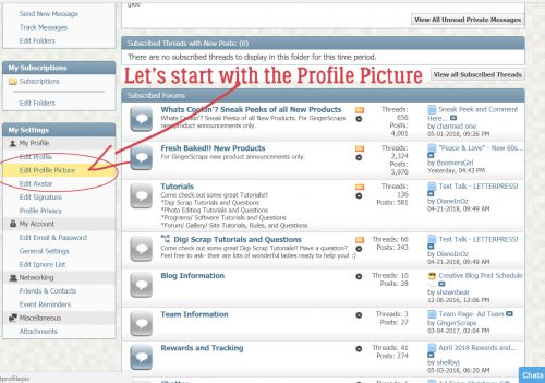
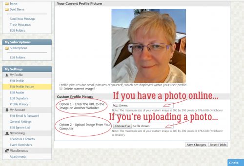
My Profile has a series of options for telling others who you are, and it’s pretty straight-forward so I’m going to skip that part. First I’d like to show you the quickest, easiest and least taxing method of adding a photo to your profile. Since I already have a profile photo, the steps show how to change the photo, but they’re exactly the same for getting one out there for the first time, there just won’t be an image there for you to change. Make sure you’re on the Forum page and click on the Settings button.
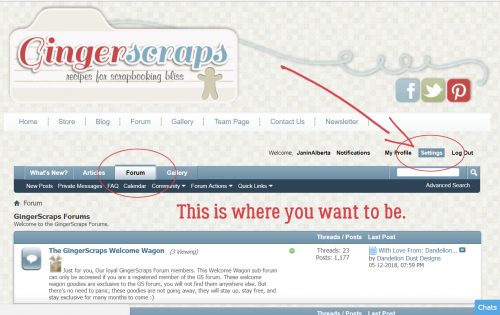
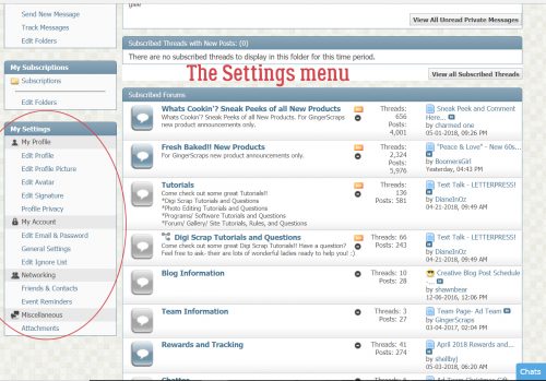
On the left side of the Settings page is the menu that allows you to customize to your heart’s content.
Under the My Profile heading, click on the Edit Profile Picture button.
I’m going to pretend that the photos you’re seeing are recent. (They’re REALLY not. 🙁 ) As I said, I already had a profile photo so I changed it to allow you to see how easy it is. You can use photos from a website by using the first box, labeled Option 1. So if you have a photo you like posted to Flickr, (or Facebook, Instagram etc) for example, you could copy the URL (Uniform Resource Locator) where the photo is and paste it into that first box. To do that you would open a browser tab to the place where your photo is, highlight the text in the address box at the top of your browser screen then right-click and select Copy (CTRL/CMD>C); then go back to the tab with your Settings menu open, put the cursor in the first box (If you have a photo online…), right-click and select Paste (CTRL/CMD>V). Alternatively, if you have a photo on your computer that you’d like to use, then you’d use Option 2. Click on Choose File next to that second box (If you’re uploading a photo…), then find the photo on your computer.
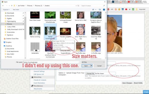
I’m giving you a peek into my cluttered mind and messy desktop here. Yep, I have LOTS of browser tabs open, all the time, and I have a long list of links on my Toolbar. I’ve found the folder with my photo in it, then chose the photo I want to use. As the screenshot says, SIZE MATTERS. For profile photos, which are the ones people will see when they look at your PROFILE, not your Forum posts, your photo must be no larger than 300 x 300 pixels or 976.6 kilobytes, whichever is smaller. You can hover your cursor over the image in your folder to see the dimensions of your photo so you won’t make the mistake of choosing a photo that will be rejected.
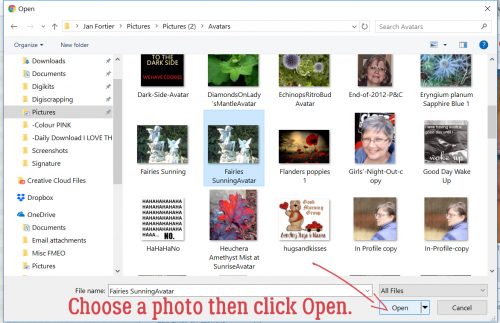
After you’ve clicked on the thumbnail image of your photo, click on Open.
Once you’ve opened your photo you can see how it’ll appear on your profile. I decided I didn’t like this one after all. But if I had liked it, I would have clicked on Save Changes and carried on.
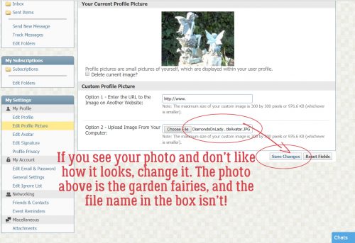
I just followed that first step again to choose a different photo, Opened it and Saved the Changes.
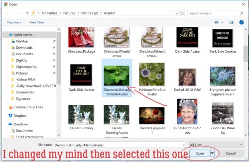
Yes, that’s what I like!
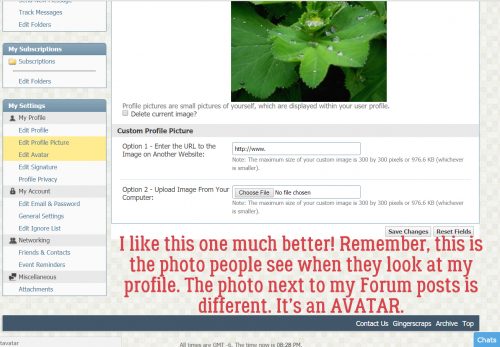
Now we can work on the photo people see in the Forum when you post questions, comments or layouts. This photo is called an Avatar. It doesn’t have to be a photo of you, it can be anything you want it to be. I’m rather partial to Bitmojis myself.
In the same Settings menu, click on Edit Avatar. Here again, you can use an online image, say from Facebook, Instagram or Pinterest. The steps to do this are exactly the same as for the Profile Picture… with one significant difference.
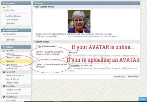
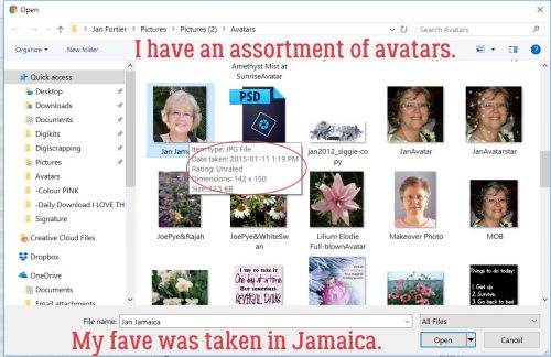
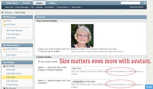
As you can see in the screenshot, I have photos of me, flowers from my garden and memes I found online and saved for later. The photo I chose to use for my Avatar for this lesson is one that was taken at a wedding in Jamaica 3 years ago. I checked to make sure it would work as an avatar by hovering my cursor over it.
Here’s where that significant difference comes in. The MAXIMUM size for avatars is 150 x 150 pixels, or 1.91 megabytes, whichever is smaller. Since I’d already checked that out, I knew this photo would be fine and I clicked Save Changes.
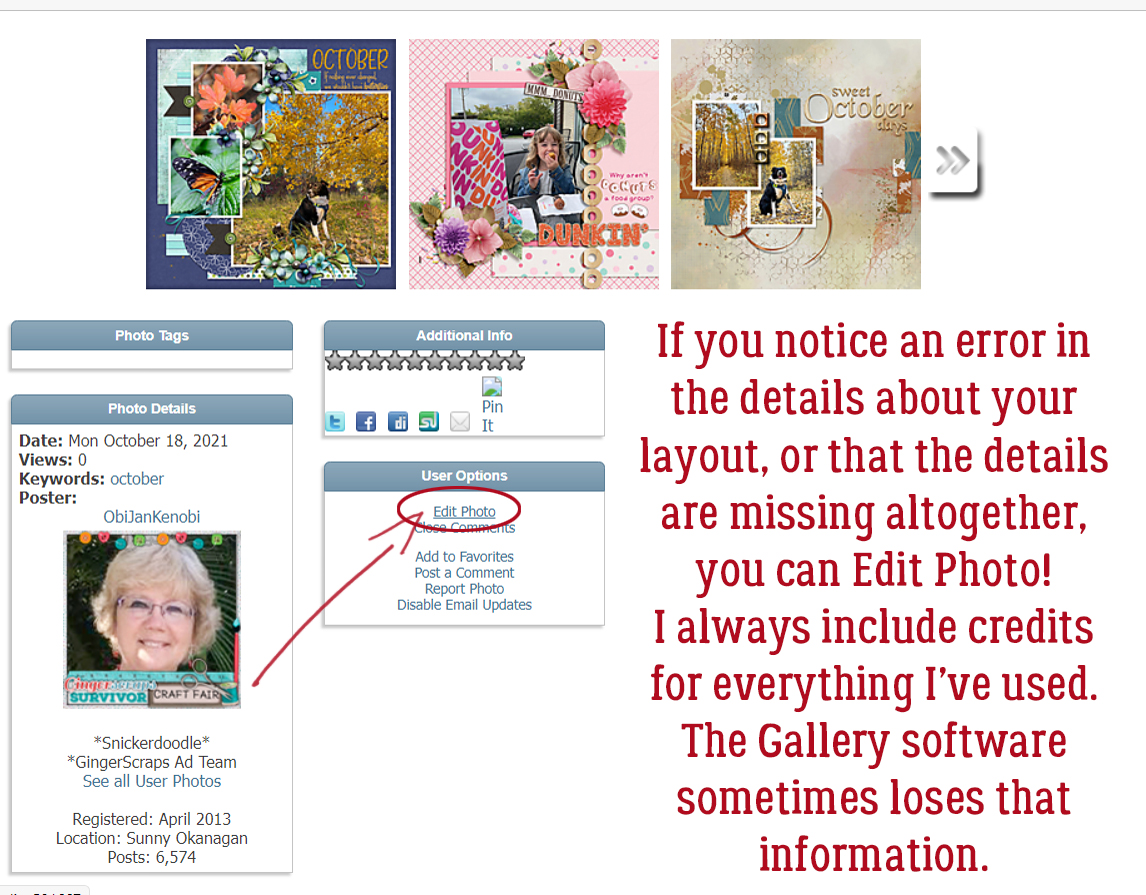
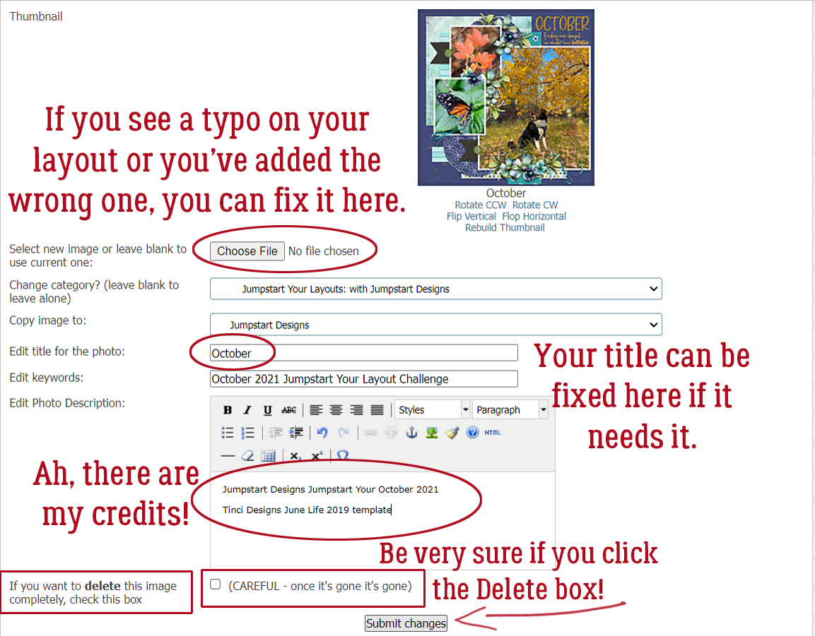
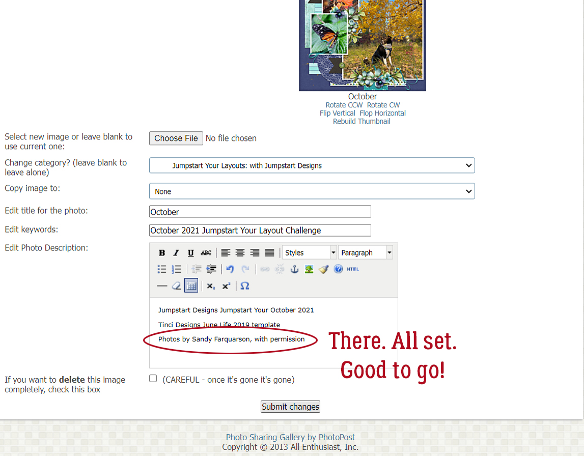
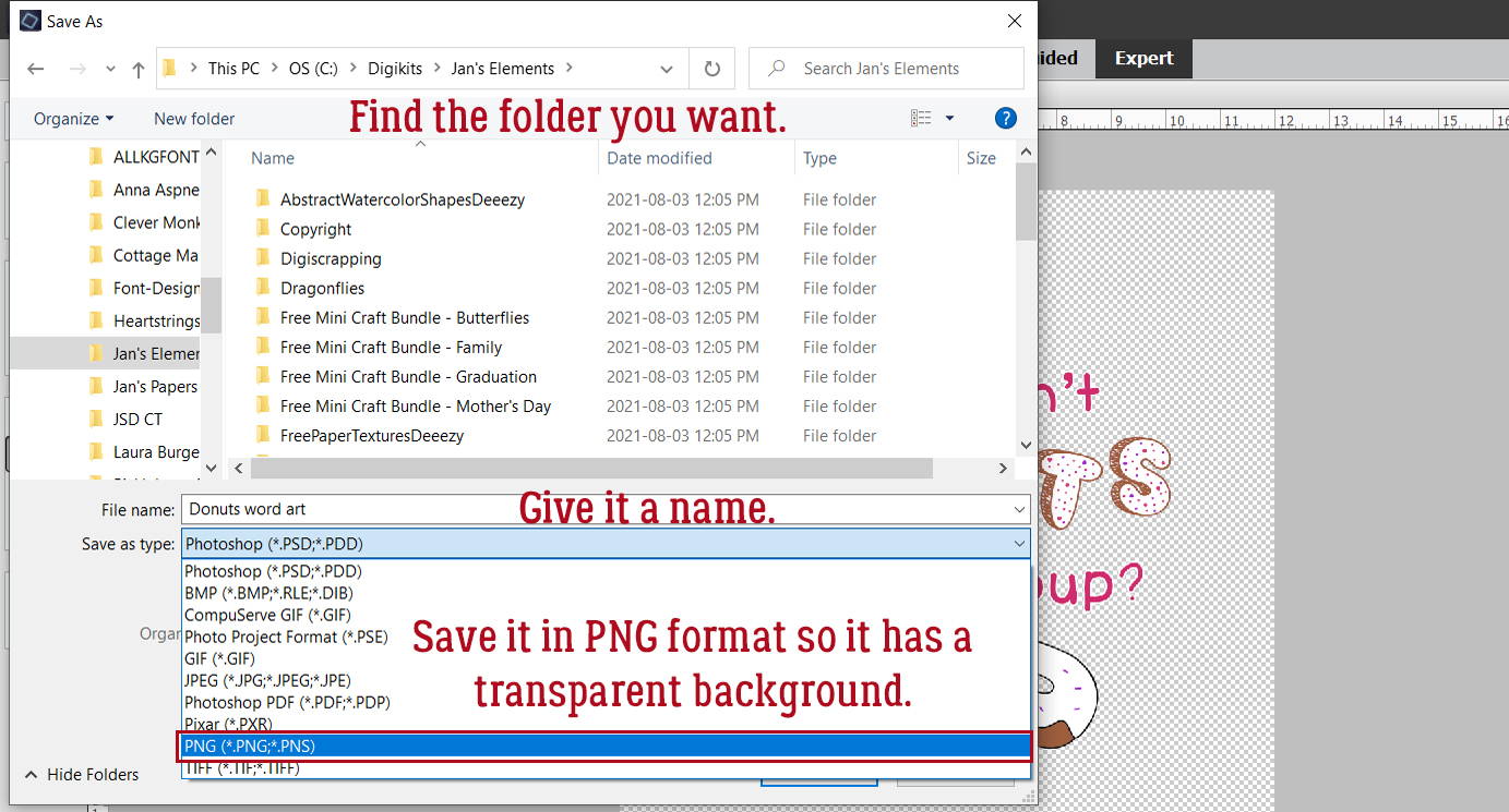
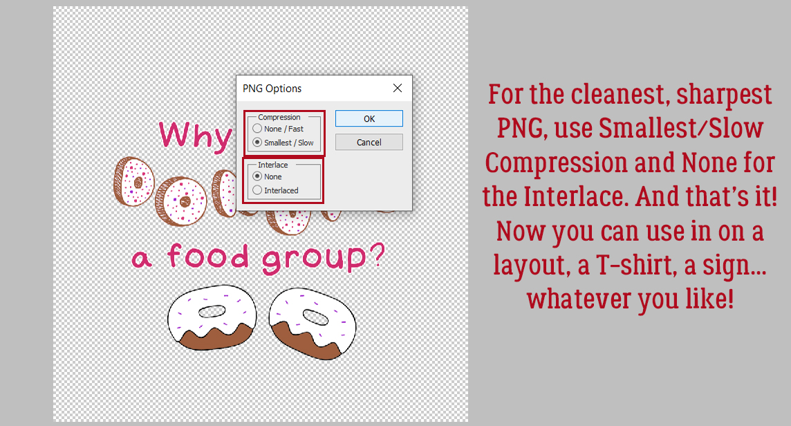
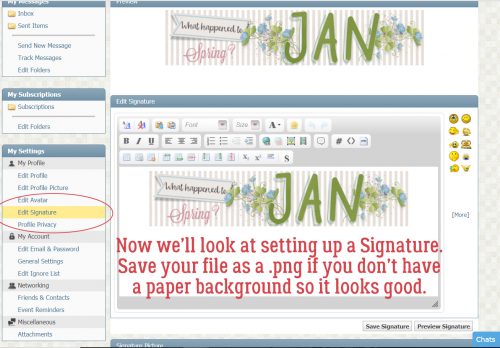
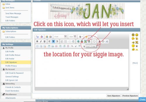
Let’s do a Signature now. A while back I wrote a tut about creating original signatures for the Forum; you can find it here. I always save my signature files as .pngs so if I have rounded corners, elements extending out from the main part of the siggie or I want a transparent background, it’ll look the way I want it to when I use it. I also save them slightly smaller than the maximum size allowed because I want it to be a footnote, not the focus! For this feature, you will need to post your signature image to the Gallery, where you’ll get the image location data to put it into your profile. Have that Gallery tab open to your siggie. The screenshot below shows the existing signature and the Editor.
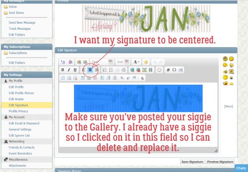
I like my signature to be centered at the bottom of my posts, so I click on the icon shown below. To remove my old siggie from March’s Signature Challenge, I clicked on the image that is now blue in the screenshot. Then I hit the Delete button on my keyboard and it went away.
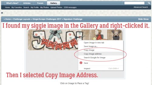
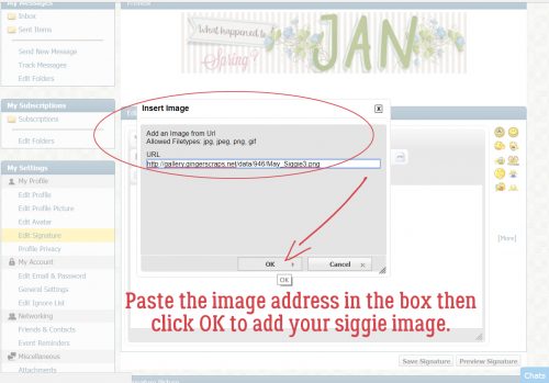
Then I went to my Gallery tab and right-clicked on my May Signature Challenge signature itself. This option box opened up, where I chose Copy Image Address.
Moving back to the Settings menu browser tab, I clicked on the Insert Image link as I’m showing you below.
Then I pasted the data I copied from my Gallery image into the box and clicked OK.
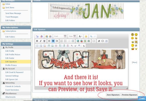
In the screenshot, you can see both the old siggie and the new one. You have the choice of Previewing it or just Saving it.
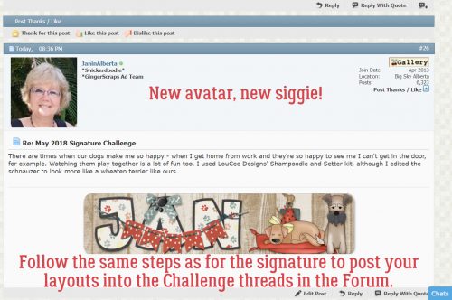
Here’s a Forum post with both my new Avatar and my new Signature on it.
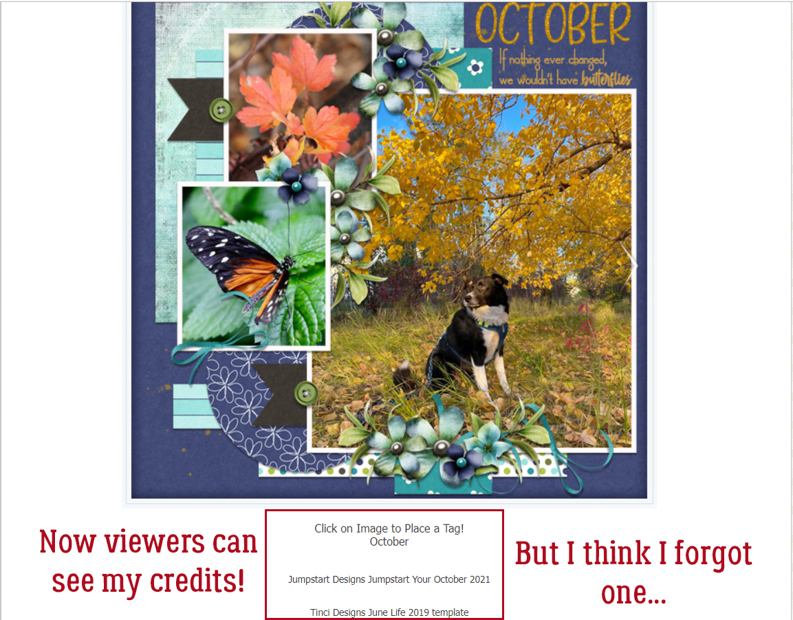
These methods work identically when you want to post a layout to a Challenge thread in the Forum. I highly recommend having two GingerScraps tabs open in your browser and simply moving back and forth between them, Working Smart, Not Hard. Go to your layout in the Gallery, right-click the image, Copy Image Address then navigate back to the Challenge thread. Select that Insert Image icon, paste the Image Address into the box and click OK. It doesn’t matter if you’re on the first page of a thread or the last, you can compose your post at the bottom of the screen and the site will automatically move it to the end of the thread.
These Tutorial Tuesday Blog posts are all tagged with Tutorial Tuesday. If you don’t want to bookmark them (or aren’t sure how) for future reference, you can always just type Tutorial Tuesday into the search bar up in the right corner of the main Blog screen and the site will find them all for you, in reverse order. If you know a key word that appeared somewhere in the post, you can also use that to find the post again. As with everything else in life, the more you do a task, the easier it becomes and the less thought you have to put into it. But… update for late 2021… Ginger has been converting each new tutorial into PDF files that can be downloaded and saved to your computer for posterity! Those of us who’ve been here for a long time sometimes forget how lost we felt in the beginning; as Pickymom said in her initial post, technology is still a challenge for people who grew up without it. But the best part of the GingerScraps community is that help is always a couple of clicks away!
PDF Version : https://bit.ly/3k7B9dn
![]()


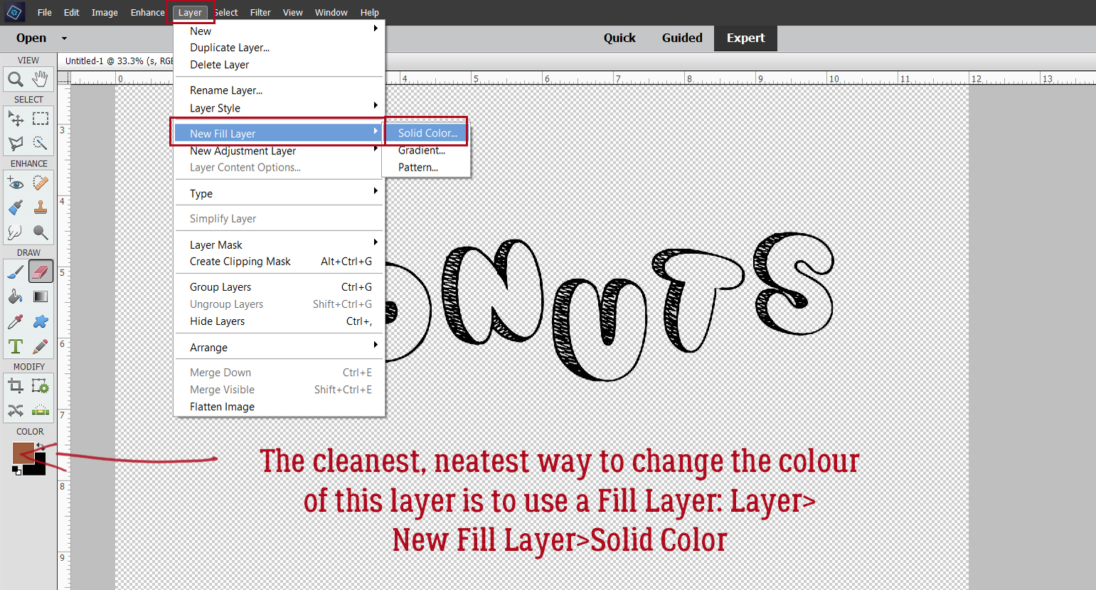
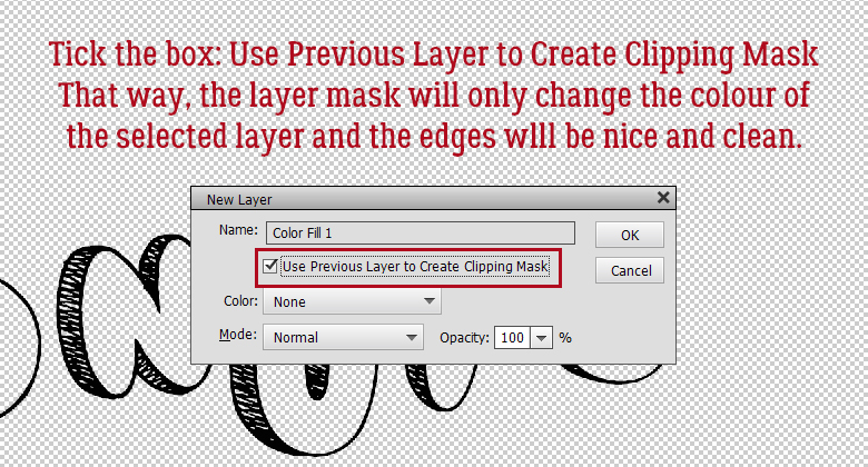
 By clipping the lighter-coloured paper to a mask on a black background,
  The way