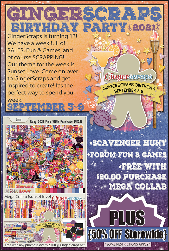
Who’s ready for some amazing deals!?!?
The $1.00 Bake Sale is NOW OPEN!
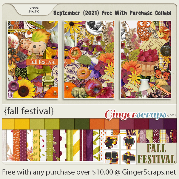
Remember when you spend $10 in the store, you get this great kit for free.
*$1.00 Bake Sale* September 15-20

Don’t forget to stop by The Cherry on Top’s shop, 70% off until her closing on September 19, 2021

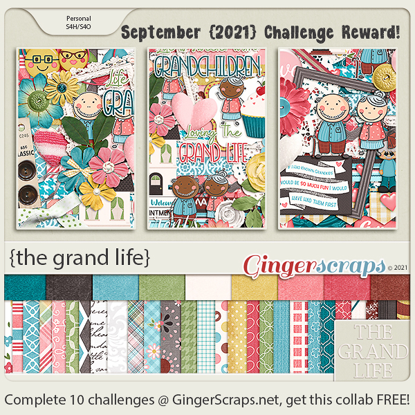
Are you working on those challenges? Just 10 completed challenges gets you this great kit as a reward.
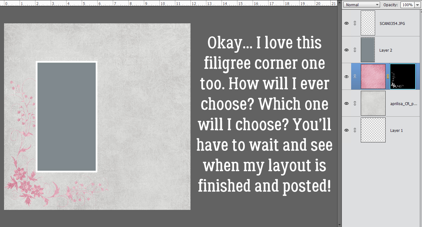


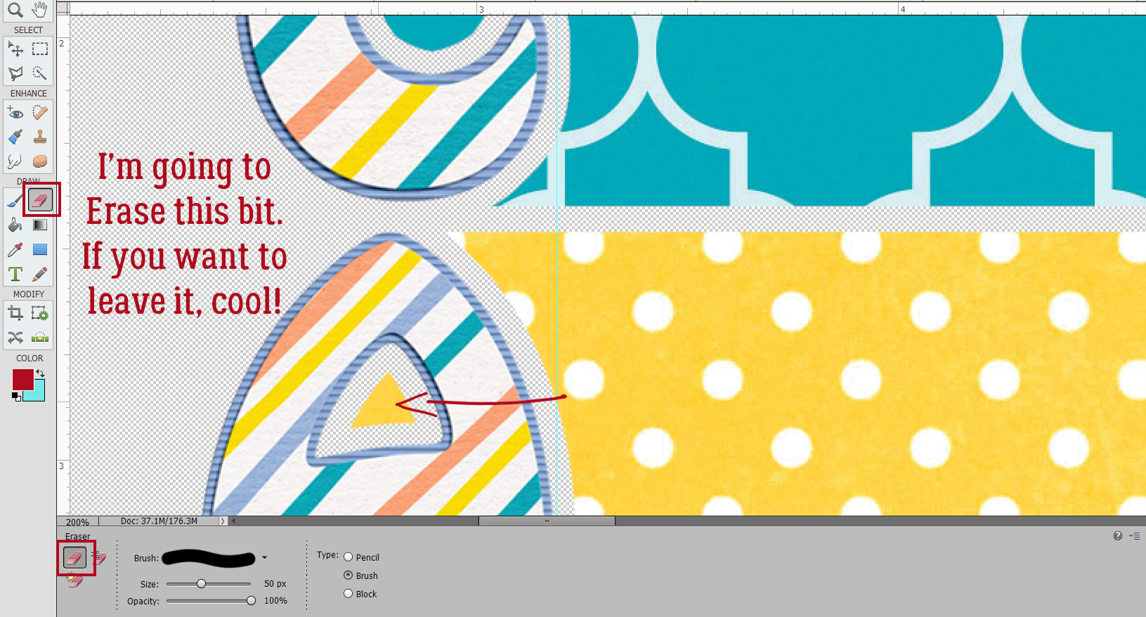
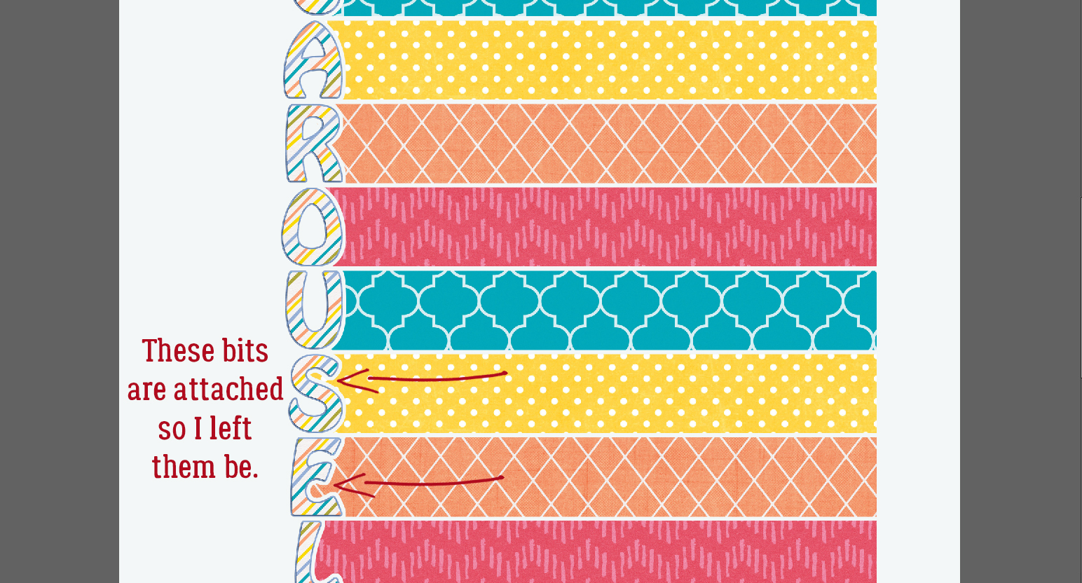


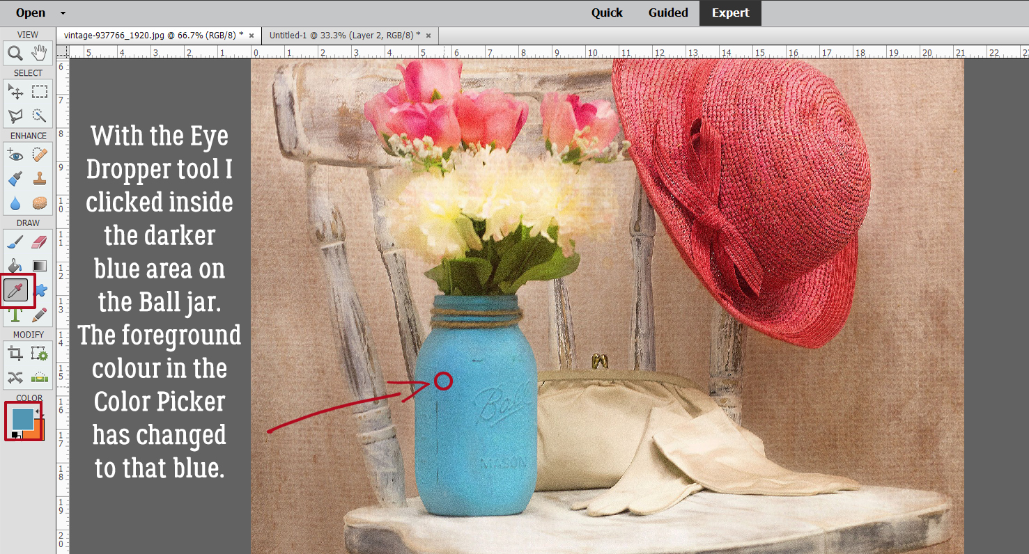
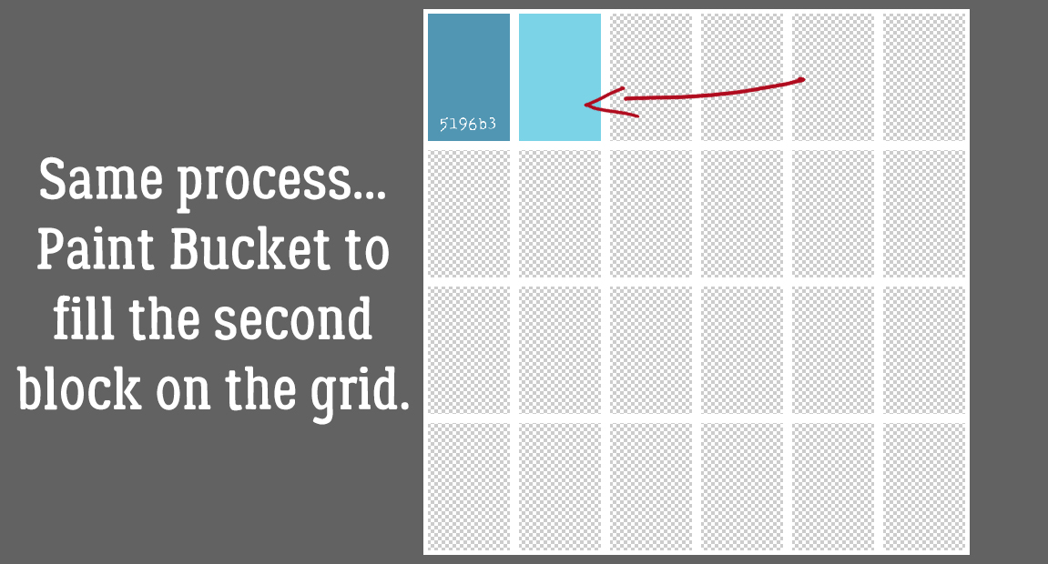
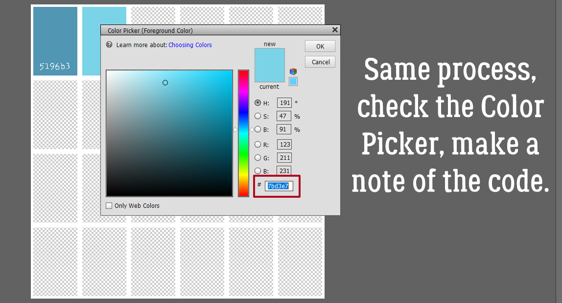
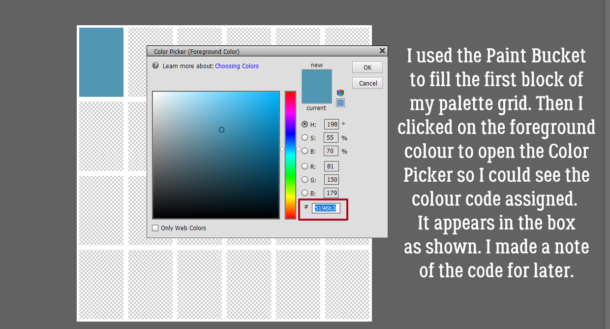 Following the same process I used the Eye Dropper to pick a spot of lighter blue.
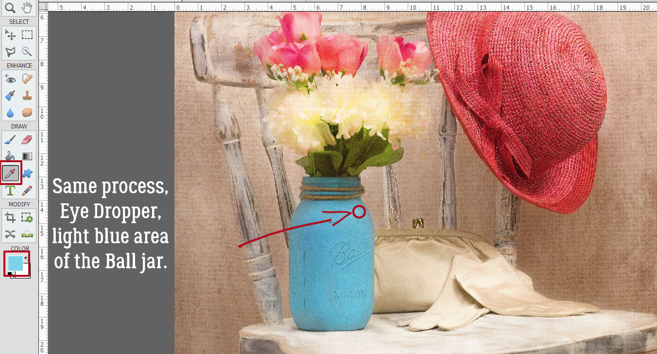


