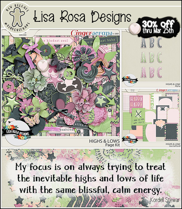
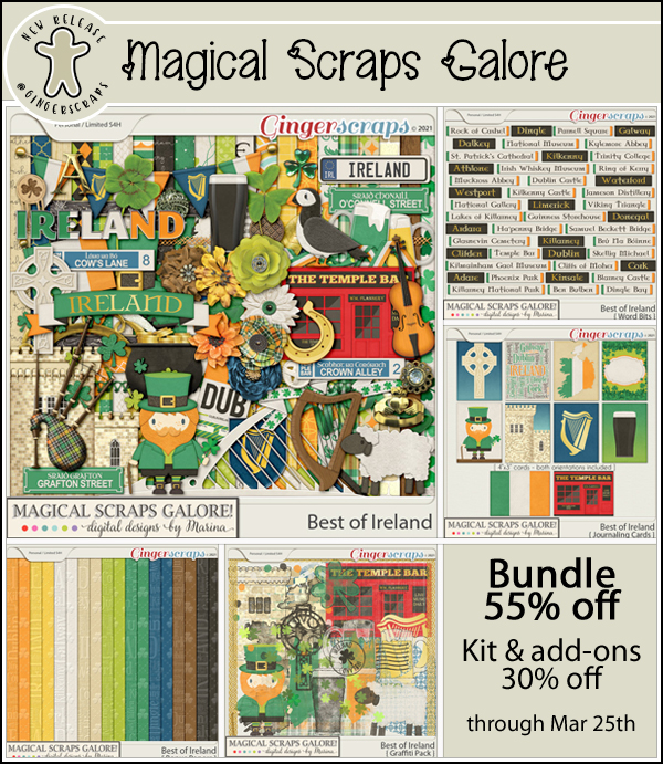
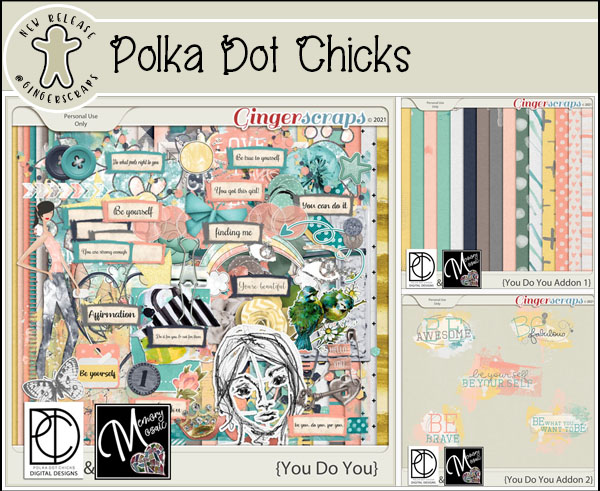
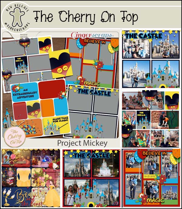
Welcome to Friday and a new batch of Fresh Baked goodies. Have you checked out our No Joke Sale?
REMEMBER THIS SALE WILL END ON APRIL 2 AT 11:59PM EASTERN TIME!
Make sure your checkout is complete prior to the close of the sale, as soon as the clock strikes midnight the sale prices will disappear.

Remember, any $10 spent in the store will get you this great collab for free.

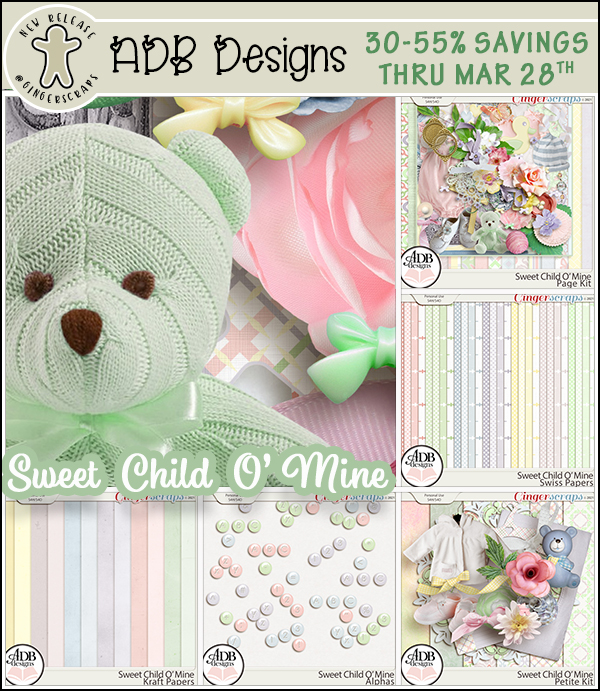
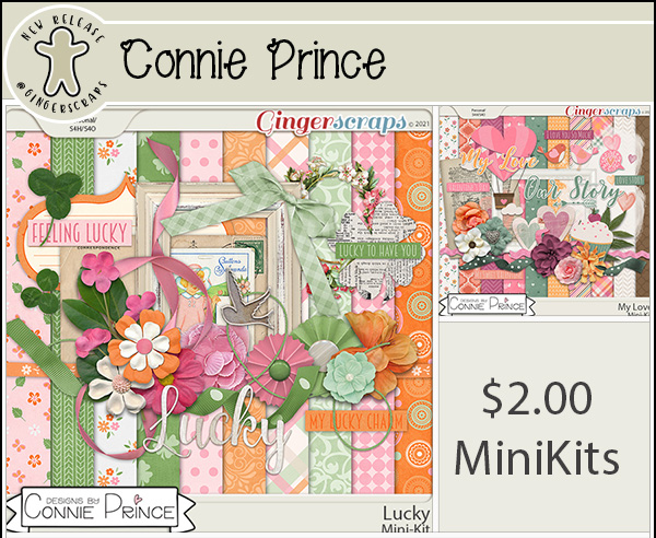
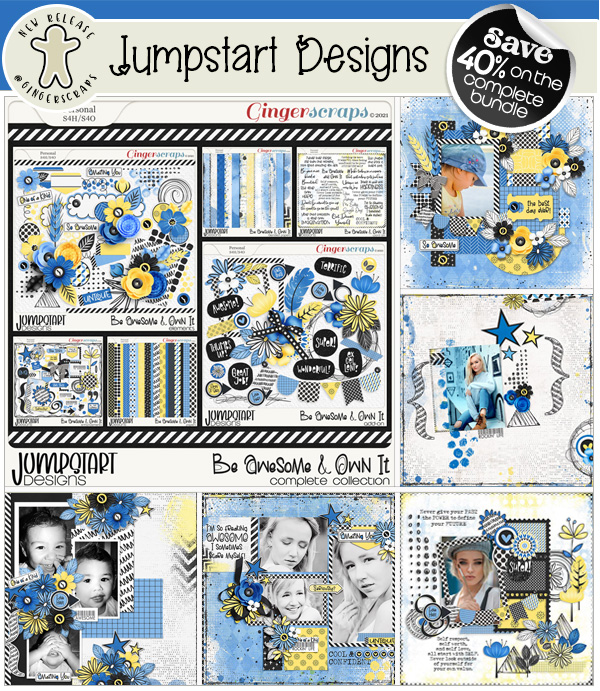
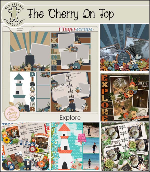
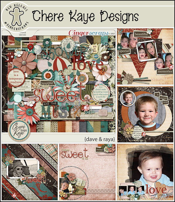
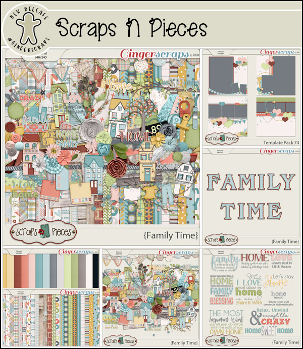
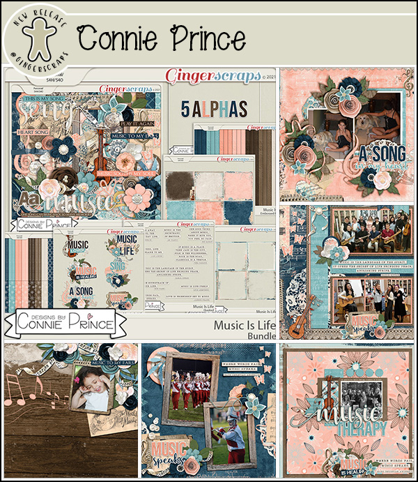
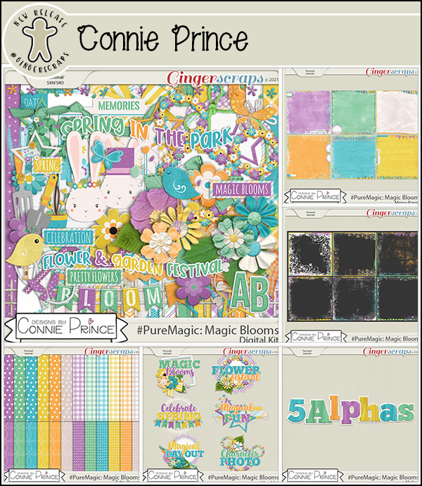
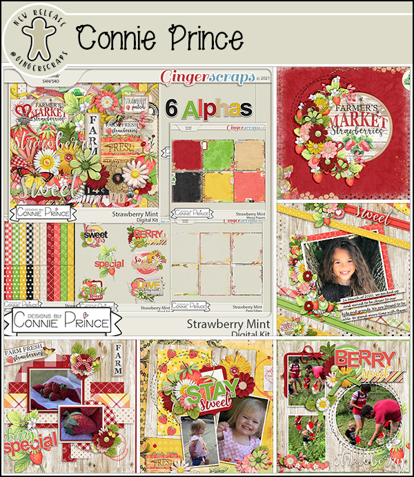
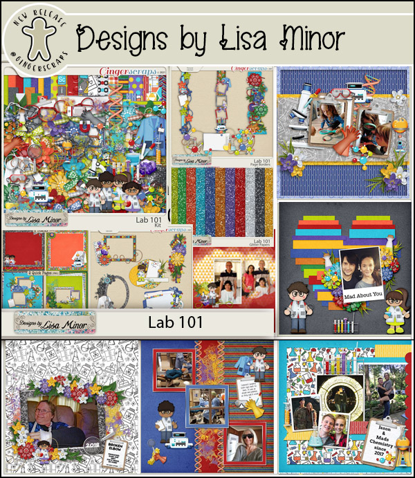
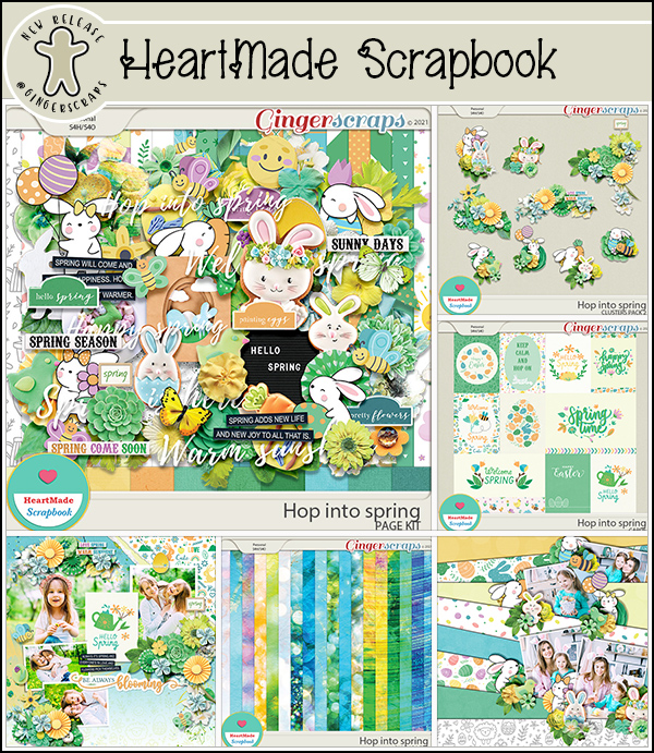
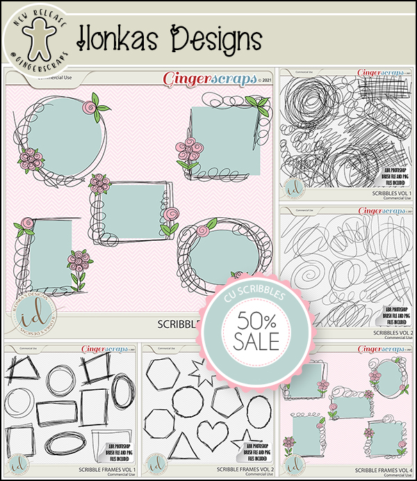
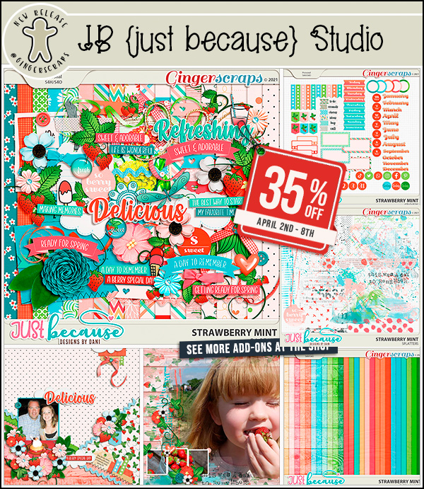
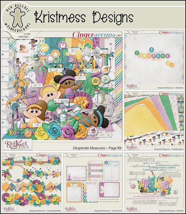
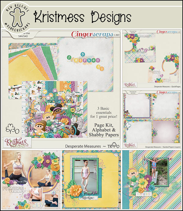
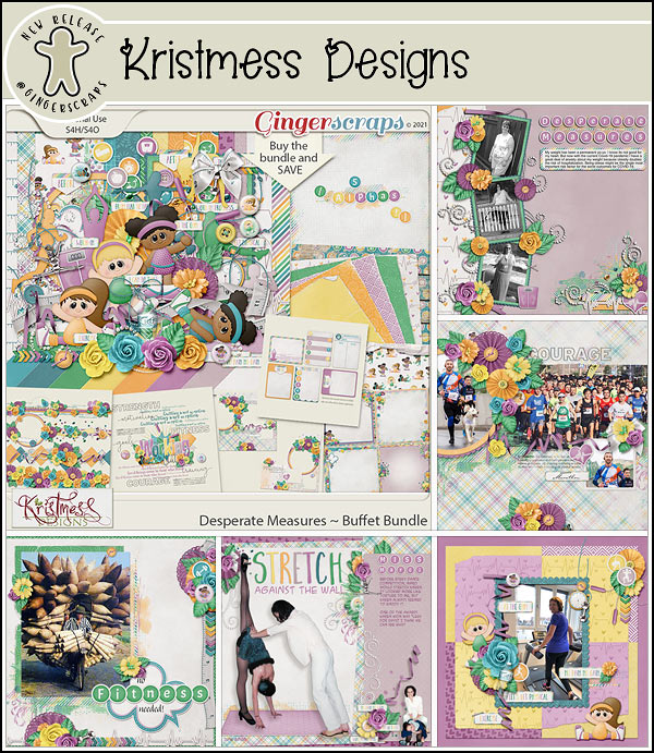
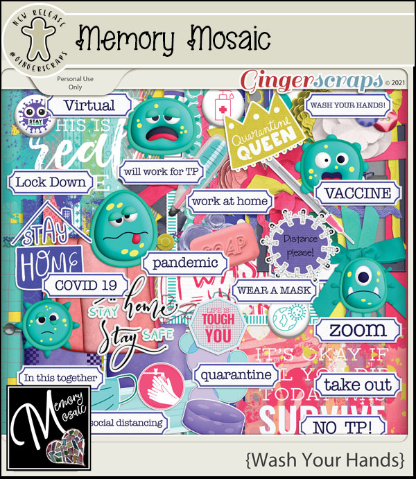
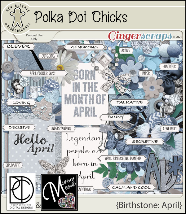
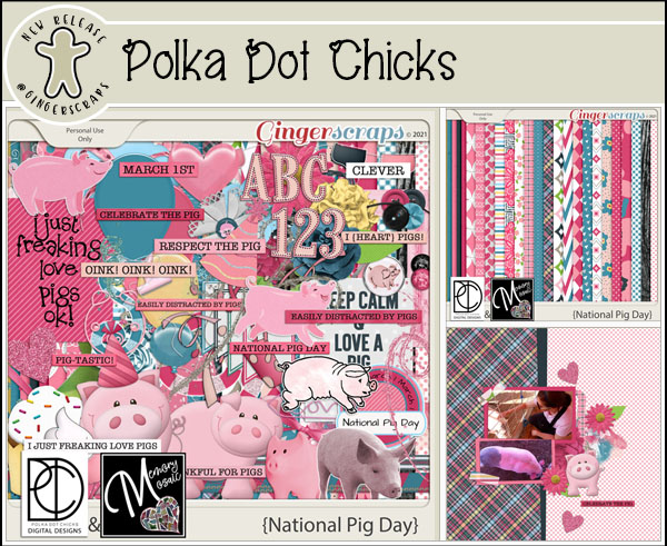
And now our Fresh Baked goodies.


Have you gotten started on your challenges yet? Do you have favorites? Remember, any 10 completed challenges earns you this kit as a reward.