
Hey GingerScrappers! Let’s get to know Laurie…
1. How long have you been designing?
12 years on and off
2. What made you decide to design?
I have always been creative so this is just another way to be creative.
3. What led you to decide to design together?
I love the designs from Just Because! She is an amazing talent and a great person too, so why not?
4. What do you use to create your designs (program, additional tools, etc.)?
PS CC
IPad
and a Lenovo Laptop
5. Describe your design workplace.
Right now it is in my bedroom on a foldable table. I had to move up here so I can work away from the kids. But usually it is on our kitchen table.
6. What motivates and inspires you as a designer?
My kids most of the time.
7. What is your favorite kit currently in your GS store and why?
uhhhhhhhh…… I have no idea! Probably one of my “magical” ones. I love Disney and all that magic!
8. If you could only eat one meal for the rest of your life, what would it be?
wow, ok….ummmm…. Probably a typical Thanksgiving dinner. But I love all sorts of food!
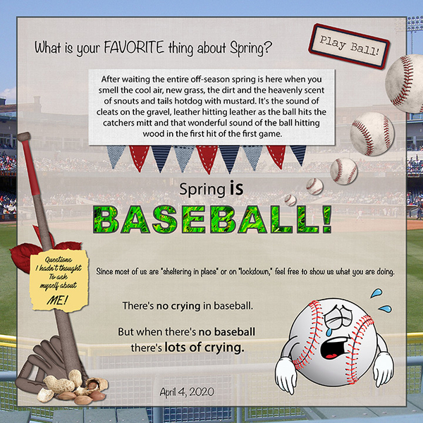
9. What is your favorite game or sport to watch and play?
Soccer… it is easier to understand.
10. What did you want to be when you were small?
A Lawyer, Doctor and Teacher. All at once.
11. Aside from necessities, what one thing could you not go a day without?
Right now….Allergy pill. Hahaha.
12. Who would you want to play you in a movie of your life?
Charlize Theron…. she is sooo pretty!
13. If you had a warning label, what would yours say?
#NOFILTER! I do not filter out what I say most of the time. So what you see if what you get!
14. What celebrity would you like to meet at Starbucks for a cup of coffee?
Yikes! I have so many…. to have a discussion, probably Leonardo DiCaprio.
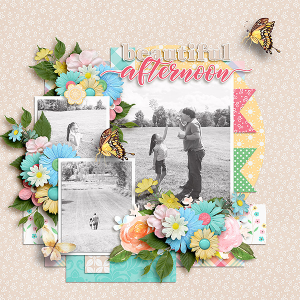
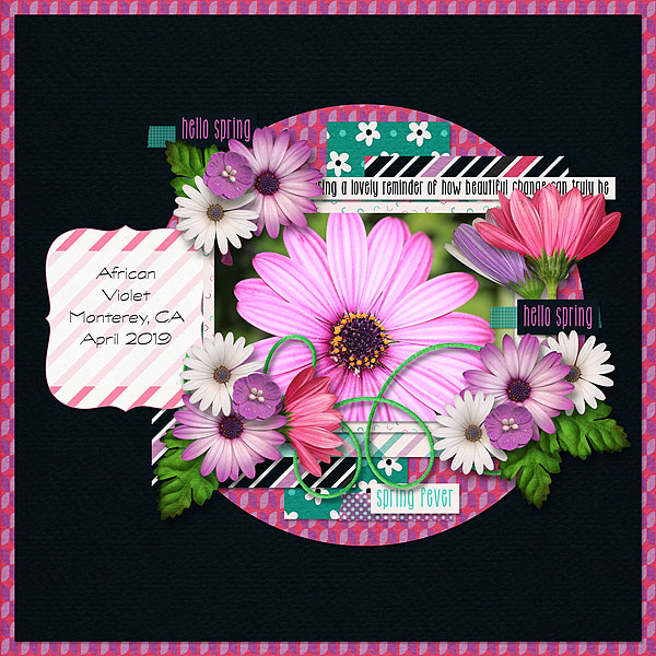
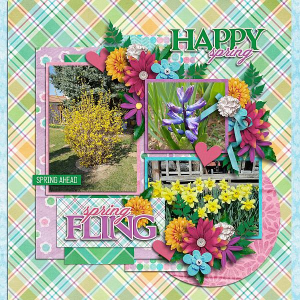
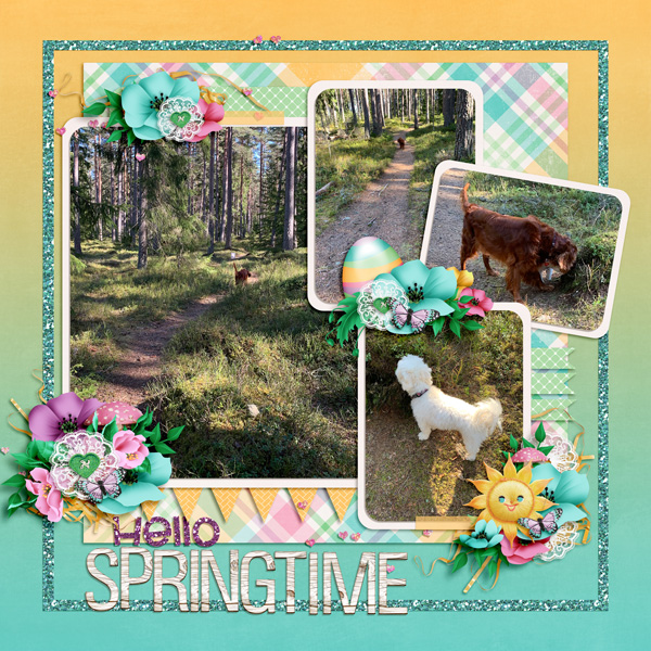
![]()