It’s Almost DIGITAL SCRAPBOOKING DAY!!
![]()
Hey all you GingerScrappers! Digital Scrapbooking Day is coming up fast!! It’s on Saturday, October 2 and it’s going to be a blast. But don’t let “Day” throw you off. It’s not just a day, it’s a week-long celebration of our hobby and it’s always epic. This year’s theme is just perfect. Ginger has given me the go-ahead to share this sneak peak with you. Drum roll please!
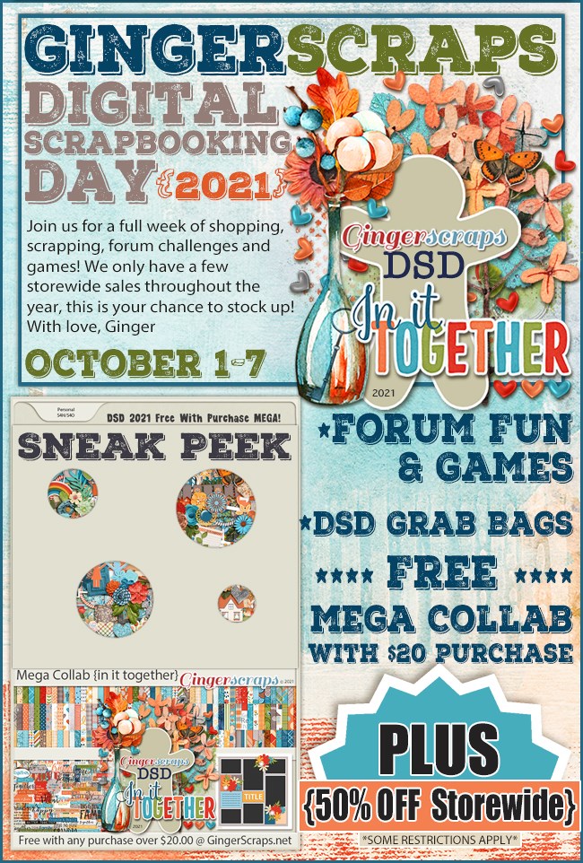
All the digital scrapbooking stores around the worldwide web have special events and sales. Here at GingerScraps, there are a bunch of grab bags specifically designed for DSD, special challenges, another scavenger hunt, and a free-with-$20-purchase MEGA collab. (I’ve seen the MEGA collab… you’re going to love it!!!! It has about 100 papers… and the palette is beautiful.) Other stores will have designer blog hops and special events on their sites too…
So start with a PLAN! Don’t just jump into the deep end. Check out the forums at your favourite stores to see what they have going on. Then make yourself a calendar of events. Set some reminders so you don’t miss the entry deadlines, speed scraps or chats. If you’ve ever missed out on something amazing by a matter of an hour, you’ll understand the need for some nudges.
Make sure you have hard drive space for your purchases and freebies. Or invest in some thumb drives or an EHD to transfer some of your older stuff to so you have lots of room for your downloads. That MEGA is going to need a bunch of room. Label this extra storage right away so you don’t forget what you’ve put on it. Forgetting to label them could mean you lose track of all the awesome kits you’ve moved and you don’t want that! I have a brand new 6TB EHD just waiting for me to fill it up.
Set a BUDGET! It’s way too easy to overspend when you’re surrounded by smokin’ hot deals, and PayPal makes it painless… until later. Figure out how much you have to spend, and stick with it. I usually save a bit of money so I can spend $20-25 per favourite digishop (I have 3 that I like a lot) without feeling guilty. (With the slightly stronger Canadian dollar this week, I might be able to make my money go a bit farther. As long as there isn’t some catastrophe here that causes our currency to tank. ‘Cause that’s never happened before….. 😉 )
Don’t feel obligated to participate in anything that isn’t going to make you happy. If you don’t have time to join in on the games in the Forum, don’t worry about it! If you aren’t into speed scraps, that’s great! Extra challenges might be fun, but if you have better things to do, you have better things to do. Freebies take up a lot of space, both on your computer and in your head; if you don’t think you’ll ever use what the designer is giving away, you don’t have to take it. This is especially true of blog hop freebies; the topic and palette may be really exciting, but there will be some designers’ contributions that don’t fit into your style of scrapping, so don’t download them. Believe me, you won’t miss them.
While you’re waiting for the festivities to begin, go through your photos and choose some for those challenges you just won’t be able to resist. Let your family know when you’re going to need some uninterrupted time and don’t stay up too late! Because there’s still Black Friday next month – we have to pace ourselves!
Sharing our stories is important, both for us now and for those who come after us. The last 18 months have had quite an impact on all of us in one way or another. Some of us have lost loved ones, some of us have been sick ourselves, some of us have worked harder than ever before to help others and some of us have channeled our energies in new directions. But we all have learned what matters and what doesn’t. Let’s celebrate ourselves!
![]()


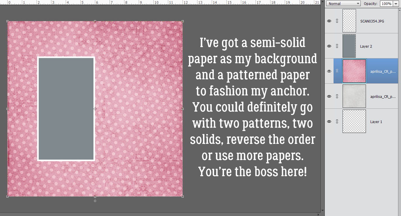
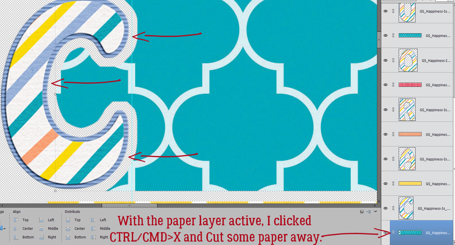
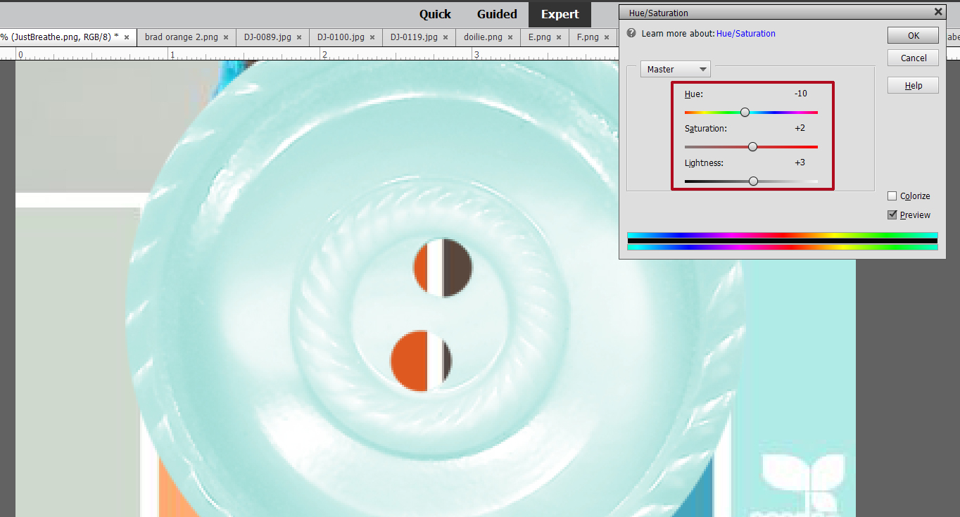
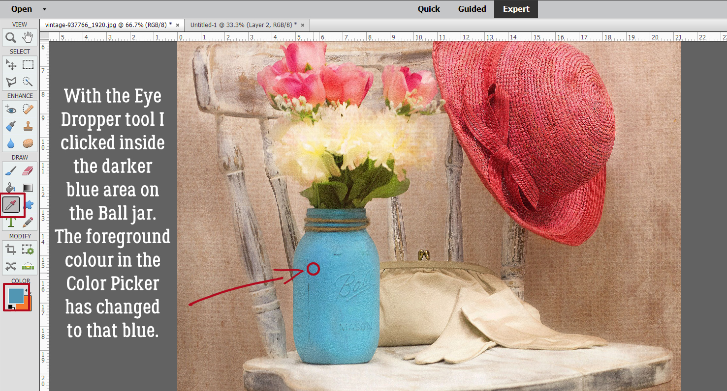
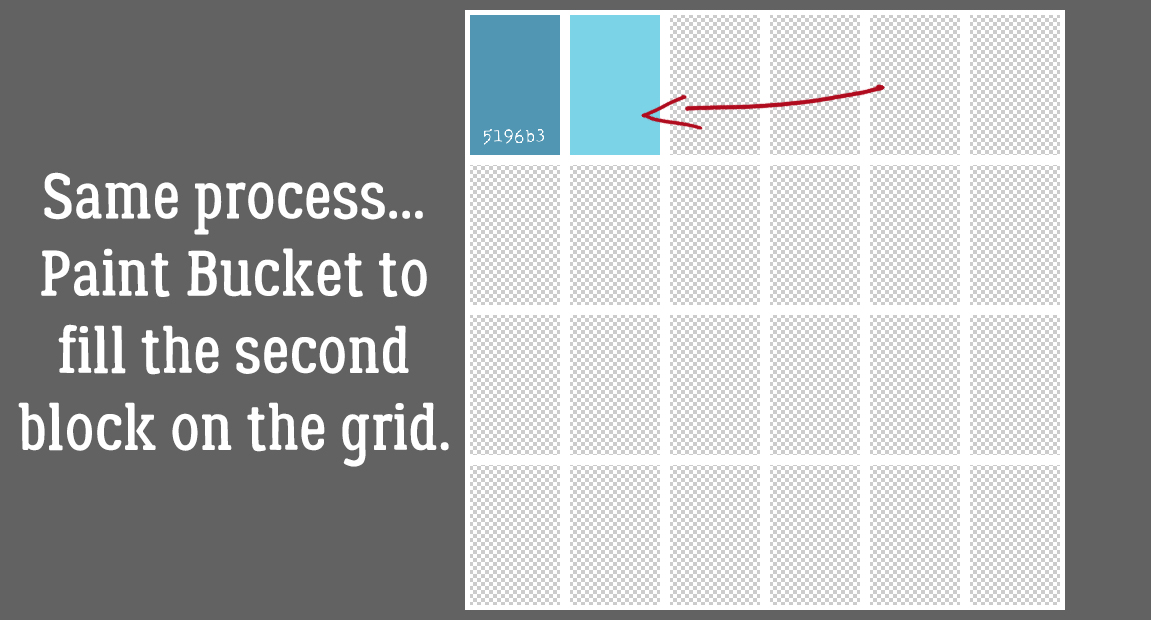
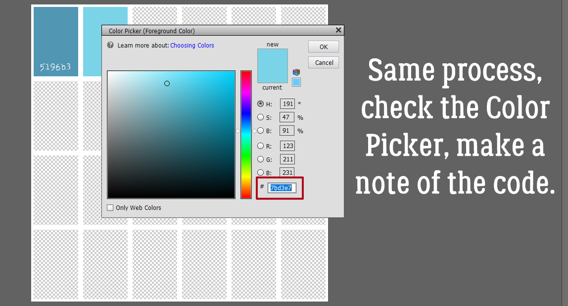
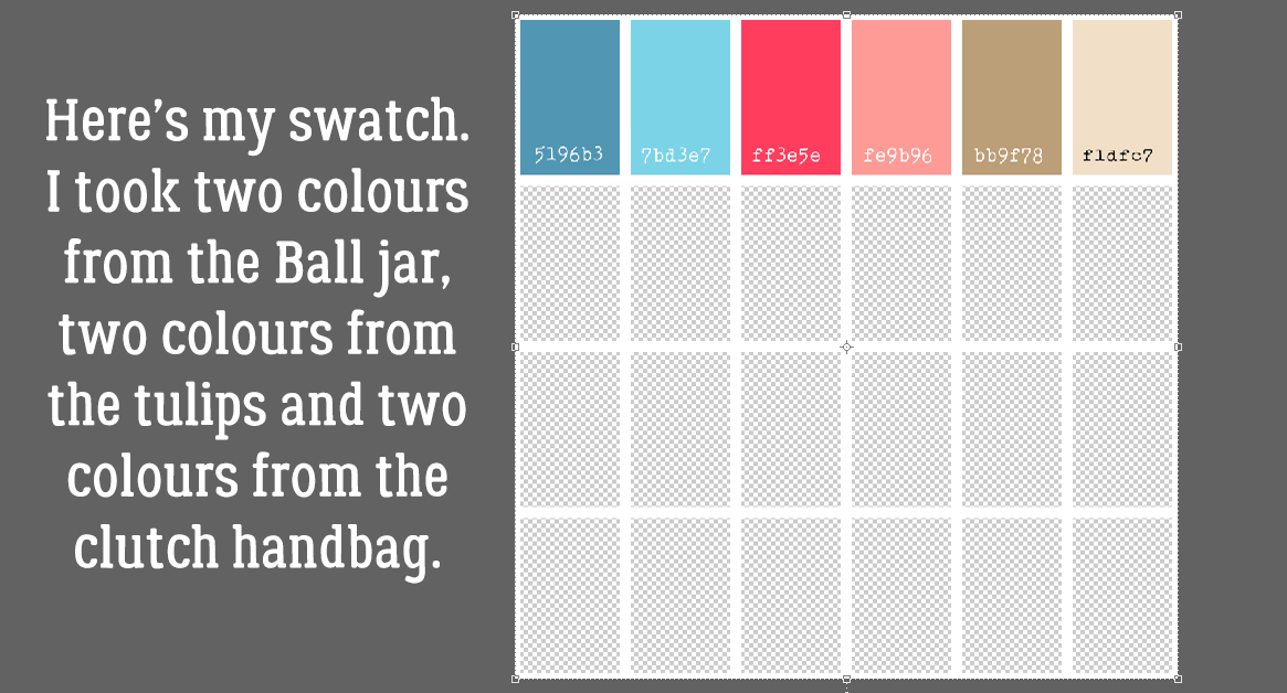
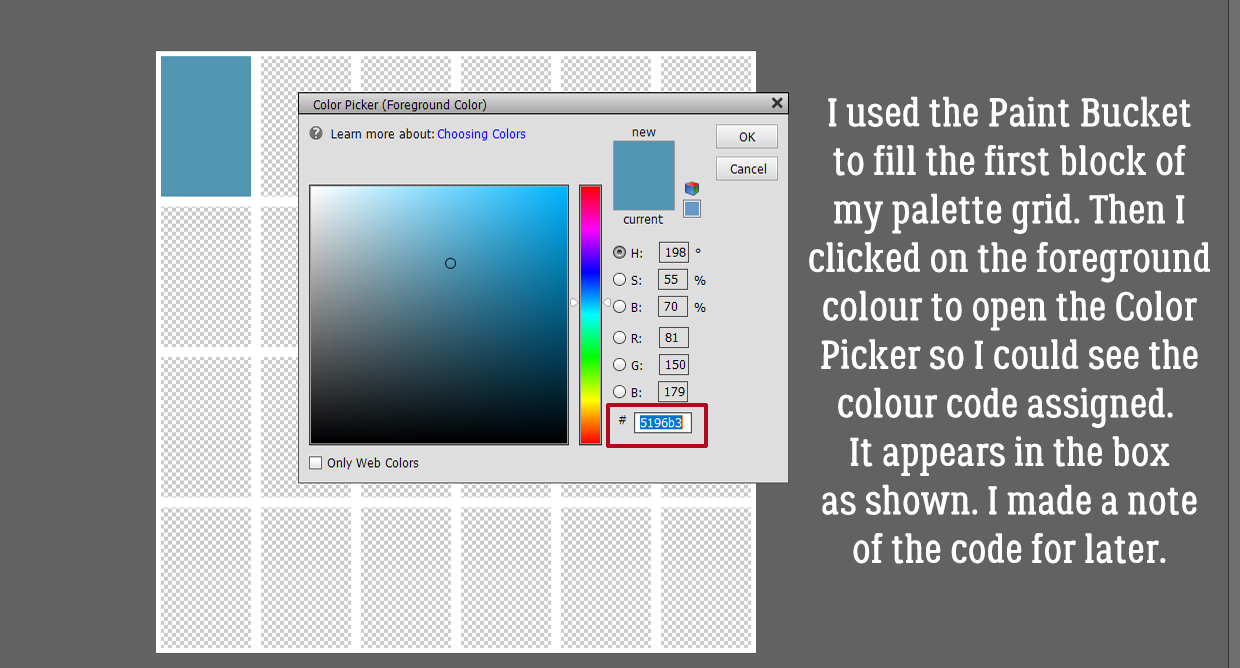 Following the same process I used the Eye Dropper to pick a spot of lighter blue.
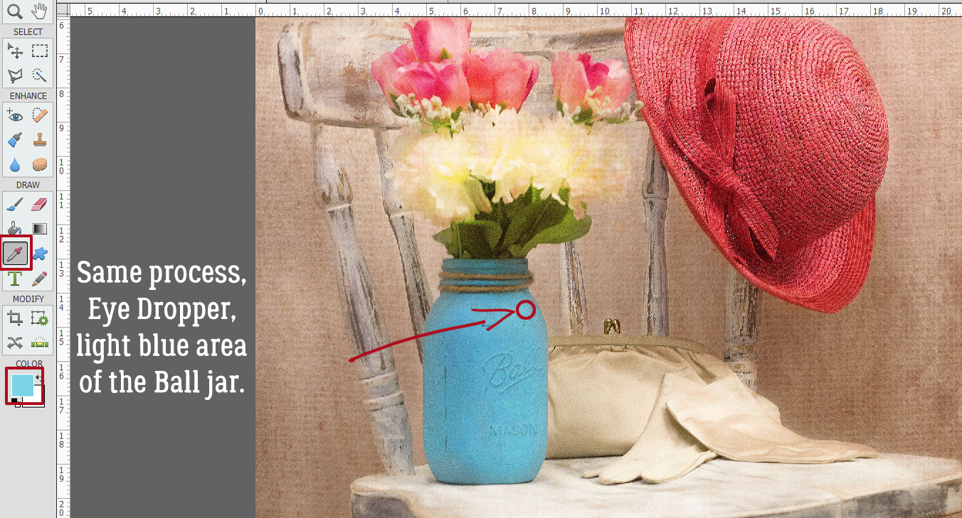


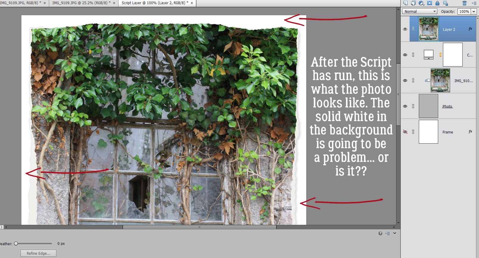
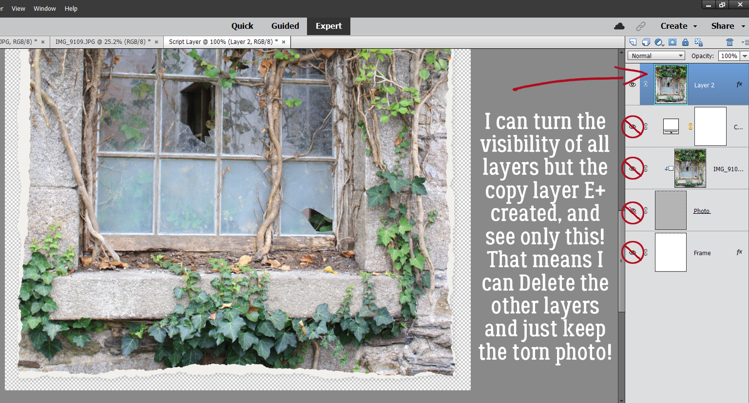
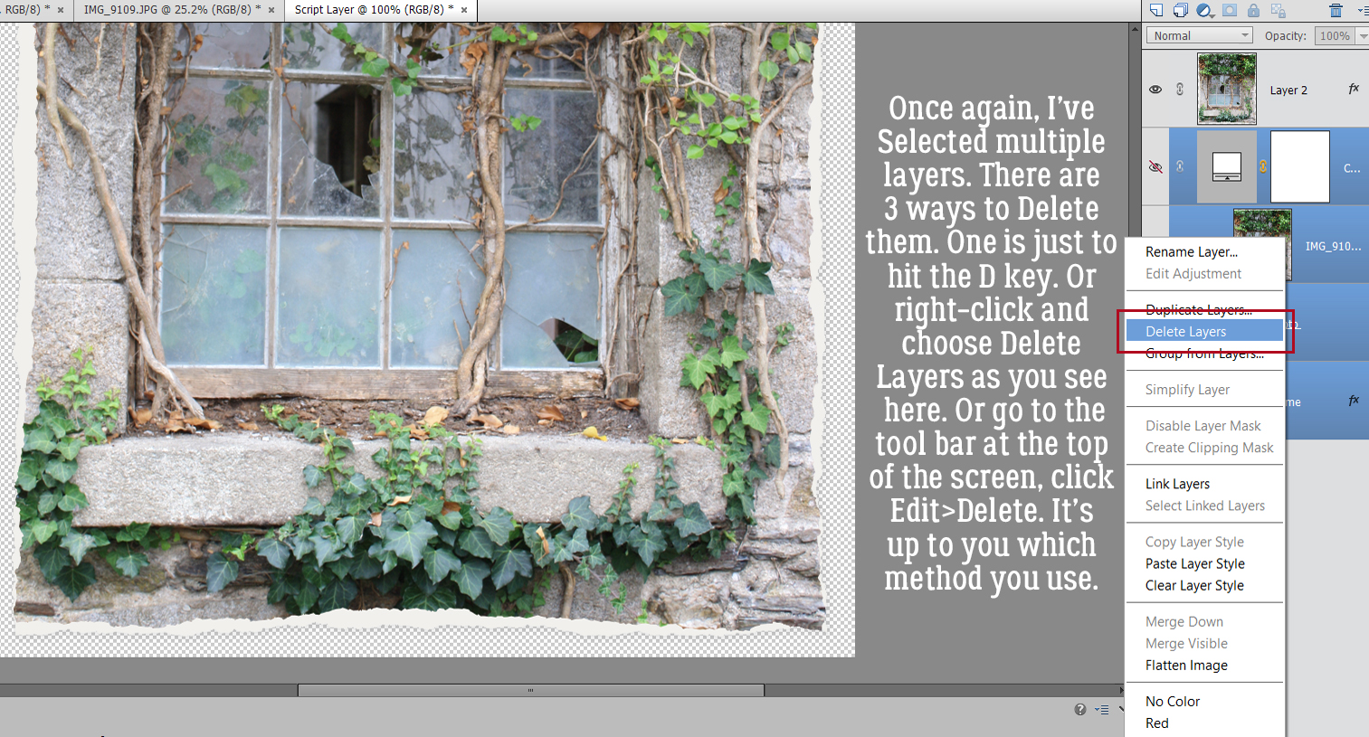


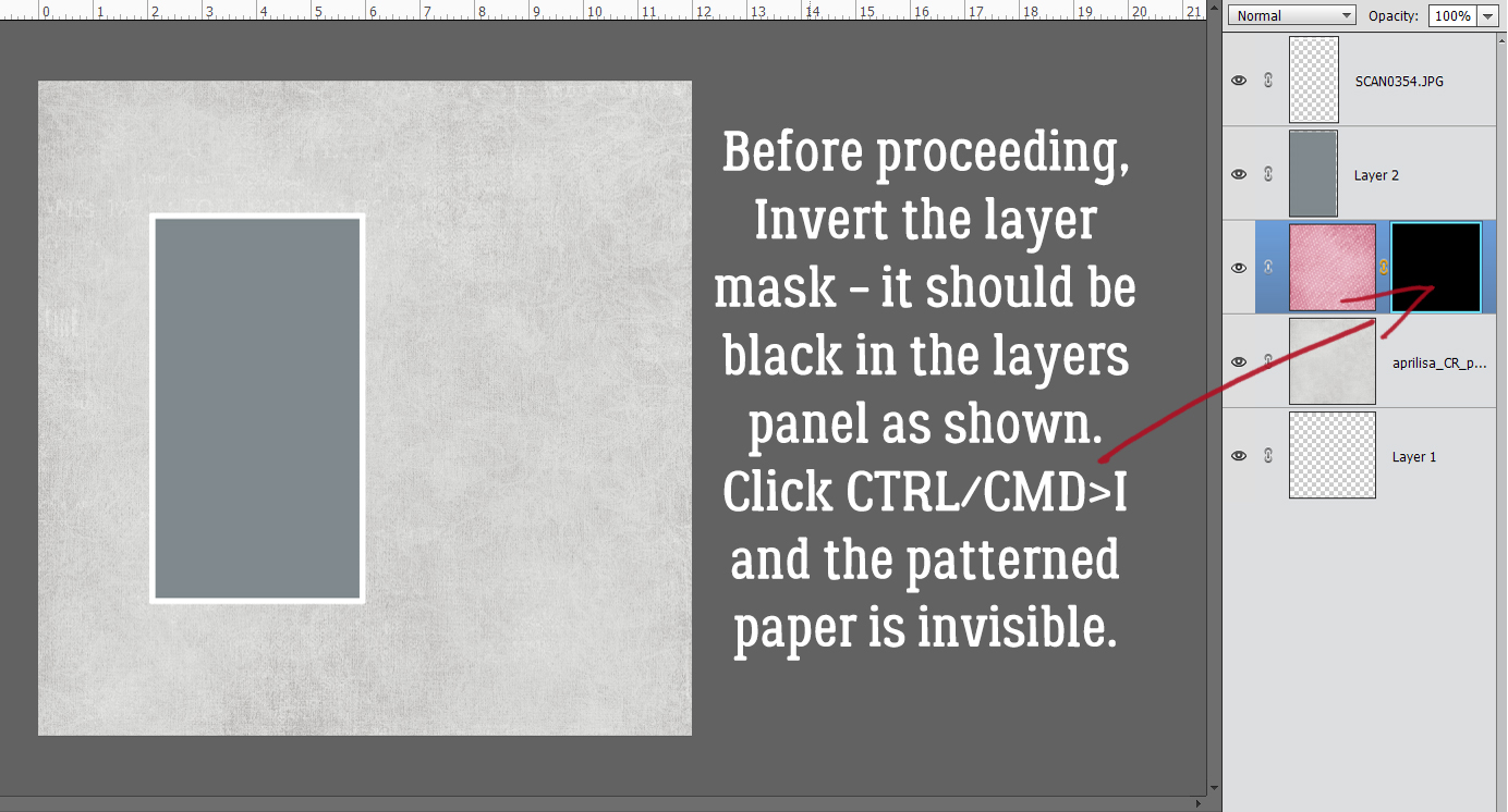
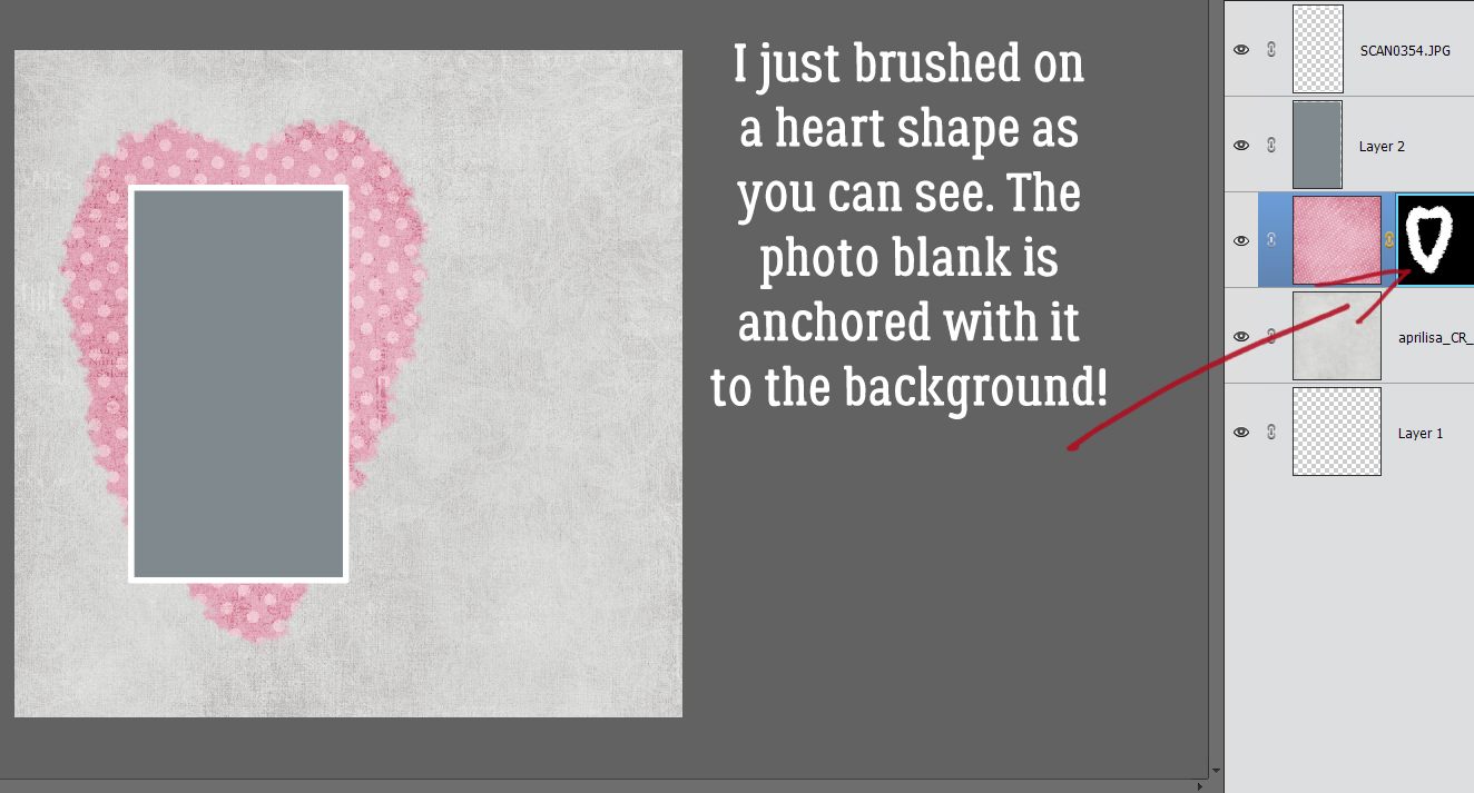
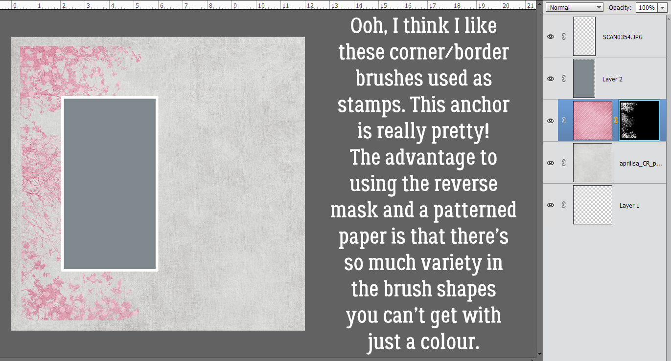
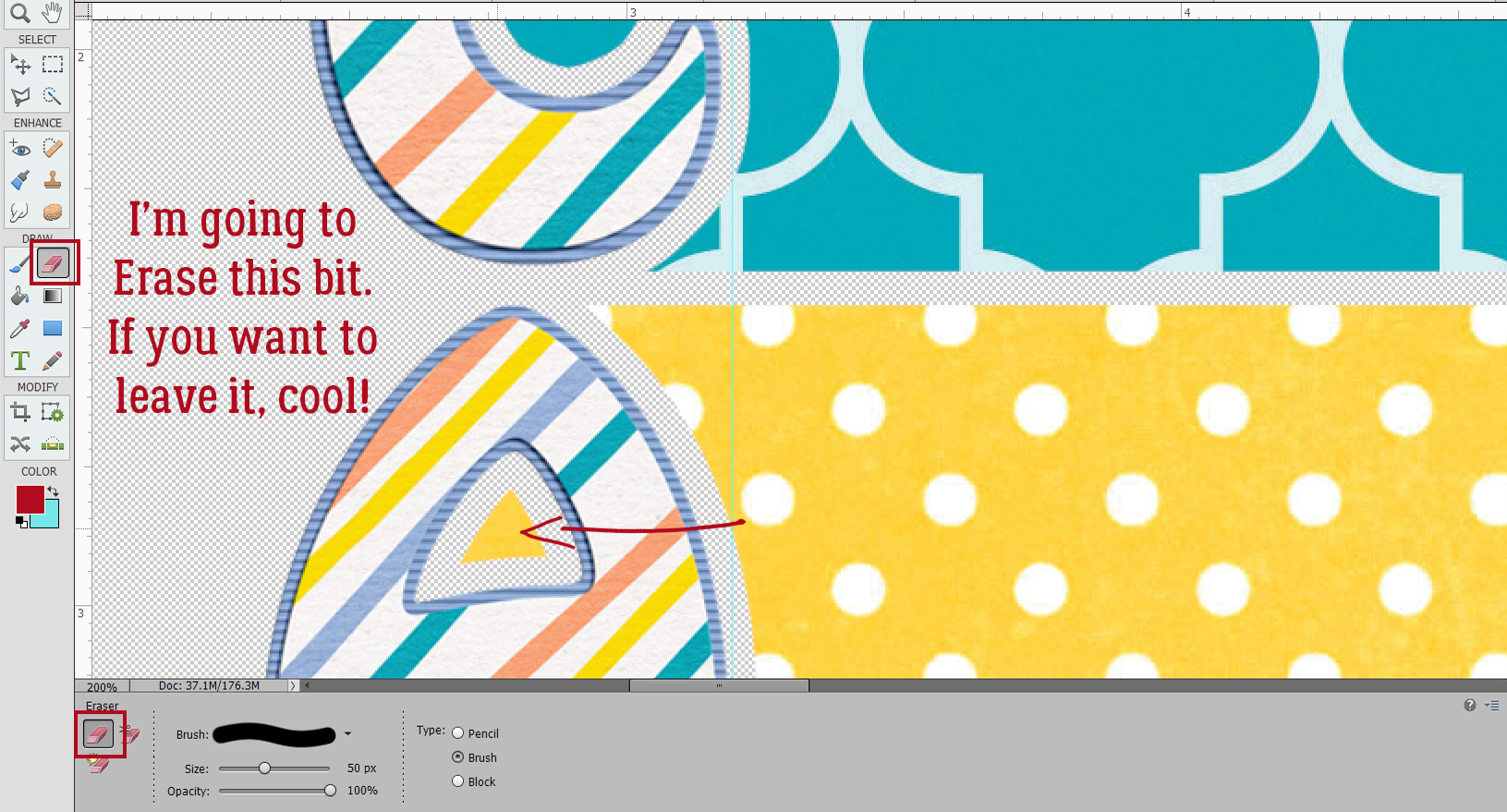
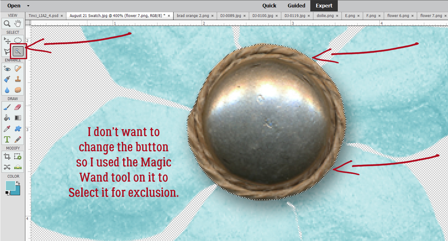
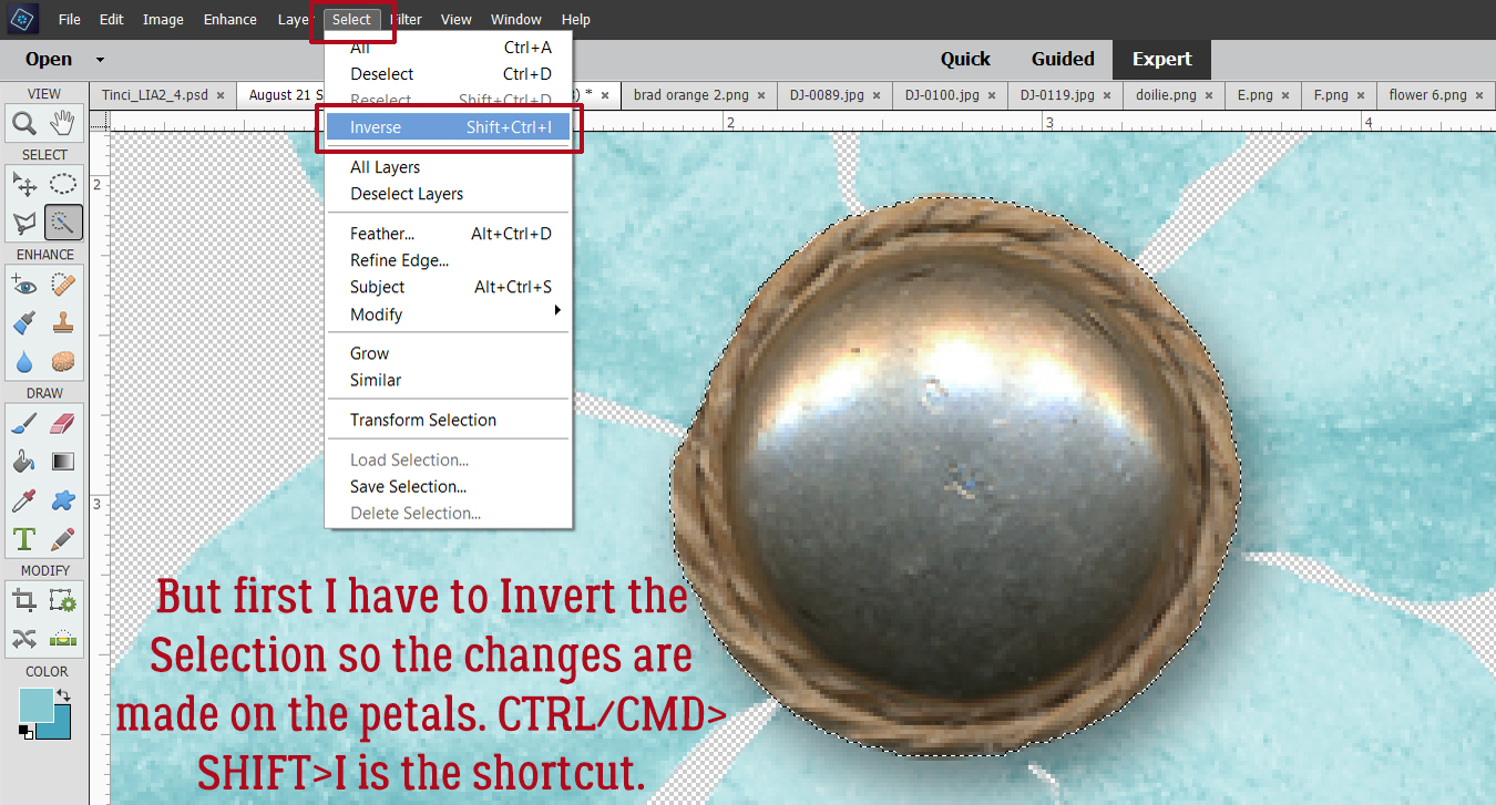
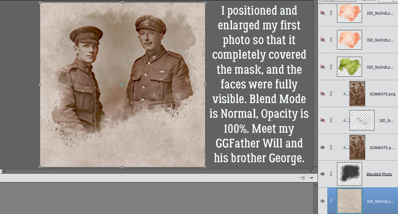
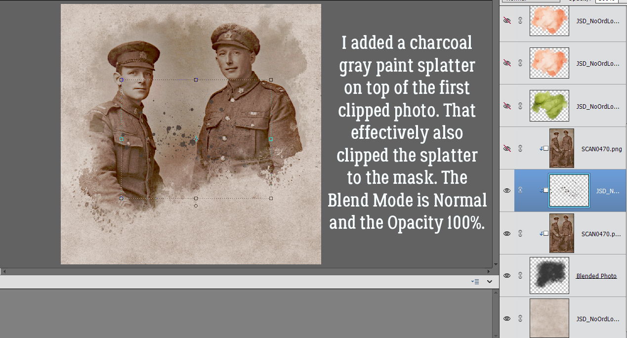
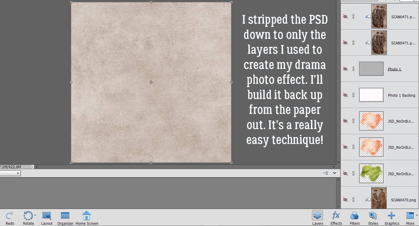 In the Gallery comments, Jill pondered whether I’d done any (labour-intensive) extractions or other witchery to obtain my results, but I didn’t. I used the mask exactly how
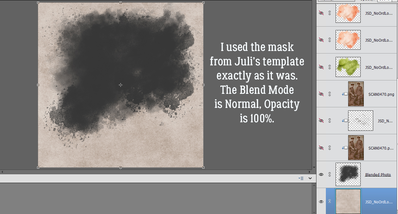

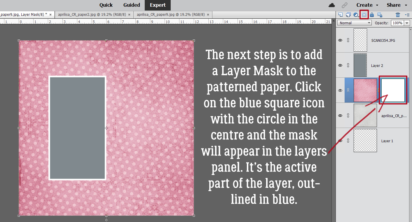
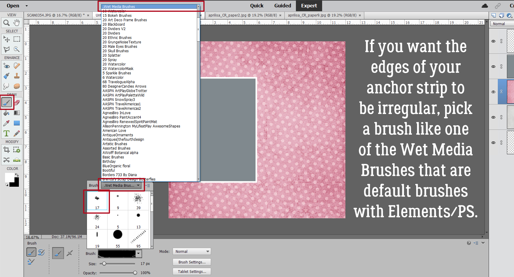
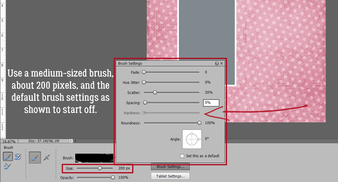
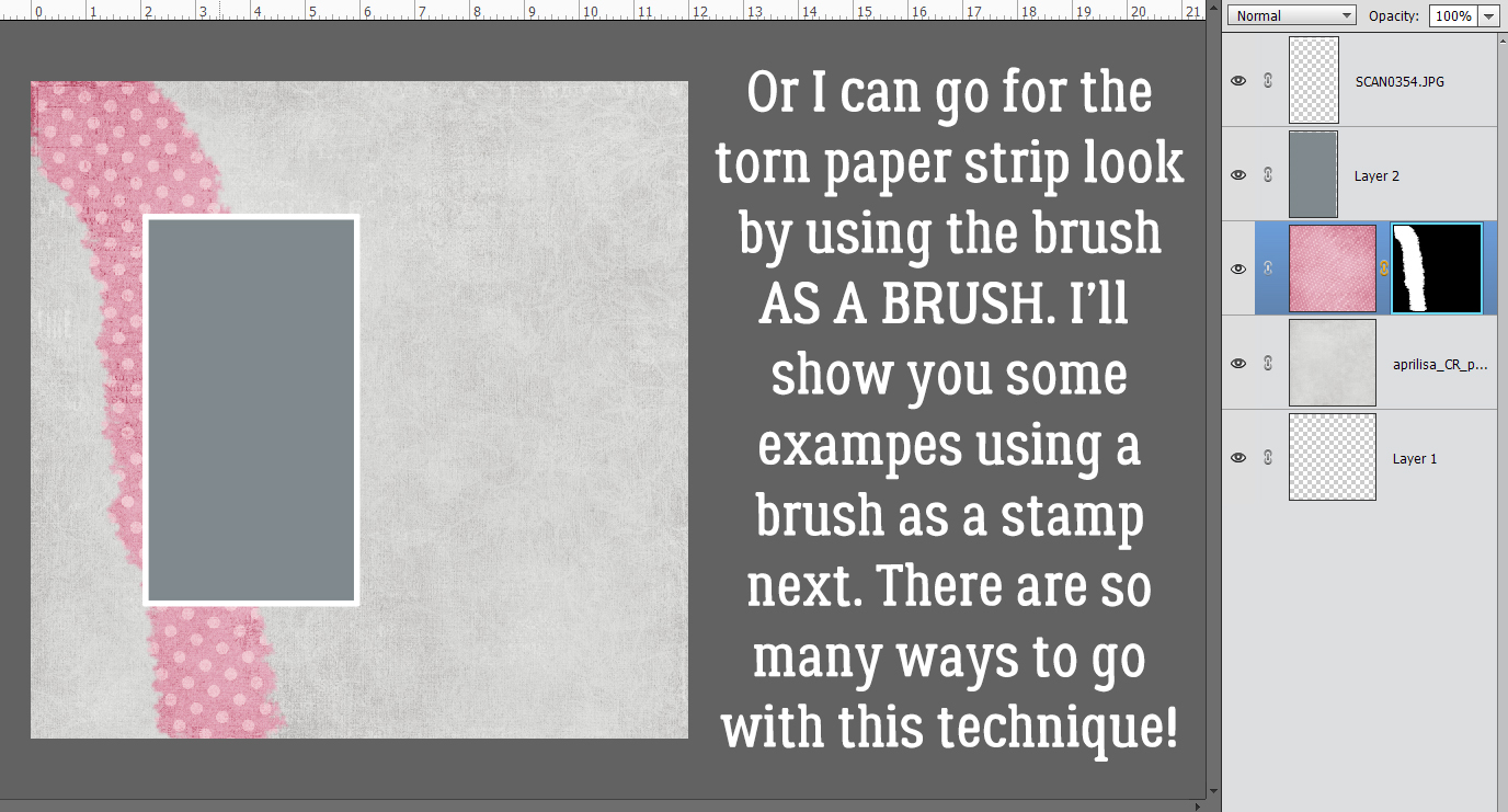
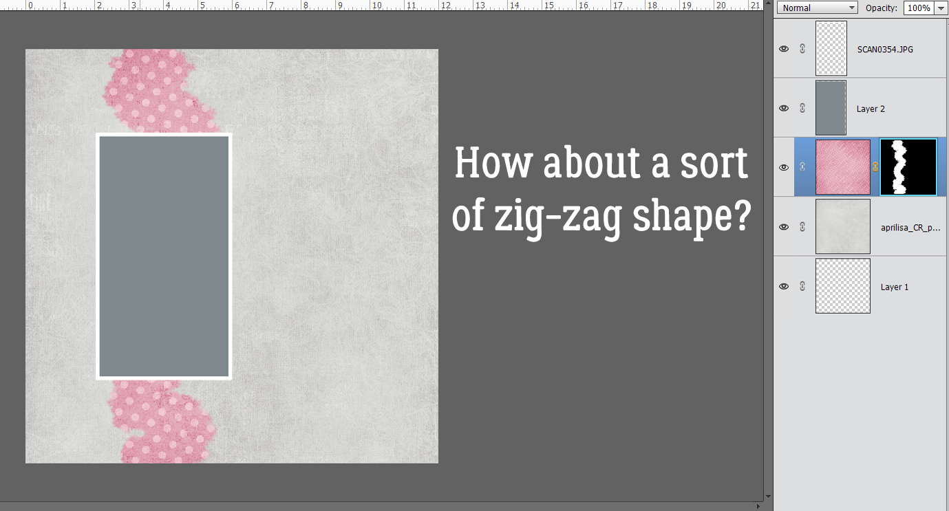
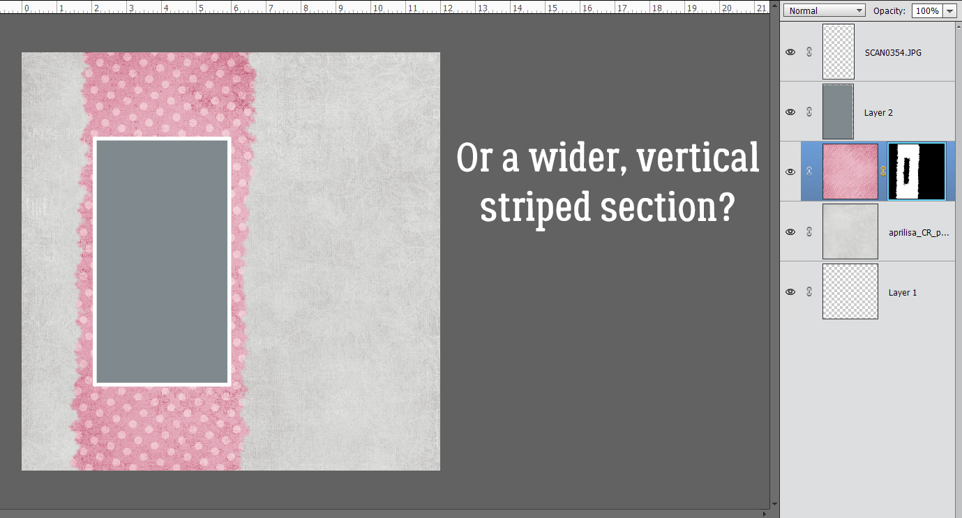
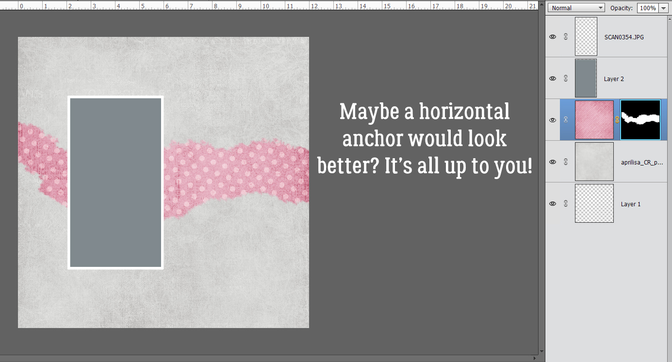
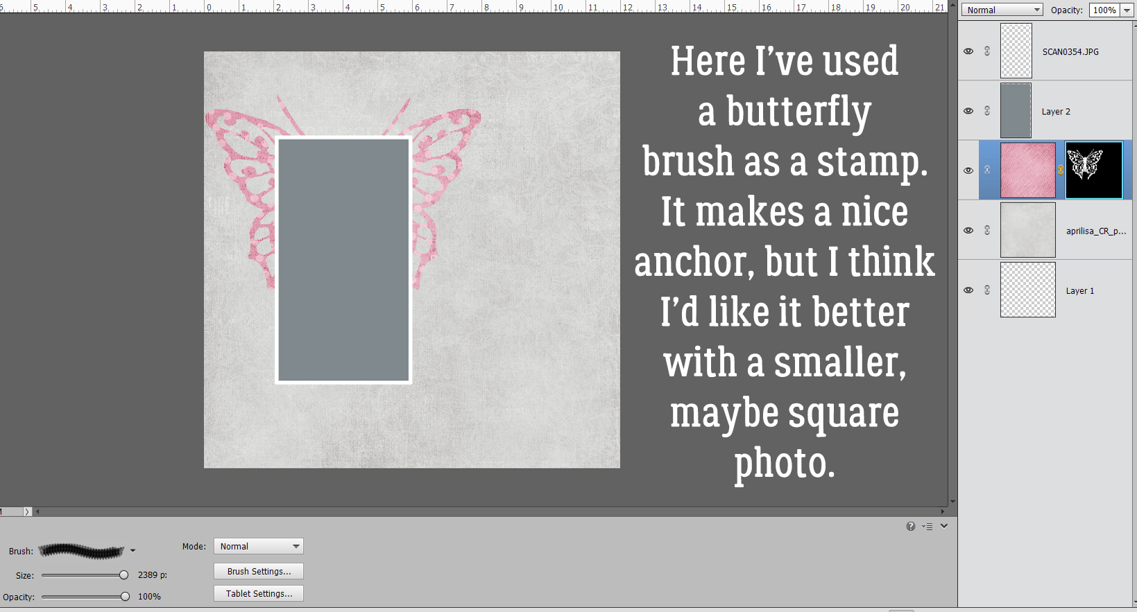
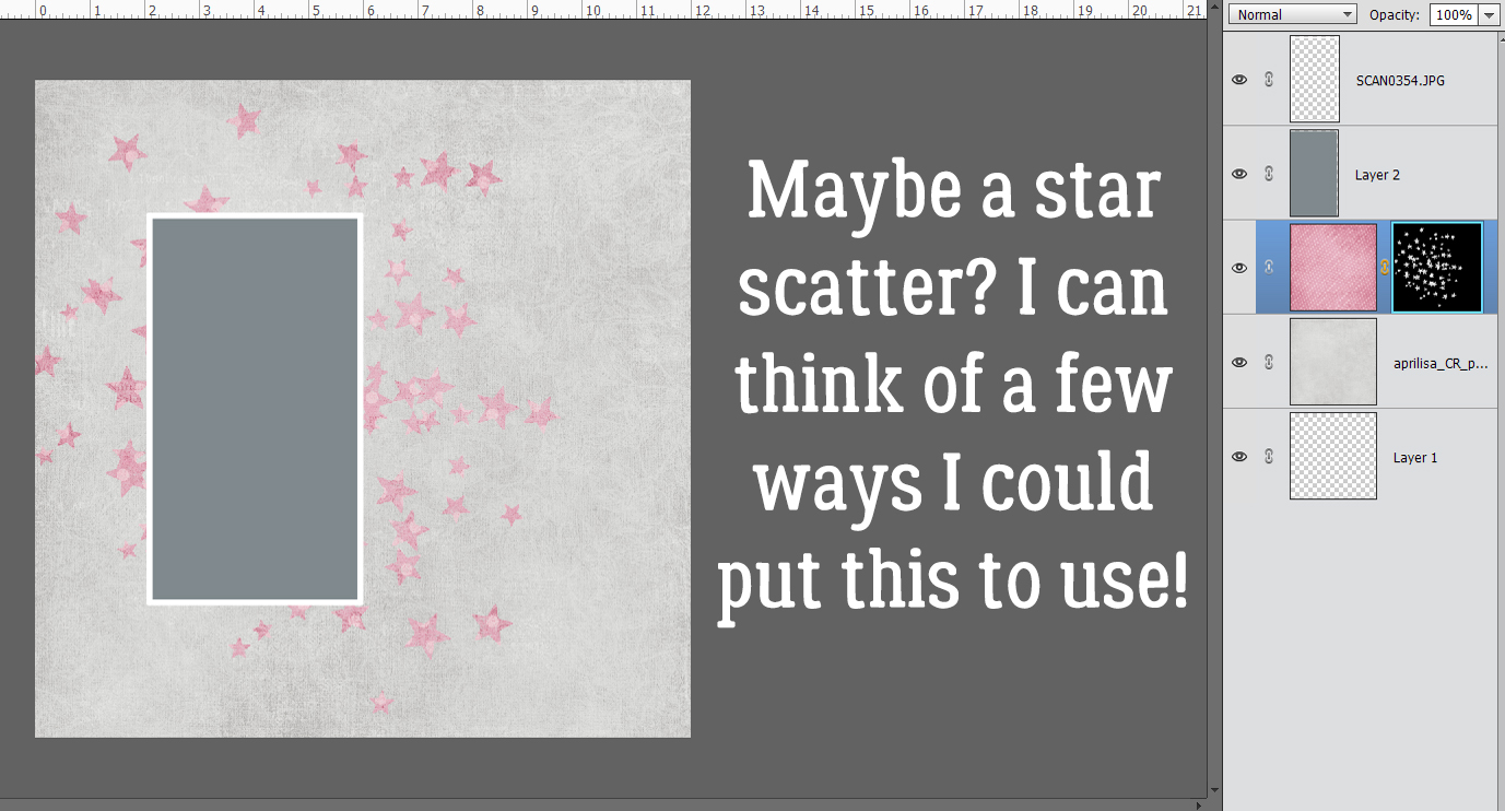
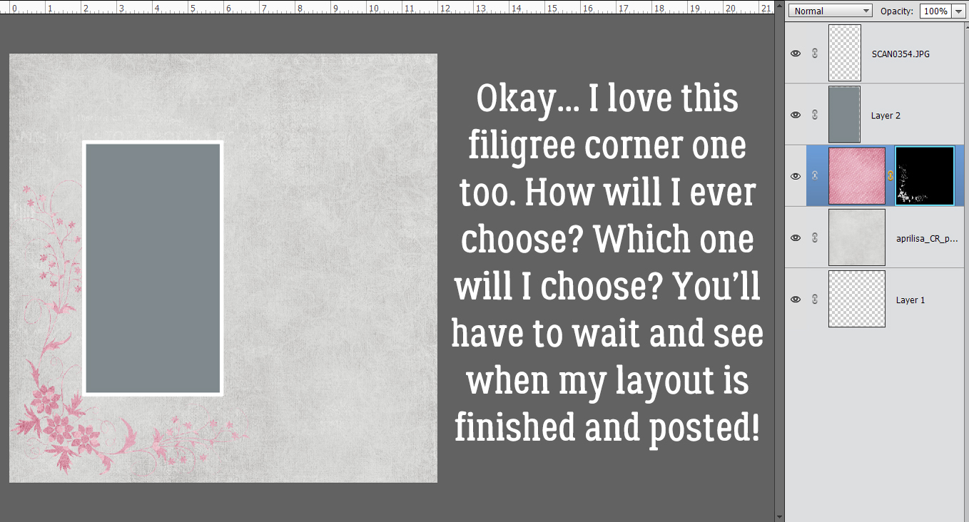
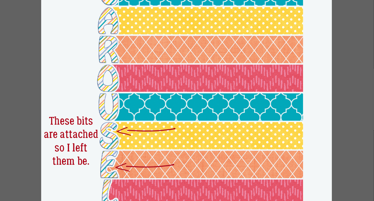
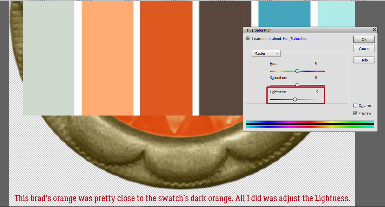
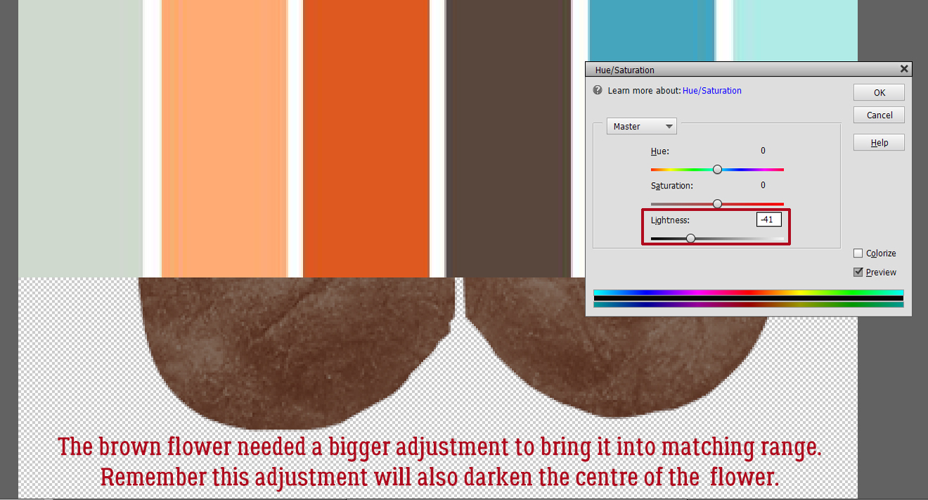
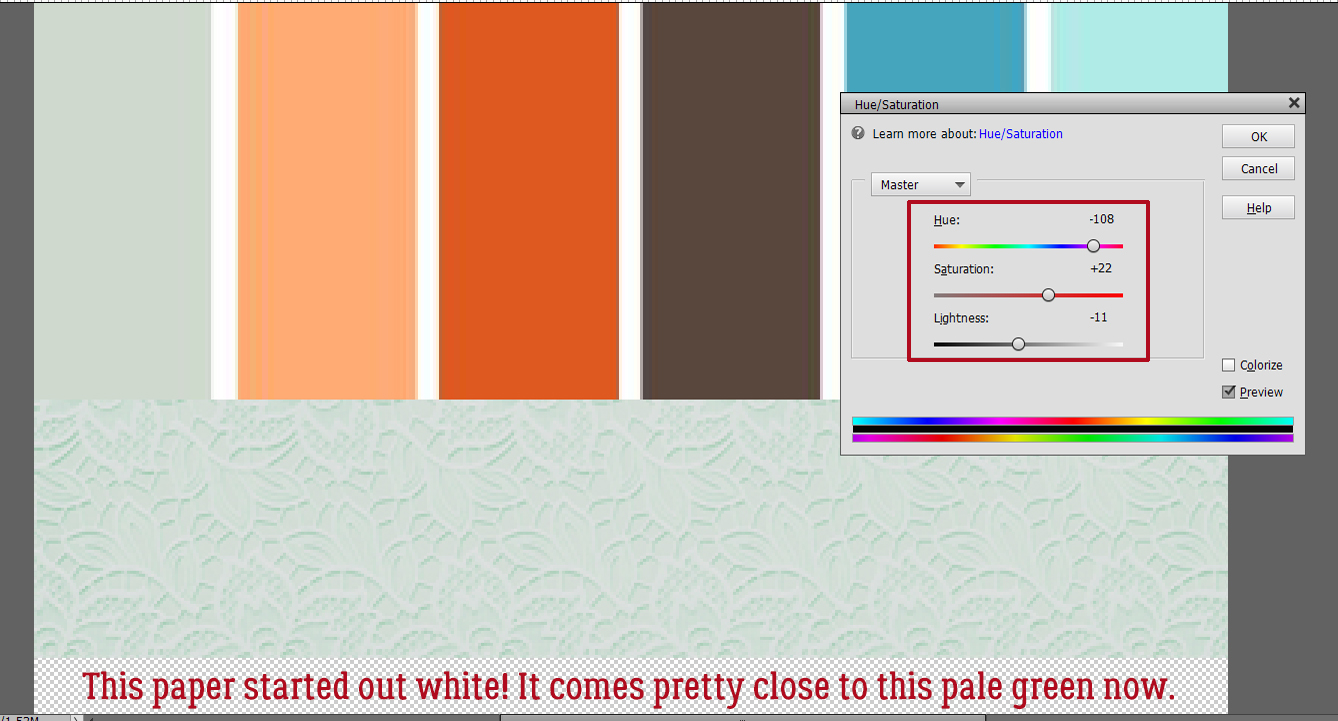
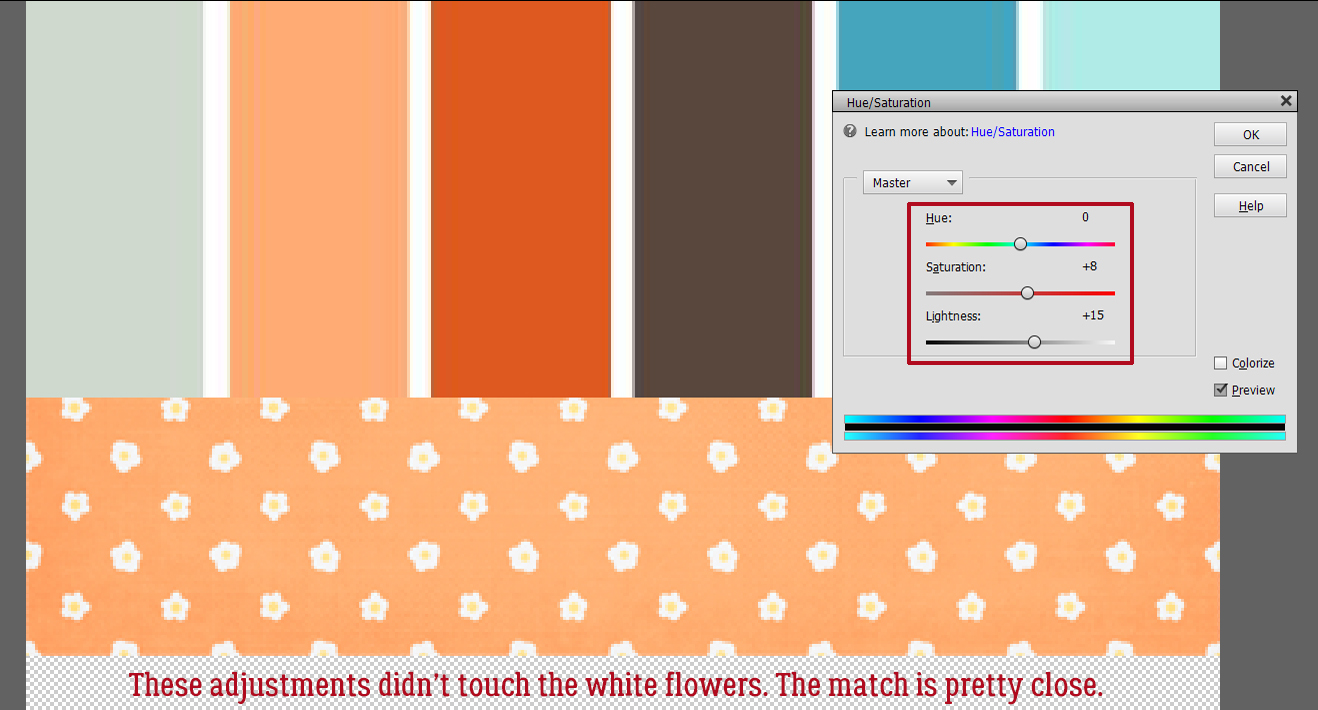
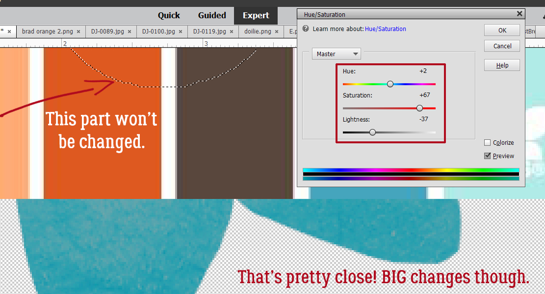
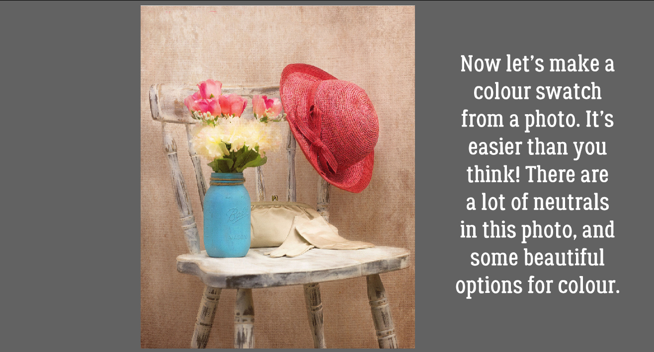
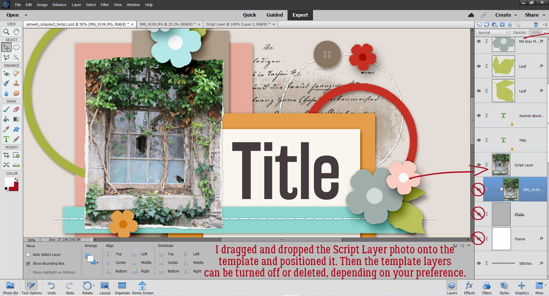
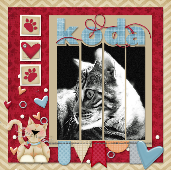
 Another example: this month’s