Archives for February 2017

Tutorial Tuesday (Photoshop Elements)

Blend Modes? Say What??

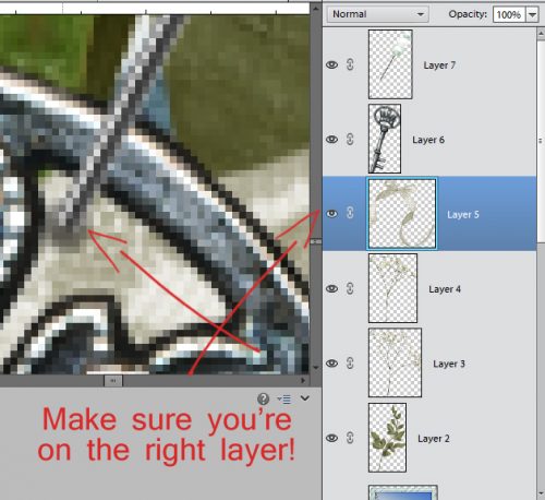
Photoshop Elements is considered the poor gal’s Photoshop because it has its limitations; there are lots of things Photoshop does that can’t be easily done in Elements. But that doesn’t mean Elements isn’t a powerful tool. I’ve mentioned Blend Modes before, mostly in passing; today we’re going to take a deeper look at them, but I’ll admit I’m still figuring out how to make them more useful to me, and to you. If you’ve ever used a photo-editing action set, like those available free from The Coffee Shop or for purchase from Paint the Moon, you might have noticed there are dozens of layers created by the action as it alters your photo. Many of those layers use Blend Modes to create their magic. So let’s go down the list.

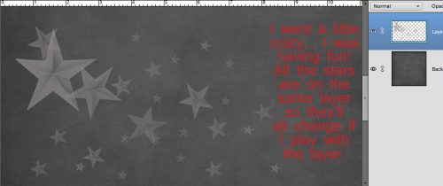
In the image below, I’ve opened the Blend Mode menu in the Layers panel. It’s the oblong button at the upper left, underneath the icons and next to the Opacity slider, and it defaults to Normal. Take note of the divisions in the menu… they’re grouped according to the effects the modes have on an image. Modes in the first box don’t really visually alter your image. In the second box, they DARKEN something; white is the neutral point in this mode. In the third, the LIGHTEN something; here it’s black that is the neutral point. The fourth group produces effects on CONTRAST; it uses 50% gray as the neutral point. That fifth group is the INVERSION group, they cancel out something in the image. And the last grouping is the component section, where a COMPONENT of the image is blended in some way. All of these modes affect the layer IMMEDIATELY BELOW IT. The Opacity of the Blend Mode layer will also affect how the resulting image looks. In the demonstrations below, the opacity of each mode has been left at 100%. (WSNH tip: You can quickly scroll through all the modes by holding down the Shift key and clicking either + or . Try it! It’s fun to watch the way the image changes.)

As you can see in the screenshot below, Dissolve produces a slight change in the image, and softens it a bit. If you were to copy your image and apply Dissolve to the copy, there would be a bit of pixelation created.

Darken is in that second box, and it does create a slightly darker image, but with a bit of lost contrast.

Multiply definitely darkens the image and improves contrast. This is a good mode for those cast shadows we’ve played with in other tutorials. Another really easy but very useful application for this mode is to improve those slightly overexposed photos we all have. Duplicate your photo, switch the Blend mode on the upper version to Multiply and then tweak the Opacity and you’ll be astounded at how much it improves your photo. When you love it, merge the two layers.

In the old days when photos were on film, post-processing was an art, and a science. Magic was created in the darkroom through manipulation of light. By hand. When an underexposed area of the photo needs to be made more visible, the photographer “burns” the area by holding a piece of cardboard with a hole in it over the photo paper, projecting the image through the film, through the hole and increasing the amount of light falling on that area. To keep the shape of the hole in the cardboard from being obvious, the cardboard has to be kept moving. It’s a labourious process, one that has been drastically improved with software like Elements. The Color Burn mode takes all the guess work and technical difficulty out of darkening areas of an image.

Linear Burn darkens the image even more, slightly changes the colour and maintains contrast. When you see “burn”, always think “darker”. This mode isn’t particularly useful for scrapbooking although it’s an option for those shadow layers.

Darker Color doesn’t produce a dramatic change at all. The colour is slightly darker and contrast is preserved.

Now we’ve moved into the third box, where the modes all lighten something in some way. Lighter Color does just that, it brings out the lighter shading in the image.

Screen mode produces a much less saturated image and lightens the colour as well, while preserving contrast.

Another darkroom trick photographers use to lighten up areas of over-exposure is called “dodging”. A circular piece of cardboard is held with tongs over the area that is too dark while the image is projected through the film and onto the paper. And of course, the cardboard has to be kept moving so there’s no visible image of the disc. Color Dodge takes away all the finickiness of that process. It also dramatically changes the colour.

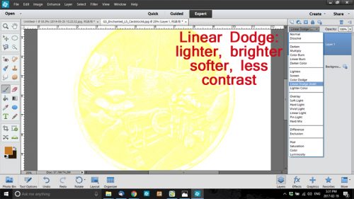
Linear Dodge produces even more lightening, with a change in colour and a loss of contrast.

Lighter Color simply does that. It doesn’t produce a huge change, and it does soften the image slightly.

Overlay is one of my favourite modes. It lets the texture of the background show through when used on text. It also sharpens the details a little. BUT… it changes the colour of whatever it’s applied to, so if you use it for text so you can see the paper texture, you might be unhappy with the colour you end up with. We’ll talk about Overlay again in another lesson when we get into photo editing.

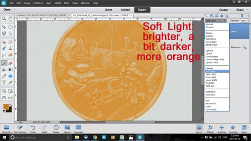
Soft Light mode brightens the image a little, while slightly darkening the colour and shifting the hue a smidge.

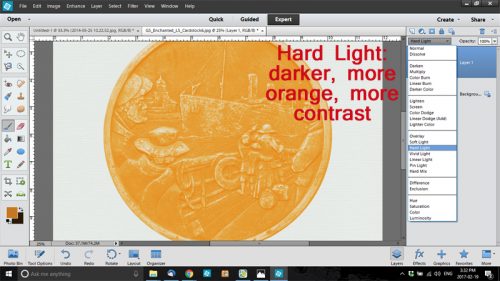
Hard Light is just that… hard. It makes the image darker, deepens the colour and improves contrast.

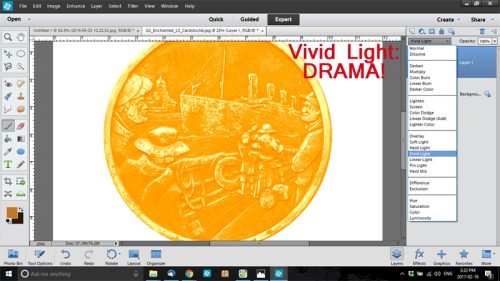
Look at how Vivid Light changes EVERYTHING!

Linear Light produces a brighter, more saturated image with greater contrast.

Pin Light creates a softer image with no obvious change.

This mode will have very limited utility for the average photographer or scrapbooker and would be more useful to the graphic artist whose work involves transforming images completely.

Difference is only used by very skilled Photoshoppers to create advanced edits of images.

Exclusion, when used on photos, will produce a negative effect. Whites become black, blacks become whites and everything else will be grayed shades. The colour wheel is essentially inverted.

Hue mode has very little effect on the layer below. It may be useful when blending in textures from an overly or a paper layer.

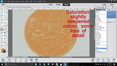
Saturation behaves in a similar manner and really doesn’t alter the layer below much unless that overlying layer is not a copy of the layer below.

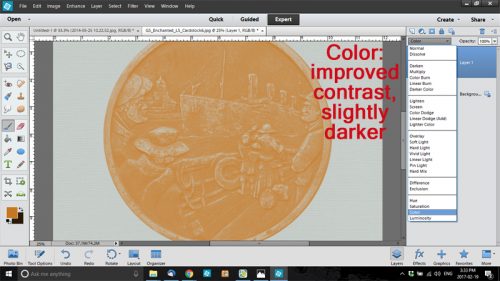
Color mode improves contrast over Saturation and slightly darkens the underlying layer, but isn’t really visually striking.

Luminosity brightens.

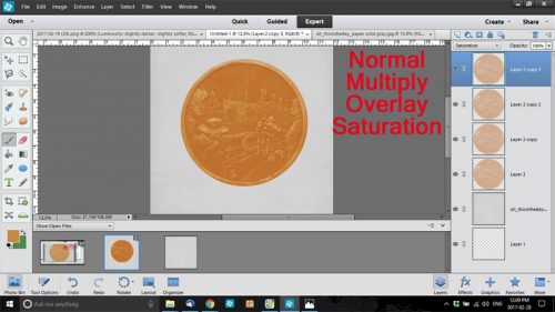
Now that we’ve looked at each mode individually, let’s see how they can be combined to really improve an image.

The steps I took are listed in reverse order. The base layer is Normal. See how The colour is darker, the detail is preserved, if slightly sharper, and the contrast is somewhat better too?

I hope you take the time to play around with these modes to see what great images you can produce.

Remember, if you’ve used a technique from these tutorials, post your finished layout in the GingerScraps Facebook Tutorial Tuesday Challenge Gallery for an opportunity to have YOUR chance to challenge me. If you’re not a Facebooker, you can post a link to the layout you’ve created with the tutorial you used in the comments section here on the Blog. I’ll get a notification and will then enter you into the draw. The first week of each month I’ll have a random draw of all entries and the winner will be announced at the end of the first tutorial of that month.

Fresh Baked: February 24, 2017

Can you believe that February is nearly over? The month of pinks and reds is nearly to an end and the month of green is nearly upon us. But do not fret, the designers are still creating some beautiful products!

Remember when you spend $10 in the store, you get a great new collab!

fwp3622 
https://store.gingerscraps.net/GingerBread-Ladies-Collab-I-Believe-In-Love.html

[Read more…]

Sneak Peeks February 23,2017

Happy Thursday! There’s lots of awesomeness coming out tomorrow!

From Aimee Harrison

From Dagi’s Temp-tations


From Tinci

From Miss Fish


From JoCee Designs

From Neverland Scraps

From JBS Templates

From Ponytails

From Neia Scraps

Have a wonderful weekend!


GingerBread Ladies Sneak Peeks – 2/24/17

It’s sneak peek time. I don’t know about anyone else, but the last 7 days have been crazy so I thought I would just drop in real quick to show you a bit of what is coming up this week.

Make sure to head over to the store to grab these on Friday!

Tutorial Tuesday (Photoshop Elements)

Build-a-Brush Workshop

Brushes are one of the most effective and interesting tools the digiscrapper has for livening up a layout. There are so many things we can do with brushes, which stand in for rubber stamps used by the traditional paper scrapper. There are brushes built into Photoshop Elements and there are lots of sources for both free and for-purchase brushes around the Web. But did you know that you can turn almost anything into a digital brush, to customize and personalize your layouts like no commercially-obtained brush can? I’m going to show you how to do that in a couple of easy steps, then give you some tips about using your brushes for truly unique design. For the basics, I’m going to use a star from Luv Ewe Designs‘ kit Yo Bro, part of a sensational collab with JoyLynn of Blue Heart Scraps. Jennifer of Luv Ewe Designs has retired from designing (temporarily, we hope!) so her kits can’t be used for challenge layouts, but they’re still worth a look. I chose this star for a couple of reasons. It has well-defined details and some shading, which will make for a more interesting brush.

I checked my Brush tool menu to see which set was currently open at the time, so I would know where to look for my brushes later. I suggest you select a brush set with only a couple of brushes in it, because they’ll be duplicated in your resulting brush set and you’ll then have to delete them.

Then I clicked on the Edit tab and scrolled down to Define Brush… and here comes the magic!

This popped up. Choose a name for your brush that defines it and that you’ll remember later.

BOOM! You’re done!! It really is that easy. Now let’s take it for a test drive. I always put my brushes on their own layer. This is a good idea for a number of reasons. First, you don’t end up changing whatever is on the layer below it. You can change the opacity, making it soft and subtle, or you can copy it and use a blend mode to give it more punch. You can resize it, you can move it around, you can play with it in so many ways that you can’t if it’s applied to a paper layer.

So I went ahead and created a new layer to apply my brushes to. (All you English teachers, cringe away at my ending a sentence with a preposition…)

I plopped a star down on my paper using a much lighter gray, because my goal is to create a custom paper with a brushed pattern over part of it. Looks pretty good, doesn’t it?

Next I changed some of the brush settings, changing the size, the angle and the opacity and kept on stamping.

Where my second stamp overlaps the first, the opacity increases, but the transparency isn’t changed.

I kept all my stars on the same layer, and added lots more in different sizes, different opacity and at different angles. If I want to make changes to how they look, all the brushed stars on the layer will change at the same time.

I decreased the opacity of the brush layer to make them look a little less obvious, and to make them look like they’re part of the paper.

When I put my newly created paper – I linked the layers together then moved the two layers at the same time onto the background layer – into the template I wanted to use, I found the brushed layer wasn’t quite how I wanted it, based on how and where my photo was going to be placed into the layout. So it was a good thing I had the brush layer still separate from the paper and after I UNlinked the brush and paper layers, I could flip it horizonally, as well as tweak the size a bit. I wanted this brush layer to replace the paint/spatter layer from the template and now it does.

I also wanted to show you that you could use items in your photos to create brushes too. In 2014 I was in Ireland; I took this photo of a brass memorial medallion at the Titanic Museum in Belfast. Having the camera perfectly parallel and perpendicular to the medallion was vital to the success of this technique, only in the sense that it made it easier to extract from the photo. (Remember: Work Smart, Not Hard!) If you’re using a photo image, extract the item as I showed you in the Extractions – Choose Your Method tutorial.

I was able to use the Elliptical Marquee tool to remove most of my background, and then a Layer Mask and the Eraser tool to clean it up.

Then I clicked Edit>Define Brush… and gave it a name that would help me connect to it later.

This is what the brush looks like against a gray paper. I want to tidy it up a bit, brightening the raised areas so they contrast better and maybe sharpen the detail a touch. When I’m thrilled with how it looks, I can then Define Brush… it again and delete the first one. When you close the software, you’ll get a pop-up that asks you what you want to label the brush(es) you just made

You’re not limited to using .png objects as the basis for your brushes. You can combine fonts and dingbats to make word art stamps, you can combine other brushes into something really original, you can use the Custom Shape tool to make tags, arrows, paw prints… the sky’s the limit. You can even make a digital brush of your signature… in case you have need of one.

Once you’re done and have saved your brush(es) you’ll need to load them into your software. So click on the little stack of parallel lines in your Brush tool menu and then select Load Brushes. Your new set’s name will appear and you can double click on it. It’ll go to the bottom of the list. Delete any brushes that aren’t your personal ones. They’re still there in their original set. And you’re ready to use them over and over and over.

I just whipped this St Patrick’s Day greeting together using a font (SNF Abernethy) and some dingbats (DB Gaelic Weave). It means “one hundred thousand welcomes”.

Remember, if you’ve used a technique from these tutorials, post your finished layout in the GingerScraps Facebook Tutorial Tuesday Challenge Gallery for an opportunity to have YOUR chance to challenge me. If you’re not a Facebooker, you can post a link to the layout you’ve created with the tutorial you used in the comments section here on the Blog. I’ll get a notification and will then enter you into the draw. The first week of March I’ll have a random draw of all entries and the winner will be announced at the end of the first tutorial of the month.

Focus On : Paper Packs

Hello Scrappers! Team member La’Shawn here with another edition of Focus On. That is where we take one thing, that isn’t a kit and focus on it. Our store has amazing designers that work so hard to bring us great digital scrapbooking supplies every week. Sometimes things get lost in the ever changing store. Some people don’t check the new releases every week. Some people are just starting and might not have seen some things from the past. That is where I come in. I am here to go back in the archives and bring you some great stuff.

This isn’t a from the archives post. We do have those! If you are looking for something that was in our store over a year ago, check HERE. This is where we just look at one thing. Today we are going to take a look at some great paper packs. Our designers are some of the best paper designers around! I am going to bombard you with some great examples and tell you how to find more.

There is an entire section dedicated to paper packs in the store. You can find that HERE. Paper packs are a great edition to any digital scrapbooking layout and stash. Sometimes you cannot find that one paper you need. Or it might be made to be an add-on to a collection. You can also mix and match!


This was only page 4 into the paper pack section. There are pages and pages of amazing paper packs in the store.  Show us what you have done with an add on or paper pack from the store!

GS_footer_LaShawn


Fresh Baked: February 17, 2017

The weekend is nearly upon us! Just one more day to go through! The designers are loving the near ending of the month, I think, because they’ve created some amazing stuff!

Remember when you spend $10 in the store, you get a great new collab!

fwp362 
https://store.gingerscraps.net/GingerBread-Ladies-Collab-I-Believe-In-Love.html

[Read more…]

Sneak Peeks February 16th 2017

Happy Thursday! Did you enjoy Valentine’s Day? This is a great week for me as it’s my 9 year wedding anniversary! I still can’t believe it’s been 9 years. Time does really fly! I am so glad I discovered scrapbooking so I can preserve the awesome memories of my family and reminisce as I scrap the pictures. To help you scrap your memories, our designers have some awesome new releases!

From Aimee Harrison Designs

From Ponytails

From Miss Fish

From Amy Stoffel

From JoCee Designs

From Tinci Designs

From Little Rad Trio


From Lindsay Jane

From JB Studio

Have a wonderful weekend!

February BAKE SALE

It’s Bake Sale time! It’s one of my favorite times of the month. From February 15 to February 20, our designers have some of their kits reduced to just $1. You can’t beat a full kit or template set for $1. Let’s see what the offerings are this month.

Just head over to the Bake Sale area of the GingerScraps store and go shopping.

Enjoy the day!

Tutorial Tuesday (Photoshop Elements)

Creating Clusters… not Clutter

When I first started digi-scrapping, I was convinced I would never be able to create the gorgeous layouts I was seeing from other people. My efforts were so patently amateurish and very simple. I wanted so badly to cluster like a pro. On Day One. How realistic of me! So I started using templates to help me figure out the basics of clustering. Then I started playing around a bit with my software and learning new things with it. And over time, I found my clusters were looking a lot more natural and I was getting closer to my goal. Today I’m going to talk a bit about composition, and show you some of the tricks I’ve learned to make my clusters look more pleasing and real.

There are no rules, but lots of possibilities. Our eyes like to see odd numbers of things, with 3 being an aesthetically-pleasing number, to quote my good friend Sandy. Are any of you gardeners? The way to create pleasing planters is to have a mix of textures, shapes and colours. The gurus of container planting call it the Thriller-Filler-Spiller theory. I use the same theory for my clusters; when I choose the items I’m going to include there’s always something bold and obvious, like the cream-coloured flower in my cluster. The key is also a thriller, as is the tin star. I used baby’s breath, roses, a pom-pom-shaped flower head and foliage as my fillers, and the gingham bow is my spiller. You might recall from last week that the frame I used is from Ooh La La ScrapsIn the Frosty Air collection. All the other items used in this layout/tutorial are in Ooh La La Scraps’ collection called Shabby Chic.

So let’s get started. Once again, this is MY work flow and you don’t have to do what I do. I’m making suggestions based on how I like to work. Whatever process you find that works for you is perfectly perfect. Having said that… I start at the beginning, the bottom. What do I want in the background? Leaves, of course!

Then I add in some filler material. Everything can be tweaked and and adjusted as you go along.

If you’re making a spray of flowers as the base of your cluster and you’re going to add a bow or some other type of fastener later, have the stems cross over each other a little or touch each other somehow so that there’s a natural place for your bow.

See how the bow just nestles right in there? That’s just how it would look if you gathered a bunch of leaves and baby’s breath in your hand and tied a ribbon around the stems.

Remember to use your Zoom In (WSNH tip: CTRL/CMD>+)and Zoom Out (WSNH tip: CTRL/CMD>-) frequently so you can get an up-close look at what you’ve got going on.

Ever wondered how others can wrap ribbon around something, or twine string between letters, or have just a single leaf hang down over the loop of a bow? You could just use the Eraser tool to erase the part that overlaps, but if you make a mistake, you have to Undo a lot to get back to where your oops is. The easier and non-destructive way to to that is to create a Layer Mask and do your erasing on that. Click on the blue rectangle with the gray circle in it and you’ve now got a Layer Mask.

Making sure you’re working on the Layer Mask, select the Eraser tool and have white as your foreground colour. Black reveals, White conceals. Setting the size of your Eraser just slightly smaller than the area you’re going to conceal, paint over the area where the leaf would hang over the loop of the bow. Don’t worry if you erase too much, because you can switch your foreground colour to black and paint it back in. (This was covered in the lesson on Extractions.) WSNH tip: Ctrl/CMD>X to toggle between reveal and conceal.

This screenshot just reinforces the important points of the narrative above.

Once you’ve painted the ribbon back up to the edge of the leaf, it’ll look like this. Try to ensure you can’t see any of the paper or whatever is immediately behind your items. If you have trouble seeing exactly what’s where, you can make a temporary fill layer underneath everything in hot pink, or black or whatever would work, and then delete it later. (WSNH tip: Layer>New Fill Layer>Solid Color then use the colour picker to fill the area.)

When you’re satisfied with how it all looks, Simplify your layer. You’ll thank me later when you put in your drop shadows. If you forget to simplify the layer, you’ll have some shadowing where the masked parts are and it’ll look awful. Trust me on this!

Now let’s hang a key from the knot in our bow. This sequence can be modified to suspend other heavy items, tags, charms and such.

Once I had the hat pin shrunk down to a size that would work with my other bits, I lined it up so it looks like it’s holding the key up and passing through the knot on the bow.

Yes, there’s another Layer Mask involved. Please don’t be intimidated by Layer Masks. They’re fantastic tools! This one lets me take a little bite out of the knot by removing the part of the pin that wouldn’t be visible.

To keep the realistic look going, you’ll need to use a Drop Shadow brush, which is very different from the Drop Shadow styles we’ve all used. (Yeah, I know… I have a LOT of brushes.)

The reason for using the Drop Shadow brush is to create a little hole or depression where the pin passes into the ribbon. You want it to surround the spot where the pin would pierce the fabric.

See how it makes it look more like the pin is actually going into the ribbon and not just sitting on top of it. Ensure you’re on the BOW layer and not the key or pin layer!

Before I moved on, I wanted to put down a shadow behind the pin. Because it’s overlying a green/tan/gray area I decided to change the colour of the Shadow style and double-clicked on the fx icon on the layer and then clicked on the colour picker box in the Style Settings menu.

I moved my sample source (the circular cursor) to a gray area and then clicked on the rainbow to choose a more golden gray.

The preview shows what the new colour will look like.

I decided not to put the shadow on its own layer and warp it because it looked pretty realistic as it was. Then I tucked my Thriller cream flower in behind it. I was very careful NOT to get any of it in the way of my hat pin.

Then I added in some smaller flowers, tucking them in where they looked good. You can always move them up or down in the Layers panel, and reposition them as many times as you want, until you like how it looks.

As I went along I made sure I wasn’t hiding the hard work I’d already done with the hat pin.

I added a few more things onto the cluster, moving them around until I was happy. (Think about what you like about other people’s clusters as a guide for placement. Also pretend the things you’re using are real, solid, dimensional articles and think about how you’d use them in that realm.)

I wasn’t totally happy with my cluster and felt like it still needed something. So I added in a ceramic heart. It would be very heavy, so it needed to go behind the rest of my things.

The spot next to the tin star was a little underwhelming so I put another rose in there.

Then I decided to tuck one of the points on the star, where it was overlying the leaf to, under the loop of the bow. Layer Mask time again.

Once I had everything where I liked them, I zoomed out and cast a critical eye over everything. The cluster just didn’t have the oomph I wanted it to have. So I made everything bigger. I think I also tilted it slightly. To keep all the things I’d already done in the appropriate places, I selected ALL the layers for the cluster and adjusted them at the same time. (Remember, Work Smart, Not Hard!)

Another close-up inspection suggested there should be some baby’s breath behind the ceramic heart, so another Layer Mask was created.

And then I was happy. I liked how my cluster looked, the various items in it were in a pleasing arrangement and looked natural. The last step was to add in my drop shadows. WSNH tip: I batched them by selecting all the flower layers then applied my drop shadow style to the entire batch in one move. Once all my layers were shadowed. I took another long look, tweaked shadows on a couple of layers to look more real, and opted to shadow the bow on a separate layer so I could warp it a bit. (See how I’m pulling in bits form so many of our previous lessons? 😉 )

The resulting layout was my January Inspiration challenge layout.

Remember, if you’ve used a technique from these tutorials, post your finished layout in the GingerScraps Facebook Tutorial Tuesday Challenge Gallery for an opportunity to have YOUR chance to challenge me. If you’re not a Facebooker, you can post a link to the layout you’ve created with the tutorial you used in the comments section here on the Blog. I’ll get a notification and will then enter you into the draw. The first week of March I’ll have a random draw of all entries and the winner will be announced at the end of the first tutorial of the month. So far there are two entries, both from the same person… Anyone want to give her some competition?