Archives for November 2016

$1.00 Bake Sale OPEN NOW!

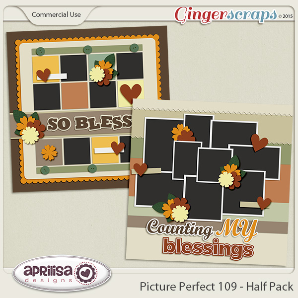
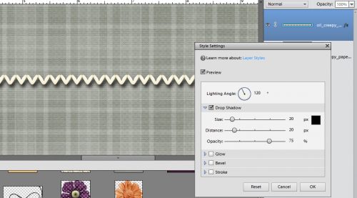
Hello my lovely scrappers! I am here to bring you the $1.00 Bake Sale goodies for the month of November!

Remember we have our $1.00 Bake Sale every month from the 15-20th, it is a perfect time to stock up on some amazing products for only $1.00 each! You just can’t beat that!

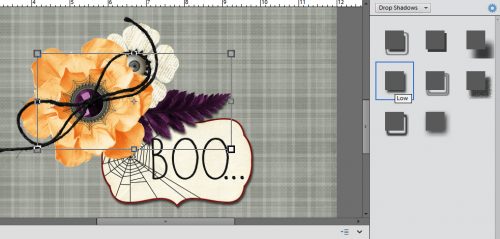
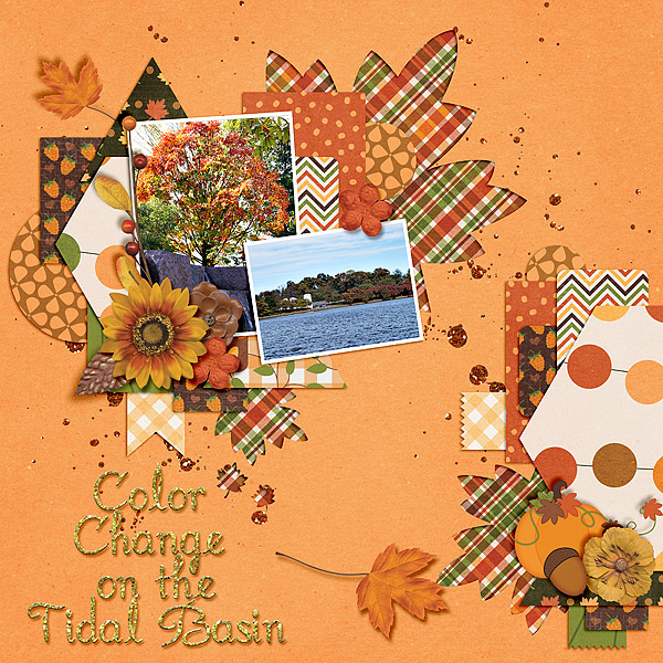
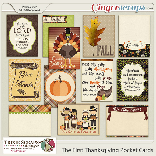
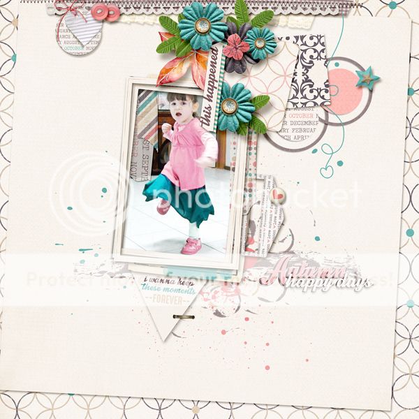
Here is a sampling of what our designers are offering this month:

*$1.00 Bake Sale* November 15-20

Bake Sale Image

*$1.00 Bake Sale* November 15-20

See you back on Friday for our weekly Fresh Baked goodies! 

Happy Scrapping, Ginger {and the GingerScraps family}

GS_footer_Ginger

From the Archives Vol. 8

We are almost to the end of 2016; and already on the 8th edition of from the Archives. This year has flown by!

From the Archives is one of my favorite posts to write here at GingerScraps. I have been an enabler of digital scrapbooking with my friends from the start of it for me. I enjoy helping people find new digital scrapbooking supplies.

What archives? Well, we are going to show you some digital scrapbooking supplies that are in the store that are at least a year old. Usually older than that.  Some of us may be new to digital scrapbooking or new to GingerScraps. Some people don’t check the store every week. Basically, things can and do get lost in the weekly shuffle of the store. With that in mind, we are going to go back and look at some great products. Our hope is that you find some great things you might have been looking for; or find something that you didn’t know you needed but totally do now that you see it!


You  might have noticed all these oldies but goodies have similarity about them. The color! This From the Archives, I chose to go back to November 2015’s Buffet. Taking a look at what hitting the store a year ago.  Don’t forget about November 2016’s Buffet! These two compliment each other well.

Fresh Baked: November 11, 2016

Happy Friday! Are you ready for Thanksgiving (in the US)? Are you getting your Christmas shopping lists ready? Still scrapping Halloween? Just holding on for a breather? No matter what’s going on, this week, the designers have some amazing products that will fire off your imagination and help you get some memories scrapped!

Remember when you spend $10 in the store, you get a great collab!

fwp32
https://store.gingerscraps.net/GingerBread-Ladies-Collab-Must-Love-Books.html [Read more…]

Sneak Peeks November 10, 2016

It’s a three day weekend for most of the US to honor those who served in the military. It would be the perfect time to scrap a layout in honor of  a loved one’s service. Maybe one of the new releases might appeal to you!

From Mags Graphics

From Keley Designs

From Dagi’s Temp-tations

From Little Rad Trio

From JoCee Designs

From Tinci

From JBS Templates

From Clever Monkey Graphics

https://scontent-ams3-1.xx.fbcdn.net/v/t1.0-9/14955948_10211337855304545_2695449447886076774_n.jpg?oh=ef67202769a43609fa3eb7cdec7b4e79&oe=58936183

Have a wonderful holiday weekend!

Designer Sneak Peeks – November 11, 2016

Happy Wednesday. Sliding in through here to show off a few sneak peeks from our designers.

Make sure to come check out these and more in the GS Store on Friday.

Tutorial Tuesday (Photoshop Elements)

Shadow Basics

gs_blog_teachyouiwill_header

Gingerscrapper Marie Williams responded to my request for topics with an interest in learning more about shadows, particularly with clusters. Shadowing is a very complex topic so we’re going to look at some basics today.

When we scrap our memories with digital supplies everything is completely flat, two-dimensional… and it looks funny. Using drop shadows makes everything more realistic and attractive. Let’s talk about shadows a little bit before we look at how to make them look good. The first thing we should talk about is light and the source of the light. There are usually multiple light sources shining on an object, and there may be shadows in several directions but unless the light is directly above and perpendicular to an object, there will be one dominant light source/shadow combo. In Photoshop Elements, the default angle of light for the drop shadow styles bundled in the software is 120° – coming from the upper left corner – but that can be changed to suit your purposes. The default colour of the integrated drop shadows is solid black… and about as UNnatural as you can get. But that too can be changed to suit your purposes. Many digiscrappers like to use a dark brown shadow for their layouts, which makes a natural-looking shadow and a pleasing outcome. So let’s play with the shadows that come with the software and see how to manipulate them.

Flat and uninspiring. That’s how these beads from Ooh La La Scraps’ Creepy kit look against one of the papers from the same kit.

1

When thinking about shadows, you not only have to consider where the light is coming from but also how much light will pass UNDER an object and how far the shadow will spread. Anything that touches the surface it’s sitting on will cast a sharper, darker shadow than something that floats over it. The more contact an object makes with the surface under it, the darker the shadow will be. So hard objects like beads, buttons, frames, metal pieces like paper clips and brads need a more substantial shadow than a flower or a butterfly. Also, the thinner an object – like paper for example, the narrower and sharper the shadow.

The Drop Shadow menu is found under the Styles tab in the Effects panel. Shown below is the meager selection of shadow choices. For the beads in the screenshot, I selected the “Low” shadow style and double-clicked on it to shadow my beads. (If you’re someone who likes to take extra time at a task, you can right click on the style swatch and then select Apply to Document.)

2

The resulting shadow was quite sharp and harsh, so I double-clicked on the little fx on the Layers panel, which opened up this menu. I pulled the sliders until I liked the way the shadow looked. In another set of screenshots I’ll show you the difference between the stock shadow and one that’s been tweaked. Notice that there’s an indicator for the Lighting Angle. The labels for the sliders are a little confusing, so I’m going to explain how they work. The Size slider will alter the sharpness of the edge on your shadow. The Distance slider controls the width of the shadow and the Opacity slider is pretty self-explanatory. Having said that, remember you’re going for natural and appealing so you’ll probably want to decrease the opacity from the default setting of 75%; how much will depend on what you’re shadowing. There’s also a black box there that, when you click on it, opens up the colour picker. More about that later.

3

Flowers are much more complex than beads so let’s do one of them now. The style that is highlighted in the screenshot is the same one I used for the beads, but the one with the label Soft Edge is the one I used. Remember what I said about the amount of light that can pass UNDER an object. Flower petals allow a lot more light under them than beads do, so the shadow will be softer and wider.

4

Below is the way the shadow looks without any adjustments. It looks okay, but I think it can look better. What do you think?

5

It’s bigger, it’s farther away and it’s not as dark here, but it looks much more natural.

6

Brads aren’t a lot different from beads and buttons, but they usually have very sharp edges, so their shadows need to be a bit sharper. They’re also hard and dense, so they need a darker shadow.

7

The unadjusted shadow, using the Hard Edge style which should be appropriate for a hard, sharp object like this, is pretty harsh. See where the sliders are? Size is at 0, Distance at 20 and Opacity at 75%. And it’s kinda ugly.

8

So I pulled the sliders a bit, Size to 18, left the Distance at 20 and decreased Opacity to 65%. But I also thought I’d play with the colour of the shadow a little. So I looked at the gray paper in the background and selected a paler greenish-gray for the shadow.

9

The change shows up below. See how the shadow is a little softer and looks so much better? The difference in colour of the shadow is very subtle and isn’t really visible in the screenshot. But this is an important step to know, because if your background paper is already black, how are your shadows going to show up? Simple… change the shadow colour.

10

Buttons are very similar to brads, in the sense that they’re hard and most of the back is in contact with the paper. But this one has a slight curve at the edge, so there will be a bit more light getting under there. Unadjusted Hard Edge shadow shown below.

11

Size is now 32, Distance is still 20 and Opacity is 63%. Notice anything else? YES!! I changed the Lighting Angle to 60°. Good eye! (That’s the main secret here… watch what happens to your shadows as you move the sliders and when it looks right, you’ll know it.)

12

Okay, let’s talk about string, twine, curly ribbon, yarn, wire… those things that are skinny and flexible. Their shadows will be a little different. Because there’s not going to be a lot of it that is in direct contact with the background, their shadows are going to need to be a bit further away and a lot softer. I selected the Soft Edge style, which looks okay, but it can be a lot better. (Where have I heard that before?)

13

I thought the shadow was a little TOO soft, so I pulled the Size slider to the left a touch – to 32 from 42, the Distance slider to the right a touch to 42 from 20 and the Opacity slider to the left to 46% from the default 75%. Better!

14

Let’s go back to flowers again for a second. Some flowers are much denser than others. This one has several more layers of petals than the first one I showed you, so it’s going to cast a more substantial shadow. It’s also flatter, so there will be less light getting under it and the shadow won’t be as spready.

15

I decreased the Size a bit, increased the Distance a bit and decreased the Opacity a bit.

16

Stitches are really tricky! Depending on what kind of thread used they can be fine or hefty, narrow or thick. The also are close to the surface they’re applied to, so the shadow will be… narrow, fairly sharp and fairly dark. I selected the Soft Edge style.

17

Um… no. Let’s tweak a bit.

19

You can see what adjustments I made. And how much better it looks!

20

I know you’re all wondering, “But you haven’t said anything about paper, except in passing”. So think about paper. It’s thin – but can be thicker (cardstock). It usually is quite close to the surface it’s sitting on. (Lifting paper corners digitally is a lesson for another day.) And it has a sharp edge. (Paper cuts anyone?) I used the Low style since it is paper I’m shadowing and it is close to the paper under it. I wanted to show you a dialog box you’ll sometimes see if you use these integrated shadows on something narrow (like the stitches) so I’m showing you a paper border.

21

You can ignore that! Click on OK and carry on. Your shadow will still show up just fine. You can leave it as is, or tweak it a bit so the shadow is a little tighter. Defaults are 20, 20 and 75%.

22

And then we should look at stickers. My very first tutorial for GS taught you how to make stickers with fonts, so I’d be remiss if I didn’t show you how to get a realistic shadow on your stickers. Stickers sit VERY close to the background they’re attached to. There will be a shadow, but it will be narrow, sharp and not particularly dark because of the thinness of the paper they’re on. I went with the Hard Edge style.

23

Then I shrunk it down to a teeny, tiny skinny shadow. Because stickers don’t float!

24

Now let’s put it all together and make a cluster. Start dropping your shadows on the items closest to the paper and work your way up, thinking about how much of the object is touching your layout, the object’s density, where the light is coming from and what’s underneath it.

25 26

I decided the tag is made of cardstock, so it’s got a bit heavier shadow than plain paper.

27 28

The leaves are touching but curved, so they get a bigger, softer shadow.

29 30

The white flower is flat and stiff, but is on top of the leaves, so it gets a slightly sharp but also slightly wider shadow. The yellow flower is a bit fluffier and is on top of the other three items so it needs a more diffuse shadow. Notice the colour of the shadows cast by the top-most layer of petals… they’re not black but a dark orange. Try and picture those in black. Ugh!

32

And finally, the string bow is on top of everything, and is thin and floppy. So it needs a shadow that’s farther away but still visible. (A lesson on warping shadows for things like this bow is on my list for a tutorial down the road.) And there we are! A cluster with natural-looking drop shadows.

33

WHEW! That was a long-winded lesson!! I hope you’re still following along. After all that, I’ll tell you a secret. I use a set of shadow styles I bought from a designer. Because I’m into instant gratification… and I’m lazy! It’s just so much easier and quicker to use a preset – double-click and you’re done. But there are times when I still play with those presets because I want a different look. The layout I created with the items in this tut is in the gallery. See if you can pick out where I’ve tweaked things. There are a few, but they’re not obvious… Then go practice, practice, practice! Your eye will get better and better and soon your shadows will be the envy of the digi-world.

(PS… GS doesn’t have a designer who has shadow presets in her store. But I know where you can find them…)

gs_footer_jan

November Feature Designer – Laurie’s Scraps and Designs

Welcome to November. This month our feature designer is one of our newer designers, Laurie’s Scraps and Designs. I asked her some questions so that you can get to know her a bit better.

How did you get started in digital scrapbooking?

My sister told me about it so I downloaded some freebies and loved it!

What made you decide to design?

I have always been creative. So Designing was just another creative outlet for me.

What do you use to create your designs (program, additional tools, etc.)?

PS CS4, Illustrator CS5.

Describe your design workplace.

Desk in the playroom so I can be with my kids too.

What is your favorite thing about designing?

I love the color palettes. I love to see how it comes to life with a color palette!

What is your favorite kit currently in your GS store and why?

It is a tie between Fall Harvest and Fright Night. I love the watercolor elements.

What do you do when you are feeling very sad or depressed?

Design, and eat chocolate

Which is the best vacation you’ve ever had in your life?

I used to live overseas as a child in Malaysia. So we would travel a bunch while we lived over there. So traveling on that side of the world was amazing!

Which is your most cherished childhood memory?

Playing Hide and go seek in the dark with my family.

Do you believe in ghosts?

No, not really.

Who is your celebrity crush?

I don’t really have one, but if I had to choose, it would be Thor.

What do you order when you go to Starbucks?

I rarely go there because it is far from my house, but I usually get a smoothie of some sort.

What is your favorite kind of cookie?

Chocolate with Chocolate Chips.

How old were you when you had your first kiss?

14? I think?

Are you an optimist or a pessimist?

Optimist for sure!

Would you change your name if you could? If so, what would you change it to?

No. My Mom used to tease my Dad after I became an adult, that I was named after his old girlfriend. Good thing my Mom was an independent woman, because I know she must have liked the name too, or I would be named something else.

What is your favorite pizza topping?

Sausage.

If you could give the world one piece of advice, what would it be?

Be nice to everyone, and don’t gossip behind people’s back. It just makes you look bad!

What do you do to wake up in the morning?

Check my emails and Facebook.

What is a small luxury that you treat yourself to?

Ice Cream. I lost about 50 pounds a couple years ago, and I try to not eat it, but I have to sometimes.

What did you want to be when you were small?

Teacher, Lawyer, or a Doctor.

Which would you rather do: wash dishes, mow the lawn, clean the bathroom, or vacuum the house?

VACUUM! I love it, It is immediate satisfaction. I should go vacuum now!

If you could hire someone to help you, would it be with cleaning, cooking, or yard work?

Cleaning for sure! When I get designing, I sometimes never have the desire to stop and go clean!

What would you do if you won the lottery?

Buy a new house! And pay Bills!

What’s the most interesting thing you can see out of your office or kitchen window?

The neighbors…. like the whole street! It is good when I am looking for my kids to come home from school.

Share your favorite recipe with us.

ohhhh, I have so many. But since it is getting cold outside. I will share my favorite soup recipe. You can leave out the cream and sour cream to make it more healthy. ENJOY!

Ingredients

1 pound boneless skinless chicken breasts, cut into 1/2-inch cubes
1 medium onion, chopped
1-1/2 teaspoons garlic powder
1 tablespoon canola oil
2 cans (15-1/2 ounces each) great northern beans, rinsed and drained
1 can (14-1/2 ounces) chicken broth
2 cans (4 ounces each) chopped green chilies
1 teaspoon salt
1 teaspoon ground cumin
1 teaspoon dried oregano
1/2 teaspoon pepper
1/4 teaspoon cayenne pepper
1 cup (8 ounces) sour cream
1/2 cup heavy whipping cream

Directions

In a large saucepan, saute the chicken, onion and garlic powder in
oil until chicken is no longer pink. Add the beans, broth, chilies
and seasonings. Bring to a boil. Reduce heat; simmer, uncovered, for
30 minutes.
Remove from the heat; stir in sour cream and whipping cream. Yield: 7
servings.

Thanks so much Laurie. Make sure to check out her GS store, her FB page, her FB group, and her blog. Also, be sure you are collecting each of the Daily Downloads from our blog to get this fun kit she is giving to us this month.

Creative Style – Scrapping with Leaves

Here in the states it is technically Autumn. Although, in the south eastern side of things it doesn’t feel like it. We had summer temps last week. No joke! The hot weather I am dealing with aside, it is Autumn none the less.

To me, when I think Autumn, I think leaves!…and well scrapping. Hands-down this time of year brings my favorite digital scrapbooking supplies to the stores. I just love the colors of the Autumn kits, all the leaves, and the nature feel to it all.

Today though we are going to talk about scrapping with leaves. Digital scrapbooking with leaves to be more precise. I will show you some fun examples here in the store I found that should get those creative juices flowing. We will end today’s post with some great digital scrapbooking supplies from here at GingerScraps to get those leave inspired layouts scrapped. (All images are linked to either their counterpart in the store or the gallery.)

One of my favorite things to do with leaves on a digital scrapbooking layout is to cut them out into the page with a patterned background behind it. This is a great example of that! You could also get this effect by overlaying your favorite paper on top of a leaf you like in a kit (or shape in your program). Then shadow it to look like a cut out.

One of my favorite things to do with leaves on a digital scrapbooking layout is to cut them out into the page with a patterned background behind it. This is a great example of that! You could also get this effect by overlaying your favorite paper on top of a leaf you like in a kit (or shape in your program). Then shadow it to look like a cut out.


One of my favorite things about digital scrapbooking (besides actual scrapping) is the online community. Siggies in forums are a fun part of that!

One of my favorite things about digital scrapbooking (besides actual scrapping) is the online community. Siggies in forums are a fun part of that!


You can also take fun photos with leaves, to scrap. Here are two great examples of that. One of them being super fun; and the other one showing the beauty that is nature.


You can also use a cut out to make a great focal point or background to a title for your layout. See below for this exact template!

You can also use a cut out to make a great focal point or background to a title for your layout. See below for this exact template!


Leaves are also one of the best (in my opinion) items to use for clustering. Framing a photo or anything really is another great use for leaves. Let us not forget the beautiful leaf-patterned papers and more.


There are a lot of uses for leaves in digital scrapbooking. The examples above are just a slight glimpse into what you can do. Now that your mind is thinking about leaves and how to scrap them, here are some great items from the store to scrap with!


Fresh Baked: November 04, 2016

Happy Friday! The weather is finally cooling and fall is really in the air! The designers feel the chill and also seem to notice that the end of the year is almost upon us! This week, there are some great templates and kits to make calendars, which make wonderful gifts for the holidays! There are also some great kits and templates for all the moments in your life!

Remember when you spend $10 in the store, you get a great collab!

fwp3
https://store.gingerscraps.net/GingerBread-Ladies-Collab-Must-Love-Books.html [Read more…]

Sneak Peeks November 3rd, 2016

Happy Thursday! The holiday season is almost upon us. I can’t wait for the election talk to stop next week and the talk about how best to cook a Turkey, what other food to serve, if the shopping on Black Friday is worth risking the crowds becomes the topics of conversation. To keep our minds off of the election and on the coming holiday, there are some great new kits to scrap with coming out!

From Tinci Designs

From Clever Monkey Graphics

From Neia Scraps A New Template Grab Bag

From JoCee Designs

From JBS Templates