Double Indemnity? Nope, Double Exposure!
![]()
Here we are, at the very end of 2019!! I hope you all had some wonderful times with family and friends over the holidays. If you’re celebrating tonight, stay safe!!
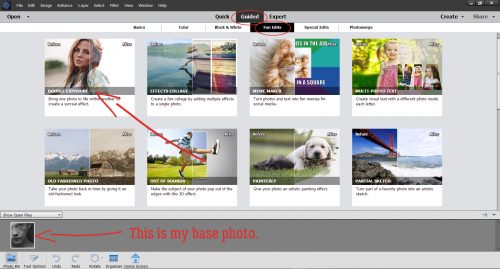
Are you ready for another Guided Edit? This one was only introduced with the 2018 version, but I LOVE it!! It’s under the Fun Edits tab and it creates a double exposure almost automatically. It caught my interest when I started seeing lots of double-exposure photos popping up on my Pinterest feed after I Googled PSE techniques. All the how-to’s were for Photoshop‘s full version and try as I might, I wasn’t getting the results I hoped for when I tried to find a work-around. Then I tried this. I know you’re going to love it. I’m playing with photos I downloaded from Pixabay and chose a black-and-white close-up portrait as my base photo.
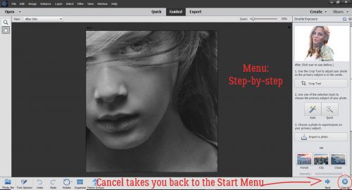
Once I clicked on Guided>Fun Edit>Double Exposure this is the menu that comes up. (Remember, if you click on Cancel, you’re back to the Start Menu so be very sure that’s what you want to do…)
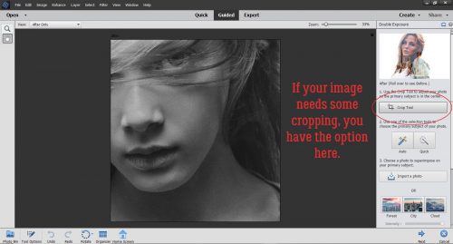
For this tutorial I just took the most basic route possible with my photo choices so as to make it as straight-forward as possible. I’ll be playing with it a lot more in the weeks to come, so you may see another more complex tut later. The Edit tools are lined up top-to-bottom for easy progression through the steps. If your photo needs to be cropped, this is when you’d do it, with the Crop tool. The Guide suggests cropping so your desired focal point is in the centre.
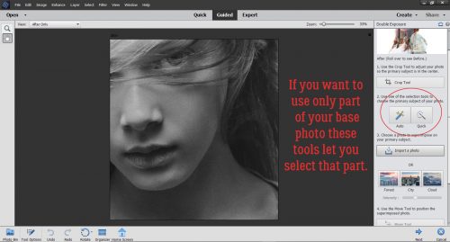
There’s also the option of Selecting only a portion of your photo. I skipped both the Crop and Select steps altogether.
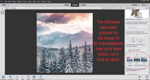
Now, the software has some images already embedded in the Edit that you can use for your double exposures: a forest scene, a cityscape and some clouds. Here I’ve superimposed the forest scene over my photo; if you look in the upper left corner you can see the girl’s eye, but it’s pretty well concealed.
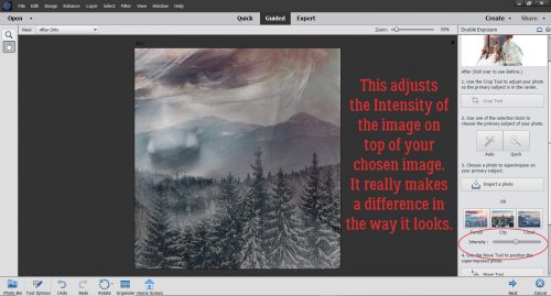
Thankfully the software knows that might not be the look you’re after. The Intensity of the superimposed photo can be easily adjusted by pulling the slider to the left. Here you can see the difference it makes to decrease it to about 47%.
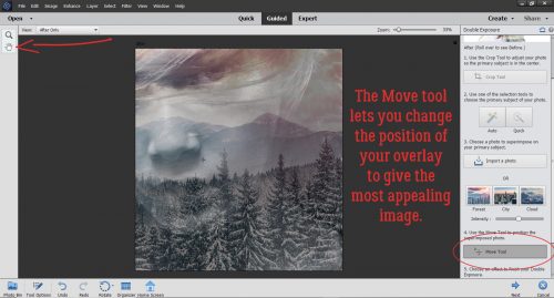
There’s also the opportunity to move the superimposed image around a bit by using the Move tool. It can be activated either by clicking on the tool image in the upper left of your workspace, or by clicking on the tool bar in the menu.
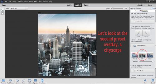
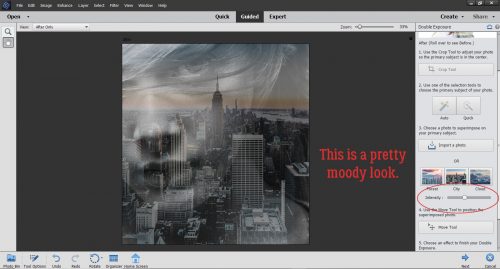
The cityscape almost completely obliterates the original photo. Good thing it’s adjustable!
I decreased the Intensity to about 35% and the resultant image is really moody. It suggests the girl is homesick for this view, at least in my imagination…
What will the clouds do? Well, at first glance, we can see her nose and chin fairly clearly, but not her eye, and I think the eye is the key.
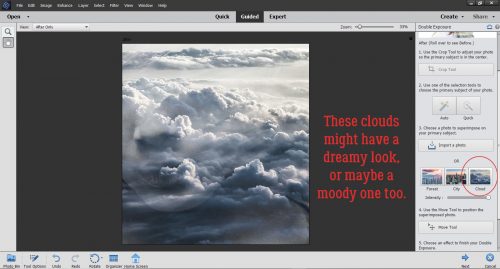
I’m conflicted as to which emotion this evokes. I think she looks wistful, so maybe it’s dream-like.
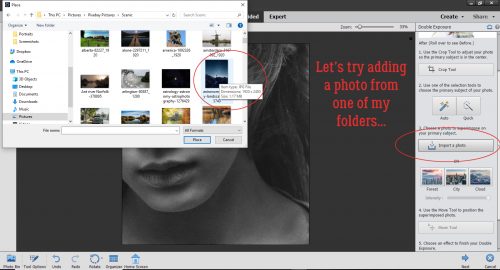
Okay, before we move on, I want to show you how to use another of your own photos. So instead of using a preset, I clicked on Import a Photo. It opened up Windows Explorer and let me find a suitable photo for the look I’m aiming for. Once I clicked on the thumbnail in the photos folder, I clicked on the Place button.
Wow! That’s a really dramatic image!! I don’t even know if there’s any adjustment needed.
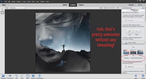
But just to be sure, I decreased the Intensity by 50%. There are still more ways to manipulate the image so let’s keep going.
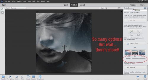
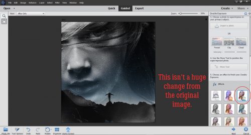
Before I moved on, I opted to shift the rocks in the superimposed photo down and almost off her face. It makes the sky more of an element in the image and you can’t see the demarcation where the superimposed photo ends. Further down the menu, there are some more Effects presets. So working with the image with the superimposed photo at 50%, let’s hit it with each of the Effects to see what they do. The very first one, top left of the tool menu is No Effect… just the way it is.
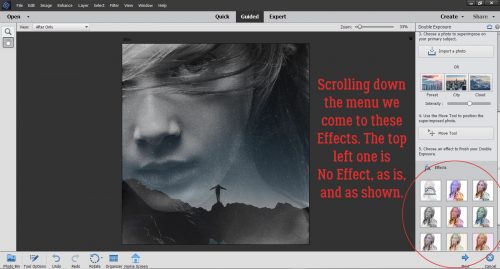
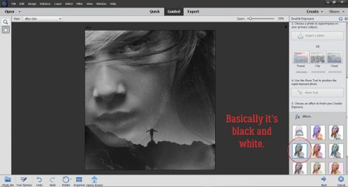
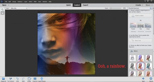
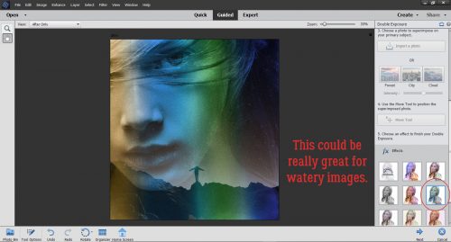
I’ve circled the Effect with each image so you can see what they look like right out of the box. This one adds a lot of colour.
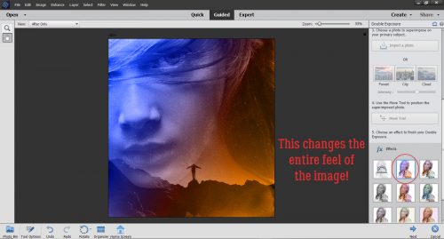
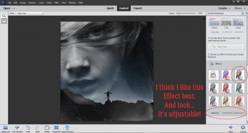
This one makes the original image more vivid and increases the contrast.
Here, it’s basically a black-and-white version. If my original photo had been a colour portrait, it might make a big difference to use this Effect.
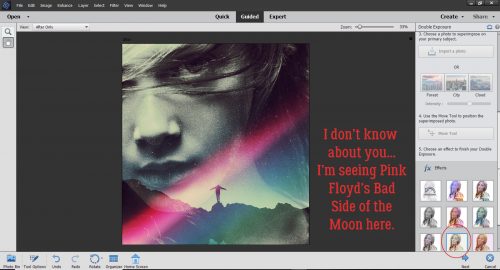
This one is a soft, rainbow-hued look.
I think this one would be amazing with underwater photography, or for photos with a beachy, watery theme.
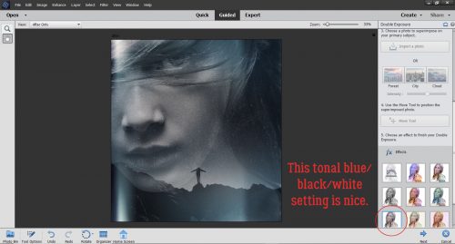
This adds a touch of cool colour to a tonal black-and-white image.
I’m showing my age. All that’s missing is a prism in the middle.
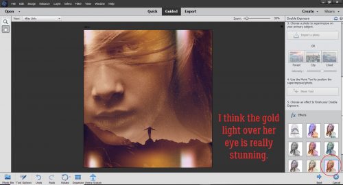
The last one gives the whole image a warm, golden look.
After seeing them all, I decided I like the third version best. I decreased the Intensity to 50% again and have a really eye-catching image. I might add an inspirational quote into the dark area to the right of her neck. What do you think?
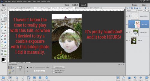
Before I shut down for the night, I decided to play with a couple of other photos I had. The one of the stone bridge provided a perfect frame for a superimposed face, but I didn’t take the time to figure out how to use the Guided Edit. Instead… I took a lot more time doing it manually. Duplicated layers, layer masks, erased areas, clipping masks, more layer masks to bring out the blue in her eyes, blend modes, sheesh. There’s gotta be a better way! When I find it I’ll share it with you!
I hope that whatever 2019 brought your way is greatly improved on in 2020! I know there are big things coming up for our family, details to follow. Happy New Year, dear GingerScrappers!
![]()