Archives for March 2020

Tutorial Tuesday (Photoshop Elements)

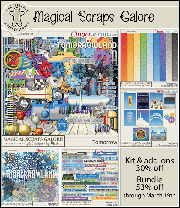
It All Comes out in the Wash-i

This week’s tutorial is brought to you by Shana Read, whose suggestion for a topic in response to my Facebook plea last night was the one I could get together the quickest. I’m finding I have even less motivation “in these uncertain times” – so tired of that cliché!! – than I usually do and was in need of a good kick in the butt. There were some great suggestions offered up and I’ll be working on them in coming weeks. But first, we’re going to make digital Washi tape look real!

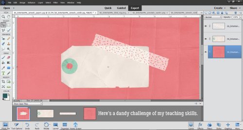
I started out with a cardboard tag, a pretty piece of Washi tape and some heavily-creased cardstock from the GingerBread Ladies‘ collab Entertain Me. I didn’t deliberately choose that kit, although it seems weirdly appropriate. I did, however, deliberately choose the creased cardstock, because it’ll make the tutorial more meaningful.

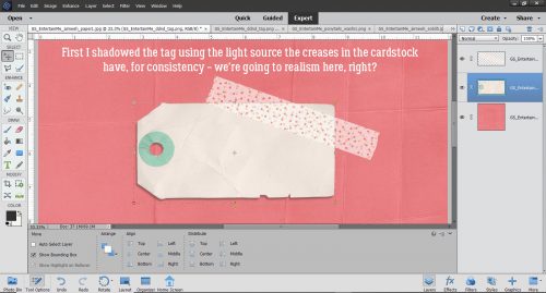
I added a drop shadow to the tag, setting it at the same angle as the shadows cast by the creases on the cardstock. I like consistency and when I’m shooting for realism, that’s one of the key aspects.

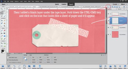
Those of you who are using my custom shadowing method can skip down about 6 steps… For those who need a refresher or who haven’t tried it yet, this is how my custom shadows start. I create a new, blank layer underneath the object I’m going to shadow. The keyboard shortcut for this process is to hold down the CTRL/CMD key and click on the new layer icon, the one that looks like a sheet of paper with the lower left corner curling up.

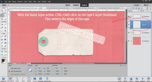
Still on that blank layer, I CTRL/CMD>click on the layer thumbnail – that tiny picture of the object you can see on the layers panel – to select the edges of the object, tape in this case.

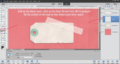
Next, click on the Paint Bucket tool so you can fill the outline of the tape.

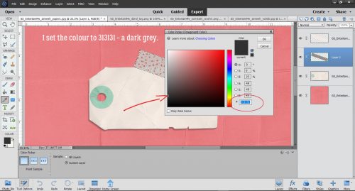
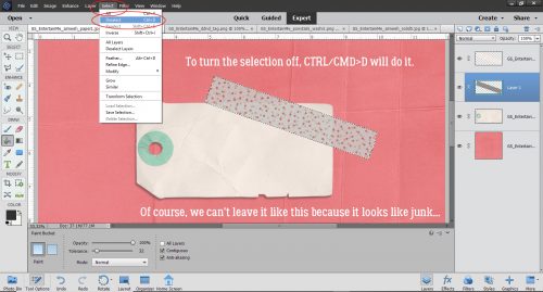
The colour I like for shadows is 313131, which I just type into the box I’ve circled below. It’s a medium grey and works pretty well for most purposes.

With that grey as the foreground colour, click anywhere on the blank layer. The outline will fill with grey like magic. To get rid of the marching ants, either click Select>Deselect or just use the keyboard shortcut CTRL/CMD>D. We can’t leave it like this though, because it shows through the tape and looks like junk!

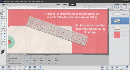
I like to move the shadow to where I’d like it to be before I start tweaking it. So I nudged it over a bit to the left and down, again keeping the same angle of light as seen in the shadows cast by the creases. The only drawback to that is that the tape is semi-transparent and now there’s a white strip at the top. I’ll show you how to take care of that in a minute.

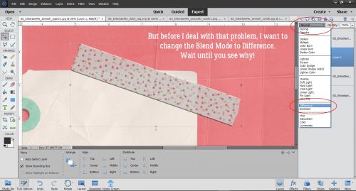
But first I’m going to change the Blend Mode (that button at the top left of the layers panel just under all the icons) to Difference. You’re going to love it!

Can you see the shadow peeking out at the bottom edge of the tape? I know you can see the tag showing through it. I could leave it like that, but that’s not how I’m made. So let’s keep going.

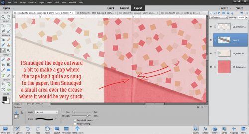
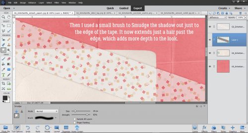
To adjust the shadow layer, I use the Smudge tool. It looks like a hand in a white glove with the index finger stuck out. I tend to use a fairly big brush and a very light touch. I start a bit of a distance from the edge of the shadow and just slightly move the brush toward or away from the object being shadowed, depending on where the light source is, and how much of the object would actually be touching the paper if it was real. In this case, I brought the shadow away from the tape a little where it comes off the tag and onto the cardstock to suggest it’s not stuck down quite as tightly there. Then I pushed it back toward the tape a little where the tape crosses the crease, because it would be adhering more closely here. For this kind of detail, I use a very small brush, still with a light touch. It’s better to go a tiny bit at a time so you know when to stop than to try and do it all in one step and have to start all over.

To eliminate that white strip at the top, I used the same small brush to very carefully nudge out the shadow right to the edge of the tape. There’s a hint of the shadow coming out from under the tape at the top, and that only adds to the realistic look.

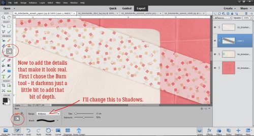
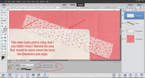
So how do we make the tape look even more realistic? Easy! We’ll use the Dodge and Burn tools. Dodging and burning are old tricks used in print photography to spot-improve exposure. Dodging lightens an area while burning darkens. If you have trouble remembering which is which, just think of a burnt stick… it’s black! The edges of my tag are nice and straight so this technique will be simple. I started with the Burn tool and changed the Range to Shadows from the default Midtones.

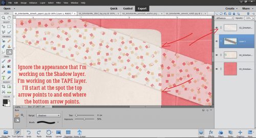
With the TAPE layer active, and a small brush size selected, I set the centre of the brush tip over the spot where the tape and the paper meet, with the width of the brush on the area on top of the paper. Holding the Shift key down, I clicked at that spot then moved the brush tip down to the spot at the bottom of the tape and clicked again. There’s a very faint darkening of the tape along the edge. As long as I hold down the Shift key, I can go back and forth between the top and the bottom of the tape as many times as necessary to build up a nice sharp edge.

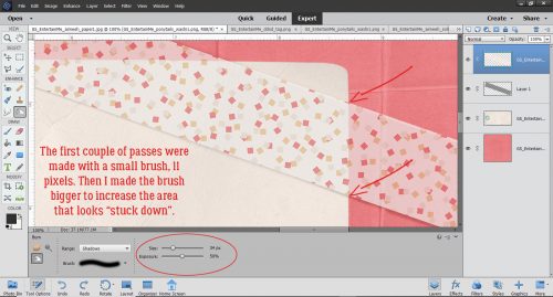
The last pass over the edge is with a wider brush to make the tape look like it has been pressed down firmly with a finger.

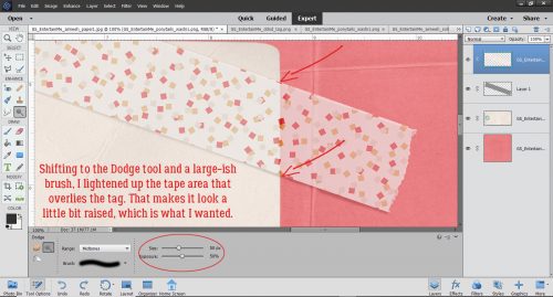
Then I switched to the Dodge tool and a large-ish brush.  There will be more light hitting the tape where it sits on top of the tag, so we need to lighten that area just a bit. Using exactly the same steps but with the brush’s width sitting on top of the tag, I Dodged that edge.

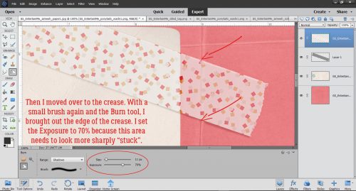
Can you see the difference where I’ve already done the D&B? Let’s move over to the crease that runs under the tape. The shadowy area is a bit more pronounced here so with a small brush and the Exposure set to 70%, I Burned the tape where it overlies the shadowed edge of the crease. If I remember correctly, I made 4 passes top to bottom and back up, so a total of 8 clicks.

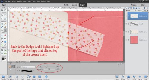
The section of tape that runs along the domed part of the crease needs to be lightened quite a bit to give the crease back its dimension. I Dodged with a brush sized to just cover the crease edge-to-edge. It took several passes to get it right, but like I said before, building up a little at a time gives you control and you’ll know when to stop.

Once I was happy with the creased area, I moved over to the top edge of the tag. The Dodge tool was active so I did that phase first. There’s a lot more tag covered with tape at this edge so I used a big brush with its width sitting on top of the tag to “elevate” the edge.

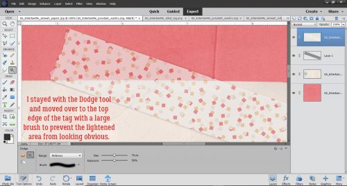
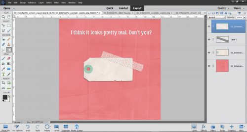
Don’t worry about being too precise with positioning the brush tip. If you’re past the end of the spot where the tape and tag touch, it doesn’t matter; the tool won’t do anything to the inactive layers – the paper and tag layers. It’s actually better to go a bit past than it is to stop too short. After I Burned the stuck-down area it looks like real Washi tape and real cardstock. It sounds like a lot of work, but it really isn’t once you get the hang of it.

So there you have it, Jan’s technique for adding a shadow to Washi tape. I suggest that if you’re going to do this, turn the visibility of all the other layers off so you can see exactly what you’re doing. Dodge and Burn even the parts that will be hidden by other layers, for the best results. You never know when you might resize an element, or move things around… right?

See you all next week!

Fresh Baked: March 27, 2020

Well, we made it through another week. This was my first week working totally from home and let me say – it’s weird. Add that some of my family forget I’m supposed to be working and want to chat. It appears it will be this way for the next 3 weeks for sure.

You only have a few more days to get this great kit when you spend $10 or more in the GS Store. Read, Know, Learn, Go!

You can still grab this mega collab even if you aren’t playing Survivor. So many fun baking elements in this.

Now it’s time for all the great new goodies from our Designers.

Remember if you complete 10 challenges, you get this amazing kit!

It’s time to Bring On Spring!

Tutorial Tuesday (Photoshop Elements 2019+)

Jan has a Challenge for All Y’ALL!

We’re living in interesting times. I know we’re all afraid and worried about what’s happening and what’s yet to come. And we have no control over any of it. I also know that humans are remarkably resilient, we’ve lived thorough hard times before and come out of it stronger, and that this is temporary. While we stay in our homes (or, because we provide an essential service, we’re going to work anyway) we all have lots of time for our thoughts to add to our stress. Rather than throw the Serenity Prayer your way, instead I want to extend a challenge to you. I’d like you to find a photo that speaks to the part of you that isn’t afraid, the part that still has hope. It can be a photo you’ve taken, or someone you love has taken or one you found on an open-source photo website like Pixabay. (Just looking through those sites is a terrific distraction!) Then I want you to find an inspirational quote to match the optimism or spiritualism of your photo. And then I want you to create a meme with it! (No, you don’t have to share it with anyone unless you want to, but it might be a comfort to somebody you know who seems to be doing okay but really isn’t.)

Photoshop Elements 2019 and 2020 have a Guided Edit that makes memes easy to create. It’s found in the Fun Edits menu as shown below. But don’t worry if you’re working with an older version. The same steps can all be done manually.

This is the photo I chose to work with. I had quite a few from Pixabay that would have worked but I like the thumbs-up gesture and the sunbeams that to me represent God’s love. The Edit menu looks like the screenshot below. One warning: don’t hit the Cancel button at the bottom unless you really like starting over from scratch!

First step is to click on the Create Meme Template button. Then a progress bar pops up.

Oh… hmmmm. Let’s keep going. There has to be a way to change that border!

The next step is to add the text. My quote is one from Benjamin Disraeli and it’s pretty spot-on. Once you’ve clicked on the Text Tool button, the same Text interface we’re all comfortable with opens up.

The default text is Impact Regular, but I want a script font so I looked through my vast collection and tried Hysteria Regular on for size. (See the image above for what it looks like.) I thought it was weirdly appropriate.

But it wasn’t quite the look I was after so I went back to my fonts and chose Steady Style Script Regular (another appropriate choice!) instead. In later versions of Photoshop Elements, it’s easy to find a script, or a typewriter or a sans serif font just by typing the style of font you’re looking for in the box. I typed in “scrip” and all the fonts in my collection with “script” in their name were displayed.

After I typed in the first part of my quote at the top of the meme, I clicked on the checkmark to Commit the Current Operation. The software needs that instruction to move to the next step.

Then I typed in the second part of my quote. The Edit allows for moving the text, and knowing I wanted to include the author’s name as credit for the thought, I moved the second line of text up a smidge. Then I Committed the Current Operation again. Without taking that step, I couldn’t move on with the Edit.

Aha! Here’s where I can do something about that border that I don’t think suits my meme. I moved the slider to make the photo bigger, then noticed the Fit Photo to Canvas tick box. So I ticked that box!

If I’d decided I still wanted a border, just not THAT border, this is where I could have changed it. And there’s an option to add an Effect to the photo. I like the photo as is. I apologize, I didn’t actually play with those steps so I can’t show you what the options look like. But you can always experiment if you like!

Now that I was happy (more or less) with my meme and having not been able to add the author’s name onto the meme, I clicked on the Next button and then chose Continue Editing in Expert.

When the Expert work space opens, you can see all the layers Elements has added to the image. Now I can decide where I want to put my author’s name.

But first, to protect my other text from accidental messing up, I Simplified both text layers. Then I moved them closer together, bracketing the sunbeams.

After I changed the font to a typewriter one, I added Disraeli’s name onto the image. To make sure the text layers were properly centred, I selected all three text layers and the (invisible) background layer, then Aligned the layers by the Middle.

And here is my finished meme. To all the folks who are still standing between us and disaster, I salute you.

Edited to add: The typo in my original version was bothering some readers enough that they pointed it out to me. So I’ve cleaned it up and replaced the final image. (I didn’t do ALL the screenshots – there are 9 of them in all – and it would have been a ton of work.) Keep on swimming, friends!

Fresh Baked: March 20, 2020

Happy Friday!! We at Gingerscraps hope you are all weathering these tough times safely. Let’s see if we can find you some new goodies to scrap with while you are staying in and trying to stay healthy.

It is time for our 10th season of Scrapping Survivor!! Whoop Whoop! We have a few fun changes this year, you can read all about them in the forum. Are you ready to hear our theme this season … drum roll please … this years theme is *Sugar & Spice Bakery* and we have baked up some really fun challenges and an AMAZING Mega collab!

Here is a link to the official Scrapping Survivor Season 10 sub-forum you can sing up in the “sign ups” thread:

2020 Scrapping Survivor 10 *Sugar & Spice Bakery*

Remember when you spend $10 in the store, you get a great new collab! Read, Know, Learn, Go!

Here is the amazing MEGA Collab for this season of Survivor: It is HUGE and you are going to love it!

Now let’s see what fun stuff our designers have for us this week.

Remember if you complete 10 challenges, you get this amazing kit!

It’s time to Bring On Spring!

Sneak Peeks … March 20, 2020

So … quarantines are going on. Rather than focusing on that, let’s focus on the fact that tomorrow you will have some amazing kits and templates to play with! And if you’re stuck inside, why not go through that pile of photos that need to be scrapped Open-mouthed smile

Amy Harrison

has an amazing kit coming out! Very nature inspired!

aimee01aimee02

Carol W Designs

also has a great template set coming out!

carolw01carolw02

Dagilicious

has a wonderful template series coming as well!

dagi01dagi02

Just Because Studios

has a kit perfect for that morning person in your life (so not me, by the way Winking smile)

jb1jb2

Miss Fish

has some blended templates coming!

miss01miss02

Scrappin’ Serenity

is hoping that the beaches will reopen soon! Lake or Ocean Smile

scrappin01scrappin02

Snickerdoodle Designs

has the sweetest spring kit coming!

snick01snick02

Which kit or template series are you the most excite for?

GS_footer_blog_Sarah_2019_thumb

Tutorial Tuesday (Photoshop Elements)

Jazzing Up a Font

Wow, how much the world has changed in one short week! Our provincial government has declared a state of emergency, although the total number of cases of COVID-19 in our province is still under 100. We’ve been sticking close to home since last Thursday night, which is giving me time to do all the things on my task list. This post is late because I got sidetracked painting the family room… hope the buyer – whoever that ends up being -approves! But let’s get into distraction mode for a bit.

Maybe you’ve seen my layout in the Gallery, the one where my granddaughter is eating her peas with her tongue. This is how I created my title. I started with one of the fonts I linked you up with last week Floral Capitals. Everything I’ve done in this tutorial has been shown to you at least a couple of times before, so if you’re a faithful reader, you might even predict what’s coming next as we work through. There are a lot of steps but I’ve taken the guesswork out of it for you. Whenever I do something that I’m making up as I go along, I like to make some copies of the original layer so I’ll still have one untouched one should I need it. Here I made 2 copies and turned their visibility off.

I analyzed the font’s appearance and had an idea of what I wanted to do. I knew the border would be different so I started off on the bottom layer by Erasing the middle parts of each letter, leaving just the border. Then I made a copy so I could quickly reset if I did something I didn’t like.

Next, I Selected the edges of the floral design by Clicking on the Layer Thumbnail of the lower copy of the original.

Now the Marching Ants come into play.

Now that Elements knew I wanted to work with just the Selected areas of my title, I added a new blank layer between the copy of the border layer and the lower copy of the entire title.

With the new blank layer active, I hit Select>Modify>Expand. I want to adjust the areas selected just a tiny bit.

But I only needed to adjust it a smidge, 1 pixel wide.

Still on that blank layer, I added a Stroke to the Selection. Edit>Stroke (Outline Selected Area).

Again, I went with a skinny stroke, only 2 pixels wide, and I chose this carnation pink, pulled from one of the papers I planned to use for my layout. (Diva-tude from Jumpstart Designs.)

Here you can see the pink a little if you squint.

When I turned off the rest of the layers, now I could see clearly where the Stroke went.

Using the Paint Bucket, I filled in all the letters with the same pink.

Yep, then I Erased the fancy parts, leaving just the pink letters.

I zoomed in quite a lot so I could clean it up to the best of my ability.

To give the letters some more presence I went to the Styles menu and chose Bevels.

I like to use Simple Pillow Emboss, because it’s pretty predictable.

See how it adds weight to the letters, and puts a bit of shading around them too?

The Bevel default is 21 pixels, which is a bit too much for the look I’m after, so I decreased the size down to 7 pixels. Now the letters look like die cuts.

One way to check for stray pixels after you’ve extracted something, as I’ve done with the letters, is to apply a Style or a Shadow. Those stray pixels pop out like zits before a big date. That makes them easier to remove. (If you’re only looking for stray pixels, you can clear the Layer Style when you’re done by right-clicking on the layer in the Layers panel and selecting Clear Layer Style from the menu.)

Okay, mission accomplished. Onward and upward! I turned off all but one of the layers, the lower copy of the original title. I Erased the borders on this layer, since I have plans for the ones I’ve saved down at the bottom of the pile.

As I was getting the screenshots edited I discovered I’d missed one… an important one. I added a black chipboard Layer Style from Ooh La La Scraps’ All Hallows Eve to this layer. It adds just a bit of a flocked look to the outline. I played with the Layer Style settings.

But all I did was increase the Bevel a bit, from 10 pixels to 15. That sharpened the edges just a bit.

Next, using the Rectangular Marquee tool I dragged out a box just inside the outline of the first letter and used the Paint Bucket to Fill it with this dark olive green, also from Diva-tude.

And I did the same with all the rest of the letters.

It’s looking pretty good but it still wasn’t where I wanted it so I added a few more little tweaks.

I turned the border boxes layer back on and took a good look at them.

They needed to be punched up just a tad, so I added a Stroke.

It had to be a narrow one so the border didn’t run into the fancy part. 3 pixels worked. I could have put the Stroke outside the boxes, but then the boxes might have coalesced. Instead I centered the Stroke on the lines.

I found this perfect pink Glitter style in ADB Designs’ Holiday Joy styles kit. So it went on the borders.

OOH! So close!

Last thing I did was to add an epoxy Style (from Mommyish at another store) to just the pink letters.

And then I was happy!

You can use these tips on other detailed fonts, and experimenting is fun! I hope you give it a try!

Designer Spotlight: NMSS

Greetings and salutations! I know you’re all wondering why I’m popping up and it’s not Tuesday. Well, I’m stepping in to bring you the March Designer Spotlight. We’re chatting with the lovely Connie Prince, the South half of North Meets South Studios. Let’s get to know her a bit better, shall we?

J: How long have you been designing?

I began designing digital scrapbooking products in 2004-2005ish, but officially selling in 2006.

J: What made you decide to design?

At the time the offerings were so limited, I was a paper scrapper and want to add unique elements to my layouts which I began to make digitally and print. It didn’t take long to realize I could do the whole thing digitally so much easier!

J: What led you to decide to design together?

Tracy & I developed a friendship early on. I think the progression into forming a brand together just happened. At the time she lived in the northeast and I am of course from the south. We named our brand North Meets South Studios. She’s in the midwest now, but you really can’t take the New Jersey out of a girl so we are sticking with our original name lol.

J: What do you use to create your designs (program, additional tools, etc.)?

I use Photoshop CC, Illustrator. I also have a scanner that I use pretty often to scan things to extract.

J: Describe your design workplace.

It’s pretty minimalistic. I have a double monitor setup, that’s the most exciting thing about it lol.

J: What motivates and inspires you as a designer?

I enjoy the process, coming up with an idea and creating it. The most rewarding part is seeing someone else use something that I’ve created to preserve their own memories.

J: What is your favorite kit currently in your GS store and why?

About A Boy is my current favorite (usually my latest is my favorite lol).

J: If you could only eat one meal for the rest of your life, what would it be?

Chicken wings, hands down I am obsessed! However, if I could only eat at one restaurant the rest of my life it would be Waffle House.

J: What is your favorite game or sport to watch and play?

None of them? lol I’ll watch some when the Olympics are on.

J: What did you want to be when you were small?

I can’t really remember wanting to be anything in particular, I played school a lot so maybe a teacher? I did grow up and get a degree in education, but I didn’t really enjoy teaching very much so I retired early 🙂

J: Aside from necessities, what one thing could you not go a day without?

My phone or computer!

J: Who would you want to play you in a movie of your life?

Cameron Diaz, she’s just quirky enough!

J: If you had a warning label, what would yours say?

I would have a bunch, but definitely: If you leave cookies unattended she will eat them!

J: What celebrity would you like to meet at Starbucks for a cup of coffee?

Dolly Parton, she’s a hoot!

J: These two designers are very talented. I hope you’ll give their store a look and that you’ll take part in the Designer Spotlight challenge. And don’t forget to pick up your Daily Download here on the Blog!

Fresh Baked: March 13, 2020

Spring has sprung. At least in my corner of the world. Warmer temperatures, budding trees, and pollen. For those of you that had to “spring forward”, I hope you have all adjusted.

We have some VERY exciting news today!! It is time for our 10th season of Scrapping Survivor!! Whoop Whoop! We have a few fun changes this year, you can read all about them in the forum. Are you ready to hear our theme this season … drum roll please … this years theme is *Sugar & Spice Bakery* and we have baked up some really fun challenges and an AMAZING Mega collab!

Survivor

Here is a link to the official Scrapping Survivor Season 10 sub-forum you can sing up in the “sign ups” thread:

2020 Scrapping Survivor 10 *Sugar & Spice Bakery*

Remember when you spend $10 in the store, you get a great new collab! Read, Know, Learn, Go!

Here is the amazing MEGA Collab for this season of Survivor: It is HUGE and you are going to love it!

And now on to the best part of the week, our Fresh Baked goodies!

Remember if you complete 10 challenges, you get this amazing kit!

It’s time to Bring On Spring!

Sneak Peeks … March 13, 2020

Hi!! New person writing these sneak peeks! I’m Sarah, and you might recognize me from the newsletters, but with a little shuffling to make schedules work more easily, I’ve moved to sneak peeks, and let me tell you, I think I might have gotten the better deal Winking smile The layouts the CT have created are AMAZING!! Trust me, you’ll want these kits!!

Amy Harrison

has two new kits coming out, and they’re so gorgeous!

amy01

amy02

Carol W Designs

has a wonderful template set coming out!

carolw01

jb01

JB Studios

has two sweet kits coming out!

jb02

mf01

MissFish

has a template bundle coming!

mf02

tin01

Tinci Designs

has an “easy” template set coming!

tin02

whim01

Check back tomorrow to the blog and for the newsletter to see the new kits arriving! It’ll be worth it, I swear!

GS_footer_blog_Sarah_2019

Tutorial Tuesday (Potpourri)

Spring-y Fonts (Part 2)

Are you ready for some fresh new spring-y fonts? I last did a spring font post a year ago and figured it was time. (Plus I’ve been so busy trying pretty much single-handedly to get our current house ready moving out of. I’m getting tired of the smell of paint!)

All the fonts below are free for personal use at Dafont. They’re ones I haven’t shown you before, and there are a couple that would be perfect for titles. See what you think!

CF Springtime is one that I might use for a title or two. It’s got good weight and with the leaves, it’s just a bit different.

This isn’t a font but it’s so pretty! These wreaths, or whatever we want to call them, can be used as photo overlays, to frame photos, to frame other fonts and so many other possibilities. You’re looking for Spring Romance.

Here’s another font just screaming to be used in titles. It lends itself well to multiple modifications, and if I can find some time, I’ll play with it so you can see what I mean. Floral Dawn sounds so poetic!


Can you see this one as a title font? How much fun it would be to deconstruct it and use multiple colours to make it really pop. Floral Capitals might be my favourite of the bunch.

This is just a cute little romantic script with curlicues and everything! Flower Shop could be a journal font, don’t you think?

I like the graphic effect this one has. Imagine it clipped to a pretty green paper, maybe with a glitter style added on top. I’m not really loving the name the designer gave it though… Forced Flowers.

Sweet Duck has three different options and all of them are pretty awesome.

I threw this one in just for fun, for all of us arctic blonde hippie chicks. The 70s were the BEST decade ever… LMS Hippy Chick says so!

How do they come up with these names? LRT Chickenhawk… it’s cuter than its name, for sure.

And last but not least, I’ve got a dingbat for you. KR Spring Me has an assortment of spring-y images you could use as stamps.

I’ve linked up each font for you so if you see one you love, go and grab it! I have a couple of ideas for tuts for next week but haven’t decided which one I’ll go with. Stay tuned!