In the Background – Harnessing the Power of Your Software
![]()
I hope you weren’t thinking I jammed on you again this week. I made some serious miscalculations… My son had a liver biopsy today and although I knew we’d be at the hospital for several hours, I underestimated both the amount of time we’d spend sitting and waiting, as well as how draining it would be on both of us. And I overestimated my enthusiasm for going all day without food, fluid or a bathroom!
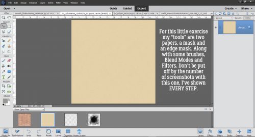
Susan said she’d like to try her hand at making her own custom backgrounds and I just happened to be fooling around with a few ideas for a layout that would work into a tutorial on using ordinary items in extraordinary ways. So this is the result. I’ve put most of the instructions right on the screenshots (there are 37 of them but don’t let that intimidate you – I’ve shown literally every step) so I’m not going to add a lot of text in between them. I hope you like the final result! I started by choosing a solid paper, a patterned paper that fit into the desired theme, a mask and an edge mask.
My paper is going to be soft and faded, but all the things I’ve done here can be customized to whatever look you want. I think it could easily be bent to a very bold, colourful, evocative layout, or boho’d up for an art journal layout. The limit is your imagination!
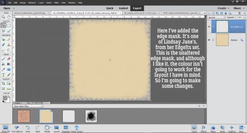
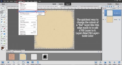
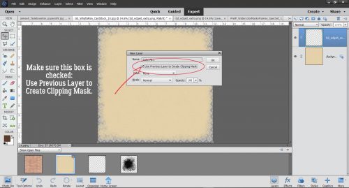
I love using Fill Layers to change colours on “flat” items like this edge mask.
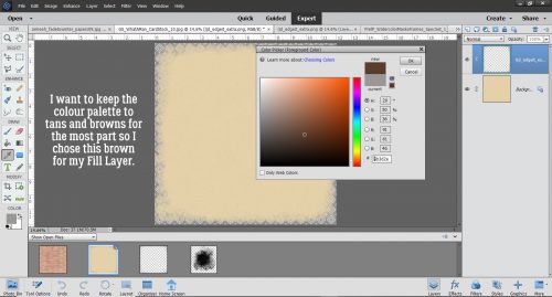
I’m planning to use a heritage photo for my layout and opted for a sort of sepia palette.
This is the most important thing to remember when you’re changing colours with Fill Layers. Check that box!
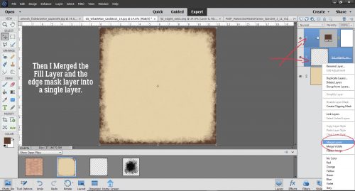
Merging layers is the best way to ensure the changes you make are going to actually be applied where you want them.
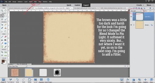
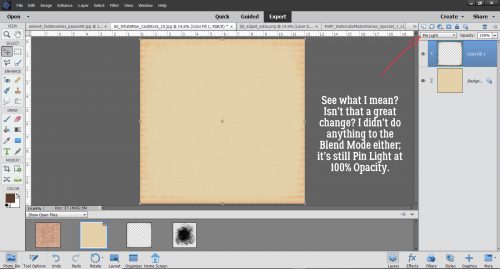
I changed the Blend Mode to Pin Light. (I tried them all to see what each did before I settled. That’s the fun part of this process!) Then I thought, “How would this look with a Filter applied to it?” So I opened up the Filter menu.
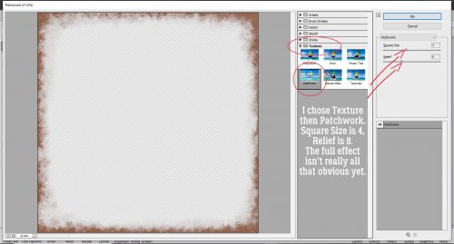
Again I tried a few, but decided Texture>Patchwork would look good.
Okay, I know this change is really subtle, but you can see that it changed the colour and added a nice depth to it.
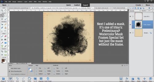
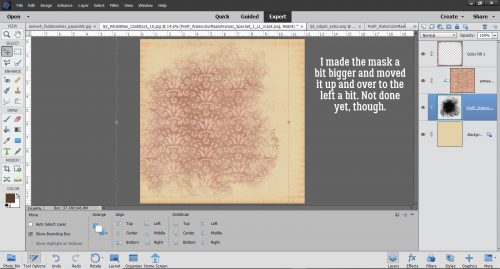
On to the mask. I love Irina’s masks. They’re just gorgeous and can be used so many ways.
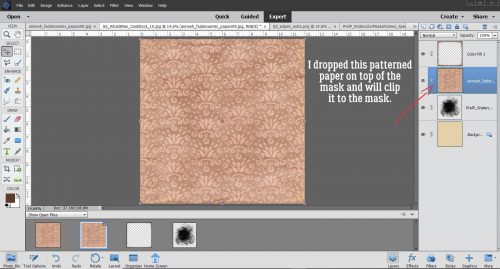
Rather than clip a photo to the mask, I clipped a patterned paper to it.
Okay, that’s nice, but not exactly what I want.
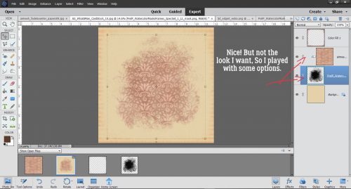
Tweak, tweak.
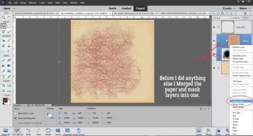
Once I had it kinda-sorta where I liked it, I Merged the two layers so all the rest of the changes were sure to go where I wanted them.
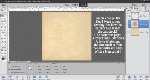
Something as simple as changing the Blend Mode to Overlay makes it look completely different.
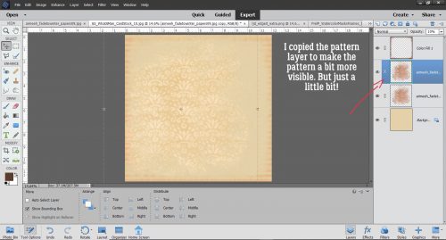
I decided it needed a little more presence so I copied the pattern/mask layer. That layer I left untouched.
Okay! Now for the really fun part!! Brushes. If you don’t have many, you should check out the sources for free ones online so you can build a collection. Remember, ALWAYS put your brushes on their own layer. You need to be able to make adjustments JUST to the brush.
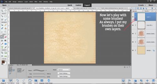
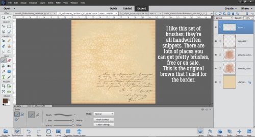
I have a collection of brushes, some I bought and some I didn’t. This set of handwritten ones was a purchase years ago… store has been long forgotten so I can’t even point you to it.
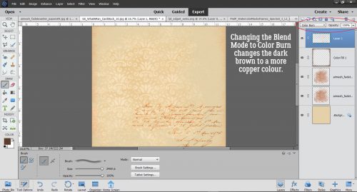
It was too stark so I changed the Blend Mode to Color Burn.
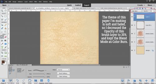
I want the writing to be there, but not “THERE”. So I also decreased the Opacity to 35%.
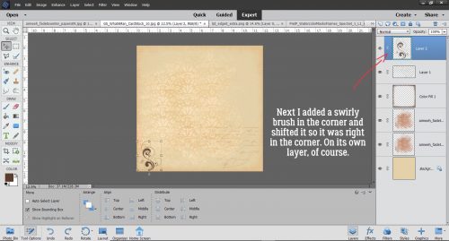
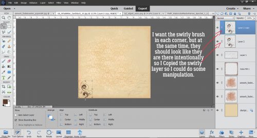
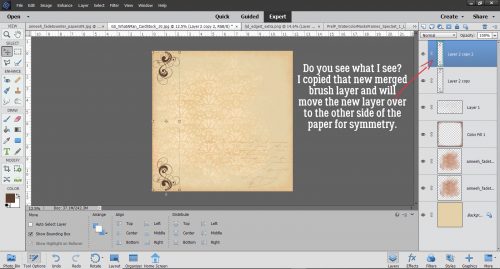
In keeping with my theme, I added a swirly brush in one corner.
And Copied it…
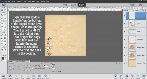
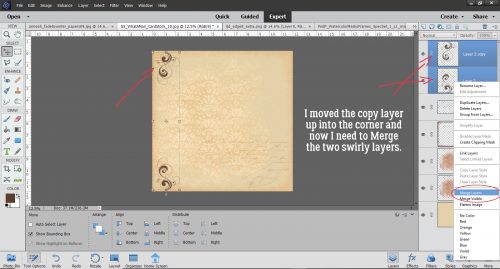
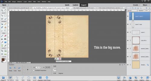
For symmetry, I flipped the copy and them moved it up into the top corner.
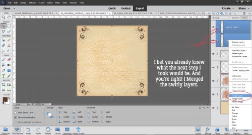
… then Merged the two layers.
And I Copied the new merged layer so I could put swirls into the other corners too. But after that, I’m done with symmetry!
There they go…
Do you need some hints?
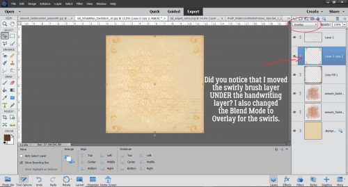
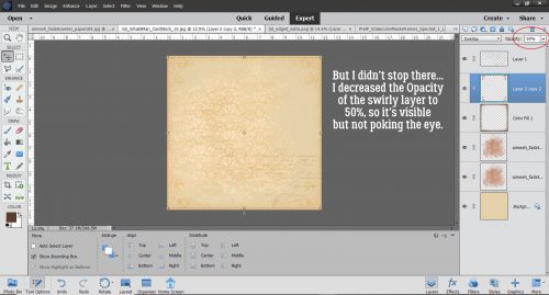
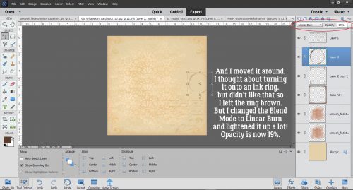
The fact that I moved the swirly layer under the handwriting layer isn’t a crucial point, but I did want my handwriting to sit on top of the swirls. Then I went with Overlay on the Blend Mode.
They were still too obvious so I turned them down to 50%.
I had this goal of creating something that looked aged and a little distressed so naturally, I wanted a coffee ring on it somewhere!
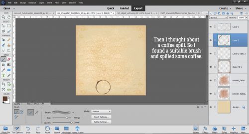
But where? By putting it on its own layer, I can move it around until I like it.
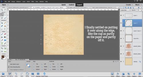
I think this is the spot for it.
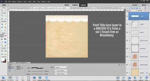
This brush set is amazing! It has about 8 different styles of lace and can be used in so many ways.
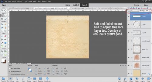
But it couldn’t be so in-your-face. Overlay at 37% is where I stopped.
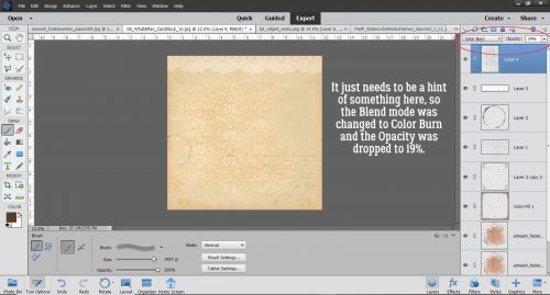
I stopped playing with it and just looked at it for awhile. What was missing? What didn’t need to be there? Well that bald spot to the right of the masked paper needed some attention. So I added a grid brush that sort of follows the contours of the mask’s edge.

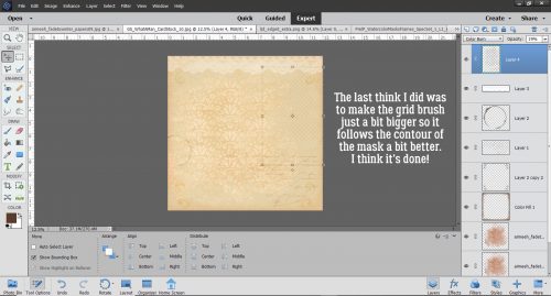
Some fine-tuning …
and a little resizing and I’m so happy with how it turned out. Now to do the layout………
![]()
Loved this tutorial – so many tips & tricks I didn’t know.
It’s surprising how much can be done with Photoshop Elements once somebody shows you! It’s a lot more powerful than we think.
wow! great information here! thank you for this tutorial.
I’m glad you found something in there that caught your interest.
I had started to comment yesterday, but got sidetracked (I don’t even remember by what! LOL!!)
Just wanted to say, this is a terrific tutorial. I love the artsy, blended papers that come with a kit. Now I can make my own!! Although to be honest, I would probably spend too much time trying to make one paper … & it already takes me so long just to create a LO! LOL!! But I’m so glad you showed us how to create our own; especially for those times when a kit just doesn’t have the right paper!!
Thanks, Jan! Praying that your son gets some good results from the biopsy & that all is well!