Archives for July 2021

Fresh Baked: July 23, 2021

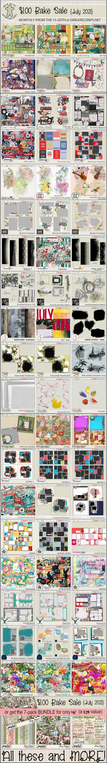
Wow. Another Friday and almost the end of another month. Time is just flying. I hope everyone is staying healthy. And staying cool if you are in one of the places with crazy heat waves.

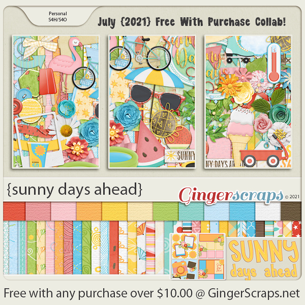
Don’t forget, any $10 spent in the GingerScraps store will get you this fun collab for free.

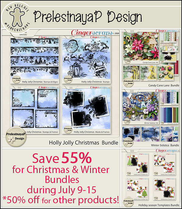
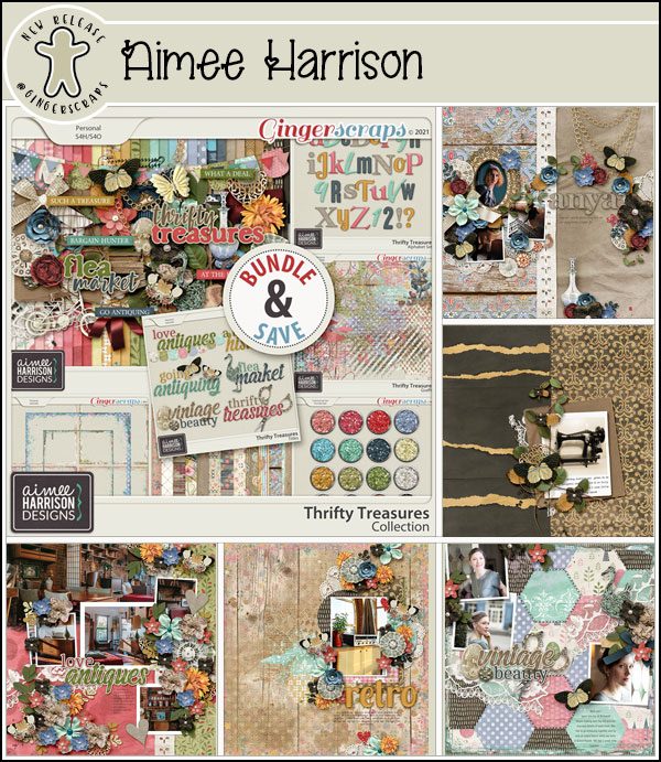
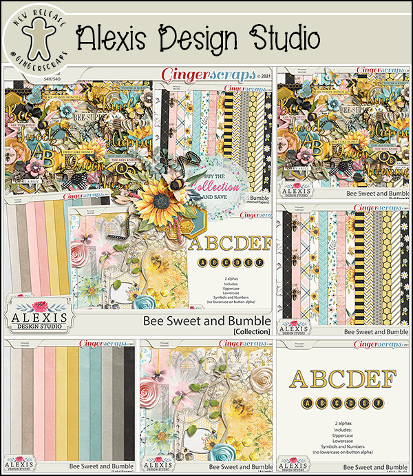
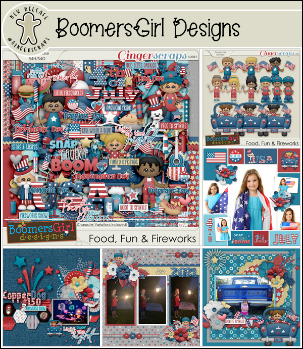
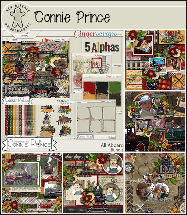
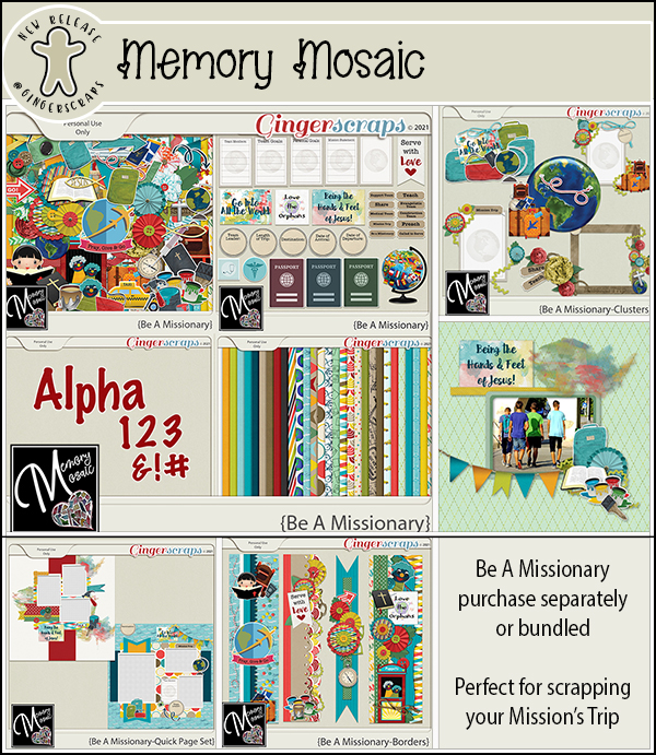
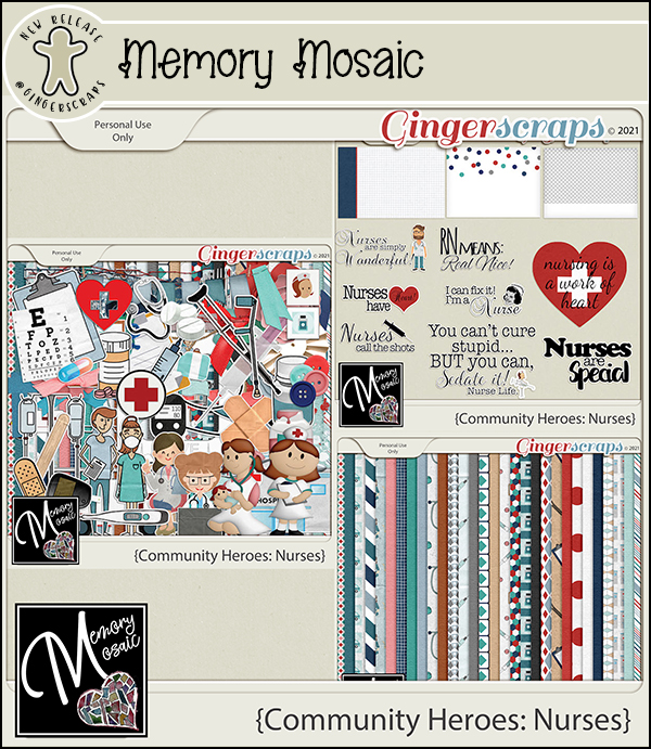
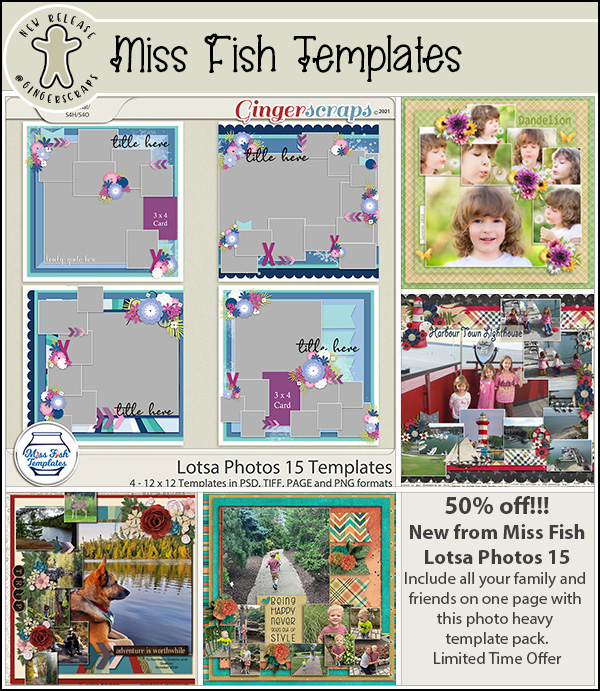
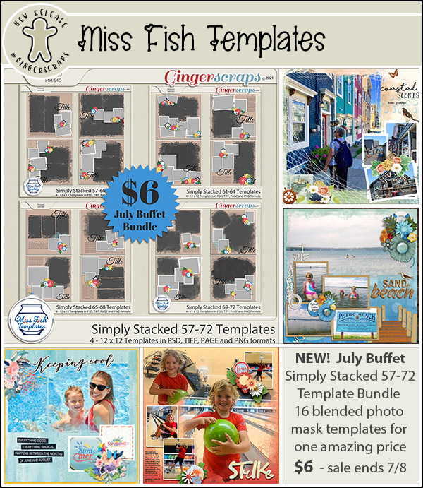
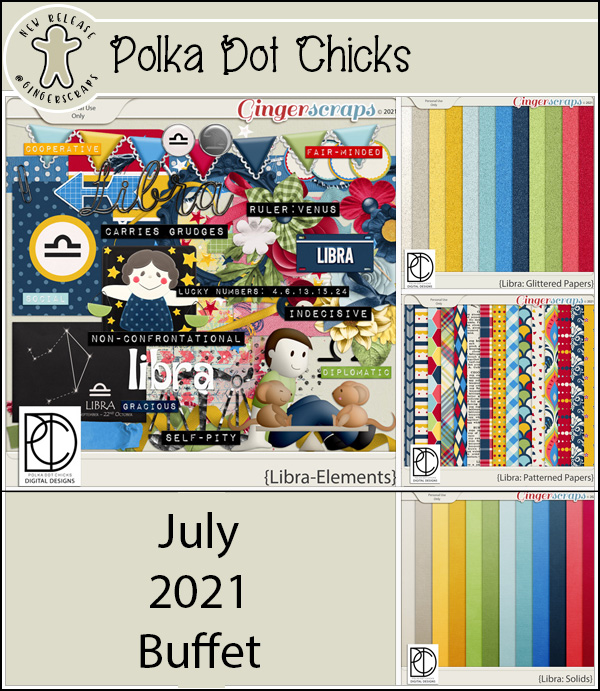
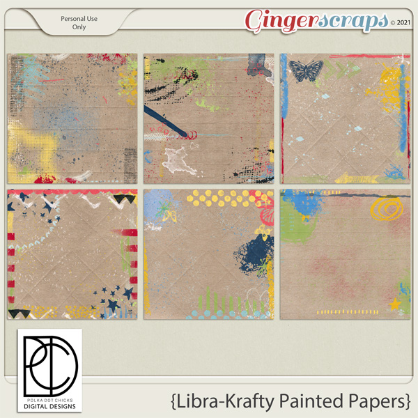
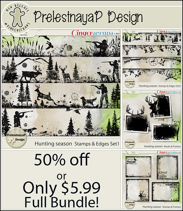
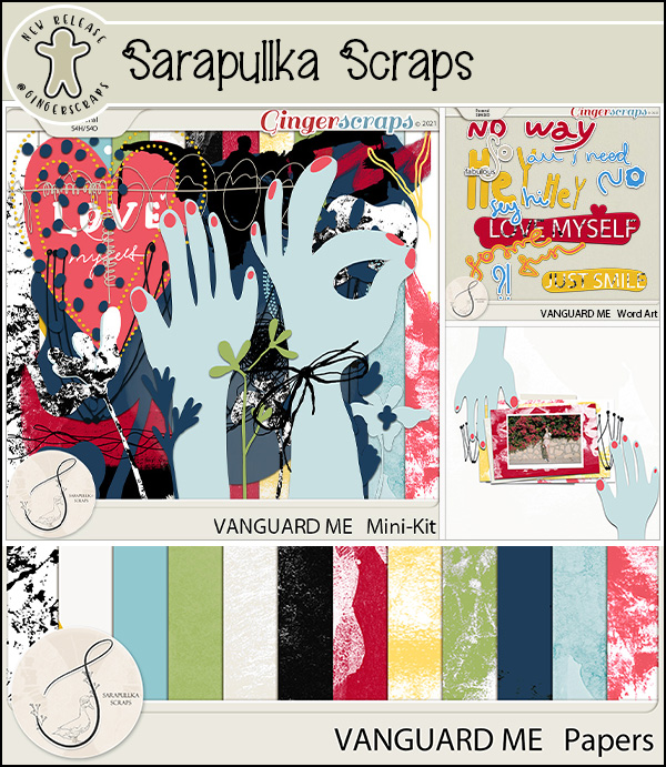
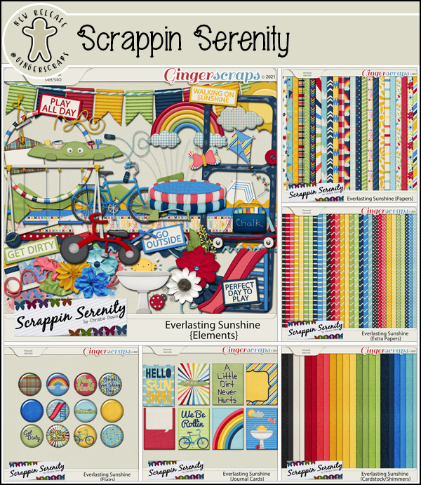
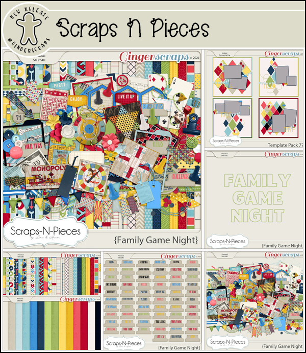
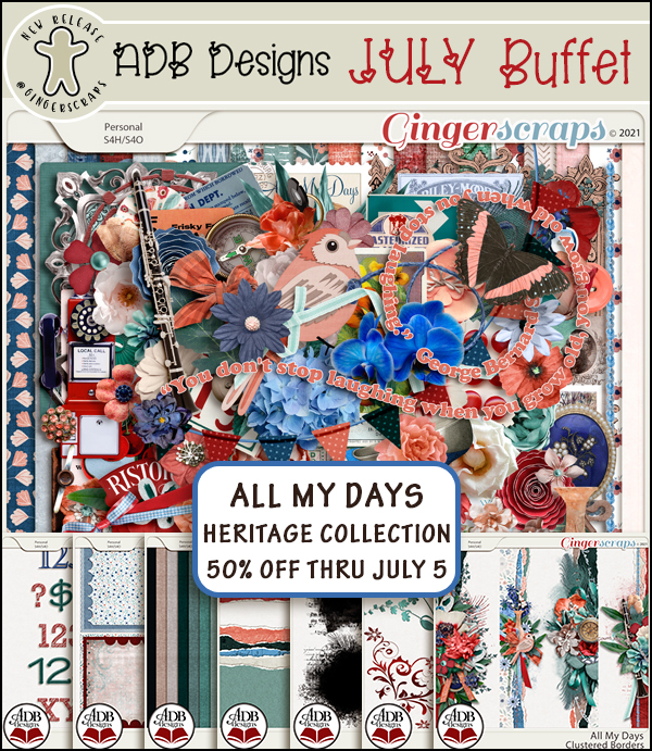
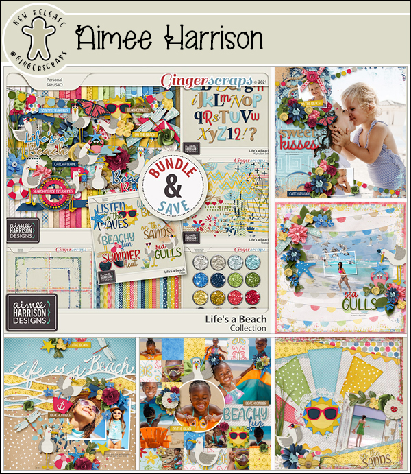
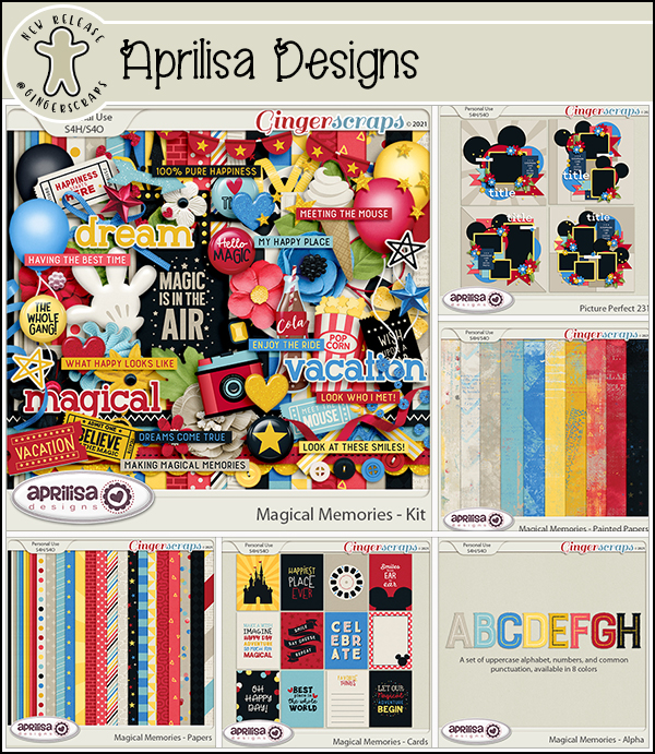
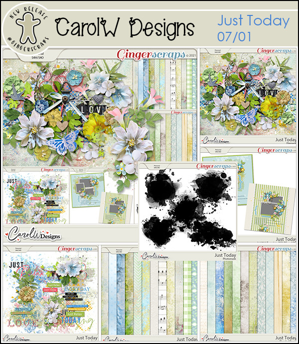
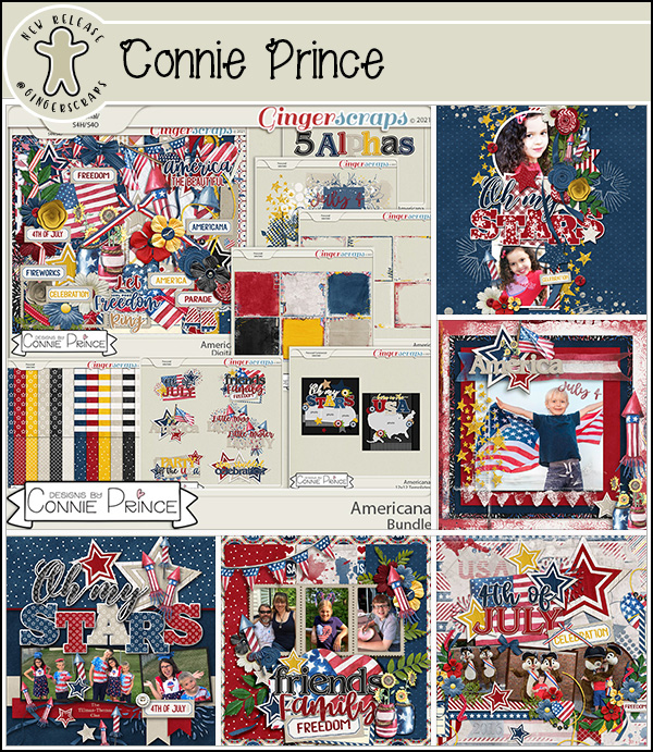
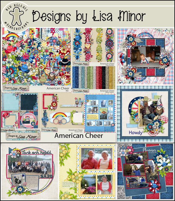
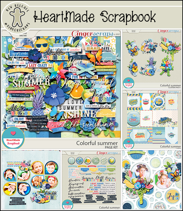
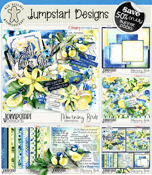
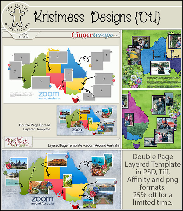
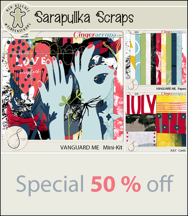
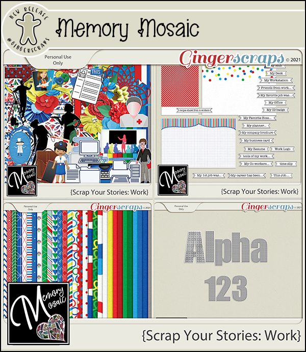
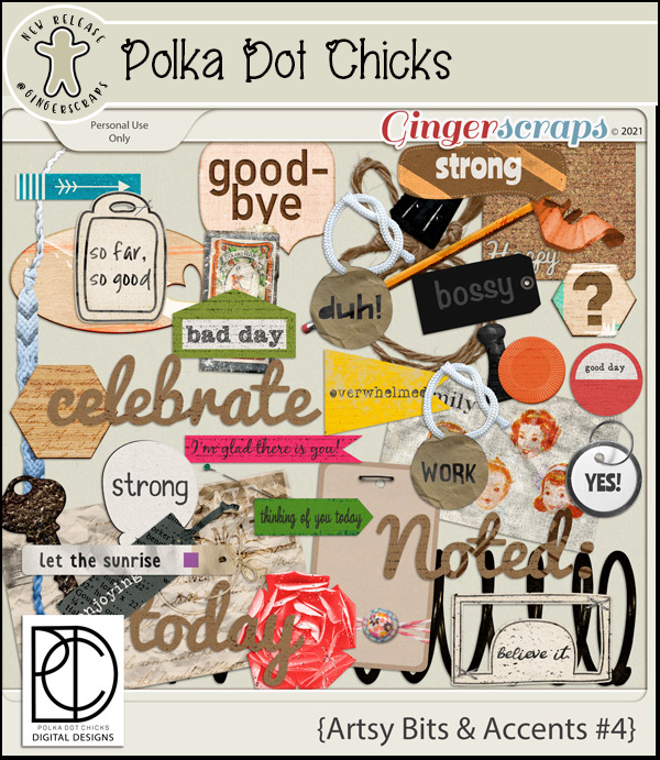
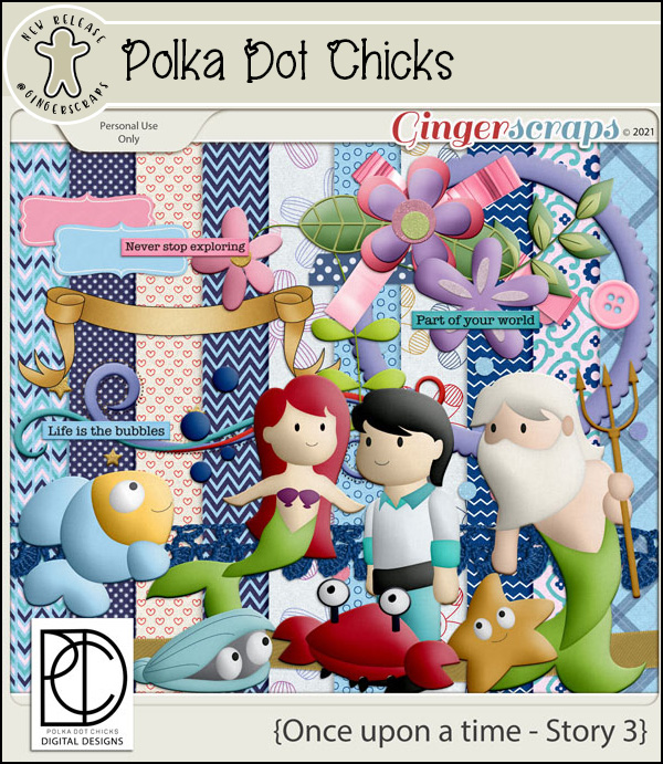
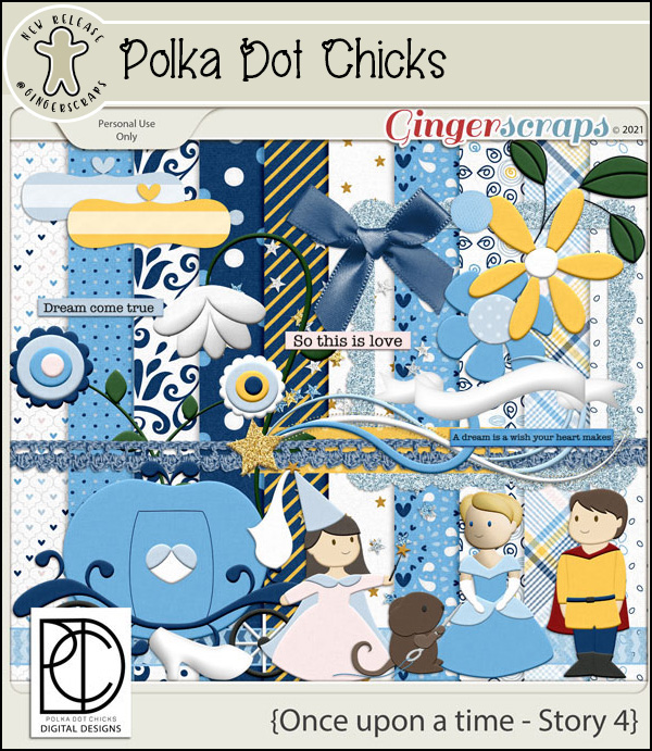
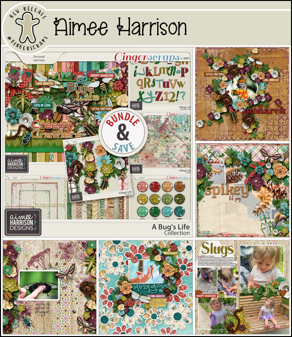
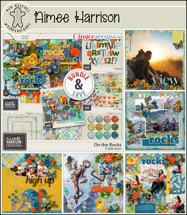
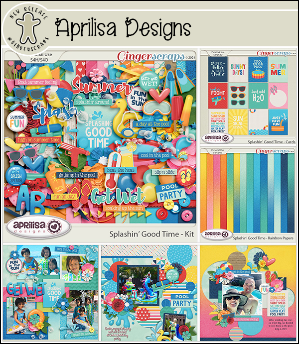
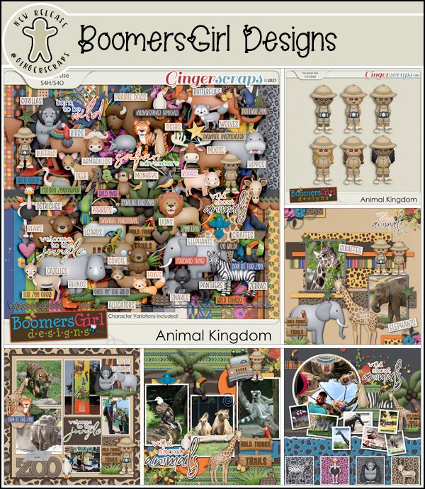
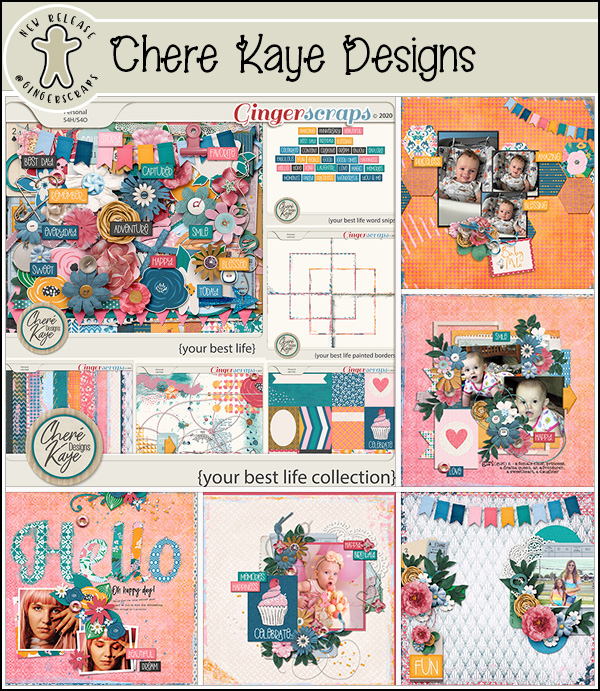
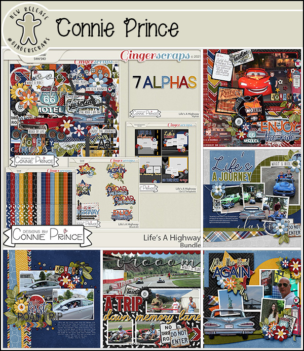
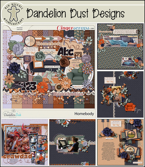
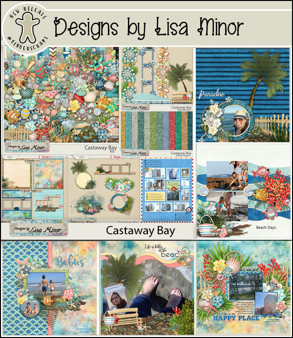
We’ve got some very fun and cute things from our designers this week.

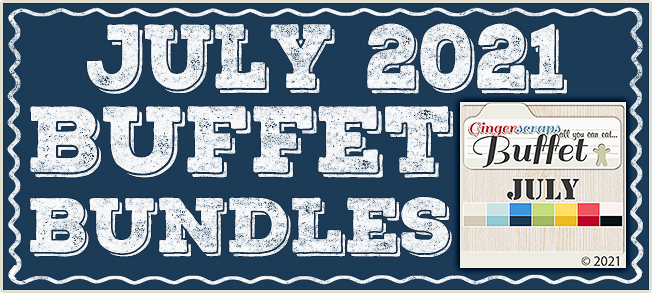
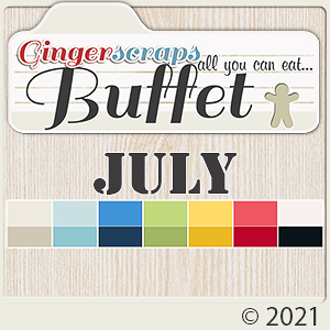
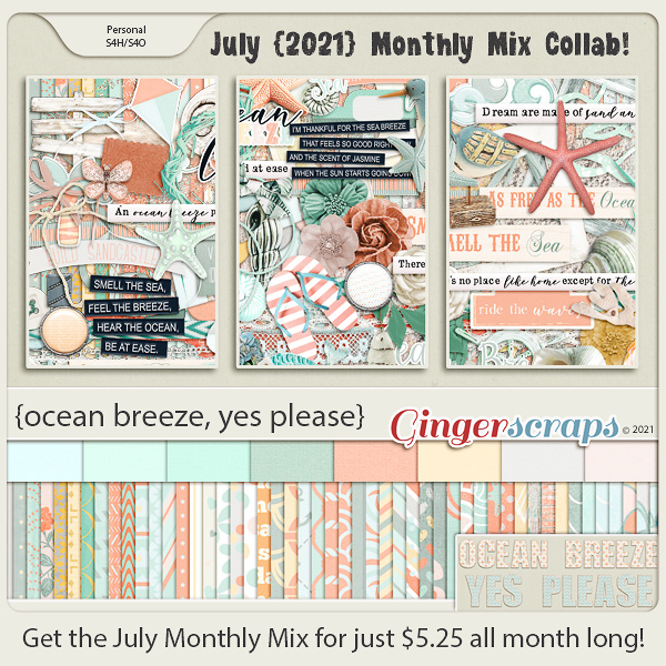
Have you grabbed the July Monthly Mix? Only another week to grab it at this great price.

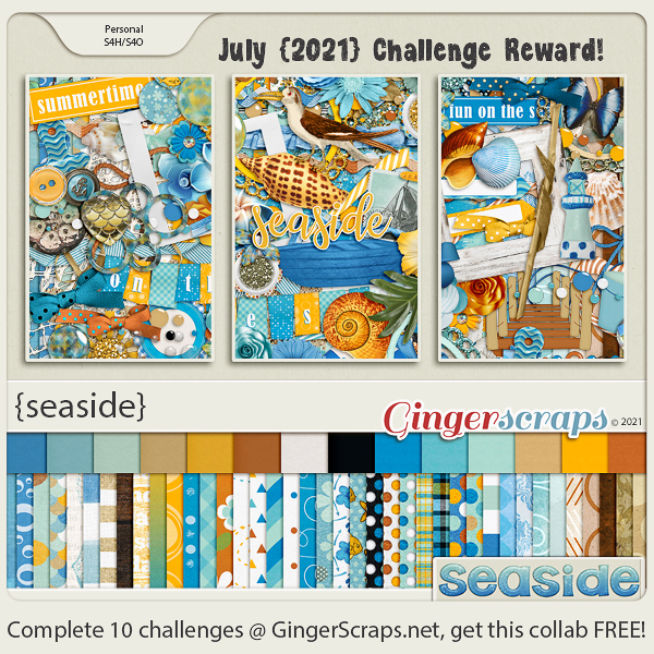
How are your challenges going? One more week to get them finished! I just love this reward kit. It’s yours with 10 completed challenges.

Tutorial Tuesday (Photoshop Elements)

More Fun with Blend Modes

When I started playing with Blend Modes for my Memory Mix It Up challenge layout, I wasn’t sure it would be worthy of a tutorial, but the comments in the Gallery soon changed my mind. Before I start the step-by-step, I want to assure you all that although this layout took me two days to complete, it wasn’t because the technical aspects were time-consuming. I was under the weather – literally AND figuratively – so I took my time. When you see the process, start to finish, you’ll see it’s really a quick but dramatic effect. I must also give credit where credit is due: I modified a technique presented by Nancy Adams, who is a creative team member for Anna Aspnes. Let’s dig in!

First, let’s talk about Blend Modes for a minute. New-to-digiscrapping readers are feeling a little overwhelmed, I can tell. In short, Blend Modes can lighten, darken, or alter the transparency of a layer without changing that layer’s Opacity. To change the Blend Mode, click on the bar at the upper left corner of the Layers panel where it says “Normal” and find the mode you’re seeking. We looked at all the options in this tutorial: Blend Modes? Say What? 

I’m so fortunate to have these professional photos of my great-grandfather Will and his siblings. They were taken shortly after the youngest, Geoff, was inducted into the British Army just after his 18th birthday. I’ve wanted to create a layout with them for awhile, and this challenge template was just perfect for the job. In order to recreate my workflow for this tutorial, I deconstructed my layout, stripping it down to just the layers that create the arty effect. The background paper is a simple “solid” gray from Jumpstart DesignsNo Ordinary Love collection. Other than the alpha I used for my title, all the elements of this layout are from that collection (because I liked the title!). My title alpha is from the GingerBread Ladies collab Spice of Life. The screenshot shows that all the other layers have been turned off, and I’ll turn them back on one layer at a time, working from the paper layer up.

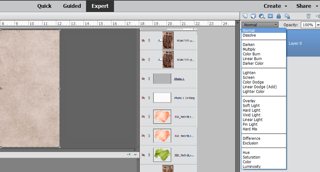
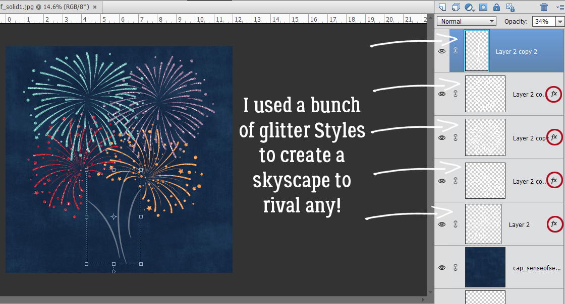
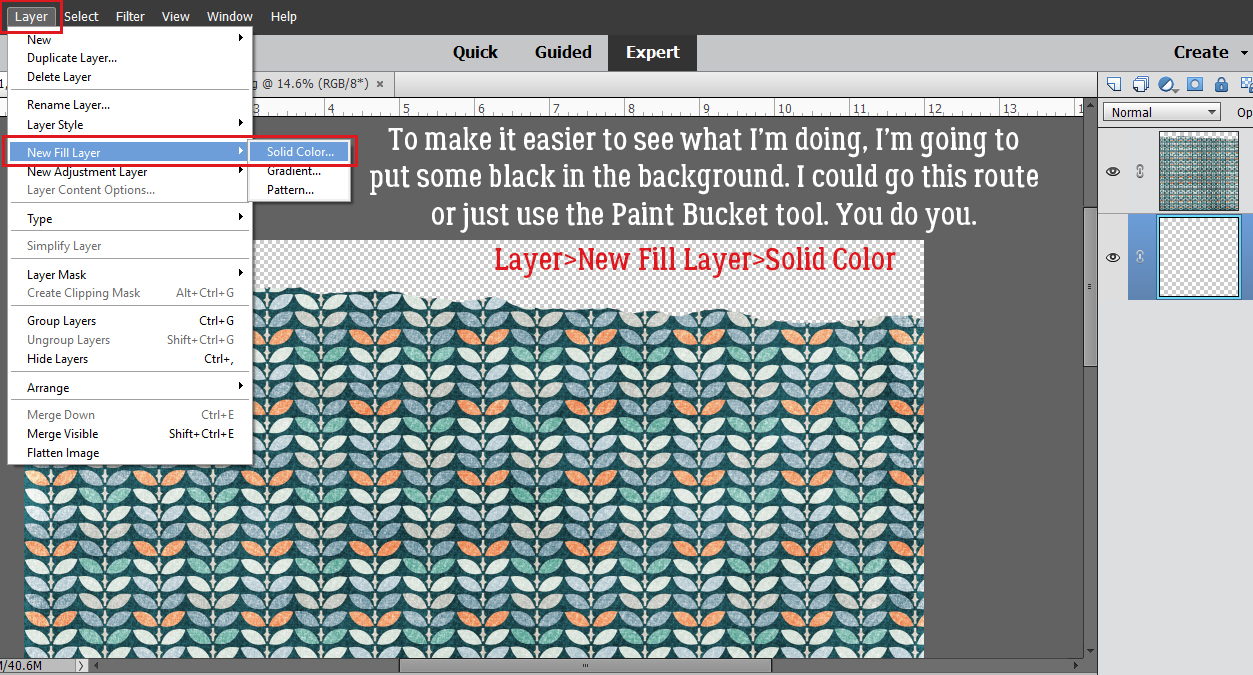
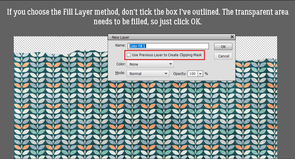
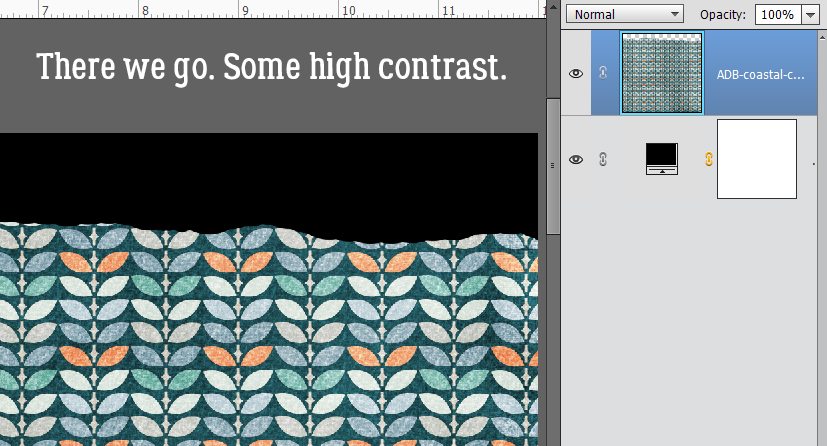
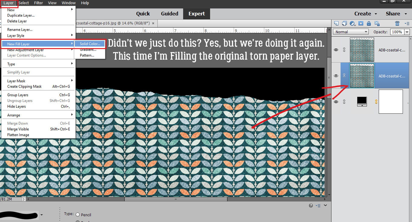
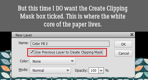
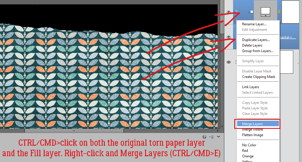
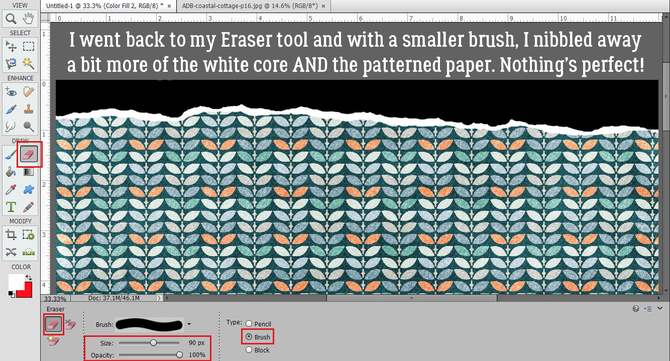
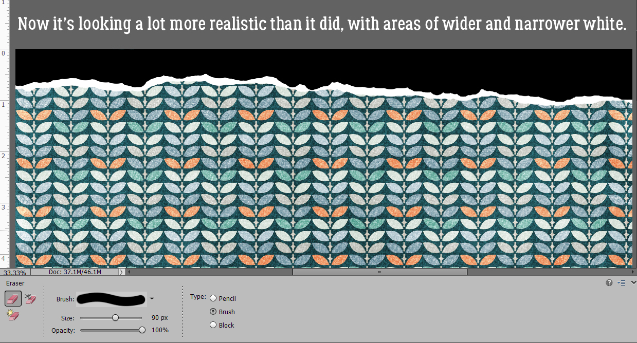
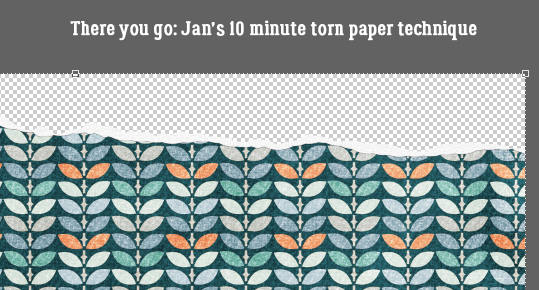
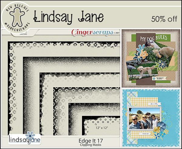
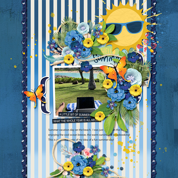
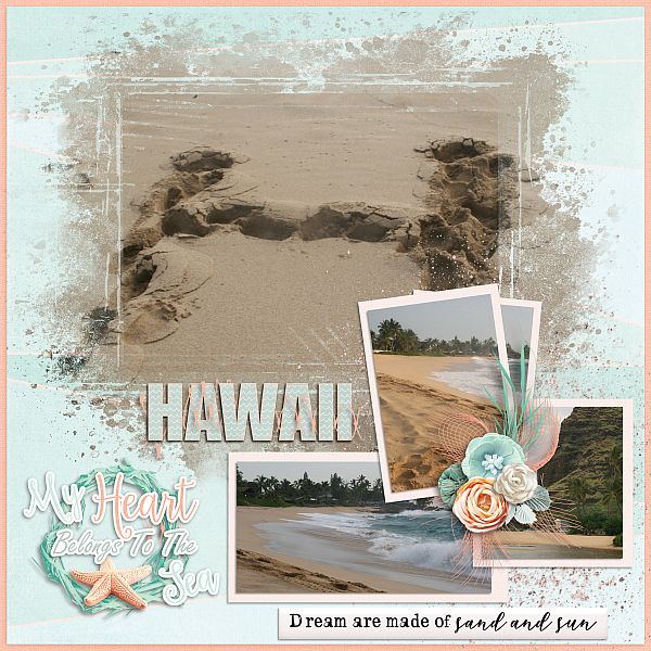
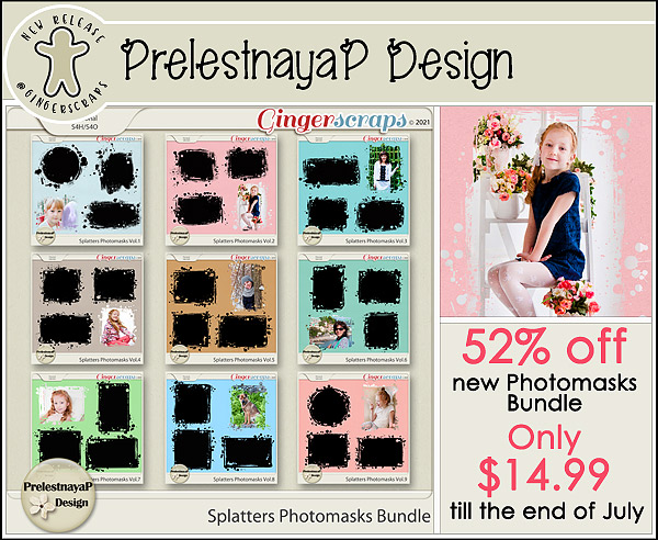
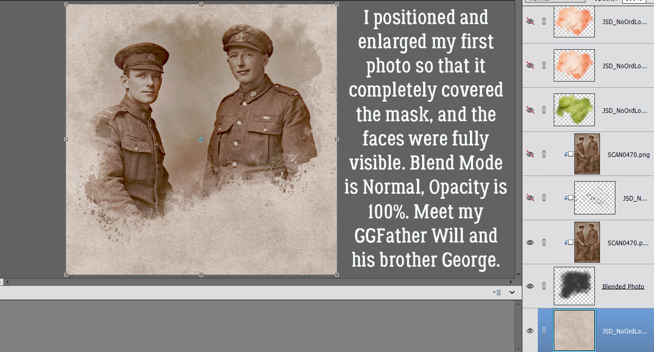
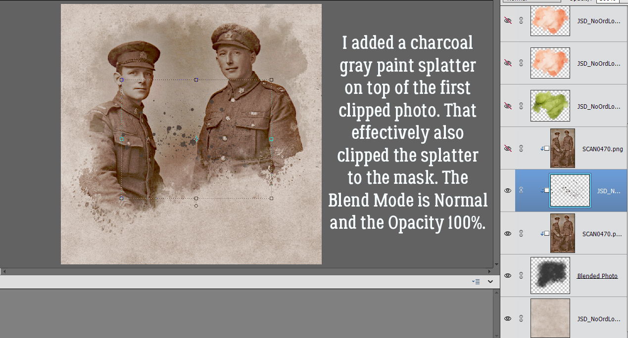
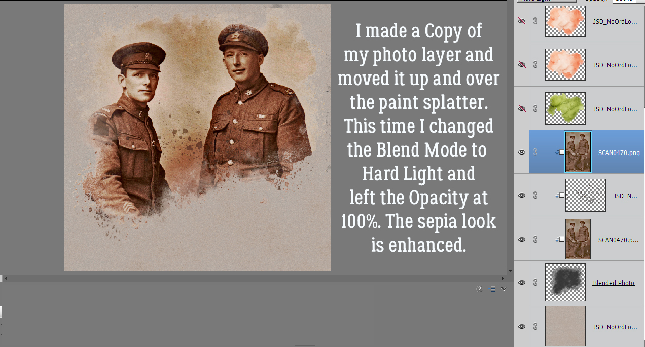
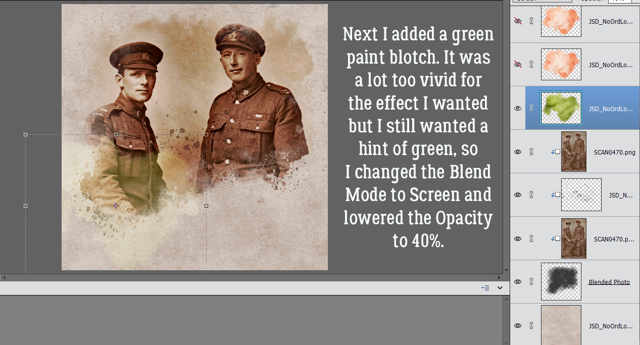
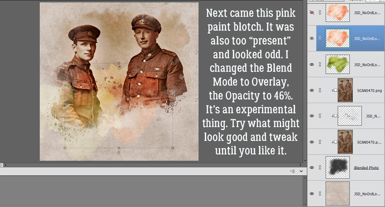
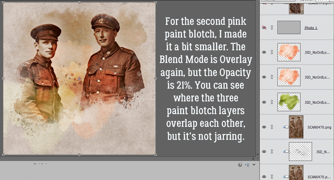
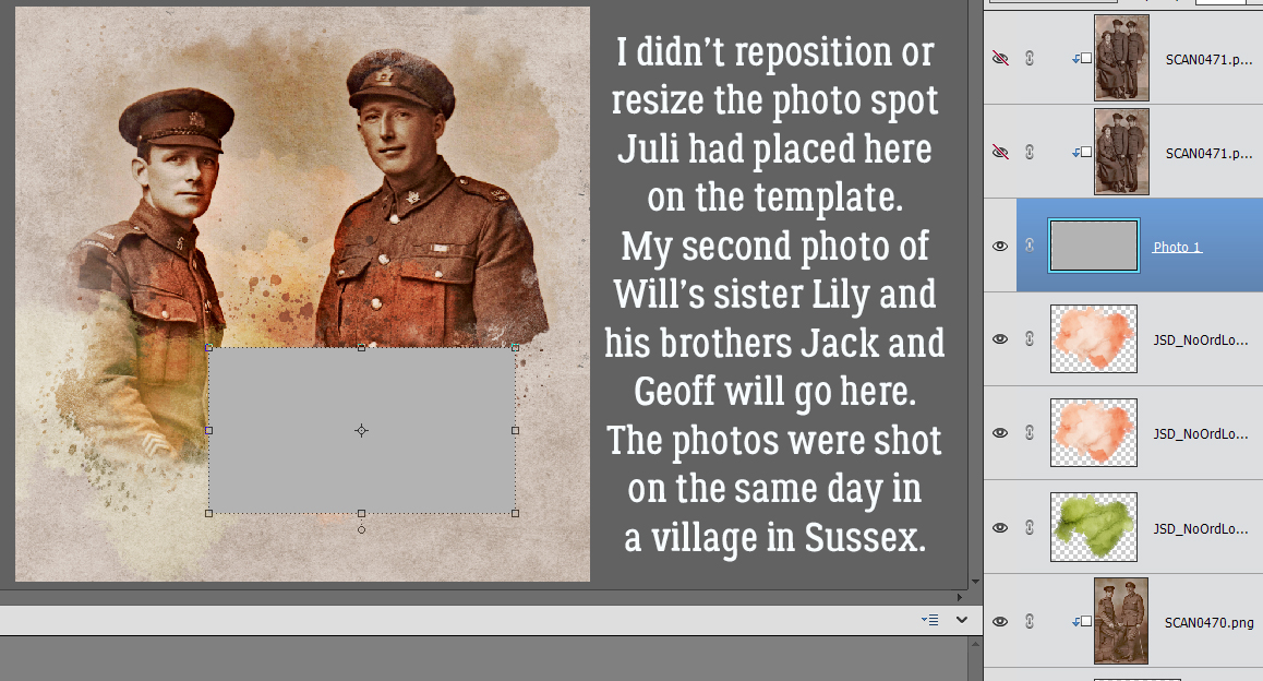
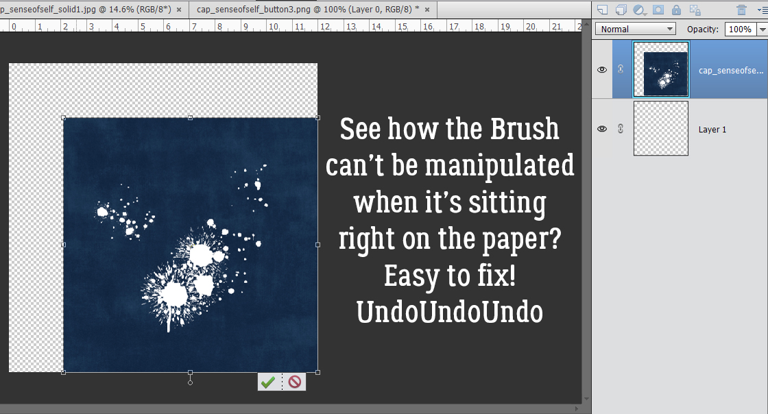
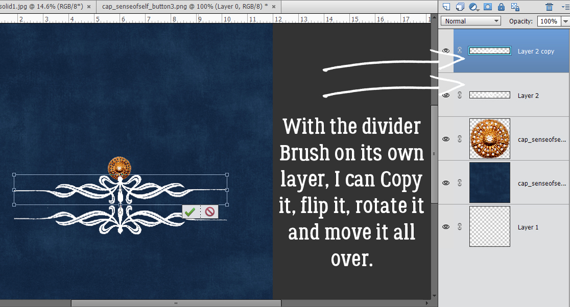
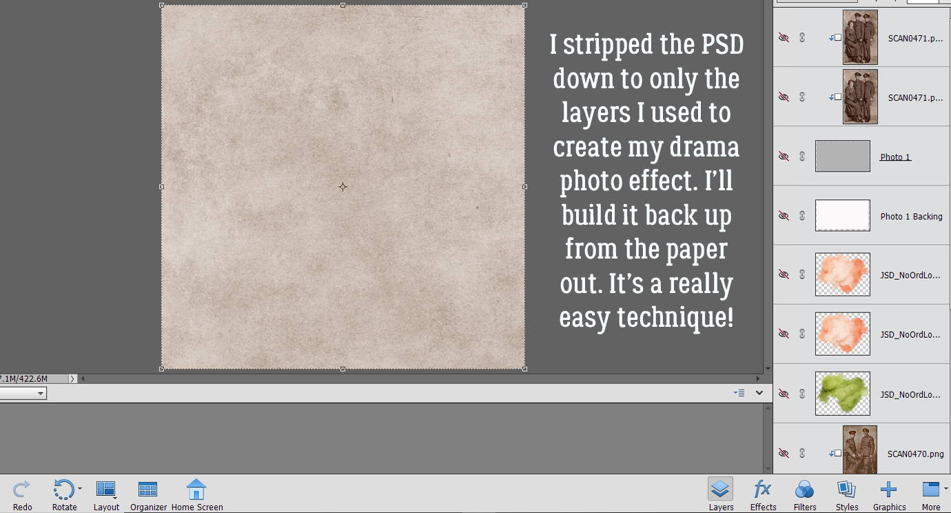
In the Gallery comments, Jill pondered whether I’d done any (labour-intensive) extractions or other witchery to obtain my results, but I didn’t. I used the mask exactly how Juli (Miss Fish) designed it, in the exact spot she’d put it on the template. The Blend Mode was left at Normal, Opacity at 100%.


I positioned my large photo of Will and George over the mask layer, resized it to be sure it completely covered the mask and repositioned it so their faces were clearly visible. Then I clipped it to the mask. [Right-click on the photo layer and select Create Clipping Mask or CTRL/CMD>G for versions prior to PSE 15 or CTRL/CMD>ALT>G for later versions.] The first photo layer is Normal at 100%.

Next, I dropped a gray paint splatter on top of the photo layer, clipped to it. I left this layer’s Blend Mode and Opacity at the default, Normal and 100% as well.

I made a Copy [CTRL/CMD>J] of the photo layer, ensuring it was clipped to the mask as well. This time I changed the Blend Mode to Hard Light and left the Opacity at 100%. It makes the sepia tone even more vivid. Also, see how this layer brings more of the variations in the background paper into view.

I wanted to add some green hints to the layout, but not bash-you-over-the-head-visible. The uniforms in the photos were a khaki colour, not really brown, not really green. I added a green paint blotch on top of the second photo layer, but not clipped. I wanted it to extend onto the background paper too. Then I changed the Blend Mode to Screen (which lightens) and dropped the Opacity to 40%. Now the green looks more khaki, and it’s transparent so the detail in the photo shows through beautifully.

Adding a pink paint blotch layer on top of both the photo layer and the green paint layer without resizing, I changed the Blend Mode to Overlay (which lightens and increases transparency) and decreased the Opacity to 46%. See how the tonal changes make the photo more visually interesting? If the changes I make seem random, it’s because this is a very experimental process. I tried more than one Blend Mode and tweaked layer Opacity until I liked the way it looked. So it IS random! Don’t be afraid to play with your software. It’s how you figure out what you like and how to achieve it!

I made a Copy [CTRL/CMD>J] of the pink paint blotch layer and repositioned it. I made it quite a bit smaller than the first pink blotch, left the Blend Mode at Overlay and really decreased the Opacity to 21%. There’s a hint of colour, and the two other paint layers blend into the whole.

I was satisfied with the way the masked photo was looking so it was time to add in the second photo of Will’s siblings. I left the photo spot in precisely the place Juli put it, made no changes to it at all.

I clipped the photo to the spot and adjusted it to fit. I wish I could’ve gotten a bit more of Lily’s shoulders in there, but it wasn’t a big deal. For this layer, the Blend Mode is Darken and the Opacity is 61%. I played with the order of the layers a little; this one originally was the top photo layer, but it looked better as the bottom one.

This Copy layer of the second photo ended up with the same tonal quality as my large photo totally because of the Blend Mode change to Hard Light. With the Opacity at 100%, it’s tack-sharp and the sepia in the photo’s backdrop pops. From there, I finished my layout, adding in the other elements and applying custom shadows to each layer.

This is my finished layout. I LOVE how it turned out. The title reflects how although the three older brothers enlisted in the Canadian Expeditionary Force, Canada’s involvement in WWI was automatic when Britain declared war on Germany on August 4, 1914; George V was the titular head of Canada at the time. They all spent a significant part of their time overseas in Britain, which made their parents – who were still living there – ecstatic. Lily and Geoff served with the British Army; Lily became a nurse and Geoff was part of the Short-Service branch. Geoff enlisted at 17 1/2 and was forced to wait until after he turned 18 to be inducted. He looks like a baby to me… Okay, enough with the history lesson!

There may not be a tutorial next week; my dad is unwell again and is undergoing a procedure on Monday. I may be tied up for a few days… and I know all of you won’t mind if I’m MIA. Have a good week, stay safe and stay healthy!

PDF Version: https://bit.ly/3x0382c


July 16, 2021: Fresh Baked and $1.00 Bake Sale NOW OPEN!!

Welcome to Friday, y’all. We’ve got a lot going on in today’s post. Make sure you read all the way to the end to see what goodies are in the July Bake Sale.

Remember, any $10 spent in the store gets you this cool, sunny kit for free. I think I could use some of that watermelon right now.

Let’s see what the designers have for us this week!

Have you been to the store to check out the July Bake Sale yet? All of these offerings are on sale for just $1 each.

Have a great weekend!!

Tutorial Tuesday (Photoshop Elements)

Jan’s Like a Broken Record… or “Everything on its Own Layer”

Those of you who read these tutorials regularly will know what I’m talking about. I really flog the “everything on its own layer” as a Work Smart Not Hard tip. It recently occurred to me that I should explain that mantra a little more clearly. So that’s what I’m going to do.

Let’s start with Brushes. Brushes are fantastic tools and can really take your layouts to the next level. There are so many ways to to customize them and make them work for you. But if you don’t put them on their own layer, whatever you do to them – adding a style, changing colour, resizing them, rotating them or even repositioning them, for example – you will also do to the other thing(s) on that layer. Let’s say you want a paint splatter behind your photo(s). If you splatter that paint right on your background paper layer, then decide you need to move it so it peeks out more from behind your photo(s) your paper is going with it. Then you’ll need to UndoUndoUndo until you’re back at the beginning.

By creating a new blank layer and dropping your paint splatter on it, you can move it around to your heart’s content.

For border Brushes, you may want to flip that brush horizontally to make a top-and-bottom border. If it’s on the same layer as a button, you’re bringing the button along too.

If that border Brush is by itself, it’s easy enough to Copy that layer then flip it.


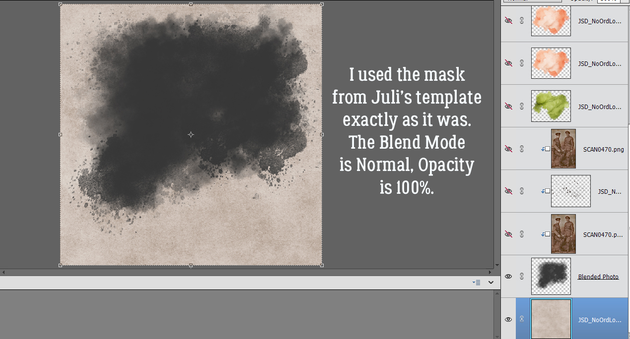
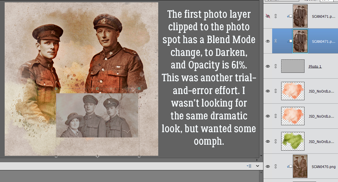
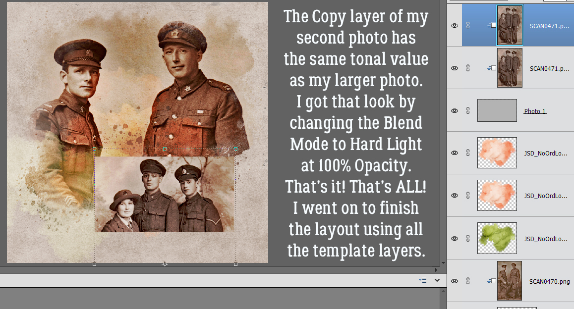
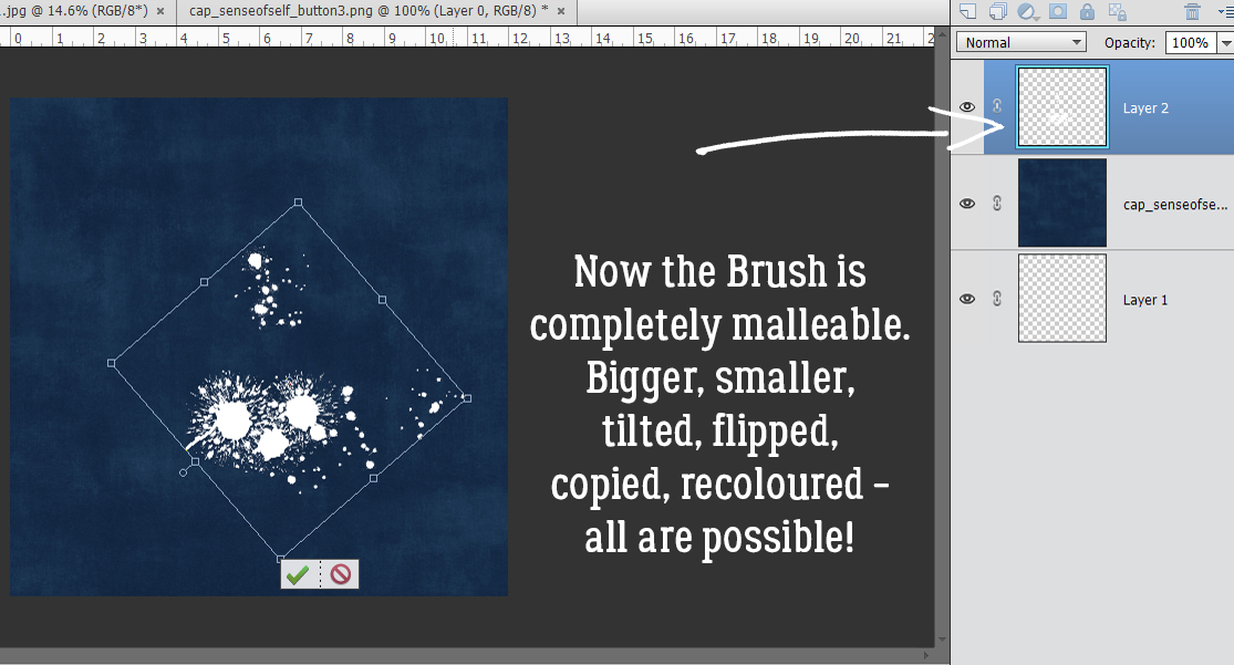
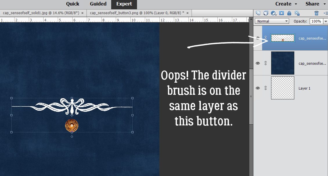
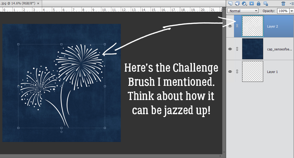
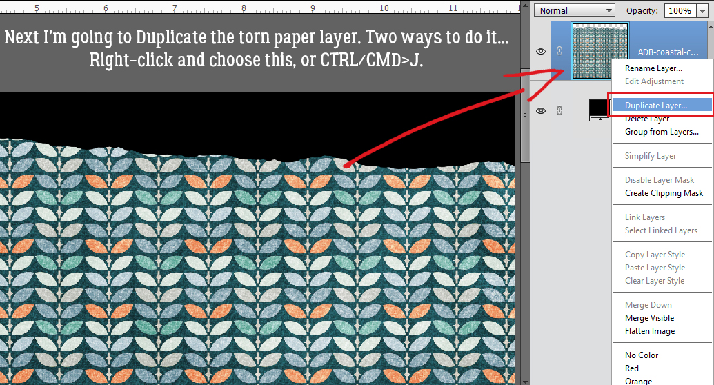
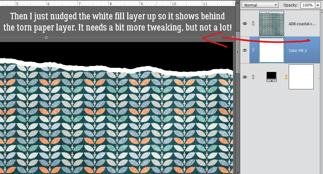
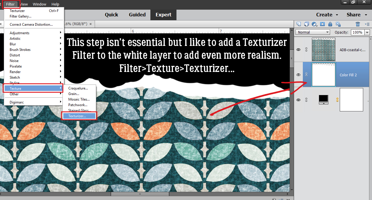
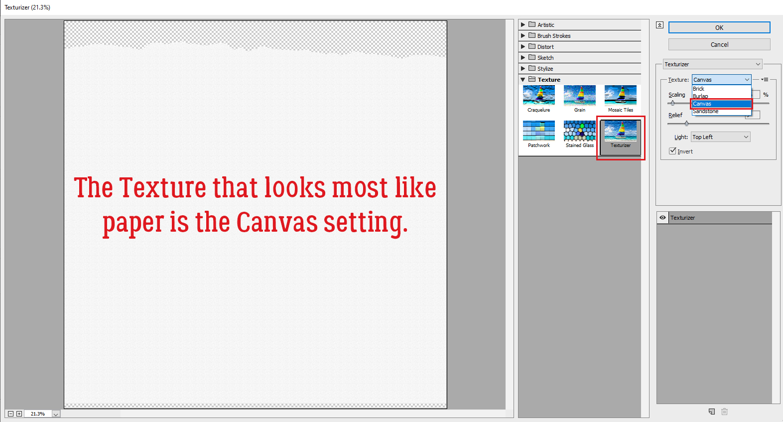
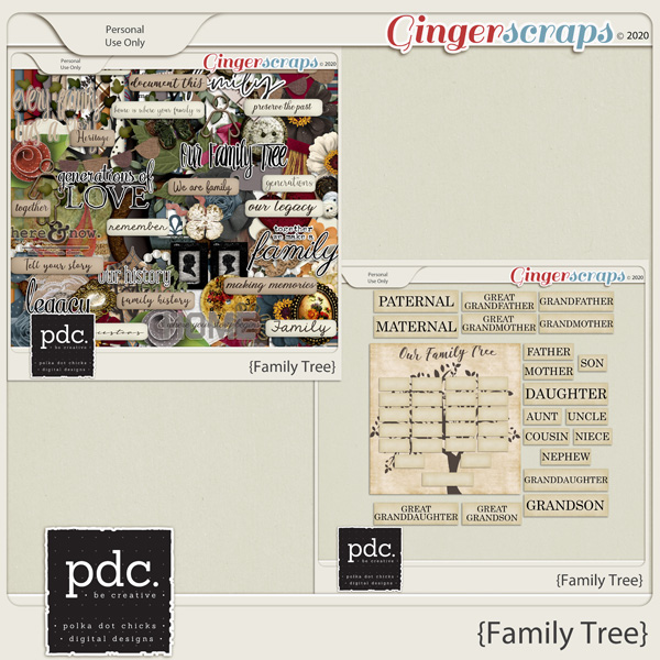
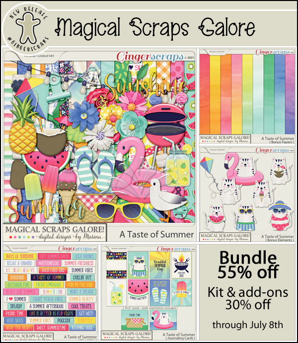
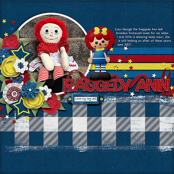
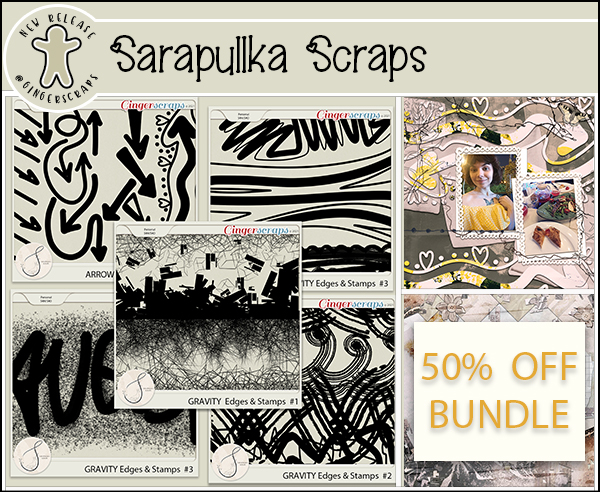
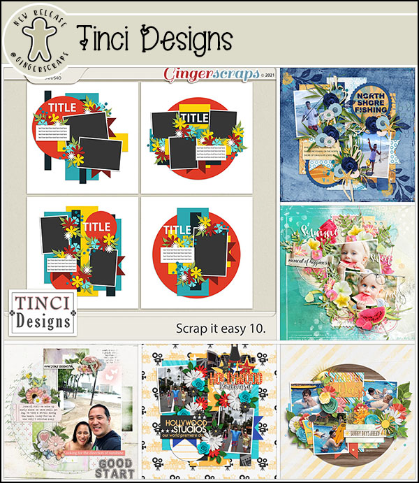
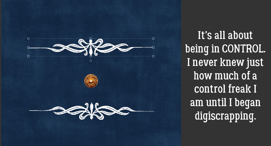
Another example: this month’s Challenge brush from Alexis Design Studio has two starbursts and they’d look stunning in different colours. But if you add your brush to a layer that has a flower on it, you won’t be able to Copy just the brush to change the colour of one of the starbursts, because the flower will be Copied as well.

And you couldn’t apply a glitter Style to the starbursts either, because the flower would get glittered up too. Do that a few times and you’ll be a convert!

While we’re talking about Styles, the benefit of applying a Style to an element on a separate layer let’s you pile Styles on top of each other. In this instance, you’d be Copying the layer you want to alter, then adding the Style to the Copy layer. Imagine I created a Custom Shape of a flower.

By making a Copy layer, I can add an acrylic gel Style to the petals and a glitter Style to the centre, removing the parts of each layer that conflict with each other.

A slight variation of putting things on their own layer is one I use for titles, whether I use a font or an alpha. I create an new document where only the title will be manipulated. Sometimes it takes a little imagination to decide how to align the letters or the words, but the advantage of the new document method is that when I like how the title looks, I’ll Merge each word. Then I can select all the layers and Duplicate them onto my layout, where each layer is still intact but can be nudged into the most appropriate spot. To Duplicate those layers, click on the first layer in the stack, hold down the Shift key and click on the top layer. That “selects” all the layers. Then right-click and choose Duplicate Layers.

Look for whatever you’ve named (or not named!) your layout and choose it from the menu and click OK.

There, all three of my title layers are there and I can move them around individually, resize them, rotate them or whatever I think they need.

I couldn’t resist. I had to apply some styles to my title so you can see how easy it is to turn a font into an alpha.

Essentially, you want to have as much control over the things that make up your layout as you possibly can. These tricks have streamlined my creative process quite a bit – in addition to using all those keyboard shortcuts I show you each week. When I’m squeezing a little bit of time out of an otherwise busy day because the creative bug just won’t stop biting me, whatever will help me move things along is vital!

I hope this has helped with understanding ObiJan’s Golden Rule!

PDF Version: https://bit.ly/36C3YaN

July 9, 2021: Fresh Baked and Christmas in July!!

Merry Christmas.

Wait, what? You heard that right. We’re having a Christmas in July sale in the GingerScraps store. Our designers even got in the fun with some Fresh Baked items that are Christmas themed.

Christmas In July 50% Off Sale! July 9-15 {2021}
*IMPORTANT NOTES* Sale effective for 7 days only, will end promptly at 11:59pm ET on July 15, 2021
(some restrictions apply)

As always, if you spend $10 in the store, you get this great collab for free!

Let’s see what our designers have been up to.

How are your challenges going? Any 10 completed challenges gets you this fun kit as a reward.

Tutorial Tuesday (Photoshop Elements)

Torn Paper: A Review

Last week, Glee asked if I could run another tutorial on digital paper tearing, and I’m only too happy to oblige. Since I wrote my first version of this tutorial I’ve streamlined the workflow a bit, which is always a good thing! Work Smart, Not Hard!! This technique uses only tools already embedded in the software and it’s easily achievable by even the very new learner.

Let’s think about scrapbooking paper – the physical properties of actual paper. The best-quality paper is weighty and has a white (or sometimes black) core. It might have a pattern on one side and a solid on the other. It may be smooth as satin or have a lovely texture. When I work with digital papers, my mind sees them as the very highest quality physical paper there is. So this technique will take that into consideration. The patterned paper I’ve used is from ADB DesignsCoastal Cottage kit. (It’s no secret that I LOVE Diane‘s papers.)

In past tutorials I’ve talked about “destructive” and “non-destructive” methods of altering digital images. With “destructive” methods, pixels are removed from the image and can only be replaced by CTRL/CMD>Z-ing back a bunch of steps. “Non-destructive” methods only hide those pixels by using a mask. They’re out of sight, not gone; they can be easily revealed again if needed. This technique is “destructive” but so is tearing paper! I’ll be using the Eraser tool with a hard, round Brush of a moderate (250 pixel diameter) size at 100% Opacity.

I don’t know about you but I can’t tear paper in a straight line without folding, creasing and using a straight-edge to tear it against. Good thing for this technique, perfect isn’t the goal. Since my imagination has told me this paper is thick and stiff, I already know the tear is going to be jagged and will expose some of the white core. With the Eraser tool, I just chewed off some of the paper.

I think I need a higher contrast between my paper and the transparent background layer, so I’m going to add a Fill Layer in black to help me see what I’m doing. You might not need this step. There are a couple of ways to Fill space: by clicking Layer>New Fill Layer>Solid Color or just by using the Paint Bucket tool.

If you choose the Fill Layer method, make sure that box I’ve indicated is NOT ticked. It’s not a big issue when you’re creating your torn paper as a separate project and then adding it to your layout, but if you decide to tear your paper within your layout, it will matter. Here, I want to fill the whole background with black for contrast. The layer is only temporary, but why make it harder for myself?

There. Now I can see that torn edge much better!

Now for the really creative part! Let’s add in the white core. To do that, I’m going to make a Copy layer of my torn paper. Again, there are a couple of ways of accomplishing that: Right-click on the layer and choose Duplicate Layer and then follow the prompts (I rarely use this method) or CTRL/CMD>J. [If you develop a habit of using keyboard shortcuts you’ll be amazed at how much time and how many keystrokes it saves you.]

Yes, we did JUST do this, but we’re going to do it again. Only this time I WILL use the Clipping Mask box. I want to Fill the original torn paper layer with white, but JUST the torn paper, not the entire layer. It’s easiest to just use the Paint Bucket tool, but I want to show you the options.

Yep, tick the box!

Then I want to Merge the Fill Layer with the torn paper layer (a step that’s eliminated when using the Paint Bucket… WSNH!) so I CTRL/CMD>clicked on each layer then right-clicked to open the layers menu so I could select Merge Layers. The keyboard shortcut for this step is CTRL/CMD>E.

The white core has to be visible (otherwise why have it in the first place!) so I nudged it up a bit with the Move tool. It’s a little too perfect, but we’ll fix that.

When a real sheet of heavy scrapbooking paper is torn, the white core will be exposed to varying degrees, with some wider bits and some much narrower bits. To emulate that look, I went back to my Eraser tool and nibbled away some of the white layer and some of the patterned layer too.

Okay, that’s more like it!

This step is entirely optional. Torn paper isn’t perfectly smooth, and I like to go for as much realism (with the fewest hassles) that I can achieve.  So I’ll show you how to add some texture to the white core layer using Filter>Texture>Texturizer.

There isn’t a perfect texture Filter in the toolbox, so I use Canvas. I just want a hint of irregularity on my white core and this’ll do it.

There are some decisions to be made when using Filters. Light Source is a big one. I tend to use Top Left more than anything, so that’s what I’ve chosen here. I Inverted as well, which isn’t as visible as it would be with the Burlap or Brick Textures. Scaling refers to the overall size of the deflections and Relief is how much of a vertical deviation the Filter provides.

On a computer screen this effect isn’t in-your-face-obvious, but trust me, it pops when you print your layout.

AGAIN? Why?? That torn edge of the patterned paper will cast a hint of shadow. The easiest way to add a new Layer is to click on the sheet-of-paper icon. To add a new layer this way UNDER the currently active layer, hold down the CTRL/CMD key when you click it and it’s done. Otherwise, Layer>New Layer or CTRL/CMD>SHIFT>N will add a new layer above the currently active layer, but it’ll then have to be moved under the torn paper layer.

I’m telling you, the Paint Bucket tool is such a nice shortcut! But make sure you’ve Selected the edge of the torn paper by CTRL/CMD>clicking inside the layer’s thumbnail (that little “photo”) before you dump your paint.

Just as I did for the white core layer, I used the Move tool to nudge the shadow layer up and out from under the torn paper layer. It’s pretty obvious in the image below, but I’ll Blur it a tiny bit and it’ll look much more natural.

Filter>Blur>Gaussian Blur… is the ticket.

If the shadow layer is Blurred too much, it’ll just make the area where the paper and the core meet look dirty. So don’t go too far!

Now all that’s left before I’m finished is to Delete the black contrast layer and Merge the three paper layers together.

And now my torn paper is ready for use on my layout! It’s literally a 10-minute technique that really adds some interest to the image.

Thankfully the heatdome has moved on and we’re only worried about wildfires out here in the west part of North America. The eastern part is having the opposite problem, with a tropical storm dumping water and creating tornadoes. And still… COVID. I had my first vaccine last Wednesday and knew I was going to react – having had the virus I had antibodies already. I felt pretty awful for about 36 hours, and then magically felt better. The vaccine is proving its worth; 99% of the people who have died from COVID since May have been unvaccinated. Pretty good stats!

See you next time!

PDF Version: https://bit.ly/3xrgE06


Designer Spotlight (July 2021)

Polka Dot Chicks and Memory Mosaic!

I apologize for not getting this out to all of you on the first, but it’s been a bit nuts around here, what with the incredible heat and the wildfires burning all around us. My parents and siblings are prepared to evacuate, should it come to that. But I have some time right now and nothing pressing to drag me away, so let’s chat with Tammy (Polka Dot Chicks) and Joy (Memory Mosaic). Let’s start with the basics and then get into the more interesting stuff! (Today I’ll be “O“, to make it easier to keep the conversation straight.)

O: Ladies, how long have you been designing?

T: Since 2008

J: For me it’s been about 6 years.

O: And what tools do you use to create your designs?

J: I use photoshop, and I am learning to use Procreate.  I hope soon to be able to incorporate things I have done in Procreate in my kits.  I use templates and photos that I extract images from.  Some photos I find on free sites like Pixabay, and some I take myself, depending on what the subject is.  I also use a lot of different styles in Photoshop.  I enjoy putting styles together and creating new ones.

T: PhotoShop Elements 21 for Mac  on 27” iMac desktop computer.

O: Ooh, I love Pixabay! It’s a real treasure trove, isn’t it? Sorry Tammy, but I’m not an Apple fan. I’ve had nothing but glitches with their products, but my daughter LOVES her iMac, her iPhone, her iPad, all of them. Anyway, nobody is asking me… Now we know what you use, tell us a little about where you create.

T: I have a craft room/office on our finished lower level with plenty of space to design and set up my craft tables for crafting/sewing/silhouette etc.

J: I work on a laptop, so my “work space” is wherever I want to go.  My husband and I are working on getting an office space fixed up in what used to be a storage shed/cabin on our property, and once that is done, I will have a more stationary work area.  Right now, I have all my “stuff”… notebook with ideas, and calendars, external hard drives, pens, iPad, etc, in a pretty tote that I move from place to place… sometimes, it’s the living room sofa, sometimes the dining room table, sometimes in nice weather,  it’s out on the deck enjoying the birds singing and the fresh air.

O: I’ve been trying to get my craft space organized but it’s such a huge job and I never know where to start. Joy, I love that idea of putting all the pieces/parts in a tote to keep handy. I might have to steal that. Tammy, which of your amazing kits in the GingerScraps store is your favourite?

T: Family Tree – I really like family tree stuff and seeing how names were picked etc.  for example: my husbands middle name, Parker has been a family name since the late 1700’s and is always the first born middle name. (narrator: It’s on sale right now, ladies!)

O: I’m a family history buff too! It’s such a fascinating and absorbing pastime. A few months ago I finally figured out where one of my husband’s middle names (he’s French… 5 names!) came from: an uncle who was killed in action in France long before he was born. There were a lot of revelations in his service records. On the subject of history, and given that today is the Fourth of July, let’s talk about vacations for a sec. Joy, what would your dream vacation look like?

J: A week at the beach.  Preferably in a condo/beach house… not super crowded, able to sleep in, days spent walking the beach, collecting shells and rocks, lying under an umbrella, listening to the surf, reading a good book, spending the evening, watching movies, or playing games with my family.

O: That sounds like bliss! Is that what you’d do if you won the lottery?

J: Sort of. I would make sure any pressing needs of my family were taken care of, fix up my house, maybe take that vacation to the beach I mentioned above, and give a good portion of it to a missions project.

T: I’d buy a big enough house to house my kids/family/grand-babies but everyone could have their own space but we would all be together, Hire a chef and cleaning person. 

O: Oh yes charitable donations and to the cleaning person! Tammy, what one word would your friends and family use to describe you?
T: Happy, loves to hug and always willing to help!
O: Okay, more than one word. Joy, if time travel was possible, would you go ahead, or back, and why?
J: I would go back… I lost my Mom about 3 years ago, and I would love to go back and just have one more day with her, to ask and do the things we thought there would be time to do later.
O: Oh, I’m so sorry! It would be a perfect day, wouldn’t it? I find such peace when I’m outside, with dirt on my knees and under my nails. Gardening has been my therapy for years. Are either of you green thumbs?
T: I do not EXCEPT for Phil my philodendron that I have kept alive since 1992 when I received it after my grandma passed away. He has moved many times and still alive and kicking…
J: NO, but it doesn’t keep me from trying. LOL!  Every year, I try to plant an herb garden, flowers, and tomato, cucumbers, and pepper plants.  Some years it goes better than others.
O: Along the line of hobbies again, Tammy, are you more likely to dance or sing in the shower?
T: Sing – badly. But all my kids can sing… go figure.

O: Yeah… I can relate. So Joy, what did you want to be when you were small?
J: I wanted to grow up, get married, be a mommy and teach school.  I did all of those things. 🙂
O: NICE! Tammy, What’s the best compliment you ever received?
T: That I don’t look old enough to have 3 grown kids and 4 grand babies.
O: That would be a sweet thing to hear, for sure. We entertained our son-in-law for his birthday recently and when I asked him what I should make for dinner, he told me he’d never have enough of my ribs. Joy, If you could only eat one meal for the rest of your life, what would it be?
J: Rib-Eye Steak cooked med. rare, loaded baked sweet potato and salad with a balsamic dressing.
O: Yum! Last question for you, Tammy. Since my last tutorial was about colour theory, what are your most favorite and least favorite colors?
T: My favorite color is RED, plaid and polka dots.  MY least favorite color is yellow (at least in clothing on me).
O: I don’t love yellow either and it looks ghastly on me – a sad fact for someone who spent half her career in a yellow isolation gown. And last question to you, Joy. If you had a warning label, what would yours say?
J: Approach with caution when under pressure… explosions can happen.
O: Duly noted!! I ended this conversation with Joy because she’s generously provided us with a coupon for July! This is on top of the Daily Download. (And don’t forget the Designer Spotlight challenge these lovely ladies are hosting too.) I really hope she plans to make her home at GingerScraps when her guest stint is done.

Fresh Baked: July 2, 2021

Good Morning! We made it to Friday! Whew. I’ll be glad to see the end of this work week.

Remember, any $10 spent in the store gets you this great summer kit for free. I’m loving that flamingo.

Let’s see what our designers have for this Fresh Bake batch.

POLKA DOT CHICKS
MEMORY MOSAIC

Are you getting a jump on those challenges? Do you have one that’s always your first? Any 10 completed challenges gets you this great kit as a reward. The color palette this month is stunning.

Fresh Baked: JuLY 1, 2021, NEW Guest, NEW Free With Purchase, Monthly Mix, and More

Welcome to July! There is a lot in the Buffet post this month and the collabs are just out of this world.

Don’t forget to check out the Buffet Bundles. One easy click to add bundles of Buffet goodies to your cart.

Look at these gorgeous colors. There is a great mix of patriotic and summer kits from the designers. Also check at the bottom to see some samples from our talented store creative team.

Remember any $10 spent in the store gets you this great collab. Do you see {sunny days ahead}?

I love these muted beach colors for the July Monthly Mix.

Now to the July Sneak Peek. This month’s Daily Download is from Memory Mosaic and Polka Dot Chicks.

We have a new guest designer for July

Sarapullka Scraps

Bio:

Hi, my name is Larisa. All my life I have been doing fine arts: drawing and photography.
I love nature very much and therefore I studied at the university as a microbiologist.
Every second I pay attention to different little things around me and I want to share them. I collect stickers, pieces of paper, scraps, beads, draw small details in my illustrations. For a very long time I did not understand through what art you can most clearly share your “collections of observations” with people))
Through Digital Scrapbooking, I want to share my work with you, which I hope will be useful to you!)
Contrasts are close to me: natural gentle motives and careless graphics, restrained color palette and bright accents. I draw most of the elements myself, so each of them has the maximum of my “inner” attitude.
I invite you to join my group https://www.facebook.com/sarapullka and subscribe to the newsletter which has a gift for new subscribers http://eepurl.com/hrPJaX

In honor of the opening of the store, I would like to arrange a sale with a 50% discount during the week on all products I have presented.

Good day,
Larisa

Take a look at the new challenge reward kit. I am in love with these colors and the theme. If you complete any 10 challenges this month, you get this gorgeous collab as a reward!

And to leave you with some great insporation, let’s see some samples from our talented store CT. You can find more samples in the Gallery.