Archives for May 2023

Tutorial Tuesday (Photoshop Elements)

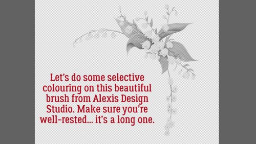
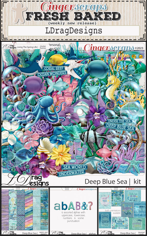
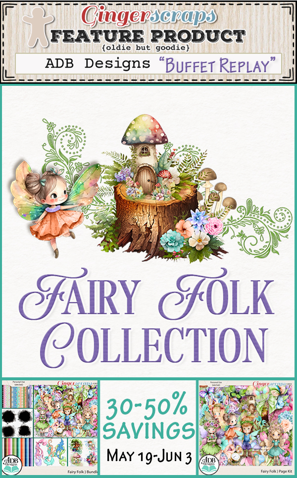
Quick Trick: Dropping Things Where You Want Them

PDF Version : https://bit.ly/3oLcNMb

And that’s a wrap on May… Time for our Quick Trick of the month. This handy little tip may just blow your mind!

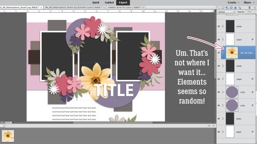
Back in the earlier versions of Photoshop Elements, dragging and dropping objects onto our templates was simple. You activated the layer where you wanted your (flower) and when you dragged it up onto the template it landed on the layer where it was intended to be. Then somewhere around Elements 14, that all changed. Suddenly it didn’t matter what layer was active, it seemed Elements put the (flower) wherever it wanted. Randomly. It’s incredibly frustrating and time-consuming to constantly have to move things up and down the template’s layers stack and I know it was a MAJOR pet peeve for me. Why mess with something that worked?? Well, let me show you how to get around Elements‘ penchant for doing its own thing.

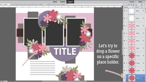
I’ve got the May Template Challenge template from Tinci Designs open on my workspace. I also have a daisy-like flower element from Cindy Ritter‘s Real Moments-Metamorphosis open and plan to put it where the large dark pink place holders are.

If I just drag-and-drop… um NO! That’s not where I want it. It seems random but it really isn’t, as you’ll see in a second.

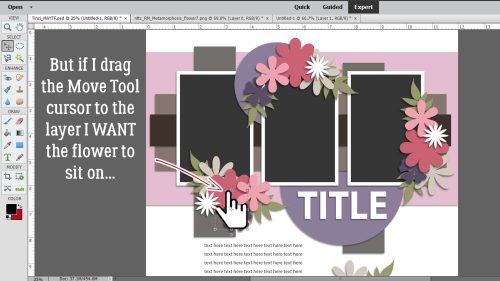
By taking an extra nanosecond to be precise and intentional, I dragged the flower up and positioned the Move Tool cursor – looks like a pointing finger as shown (enlarged for visibility) – over the exact place holder I want to swap out, THEN drop it.

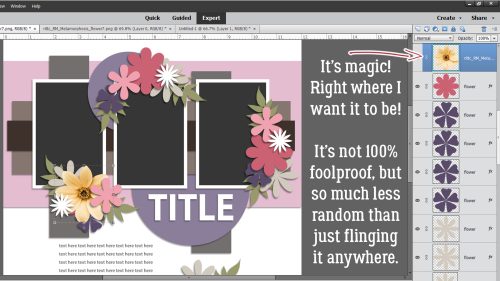
And there’s the flower… right on the layer where I want it! (Of course, it still drops in the centre of the canvas, but at least it only needs to be shifted into place, not moved up or down the stack.) Now, this isn’t 100% perfect. For example, if you’re working with a particularly small object on the template, it may be difficult to get the cursor on the exact layer. I’ve found that if I Zoom in on the template I have better success in those situations. Going just a smidge slower actually speeds up my workflow!

Give this a try if you’re working with Elements 14 or later and let me know how you like it.

May 26, 2023: Fresh Baked

We’ve made it to another Friday. It’s a holiday weekend in the US (Memorial Day). Do you have special plans for the weekend?

Remember any $10 spent in the store gets you this great collab, perfect for all your outdoorsy photos!

Let’s see what the designers have for us this week.

Have you grabbed the May Monthtly Mix? Only a few more days to get it at this price.

And you only have a few more days to get your challenges done and posted. Remember, complete any 10 challenges to get this kit as a reward.

Tutorial Tuesday (Individual Style)

Challenge Spotlight: Jumpstart Your Layouts

It seems we’ve come full-circle! The first Challenge Spotlight appeared on September 21, 2021 with Jumpstart Your Layouts. Since then we’ve looked at how scrappers’ individual style is demonstrated by how they meet the challenge of using a specific kit, brush, mask, template, theme or set of instructions. The Challenges we haven’t examined are too broad to meet the criteria. <winks>

Now we’re back at the beginning. Sheri, the creative mind and hands known as Jumpstart Designs, has had some rough personal crises to deal with lately, but she still managed to bring us a super-cute mini to Jumpstart Our Layouts. It’s SO super-cute in fact that I’ve had to use the very egalitarian method of selecting every second layout to showcase today… otherwise this post would go on for a lo-o-o-ng time. As usual, I’m going to link each layout to its spot in the Gallery so you can see it in greater detail, and hopefully leave some words of praise for the scrapper. Just click on the scrapper’s name and you’re there. But first, let’s look at the mini itself. [Sheri always makes a bundled kit to go with it, so if you like it*, grab it!]

I’ve downloaded the mini but haven’t yet done anything with it. Lucky for you, we’re going to look at a BUNCH of ways to use it!

The very first scrapper to post to the Challenge Gallery was KAPOH. She always creates these 5×7 masterpieces. She’s turned the floral paper into a rounded, wrapped frame. I love how the little girl’s feet (from the add-on kit) are hanging over the edge. So simple, and so sweet!

Next up is makeyesup. Her photos of a child sleeping in a swing are framed with the included frame element, sandwiching a cluster both simple and sweet. I like how she’s used the coral-dotted paper as ribbon dividers.

Alasandra has also used some of the papers in small strips. Her diagonal design draws the eye to her photo (how do kids and cats sleep with their heads up like that?). The circular cut in her background paper backed by the yellow striped paper looks like a crescent moon. Strong work!

There’s so much to see in this layout from lulutoo. She’s used the ombré paper as her background, and applied a sketch filter to a photo of the sleeping child over the blue side. The mini’s papers are in narrow strips, anchoring her photo and look how she’s got the bears’ heads together in slumber. A+!

Here, demma_b13 has used more than just the mini, although it’s very well-represented. Her clusters are divine!!

I love everything about zotova‘s layout. I struggle with using patterned papers as backgrounds, but she clearly doesn’t! Her nearly-identical but casually NOT-identical clusters frame her photo and add visual interest.

The way dhariana has sliced her photo and plaid paper swatch is intriguing. Her layout is one of those clean-and-simple ones I can’t manage to emulate.

This layout from lulumoon doesn’t use any part of the (free) mini – she went for the whole enchilada! I think she may be trying for the prize* Sheri promised. 😉 Her arrangement of elements on the diagonal give the impression they’re holding up the hammock. Genius!

Is there anything more heart-warming than a baby and a daddy napping together? I’m pretty sure linweb knew she’d melt hearts with her simple layout focused on those photos.

What do you do when you have a photo you want to use but it doesn’t really work with the colour palette of your chosen kit? You do what loonyhiker did… turn it into a black-and-white! Then you can do whatever you like.

For this layout, Pups_r_Paps has bent the rules a little. She’s used some of the elements from the mini and added some elements from an unrelated other of Sheri‘s kits.

Every parent knows this feeling! The simplicity of andastra‘s layout represents that bone-deep fatigue exceedingly well.

NHSoxGirl has created a digital spiral-bound memory book with her layout. The repeating circles tie the layout together beautifully.

For her layout, granny5pics has added quite a few interesting touches. She elongated the paper frame into an ellipse, clipped the blue-starred paper to it and cut a scalloped border on the ombré paper. Oh, and she put her date into the word art using a very similar font so it looks like it has always been there. Well done, Kathi!

Last, but not least, there’s this beaut from willow. That babe is communicating very clearly – DON’T BUG ME! I like that the large-and-in-charge photo is subtly blended into the blue-starred paper and the cluster is positioned perfectly.

* Here’s the scoop on the prize I mentioned earlier, in Sheri‘s own word… “WIN WIN WIN! I have also decided to add another reward for those who purchased the Limited Edition KIT from my shop during the month. After the month is over I will do a random drawing from the list of challenge customers who bought the KIT and THREE people will WIN the next month’s Limited Edition KIT FREE! Be sure to check your PM’s here at Gingerscraps so see if you were one of April’s winners!”

What do you think? Will you be in the running? I’m ver-r-r-r-y tempted!

May 19, 2023: Fresh Baked

Welcome to Friday everyone. I hope you have all had a great week.

Remember any $10 spent in the store gets you this great collab, perfect for all your outdoorsy photos!

Let’s see all the goodness the designers are adding to the store this week.

Don’t forget to work on all your challenges! Just 10 completed challenges gets you this great collab for free.

Tutorial Tuesday (Photoshop Elements)

DIY Neutral Papers

PDF Version : https://bit.ly/3MD2JN2

As I was pulling last week’s tutorial together, I got a private message from Jen (hclappy) asking me to consider a request. She sent me a link to a thread in the Forum, and I gave it a look. The first post in the thread is from Carla:

“I have found that there are quite a few designers that do not put plain solid papers in any of their kits. If you don’t purchase the “Bundle” then you have to purchase the solid papers separately. I prefer to have a selection of plain papers in the colors that match the patterned papers included in the kit and it is just so much easier. I do not always mix and match scrapbook kits, in fact, I rarely ever combine kits unless it is a challenge requirement. I could very easily MAKE my own but I don’t and I rarely every use the ombre papers as they are just not the same as a regular cardstock/plain paper and most of the time, must also be purchased separately. Please don’t hate on me because of it but I am retired and am not made out of money. Jen commented she likes to have lots of journaling on her layouts, and that her favourite papers or cardstock are the lighter, more neutral papers.

Jen’s request was a tutorial on creating solid/neutral papers that coordinate with those kits that don’t have them in the basic kit. I gave it some thought (about 5 seconds’ worth) and responded in the affirmative. Before I go any further, I’ll warn you that there are about 60 screenshots in this tut, but only about 15 of them are ACTUAL STEPS. The rest are just so you can see what the options are.

Remember that I don’t assume anything when I write these lessons. I want them to be achievable by anyone with any level of experience. I also include both Windows [CTRL, ALT] and Mac [CMD, OPT] keyboard shortcuts. So if the text seems pedantic and repetitive, go ahead and skip the parts you already know. I won’t mind! I’m going to use an older kit from Wimpychompers called She’s a Gem as my basic kit. (I just discovered that Wimpychompers has left the Shop… Sorry!) It has two solid papers but a lot of people wouldn’t want to use those darker colours as the background for journaling. So let’s make some lighter/neutrals!

First things first. Let’s talk about Color Pickers and sampling. (Experienced peeps, here’s your cue to skip ahead.) I chose this paper as my source for a lighter or neutral colour. The background looks to be white, but it actually is a very pale, blue-gray.

But first, we need somewhere to put the colour we pick. So open up a New>Blank File [CTRL/CMD>N].

Make the New Blank File the desired size, and with a transparent background. I like 12×12, and have created a preset so I can just choose Scrapbooking from the menu.

Now, using the Color Picker Tool, aka the Eye Dropper, click inside the source paper on the colour you’d like to work with. Zoom in if you need to. Here you can see the background isn’t actually white.

Once the swatch opens up, you can go lighter, darker, more or less saturated by clicking on the area of the swatch that you like. The colour will be within the same “family” and thus will coordinate with the rest of the kit.

Because Jen was specific about light/neutral, I won’t go with this darker lavender.


Let’s use this one.

Okay… onward and upward. Since Carla specifically mentioned cost, let’s first look at some ways to take this solid square up a notch without adding any expense. Photoshop Elements Filters to the rescue! Filter>Texture>Texturizer… will have some potential.

To see what’s happening, Zoom in using the little tiny button at the lower left of this screen. Then just play around! There are four basic textures in this menu: Brick, Burlap, Canvas and Sandstone. Each one can be customized to give you something you can work with.

The sliders make all the difference. These are the same settings I used for the Brick version.

I found the Canvas Filter to be a little insipid so I increased the Scaling to 100% and the Relief to 10.

Sandstone is quite a bit smoother. Of course, there are other things that can be done, such as adding a brush border or a vignette, to make the paper more special too.

Now let’s look at what we can do with some Commercial Use textures. GingerScraps is blessed with some very talented designers who also create tools for others’ use. All of these are currently available in the Store, and are linked in the text. Just click the images and give the sets a look. The first set we’ll look at is one from Aimee Harrison.


These textures look blah until you change the Blend Mode. So it’s all just a matter of choosing the one you like best. Here’s Aimee‘s texture with Multiply.

I tried each of the textures I’ve used in my samples with each of the Blend Modes. I’m not going to show you the ones that were definitely not suitable.

Color Burn

Linear Burn

Overlay

Oh, Hard Light doesn’t really look all that different.

Luminosity

On to some textures from Cindy Ritter Designs.

Multiply

Color Burn

Linear Burn


Overlay

Hard Light. Again, not too different.

Oh my! This was a surprise!! Vivid Light

Luminosity

How about some textures from Ilonka’s Designs?

Multiply

Linear Burn

Luminosity

Karen Schulz gives a suggestion with her textures to use Screen Mode.

And here’s the result.

I think Overlay might work well.

Soft Light

Vivid Light might be over the top. But with an Opacity tweak, maybe…

Neia Scraps has textures in her store too. This one has a pattern, but could surely be “read” as a solid/neutral.

Multiply

Color Burn

Linear Burn

Overlay

Hard Light

Vivid Light


Luminosity

And then there are these from The Scrappy Kat.

Multiply looked… wrong. Here’s Color Burn.

Linear Burn is probably too dark.

Overlay loses the plot.

Hard Light finds it again.

Vivid Light is harsh, but could work with decreased Opacity.


Linear Light same.

Bleahhh.

But… as a whole sheet it might be okay!

Full sheet, but light aqua and Aimee‘s texture.

And Karen‘s…

And with an Opacity decrease.

Now you’ve got some ideas, I hope you’ll give this a try! Don’t forget that you can add a messy edge, a brush border, a vignette and any number of other additions to these to make exactly the look you want. Have fun with it.

May 12, 2023: Fresh Baked

Did you survive the iNSD festivities?! We sure loved seeing the forum and gallery full of scrapping artists and their beautiful pages! Just because iNSD is over this year, don’t worry, our designers have been hard at work creating tons of new goodies for you. Let’s see what they have for us this week!

Remember any $10 spent in the store gets you this great collab, perfect for all your outdoorsy photos!

Don’t forget to work on all your challenges! Just 10 completed challenges gets you this great collab for free.


Tutorial Tuesday (Photoshop Elements)

Selectively Recolouring Brushes – Revisited

PFD VERSION : https://bit.ly/3pwIn0c

Awhile back Jill asked me if I’d consider writing a tutorial for making the Challenge brushes look like the images the designer shows of the brush in full colour. I pointed her to some similar topics from before, but the request kept niggling in my brain. This month’s brush is GORGEOUS and, wouldn’t you know, Alexis had an image in full colour. May is my birthday month and lilies of the valley are one of my favourite flowers/scents, so I dived in.

Before we get started, here are a couple of tips. If you’re planning to recolour THIS brush, you should be well-rested and have your glasses on. You WILL feel some eye-strain! And make the time to take breaks every so often to give your eyes and brain a rest!! As usual, I’ve experimented with each step to ensure the pitfalls have been already identified and covered over. I can screw up anything, so let me make all the mistakes so you don’t have to. I’ll only show you what gave me the best results.

Let’s get going. This brush if quite transparent, as you’ll see in the screenshots. I’ve got it on a transparent background and the gray grid is easily visible. I approached this task the same way I do selectively recolouring word art.

First step is to make several Copies of the brush layer. Make more Copies than you think you’ll need. Because once you get going, you might need to have an unblemished Copy waiting for you. So decide how many colours you think you’ll be using, and then make one more Copy than colour. Elements offers several methods of doing things like making Copies. Layer>Duplicate Layer is one way. Right-click on the layer and choose Duplicate Layer is another. If you use these methods there’s another step before you’ve got those new layers. (See next screenshot.) The easiest way to make Copy layers is to use the keyboard shortcut CTRL/CMD>J.

When you use the first two methods above, Elements will ask you where to send the Copy. This is handy if you want to Copy a layer from one project to another or to start a new project based on that Copy layer. In this interface, the default setting is to Copy it into the existing project; you can also rename the Copy layer to help you keep all your stuff straight.

Close your eyes on all but the bottom-most layer so you can see what’s happening. Activate your Eraser Tool. Choose a smallish, hard, round brush for your Eraser and set the Opacity to 100%. Decide which parts of the brush you want to isolate first. I usually go with the one that will be the most work first, in this case, the blossoms. Then start very carefully Erasing everything BUT the blossoms.

I really hope you get comfortable with using keyboard shortcuts. It may seem like an impossible dream that you could memorize them, but the more you use them the easier it gets. They’re amazing time-savers so they’re worth trying. To increase the size of your brush, click CTRL/CMD>] as many times as needed to bring it to the size that will work best. To shrink it, use CTRL/CMD>[. Zoom in (CTRL/CMD>+) and out (CTRL/CMD>_) as needed to see what you’re actually doing.

Remember, take frequent breaks so your eyes don’t fall out.

If you find yourself looking at a Zoomed IN image and can’t figure out what to keep and what to remove, turn one of the other Copy layers’ visibility on momentarily. See how it darkens the image so you can see that little stem so much better? Once you’ve identified the next area, turn the Copy layer back off. If you leave it on, you won’t see where you’re Erasing.

There… only the blossoms are visible on this bottom layer. If this was word art, or if the brush was more opaque, it would be easy to Erase the blossoms from the next layer. But I tried it and it didn’t work. Rest your eyes. Get a glass of water, Stretch your legs…

Let’s work on the stems. The more remote blossoms were easy to remove from the second layer. It’ll be a bit more challenging where there are leaves and blossoms touching, but not impossible.

Now I have just the stems. They’re much more meaty so they’ll come out of the leaves much easier.

Move up to layer #3. CTRL/CMD>click INSIDE the STEMS layer thumbnail to Select the edges of the stems. Don’t click outside the box though, or you’ll activate the stems layer and have to Undo. It’s hard to see the marching ants in the screenshot but they are there.

For this step you can Edit>Cut or CTRL/CMD>X to remove the stems from layer #3. I found that, due to the transparency of the brush, just Cutting once left a ghost image, so I repeated the Select>CTRL/CMD>X process several times, until every pixel was removed.

After the stems were removed, I tried again to Select the blossoms and although I couldn’t see the marching ants at all (I wasn’t seeing much of anything by then…), when I hit Select>CTRL/CMD>X a couple or four times, the blossoms vanished!

This is where I really took one for the team. Figuring out the best methods for colouring each layer was a major experiment. For the leaves, that turned out to be applying Layer>New Adjustment Layer>Hue/Saturation. I’d never used this option before but I think it’ll be a great tool.

Check the Use Previous Layer to Create Clipping Mask box. Choose green from the dropdown menu. Don’t worry if it’s not the green you want. That’s changed in the next step. Leave the Blend Mode set to the default Normal and Opacity at 100%.

At first you won’t see ANY green. Check the Colorize box! Push the Saturation slider all the way to the right. Then use the Hue slider to get the right green. If you think it’s still not quite right, adjust the Lightness slider. You’ll see all of the changes in real time. Look at how all the shading and details are preserved.

The stem layer didn’t cooperate with an Adjustment Layer so it got the Layer>New Fill Layer>Solid Color treatment. The keyboard shortcut for Undo is CTRL/CMD>Z. You can go back several moves if needed, but if you find you’ve gone one step too far, Redo is CTRL/CMD>Y.


Always check the Use Previous Layer to Create Clipping Mask, otherwise you’ll just have a solid coloured square.

I picked a much darker green for the stems so they’d show up better. Notice they’re still quite transparent.

So I Merged the Color Fill and stem layers together. Select both layers then right-click and choose Merge Layers. Or… CTRL/CMD>E.

My reason for Merging was so I could Copy the stem layer to make them more visible.

With the Copy layer in place, the stems are much more sturdy.

And it’s coming along nicely! On to the blossoms.


If I didn’t add at least a hint of colour to the blossoms, whatever will be behind the brush will show through them and that might not be a good thing. So I added a Layer>New Fill Layer>Solid Color.


I chose an ivory shade here. When you see my finished layout, you’ll also notice I made a bunch more changes to the blossoms, but let’s stick to the basics.

As expected, against the transparent background the blossoms are difficult to see. Will changing the Blend Mode for that layer to Multiply help? I still want the shading and detail preserved.

Let’s try something completely different… let’s make a Copy of JUST the Color Fill layer!

And the finished product is not terrible. I don’t know about you, but I think I’m going to Save this as a PNG so I don’t have to do the work all over again!

I turned my finished project into a sticker and went with a really minimalist look for my layout. I’ll get it into the Gallery later.

Next week’s tutorial will be much less involved, I promise!

May 5 2023: Fresh Baked and iNSD Sales, Fun and Games

Goodness y’all. It’s Cinco de Mayo and it’s also INSD time again. Are you excited? You know we always do it big here at GingerScraps. I hope you are ready for a week of sales, fun and games, and more!

Are you ready to see what our designers have for this great celebration?

Remember any $10 spent in the store gets you this great collab. Should be easy with all these great iNSD sales.

Don’t forger to work on all your challenges! Just 10 completed challenges gets you this great collab for free.


Designer Spotlight: May 2023

Memory Mosaic (aka Joy)

How is it even possible that one third of the year is already behind us? It’s crazy! Our Spotlight Designer for May is someone we’ve already met back when I first started writing the Spotlight posts. Joy is the creative mind also known as Memory Mosaic. We had a little chat so I could catch up with her and what follows is a transcript of that visit. [Click on her designer handle to check out her store!]

O: Joy! It’s good to see you again. What’s new?

J: Well, for years I designed on my lap book, a MacBook, but in the last couple months I have started designing on a 24inch iMac…. That has been a big difference. I had to get a trackpad, because I was used to using that on my laptop, and I just couldn’t get used to using a mouse. But I have to admit that the larger screen is a huge plus. I use Photoshop in making my designs. I have also been using Procreate on my iPad, to create some new elements.

O: Ooh, nice! I’m not an Apple fan – I’ve only had problems with any of their products, but I know a lot of folks who swear by them. I hear you about the trackpad… I use a laptop pretty much exclusively, so when my husband wants me to check something out on his desk top PC, I fumble with the mouse. A LOT. Which is funny to me because when I was still working, I used a mouse to chart, all the time. But then, it’s been almost 4 years since I retired, so I should expect to be rusty, right? When you switched to a desk top system, did you also revamp your workspace?

J: I have just in the last few months turned a small bedroom into my own personal office! It has been so much fun. I created word art for the walls, I have photos of my kids, and some special artwork my daughter made me. I have an antique secretary in there and a new corner desk. Beside my desk is a white board where I try to keep track of what I need to accomplish for the current month. I have a tv, which I often use to stream music, and my essential oil diffuser which I like to use to diffuse oils that help keep me in a positive frame of mind, boost creativity and peace. Having my own space has been a game changer for me.

O: Sounds like heaven! I’m still trying to organize all my non-digital hobby stuff in the room we had purpose-built… been in the house 3 years. Guess I’m just lazy! Or not motivated enough. Probably both. What inspires you when you’re designing?

J: My family and friends are a huge inspiration to me. But also life experiences play a role. I just created a new kit in my Going Places collection, that is focused on NYC, and that was based on the years I lived in NJ while growing up and we would make trips to the City.

O: That’s great! I’ve never been to NYC. I don’t love crowds so it isn’t somewhere I ever consider when I’m planning a trip, but the history would really appeal to me. I’m curious though… what colours do you really love to work with? Which ones do you steer clear of?

J: My favorite colors are blues, with punches of yellow or red added for accents. My least favorites are oranges, although I do love fall landscapes, which are full of oranges… so maybe it is more that I don’t feel I personally look good in oranges, so I stay away from them.

O: I wore a yellow gown at work all the time and look dead in yellow, so it’s not for me. Orange looks hideous on me too. But, as you say, fall colours are so beautiful. Are you a sporty person, or do you prefer to watch others sweat and injure themselves?

J: No, not sporty, But… I love playing card or board games with my grandchildren. Right now our favorites are Ticket To Ride-Europe and Trash.

O: That sounds wonderful. I haven’t seen my grandchildren since the fall of 2018. They’re all pretty physical kids, but are also voracious readers. My granddaughter is fearless and has great potential as a junior Ninja Warrior. It’s her super power. If you could have one, what would it be?

J: Well, as a kid I always enjoyed watching Bewitched… I would love to be able to wiggle my nose and have my house clean and the laundry done! LOL! Not sure that is a “super power”, but wouldn’t it be amazing?!

O: Definitely a super power! With my luck, I’d end up more like Esmeralda than Samantha. And look like Aunt Clara… The actress who played Samantha has the same surname as my mother’s maiden name but I’m absolutely sure we’re not related. Have you ever met a famous person?

J: When we lived in Ecuador, Joni Eareckson Tada came to the school I was teaching at and I got to meet her. I don’t know if she would be considered “famous”, but it felt like it to me. 🙂

O: I’m sure she’s famous in some circles. What did you want to be when you grew up?

J: When I was little I wanted to be a teacher. I actually went to college to do that, and right out of college taught 2 years, before we started our family. Later on, when we were missionaries in Ecuador, I taught in our international school to help cover fees for my girls. Over the years I taught Pre-K4, Kindergarten5, First Grade and Third Grade. Then we adopted 3 children and our family moved to a place that didn’t have good school opportunities for our kids, so I ended up homeschooling the last 3.

O: So you made your childhood dream come true! Awesome!! Having lived in a poorer country, I’m sure you learned how to do more with less. Is there anything now that you couldn’t live without?

J: It would be hard to go without my phone. I didn’t have a “smart phone” for years, but then when we did finally get them, I wondered how we had managed without them! LOL! Some days though, I wonder what life would be like, if we just went back to everyone having landlines, at their house. (Of course that would mean going back to the time of no internet, and that wouldn’t be any fun!

O: Yeah. Dystopia! When we moved into our house, hubby was the one to supervise the service provider who set up our stuff. We have a landline. It never rings. 😉 If you could make a movie about your life, who would you want to portray you?

J: Julia Roberts. LOL! Not sure that it would be a very good fit, but I think she is amazing.

O: Oh, isn’t she?? One night when it was quiet on the unit, one of my coworkers decided we should write a script and call it PICU: The Movie. He asked each of us who we’d want to be our characters; I couldn’t think of anybody I felt was suitable. He looked at me for a long moment and then said, “I know! Judi Dench!” This was at least 15 years ago, at which time I was about 50 and Judi was… older than my mother. He thought it was a great compliment. “She’s so dignified!” Yeah, well. He redeemed himself. “Oh, wait, I was thinking of Helen Mirren.” Marginally better – she’s only 13 years older than me. James, maybe just stop digging. 🙂 Joy, thanks so much for letting our GingerScrappers get to know you better.

Ladies, before we go, I should remind you all that Joy is providing the Daily Download – found right here on the Blog – this month, as well as hosting the May Designer Spotlight Challenge. That’s in addition to her regular hosting duties for the Inspiration Challenge! She also has a coupon…


interNational Scrapbooking Day is upon us, she make sure you visit both the Forum and the Store so you don’t miss out on any of the fun.

Tutorial Tuesday (Potpourri)

Buckle Up for [inter]National Scrapbook Day

According to the Master Index, this is my 300th Tutorial Tuesday post! And it’s also the lead-up to [inter]National Scrapbooking Day, which is formally set for Saturday, May 6th. I thought it could be a good time to revisit and update the Tutorial I wrote 5 years ago on how to survive the next week with your sanity intact.

I’ve been seeing a LOT of sneak peeks, ads and excited chatter, and I know there will be an overwhelming number of opportunities to get your scrap on, starting at different times over the coming week.


Here at GingerScraps, the people behind the scenes have been very busy organizing a celebration jam-packed with sales, games and a ton of fun. I haven’t seen any insider info on what’s planned for this year, but in the past, we’ve had a store-wide 50% off sale and a gigantic free-with-$20-purchase collab. The scavenger hunt is not only fun, it might show you designers you’re not familiar with and may soon become new favourites. Our designers usually create a fine selection of $5 grab bags – they’re always a great deal. And then there are the chats, speed scraps and games in the Forum. You don’t want to miss them!! And that’s just this one (albeit fantastic!) store!!

Back in 2010 when I was a digiscrapping newbie, iNSD and DSD (Digital Scrapbooking Day, which used to be in November but has been moved ahead to October because with Thanksgiving in the US, November was already too frenetic) were so exciting, but I found that I was a bit scattered in my approach. I ended up confused and bewildered, I overspent, and I wound up with a bunch of freebies I never use. So here are my tips for making iNSD work for YOU instead of the other way around.

A] Don’t dive in head-first! Take some time to look at the stores you frequent to see what their special events look like. Make a list of things that interest you, including dates and times for things like chats or speed scraps. That way you can see conflicts easily and make a decision about which will be more fun for you. Also include deadlines for any contests you may want to enter. Planning right at the beginning will really help.

B] Once your list is compiled and double-checked, create some kind of reminder for things that have a specific time associated with them. This can be as simple as a couple of Post-It notes stuck to the edges of your monitor, or as techie as reminders on your phone, complete with beeps or bells to prod you into action. I don’t know about you, but I’m becoming more forgetful all the time and without the pings on my phone, I’d miss a lot of things! Now I’ve even set certain notifications on my smart watch that are pretty hard to ignore. 😉

C] Set a budget and stick to it. Figure out BEFORE you look at the sales how much you can afford to spend and make sure you don’t go over. Because iNSD is the same week as my birthday, I tend to be a little generous to myself, but I won’t spend more than $20 at any one store, and no more than about $50 for the entire event. Inflation (and lousy exchange rates) notwithstanding. I may have to increase my limits to $25 and $75.

D] There are going to be lots of blog-hops with free collections from various sources out there. Don’t fall into the “but it’s FREE!” trap. Even free is too much if it’s something you don’t love and won’t use. Think of the storage space you’ll waste if you go hog-wild with the freebies. Look at each and every freebie with a discerning eye and only download the ones you know will work for you. Take a look at how much room you have for new files and perhaps move some less-favoured (and therefore less-used) stuff onto a memory stick or external hard drive. Personal note: When I replaced my laptop last year I opted for one with a smaller hard drive, partly to force me to do some decluttering. And while it worked, I’m such a collector… I soon was getting warnings about the lack of capacity. So I bought a SanDisk 512 GB USB drive that is so small and handy, it can stay plugged in all the time. I moved a bunch of files to it, can access them instantly and the nagging stopped. It was a bargain at $60. Might have to buy another!

E] Speaking of blog-hops, if you find one that’s especially fabulous and you HAVE to have it, you might find yourself signing up for newsletters or Facebook pages for designers you may never want to have on your Rolodex (or filling up your inbox). So make a list of ALL the places where you’ve signed up/subscribed/liked/followed so that you can later return and un-do them again. Don’t worry about offending the designer; they’re too busy right now to notice!

F] You might want to give some thought to pre-planning for any speed scraps you might join. Create a folder of possible photos to use. Have some in there that are in landscape format as well as some in portrait format, and some that can be made square or circular without losing anything important. Also have some that will work for multi-photo layouts, just in case. This will save you a lot of time when the speed scrap starts. Make sure you’re unlikely to be disturbed for the 2 hours a speed scrap usually lasts. And have a beverage and a snack ready before you begin.

G] Don’t try to conquer the GS scavenger hunt in a single sitting!! Your eyes will thank you. But by all means, DO play along. This is the exception to my rule about freebies, since the prize is usually a fabulous GingerBread Ladies collab. Who couldn’t use one of those?

H] And finally, review the tutorial I’ve provided on using a multi-file extractor. Don’t wait to unzip and organize all those amazing kits you’ve gathered, do it while you’re on a roll! You won’t regret taking the time now, but if you leave it, you might never actually look at any of the super-duper kits you just bought. And that would be a terrible shame!!

I’ll see you all again once we emerge from our iNSD-induced fugues with a new tutorial! I’ll be back tomorrow with the Designer Spotlight. Always busy!