Archives for April 2024

Tutorial Tuesday (Photoshop Elements)

Quick Trick: Level Your Horizons

PDF Version : https://bit.ly/3y3EaWg

Have you ever had some stunning photos of a lake or the ocean except that something just looked wrong? It could be that your water is flowing out of the photo…  There’s one hard-and-fast rule about landscape photography where you have both a body of water and a visible horizon: the horizon and the surface of the water must be absolutely level (unless you’re composing your photo at an obvious angle for artistic purposes, of course). But often we’re not really seeing the slight off-kilter angle we’ve snapped, caught up in the magic of the scene in front of us. Today I’m going to show you a Quick Trick for straightening those photos, well, really, any photo that needs straightening. And there’s a keyboard shortcut for that! There are several ways to straighten photos, but this is about the easiest I’ve tried.

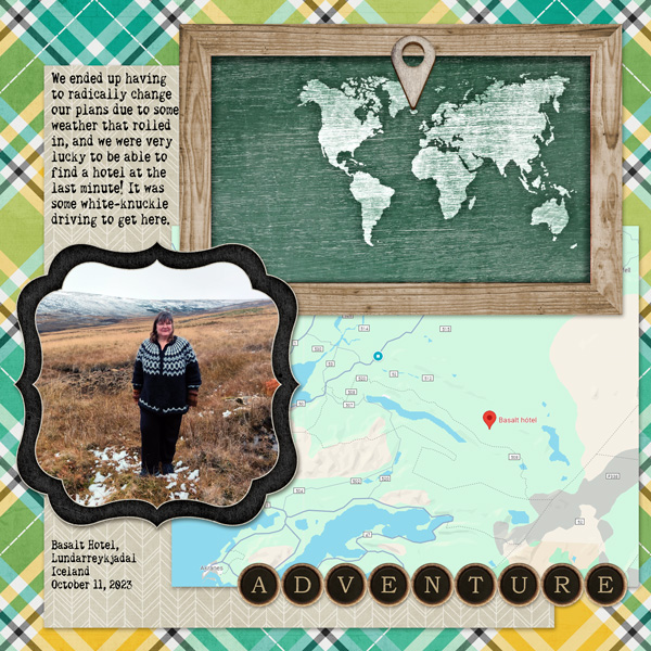
My sister took this shot last summer. It’s hard to see where the edge of the river is in the screenshot, so instead look at the reflections. Another object in the photo that can guide straightening this photo is the spruce tree.

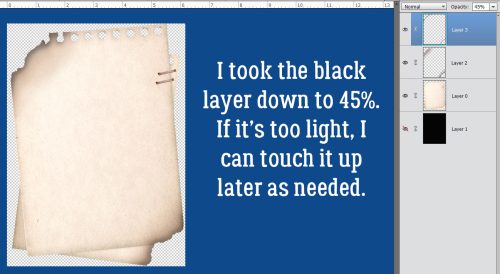
With the turquoise Guide in place, the tilt is a bit more obvious. To create a Guide, click on the top or left edge of the workspace then drag your cursor to where you want the Guide to be.

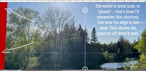
Click on the P key to activate that bubble level. Then click and drag a line using something in the photo as a reference – I used that spruce tree – to tell Elements which direction to rotate the photo. You probably won’t need to go too far off perpendicular to get where you want to go. If it’s still not quite right, click and drag another line.

This is what happens on your workspace. Notice how my click-and-drag line is perfectly perpendicular to the Guide and the reflections on the river are level. I think the developers chose the letter P for “plumb”, and that’s how I’ll remember the shortcut going forward.

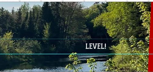
I’ve Zoomed in so you can see more easily how the reflections on the river have leveled out.

The only thing left to do is to Crop the photo inside the red border and Save it for later.

Thank you for giving me grace for taking last week off. Stuff just piled on me all at once. We bought a new car, my husband had a biopsy done, I had some medical testing done, we had company and a birthday to celebrate, AND I had to get some government paperwork squared away. It was exhausting! The good news is hubby’s biopsy was negative, all my tests are good, the wait at Service Canada for my documentation was about a quarter as long as I expected and we’re getting used to all the high-tech gear in the car. Back to normal!


Fresh Baked! April 26, 2024

Happy Friday! I hope you have all had a wonderful week!

Remember if you spend $10 in the store you’ll get this great collab.

Let’s see what we have new this week.

Have are your April challenges? Complete any 10 challenges to get this kit as a reward.

Fresh Baked! April 19, 2024

Happy Friday scrappers. It’s time for the Spring Cleaning Retiring Products sale. This sale runs from today (April 19) through Thursday, April 25 at 11:59 PM Eastern. Note that after this sale ends, all products in this category will no longer be available so grab them while you can. Take a look a the end of the newsletter to see a sampling of some of the retiring items.

Remember if you spend $10 in the store you’ll get this great collab.

Let’s see some of the new items in the store this week.

Have are your April challenges? Complete any 10 challenges to get this kit as a reward.

Tutorial Tuesday (Individual Style)

Challenge Spotlight: Daily Download

Today I have a selection of layouts pulled from the Daily Download Challenge Gallery. There’s a bit of a discrepancy between the Gallery and the Challenge thread in the Forum, so not all of the layouts posted to the Forum are here. Sorry! For those of you who are seeing a Challenge Spotlight for the first time, let me fill you in. On the third Tuesday of each month, I choose a Challenge from the long list of options we have here at GingerScraps and put the Challenge participants’ layouts in the Spotlight. Over time, each of us develops our own particular style, sometimes to the point that viewers know without looking whose layout is on their screen. My comments about each of the layouts I’m sharing will point out something specific that reflects the Scrapper’s Individual Style. What makes a Challenge well-suited for this type of Spotlight is that all participants are working from the same starting point: a kit, template, brush, mask, font, word art or image. Where there are too many variables, a Spotlight is a bit more difficult, but not necessarily impossible. Each of the layouts to come will be linked to the Gallery so you can take a closer look and leave a comment, if you’re so inclined. Just click on the Scrapper‘s user name and you’ll be whisked right to the layout in the Gallery. I chose the Daily Download today; this Challenge requires the participant to use the previous month’s Daily Download kit to create a layout, topic of their choice. Last month’s DD was supplied by Connie Prince and it looks like this:

Now, let’s look at how this kit inspired our GingerScrappers. Up first is makeyesup. She has created a minimalist desktop calendar, with what I think is one of the papers clipped to a grid brush. She has also clipped a coordinating paper to a font to create the month header. It has a bright, springy look.

This is the work of domino44. She’s added a solid white paper (included in the kit but not visible in the thumbnail) to her paper stack to provide her neutral background and changed the wording of the title tag. (I feel like that title needs some context. 😉 ) She’s shadowed the paper doily to perfection!

How eye-catching is that embossed brown cardstock lulumoon has used for her background? Her command of white space is stellar; her single photo is very much the focal point. I like that she clipped the same striped paper she framed her background with to the perforated heart; it pulls the layout together into a complete whole. If you look reaaaallly closely, she’s also threaded the ribbon through one of the heart-shaped punch-outs in the heart.

For her layout, katt chose to keep it simple… the maps, location pin, photo and title all tell the story suggested by her journaling.

Here, photocrazy has chosen patterned papers that read more like solids – I usually do that too! That choice lets all the spring elements draw the eye to her photo of hyacinths in bloom. I need Smellovision©!

I LOVE what austin_kellie has done with her layout! The kit coordinates with her photos so beautifully, and her use of the peeling painted wood paper background is brilliant. Her clusters compliment her photos without taking away from them, leading the eye around the page.

CathyS had me puzzling for a second, then I realized she’d used one of Connie‘s papers clipped to a mask for that cheery background – which I think is a blend of two solids, toning down the brightness of the yellow. Keeping the add-ons to a minimum makes that technique even more effective! I even thought she’d created an out-of-bounds look with the sunflower in the upper left… very skillful use and placement of the elements!

DianeInOz has created a beautiful travelogue with her layout. I think this type of layout is perfect for using bold patterned paper in the background. It holds its own with multiple photos but doesn’t distract. I have to give her family props for travelling at a time when COVID was still a major concern (not that it’s gone, it’s just laying low right now); I’ve only done short day trips by car. I’m too chicken!

Now THIS is genius! Look at how chigirl has turned patterned papers into ribbons, then wove them into a frame for the heart of her layout. Her clusters echo the brightness of her photos, making them pop off the page.

The simplicity of willow‘s layout is its strength. By decreasing the saturation of the green curly ribbon, she’s given it a supporting role. The mask she’s used is absolutely perfect with her almond blossom photo.

Clean-and-simple is how I describe alexandergirl68‘s style here. Her photos are driving the bus! The bright pops of yellow really bring the layout to life.

Pocket-scrapping is great for travel photos, or really, any layout with multiple photos. Kristi Martin‘s sparing use of embellishments keeps the layout crisp while the pops of yellow add warmth. The addition of white borders on all her paper blocks is intriguing. I may have to borrow that…..

To round out our baker’s dozen, this layout from trinanne puts a huge smile on my face. I’ve mentioned before that one way to achieve cohesion when your photos don’t quite work with your chosen kit is to convert them to black and white. I might have tried to keep the bunny ears in full colour, though.

There won’t be a Tutorial Tuesday post next week. I have some stuff going on that will need my attention. Details to follow…

Digital Scrapper Classes!

The best place on the web to learn digital scrapbooking.
GingerScraps has teamed up with Digital Scrapper Classes (QwikLearn) to bring you easy and affordable online classes for digital scrapbooking.

Professional & Complete

Includes videos & step-by-step manuals.

Self-Paced

You decide when to start and when to stop.

Versatile

Learn online or offline with all-in-one downloads.

Grow Farther

Private forums, public gallery, no designer restrictions.

Guaranteed

Forever Access + a 30-day Money Back Guarantee!


Learning and creating has never been more fun!

Find a Class for Everything You Need & Want to Learn


Learn the Best Scrapbooking Software for Digital Scrappers
Learn Photoshop and Photoshop Elements fast and frustration-free!
Save 15% on QwikLearn (for PSE)

Save 15% on QwikLearn (for PS)


Discover the Secrets of Beautiful Scrapbook Pages
Experience the delight of creating classically-designed scrapbook pages you’ll be proud to print and share.
Save 15% on Design Beautiful Pages (for PSE/PS)


Master Selections
Harness the power of the Selection tools with confidence and ease. Selections 1:
Master the Basics (for PSE)
Master the Basics (for PS)
Selections 2:
Powerful Selection Techniques (for PSE)Powerful Selection Techniques (for PS)


Create Amazing Scrapbook Page Templates
Breathe life into your scrapbook albums by designing and using fresh-looking templates.
Shape-Up: Layered Shapes (for PSE/PS) & Delightfully Die-Cut (for PSE/PS)
Scrap It Now Vol. 3, Masks Edition (for PSE/PS)
See All Template-Based Classes


Master the Type Tool
Travel beyond simple page titles by utilizing the powerful features of the Type Tool.
Secrets of Terrific Type (for PSE/PS) & 10 Timeless Titles Vol 1 (for PSE/PS)
See All Type-Based Classes

Transform Your Photos
Don’t let your underexposed and lifeless photos ruin a perfectly good scrapbook page.
Next Level Editing: Part 1 (for PS Only) & Next Level Editing: Part 2 (for PS Only)

An Eye for Edits (for PS/PSE)
See All Photo Editing Classes

Fast & FREE Learning for Digital Scrapbookers


Free Online Classes
Get the basics of Procreate, Photoshop Elements or Adobe Photoshop for FREE!

Page Builder Series, Vol 1 (for PSE/PS)
Intro to Procreate (for Procreate (for iPad)

Free Quick Video Tutorials
Digital Scrapper’s blog contains hundreds of free tutorials based on brushes, filters, shapes, gradients, and more!
Free Quick Brush Tutorials (for PSE/PS) & Free Quick Filter Tutorials (for PSE/PS)
See all Free Quick Tutorials

Fresh Baked! April 12, 2024

Happy Friday! Are you ready for another great batch of Fresh Baked goodies?

Remember if you spend $10 in the store you’ll get this great collab.

Now for the fun new kits in the store this week.

Have are your April challenges? Complete any 10 challenges to get this kit as a reward.

Tutorial Tuesday (Photoshop Elements)

A Little Crisp Around the Edges

PDF Version : https://bit.ly/3JeXrGz

Today’s tutorial is, once again, pulled from the GingerScraps Challenges. When I started thinking about how I’d meet the criteria for the Inspiration Challenge, which is to create a junk journal page, I started imagining how I could use the lyrics from one of my current favourite Lainey Wilson songs. They resonate with me on a lot of levels – although I don’t really think I’m a redneck. The chorus goes like this:

If I look a little drunk, it’s ’cause I drank some;

If my neck’s a little red, it’s ’cause I am one.

Heaven’s where I’m gonna go, the Bible says so on my shelf,

But if I smell like smoke, it’s only ’cause I’ve been through hell.  

So then I was thinking about how to really sell it. And I came up with the idea of altering an element to look like it’s been singed. I ran with it! Let me show you how I “burnt” some paper. I used this stack from Aimee Harrison’s The Work in Between – which is part of a mega-collab kit created by Aimee, Cheré Kaye, Cindy Ritter and Connie Prince. (Click their names to see their kits.) The collab is an ideal choice for junk journal pages; there’s a goldmine of ephemera in there. As you can see in the screenshot, I’ve dropped a blank layer with a transparent background underneath it. You’ll see why in a bit.

First step is to “tear” the area of the paper that will have the scorch marks on it. I Zoomed in on the upper left corner of the papers and chose the Eraser Tool. Set with a hard, round brush from Elements’ Basic Brushes, about 30 pixels in diameter and full strength Opacity.

I just nibbled away at the corner of the paper, with some sharper and some rounder bits. It’s not going to be perfect.

Now you can see why I put that layer under the paper. As much as I’d like to think I got it all when I was removing the corner, with very little contrast between the paper and the background, it’s hard to be sure. And leaving the odd little bits there would show up later, and not in a good way. So I dumped some black into the bottom layer with the Paint Bucket.

That made it really easy to clean it up.

I decided the opposite corner would be another good place to scorch my paper. Fire will spread to the bottom sheet in this arrangement, so I “burnt” both.

It doesn’t look quite right to me.

Easy enough to fix!

Time to play with fire! If you think about how paper burns, it changes colour first, as heat spreads through the fibers in the paper, taking on a brown tinge. So I chose this as my first scorching colour. The hex key is #883102, if you’d like to just type it in.

After I turned the black background layer off, I chose the Brush Tool, set to a SOFT, round Basic Brush at 300 pixels and 35% Opacity. It’s a good place to start, and allows for adjustment later. The Basic Brush set is one of the Brush collections that is included in Elements when you install it. To see what Brushes you have, click on the thumbnail – the squiggle with the little triangle to its right – and the list will open up. To locate the one I’m using, click on Basic Brushes, then scroll down past all the hard-edged ones until you get to the soft ones. The thumbnail will look like it fades from the centre. That’s what you want.

Say it with me… ALWAYS PUT BRUSHES ON THEIR OWN LAYERS!!! If you were to just run a Brush over the edge of the paper ON the paper layer, there’s nothing you can do to adjust that Brush that won’t also affect the rest of the things on the layer. So **BRUSHES ALWAYS GO ON THEIR OWN LAYERS**. Now, I simply ran the Brush over the edge of the paper as shown. It’s fine that there’s a mess in the background. It’s temporary.

With the same Brush active, I dropped the Opacity to 17% and dragged the Brush over the edges again, this time not overlapping the background too much. This step deepens the scorch closer to the actual burnt area.

To further deepen the singe look, I changed my foreground colour to the darkest brown in the same family of orange-brown. The hex key is #010000.

This time I made no changes to the last Brush settings and brushed over the edges again – this time with MORE of the brush OFF the paper.

See how the colour blends and fades? That’s exactly what I was trying to achieve.

Smoke show time! I used the same process as before, the same Brush but with different settings: 150 pixel diameter and Opacity at 57%. **…** The black Brush goes on its own layer.

Now to clean up the background. Select the edges of the paper stack. You can click the Select tab and then Select All, or you can CTRL/CMD>click on the paper layer’s thumbnail. That’ll turn on the marching ants.

To make the areas NOT inside the paper the active bit, Select>Inverse or CTRL/CMD>ALT/OPT>I. Don’t forget this step!!

With both the brown and black Brush layers active, to remove the brushed area that spilled over the edge of the page, Edit>Cut or CTRL/CMD>X.

And like magic, all that spillover is gone.

So I adjusted the Brush layers. The brown one drops to 47%.

The black Brush layer dropped to 45%. It looks pretty darned good!

As my faithful readers know, I can never just *be done* so I went ahead and used a tiny, soft, round black Brush to add a little more dimension to the spot where the two sheets of paper overlap. It’s a subtle thing, and totally unnecessary, but I did it anyway. I changed the Blend Mode to Multiply so the paper underneath shows through better, and lightened it to 29%. Now I’m happy!

Lyrics credit: Derek George, Lainey Wilson, Lynn Hutton and Monty Criswell.

Now, I have a question for you… As you can see, I’ve changed the Elements background to blue. Is it easier to read the text on the blue, or do you prefer any of the various shades of gray that are options?

Fresh Baked! April 5, 2024

Good morning everyone! It’s hard to believe we’re already at the beginning of April. Our temperatures have been crazy this week. 85° F three days ago and 55°F yesterday.

Remember if you spend $10 in the store you’ll get this great collab.

Let’s see the new items we have in the store this week.

Have you started on your challenges for April? Complete any 10 challenges to get this kit as a reward.

GingerScraps: April Buffet

Welcome to the April Buffet. Did you have fun with the No Joke sale? This months buffet will run from April 3-7.

Remember if you spend $10 in the store you’ll get this great collab.

Don’t forget to check out the Buffet Bundles. One easy click to add bundles of Buffet goodies to your cart.

Let’s see what is in the buffet this month. Remember that you can combine any of the buffet kits to make your own collection.

Have you gotten a jump on your challenges? Complete any 10 challenges to get this great kit as a reward.

Tutorial Tuesday (Dingbats)

Inspiration for the April Scraplift Challenge

I’m very literal (I know, I say that ALL the time) when it comes to the Scraplift Challenge. If I like a layout enough to emulate it, I’m gonna EMULATE it. So I was looking at the April 2024 Scraplift Challenge last night and what resonated with me was the abstract drawing Alexis used for her no-photo sample layout.

Then I started thinking about what I could use to emulate it. Do I have any doodle drawings in my stash? Will they work? What else could I use? And just about the time I fell asleep, it occurred to me that maybe using a dingbat could be an option. So I pored over the dingbat section at dafont.com and I found a few you might like. All the sets I’m showing you are 100% free for personal use; the bold name of the dingbat (font) is a direct link to the download. Let’s take a look.

First and most closely related to the image above is this collection called Woman Faces. Don’t be fooled… there are a LOT of options with this set that wouldn’t fit into the screenshot. 236 different glyphs, to be exact! Many of them are line-drawings, so very suitable.

If you like a less formal effect Cartoonabha might work for you. This one comes with 66 different options. some of them are very expressive!

This set contains the 12 constellations that make up the Zodiac. If you’re into that kind of thing, Constellations Ostia could provide your non-photo focal point. Or you could use the glyphs as background stamps.

The Goddess gives off a bit more of an esoteric vibe. There are 30 options in this one; the letter X is a fairy!

Art Nouveau Flowers offer a lot of possibilities. They can be filled with the Paint Bucket, Styled to look like wrought iron or lead, have papers clipped to them, or just be left as is.

For a more whimsical take, Country Cuties is your friend. Mostly line-drawn, there are some sweet kittens, cutie bears, a frog, and that hilarious pig.

For the Disney fans, there’s Disney family 1, with all the usual suspects represented.

If you’re more of an old-school Star Wars gal, check out Lucas characters. No Grogu… so if you’re looking for him, skip this one.

These Vintage Mixed vol1 dingbats remind me of print ads from the 60s. There’s even an image of Fred Astaire and Ginger Rogers for elegance. The pointing finger could work for quite a few topics, don’t you think?

I just love the gossipy image! Vintage Mixed vol2 has even more retro images; I think my fave is the cartoon bride and groom on the run.

If you’re in the Path of Totality for this month’s solar eclipse, this set called Galaxia might have something you could put into a photo-less layout. Or you could use the drawings for a border.

These just made me laugh. Smile 2 Me has a huge assortment of expressions; I love the one flashing a peace sign.

From the ridiculous to the sublime… Caligrafia Divina strikes a more elegant chord. The dragon is fabulous.

And last, since we do Takeout Tuesday at my house, there’s a food set called LMS Junk Food Junky. (Of course!) I could see myself creating a layout and calling it In Praise of Pizza.

I had one more for you but for some reason WordPress isn’t allowing me to attach an image of it. I’ve tried several different tricks and failed……… It has a selection of fairy tale images in it and is called Once Upon a Time2.

If you’re not sure you see anything you like, check out the other dingbats at dafont.com. There’s something for everyone there. These are just my picks for what would work as line drawings. (I won’t tell you how many I downloaded today. 😉 )

Before I let you go, I should explain how to use these dingbats as line drawings, shouldn’t I? Install your dingbat set; they take a little longer to install than say a script font, because of the added details. Then open Elements. Dingbats are essentially fonts, so the Text Tool will let you see what’s in the set. I usually run through the alphabet, looking at which image is attached to each letter. For this purpose, I’d use a huge size, like 200 pts. Then I’d Simplify the text (image) so it can be manipulated. Now it’s resize-able to whatever will work best. And then I’d work my layout into the canvas.

For sets that have additional glyphs you can’t access via the alpha keys, check out this tutorial Unlocking the Secret Extras in Your Font Files.

This might be fun!