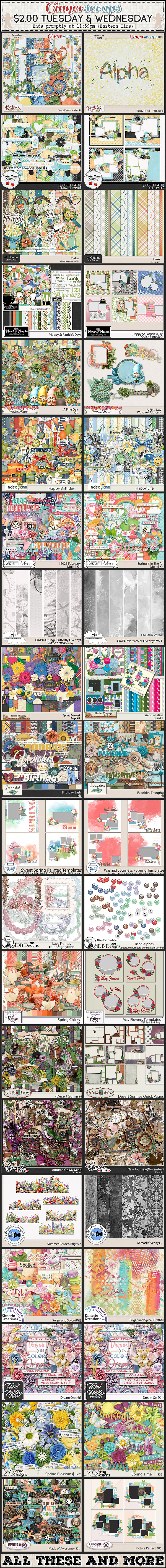
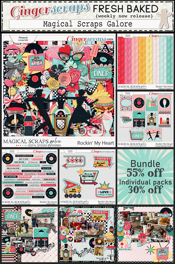
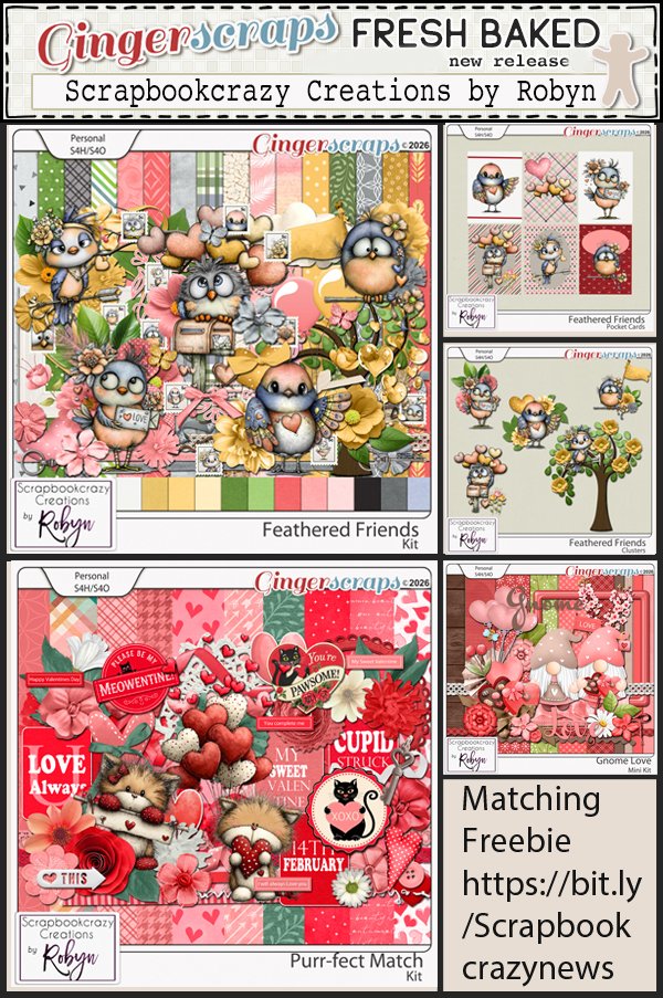
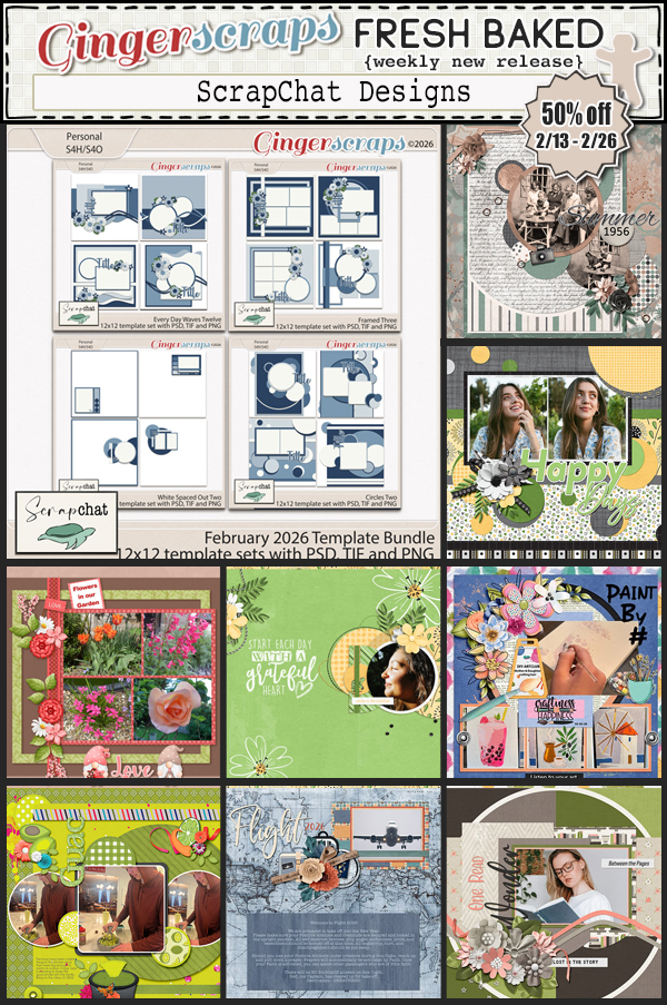
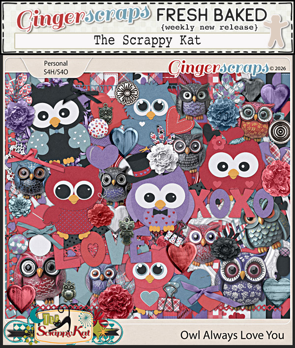
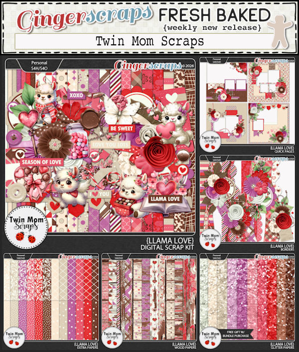
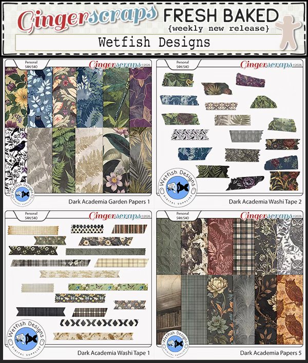
$2 Tuesday Is LIVE + Scrap-A-Thon Is Happening NOW!
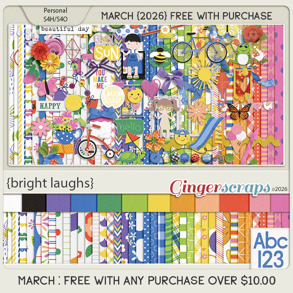
Happy $2 Tuesday & Wednesday, scrappy friends! If you love a good deal (and really, who doesn’t?), this is your moment. Our $2 Tuesday & Wednesday sale at GingerScraps is live and packed with amazing goodies ready to jump into your cart for just two dollars each. It is the perfect excuse to grab a few new kits, templates, or papers and give your stash a happy little boost.
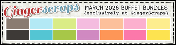
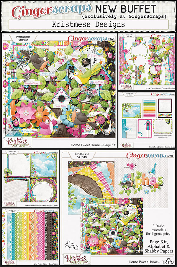
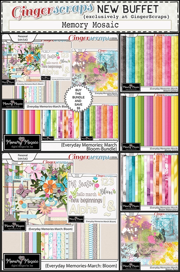
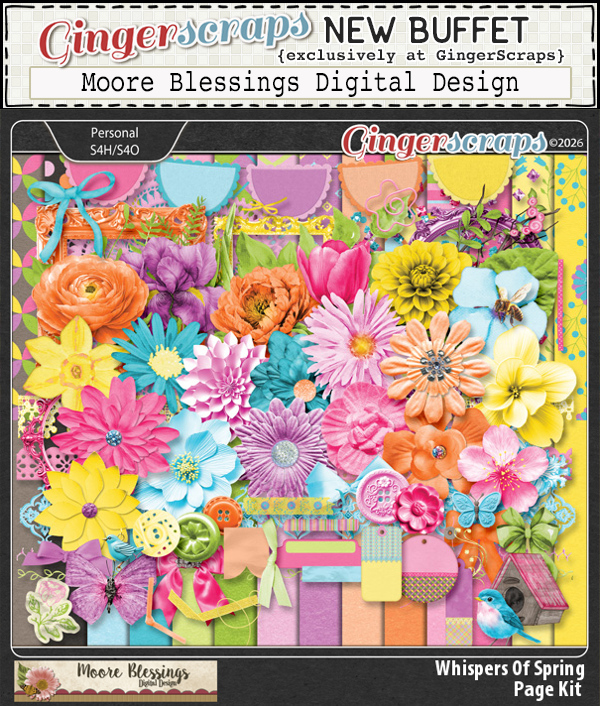
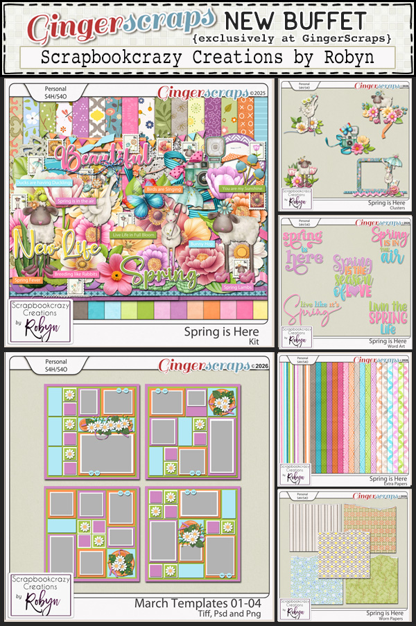
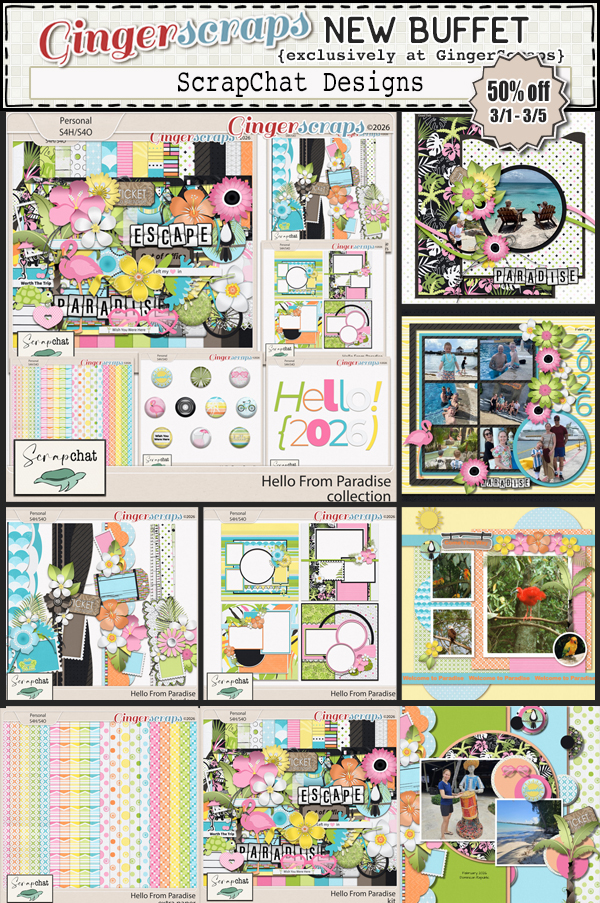
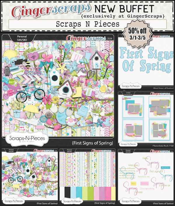
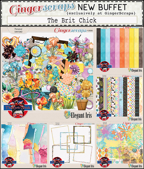
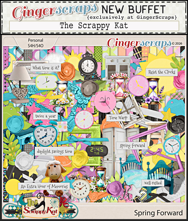
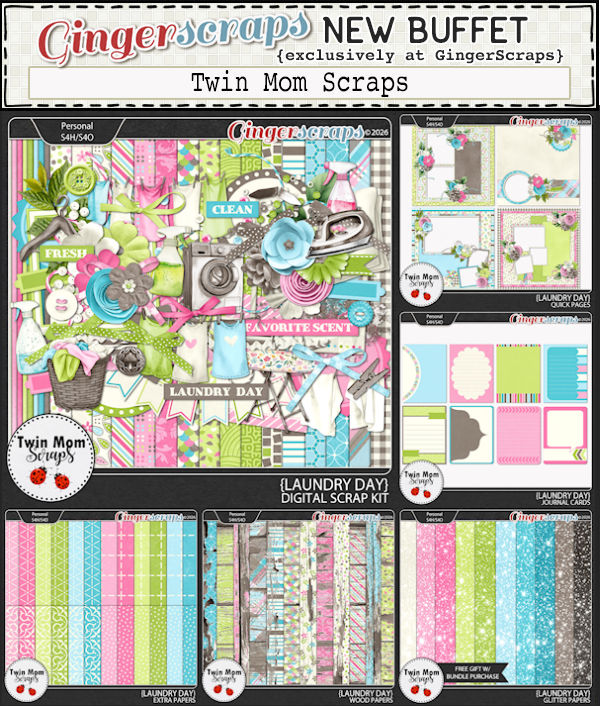
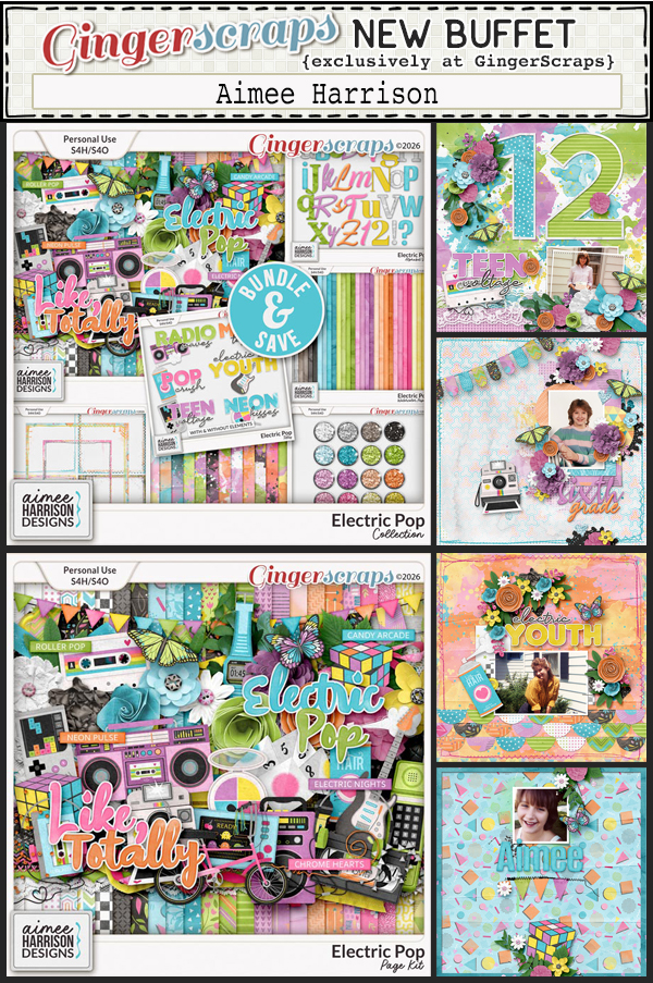
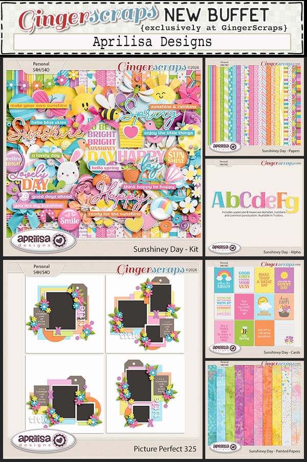
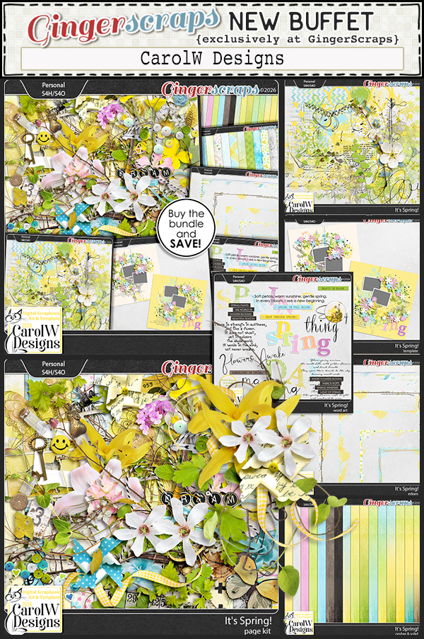
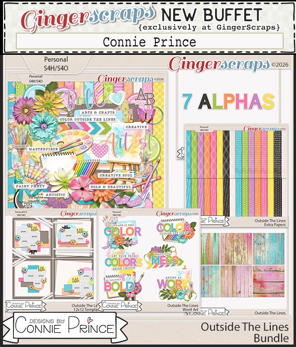
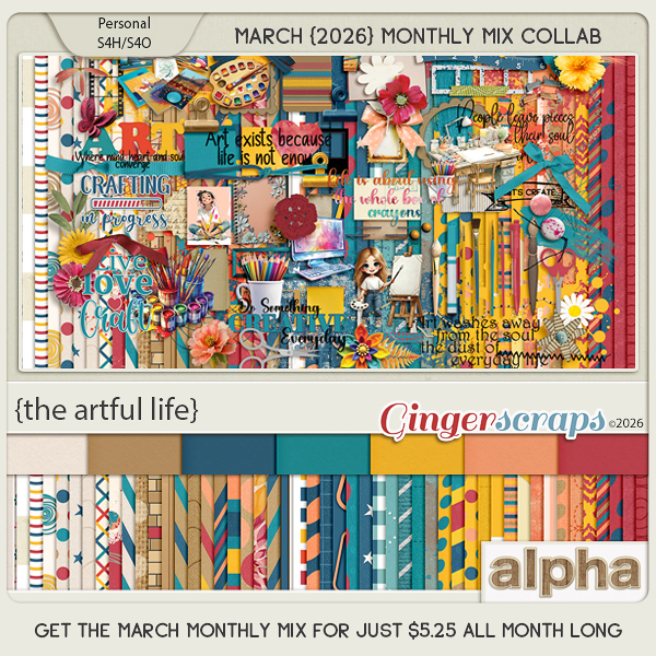
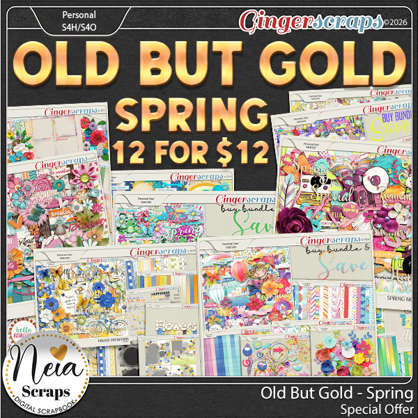
And wait… there is more scrappy goodness! The March Buffet is officially live and on sale for 50% off through the 5th. You know how much we love a good coordinating collection, and this month’s Buffet is packed with mix-and-match pieces that make page building a breeze. Half off is the perfect time to grab the full set and let your creativity run wild.
And the fun does not stop there… our Spring Scrap-A-Thon is happening ALL month long right now! March is filled with creativity, encouragement, and tons of inspiration in the forum. There is no pressure and no competition, just a wonderful community scrapping together at their own pace using our Monthly Challenges as the guide. Complete challenges, earn rewards, cheer each other on, and soak up all the motivation that comes from creating alongside friends.
Between incredible $2 deals, the March Buffet, and a full month of Scrap-A-Thon excitement, there has never been a better time to jump in and start scrapping. Let’s make March amazing!