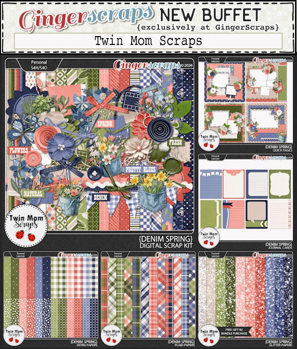
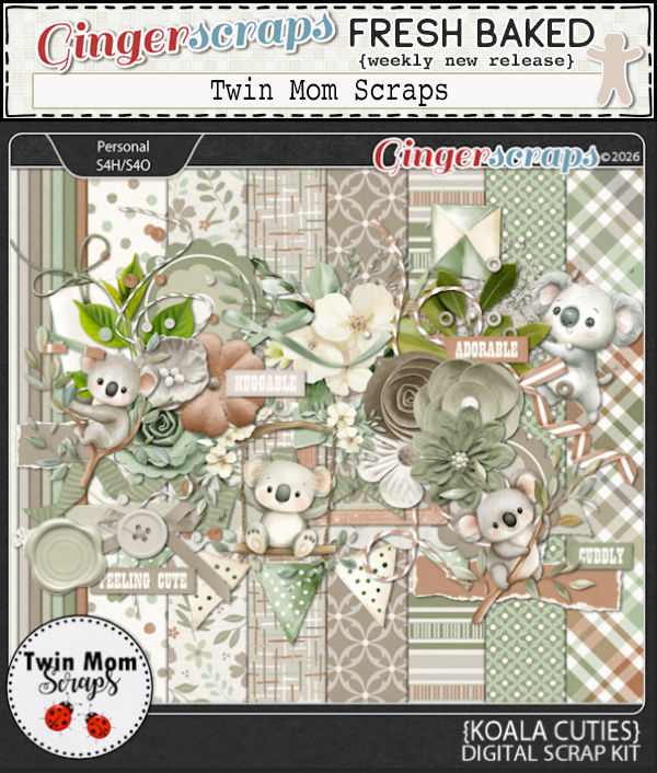
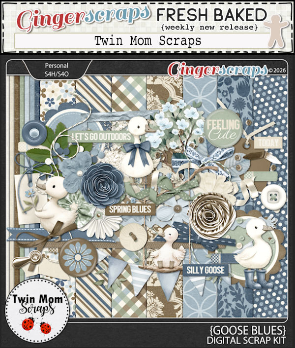
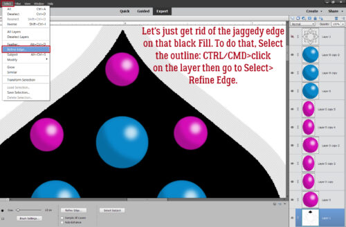
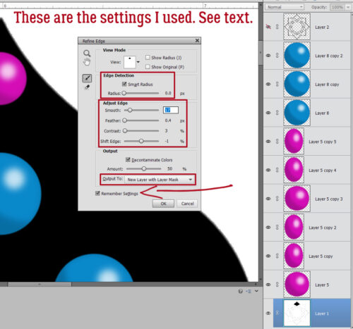
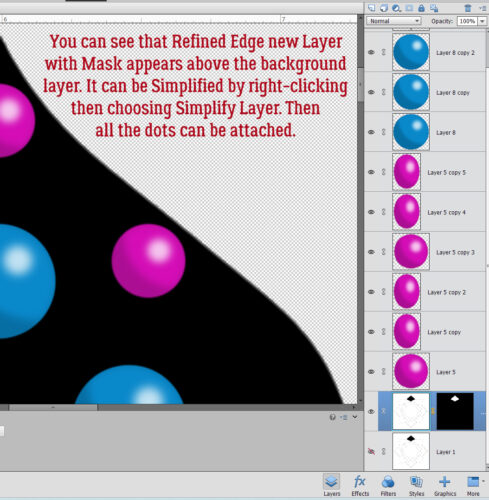
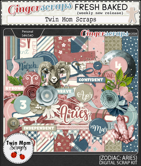
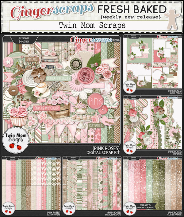
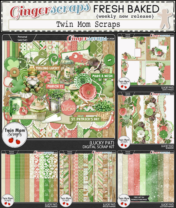
Twin Mom Scraps!
Before I get started I’d like to apologize to Rebecca (Twin Mom Scraps) for the great delay in getting this port written. It’s been rather chaotic chez Jan et al the last week or so; every time I sat down to compose my thoughts, somebody or something interrupted me. And my new glasses are… not right. I have another appointment tomorrow to get that sorted out. 🙁 Anyway…
If Rebecca seems familiar, it’s because she’s a Spotlight frequent flier! Here’s something you might not know about her: her mom Lydia was the lead Sugar Cookie for a long time before her health led her to step down. She was also my friend. Lydia left this world 2 1/2 years ago and she’d dearly missed. Now, onward!
J: Rebecca, how nice to see you again! What wonderful little snippets do you have to share with us this time? Given that I’m way behind with this conversation, tell me how you keep track of all the things, between designing, personal life, and other commitments?
R: Lists! And more lists! I use a google calendar which keeps track of all my recurring responsibilities, upcoming deadlines, etc. It has really helped keep me organized.
J: I use lists too, but for some reason, my process has fallen apart. Good for you staying on top of it all! So, tell us about your favourite part of seeing our GingerScrappers using your designs?
R: I love seeing the versatility of my designs in layouts. It’s flattering to see a really beautiful page!
J: I like thinking outside the box with my scrapping, (not that I’ve done much of that lately!) and using kits for layouts that are really off-theme. It’s fun! When you’ve finished a big collection, do you have a ritual celebration?
R: Nope! I start the next one!
J: I’ll have to start calling you Queen of Hustle! 😉 What do you do to unwind from all that busyness?
R: Some eyeball reading on my beloved Kindle!
J: Me too! My Paperwhite is starting to show ghosts of books past on the screen behind books present, but I don’t want to replace it yet. I like it because it fits in my purse. Do you have anything… unusual in your purse or pocket?
R: A painted rock – I found it the morning after my Dad passed away, and have carried it with me ever since.
J: That must bring you a lot of comfort. I remember when your dad passed. I don’t have anything sentimental like that in mine, but I do have a screwdriver and a multitool. 😀 I like to be prepared. My dad loved pizza, so whenever we eat it, I think of him. That’s my painted rock. 😉 Do you have a specific comfort food for those moments when you really need to feel better?
R: Really, anything sweet!
J: A gal after my own heart! But I’m trying to keep my hemoglobin A1C in the green zone, so I’m cutting back. I think it’s working, because I’ve lost 17 pounds. What would you choose if you could only eat one food for the rest of your life?
R: Probably pasta
J: I love pasta too, but I don’t think I could eat it every day. Did you know that if you chill pasta before you eat it, then reheat it, the carbs aren’t as readily converted to sugar? PSA for the day, <snicker> I need some new clothes; do you have an outfit or item of clothing that you’d be happy to wear every day?
R: I’m happy as long as I’m wearing flip flops.
J: SAME! We had a really mild winter and I’ve been wearing mine for a couple of weeks already. It messes with my brain to be outside with bare feet this early in the year, but I’ll cope. It’s been a lot of fun taking note of all the early migratory bird arrivals. I’ve been a birdwatcher for my entire adult life, and I’m learning to identify bird sounds too, using the Merlin app on my phone. Is there a hobby that you’ve always wanted to try but just haven’t yet?
R: I would love to learn how to make pretty soaps…I get stuck watching videos on Tik Tok and it’s so relaxing
J: I watch card-making videos on You Tube while I’m brushing my wheaten terror (not a typo) and the two together really relax me.
R: I would definitely switch places with one of our dogs…they are living their best life, like they pay rent
J: Right?? Well, I’m not going to keep you yakking because I know you’ve got irons in the fire. I’m going to fill our readers in on all the big plans for your Spotlight month (what’s left of it) but first, I want to wish you an early Happy Birthday! Now, back to business…
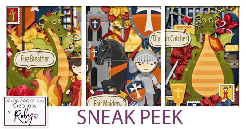
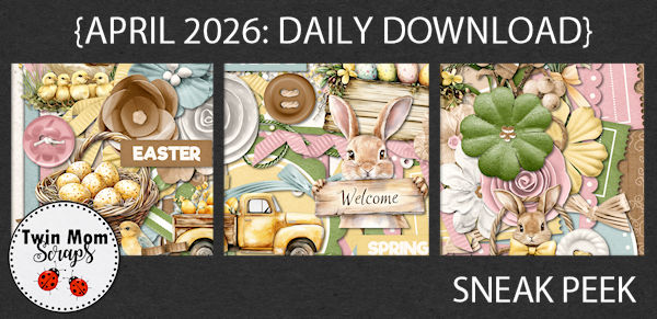
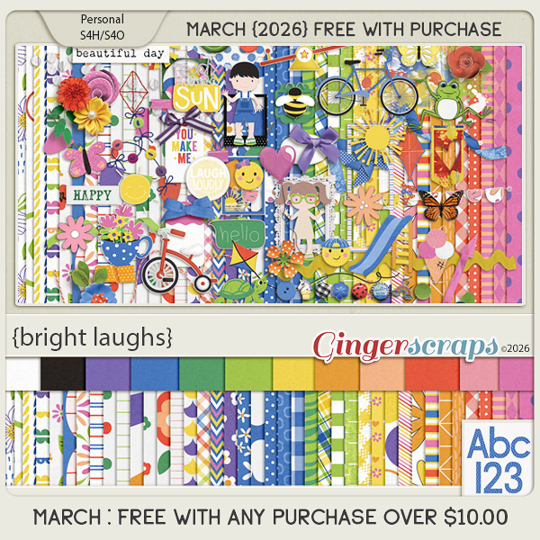
Rebecca is, of course, the provider of this month’s Daily Download. Here’s a sneak peek.
She’s so generous, she also has a Fan Club Freebie on Facebook! Click on the link!!
But wait!! There’s more! Because in addition to her regular Memory Mix Up Challenge, she’s also hosting this month’s Designer Spotlight Challenge. And if all of that isn’t enough…
ANDDDDDDDDDDDDDDD!
Sp what are you waiting for?? Go shopping, get scrapping!!
![]()