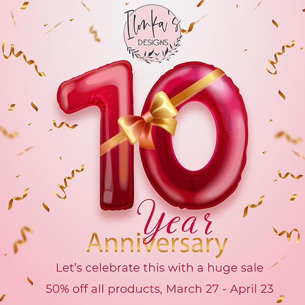
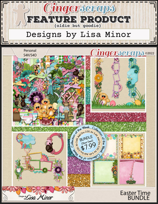
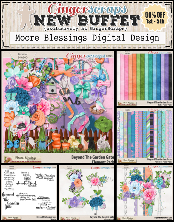
Did you get all the goodies you wanted during that huge sale? Now it’s time for the April Buffet.
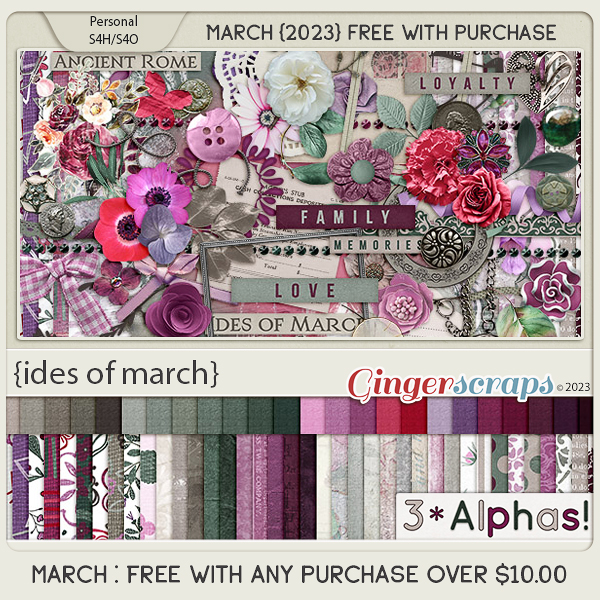
Remember any $10 spent in the store gets you this great collab.
Don’t forget to check out the Buffet Bundles. One easy click to add bundles of Buffet goodies to your cart.

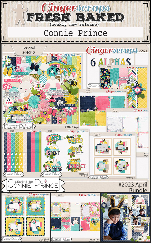
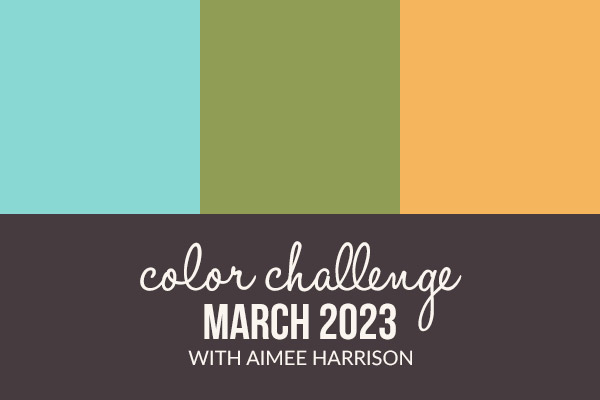
I love the spring hues of this month’s buffet! They just make me smile!


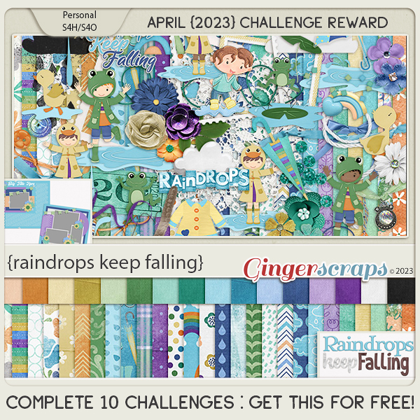
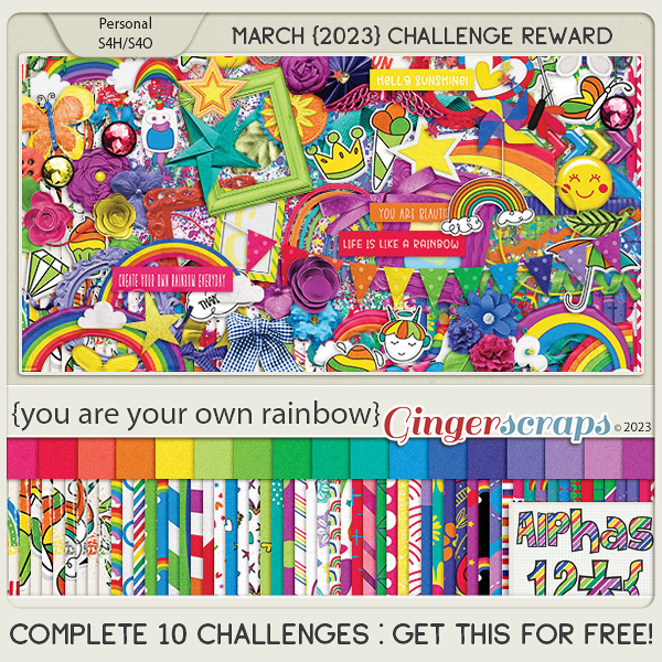
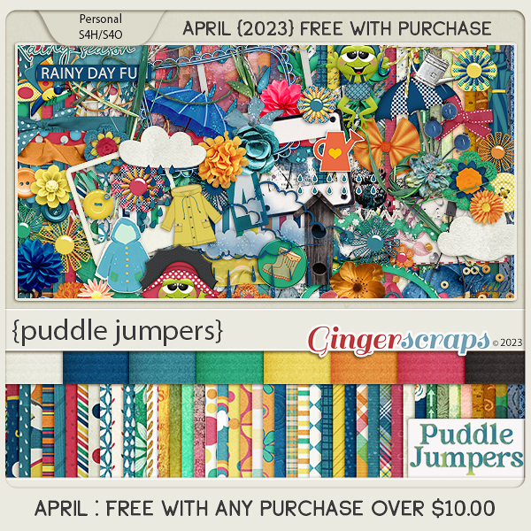
Have you gotten a start on the challenges? Complete any 10 challenges and get this kit as a reward.