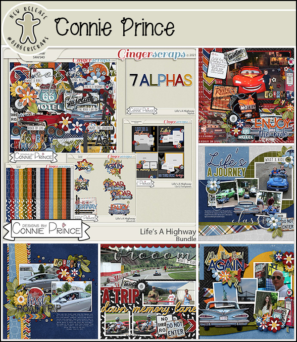
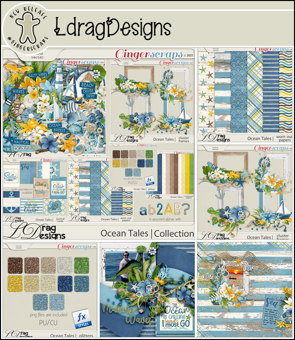
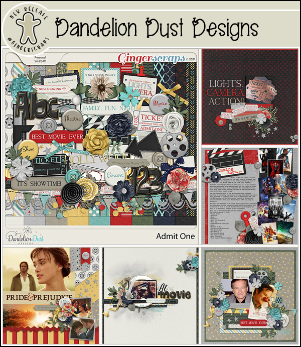
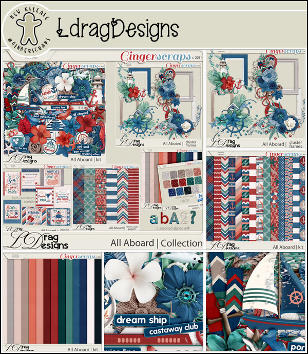
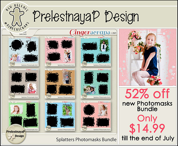
How Can I Run an Elements+ Script on a Template?
![]()
I found this Forum post from DianeInOz that referred to a previous Blog post where I mentioned I’d had to upgrade my Elements+.
After reading a recent GS blog post, I discovered the elements + add-on and downloaded it! I have been playing all morning and searching everywhere, but I am having trouble. When I run scripts (lets say “torn edges”) and I click on a layer (say a single photo), open the script box, hit run. It runs the script on the whole layout instead of just the one layer so the edges of the 12×12 layout look torn, but the photo layer is just the normal photo.
Does anyone know if these scripts can be done on just one layer in a layout??!?
What a great question! Right away my wheels started spinning and I had to try something that I thought might work. And it DID! So I’m going to show you all what I did and hopefully it’ll help Diane too.
In my example I’m using a template from Aimee Harrison‘s Singular V.2. I’m intrinsically lazy, so if there’s a quick work-around, I’m going to find it.
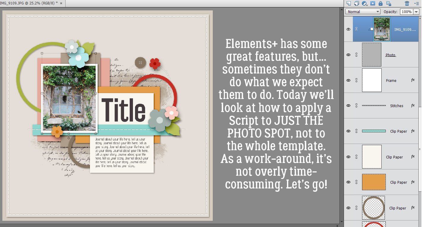
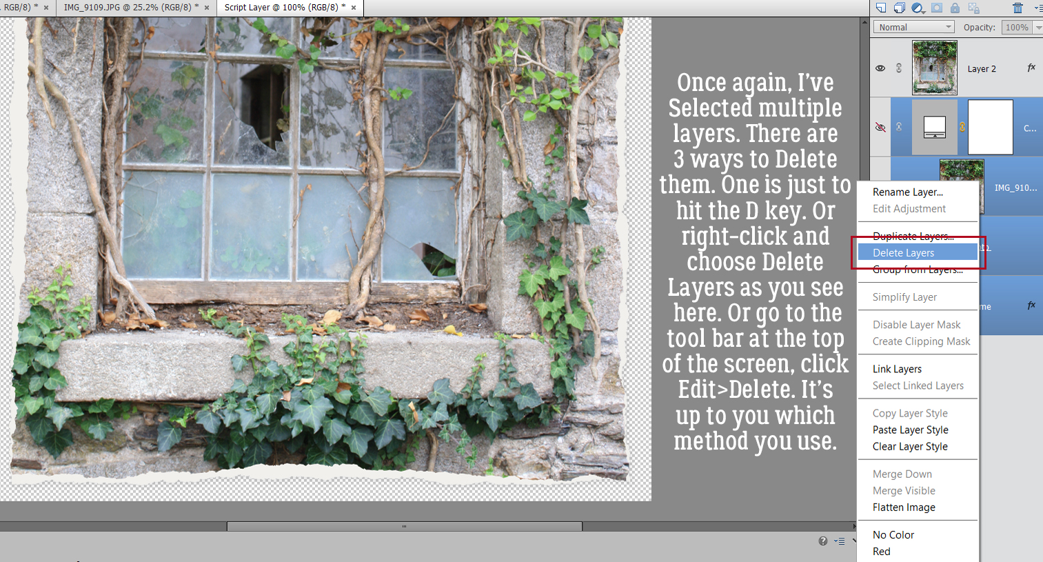
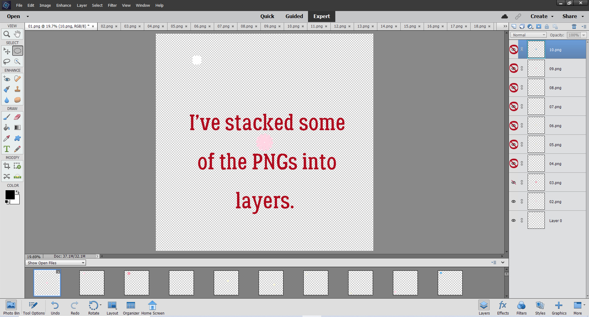
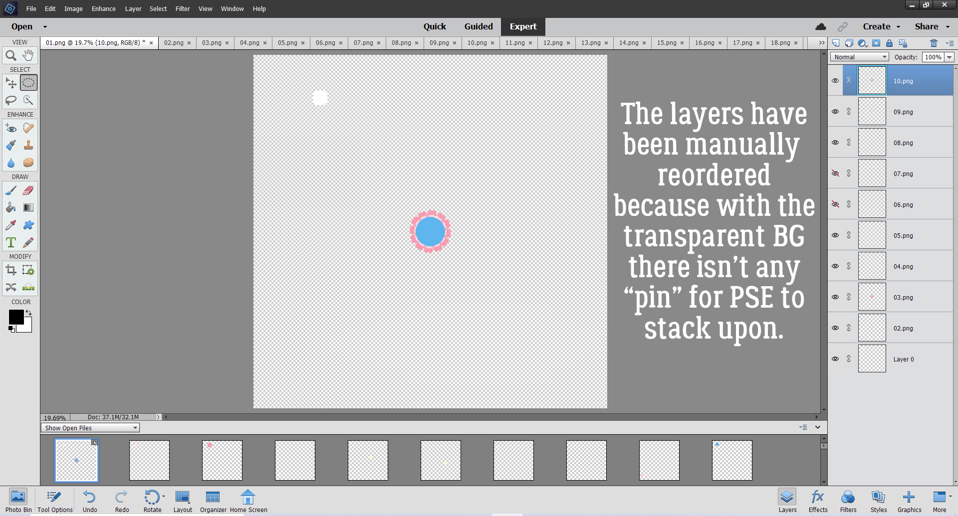
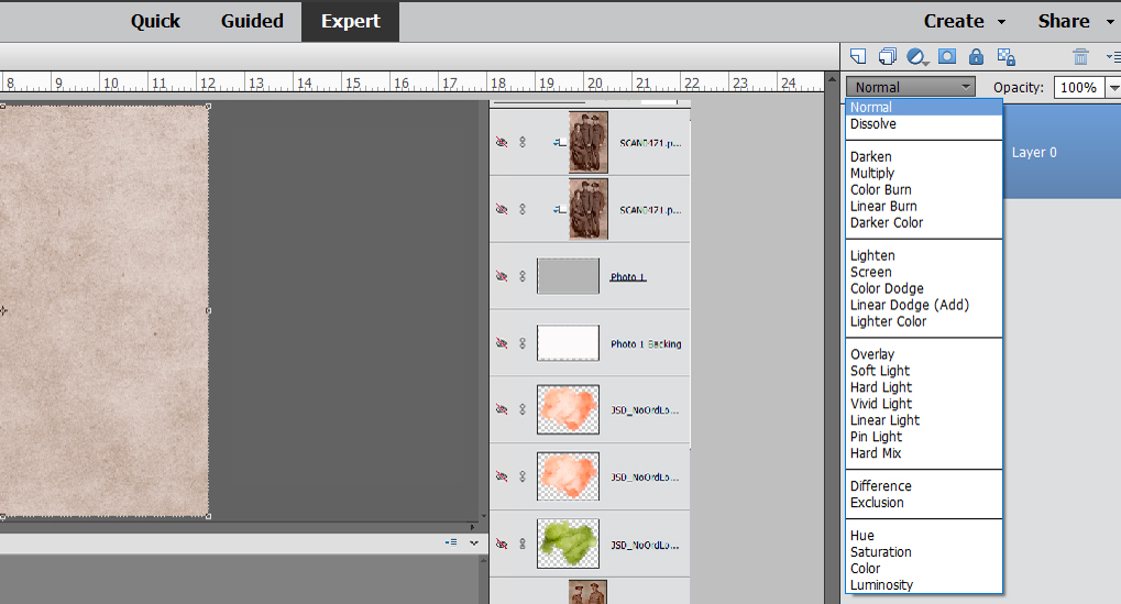
After I clipped my photo to the photo spot so I’d have a frame of reference, I selected the three layers that make up the photo spot. When you want to select multiple layers that are all stacked one on top of the other like these are (or are in side-by-side order in a folder, for example), hold down the Shift key, click on the first layer then on the last layer. All the layers in between will show a blue flag in the Layers panel as shown. [If you want to select multiple layers or objects that AREN’T stacked or in order, hold down the CTRL/CMD key and click on each of the things you want to select.] Next I’m going to Duplicate the three photo spot layers. There are 2 ways of doing this. One is to right-click then choose Duplicate Layers… and the other is using the tool bar at the top of the screen, click on Layer>Duplicate Layers… Which one you use is up to you.

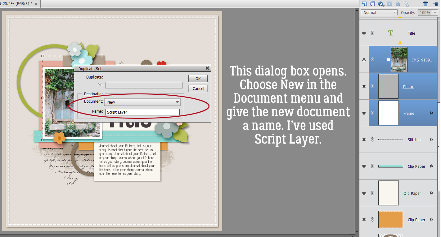
This dialog box opens up. Select New from the Document menu and give it a name (or don’t – it’s all up to you). I named my new document Script Layer.
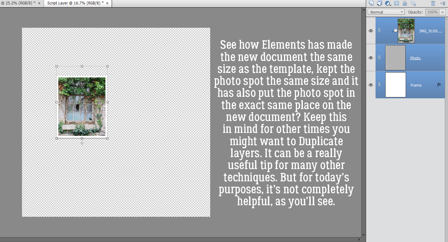
And here they are! As you can see, Elements has created a new document the same size as the template, it’s kept the photo spot layers the same size as on the template, and put them in exactly the same place. This might be a valuable thing in another situation (like creating a title that will fit exactly in the spot designated for it) but for this purpose only keeping the photo spot layers the same size will be a time-saver.
Here’s where the let-Jan-do-the-experimenting-so-you-don’t-have-to aspect comes into play. When I just ran the script on the new document, it put the torn edges around the 12×12 background. Not what I want. So I tried Cropping the new document down to the very edges of the photo, on the photo layer itself.
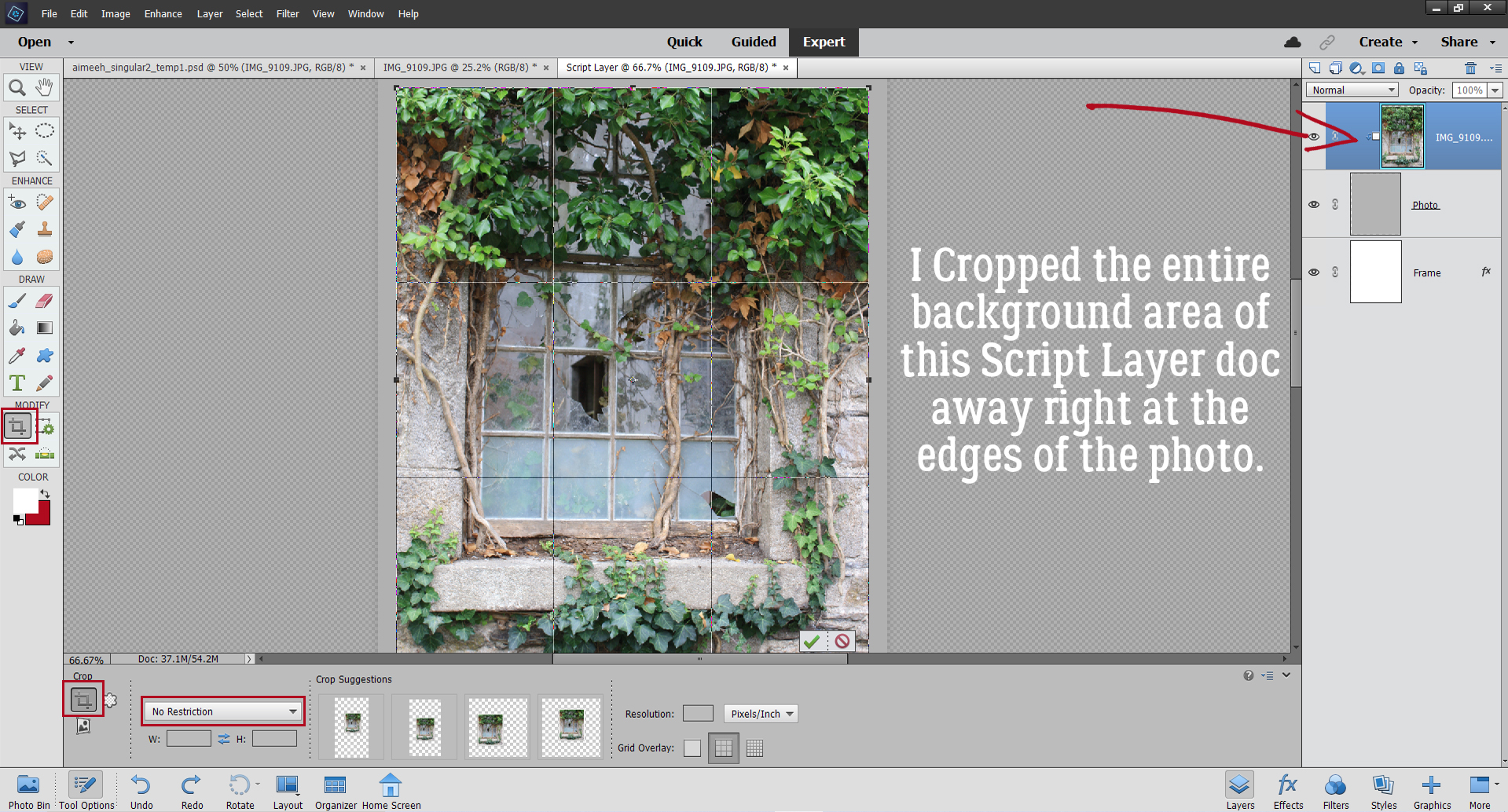
Now on to the fun part! When you install Elements+ it embeds itself into the Elements menu so you can find it quickly. Click on File>Automation Tools>e+ Scripts.
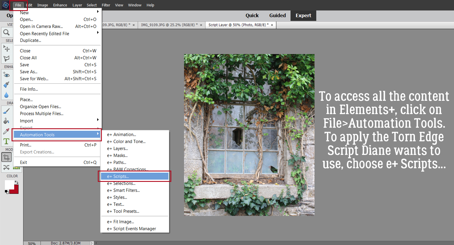
To find the Torn Edges Script, click on the pull-down menu bar to select Edges. This menu opens and Torn Edges is near the bottom. Select it, and click on the green, rightward-pointing arrow as shown. Stand back and let E+ do its magic!

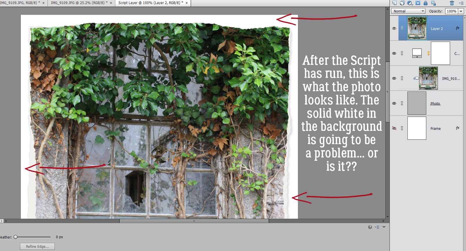
After the Script has run, this is what it has done. That solid white background might present a problem. Time to do a bit more experimenting….
Okay, I’m back. Problem solved. Onward and upward!
AHA! I can turn the visibility for all but the Copy layer E+ created of my photo, with the torn edges preserved. That means they can be Deleted.
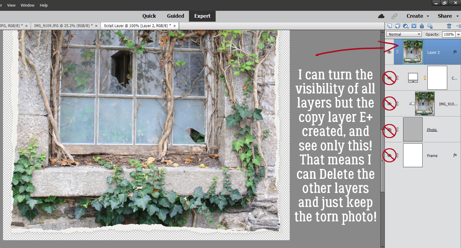
So I did just that!
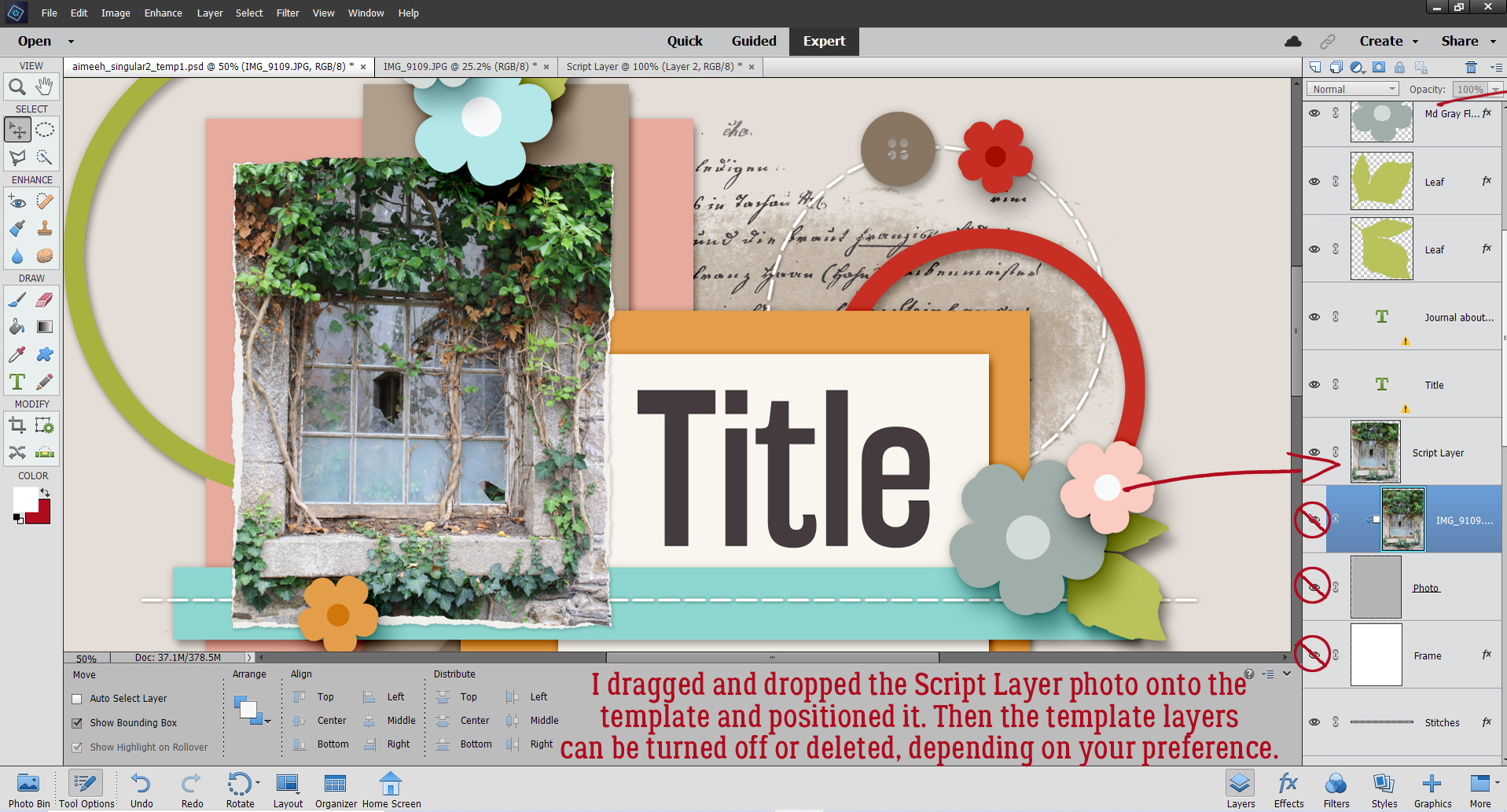
All that was left was to move the new torn-edges photo onto the template. With the original photo spot still in place, it’s just a matter of positioning the Script Layer photo and either turning off the photo spot layers or Deleting them. Another choice that’s left to you.
This tutorial only looks at a single Script. But it has applications for other purposes too, so don’t be afraid to try it if what you want to see isn’t what you’re getting. Have fun with it!
Next week – God willing we’re not under wildfire evacuation – we’re ironically enough going to play around with digital wood burning. Meanwhile, I’m praying for more rain.
PDF Version: https://bit.ly/2VYjP1U
![]()


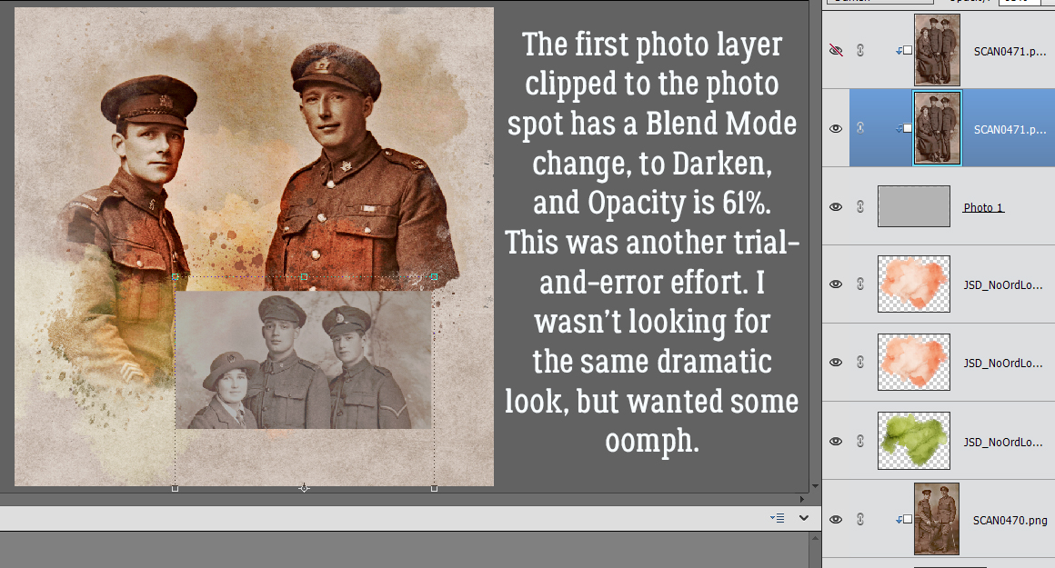
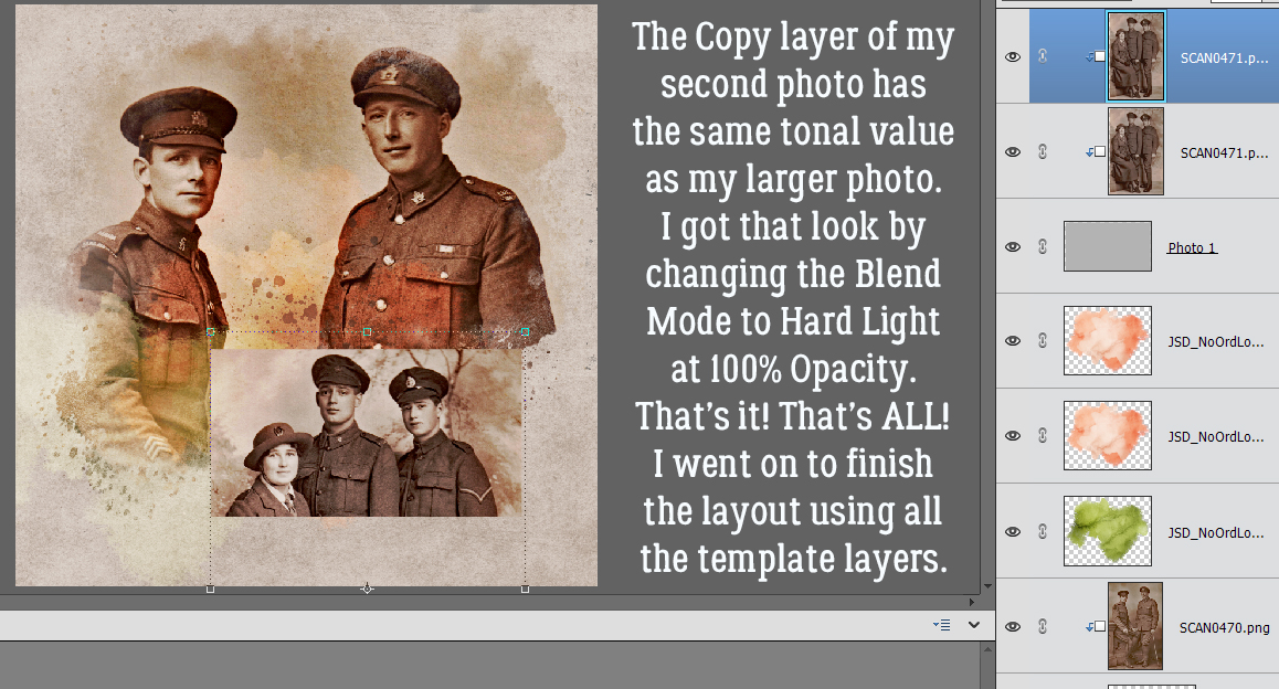
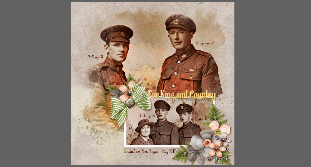
 In the Gallery comments, Jill pondered whether I’d done any (labour-intensive) extractions or other witchery to obtain my results, but I didn’t. I used the mask exactly how