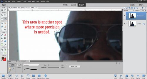
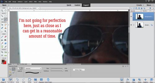
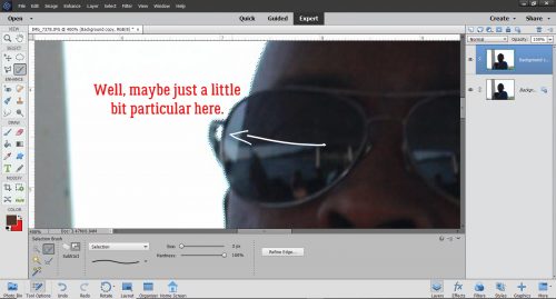
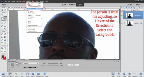
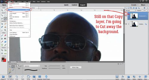
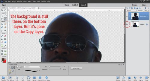
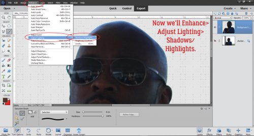
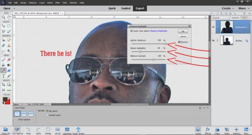
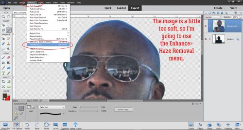
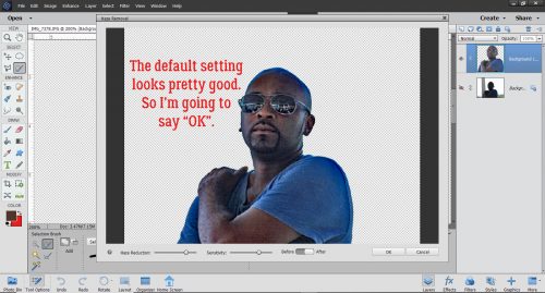
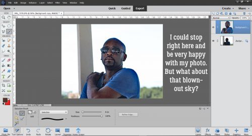
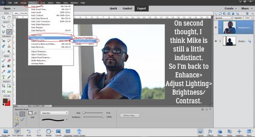
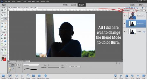
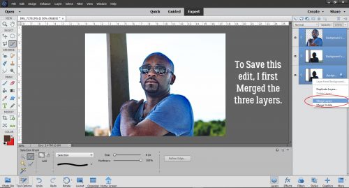
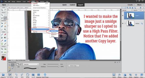
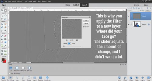
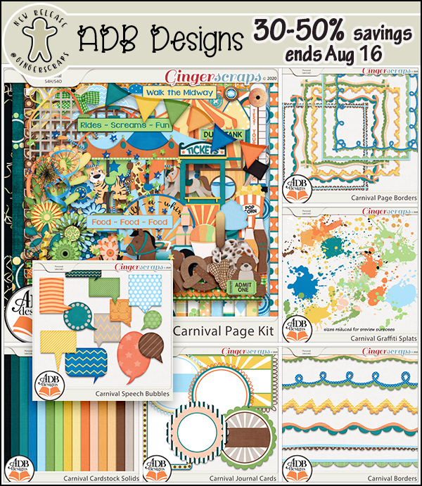
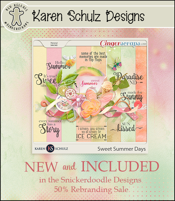
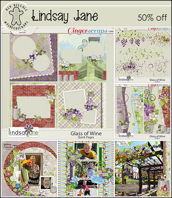
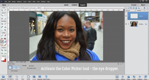
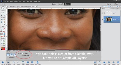
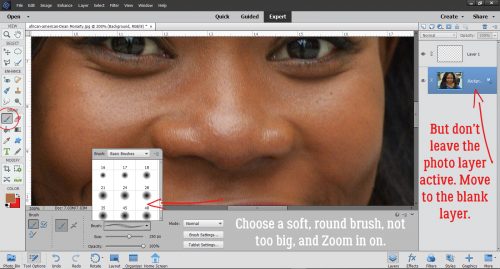
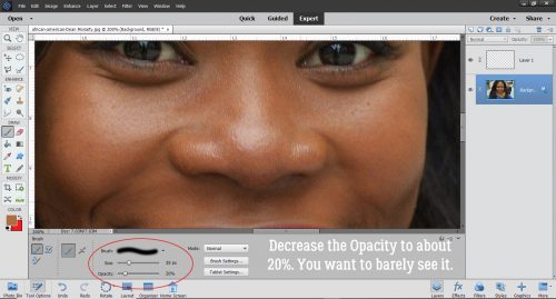
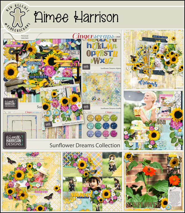
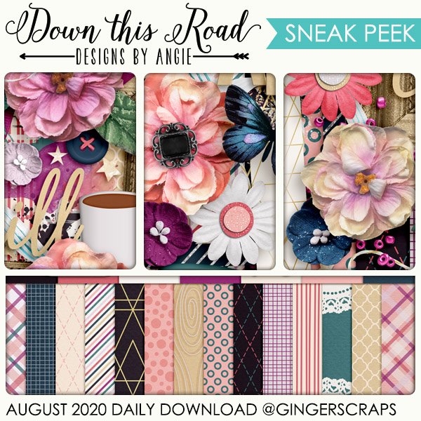
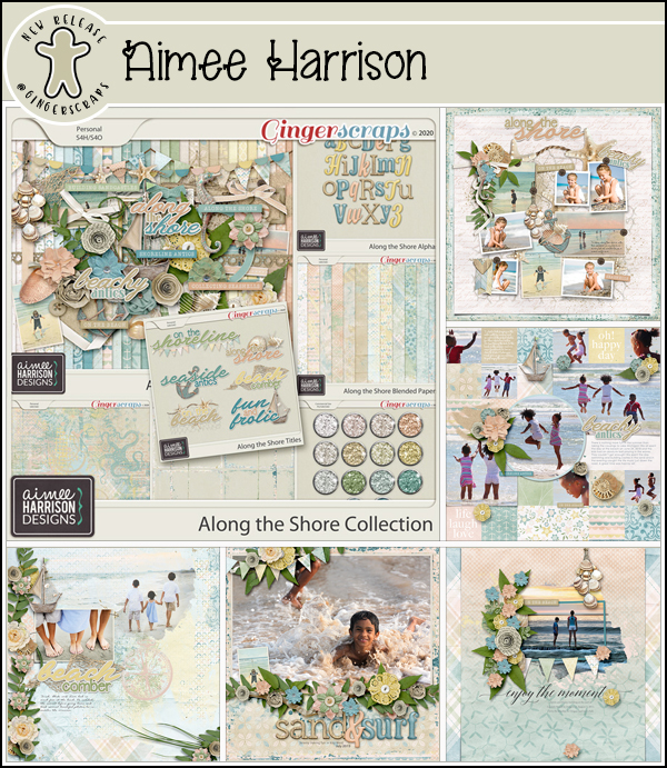
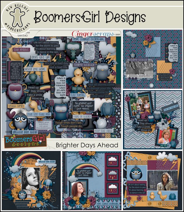
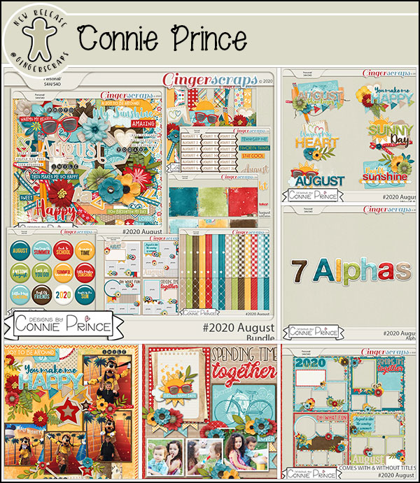
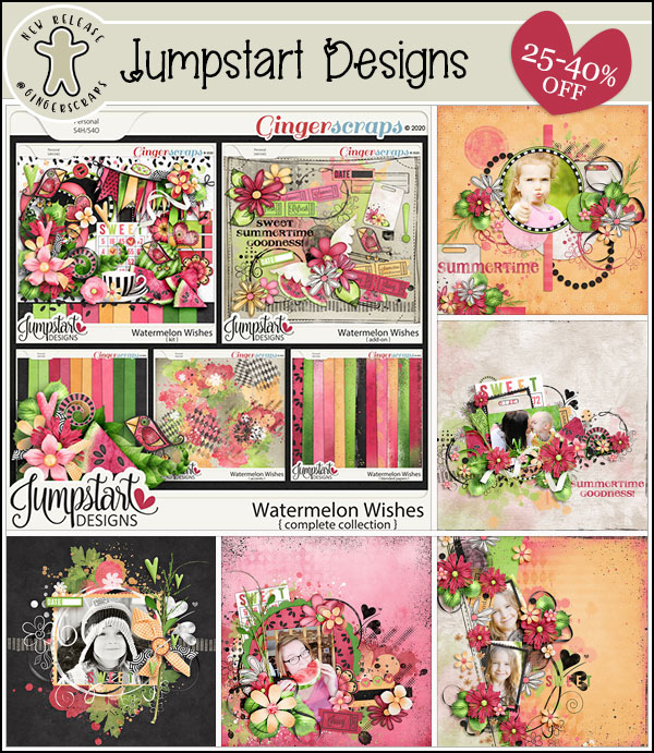
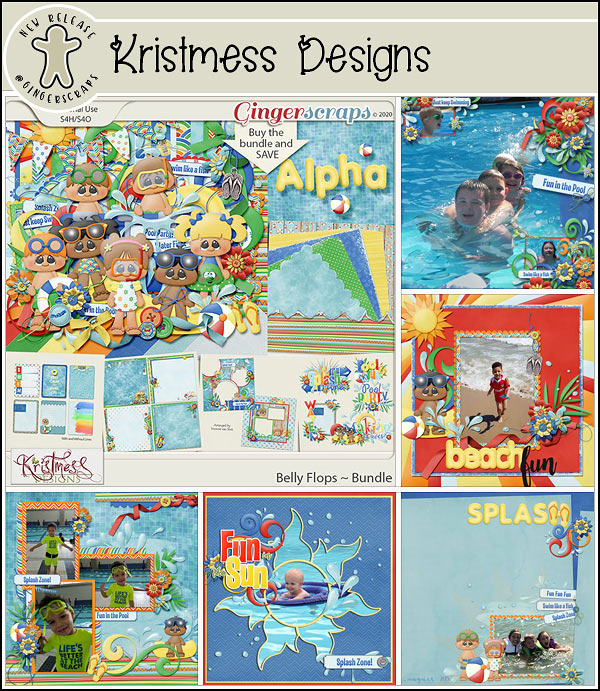
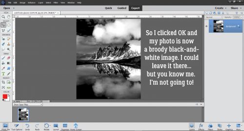
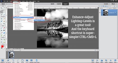
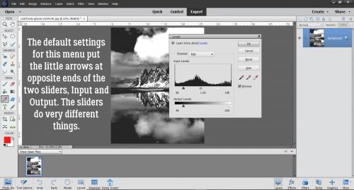
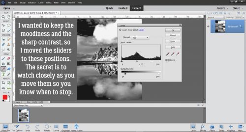
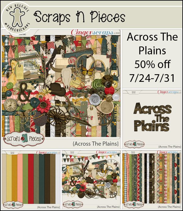
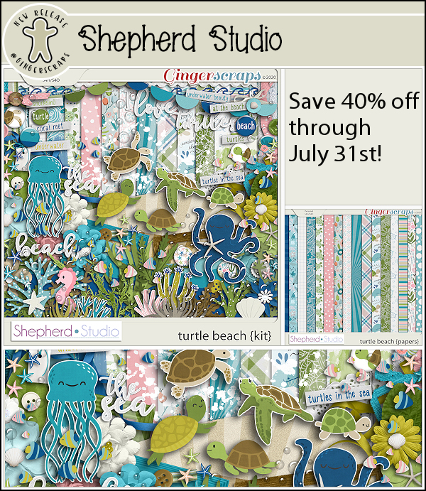
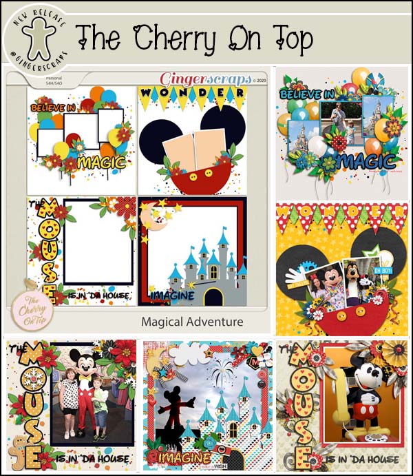
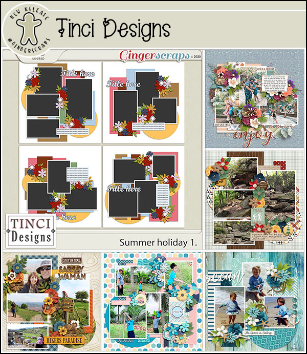
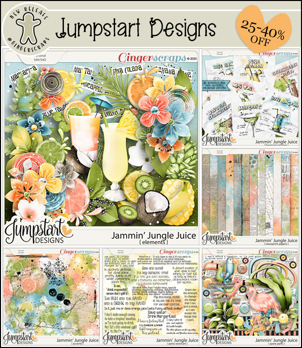
Recorded History
![]()
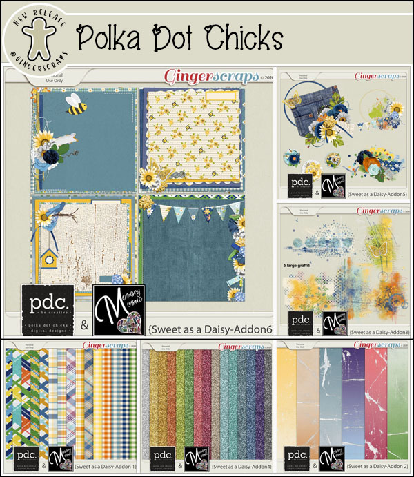
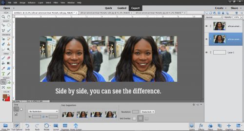
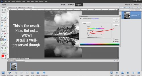
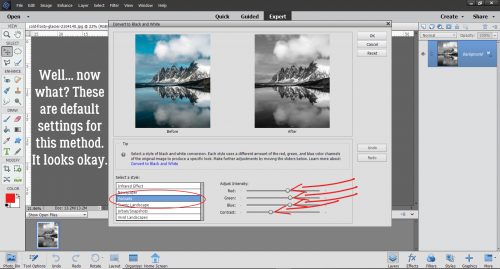
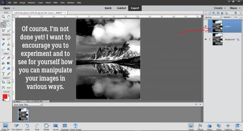
When I woke up this morning I was shocked to realize that it’s Tuesday already! There has been some momentous happenings in our house since I last blogged here. We found out on Thursday that my husband has a half-sister! He was raised as an only – his father left them when he was a toddler. So when this very sweet lady contacted our daughter via 23andMe to find out how they were related, it was the LAST thing that occurred to any of us. He’s very excited, which surprised me a little. We’re still trying to track down confirmation, but the odds are very high that she IS his half-sister. And that’s what has consumed me for the last few days. So today’s tutorial is a bit of a lazy one – I’m going to show you some great (FREE) fonts for heritage layouts, since genealogy is at the forefront of my mind right now. I found all of these at my favourite source for free fonts, dafont.com.
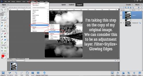
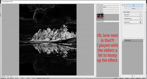
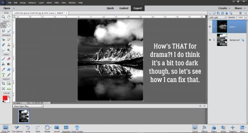
I looked for title fonts, monogram fonts and journaling fonts. We’ll start with titles, but they’re not really in any kind of order.
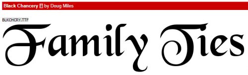
Black Chancery is a Gothic font that is easy to read and not overly fancy.
Blacklet is another Gothic font, a bit more like those old stencils we used in school.

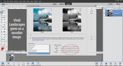
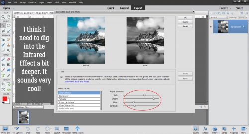
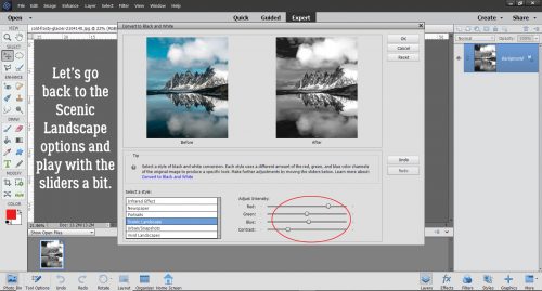
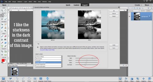
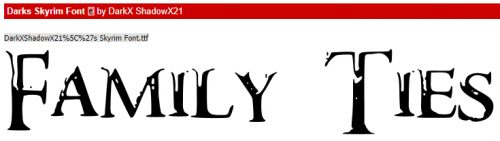
I like Darks Skyrim Font for its drama! It has a vintage look to it, but also suggests intrigue and strength.
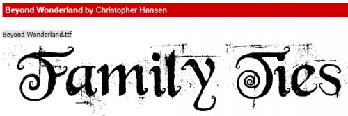
Beyond Wonderland has a whimsical but old-tyme-y look.
Then there’s Valdemar. This one is a bit Teutonic, so if you have Germanic ancestry it would fit very well.

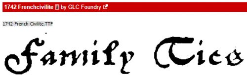
1742 Frenchcivilite makes me think of pirates and swashbuckling. It looks like it was written with a quill pen.
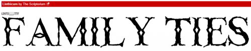
Linthicum reminds me of early America. I don’t have any ancestors who arrived in North America before about 1830, but my husband has them dating back to 1608!
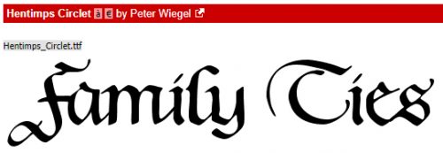
Hentimps Circlet is another crisp Gothic font with just the right amount of curlicue.
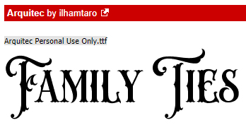
Arquitec is another very antique-looking one. I can’t remember if I downloaded it, but I want it in my collection! [There! Fixed it!]
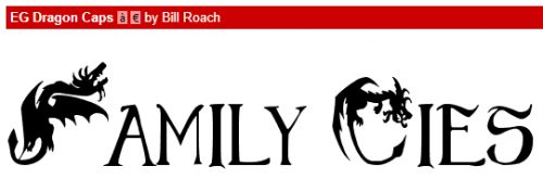
Any J. R. R.Tolkien or George R. R. Martin descendants out there? EG Dragon Caps was made for you!
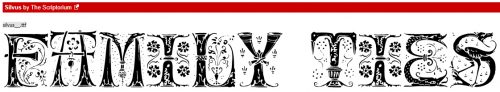
I saw Silvus and swooned! The fairytale quality is so attractive! I think it could be great for either titles or monograms and I’m already planning to dissect it so I can turn it into illuminated initials.
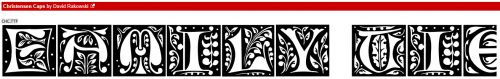
Christensen Caps is another one that could be amazingly illuminated. It looks like something you’d find on a medieval manuscript.
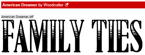
I like American Dreamer for its simplicity.
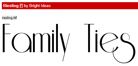
Riesling is one of my favourites. It’s got a real Art-Deco vibe to it and makes me think of the Great Gatsby.
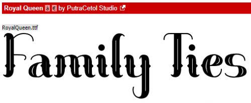
I like Royal Queen, a curvy Gothic font. It could be a title font, or used for journaling because it’s readily legible.
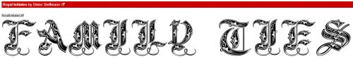
Royal Initialen is one I’ve had in my collection for years. It’s purely a monogram font and it has so many possibilities for someone who likes to experiment. <raises hand>
What a great serif style title font! Cash Currency is bold, solid and elegant.

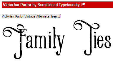
When I first saw Victorian Parlor, the first thing that popped into my head was the Addams Family! I like the curly-swirly caps paired with the more simple lower case letters.
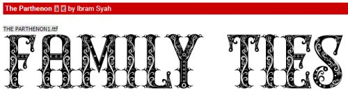
The Parthenon isn’t just a Greek monument! I feel like this could work for both titles and monograms.
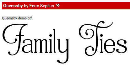
Here’s another versatile one, Queensby. I’d probably use it for subtitles and journaling.
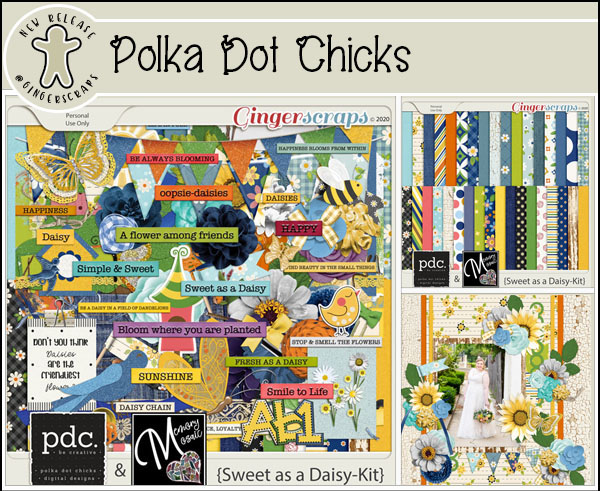
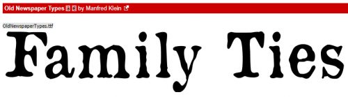
Journaling fonts should be ones that don’t eat space and are easy to read. I like to use typewriter-style fonts for documenting family history, and the more rustic the font, the better I like it. Old Newspaper Types is one I’ve used a few times, and when I finally get around to scrapping the story of my Luddite ancestor, who I learned about via a newspaper story, this is what I’m going to use.
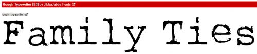
Rough Typewriter is another of my go-to typewritten fonts. It’s just messy enough to look old, but not too messy to read.
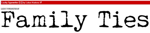
Lucky Typewriter is just a bit more detailed.
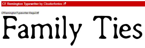
CF Remington Typewriter has that antique look to it that I like so much.
Tippa reminds me of mimeographed tests I had back in elementary school. It has that distressed look.

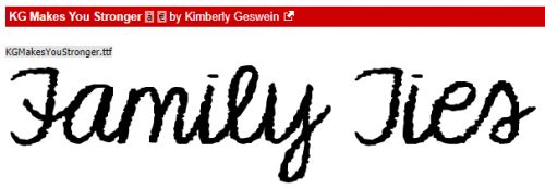
Kimberly Geswein has a ton of fabulous handwritten fonts that are perfect for journaling and I think KG Makes You Stronger is about perfect.
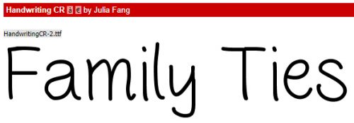
Handwriting CR is clean, clear and great for those back-to-school layouts too.
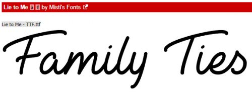
I like Lie to Me a lot. It’s legible but a little more adult than some of the handwritten fonts.
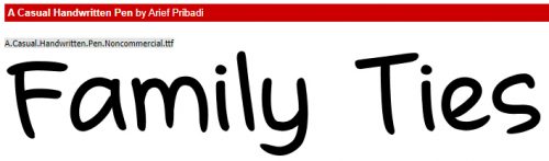
If you want a little more oomph in your handwritten font, A Casual Handwritten Pen brings it. It’s a bit bolder, but still clean and clear.
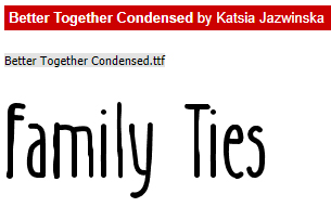
And last, Better Together Condensed is a clean, clear and slightly different handwritten font. It’ll allow you to cram a lot of text into a small space.
I know that as scrapbookers our main goal is to preserve our stories. Sure, creating a beautiful layout is a wonderful pursuit, but it’s the story behind the creation that really matters. I hope you’ve seen some new fonts that might work for your historical records!
![]()