Quick Trick: Layer Thumbnail Appearance
![]()
PDF Version : https://bit.ly/3rRXlPq
I was looking through some previous tutorials and it occurred to me that I’d neglected a really simple thing that makes my life so much easier, and the screenshots for our tutorials easier to follow… Layer Thumbnails. I work on a 14″ laptop, backlit by 100 square feet of windows, and I have senior eyes, so I like those thumbnails to show me exactly WHAT’s on the layer at just a glance. I’m not so worried about WHERE it is on the layer. So the default Thumbnail settings (see below) really fail me. If you’re trying to work with the defaults and wish you weren’t, read on!

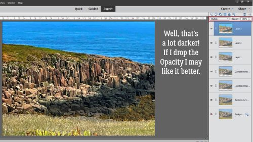
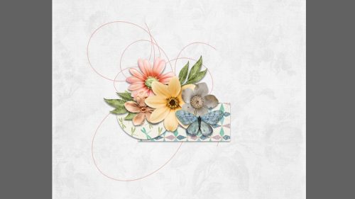
This is what I see when I’m scrapping. Those BIG Thumbnails are so helpful.

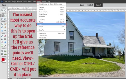
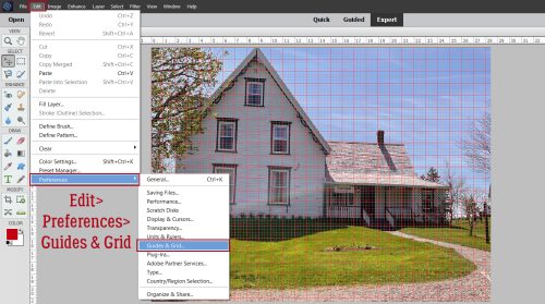
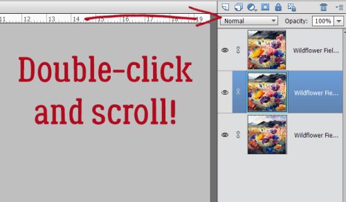
Go over the the upper right corner of your Layers Panel and click on the stack of horizontal lines. The menu that opens has a lot of options. We’re only concerned with one at the moment.

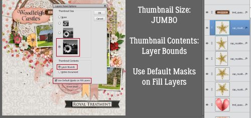
That option is all the way at the bottom of the list. Click on Panel Options…

Here are your Layer Panel Options. Click the biggest of the Thumbnail Size options. For Thumbnail Contents, click Layer Bounds. That tells it you only want to see the actual object on that layer. You don’t really need to see the Entire Document, do you? I mean, it’s right there on your canvas, right? Last, click on Use Default Masks on Fill Layers. Then your Layers Panel will look just like mine!
We finally got some much-needed rain last night and it has cooled off nicely with it, so I’m off to spread some mulch on my flowerbeds. See you next week!
![]()