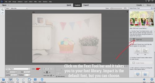
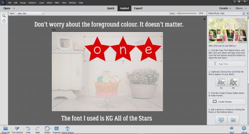
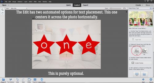
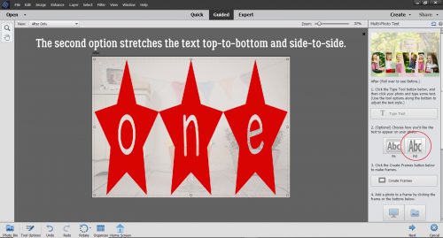
Tutorial Tuesday (Photoshop Elements)

It All Comes out in the Wash-i

This week’s tutorial is brought to you by Shana Read, whose suggestion for a topic in response to my Facebook plea last night was the one I could get together the quickest. I’m finding I have even less motivation “in these uncertain times” – so tired of that cliché!! – than I usually do and was in need of a good kick in the butt. There were some great suggestions offered up and I’ll be working on them in coming weeks. But first, we’re going to make digital Washi tape look real!

I started out with a cardboard tag, a pretty piece of Washi tape and some heavily-creased cardstock from the GingerBread Ladies‘ collab Entertain Me. I didn’t deliberately choose that kit, although it seems weirdly appropriate. I did, however, deliberately choose the creased cardstock, because it’ll make the tutorial more meaningful.

I added a drop shadow to the tag, setting it at the same angle as the shadows cast by the creases on the cardstock. I like consistency and when I’m shooting for realism, that’s one of the key aspects.

Those of you who are using my custom shadowing method can skip down about 6 steps… For those who need a refresher or who haven’t tried it yet, this is how my custom shadows start. I create a new, blank layer underneath the object I’m going to shadow. The keyboard shortcut for this process is to hold down the CTRL/CMD key and click on the new layer icon, the one that looks like a sheet of paper with the lower left corner curling up.

Still on that blank layer, I CTRL/CMD>click on the layer thumbnail – that tiny picture of the object you can see on the layers panel – to select the edges of the object, tape in this case.

Next, click on the Paint Bucket tool so you can fill the outline of the tape.

The colour I like for shadows is 313131, which I just type into the box I’ve circled below. It’s a medium grey and works pretty well for most purposes.

With that grey as the foreground colour, click anywhere on the blank layer. The outline will fill with grey like magic. To get rid of the marching ants, either click Select>Deselect or just use the keyboard shortcut CTRL/CMD>D. We can’t leave it like this though, because it shows through the tape and looks like junk!

I like to move the shadow to where I’d like it to be before I start tweaking it. So I nudged it over a bit to the left and down, again keeping the same angle of light as seen in the shadows cast by the creases. The only drawback to that is that the tape is semi-transparent and now there’s a white strip at the top. I’ll show you how to take care of that in a minute.

But first I’m going to change the Blend Mode (that button at the top left of the layers panel just under all the icons) to Difference. You’re going to love it!

Can you see the shadow peeking out at the bottom edge of the tape? I know you can see the tag showing through it. I could leave it like that, but that’s not how I’m made. So let’s keep going.

To adjust the shadow layer, I use the Smudge tool. It looks like a hand in a white glove with the index finger stuck out. I tend to use a fairly big brush and a very light touch. I start a bit of a distance from the edge of the shadow and just slightly move the brush toward or away from the object being shadowed, depending on where the light source is, and how much of the object would actually be touching the paper if it was real. In this case, I brought the shadow away from the tape a little where it comes off the tag and onto the cardstock to suggest it’s not stuck down quite as tightly there. Then I pushed it back toward the tape a little where the tape crosses the crease, because it would be adhering more closely here. For this kind of detail, I use a very small brush, still with a light touch. It’s better to go a tiny bit at a time so you know when to stop than to try and do it all in one step and have to start all over.

To eliminate that white strip at the top, I used the same small brush to very carefully nudge out the shadow right to the edge of the tape. There’s a hint of the shadow coming out from under the tape at the top, and that only adds to the realistic look.

So how do we make the tape look even more realistic? Easy! We’ll use the Dodge and Burn tools. Dodging and burning are old tricks used in print photography to spot-improve exposure. Dodging lightens an area while burning darkens. If you have trouble remembering which is which, just think of a burnt stick… it’s black! The edges of my tag are nice and straight so this technique will be simple. I started with the Burn tool and changed the Range to Shadows from the default Midtones.

With the TAPE layer active, and a small brush size selected, I set the centre of the brush tip over the spot where the tape and the paper meet, with the width of the brush on the area on top of the paper. Holding the Shift key down, I clicked at that spot then moved the brush tip down to the spot at the bottom of the tape and clicked again. There’s a very faint darkening of the tape along the edge. As long as I hold down the Shift key, I can go back and forth between the top and the bottom of the tape as many times as necessary to build up a nice sharp edge.

The last pass over the edge is with a wider brush to make the tape look like it has been pressed down firmly with a finger.

Then I switched to the Dodge tool and a large-ish brush.  There will be more light hitting the tape where it sits on top of the tag, so we need to lighten that area just a bit. Using exactly the same steps but with the brush’s width sitting on top of the tag, I Dodged that edge.

Can you see the difference where I’ve already done the D&B? Let’s move over to the crease that runs under the tape. The shadowy area is a bit more pronounced here so with a small brush and the Exposure set to 70%, I Burned the tape where it overlies the shadowed edge of the crease. If I remember correctly, I made 4 passes top to bottom and back up, so a total of 8 clicks.

The section of tape that runs along the domed part of the crease needs to be lightened quite a bit to give the crease back its dimension. I Dodged with a brush sized to just cover the crease edge-to-edge. It took several passes to get it right, but like I said before, building up a little at a time gives you control and you’ll know when to stop.

Once I was happy with the creased area, I moved over to the top edge of the tag. The Dodge tool was active so I did that phase first. There’s a lot more tag covered with tape at this edge so I used a big brush with its width sitting on top of the tag to “elevate” the edge.

Don’t worry about being too precise with positioning the brush tip. If you’re past the end of the spot where the tape and tag touch, it doesn’t matter; the tool won’t do anything to the inactive layers – the paper and tag layers. It’s actually better to go a bit past than it is to stop too short. After I Burned the stuck-down area it looks like real Washi tape and real cardstock. It sounds like a lot of work, but it really isn’t once you get the hang of it.

So there you have it, Jan’s technique for adding a shadow to Washi tape. I suggest that if you’re going to do this, turn the visibility of all the other layers off so you can see exactly what you’re doing. Dodge and Burn even the parts that will be hidden by other layers, for the best results. You never know when you might resize an element, or move things around… right?

See you all next week!

Tutorial Tuesday (Photoshop Elements)

Jazzing Up a Font

Wow, how much the world has changed in one short week! Our provincial government has declared a state of emergency, although the total number of cases of COVID-19 in our province is still under 100. We’ve been sticking close to home since last Thursday night, which is giving me time to do all the things on my task list. This post is late because I got sidetracked painting the family room… hope the buyer – whoever that ends up being -approves! But let’s get into distraction mode for a bit.

Maybe you’ve seen my layout in the Gallery, the one where my granddaughter is eating her peas with her tongue. This is how I created my title. I started with one of the fonts I linked you up with last week Floral Capitals. Everything I’ve done in this tutorial has been shown to you at least a couple of times before, so if you’re a faithful reader, you might even predict what’s coming next as we work through. There are a lot of steps but I’ve taken the guesswork out of it for you. Whenever I do something that I’m making up as I go along, I like to make some copies of the original layer so I’ll still have one untouched one should I need it. Here I made 2 copies and turned their visibility off.

I analyzed the font’s appearance and had an idea of what I wanted to do. I knew the border would be different so I started off on the bottom layer by Erasing the middle parts of each letter, leaving just the border. Then I made a copy so I could quickly reset if I did something I didn’t like.

Next, I Selected the edges of the floral design by Clicking on the Layer Thumbnail of the lower copy of the original.

Now the Marching Ants come into play.

Now that Elements knew I wanted to work with just the Selected areas of my title, I added a new blank layer between the copy of the border layer and the lower copy of the entire title.

With the new blank layer active, I hit Select>Modify>Expand. I want to adjust the areas selected just a tiny bit.

But I only needed to adjust it a smidge, 1 pixel wide.

Still on that blank layer, I added a Stroke to the Selection. Edit>Stroke (Outline Selected Area).

Again, I went with a skinny stroke, only 2 pixels wide, and I chose this carnation pink, pulled from one of the papers I planned to use for my layout. (Diva-tude from Jumpstart Designs.)

Here you can see the pink a little if you squint.

When I turned off the rest of the layers, now I could see clearly where the Stroke went.

Using the Paint Bucket, I filled in all the letters with the same pink.

Yep, then I Erased the fancy parts, leaving just the pink letters.

I zoomed in quite a lot so I could clean it up to the best of my ability.

To give the letters some more presence I went to the Styles menu and chose Bevels.

I like to use Simple Pillow Emboss, because it’s pretty predictable.

See how it adds weight to the letters, and puts a bit of shading around them too?

The Bevel default is 21 pixels, which is a bit too much for the look I’m after, so I decreased the size down to 7 pixels. Now the letters look like die cuts.

One way to check for stray pixels after you’ve extracted something, as I’ve done with the letters, is to apply a Style or a Shadow. Those stray pixels pop out like zits before a big date. That makes them easier to remove. (If you’re only looking for stray pixels, you can clear the Layer Style when you’re done by right-clicking on the layer in the Layers panel and selecting Clear Layer Style from the menu.)

Okay, mission accomplished. Onward and upward! I turned off all but one of the layers, the lower copy of the original title. I Erased the borders on this layer, since I have plans for the ones I’ve saved down at the bottom of the pile.

As I was getting the screenshots edited I discovered I’d missed one… an important one. I added a black chipboard Layer Style from Ooh La La Scraps’ All Hallows Eve to this layer. It adds just a bit of a flocked look to the outline. I played with the Layer Style settings.

But all I did was increase the Bevel a bit, from 10 pixels to 15. That sharpened the edges just a bit.

Next, using the Rectangular Marquee tool I dragged out a box just inside the outline of the first letter and used the Paint Bucket to Fill it with this dark olive green, also from Diva-tude.

And I did the same with all the rest of the letters.

It’s looking pretty good but it still wasn’t where I wanted it so I added a few more little tweaks.

I turned the border boxes layer back on and took a good look at them.

They needed to be punched up just a tad, so I added a Stroke.

It had to be a narrow one so the border didn’t run into the fancy part. 3 pixels worked. I could have put the Stroke outside the boxes, but then the boxes might have coalesced. Instead I centered the Stroke on the lines.

I found this perfect pink Glitter style in ADB Designs’ Holiday Joy styles kit. So it went on the borders.

OOH! So close!

Last thing I did was to add an epoxy Style (from Mommyish at another store) to just the pink letters.

And then I was happy!

You can use these tips on other detailed fonts, and experimenting is fun! I hope you give it a try!

Tutorial Tuesday (Potpourri)

Spring-y Fonts (Part 2)

Are you ready for some fresh new spring-y fonts? I last did a spring font post a year ago and figured it was time. (Plus I’ve been so busy trying pretty much single-handedly to get our current house ready moving out of. I’m getting tired of the smell of paint!)

All the fonts below are free for personal use at Dafont. They’re ones I haven’t shown you before, and there are a couple that would be perfect for titles. See what you think!

CF Springtime is one that I might use for a title or two. It’s got good weight and with the leaves, it’s just a bit different.

This isn’t a font but it’s so pretty! These wreaths, or whatever we want to call them, can be used as photo overlays, to frame photos, to frame other fonts and so many other possibilities. You’re looking for Spring Romance.

Here’s another font just screaming to be used in titles. It lends itself well to multiple modifications, and if I can find some time, I’ll play with it so you can see what I mean. Floral Dawn sounds so poetic!


Can you see this one as a title font? How much fun it would be to deconstruct it and use multiple colours to make it really pop. Floral Capitals might be my favourite of the bunch.

This is just a cute little romantic script with curlicues and everything! Flower Shop could be a journal font, don’t you think?

I like the graphic effect this one has. Imagine it clipped to a pretty green paper, maybe with a glitter style added on top. I’m not really loving the name the designer gave it though… Forced Flowers.

Sweet Duck has three different options and all of them are pretty awesome.

I threw this one in just for fun, for all of us arctic blonde hippie chicks. The 70s were the BEST decade ever… LMS Hippy Chick says so!

How do they come up with these names? LRT Chickenhawk… it’s cuter than its name, for sure.

And last but not least, I’ve got a dingbat for you. KR Spring Me has an assortment of spring-y images you could use as stamps.

I’ve linked up each font for you so if you see one you love, go and grab it! I have a couple of ideas for tuts for next week but haven’t decided which one I’ll go with. Stay tuned!


Tutorial Tuesday (Potpourri)

Is Exhaustion a Thing?

Well, last week was a total whirlwind! It still feels a lot like a dream, but we now own a beautiful new house in a surreal setting, even though we’re not moving into it until early May. The trip itself was pretty exhausting, both mentally and physically. Somehow we got to the airport without our son’s photo ID, without which he couldn’t board the plane. (We live 30 miles away, on the other side of a major city…) The airline was amazing and got us on a later flight so I could run home and get it. We ended up getting there 5 hours later than originally planned, but in the end that was fine. All the things that needed to happen to get us into the house happened, and I’m planning and scheming every minute of the day. All of this is leading up to me apologizing for not having a tutorial for you today, but in its place I’m going to give you a sneak peak at some of the photos you’ll see in my layouts in the coming weeks. And then I have a couple of little challenges for y’all.

What do you think??

Okay. Your first challenge is to find one of your layouts where you’ve used something you learned from Tutorial Tuesday and send me a private message (JaninAlberta) with a link to it. Don’t tell me what you did, I’m going to see if I can figure it out! Next week I’ll compile all the layouts I get from you into a blog post and share your successes with everybody else.

Your second challenge is to help me come up with a new user name. When we move, I’ll no longer be Jan in Alberta… I’ll still be Jan, but living in Kelowna, British Columbia. Ginger has told me I can change my user name when the time comes and I’d like it to be a bit more creative! Help?

Have a great week!

Tutorial Tuesday (Photoshop Elements)

Effect? Affect? What’s the Difference?

Today’s tutorial has some common elements with last week’s. I’m going to show you how to turn a photo into a work of art, and to blend it into a layout. But that’s where the similarities end! I played around for quite awhile before I got the look I was after, but lucky for you, I kept track of what I did so you can skip the experimentation and go right to the good part.

There are so many ways to make Photoshop Elements do fantastic things. I first played with the Filter Gallery, but didn’t get what I wanted. So then I started looking at the Effects Gallery. There’s where I found the pot of gold.

First I made a copy layer of my photo. (I actually tried to work right on the background photo layer but didn’t like where I ended up – no control!)

Then I clicked on the Effects button down at the bottom right of the work space. From the Effects Gallery I chose Vintage and then Pencil Sketch. (Yes, I’ve done a couple of sketch tutorials before, but this one is different. And a lot easier!)

One click and this is where I went.

Elements has created another Copy layer and then added the Sketch effect to yet another separate layer.

I tried out each of the Blend Modes until I found one I liked – Hard Light. It brought back some of the colour but kept the sketchy look.

I made another copy, of the very topmost layer and it lightened up the image and blew out some highlights.

Blend Mode change to the rescue! I changed it to Multiply, and got a really arty looking image. I Merged all the layers and saved my new image as Sketch Edit.

I don’t think anybody can guess what I did when I added the Sketch Edit copy of the photo to this blended template from Heartstrings Scrap Art. I decided to try some Blend Modes and settled on Luminosity. I love how it turned out.

I hope you’re having as much fun as I am when you try my techniques. But I feel it’s only fair that I let you know I may be MIA a bit in the next while. We’re closing on our brand-new house (in another province) next Tuesday!! It’s been a long haul since we signed the construction contract, and in some ways it feels a little surreal now that it’s finally done. We’ll be out of town tying up all those loose ends next week but I’ll try to have something for you for the following week… even if it’s just photos of the new house. We won’t be moving for a few weeks yet, and I’ll make sure you have a heads-up for that. Thank you for supporting me in this amazing hobby we share!


Tutorial Tuesday (Photoshop Elements)

A-Tinting We Will Go 

How did it get to be February already? The older I get the faster time flies. The last week has really kicked my butt, let me tell you. So I thought we’d try something very simple but incredibly beautiful today. I love this photo (from Pixabay) but I think it could be even prettier in black and white. With a little hint of tint…

In Photoshop Elements there are several ways you can convert a colour photo to black and white. Probably the easiest is to click on Enhance>Convert to Black and White (CTRL/CMD>ALT>B) as shown. Or you could use Enhance>Adjust Color>Adjust Hue/Saturation then pull the Saturation slider all the way to the left. But… using the method shown gives you some added options that don’t involve fiddling.

When you use the Enhance>Convert to Black and White tool, this menu opens. The default setting is for Scenic Landscape, but there are multiple style options you can choose from.

There’s a slight but visible difference when I change the style to Portrait. The image is a little sharper and the contrast is a little higher. For this technique, that’s perfect.

I plan to blend this photo into the paper shown below. It’s from January 2020’s Daily Download, Toujours from Key Lime Digi Designs and The Cherry on Top. I’m going to choose a colour from it to tint my photo.

I decided that the soft green would be lovely, so I grabbed my Eye Dropper tool and clicked on the spot shown.

Next I clicked Layer>New Fill Layer>Solid Color. The green that I chose is the foreground colour so it will be the colour used.

I made sure the Use Previous Layer to Create Clipping Mask was selected.

The Color Picker still opened so I had the chance to verify the green is what I want.

And there it is… the Fill Layer. Now what?? As you can see there are two separate layers there, with the colour layer on top. I changed the Blend Mode to Color.

If you’re of a certain age, you might remember the days when the colour on those old tube TVs would go wonky and everything was really green. Look familiar?

So I lowered the Opacity of the Fill Layer to 51%. Now there’s just a faint green glow.

I had already chosen a masked template that would work nicely with this photo. It was a freebie from Promethean Concepts in the A Love for Layout Templates Facebook group in December 2019.

Here’s a tip for ensuring the part of your photo you most want included within a mask makes it onto your layout. Rather than dragging and dropping it ON TOP of the mask, clipping and fiddling with it, try dragging and dropping it UNDERNEATH the mask and moving it around.

It isn’t exactly perfect, and I know I don’t want any harsh edges visible. I didn’t know this trick until just recently, but when using a mask like this it’s possible to use the Clone Stamp tool to extend a photo out to the edges of your mask.

I wanted more of the pearls and her hair inside the mask, so before I started playing with the Clone Stamp, I clicked Image>Transform>Skew to adjust the shape of the mask just a bit by pulling the lower left corner down and to the left, the lower right corner just over more to the right.

Then I moved the photo layer ON TOP of the mask and clipped it in place. I’m going to Clone the window, curtains and the top of her head to cover up all that pink that’s still visible from the mask. Once I’ve done that, I’ll use the Healing Brush tool to make the Cloned areas less obvious.

And there’s my finished blend. I’m pretty pleased with it, and with how little time it actually took to get the effect. I’d say 20 minutes, tops!

My finished layout looks like this:

Will you give this a try? Shout-out to Ulla-May for the inspiration.

Tutorial Tuesday (Photoshop Elements)

It’s a Total Eclipse!

Greetings! As promised, today I’m going to show you a paper-to-digi technique that CalGirl (Steph) brought to my attention. It’s called the Eclipse Technique, and I’ll tell you, the digi version is a LOT less work than the paper one. To get this effect with paper, first the letters need to be cut from the foreground paper. Then several layers of each letter are cut from the background paper, stacked and glued together onto the back of the foreground paper letters. Then some foam adhesive pieces are added to the bottom of the stack, the stack is stuck into the cut-out areas and it looks like this card created by Amy Koenders from Stampin’ Up. It’s a really pretty look, and so simple to obtain digitally.

I think the best choice for a background paper for this technique will be a solid, but a paper with a tiny print might work well too. To look really fabulous, the foreground paper should have some sort of design. In the card image above, the pine branches and cones were stamped onto the foreground paper. Digitally, that’s a step you can skip unless you really want to do it. When you see my finished layout you’ll know how I went on that. I planned to use a template for my layout so I did the process with the papers I planned to use, in the way I planned to use them. The solid is from the GingerBread Ladies Warm and Cozy January gift-with-purchase collab, and the foreground paper is from Ilonka DesignsRejoice kit.

The font I used is called Amadeust Regular. Choose a font that has some oomph to it, so you get the full effect. (Although we’re not gluing together skinny little strips of paper so I bet it would be fine to go with something more scripty or delicate too.) Make sure you have two copies of your foreground paper before you go on to the following steps. Turn the visibility of your top layer off so you can see what’s happening.

You can use any colour you want for your text because that layer is going to be deleted later. This it the title for my layout. At this stage, your text layer needs to be underneath your lower paper layer; I’ve made it visible here just for clarity.

Now Select your text by CTRL/CMD>clicking on the Layer Thumbnail. That will turn on the marching ants.

Make sure your active layer is the lower paper layer now. You’re going to Edit>Cut the text out of your lower paper layer. Keyboard shortcut for this is CTRL/CMD>X.

With both the text layer and upper paper layer visibility turned off, you can see the background paper through the “holes”. When you add a drop shadow to that upper paper layer, the appearance of your cut-outs will change.

If you want to, you can move your text layer up to just underneath the upper paper layer, but it’s not essential. Again, Select the outline of your text the same way. CTRL/CMD>Click on the text layer thumbnail. But this time we’re going to shrink the selected area just a tiny bit. Select>Modify>Contract is shown.

In the dialog box for that task type in the number 2, which will move the marching ants toward the centre by 2 pixels. It doesn’t have to be much, just a wee little bit.

The next step is to Invert the Selection. Select>Inverse or CTRL/CMD>shift>I.

With this step we’re going to cut away everything BUT the letters themselves. Edit>Cut or CTRL/CMD>X.

Aha! See the red outline of my text? That’s exactly what I wanted to see.

The original text layer has served its purpose, so you can go ahead and delete it, or simply turn it off.

I made a copy of the INSIDE letter layer and will be working on the very topmost layer in the next step.

Here’s the fun part. We’re going to apply a Bevel Style to that topmost layer. Click on the Styles button at the lower right of your workspace and choose Bevels from the Styles menu.

I tried almost all of the Bevels on for size before settling on the Scalloped Edge style shown below.

It’s not exactly what I was looking for so I made some adjustments.

To adjust any Style or Effect on a layer, double-click on the fx to the far right of the layer in the layers panel. The menu box has several options you can change. I adjusted the Lighting Angle to 120°, which is the angle my template uses. The default setting for Bevels is 21 pixels, but that’s not the look I want so I decreased the amount of Bevel down to 5 pixels.

Then to make the offset look a little more obvious, I added a solid colour Fill Layer in the same turquoise as my background paper to the bottom letters-only layer. Layer>New Fill Layer>Solid Color.

Ensure the box next to Use Previous Layer to Create Clipping Mask is checked and that the Opacity of the fill layer is 100%.

Then I Merged the two layers together.

Here the only layer not visible is the original text layer. I think it looks pretty awesome! I know it seems like even more work than the paper version, but it’s an illusion. Explaining it all makes it look like more work than it is.

When I put my layout together, I decided to add some brushes and some glossy glitter to the patterned paper layer. See how the white brush crosses the edge of the “O”? I love this technique and I think I’ll be using it a lot more.

Thanks Steph!

Tutorial Tuesday (Windows and Elements)

Following Up for Donna

Last week’s organization tips drew some great comments. Many of you have good systems for sorting and retrieving your digi goodies. But… there are some things that still prove elusive.

Donna had this to say: Dragging from all different folders from the finder is a pain in the ***, it was so much easier dragging from the searched results in photos.. Because I usually copy the files I plan to use and place them in a subfolder of my digiscrapping master folder, I hadn’t worked out a trick for that process that might streamline it a bit for those of you who prefer to drag-and-drop right from your folders into your scrapping software. Read on!

First I’ve shown my folder method using the search box in Windows. (Sorry, I’m not a Mac girl so I don’t have any tips for that platform.) I ran a simple search for “buttons“. The search box is at the upper right of the window and the progress bar runs from left to right as Windows does the work for you.

Once the search was done, I selected 4 buttons with a similar colour scheme, from 4 different folders. Remember, to make multiple selections, hold down the CTRL/CMD key while you’re clicking on the items you’re choosing.

Next, I Copied all 4 of the buttons.

Finally, I Pasted those buttons into a new Button folder I’d created within my Digiscrapping folder. Now, when I’m ready to use them in Elements, I can open that Button folder with the Open tool on the main screen. But that seems to be a little involved. Is there a way to select the same 4 buttons and open them in Elements without the extra steps? Work Smart, Not Hard, right??

OF COURSE!! I got Elements up and running. Then I activated that big Open button at the left of the main screen. But instead of having a dedicated folder with my buttons in it, I instead opened my Digikits folder and USED THE SEARCH BOX! It was something that had never occurred to me before. I typed “button” into the search box and waited.

Then I went through the results in the same way I would any other time. I Selected the same 4 buttons as before. (The image below shows the search results as a list. I did my selections using medium icons so I could see the actual images then I changed the display to a list so I could show you multiple selections.) When I had all 4 selected, I just hit that Open button at the bottom right of the menu.

And there they are! All from different folders and in fewer steps! I hope this is what Donna was looking for.

Her second organizational challenge reads like this: Having switched to using my cellphone as my primary camera these last few years has actually made it more difficult to group as events, etc because of all the random photos, notes, screenshots etc that I also take photos of. Open to any suggestions there…? This one is actually an easy fix. Both iPhone and Android have the ability to build albums with our photos. My Android phone creates some of its own albums, but I can make more to suit myself. Moving photos into the albums is as easy as clicking on them, going to the gallery menu and moving or copying the selected photos over. The key here is to sort them soon after you take them so it doesn’t become an all-day job. If you’re planning to use a group of photos taken on a specific day, make an album for that day. Sending the photos to the platform upon which you do your scrapping is the same process as whatever you’re doing now. If you’re using the iCloud, Dropbox or Google Drive or some other cyber-sharing device, that will allow you access to all your phone folders. Give it a try and see if it makes life easier!

Next week I’ll be showing you another paper-to-digi technique courtesy of Steph Barry. I think you’re going to love it!

Tutorial Tuesday (Potpourri)

Decluttering Isn’t Just for Homes

It’s January. It’s bone-chillingly cold in some parts of the world (like HERE!) and unseasonably warm in others. The holidays are over, and winter stretches out in front of us like a long and bumpy road. There’re no truly exciting events on the horizon, so what’s a girl to do? Well, the flyers are filled with supplies for organizing our stuff… But for digiscrappers, we don’t need to buy anything. It’s all right in front of us! I think now is a good time to talk about organizing our stuff, and maybe actually making some effort to get ‘er done. This is how I do it, but I know y’all have your own way of doing things, The important part is to DO it!

It’s not as important where we start as that we actually DO start. For me, the place to begin will be with all the new kits I’ve amassed but haven’t unzipped. This is actually my New Year’s Resolution, to unzip and relocate my supplies as soon as I download them. I was keeping up just fine until my dogs started fighting in the house and I had to spend a lot of time keeping them away from each other. I have a backlog, and I WILL attend to it ASAP. I use Extract Now, a free rapid unzipping app that makes the unzipping part pretty easy. I make folders within my download folder into which I unzip the new goodies, which eliminates a couple of steps in the process, and it works pretty well. I still go through each of the subfolders, deleting all the duplicate previews and things I know I’m not going to use (like alpha sheets!). If the kit is templates, I delete the PNG files and the TIFF files, and I add to the name of the previews to include single or double and the number of photo spots the template includes. That lets me put a keyword like “single4” in the search bar and Windows will find all the previews with 4 photo spots. Once I’ve arranged my folders the way I like them, I move them en bloc to my digikit folder for the store or designer as appropriate. Then my download folder should be empty. Until I fill it up again!

The way I sort my digikits is primarily by store or by designer’s creative team, with the exception of Heartstrings Scrap Arts… I have so many of Bryony’s kits I need a separate folder just for them. Having said that, my GingerScraps folder is ENORMOUS!  (24.6GB without the kits sitting in my downloads folder. Thank heaven I have a 2TB drive on this laptop!) I rename each kit’s folder: DesignerNameKitName, unless it’s a Buffet kit, then it’s MonthYearBufDesignerNameKitName. That makes it easier when I’m doing a store challenge.

I try to organize my photos as I take them, so the job isn’t too daunting. I don’t care for the Organizer that comes with Photoshop Elements so I don’t use it. But it can be very useful for both organizing and retrieving your photos. The Help menu can give you some ideas about how to maximize your efficiency. The way I file my photos is in folders… what else? I create a new folder for the current year, and a subfolder for each month. I download a lot of photos from my daughter’s Tiny Beans album where she posts pics of my grandchildren. Those I rename with a suitable tag so I can run a keyword search later. If I’m looking for photos of Aaron, I just type in his name. These photos go into the folder for the month and year they were taken so I have some frame of reference later. I have a folder for the photos my friend Sandy takes and graciously allows me to ‘steal’ and one for the photos I download from Pixabay. My Pixabay folder is broken down into subfolders by topic: Kids, Insects/Flowers, Animals, Portraits, Scenic and such. This method of filing makes it a lot faster to find what I’m looking for.

I also organize my layouts. I have folders for each month’s challenges, with subfolders for the challenges themselves. When the year is over, they all collectively are filed in a folder for the whole year. Then again, I have some folders that have copies of the finished layouts for my daughters’ weddings, my grandkids’ first years, all of my Ireland layouts and for the creative teams I’m on. It’s all about finding things later!

Since I set up this new(ish) laptop back in September, I haven’t taken the time to go through my 1400+ fonts and retag them for MainType. That’s something I really need to get on with! It’s a daunting task, but you know what they say. Focus on the first step. I know the time I spend on it now will decrease the time it takes me to find the one font I’m looking for later. The best part of MainType is that I decide what my tags are, based on MY workflow – how I search for things. And like everything else, if I work at it as I add new fonts, the amount of time I spend on it will go way down. But just writing about it is giving me a rash, so let’s move on!

One caveat. If you’re going to delete duplicate files, make sure you only delete the ones you’re not going to want to search for later. I made the mistake of using a Windows utility and chose the wrong metric so it removed a LOT of my original templates and left me with the PSD files for the last layout I used them for. Retrieving the original template takes a lot of time but is necessary when I use the search feature to find previews for my desired number of photos.

I’m interested to hear how YOU organize your stuff. So please, share your secrets!!


Tutorial Tuesday (Potpourri)

Beyond the Ordinary – Holiday Photos

Wow, can it really be only 8 days until Christmas? Even fewer until the first night of Chanukah… Families all over are getting ready for the Main Event and of course, no special occasion is ever complete without the photos to prove it happened. I think I can speak for most of us when I say I’ve taken a LOT of really ho-hum photos over the years. If you’re like me and browsing through the Gallery in late December makes you envious of the amazing photos OTHER scrappers have scrapped, I’m going to offer some thoughts on how to make our holiday photos better. I’m not going to completely rehash this tut from last year but some things do bear repeating.

First, make sure you have fresh batteries and a large SD card for all the great shots you’re going to take. If you’re into phonetography, you might want to trim your in-phone collection by saving them to your computer or the Cloud, then deleting them from your internal storage.

Make a list – physical or mental – of the shots you MUST have. We all have our own preferences for what we want to document so don’t feel like you’re being forced to conform. But there are some sort of standard images we all like.

Even if you feel like decorating for the holidays is a dreaded chore, take some photos of the process. Get a shot of the decor while it’s still in the box. If your kids are helping, turn them into models for your portfolio. Remember to get down on their level. Even the cutest kids aren’t great photo subjects if they’re always shot from above. And get in close!!!! I know I’ve mentioned before that the best crop is the one you do in the viewfinder. so fill the frame! Don’t be afraid to zoom in. Same goes for your pets, if you want them in your photos.

When shooting your tree, look for a different approach than the typical 8-feet-away-so-the-whole-tree-and-gifts-are-in-the-shot. Maybe take some close-ups of your favourite ornaments. Use a portrait mode to soften the background and make the ornament totally the focal point. Get down on the floor and shoot up toward the topper, or shoot down through the branches and make the presents the subject. Turn off all the room lights and shoot the tree with just the tree lights. Experiment with shutter speed and aperture to create some lovely bokeh effects. Add a human or a pet to the frame. Or take a photo of the lights reflected in a window. (If you don’t want your reflection in your photo, stand at an angle to the window and look carefully at what’s in the viewfinder.) Or take a photo of the tree THROUGH the window! Turn off your flash though, so you don’t spoil the shot.

If you’re celebrating Chanukah, there are lots of great ways to take photos of your menorrah. A series, with each night’s new candle lighting, would make a lovely layout. Look at the angles. On the last night, when all the candles are burning, an angled shot from one end with each flame visible would be incredible. Some of my favourite photos of my grandsons are of them lighting a candle, with the soft glow of the flame on their cheeks and wonder in their eyes. (Their mom takes amazing photos.)

We’ve all got a folder full of group photos where everybody is stiffly lined up and fake-smiling at the camera. So how can we take better group shots? Having the subjects doing something together is a good start. If you have snow in your area, have the group build a snowman, or have a snowball fight. Or play football in the snow. Beach ball volleyball (in sand or snow) would make some entertaining shots. But if you just have to have a posed group shot, give some thought to who goes where. If you can arrange the people so that their faces form little triangles, you’ll have a nicer image. Have them turn their shoulders toward each other or the centre of the photo so they can get a bit closer together. Make sure you’ve chosen a landscape setting so everybody will be in focus. Think about trying not to cut people’s legs off. If you can, shoot everybody down front from the waist up. Your subjects will thank you.

Do you go all out with a gorgeous table-scape for your guests? I’ve never done it, but I love seeing how others do it. If you’re hosting and have your table all set well in advance (like the experts recommend for sanity’s sake 😉 ) take a few minutes to look at it with your photographer’s eye. Take a shot of a single place setting. Try and get the whole table in a shot, easiest if you shoot from one end. Take a closeup of your crystal.

Don’t forget to get some shots of the dinner prep. Be stealthy and get some candids of the main cook, or if that’s you, get some of your helpers. Look for interesting camera angles of your turkey, ham or standing rib roast. Ask someone to be the carver and get some action shots. And look for smiling faces as the meal commences.

What about gifts? Well, there’re lots of opportunities around gift opening. Get down on the floor with the kids. Try to capture the moment when they identify what’s in the package. If it’s your thing, you can take some of them channeling Vanna White, holding up a favourite gift. If there’s a very special gift being given, arrange for it to be delivered when you have a moment to frame your image. I really wish I had a photo of myself when I opened a gift from my sister quite a few years ago. It was a resin frame with dragonflies on it, but what made it truly special was that it held a photo of me with my grandfather, who died when I wasn’t yet 4 years old. If you know in advance, you can be ready to catch the emotion.

After the dust settles, you can relax, but don’t forget there might still be some great photos yet to happen. Like when a child falls asleep in the middle of a game, or the dog takes off with a long piece of ribbon… they could be the best shots you get all day. But don’t concentrate so hard on getting good photos that you don’t have fun! At a family reunion, my niece made a point of taking a selfie with every single one of us, and they were all fantastic. If you have mad selfie skills, give it a whirl. You might surprise yourself!

I’ll be taking next Tuesday off, as I expect most of you will too… bigger fish to fry! Merry Christmas! Mazel tov! Kwanzaa blessings to all!