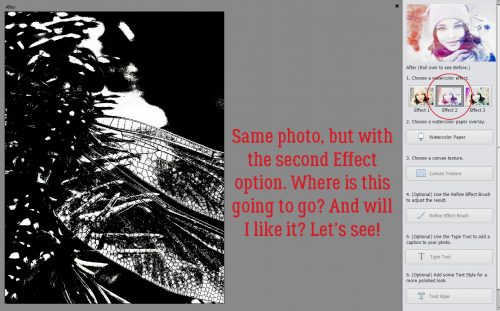
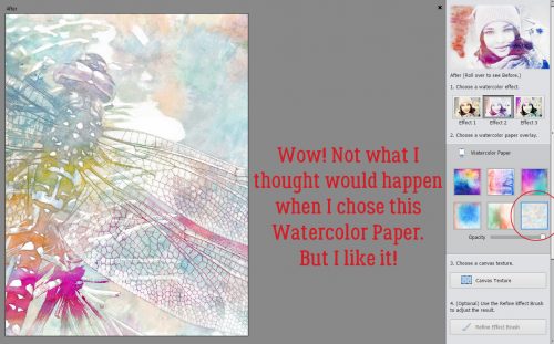
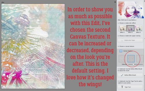
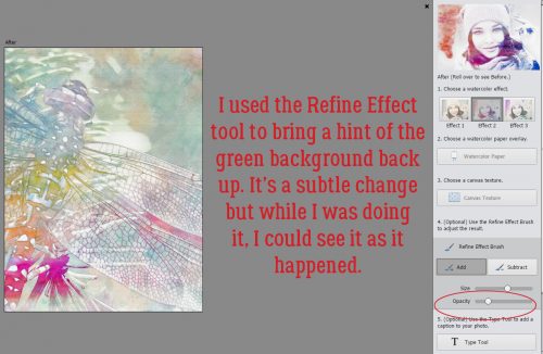
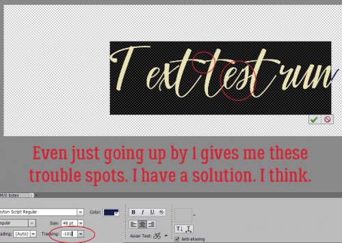
Anatomy of a Well-Composed Layout
![]()
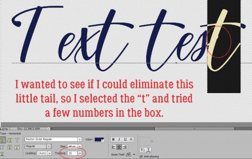
Last week’s tutorial about stacking papers brought this comment from Franghurst: “I found this article very useful. I have never stacked a paper digitally and I now feel comfortable enough to give it a try. It’s great when you give us a brand new idea about doing something but I must admit, I like the articles when you go back to the basics. It’s fun to be reminded how to do things that you learned about a while back.” Of course, that got me thinking. And thinking some more. Today we’re going to go right back the most basic aspect of scrapbooking: composition!
When I look at the layouts in the Gallery, there are layouts that snag my attention right away. I think you know what I mean. There are some things these really fabulous layouts have in common: they’re well-composed. It might not be obvious what makes them catch the eye, so let’s talk about the six basic components of composition. These are focal point, leading lines, balance, rule of thirds, white space and movement.
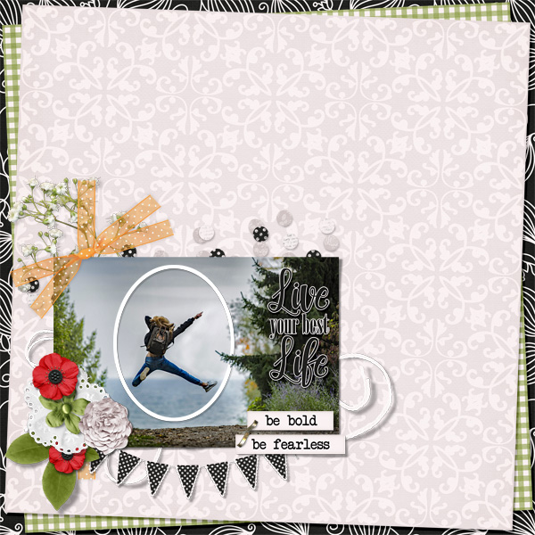
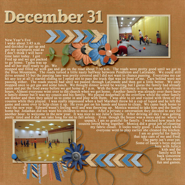
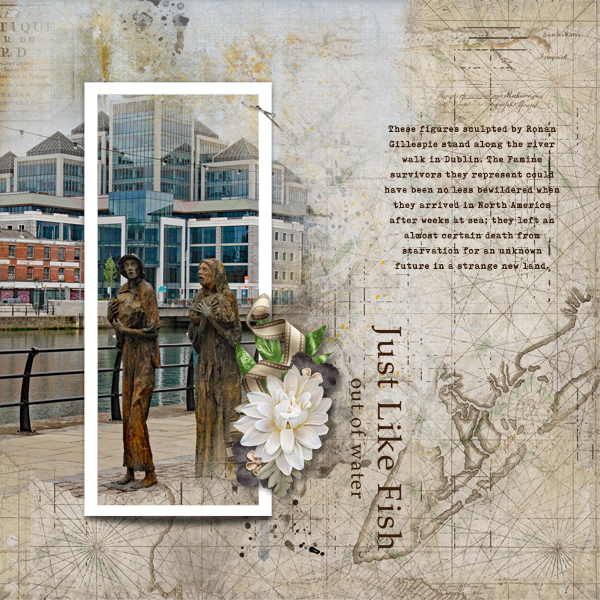
Focal point: Usually the purpose of a layout is to showcase a photo, or photos. So typically they will be the focal point. But not always. Sometimes the scrapper wants the focus on the story it’s telling, and sometimes the focus is on some other aspect of the layout. This piece by shawnbear is definitely focused on the large photo. She has used several tools from the composition list to achieve her goal.

The size of the photo is the first tool; the rays of paper and the column of elements does the rest.

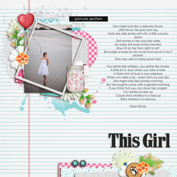
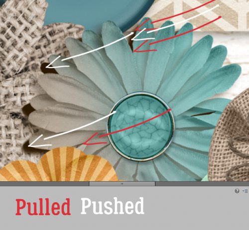
Leading lines: What exactly are leading lines? They are whatever linear aspects of a layout that lead the eye right to the focal point. Like shawnbear‘s papers. This layout by gwalters goes even deeper into leading lines because they’re both in the main photo AND the layout.

The wire of the fence draws the eye to his face. with one eye framed by them. The chevrons lead the eye to her title. And the concentric paper squares emphasize the converging lines of the layout quite neatly.

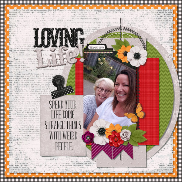
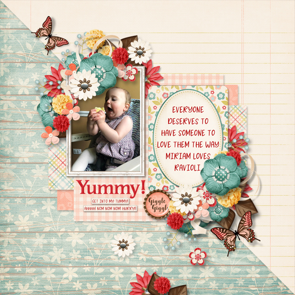
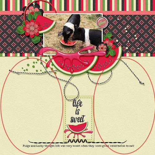
Balance: There are lots of ways to create balance in our layouts. The goal is to have areas of equal weight. Flissy61 has done just that.

She’s got the large blended photo balanced by the trio of smaller photos at the bottom. Let’s talk about those small photos for a second. Notice how she has a photo of just the sculpture and a photo of just her daughter, flanking a photo of both. Bingo! Balance. Then she’s used repetition to add more balance to the image with the two vines and the pennants.

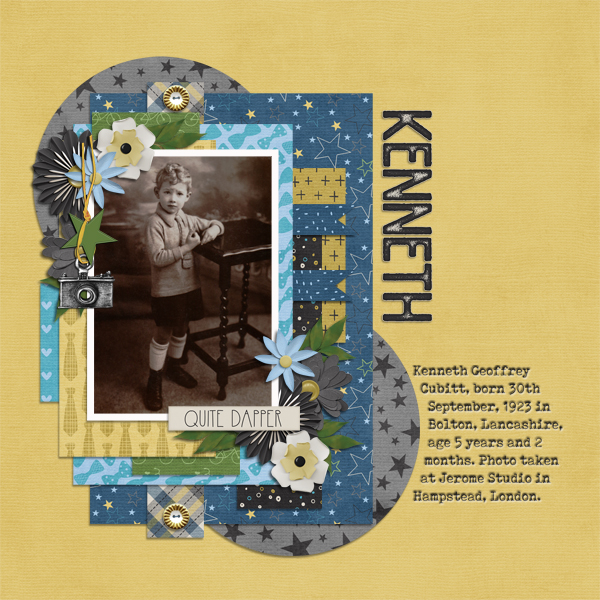
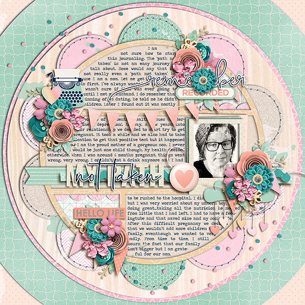
Rule of Thirds: This is something I discussed in a previous tutorial on taking better photos. The “Rule of Thirds” means imaginarily dividing your image into thirds, both horizontally and vertically, then placing any (or all!) intersection of those imaginary lines over a focal point. lmtroch has done that in her layout below.

Do you see it? (My lines might be a little off… I eyeballed them.)

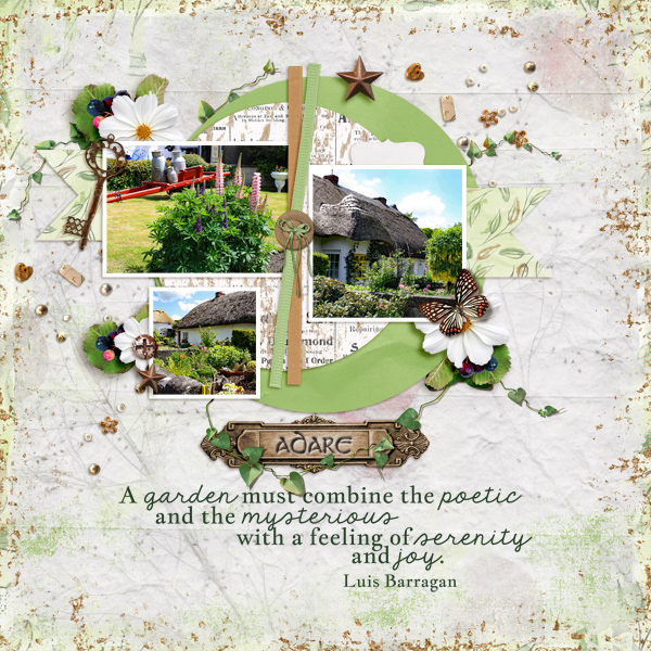
White space: This isn’t a literal thing… more of an uncrowded area of the layout where the eye can go to rest. Jill is a master at the use of white space – literally in this layout!

I think white space is a vastly underused tool. But see how effective it is to have these two large areas of just paper.
And last is Movement. By this I mean the way the layout guides the eye around to take in all its components. becky_a makes it look easy.

It really doesn’t matter where you start with this layout, your eye is moved around the whole thing perfectly. Here again, the placement of her photos is key; they all are facing the centre of the layout – harmonious and very pleasing. The bubbles act as a vector to move the viewer, as does the piece of string. And the three little flower clusters keep things on track.

Okay. There you have the factors that create strong compositions. I invite you take a good look at each of these layouts and see if you can pick out each of the “rules” in them. You might also take a critical look at the templates you really like and analyze what makes them attractive to you. I bet you’ll find at least a couple of ways to fit them into the “rules”!
![]()