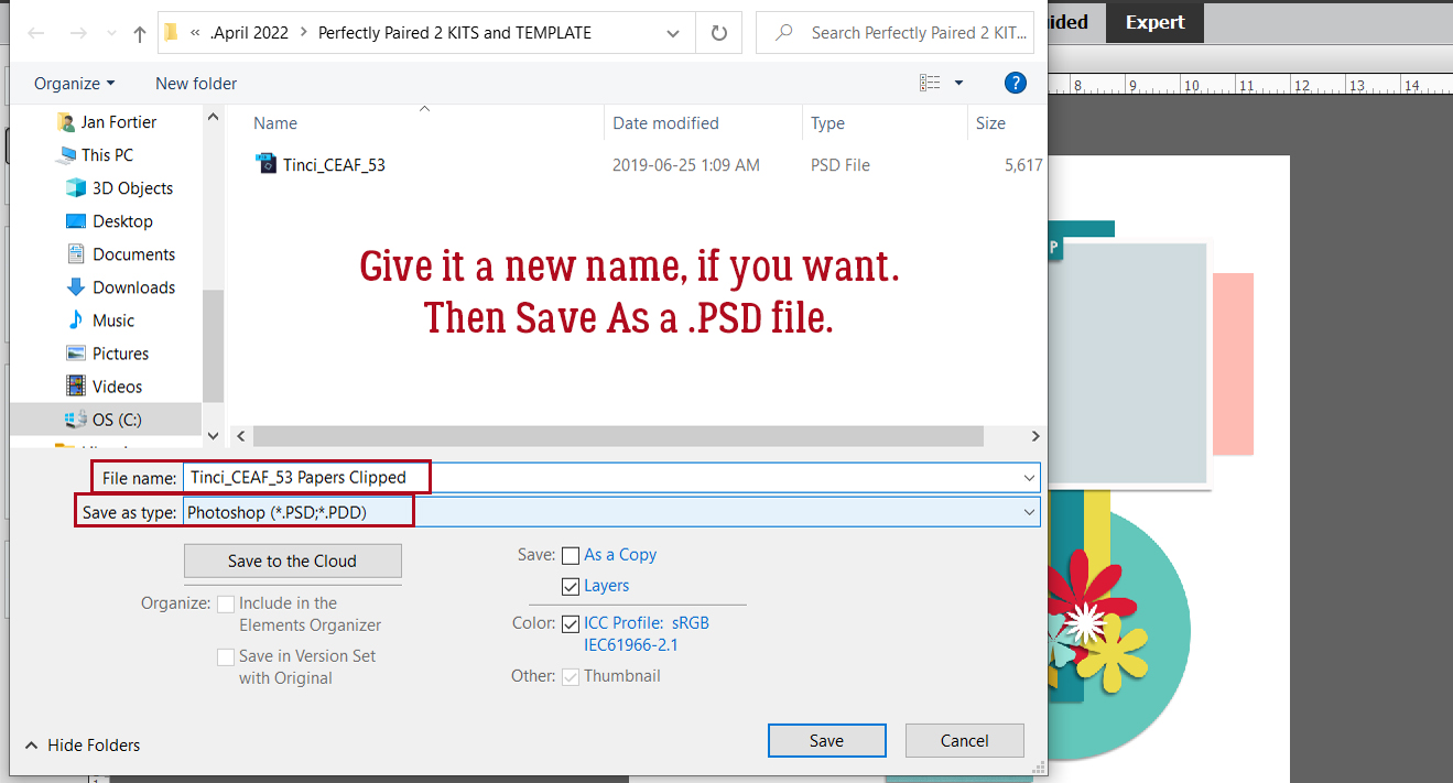
Create a Word Art Photo Frame
![]()
PDF Version: https://bit.ly/37KoqdK
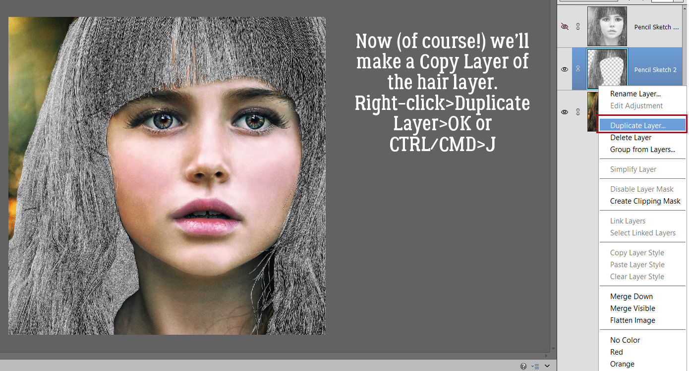
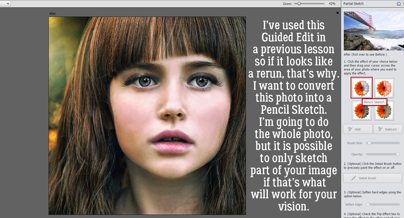
Have you ever seen a set of word art frames in a digi-scrapping store and like the idea of them, but not the words the designer has used? Well, that’s an easy fix!
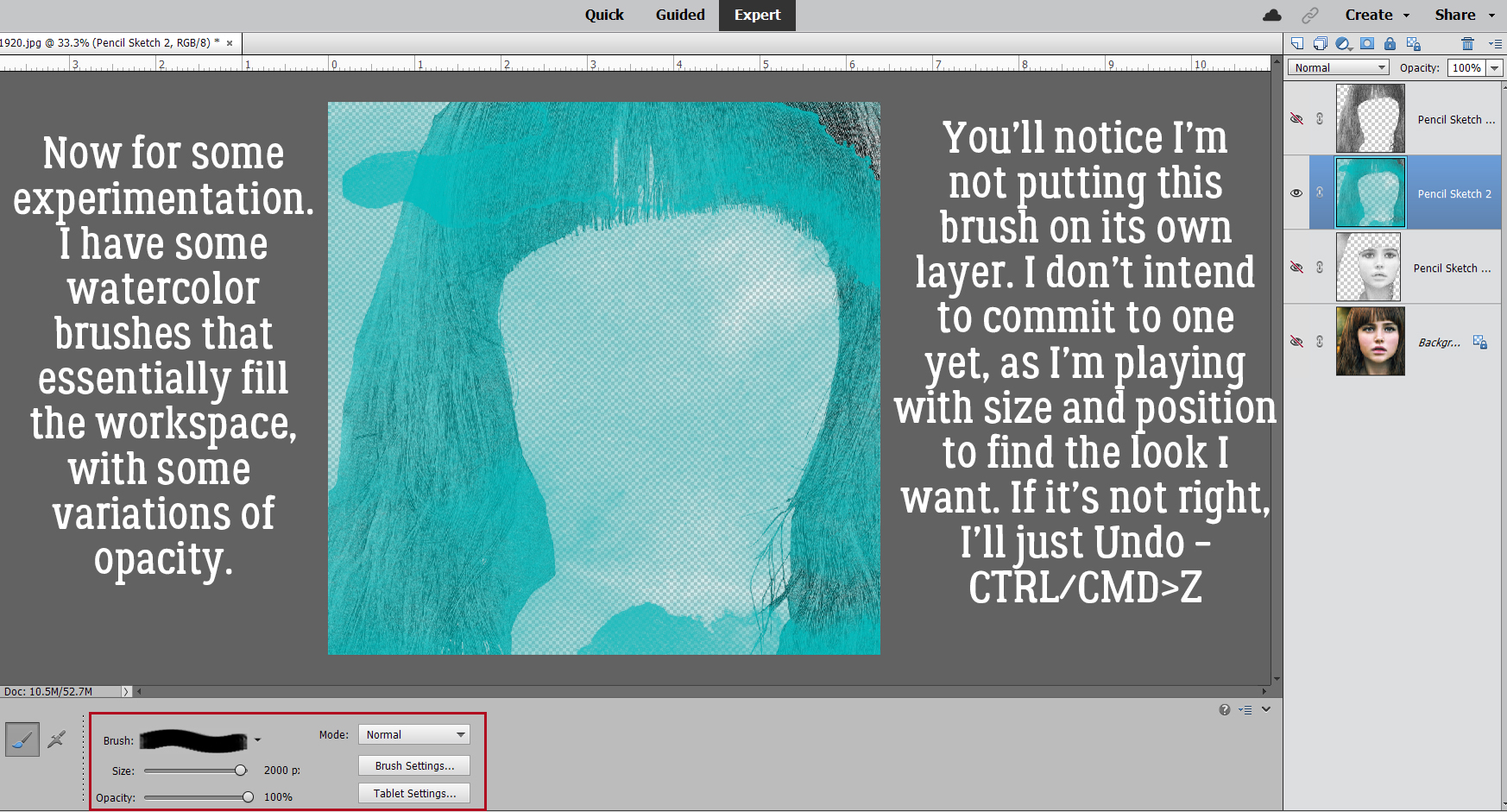
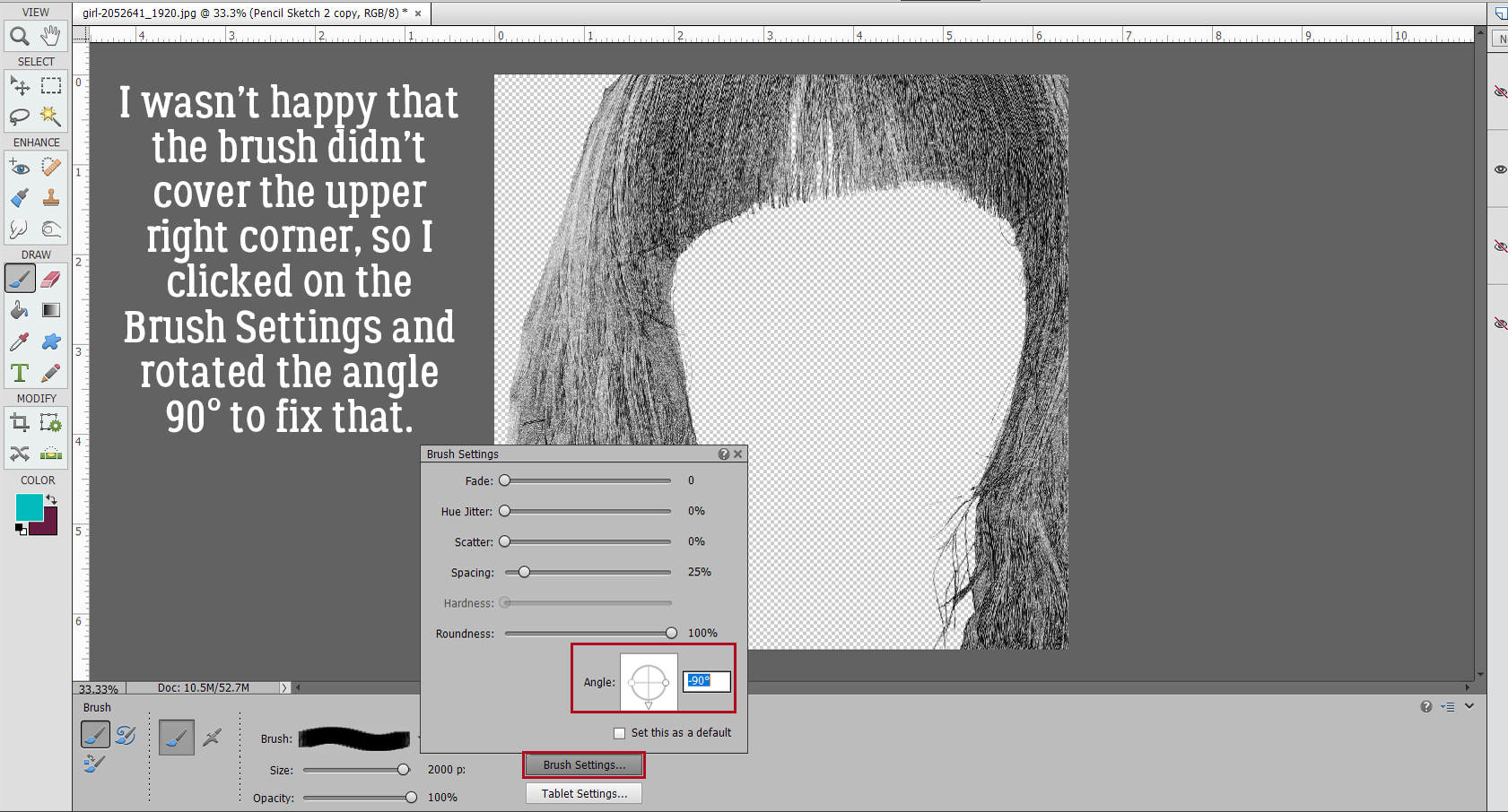
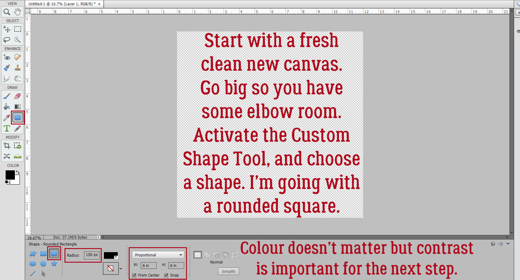
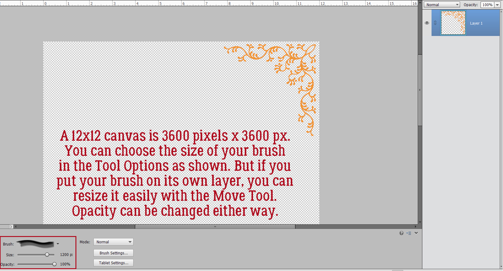
Open up a shiny, new blank canvas with a transparent background. Make it big so you have lots of room to manoever. Mine is 12×12. It can be big while under construction because we can always resize it to fit the layout when the time comes, right? Activate the Custom Shape Tool and pick a shape. I’ll use a square with rounded corners. By utilizing the Tool Options, I can set predetermined dimensions for the shape. In the Rounded Rectangle toolkit, I like a Radius of 150 pixels to give an obvious round edge to the corners but still maintain the “square” of it. As for colours, whatever you like will be totally fine, as long as there’s sufficient contrast for the next step. I’m going basic black and white.
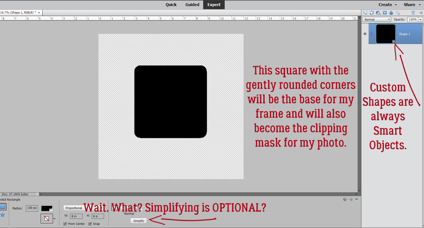
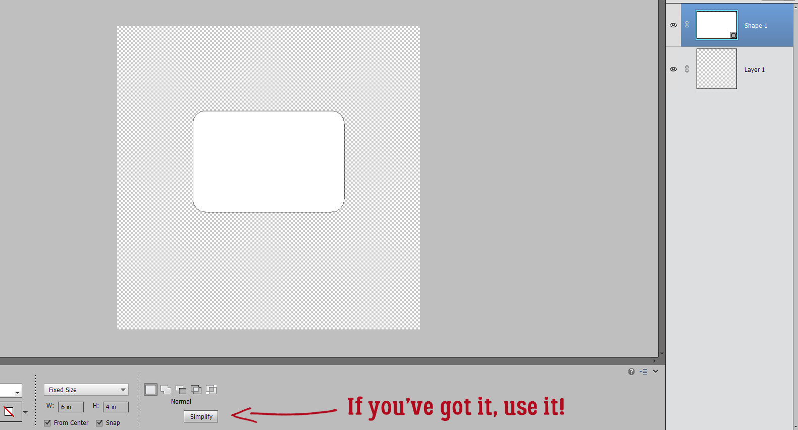
With my predetermined settings all I had to do was click on the centre of my canvas and I had a perfect, 6×6 square with rounded corners in the middle of my canvas. Easy peasy! As I may have mentioned once or twice, the Custom Shape Tool output is ALWAYS a Smart Object – meaning it can’t be manipulated in any way but resizing. (I prefer to think of them as Stupid Objects.) To have the ability to make other adjustments to a Custom Shape, the layer has to be Simplified. But wait!! For this technique, Simplifying isn’t needed! Yes, you read that right… only Simplify if you want to. (But it IS another step.)
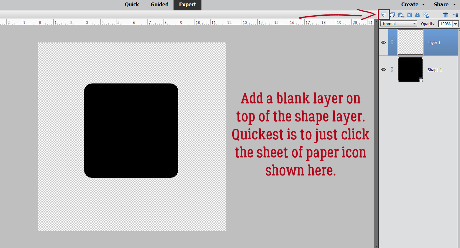
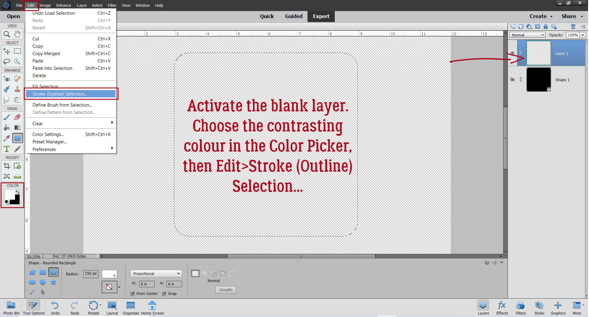
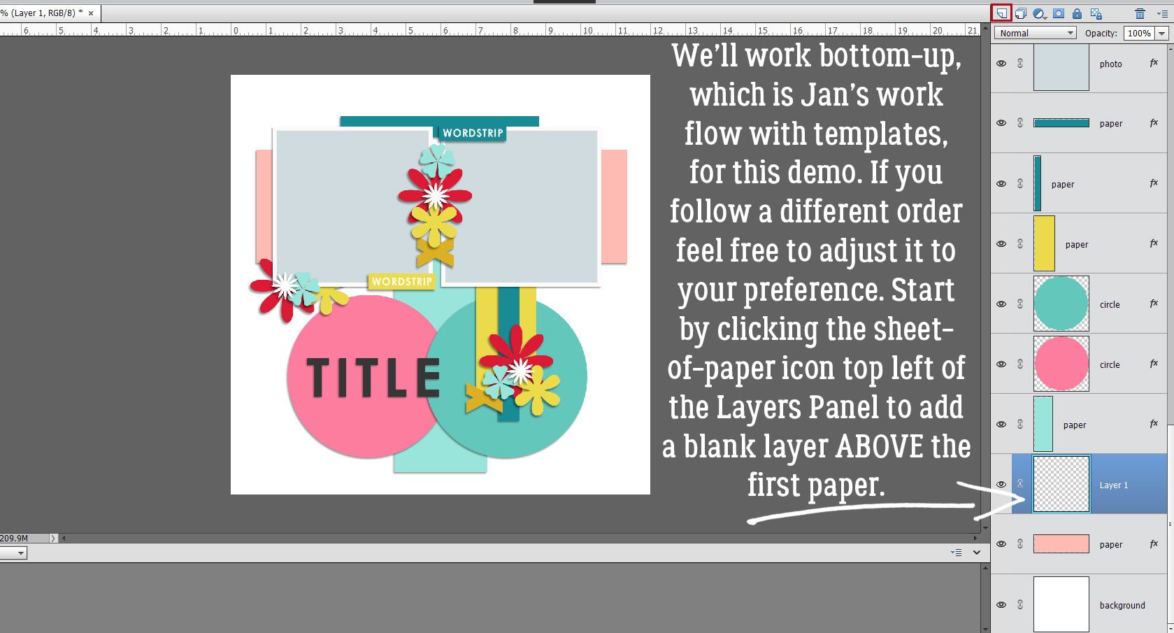
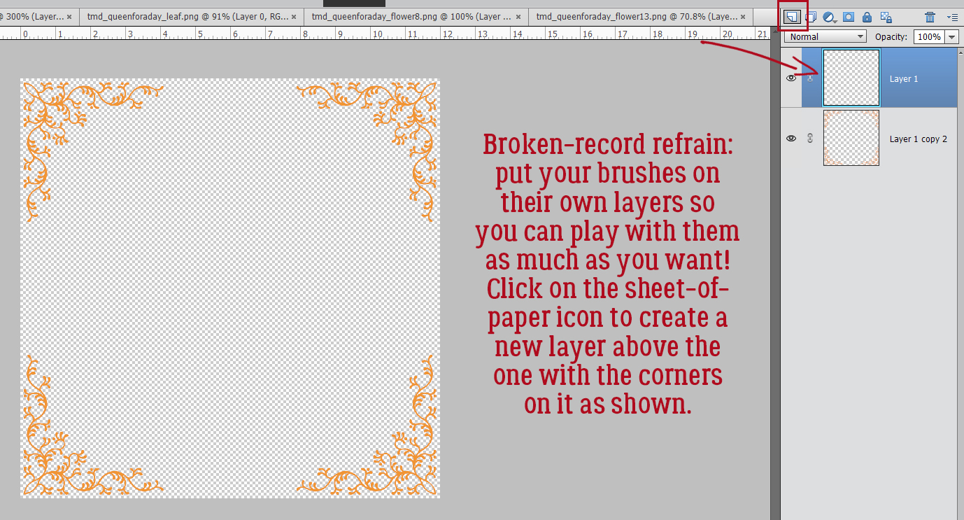
Next, pop a new blank layer on top of the Shape layer. The quickest and easiest way to do that is to just click on the sheet of paper icon as shown.
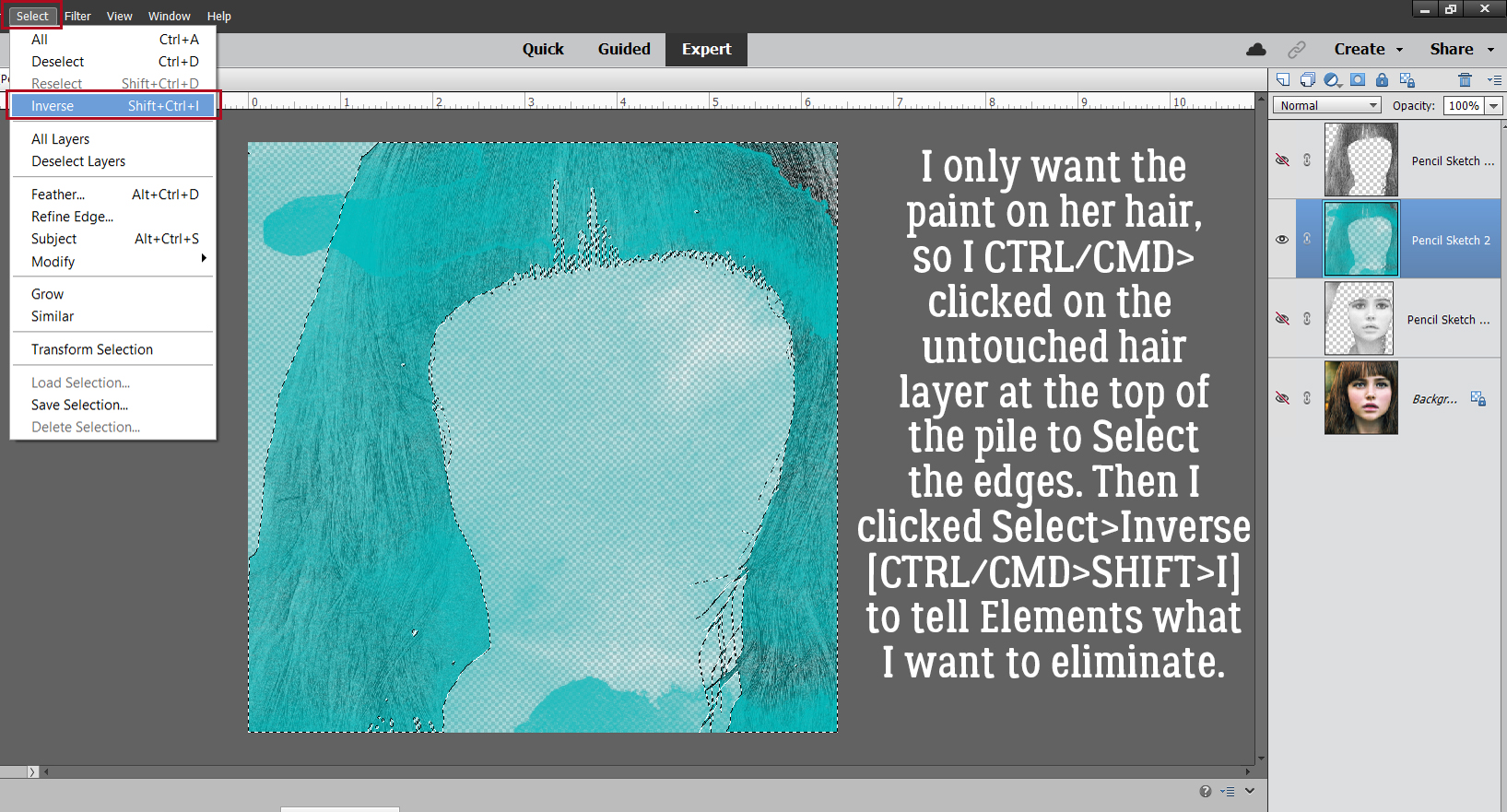
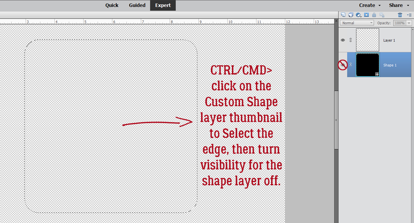
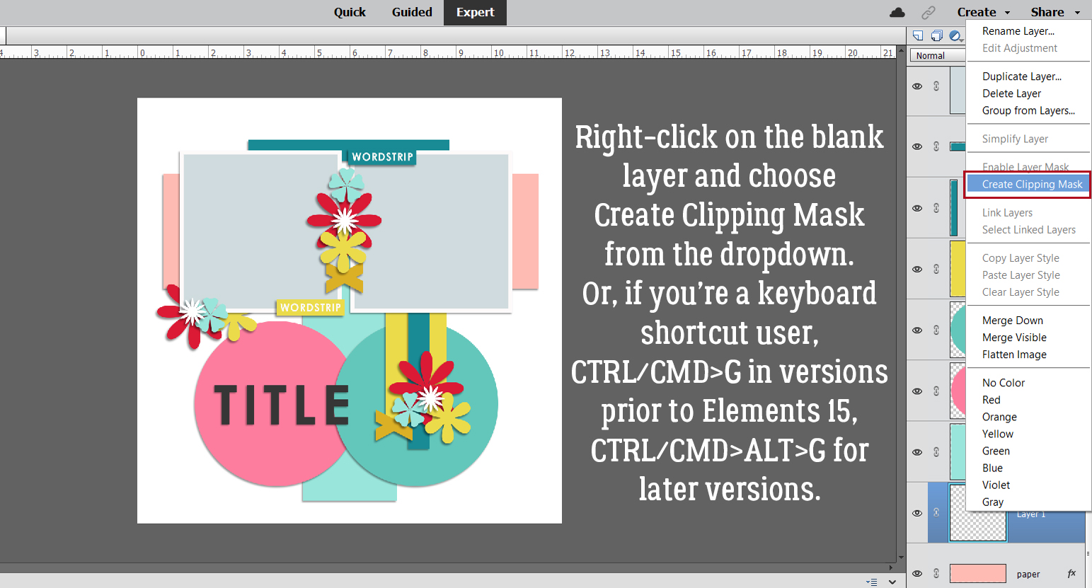
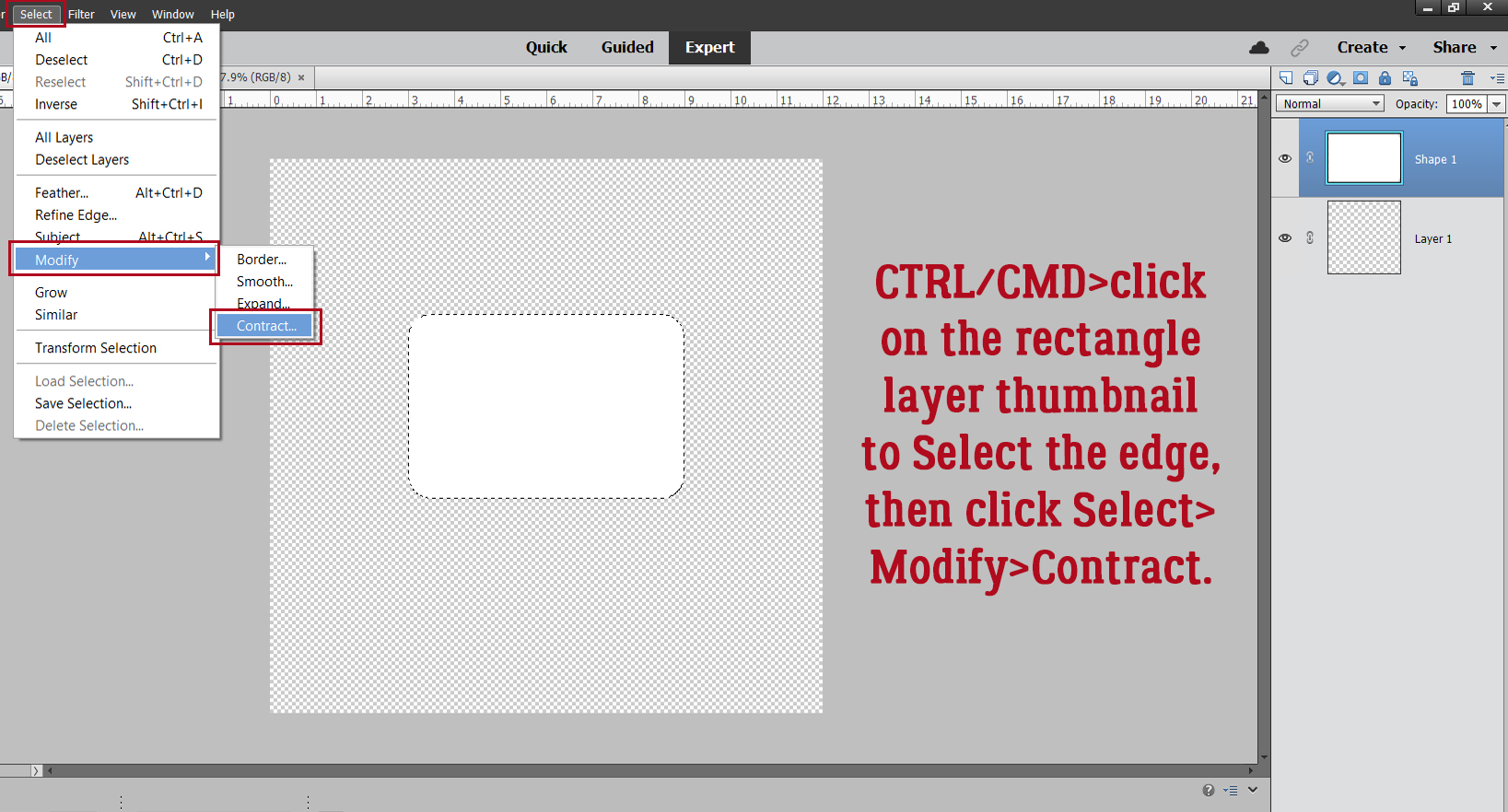
To Select the outer edge of the Shape layer, CTRL/CMD>click on the layer thumbnail – the picture of what’s on the layer. The marching ants will appear, and then the layer’s visibility can be turned off. Close that eye!
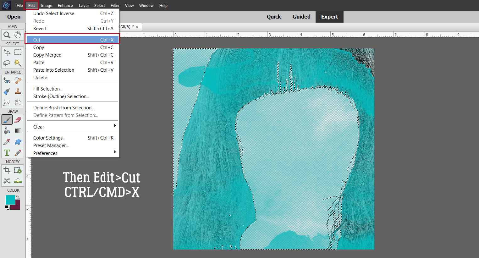
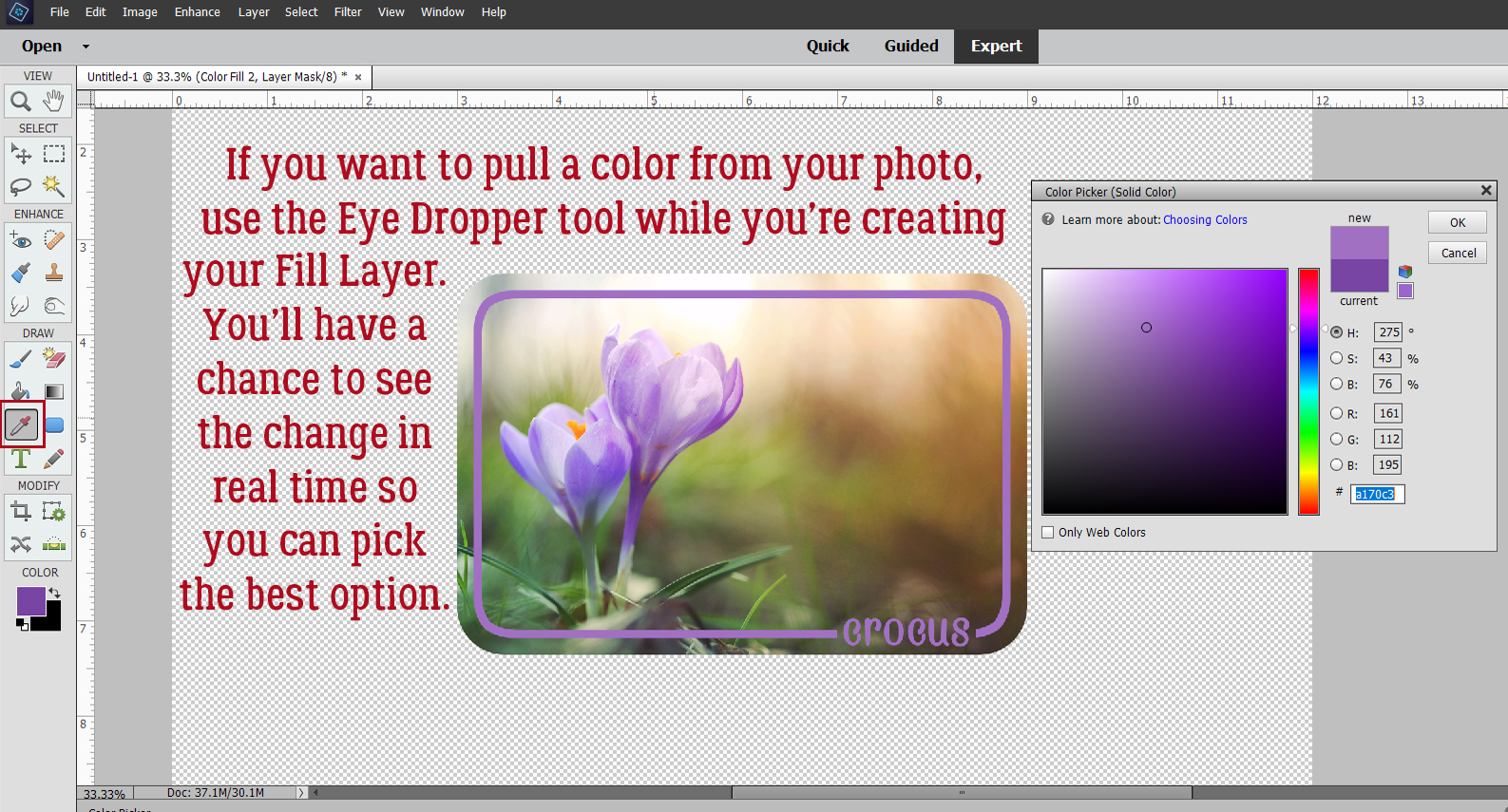
Activate the blank layer, where you still can see the marching ants. Change the foreground colour to your other colour. [The X key will let you toggle between foreground and background.] <whispers> you could use the same colour… Jan just likes everything to be easily seen. Then Edit>Stroke (Outline) Selection…
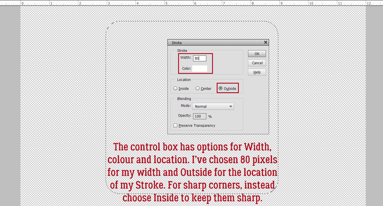
The control box for the Stroke process has multiple settings you can customise. It’ll show you what colour you have in the foreground. You decide the Width of the outline, where the outline will be Located, Blending Mode and Opacity. I opted for 80 pixels, which will give me a substantial but not overbearing outline. I’ve Located it Outside the Selection. If you’re using a shape with sharp corners, put your Stroke Inside to maintain their sharpness.
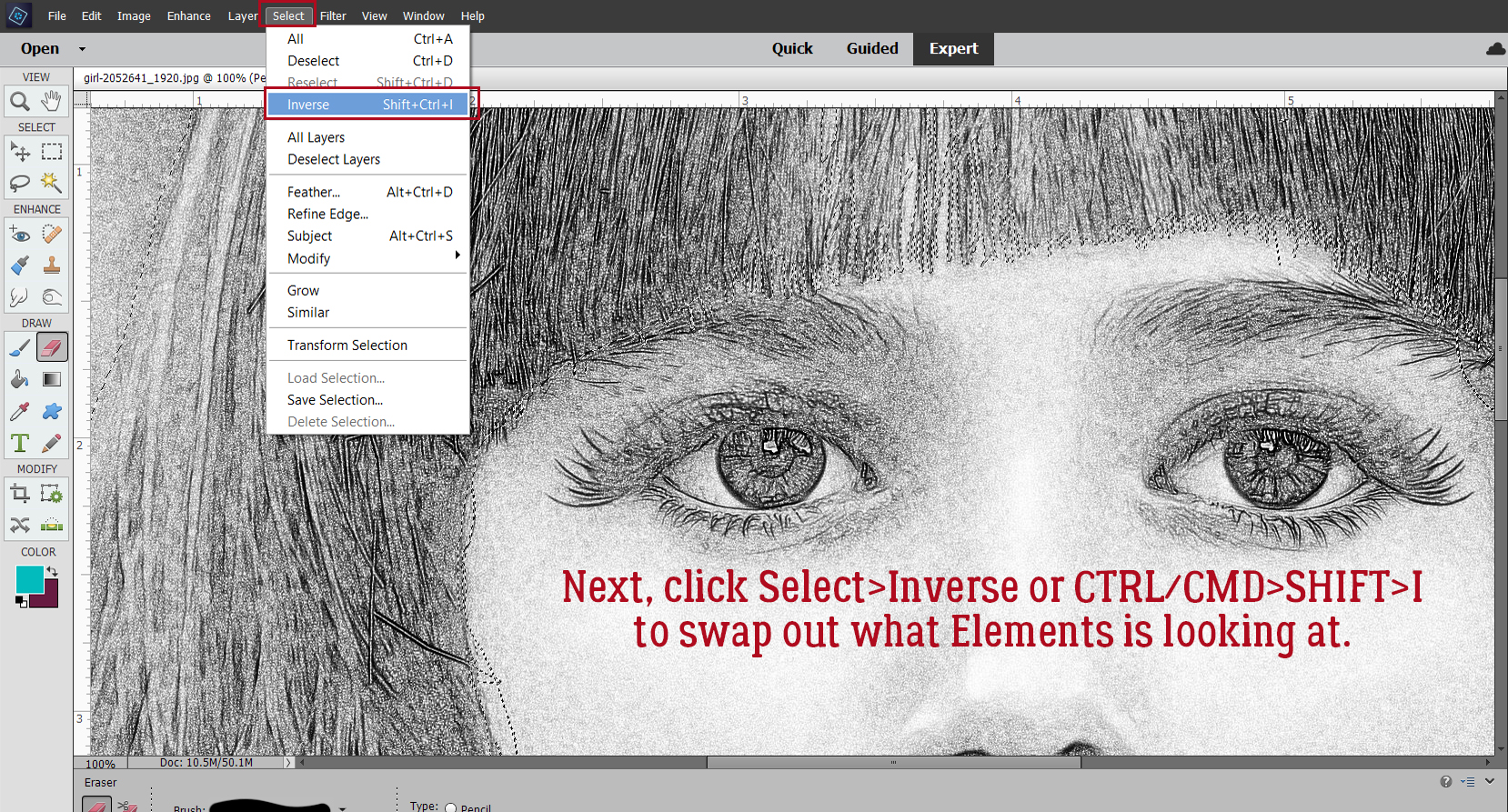
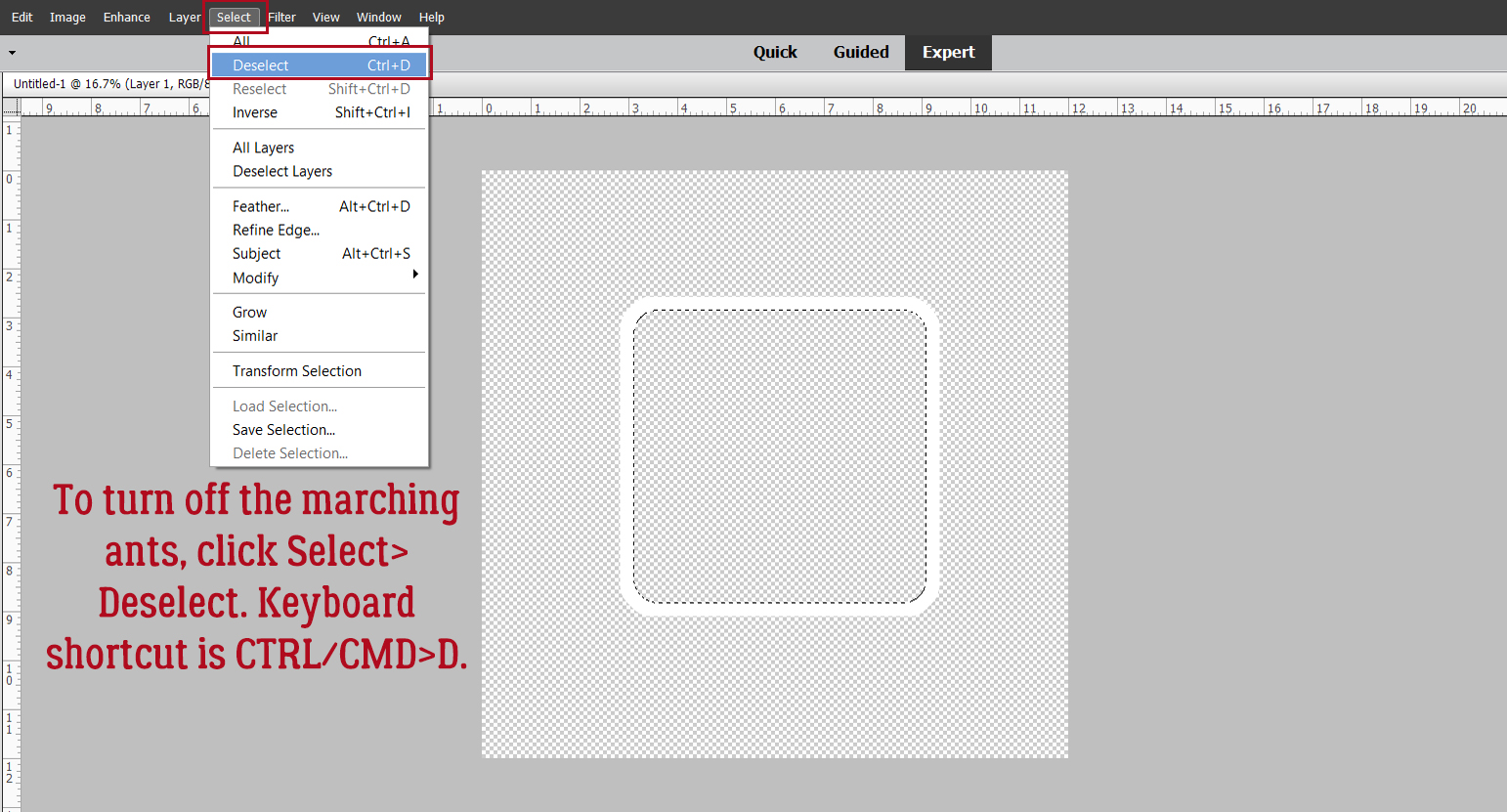
To get rid of the marching ants, Select>Deselect or CTRL/CMD>D.
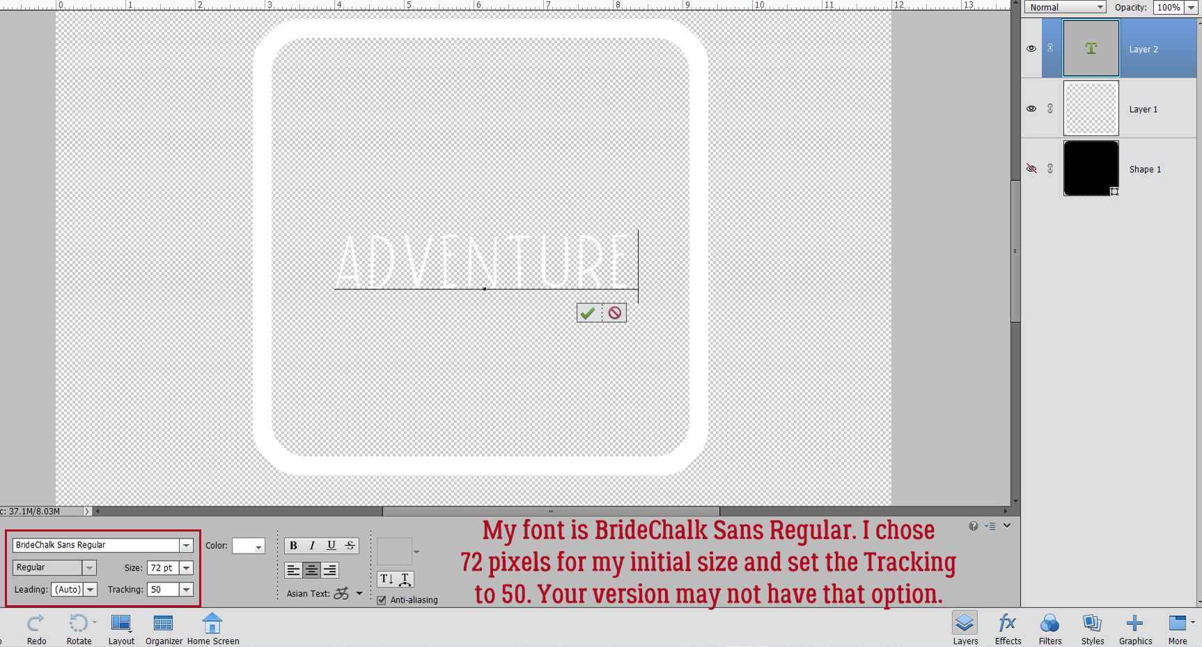
Now for the word(s).The font you choose will be dictated by the subject matter of your photo/layout. I went with BrideChalk Sans Regular, a simple all-caps handwritten font and my word is ADVENTURE. I’m using Photoshop Elements 2021, so my font settings may not look like yours. Tracking ( aka kerning) was a new addition with Elements 2019. Basically, it allows for more or less space between characters; this can be a valuable adjustment, especially with script fonts that may not connect the characters together cleanly. In this situation I want space between my characters because I’m going to make my letters heavier. If you find your characters are too close together and don’t have Tracking, you can put them on individual layers and shift them around so you’ve got that room for adding some presence.
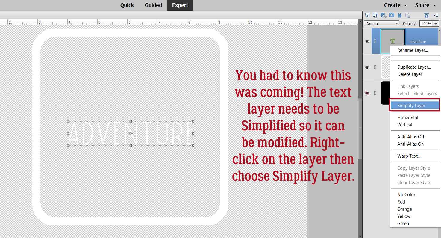
I want to make adjustments to this text layer other than resizing it, so BOOM! there it is… Time to Simplify. Right-click on the layer and choose Simplify Layer.
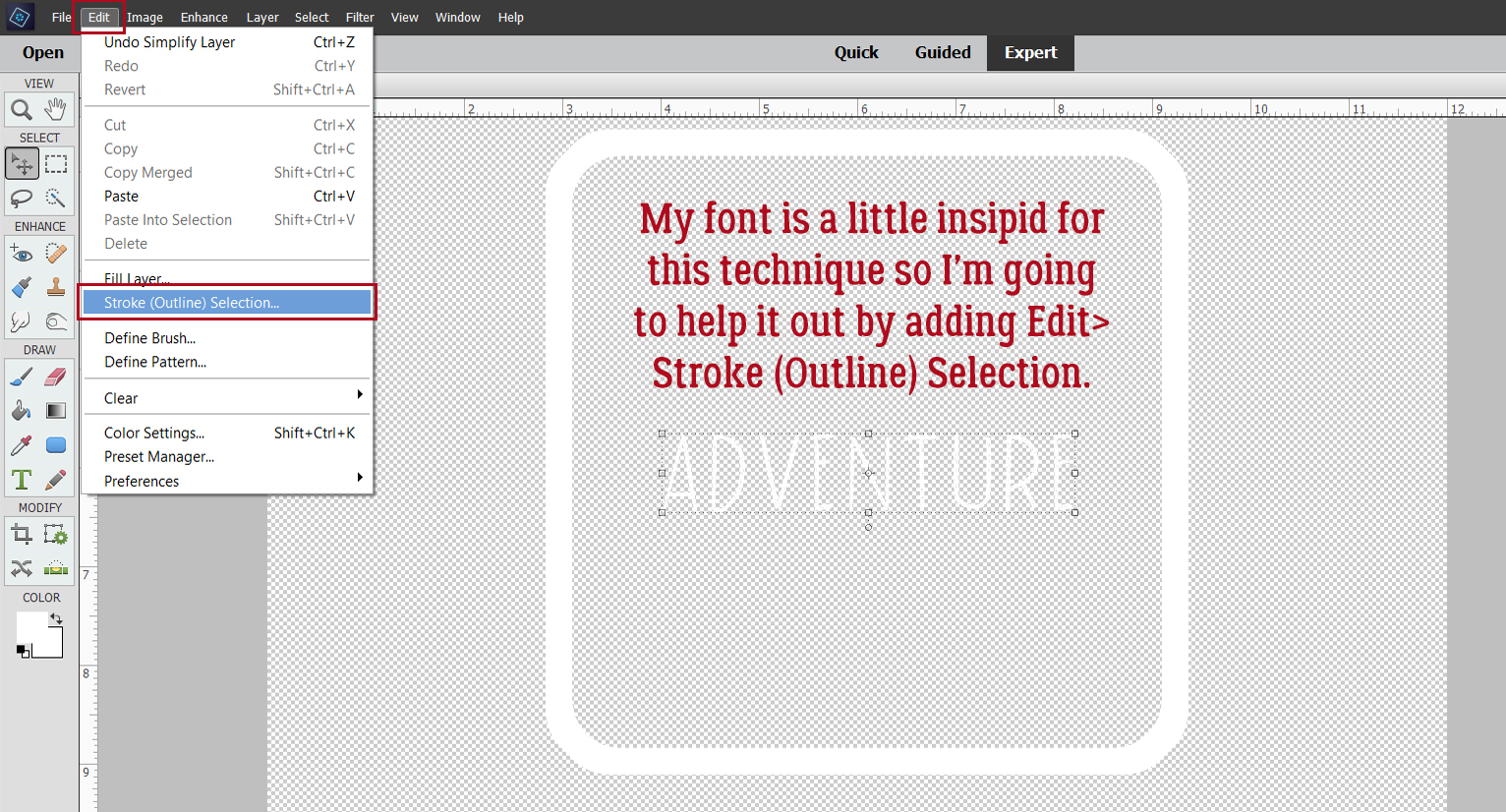
Edit>Stroke (Outline) Selection… is such a useful tool!
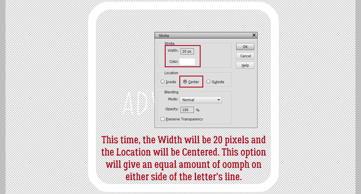
This time my Stroke will be 20 pixels and Centered on the Selection. That will put an equal amount of outline on either side of the line and it will be more balanced.
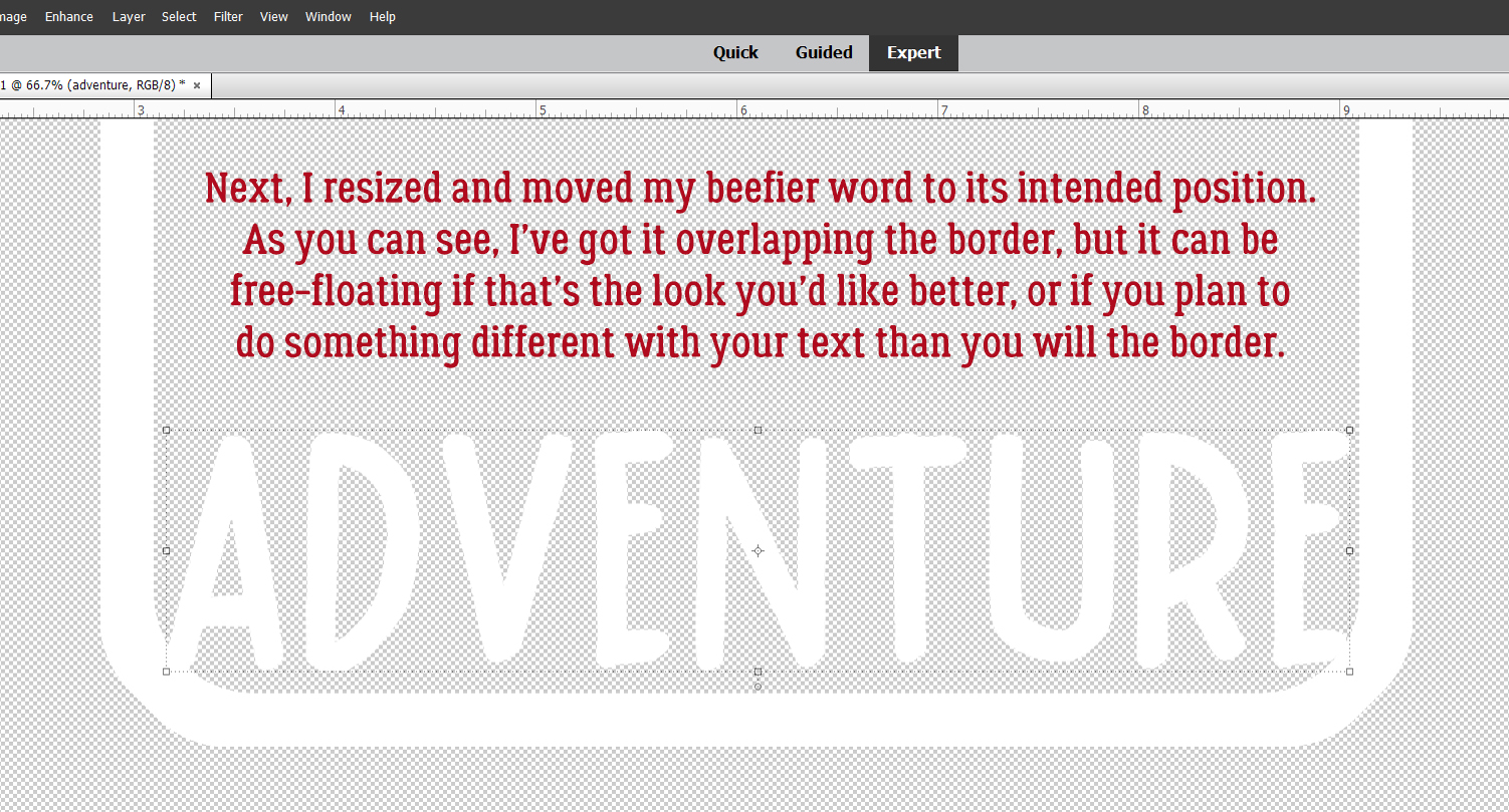
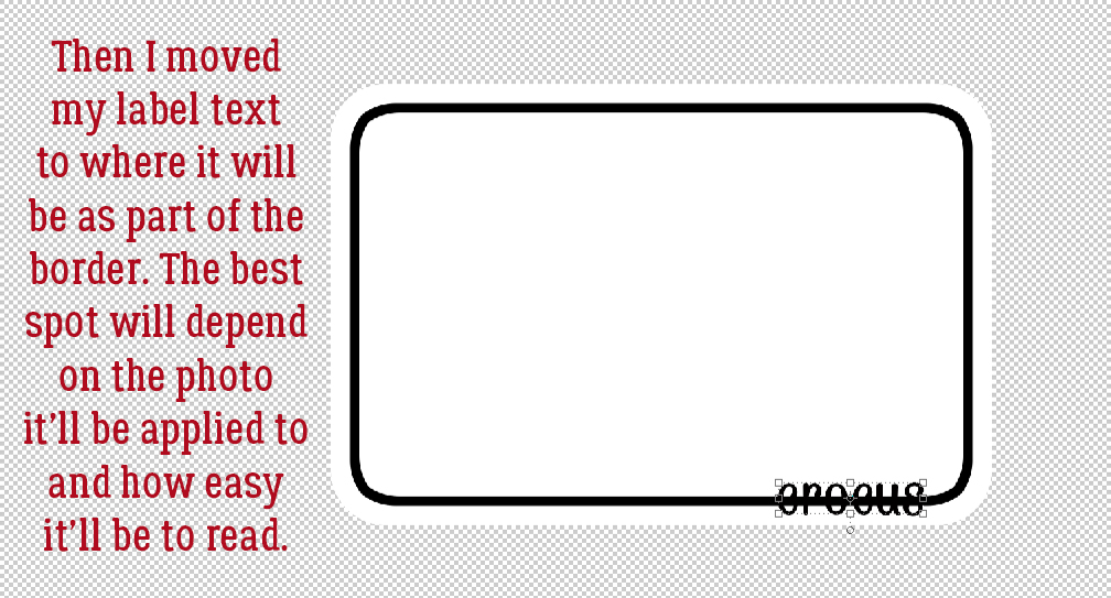
I resized the text to extend side to side and have the lower corners just overlapping the border a smidge. I’m putting it at the bottom, but it could just as easily be vertical and to one side, run across or down the middle, sit at the top… whatever looks right to you. This part is completely personal taste – if you want the word to float, let it float!
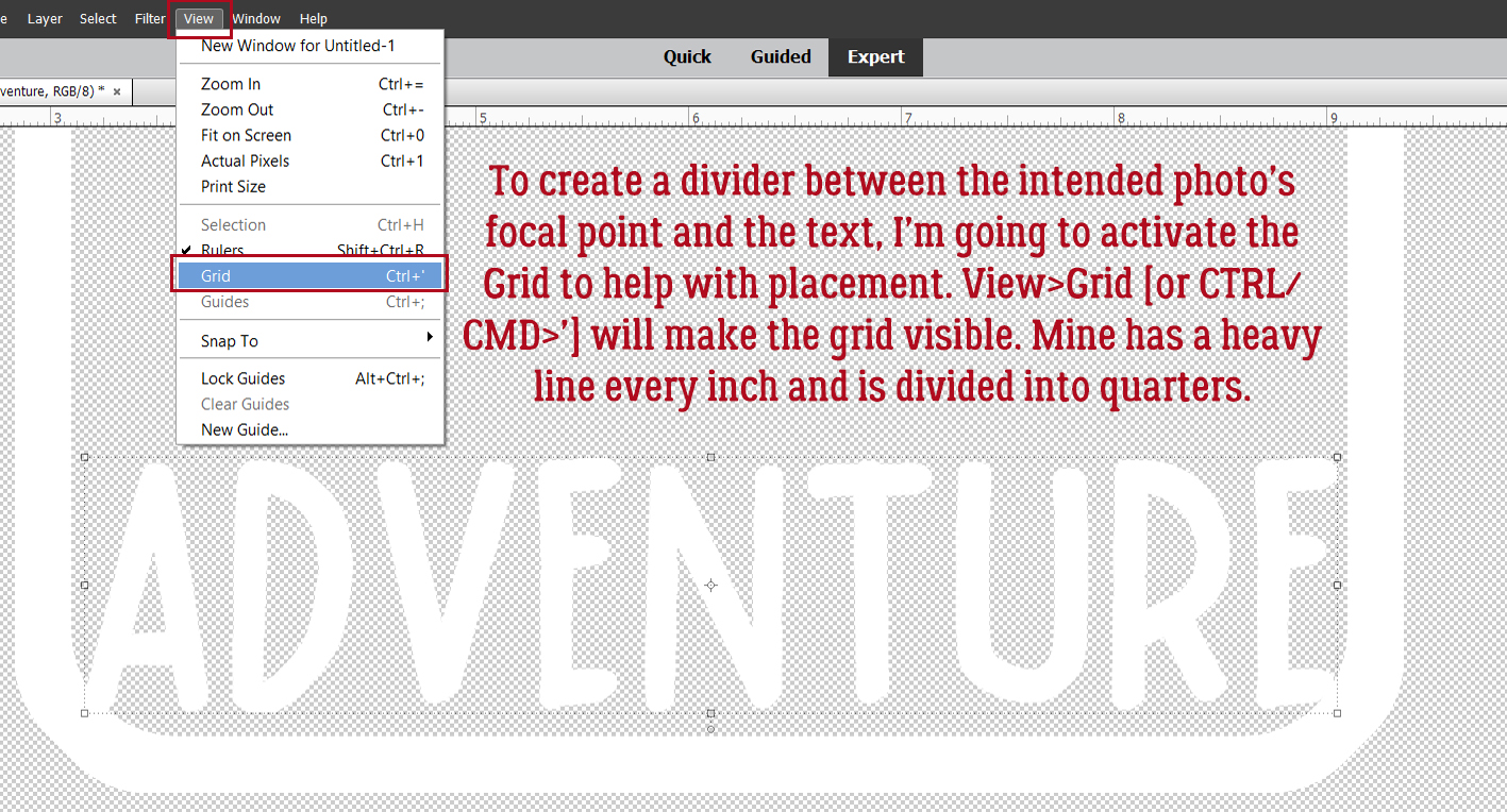
I want to add a divider above the word so that it’s framed. To make this step easy and give you control over the results, turn on the Grid by clicking View>Grid or use the keyboard shortcut CTRL/CMD>’. This will help with placement so much! In my Edit>Preferences I set the main grid lines 1 inch apart and the divisions at 4, so there’s a visible line every 1/4 inch.
Add a new blank layer to your layers stack. This will allow you more flexibility once you’ve created your divider – meaning that if it needs to be moved, you’ll be able to move it. Activate the Pencil Tool and set the Size to 80 pixels, the same dimension we used for the border. (Or to whatever you want… this is a guide!) Then choose a spot on one side of the border that sits at an intersection of Grid lines and click there. Hold down the SHIFT key and move your cursor to the other side of the border along the same horizontal line, then click there. Voilà, a straight divider line! To turn the Grid off, go back to View>Grid or CTRL/CMD>’ and it’ll go away
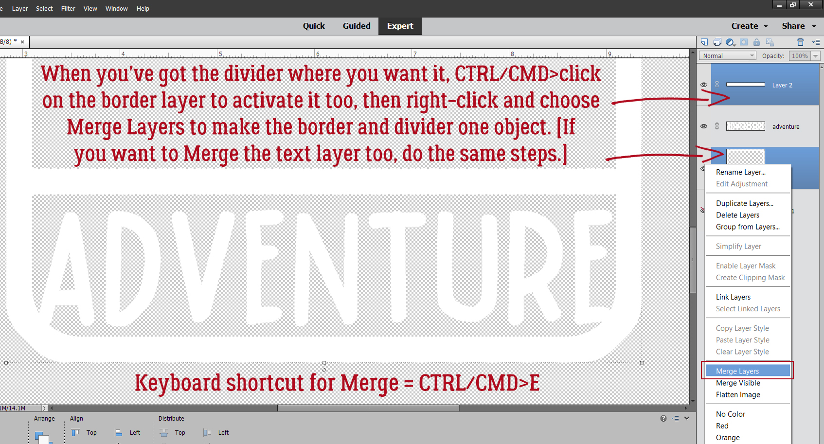
If you’re not happy with where the divider is, nudge it into place. Then CTRL/CMD>click on the border’s layer so the two layers can be Merged into a single divided frame. If you want the word to be connected to the frame as well, CTRL/CMD>click on that layer too before right-clicking and choosing Merge Layers. Keyboard shortcut for Merge is CTRL/CMD>E.
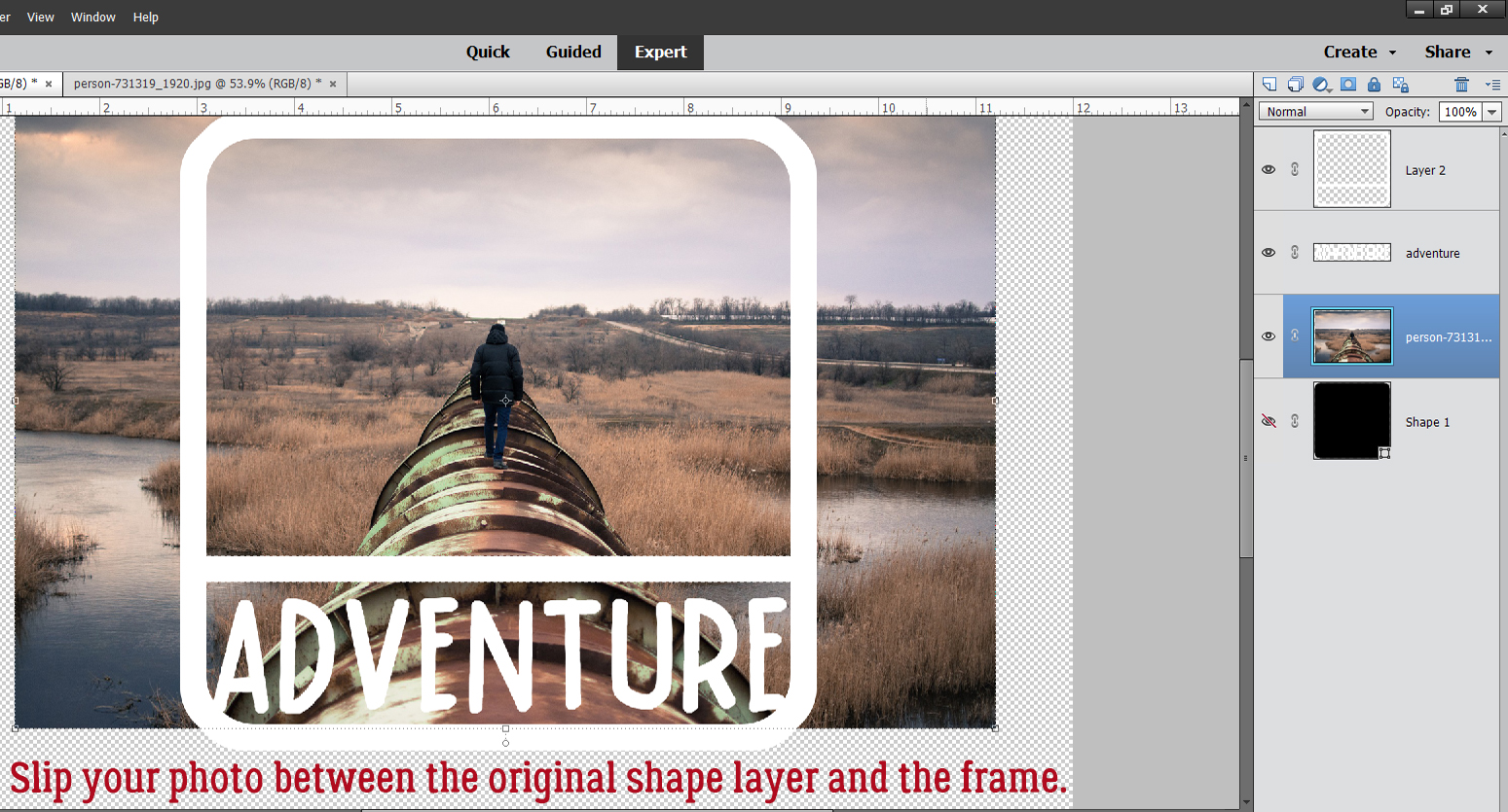
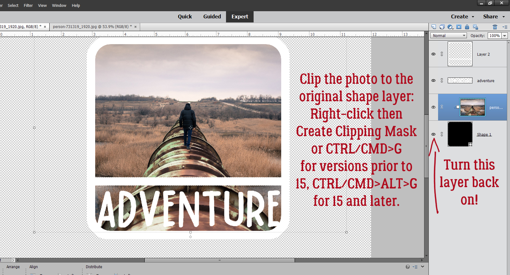
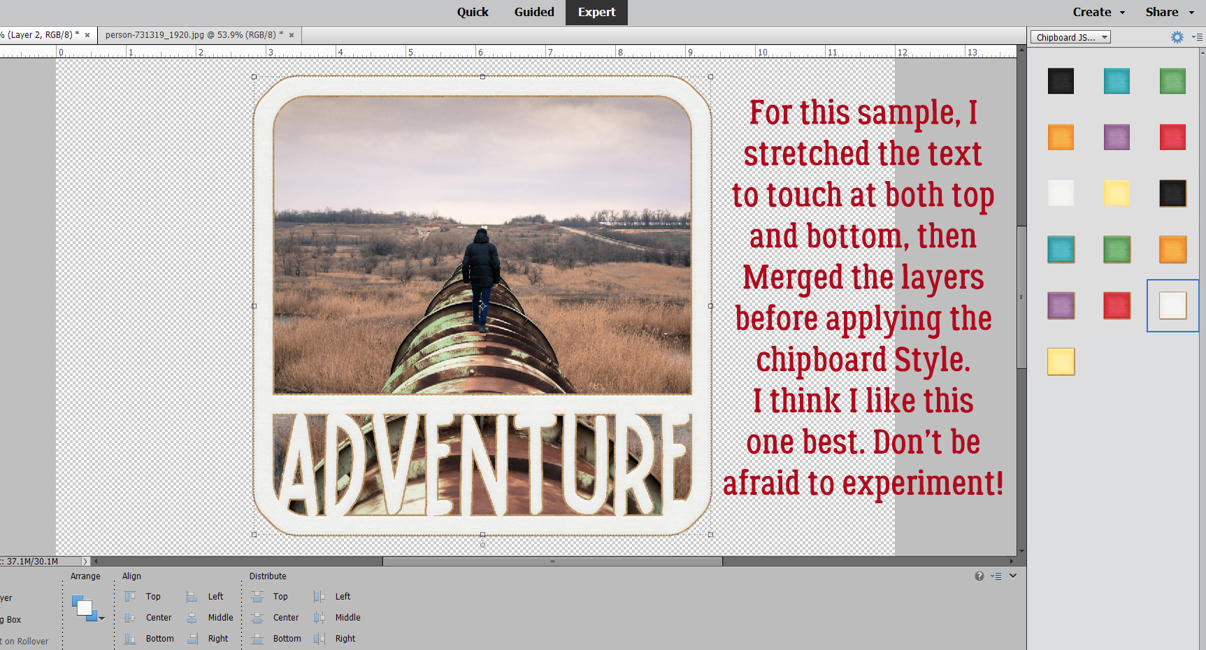
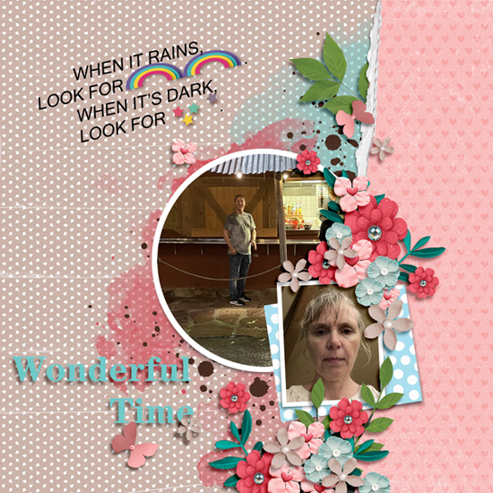
Now to add the photo. I like this Pixabay photo of a man walking on a pipeline so I dragged it onto the canvas between the original Shape layer and the frame, resized it and positioned it.
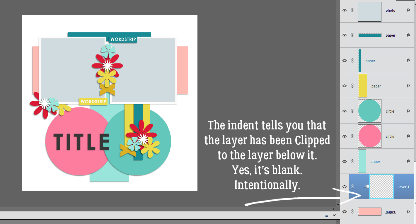
Once I turned the Visibility for the original Shape layer back on, I could use it as a Clipping Mask.
Now for the fun part! The frame and word art can be transformed in a number of ways, such as clipping a paper or cardstock to it and adding a drop shadow. Or… Layer Styles!! I like the Chipboard Styles from Just So Scrappy‘s Lucky Me with this photo/frame combo.
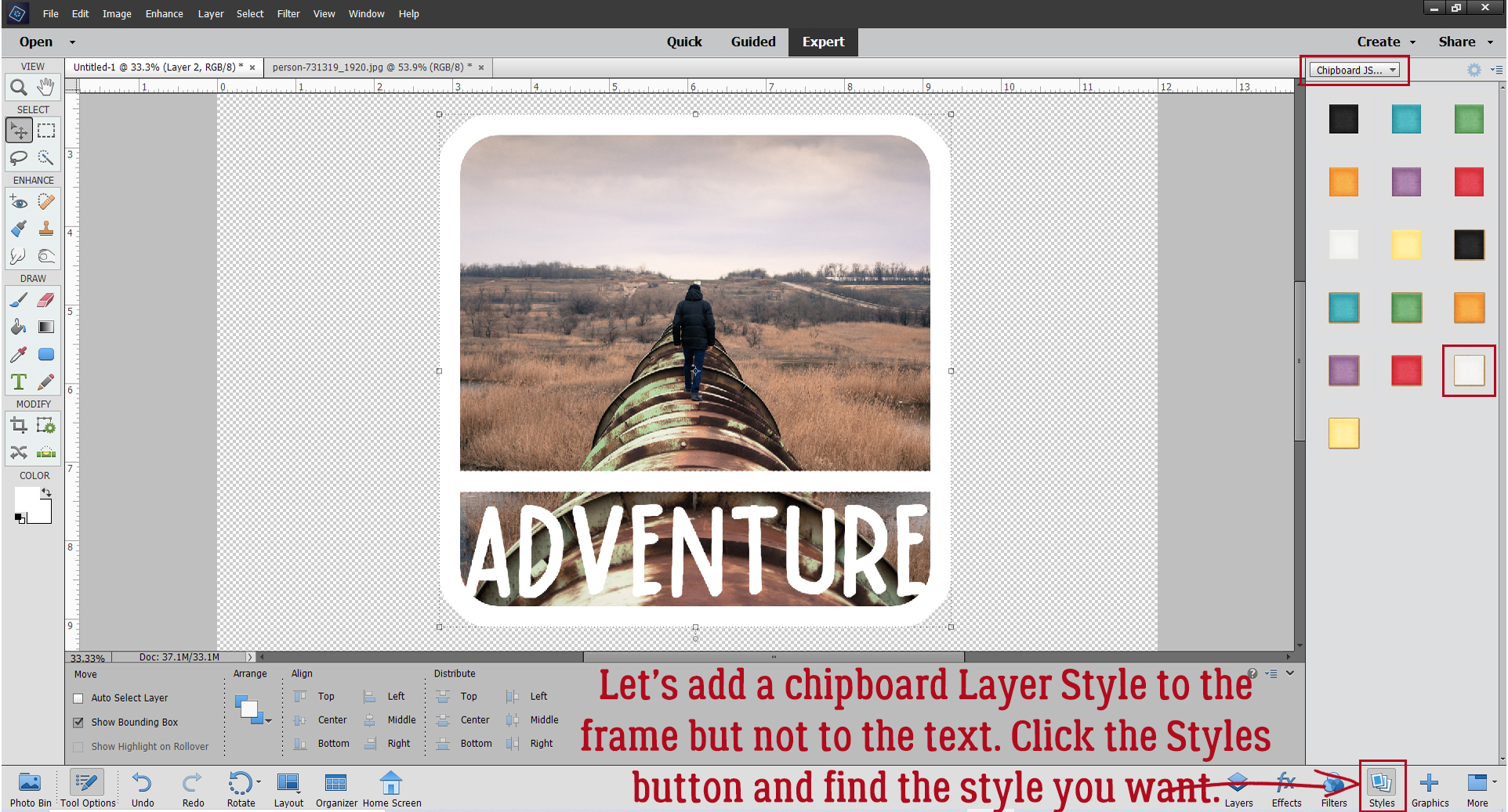
I really like the Kraft paper edge on this style and think it works really well with my photo.
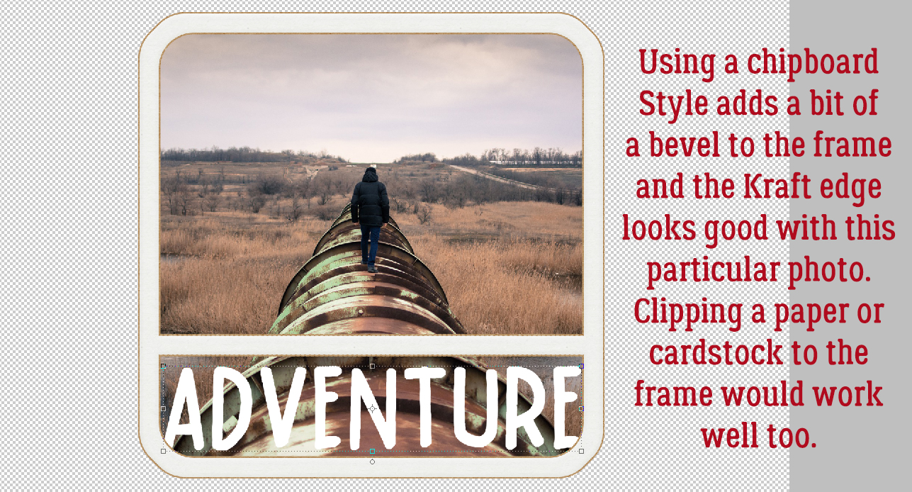
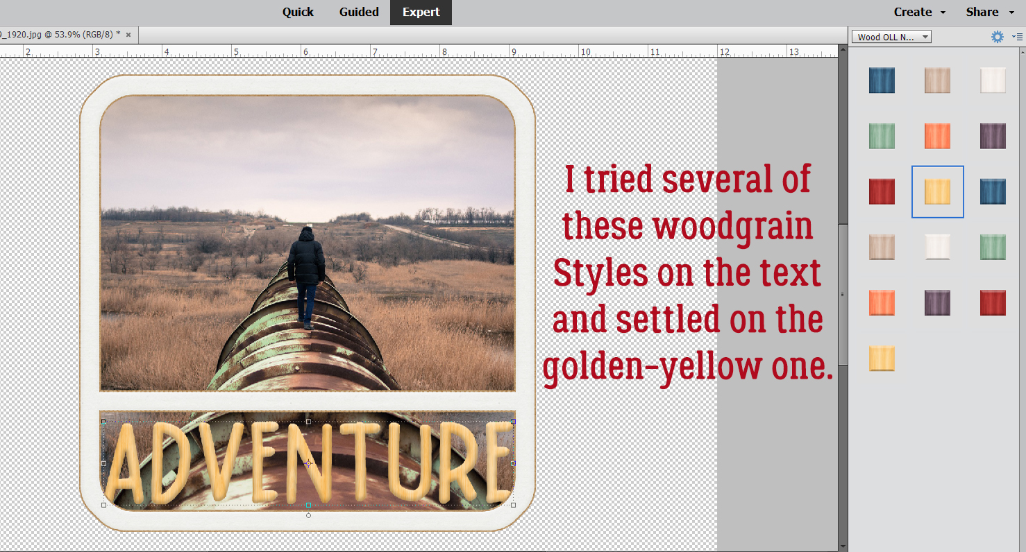
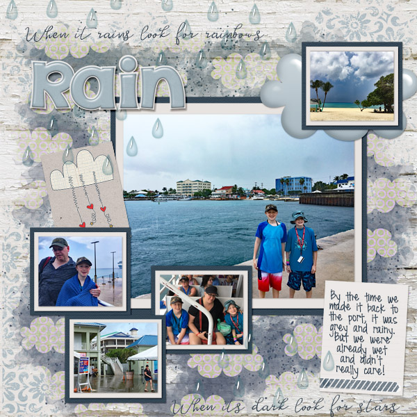
With the word art separate from the frame, I played with some other Layer Styles and settled on this golden-yellow woodgrain Style from Ooh La La Scraps Nearly Fall. It adds a bevel to the letters.
I played a bit more with it, stretching the text so it touches top and bottom, then Merged all three layers. With the Chipboard Style applied, it looks like this.
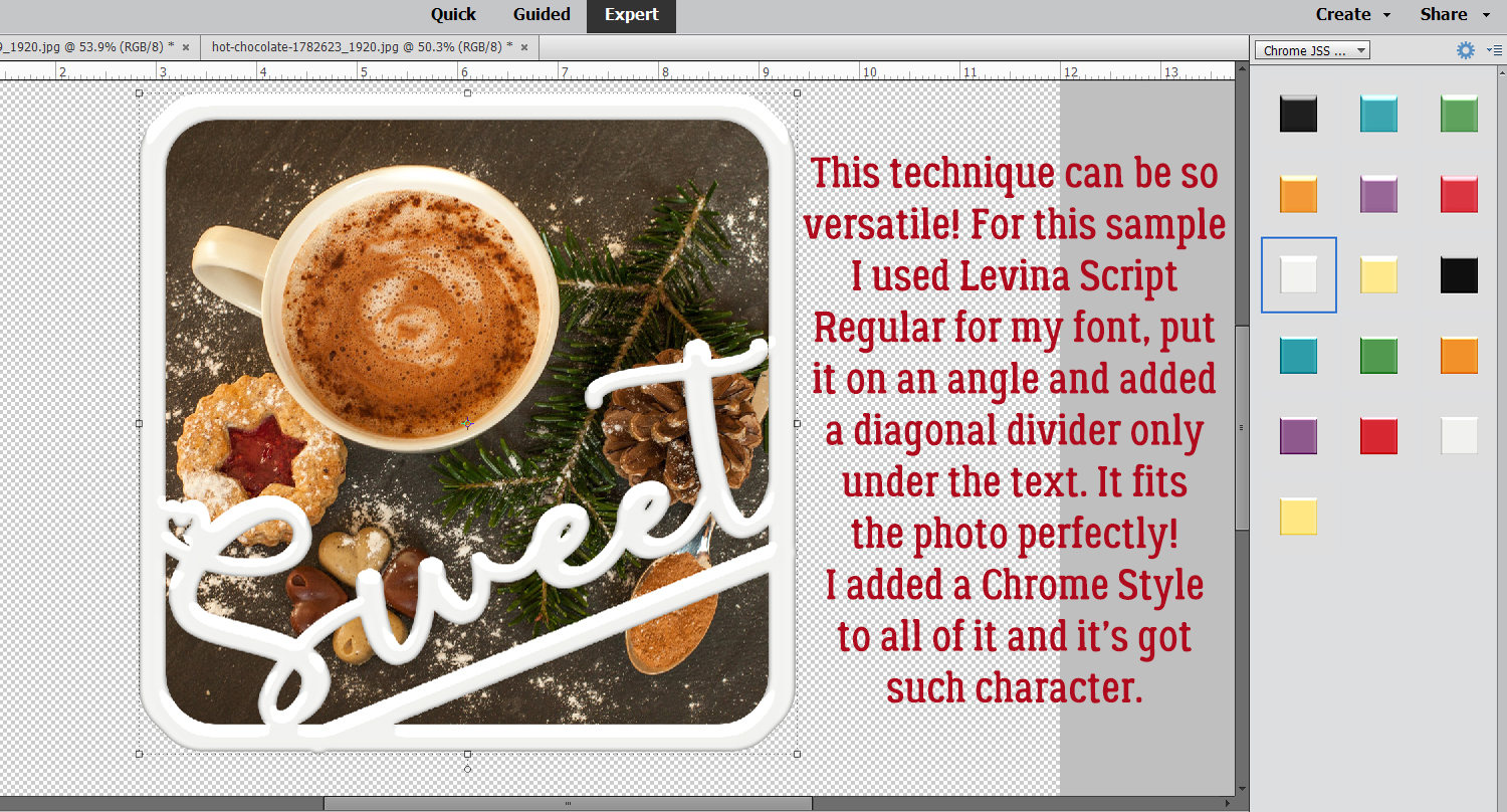
I made another sample, this time using Levina Script Regular for my word. The Layer Style is Just So Scrappy‘s Lucky Me Chrome in white. The possibilities are endless with this technique!
I hope you try this one. It’s so simple, but so versatile.
PDF Version: https://bit.ly/37KoqdK
![]()


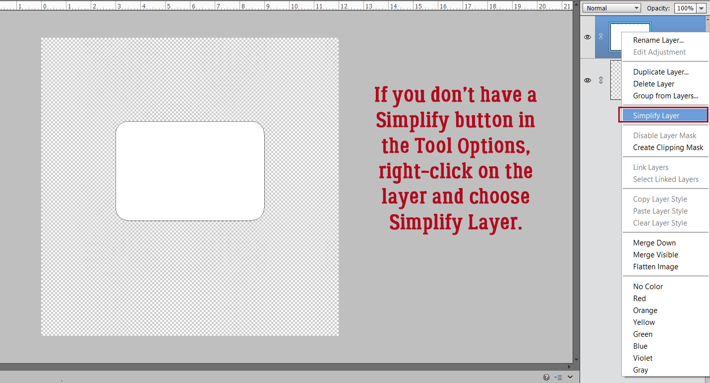


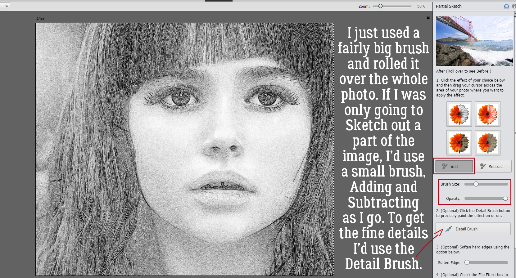
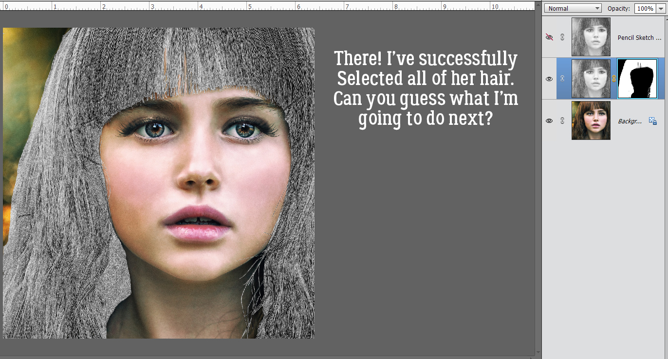
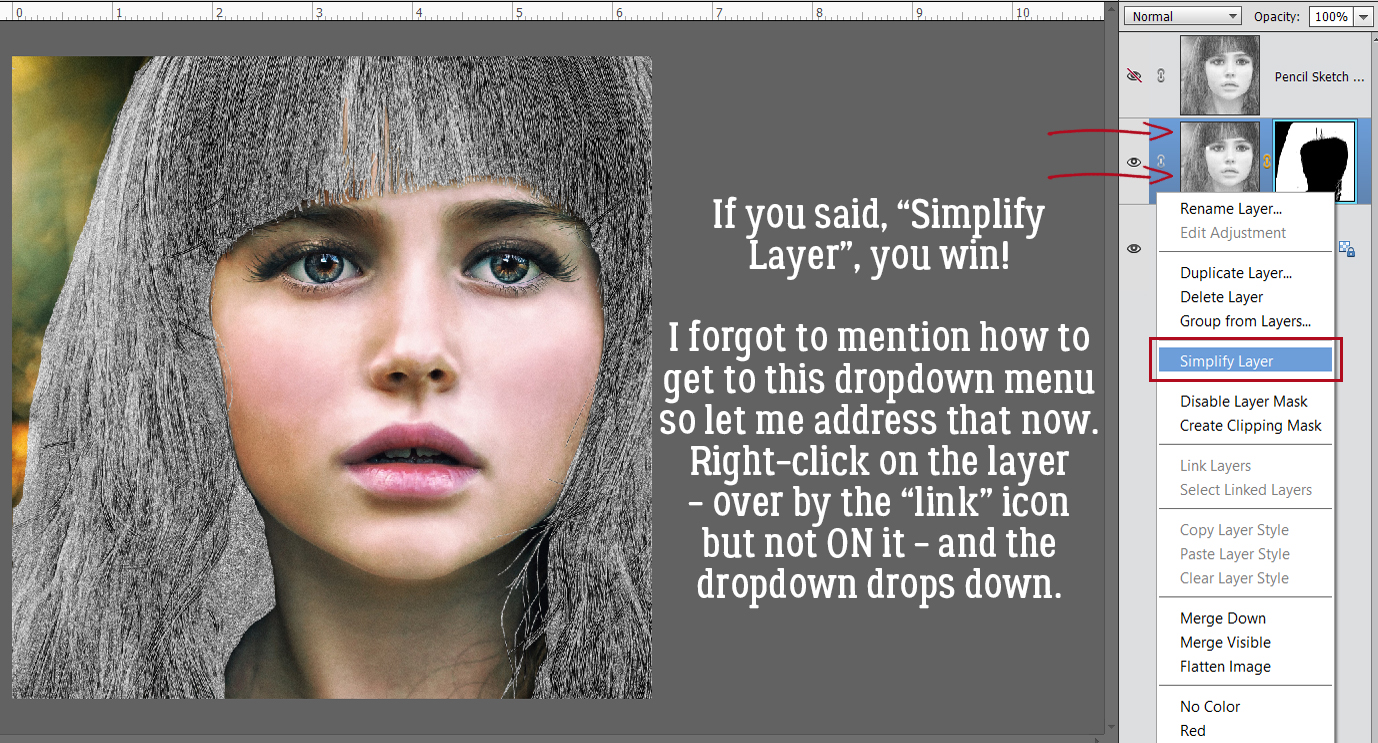
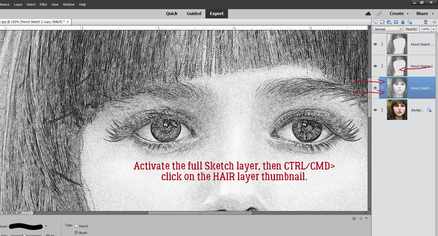
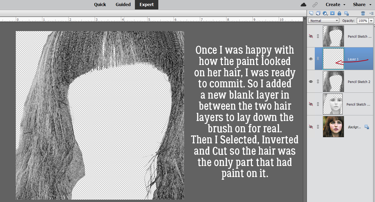
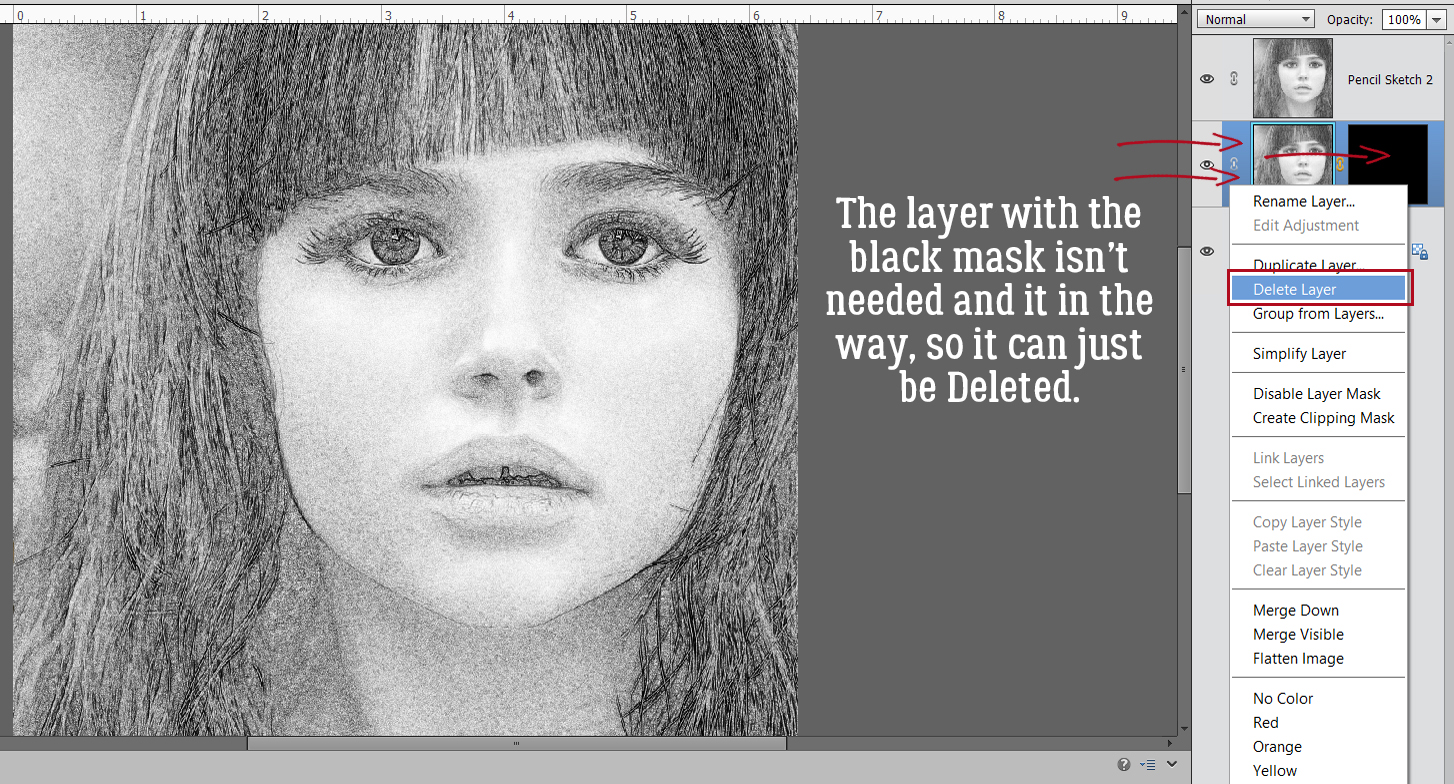
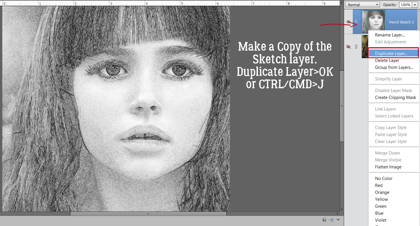
 Now it’s possible to see what Elements was doing in the background while we were busy and oblivious. Now I have 3 layers: the original, a sketch layer with a black Layer Mask and a sketch layer with a white Layer Mask. It’s possible to do the following steps using these two masked layers, but it’s a bit more challenging than my approach, so we’re not going to do that. The layer that I want to work with is the one with the white Layer Mask, but I need to Simplify it. Right-click on that layer – over on the left of the layer near but not ON the link icon – then choose Simplify Layer.
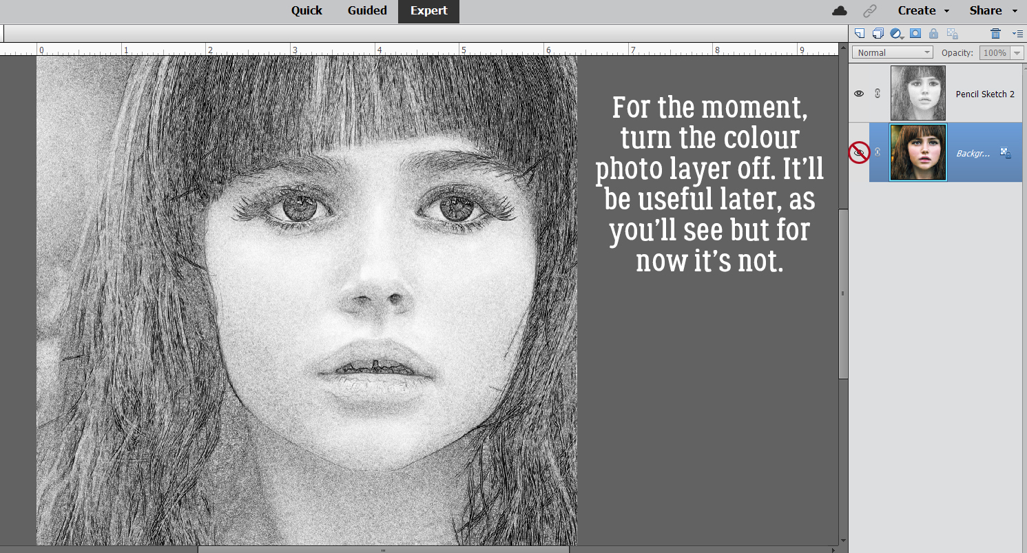
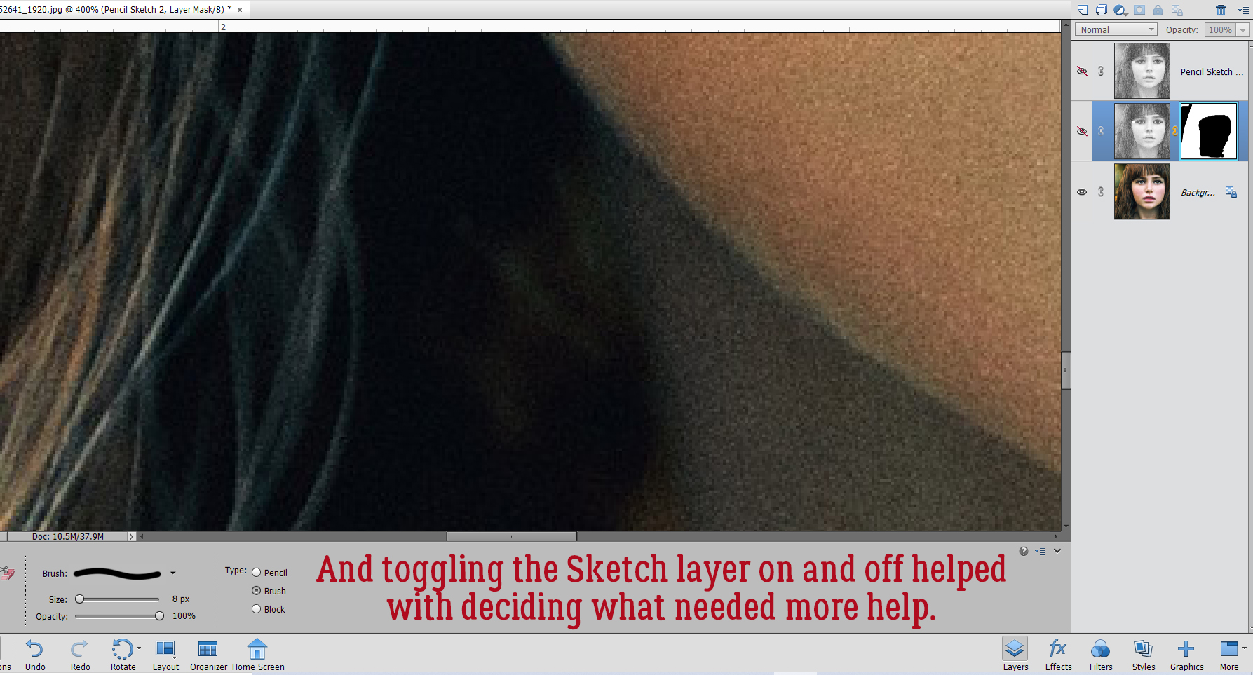
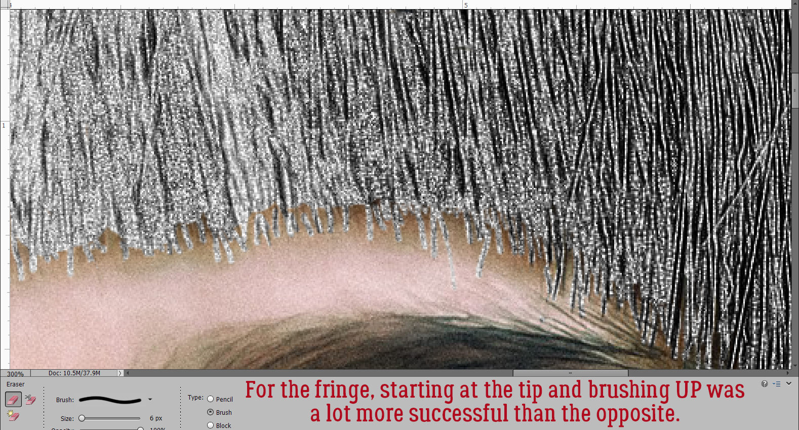
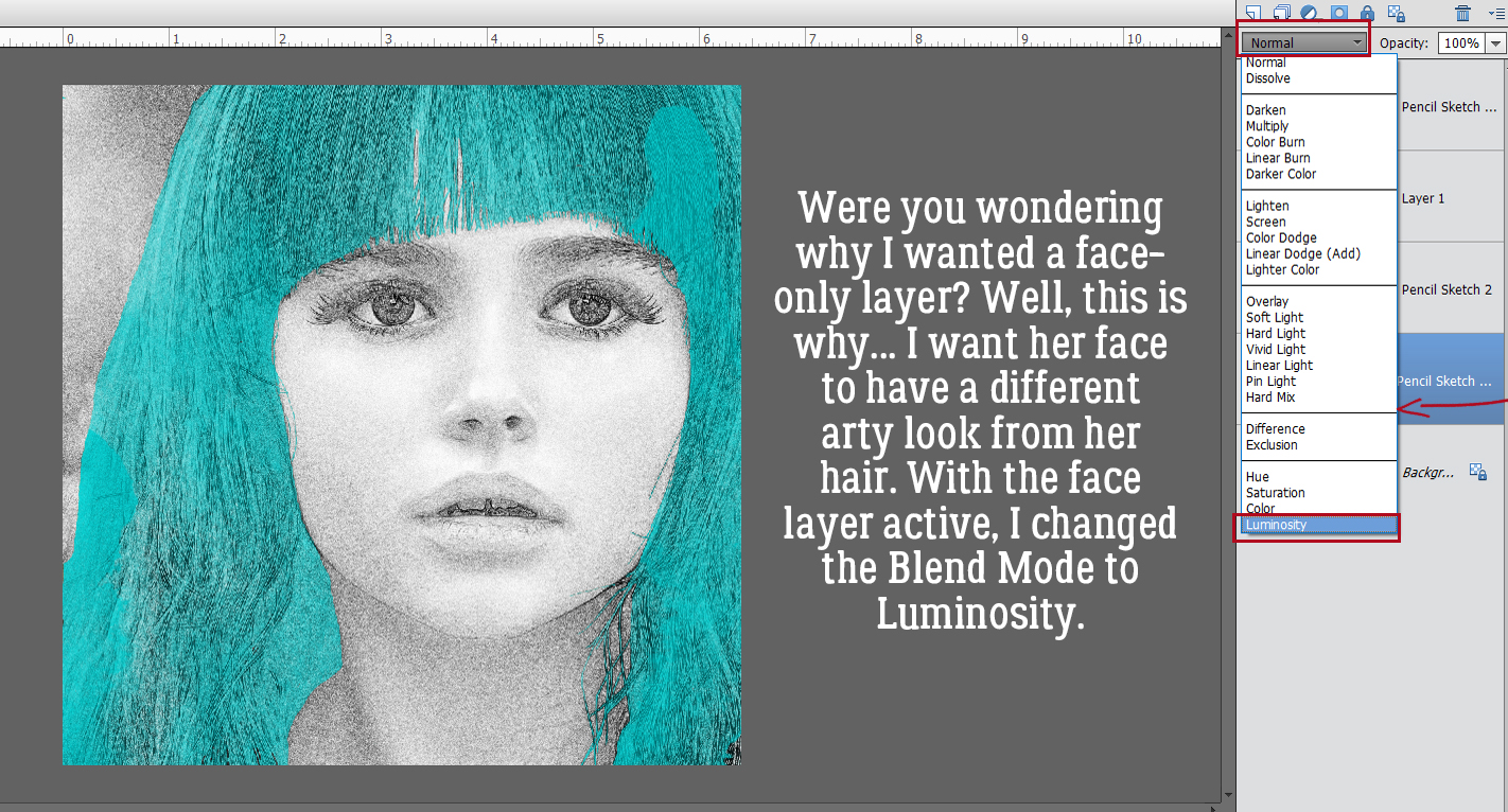
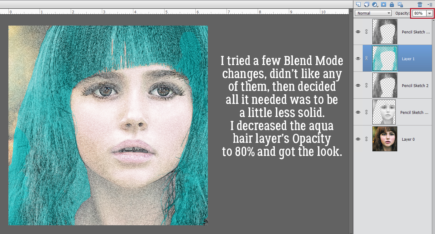
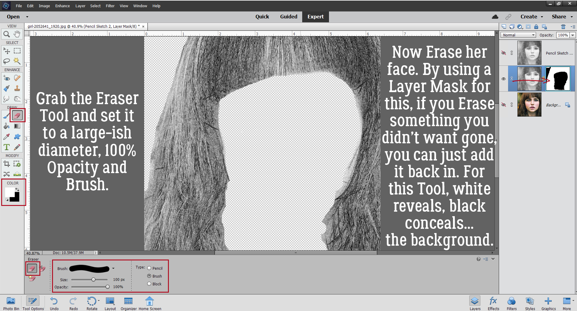 I also discovered that toggling the colour layer on and off makes it easier to see edges of things better.
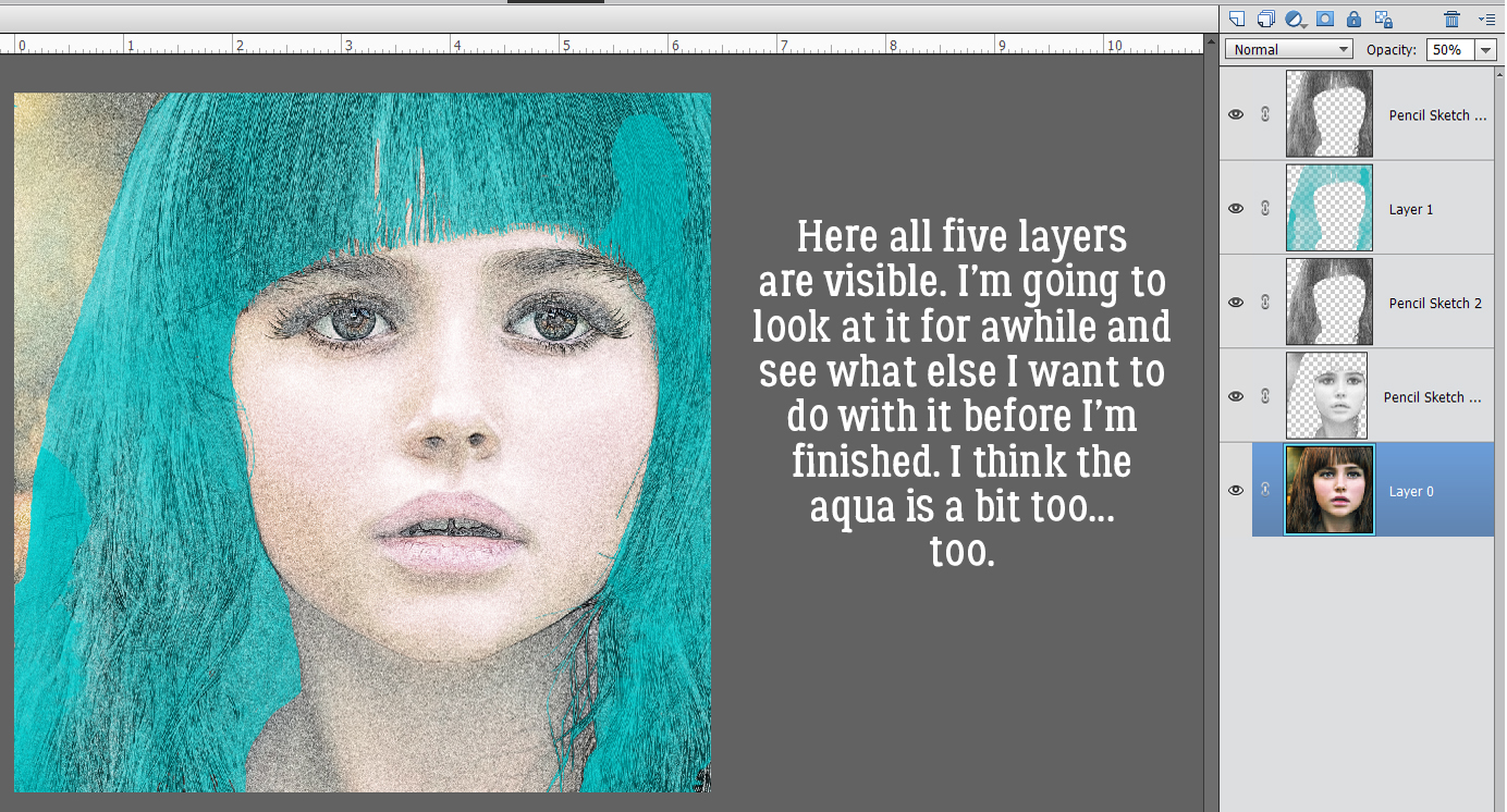
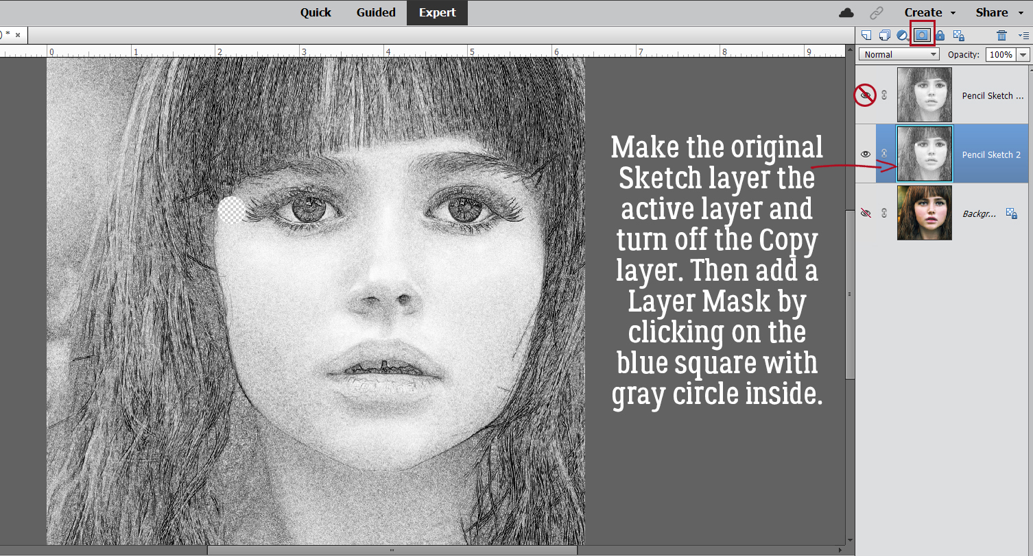
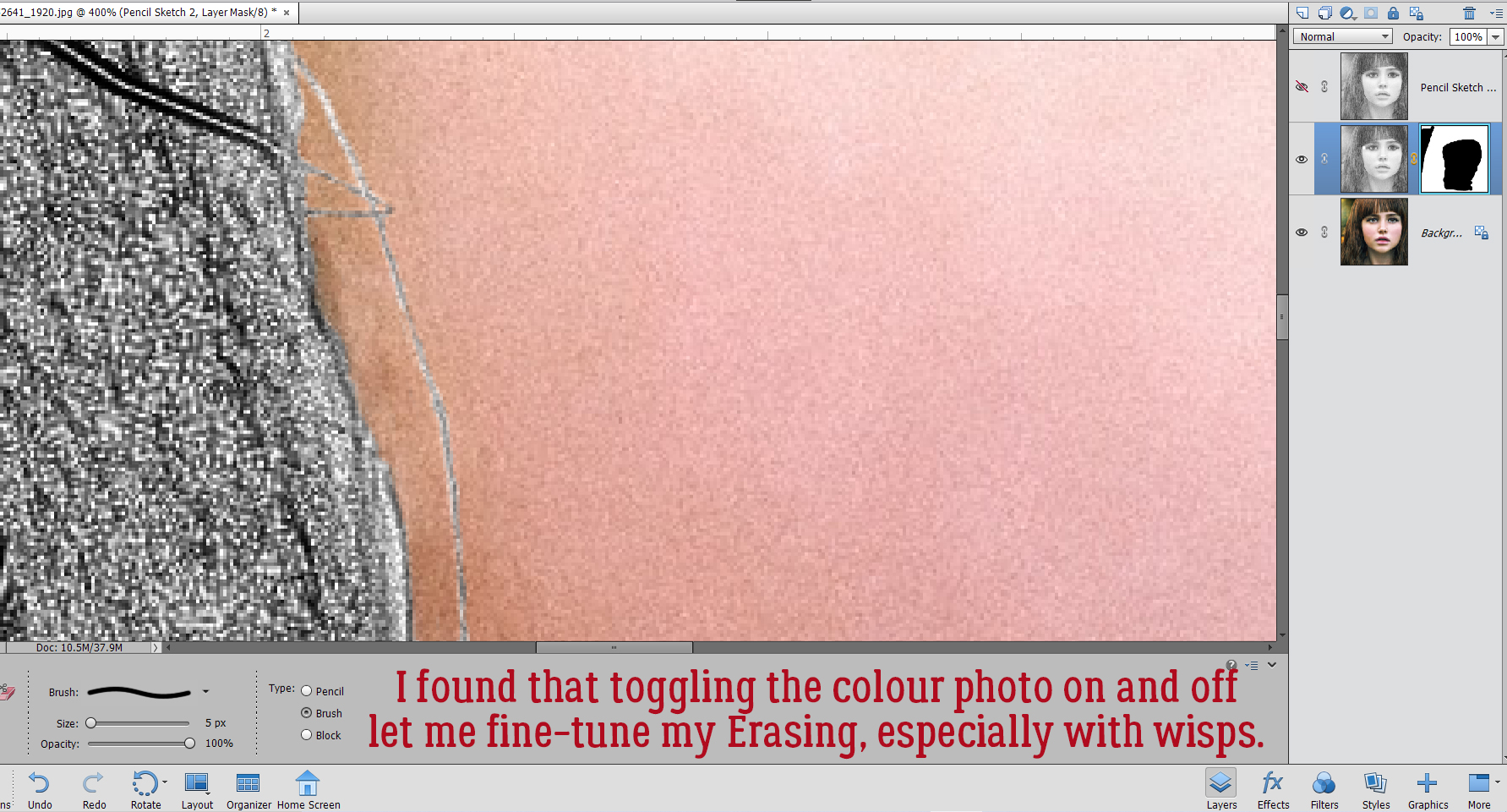 Aaaaaand toggling the sketch layer on and off helped me see where and what needed more help.