Tutorial Tuesday (Potpourri)

Heritage and History: Recorded

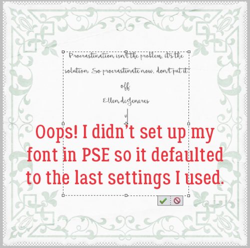
Late last week, I connected with one of my distant cousins on my mom’s mother’s side through Ancestry DNA. I never expect anything to come from my contacting them, and am always so thrilled when they respond. This particular long-distance connection led to an explosion of “new” family members for me and the beginnings of several friendships. But perhaps the best thing that has come from this is that I now have several photos of the old family Bible, that dates back to 1884.

I know there are more than a few of you loyal readers who are also interested in your family history and in recording what you learn for future generations. My family Bible photos are going to make an amazing layout. And GingerScraps has pretty much everything I’m going to need to make it special. And I’m going to let you in on my design process.

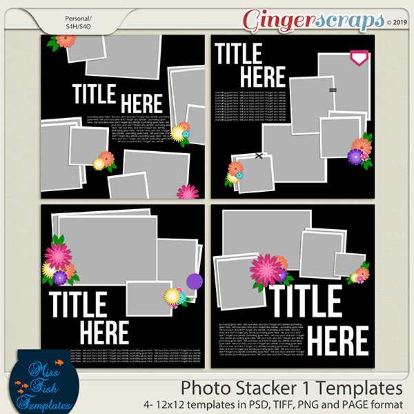
First, did you know you can search the store using keywords? On the far left of the store’s home page, there’s a search box right underneath the log-in panel. I typed in “heritage” and the search returned THIRTY-TWO pages (more than 500!) of possibilities. I know the right kit for me to use for my special layout will be in there somewhere. Here are some of the options I’m considering.

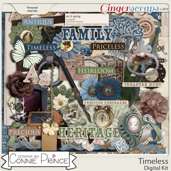
Many of these kits are part of a larger bundle, which of course is your very best value.

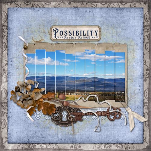
My heritage layouts go in one of two directions; I either focus on a single photo or I go with a collection of them. Because the photos by themselves are just “nice” but don’t tell the story, lots of room for journalling is a must. Our GS designers have so many options for templates that it’s like an embarrassment of riches. Here are some options for multi-photo layouts.
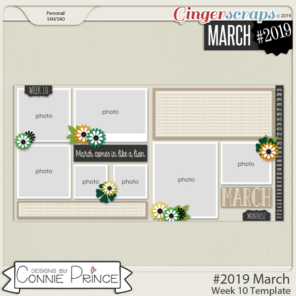
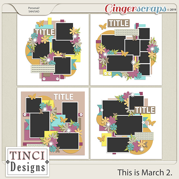
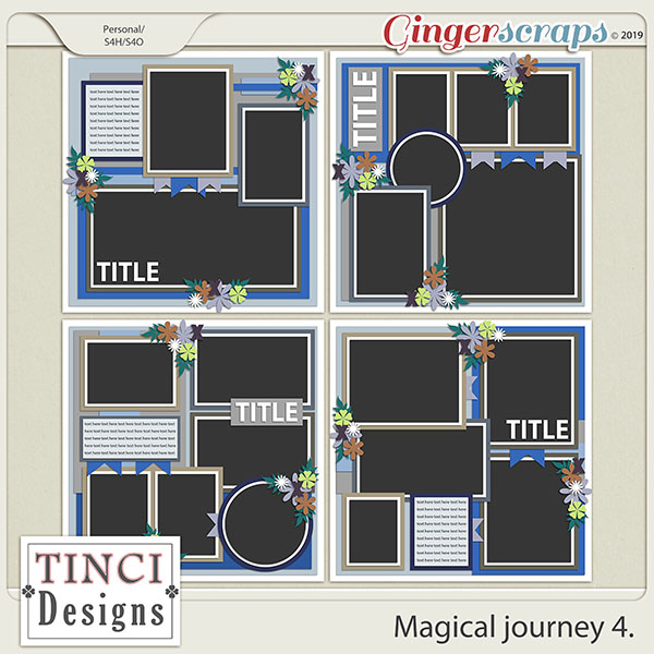
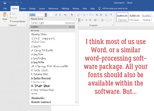
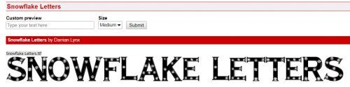
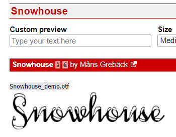
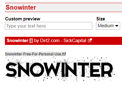
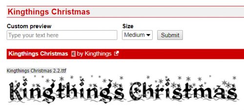
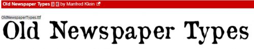
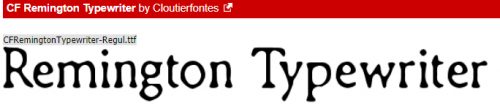
For titles and journalling, there are nearly as many options for (free) fonts as there are days in a year. I like to use decorative fonts for titles, typerwriter fonts for journalling – it needs to be completely legible for the story to be preserved. Here are some that I like.

Now, my challenge to you is to see if you can guess which kit, template set and fonts I will use for my layout. Check in the gallery at the end of the week to see if you’re right!

Tutorial Tuesday (PSE-Word Mashup)

A Whole New Meaning to Copy-and-Paste!

Welcome to the tutorial that almost wasn’t! The last week has been a little difficult around our house and the weekend was particularly so. I didn’t have time to put together something to share with you before I had to go back to work yesterday. 12 hour shifts don’t leave a lot of energy, mentally or physically, and I always do two in a row so I was expecting to have to disappoint you all by posting a “sorry…” and a promise to do better. But the over-staffing fairy visited me this morning and I magically got the day off. Not having a topic in mind, I had to do some pondering. And then I learned something myself that I knew would be perfect for this week. So we’ll settle for late, rather than not at all. Here goes!

Have you ever put your heart and soul into a layout, then spent forever coming up with the perfect journaling – only to hate the way the journaling looks, or worse… see a glaring typo? Have you ever wished PSE came with a spell-check? Or that you could copy-and-paste something from a website? Well, have I got the trick for you! Word and PSE work together! And even better… all your fonts are there in Word too!

Your Word version may be different from mine; the interface might look different but this is pretty basic, and all the things I’m going to show you will work with any version. I opened a new blank document in Word, chose a font and set my formatting so that my text would fit inside a border on a beautiful journaling blank I pulled from Ooh La La ScrapsShabby Chic collection.

I love using quotations for a variety of reasons. Like not having to think too hard! I typed out this one in a matter of a few seconds. I changed the size of the font for Mr Bergen’s name.

I just spotted a typo on my screenshot below. RATS! Word’s spell-check wouldn’t have caught it either, but it DOES catch those transposed letters, “e”s that should be “a”s and that kind of thing. It also capitalizes the first word of each sentence for you if you forget.

Then I opened up Elements on my desktop, dropped my journal blank onto a new document and set up the Text tool with the same font settings that I chose in Word. If I skipped this step now, Elements would default to the last settings I used.

Back to Word… I selected the text then right-clicked to open up a dialogue box. It looks like this. I want to Copy the text. (WSNH tip: the same keyboard shortcuts I’ve shown you in previous tuts also work exactly the same in Word, so CTRL/CMD>C will work to copy the text.)

I flipped back to Elements and Pasted my text into the journaling space. That can be done by right-clicking then choosing Paste from the dialogue box, or CTRL/CMD>V. Did you notice that Elements ignored the different text sizes?

Now I have the ability to change it up to suit my layout. I changed the text colour first by pulling the gray from the border.

Then I changed the font size on Mr Bergen’s name again. Now that I know the font size changes made in Word don’t move over to Elements, I can skip that step in the future.

Even better, it’s totally possible to Copy whole sections of text from a web site or other document on your computer and Paste it into Word. As you can see in the screenshot below, I’ve selected a new quote from my favourite quotations site.

Then I Pasted it into Word with a couple of clicks! Yeah. I wasted time resizing Ellen’s name. (Did you catch the typo in this screenshot too?)

Here you can see that I’ve got Elements open and it’s just waiting for me to Copy-Paste Ellen’s words of wisdom over.

Oh, right… I didn’t go to Elements and set up the font. So this is the font, size and colour I used for the last layout I created.

So I just Undid that step and started over. But this time I decided to use a Text Box. This handy tool helps to constrain the text so it doesn’t bleed out into areas where I don’t want it. To create a Text Box, with the Type tool click-and-drag from one corner diagonally to the opposite corner of the area you want to cover with text. This journal blank made it easy by having reference points in the border.

And then I pasted Ellen’s quote into my text box. Notice that it’s now centre-justified, rather than left-justified as it was in Word. I had “Center” selected in the Text tool settings and Elements over-rode Word.

This time I didn’t have too many changes I needed to make, other than shrinking Ellen.

But to show you how easy it is to change it to suit your purposes, I switched the angle from upright to right-italic and changed the text colour. I want to try this trick with texting on a path, but wanted to get you the basics now. Stay tuned!

Tutorial Tuesday (Photoshop Elements)

It’s All About the EXPOSURE!

Today’s tutorial comes to you courtesy of my weekend wandering through that black hole known as Pinterest. I wasn’t even looking for inspiration but BAM! there it was!!

I don’t know about you but I have a whole folder of photos that are unscrappable for one reason or another. Many of them are seriously under-exposed… and they’re usually of something I really, really, REALLY wanted to use for a layout. Like this one, for example. I took it on my first trip to Ireland in 2014; there’s a lovely 2-storey manor house in the centre, surrounded by idyllic countryside. But you’d never know it. All my efforts in the past to improve these shots were failures, mainly because they looked really over-processed and artificial. Then I found this method of fixing these oh-so-dark shots. To wow you thoroughly, I’m going to start with this one, as my worst example of underexposure.

The first thing to do is make a copy of the image, either by right-clicking on the layer and selecting Duplicate Layer, or simply using the shortcut CTRL/CMD>J. If you choose the first method, there’s an extra step, because PSE is going to ask you to name the new layer. The shortcut just makes a copy, and calls it that. (You already know what method I use.)

Now for the magic! Just change the Blend Mode from Normal to Screen. Click on the button at the immediate upper left of the Layers panel and select Screen from the drop-down menu. For those of you who don’t know much about Blend Modes, they’re really great tools; I put together a tutorial on what they that you can find here.

Can you see the change that simple step has made? Hedges!!Shrubs!

Just by copying the Screen layer, I can bring out more details.

Still not great, but so much better…

So I added another copy of the Screen Layer.

And another…

I kept adding copies of the Screen layer and the image just kept getting better and better.

It’s getting there, but still has some room for improvement.

Almost there!

And then… YES! I can see the leaves on the shrubs in the foreground, the trees on the hill and have a much better photo.

Then I Merged all the layers together. Select all the layers then right-click somewhere within the Layers panel, choosing Merge Layers from the drop-down menu. Or do what I do,  select the layers then CTRL/CMD>E.

I’m happy with the exposure now, but I feel like the image is a bit hazy. So my next favourite new tool is the Enhance>Haze Removal (or CTRL/CMD>ALT>Z).

It doesn’t change the image in a huge way, but the leaves are sharper, the house looks sharper and the colours are a smidge more saturated.

Let’s try it again, this time with an indoor photo taken without a flash. No harsh shadows, but also no background detail…

The first Screen layer does this.

Adding a second Screen layer brings out more of the carved panelling.

Now I’ve got three Screen layers and I’m almost happy.

Four Screen layers and I’m happy.

Merge those layers and carry on! This one isn’t too hazy so I didn’t use the Haze Removal tool.

Let’s try it one more time, with an image that isn’t terrible, but could use a little help.

First Screen layer…

I added another one, then one more and now could see the beams under the roof a lot better.

Then I Merged the layers.

I wondered if Haze Removal would make it even better. And to my eyes it did.

So that’s a handy trick for the under-exposed shots. What about the ones that are just a little blown out – over-exposed? Is there a quick trick for them? YES! This photo is from my daughter’s wedding trip to Jamaica.

Now, this wasn’t in the little piece I found online, but I thought about if for a minute and decided to try something… it worked! I copied that first layer but instead of using the Screen Blend Mode, I chose Multiply.

Look at that! It’s a bit dark, but much better with just ONE blended layer on top of it.

The easiest way to adjust it was to lower the Opacity of that Multiply layer to 92%.

Merge those babies!

I gave it the Haze Removal treatment too.

And there it is!

This next one, a gallery I shot in New Orleans, doesn’t need a lot of adjusting either, but I wanted to know if I could love it more.

After the first Multiply layer I feel it’s a bit too shadowy now. But I know how to fix that.

Ooh, that’s better! 82% is about the right amount of Opacity here.

I love that this trick is so much less labour-intensive! I Merged the two layers…

and hit it with the Haze Removal tool too.

I saved the worst for last. This wall paper is in the circular entry hall of the manor at Coollattin, the estate where my Irish ancestors lived and worked until 1847. It’s hand-painted watercolour on heavy paper, and it’s absolutely beautiful. But you wouldn’t know it from this photo!

One Multiply layer later… I think it’s too dark now, but when I was batch-editing I thought it was fine.

I kept going with the process and reduced the Opacity to 80%.

It’s better than the original so I Merged the two layers.

And got rid of the Haze.

There’s a lot of detail visible now, and the colours are much more saturated.

Then, just to see, I added a Screen layer and it’s PERFECT!

Are you already looking through your photo folders for shots to experiment with? I bet you are!

Tutorial Tuesday (Photoshop Elements)

Another Font-to-Alpha Option

The idea for this technique came to me while I was using Nyquil to fight off a cold and was probably not really coherent. But it seemed like a stroke of brilliance at the time so I decided to try it. It didn’t work the way I saw it in my mind’s eye, but I like how it came out in the end.

When turning a font into an alpha, bevels are very handy style tools but they don’t always give the look I want, being more sharply, blockily cut. I wanted to create a more curvy but smooth alpha with a paper clipped to it. So when it occurred to me that I could try using a rounded, beveled Style on my text then clipping the paper to that, I HAD to try it! Alas, it didn’t work the way I expected… I still ended up with a flat, 2-dimensional image. So I went back to the drawing board.

This font, called Lovelings (by a designer named Darrell Flood) was found at 1001 Free Fonts. It’s got that solid, curved look that makes great alphas.

I’ve started to automatically make a copy of my original text layer before I make and adjustments to it, just in case I need an untouched one later.

Then I started trying my idea out. And failing. Miserably. More than once! But then I tried this and it worked, so you get to see it. On my TOP layer, I added a Layer Style from Miss Mis DesignsHustle and Heart.

I used the cherry-red acrylic style and didn’t make any adjustments to it at all. It looks pretty great, but it isn’t the effect I was after.

So I turned the visibility for that layer off and went to the BOTTOM, original layer.

Then I dropped a patterned paper from I Believe in Love on top of the text. PSE in its later incarnations has an unfriendly habit of scaling objects to a single dimension (height) of the canvas, so it’s a pretty minuscule little swatch here.

To overcome that I resized the paper to 400%. It’s easy to do precisely by clicking on one of the corner handles of the Bounding Box, which opens up the Transform menu, then simply typing in the dimensions I want.

Once I had the paper big enough to work with, I Clipped the paper to the layer below it. CTRL/CMD>ALT>G is the WSNH shortcut, or Layer>Create Clipping Mask works too.

As you can see, the acrylic layer (visible again) is a little bit transparent and lets the paper show through. But not enough.

Easy enough to lighten the top layer some to let the paper show, but without losing the curvy, round effect of the acrylic altogether. I only decreased the layer’s Opacity to 80%.

All that was left was to select and Merge all the layers (CTRL/CMD>E or right-click>Merge) and I was ready to create the rest of my siggie.

I’m going to keep trying to get a rounded bevel on a font that stays put when I clip a paper to it, and if I succeed, I’ll show you how I did it.

Tutorial Tuesday (Fontography)

Fancy and Fun Fonts for Wintery Layouts

As much of the Northern Hemisphere is being walloped by heavy snow, high winds and frigid temperatures (which basically would be Wednesday here in northern Alberta 😉 ) I thought I’d compile a collection of free fonts y’all can use for your winter layouts. Sound good? Each of the fonts I show you will be linked to the source so you can find ’em quickly!

My favourite go-to website for free fonts is dafont.com. They have such a huge assortment of fabulous fonts and dingbats!

Like Snowtop Caps, which also includes numbers and punctuation.

Winter Fall is a rounded font that would be great for a wintery title, but it only includes a small number of special characters and no numerals.

Iceberg is chunky but still rounded. It also only has a few punctuations and no numerals.

Winter Flakes has it all! It includes some dingbats too, so it’s pretty much perfect.

Igloo Laser is a modern-looking all-caps font with numerals and a few punctuation characters.

Snowflake Letters would look smashing with a bevel and a clear, glossy style on it. It’s all-caps, with numerals and punctuation.

You could use Snowhouse for journaling; it’s a script font with numerals and some punctuation, and includes a large variety of special characters.

Snowinter is another super-title font, with all the goodies one would need.

I like Kingthings Christmas a lot. It’s a complete package with awesome potential.

I think I’m going to build a tutorial about how to use Ice Cold to its best advantage. It’s got some serious title charm!

CF Tuques is just a fun font for winter. (I’m super-happy the designer spells “tuque” correctly!) No numerals or punctuation though.


Now how about looking at some dingbats. Don’t know what a dingbat is? Basically, it’s a symbol, shape or drawing accessed through your alpha keyboard.

Winter has a collection of line drawings of winter things, like snowmen and snowed-in houses. It’s pretty cute!

DH Snowflakes could be used for borders, dividers or backgrounds. Lots of possibilities!

Faux Snow is another snowflake dingbat set with unique shapes.

And so is WW Flakes.

KR Snowpeople has an assortment of snowmen and snow-women.

I invite you to check out the vast collection of fonts and dingbats at Dafont. I know you’ll find lots of inspiration there!

Tutorial Tuesday (Photoshop Elements)

Memory-Keeping with Not-So-Great Photos

I don’t know about you, but I’m seriously lousy at getting good selfies. Maybe I’m too critical, or maybe I just don’t look good in photos. But when the only photos I have of an event I really want to scrap about are those nasty selfies, what’s a woman to do? Such was the day I went to the beach on the Wild Atlantic Way… the ONLY day out of the whole two weeks I was in Ireland this time when it rained. It was also the only chance I would have to walk on the beach at Kilkee, where my 3x great-grandparents were born. So I went ahead to walk on the beach (although I didn’t walk the cliffs – I AM a bit of a chicken) and took the nasty selfies, then scrapped them into a minimalist layout for the January Color Challenge.

When I say it was raining, I’m not talking about the soft, misty rain Ireland is usually known for; it was more like a prairie downpour. My hair was plastered to my head and my jacket was soaked through. (And I was freezing… in July!)

If I was going to do something with these photos that I could live with, I was going to have to think a bit. I made a copy of my photo so I’d be playing with it and not the original.

Then I did something I’d never done before… I checked out the possibilities in the Effects menu. I played with each of the options to see what they do, and some of them will be given more attention in upcoming tuts. Imagine my surprise when I found an even quicker-with-fewer-steps sketch effect than we’ve looked at in other tuts.

Just one click and I had a sketch!

The effect produced another new layer.

The details are pretty blown-out, so I thought about how to find them again. (Although I wasn’t really upset that the crowsfeet are gone!)

I used the Levels adjustment (Enhance>Adjust Lighting>Levels or CTRL/CMD>L) to darken the outlines. With Levels, pushing the Input Levels dark value slider to the right as shown and the Output Levels light value slider just slightly to the left allowed some colour to leak back in, but also brought the details and textures back. The raindrops on my glasses are more obvious now.

I wanted a tiny bit more sketchiness so I duplicated the sketch layer (right-click on the layer then select Duplicate Layer or CTRL/CMD>J) then played with the Levels again. Can you see the difference in the histograms between the two images?

Just for fun, I played with some Blend Modes too. Some of them give really interesting results… There are no limits on creativity here!

I chose Pin Light. The only difference it makes is to brighten the image up a bit. And maybe sharpen the sketch effect a smidge.

Lowering the Opacity of that layer lets a bit more colour show through without losing the total sketch effect.

But naturally, I have to play a bit more.

I tried all the Modes then settled on Overlay.

That’s more like it! Some of the gray is gone,, the details are sharper and there’s a hint of colour.

After I Merged all the layers, this is what I ended up with.

And my final layout looks like this… The blended photo in the background is simply clipped to a mask then the mask’s Opacity was lowered a bit to blend the background a bit more.

Tutorial Tuesday (Inspiration)

What’s Your Super Power (Word)?

Happy New Year! Are you ready for 2019? I know lots of you, like me, were happy to see 2018 to the door. When I was thinking about topics for this week’s tutorial, I had a few ideas, but my thoughts kept returning to just one. If you’re into social media, I know your Facebook and Instagram feeds have been flooded with chatter about New Year’s resolutions. And if you’re like me, resolutions are just wishes! Experts say it takes three months of repetition for a change to become a habit; how many of us actually stick to those diet plans, those vows to exercise more, that vague promise to ‘be more organized’, for that long? <insert laugh track here> Resolutions are things we have to DO. And I don’t like being told what to do. <wink>

What works better for me is to choose a ‘power word’ for the upcoming year, a word for me to strive to BE. If you’ve seen the annual challenge by the maven of scrapbooking, Ali Edwards, called One Little Word, you’ll know what I’m talking about. Choosing that one little word is harder than it sounds. Like making resolutions, it requires a certain amount of introspection and soul-searching. The first time I chose a power word was at the beginning of 2010. I was going through a very difficult chapter in my life then and had no idea how it would come out in the end. But I’d been through tough times before and I knew I’d come through this one too. So the word I chose was PERSEVERE. Yes, it’s an action, something I had to do, but it was also a state of mind and a state of being. Guess what… I PERSEVERED and came out the other side in much better shape than I expected. This time last year I was in a great mood with a new grandchild on the way and a trip to Ireland to find my roots in the offing. My power word was ANTICIPATE… and ANTICIPATE I surely did! By the end of the year, it had morphed into ENDURE after my husband’s accident in September. Thankfully things are 90% back to normal, and I’m entering into 2019 on a more optimistic footing. I know this year will bring challenges… after all, it’s LIFE, and that’s a challenge all by itself. But with my rose-coloured glasses firmly in place, I’m choosing POSSIBILITY as my power word this year. I usually tend to look at the glass as being half empty, but I’m making a conscious affirmation to look at the POSSIBILITY that things will go well.

Now, how do YOU go about choosing a power word for the year? If you’ve already made some resolutions, you can use them as a framework. Do you see a theme? Is there an impending event in the future that you’re already aware of, either with excitement or dread? Are things going well for you, or are you really struggling right now? There are a number of online resources designed to help choose a power word. One that I particularly like is found at Heidi‘s blog Happiness is Homemade. She has a list of options, and one of them is sure to resonate with you. Another resource is on Jess‘s blog, Cultivate What Matters.

When you go to scrap your power word, the only constraint is your imagination. You could  choose a grungy, moody art journal style if that’s how you’re feeling, you could find a photo or a few that represent the theme, you could put it into a word cloud. You could create an acrostic with it and embellish the meaning using synonyms. So many options!!

I scrapped my guiding word today, with ADB Designs‘ gorgeous Coming to America bundle. My photo was taken in October when my husband, my son and I made a previously-planned-therefore-not-going-to-be-postponed-even-for-a-knee-injury trip to British Columbia. It’s the view from Tower Ranch Hillside Park in Kelowna, a spectacular vista I’ve fallen in love with. To me it’s the visual representation of POSSIBILITY – the sky really IS the limit!

Next week we’ll get back to the nuts-and-bolts of digital scrapbooking. Thank you for indulging my navel-gazing!

PS… for Rochelle (roxyrenders): Your comment on my Happy Holidays layout reads: “Wow- what kind of magic did you work on the wordart stamp? It almost seems as if it is glowing!” Simple little tricks! I first duplicated the mask/stamp layer. I applied a fine glitter style to the bottom-most of the two, then decreased the opacity of the layer to about 50% – that’s what creates the glow. Then on the upper layer, I clipped an ivory-and-gold foil brocade patterned paper (from JoCee DesignsDecember bundle) to the mask, then changed the Blend Mode to Hard Light. It’s just that easy!

Tutorial Tuesday (Photoshop Elements)

The EYE-lets Have It!

I’m still working my way through years worth of scrapbooking magazines trying to figure out why I kept them in the first place. While I’m at it I’ve been looking for more paper-scrapping techniques I can translate into digital ones, and finding some solid inspiration. Today I want to show you how I’ve used an eyelet from the GingerBread Ladies‘ collab It Comes with Spring  to secure my photo and frame to my paper stack… just like I would have when I paper-scrapped. (This collection was the Free-with-Purchase gift in March 2016.) The rest of the layout is created with Connie Prince‘s Snowflake Kisses , LDrag DesignsJolly Holidays alphas and Aprilisa‘s Picture Perfect 177 templates from the December Buffet for the Buffet Challenge.

Once I had my eyelet in position and resized to fit within the edges of my paper frame, I clicked on the Elliptical Marquee tool.

I set the tool’s settings to Fixed Size, then experimented with the dimensions until I got a circle the correct size. Both dimensions for width and height must be the same. 50 pixels by 50 pixels works.

I made sure the frame’s layer was my active layer and clicked just inside the edge of the eyelet to make my circular selection.

Then I used the arrow keys to nudge it into place with the hole in the eyelet in the center. Once I had it positioned properly, I used the Edit>Cut command (CTRL/CMD>X) to create a hole in the frame paper.

There! Now I can see the corner of the photo. On to the next step.

I repeated the same steps, only moving my active layer to the photo layer.

I cut the corner of the photo off…

but, because I’m using a template, the photo clipping mask is still there.

Oh wait!! There’s a Work Smart Not Hard lesson here! If I make the CLIPPING MASK layer the active layer, I can cut BOTH layers with one click.

I kept repeating the layer>select>cut steps for each paper layer until I could see my background paper.

You’ll notice as you go along that the drop shadow from each paper layer is visible, but there’s no shadow on the actual eyelet. I used the default drop shadow styles to apply a narrow shadow with the light source coming from the same direction as the template’s layers.

I could leave it with just a single eyelet, but that doesn’t work for me. So I Copied the eyelet layer (CTRL/CMD>J) and nudged it over, then followed all the same steps as before to make a nice hole all the way to the background paper.

Then I did it all one more time to create 3 eyelets lined up along the top edge of my frame. To quote my friend Sandy, 3 is an esthetically pleasing number.

For balance and symmetry, I decided to put another 3-eyelet set in the diagonally opposite corner.

In this corner, there are different papers in the stack under the frame, so I had to pay attention to the paper I could see in the hole. It’s really not that time consuming to copy and cut three more eyelets.

There it is! The background paper!

I have a feeling the eyelets in the lower right corner won’t be visible on my finished layout, but I’ll know they’re there!

If you can think of a paper-scrapping technique you’d like me to translate, please let me know!

Tutorial Tuesday (Photoshop Elements)

Gentle(wo)men, Start Your Ovens!

The inspiration for today’s tutorial came from a Facebook post by one of my coworkers. She had spent the day making and decorating sugar cookies. (The photo above isn’t hers, it’s from The Girl Creative‘s blog.) As I was looking at her cookies, it occurred to me that I could probably make digital sugar cookies (bonus – NO calories!) and so I gave it a shot. It worked well, so I’m going to share the recipe with y’all. I started with a 6 inch by 6 inch square blank canvas. (P.S. Don’t be thrown by the number of screenshots in this tut. I’ve included practically every step, although we’re using a lot of techniques I’ve already shown you.)

I looked through all of the Custom Shape tool‘s menu – it’s the one that looks like an amoeba. The menu has a lot of options for shapes, most of them geometrical. But that won’t make this technique easy, so I only looked at the amoeba menu.

If you click on the triangle along the right side of the box I’ve circled below, the amoeba Custom Shape menu opens. I chose to look at them all to find the one that would work best, so I went with All Elements Shapes then scrolled until I found the one named Nuclear.

Because snowflakes in nature are perfectly symmetrical, I changed the settings for this tool from the default, which is Unconstrained, to Defined Proportions. If you’re into Working Smart Not Hard, you can also Simplify the shape by selecting that in the settings.

Getting these shapes in the exact spot you want them isn’t easy. But you can click-and-drag out your shape then move it to where it needs to be. Once it has been Simplified, you can easily resize it too.

If you didn’t Simplify in the Shapes menu, do it now. Right-click on the layer in the Layers panel and select Simplify Layer.

Not looking much like a cookie cutter now, is it? We’ll have to fill in those open areas using the Paint Bucket tool.

There we go! I could go ahead and just use this shape, which is more like a flower than a snowflake, but would still totally work. But if you know me at all, you’ll know I’m going to do more.

There are two ways to do this next step. I’m going to use the Elliptical Marquee tool. The other way would be to use the Custom Shapes tool and choose the Circle.

Because symmetry is still important at this point, I changed the settings to Fixed Ratio. This is handy for making perfect circles, but also can be set to make perfect ellipses too.

It’s possible to perform this on the same layer as the original shape, but I choose to put the outline on its own layer.

So I added a blank layer above the shape and made my Stroke outline here.

The stroke can be any size. Once I’d made my circle I filled it in with the Paint Bucket.

This is my cookie cutter. It needs a little adjustment – look closely and you’ll see the circle isn’t centered on the nucleus shape. I need to fix that!

Now that both layers were aligned properly, I Merged the layers into one shape. (CTRL/CMD>E)

Then I Duplicated the shape layer and set it aside for later. Right-click on the layer then select Duplicate Layer, or CTRL/CMD>J.

I didn’t need to see that duplicate layer at this stage, so I closed the eye and made it invisible.

To turn the shape into a cookie, I applied a Style. I used this creamy acrylic one from Miss Mis‘s Hustle and Heart layer styles set. Another option for this step would be to use a chipboard Style, such as one of Just So Scrappy‘s Cabin Fever chipboards (included in the GingerBread Ladies December 2017 Challenge Reward collab of the same name). That would allow you to condense this step and the next 9 into just a SINGLE WSNH step!

The only problem with this is that the cookie is too shiny. The colour looks good, and there’s a nice dimension to it, but I changed the Style settings, essentially turning everything off and shifting the light source. To adjust a Layer Style, rignt-click on the fx symbol on the layer in the Layers panel and this menu will open up.

Now it still has some dimension but the shine is gone. I’m still working on the bottom, original layer.

I picked a nice, toasty golden brown to “bake” my cookie.

Then I opened a new layer above the base layer, and selected a brush from one of the presets that came with my software. It’s called Pastel Light 118 pixels and I used it with the default settings that opened with the brush menu.

I picked a spot on the edge of the cookie, then clicked and dragged the brush all the way around the shape.

Remember this from when I showed you how to do digital inked edges? Same technique exactly. I CTRL/CMD>clicked on the layer thumbnail of the cookie layer while working on my brush layer. That selected the edges and the inside of the cookie.

Next I Inverted the selection – moving the chosen area of the layer outside of the cookie. Select>Inverse or CTRL/CMD>SHIFT>I.

Then I simply Cut away the brush that falls outside the cookie. Edit>Cut or CTRL/CMD>X.

Voilà! My cookie is baked to golden perfection!! Now to add the Royal Icing. (Or Royal Frosting, if you prefer.)

Here’s why I had you Duplicate the shape layer. I’m going to flood that top shape with my Royal Icing. But first, I resized the shape so some of the cookie layer is visible. The easiest way is to click on one of the little boxes at the corners of the bounding box then go down to the menu and type in a number less than 100. I chose 92%, which exposes some of the cookie layer but not too much. You can also just move the corner you’ve clicked on inward until it looks right.

I used another Style, this gel blue one from Just So Scrappy‘s Lucky Me. [GingerScraps is lucky to have designers who create layer styles, like Misty (Miss Mis Designs), Katie (Just So Scrappy/Ooh La La Scraps), Aimee Harrison, Marina (Magical Scraps Galore), Lina (LDrag Designs), Jo (JoCee Designs), Natasha (Ponytails Designs) and our lovely guest Karen (Snickerdoodle Designs).]

I made some tweaks to the layer style to make it look more like a flood of Royal Icing.

Then I got to the good part! I changed my foreground colour to pure white (which can be quickly selected by typing “ffffff” into the box at the bottom right of the menu).

Next I chose my Pencil tool from the Toolbox and adjusted the tip size to about 25 pixels.

If you’ve been adding realism to your stickers and overlays, you’ll already know how to draw a line with the Pencil. But if you haven’t read that tut, or you need a refresher, all you have to do is click at the starting point of your line, hold down the SHIFT key and click where you want the line to end.

You can turn on the Grid as shown below to help figure out where to start and stop your lines. View>Grid or CTRL/CMD>’

I used just the Pencil tool, but you could also use Brushes for adding detail to your snowflakes. Don’t worry about precision; if you were making real sugar cookies you’d be doing all the piping freehand, right?

You can make your snowflake as complex as you like. I played around for about 10 minutes, using the Pencil and changing the tip size.

No comment.

Now to turn all those lines and dots into Royal Icing. I applied a basic Style from the presets in Elements to add a Bevel. I experimented with all of them until I got the look I was after. In the end I went with the Simple Sharp Inner bevel.

It looks pretty good as is, with the default settings for the Bevel style menu.

Now, I could have stopped here and called it good. But again, anyone who has read my tutorials before know I had to experiment some more. But I’ve learned to do my experimenting on a copy layer… CTRL/CMD>J

Then I cleared the Layer Style (Bevel) by right-clicking on the layer in the Layers panel and choosing Clear Layer Style.

Then I hit that top copy layer with another of Katie’s Styles from Lucky Me, the gel white.

Then I decreased the Opacity on that layer to 46% (after some waffling).  Now the sharp edges are a little softer, and so are the shadows. Much better!

Once I was happy with my finished product, I Saved my cookie as a .png (which preserves the transparent background). Now I can use the cookie on a layout!

Of course, I didn’t stop there. I went back and deleted the snowflakey layers and started fresh. This time I stayed really basic. I just used one of the preset snowflakes from the Custom Shapes menu! The Styles I used were exactly the same.

If you’ve never saved a creation as a .png, or if you’ve forgotten how to do it, here are the settings I use.

And again… one of the Custom Shapes snowflakes, but with some personality.

Are you hungry now?

Tutorial Tuesday (Photoshop Elements)

Shaving Shadows

As you’ve already figured out if you read my tutorials regularly, I’m a bit of a perfectionist. I like things to look a certain way, and will try whatever it takes to get the effect I want. Shadows are something I don’t like to compromise on, and I often create custom shadow layers for my layouts. But I’m also a bit of a procrastinator and leave things until the 11th hour… and then I run with drop shadow styles, either ones I’ve loaded into my Styles menu or the ones the designer has added to the template I’m using. These Styles are limited in what can be tweaked, and when I’m building a cluster, sometimes the shadows just look wrong because the style isn’t more adjustable. In that case, if I’m in a real hurry, I look the other way, but I’m not happy about it. So when I discovered a Work Smart Not Hard method of customizing drop shadow styles,  I was all over it! I was absolutely giddy!! It IS possible to erase JUST THE SHADOWS quickly and easily, to give that realism to my clusters!

There are a number of designers who have collections of drop shadow styles for sale. They make short work of shadowing a variety of elements with a single click. But they have limitations in the adjustments you can make to them. At least that’s what I always thought…

The image below shows the software’s adjustment menu for Styles. You can open this menu by double-clicking on the Style icon (the little fx icon on the right hand side of the layer in the Layers Panel). Whatever settings you choose, Elements applies across the board.

Now, if I try to erase any part of the shadow on this layer, I run the risk of erasing the flower too. But with the shadow style left intact as a style, when I erase part of the shadow, I also erase the part of the flower that casts the shadow. And it looks very odd.

If I Simplify the layer (as I remind you constantly to do with your special effects), Erasing will erase everything equally; who has time for zooming in, using a tiny Erase brush and going pixel by pixel to erase just the shadow? I don’t.

See what I mean?

Here’s where the fun starts. If I Select the flower by CTRL/CMD>clicking on the image thumbnail in the Layers Panel

and THEN Simplify…

I can Invert the selection at any point either before or after Simplifying and it works just the same. To Invert, click on Select>Inverse or CTRL/CMD>Shift>I which moves the marching ants from the edges of the image to the edge of the document and Selects everrything in between – the shadow.

Now I can Erase just the shadow!! At this step I can use the Eraser brush at 100% opacity to completely remove the shadow, or I can decrease the brush Opacity to whatever I want to just to lighten the shadow in that area. Or I can partially erase, partially lighten. It’s a bonanza of options!

You may never have a reason to use this trick, but I’m glad I shared it with you.