Challenge Spotlight: Recipe Challenge
![]()
Today’s Challenge is hosted by Angelle Designs.

It’s been a while since we looked at a Recipe Challenge, so let’s do it! For the folks who haven’t taken part in a Recipe before, I look at it like a Speed Scrap but without the ticking clock. The host of the Challenge provides a list of required elements for the Challenge, and each participant approaches the Challenge from their own angle. This month’s list looks like this:
1. warm tone background
2. a frame
3. a button or a brad
4. at least 3 flowers
5. a string
6. a journal or a pocket card
(These 6 are obligatory.)
Today I have seven layouts to share with you, and we’ll look at each one to see how well it meets the terms of the Challenge. Are you ready?
Before we jump in, I have to provide the obligatory info part of the post… Each of the layouts is linked to its spot in the Challenge Gallery. This is so that you can take a closer look, and maybe leave the Scrapper some praise. Just click on the Scrapper’s user name and you’ll be taken right to the layout. (Any time you see text in any of my posts that is BOLD, COLOURED and UNDERLINED, you’ll know it’s a hyperlink that will take you somewhere else. 😉 )
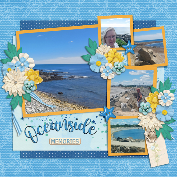
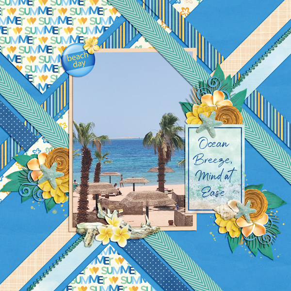
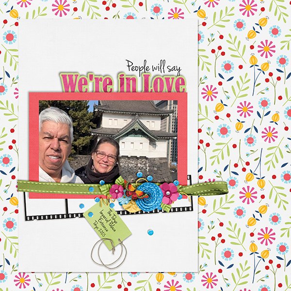
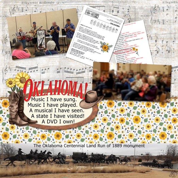
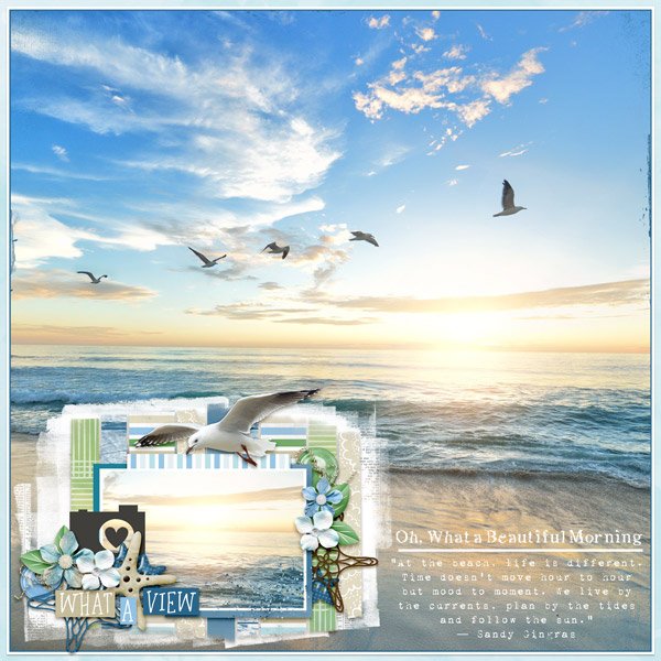
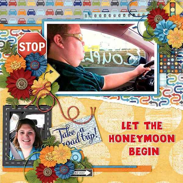
PickyMom created this layout for her entry. Her background is “mostly” warm tones. Her frame and button/brad are easily visible, as is her string. She has more than three different flowers, and she’s also included a pocket card. Full marks!
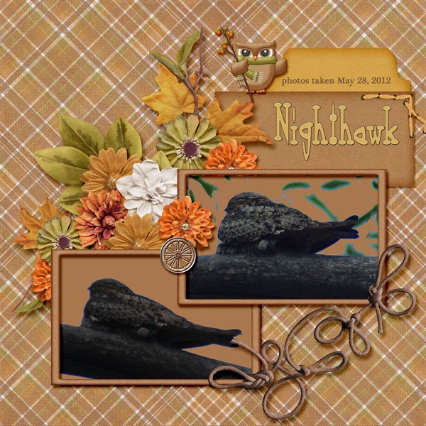
Katherine Woodin is a bird-watcher like I am! Warm tone background? Check. Frame? Check. Button/brad? Check. At least 3 flowers? Check. String? Check! Pocket or journal card? Hmmmm. Close enough!
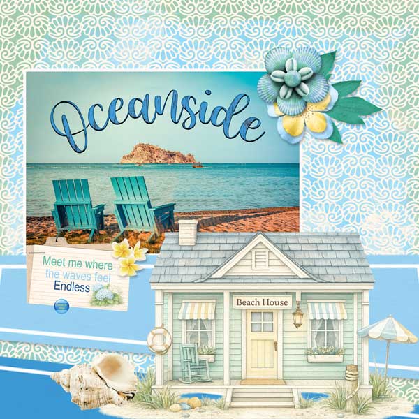
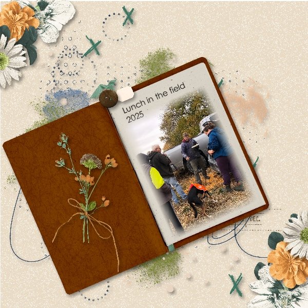
Now, the warm tone background dricamendes used is obvious. Yellow is what gives other colours warm undertones. (Remember colour theory?) She’s used several frames, her button is acting as a grounding element, she has some twine tucked in behind her central cluster and she has tons of flowers. I think we can be generous and consider her journal spot as a “card”.
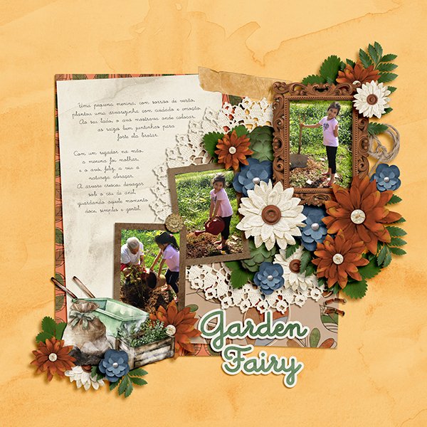
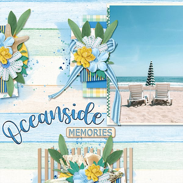
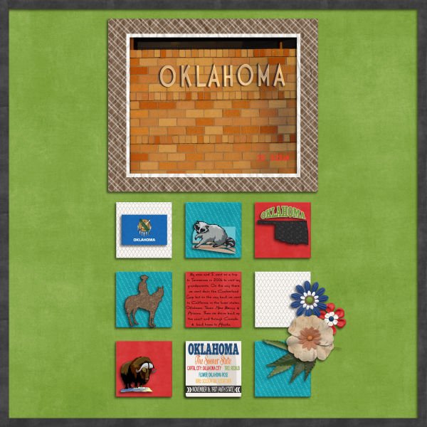
DiDi’s Mom has also used a (mainly) yellow – therefore warm – background. She tucked her frame in behind her photo, and has both button and brad represented. I see a journaling card, a tag, and a label she’s used for some of her journaling. There’s a curl of string and exactly three flowers. All boxes checked!
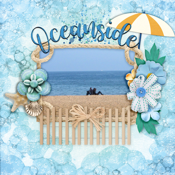
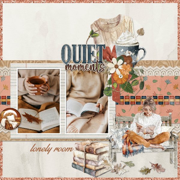
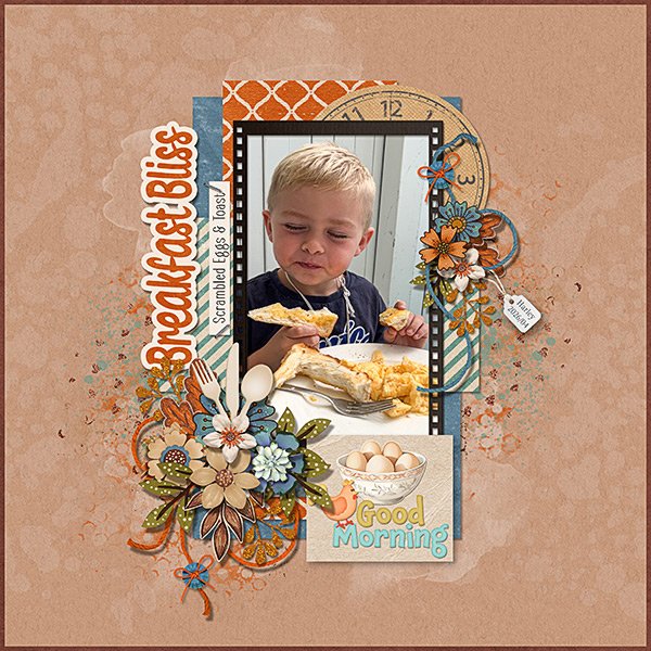
Jill chose a toast-y background. I see her frame, a button anchoring one of her pieces of string, lots of flowers and a pocket card. I just LOVE the cutlery poking out of her large cluster!
DebraB went with a lighter value of toast-y here. The only required element I don’t see is the frame, but the paper behind her photo could be perceived as framing it, so let’s go with that!
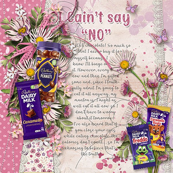
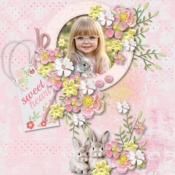
At first glance, greenfiend27 has used more of a cool pink but then there’s the yellow splash that warms it right up. Button(s), frame, string, flowers… and a tag representing a pocket card. All boxes checked!
How might you have used this Recipe?
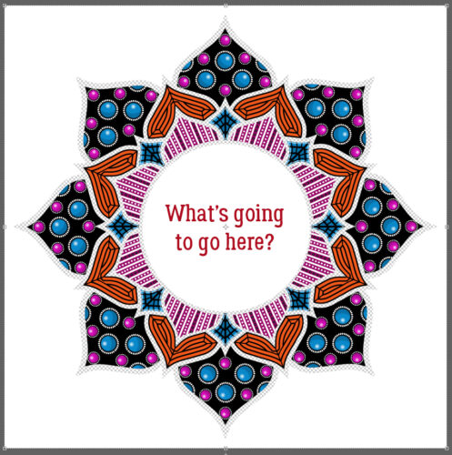
I will have out-of-town company next Tuesday, but should be able to get the final Zen Doodling installment out to you. Have you guessed what’s in the centre?
Now, I must go back to watching the wildfire crews battle a small fire on the other side of the lake…….. it looks like it’s under control.
![]()