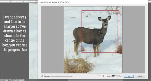
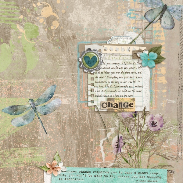
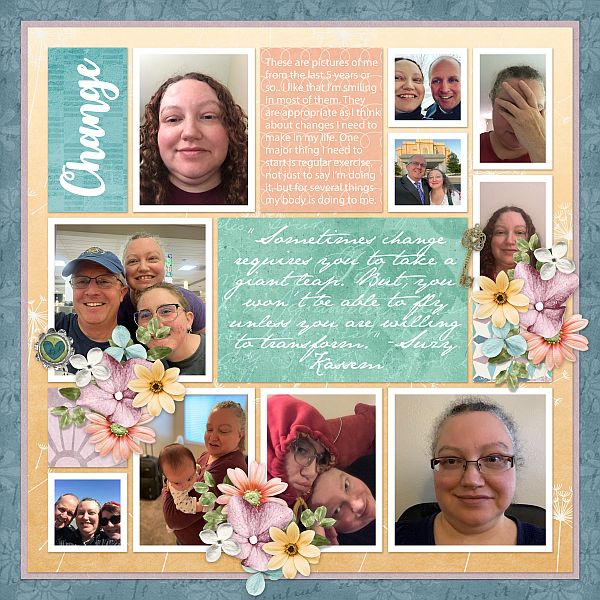
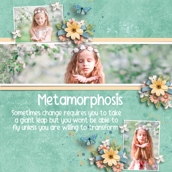
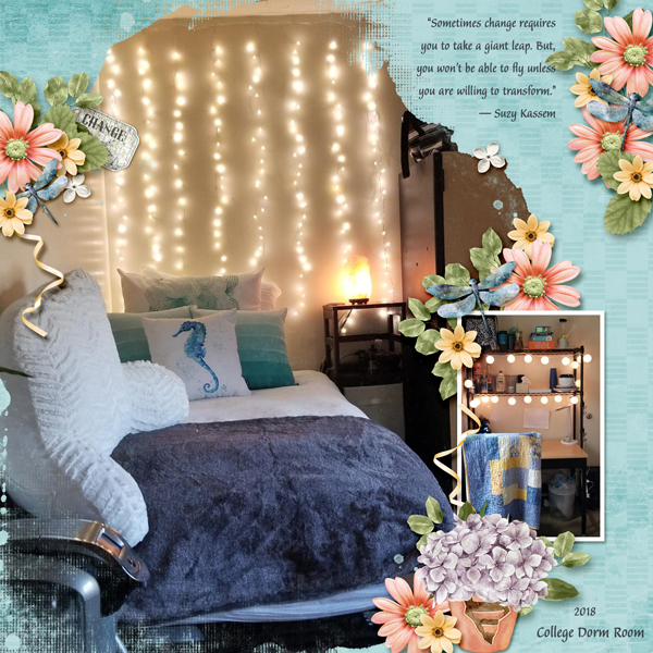
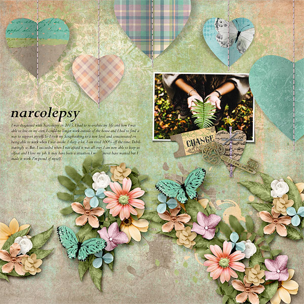
Welcome to Friday everyone! I hope your week has been good and your February is starting off well.
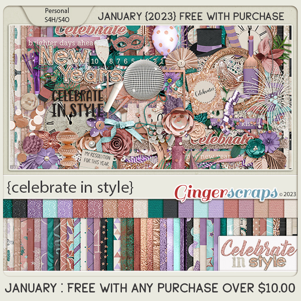
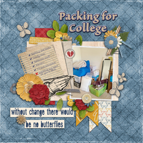
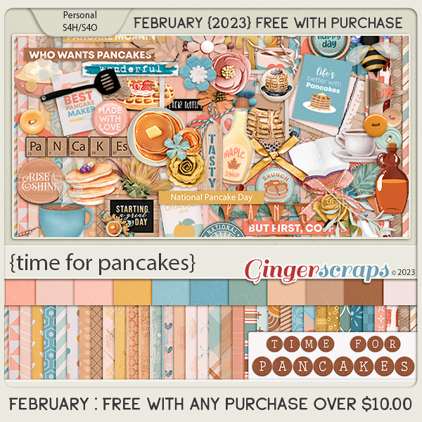
Remember if you spend $10 in the store, you get this great kit for free. I’m totally craving pancakes now.
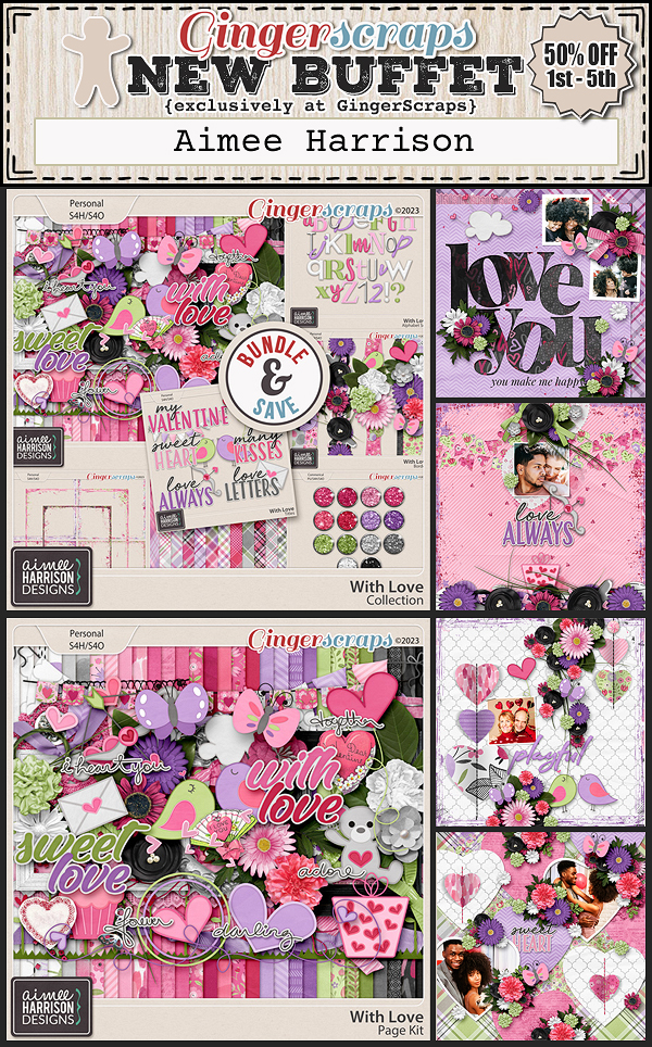
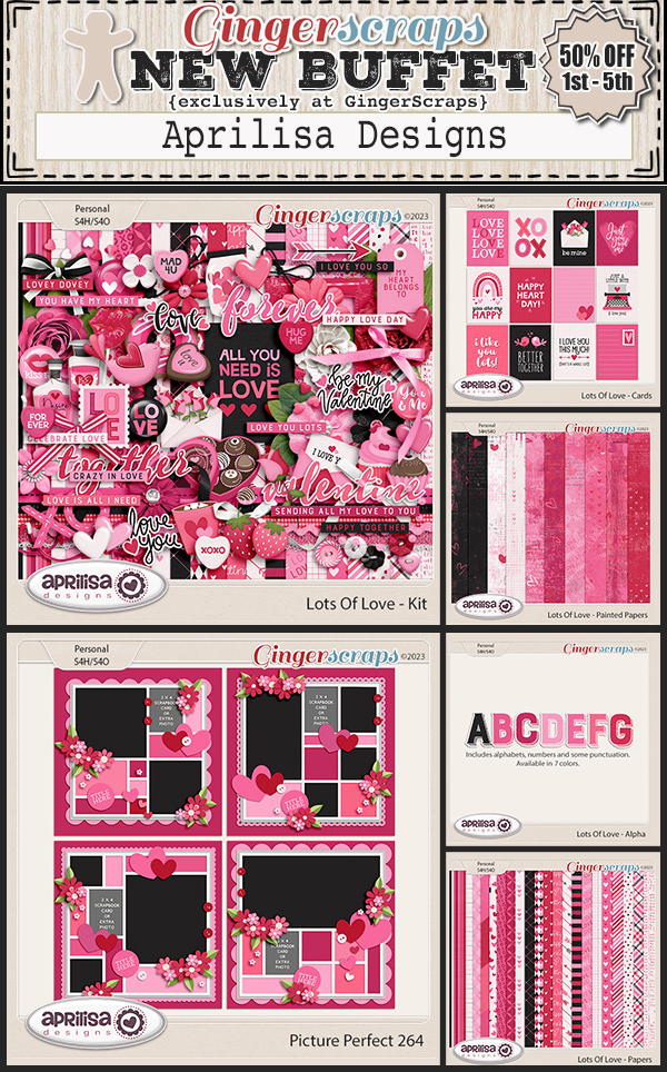
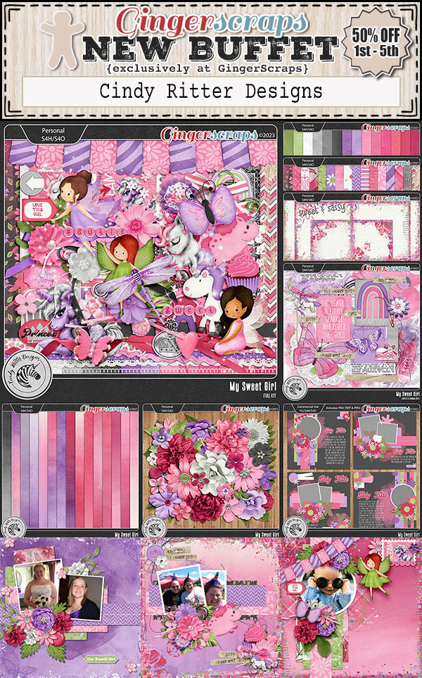
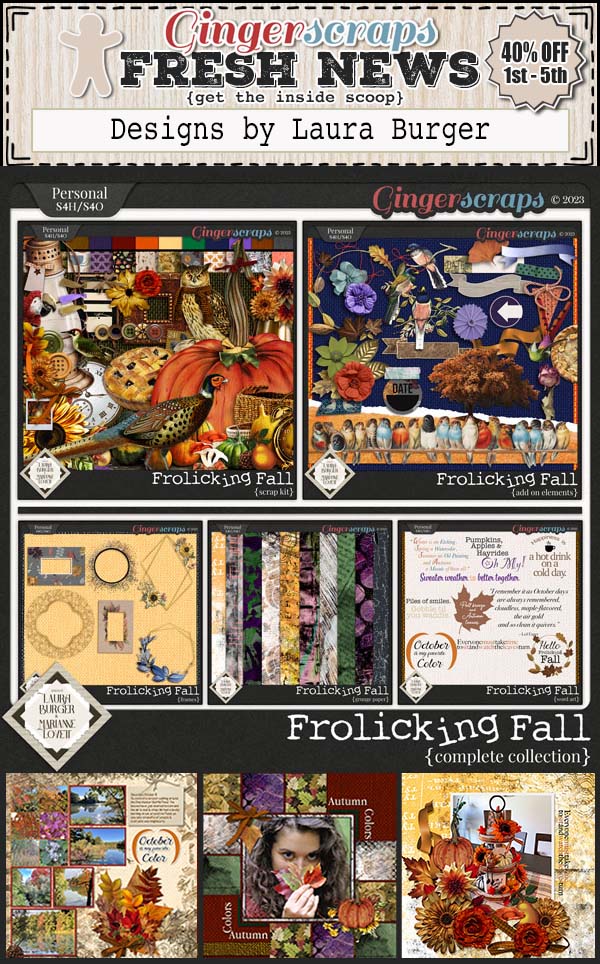
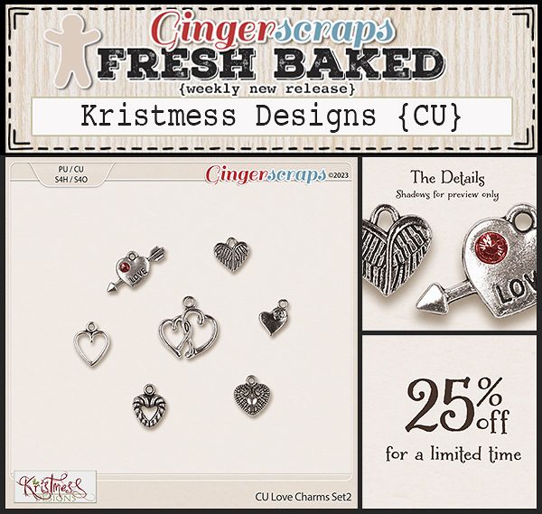
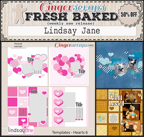
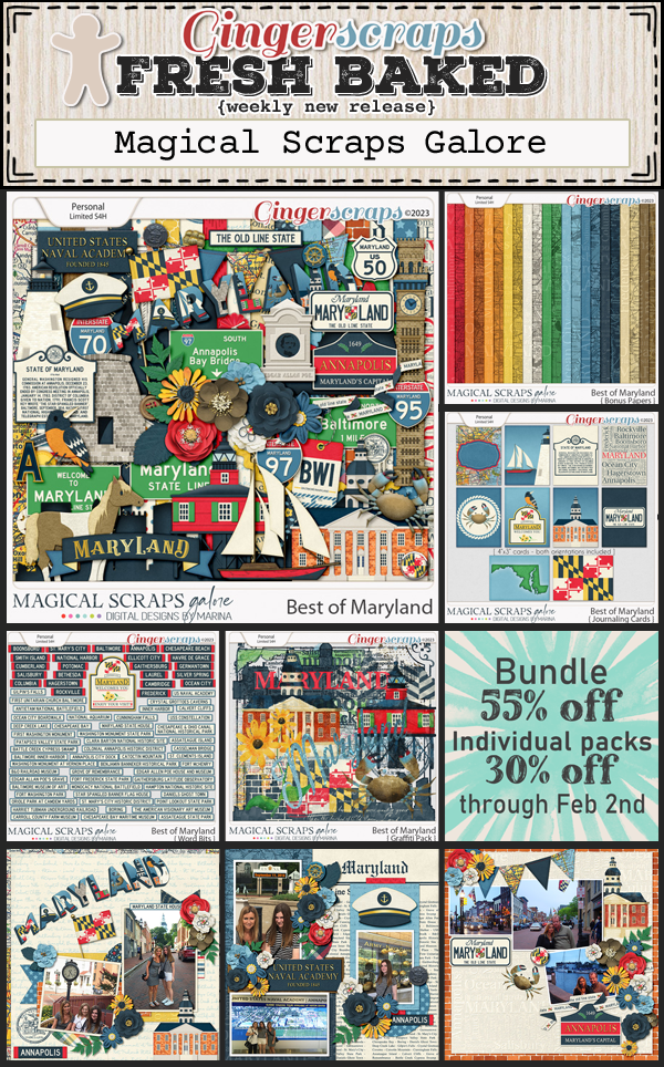
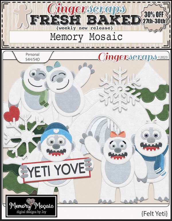
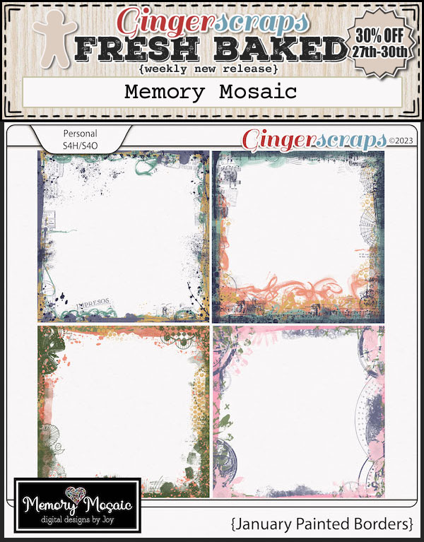
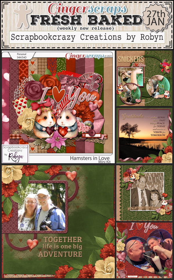
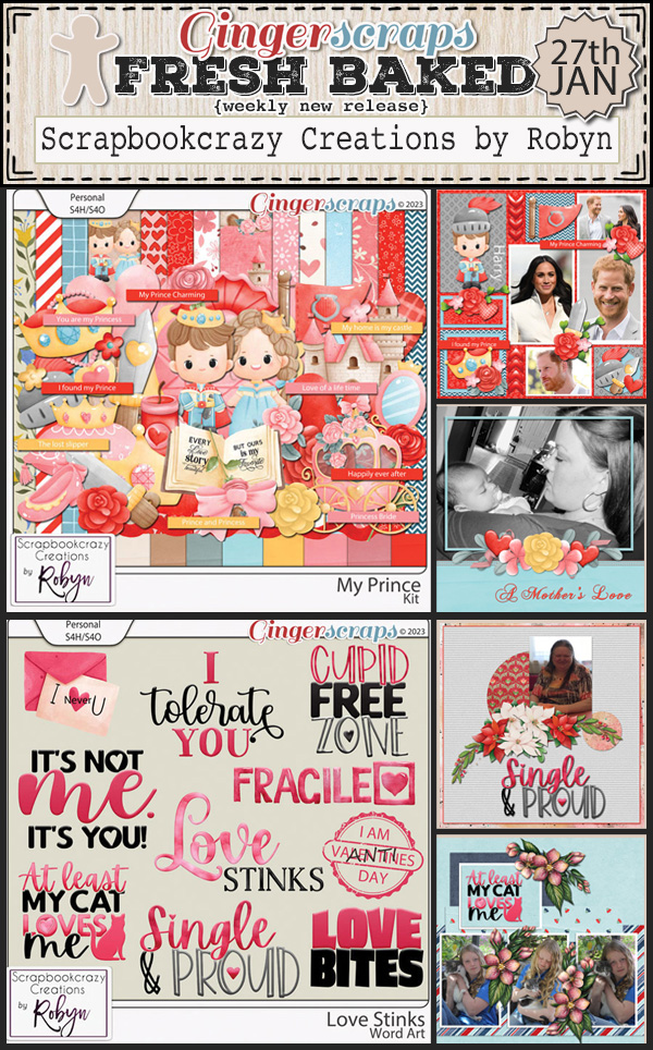
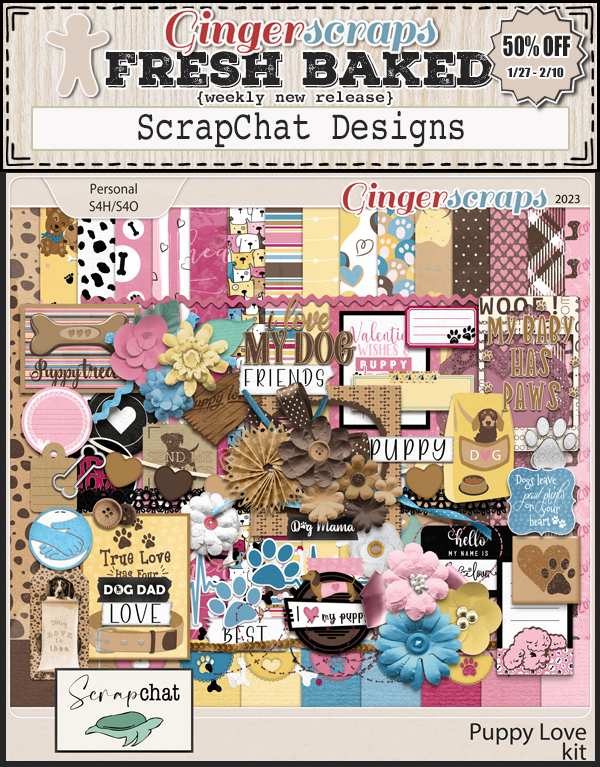
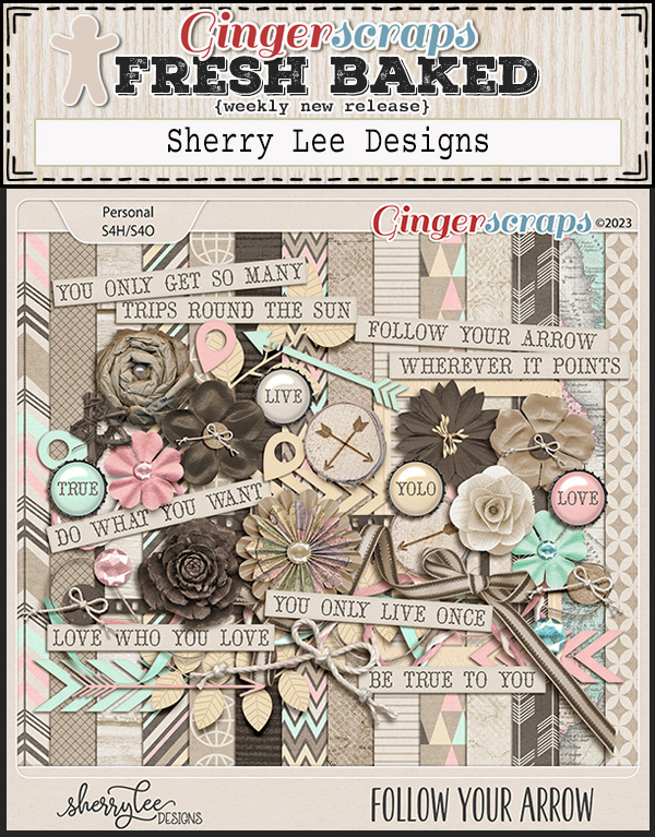
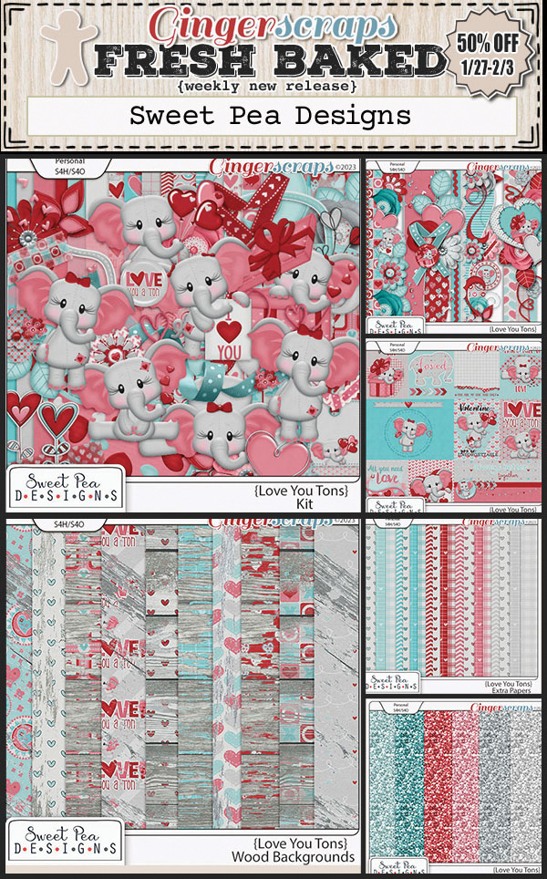
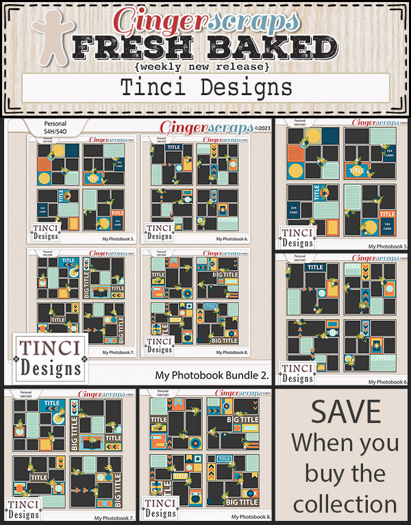
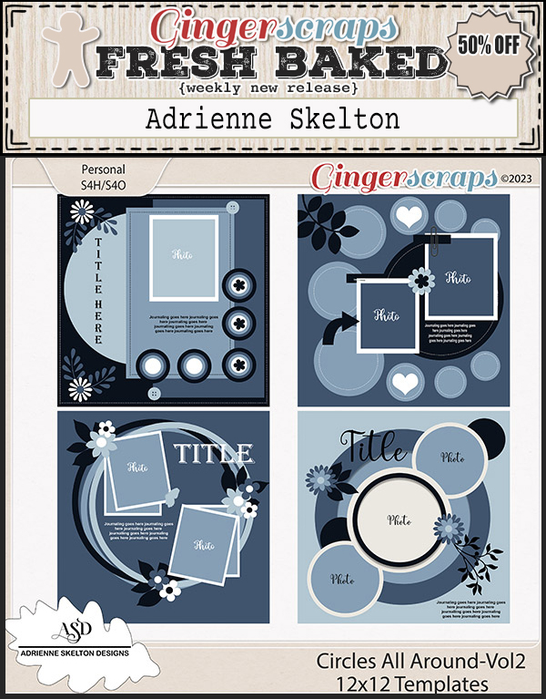
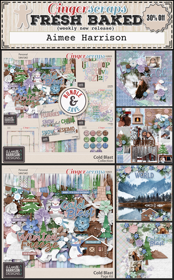
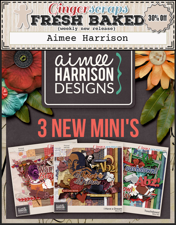
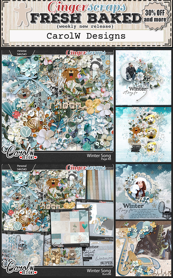
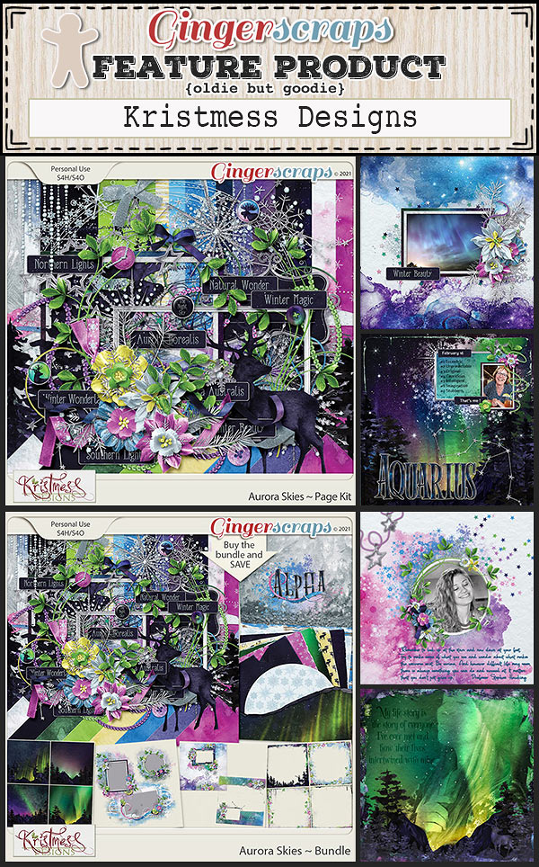
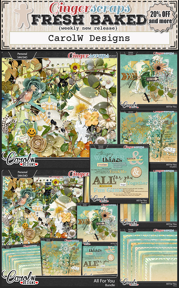
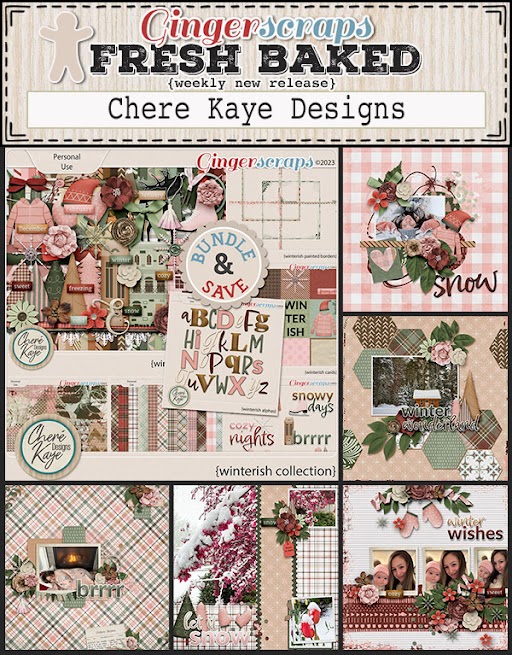
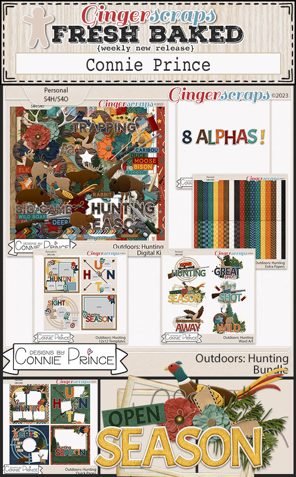
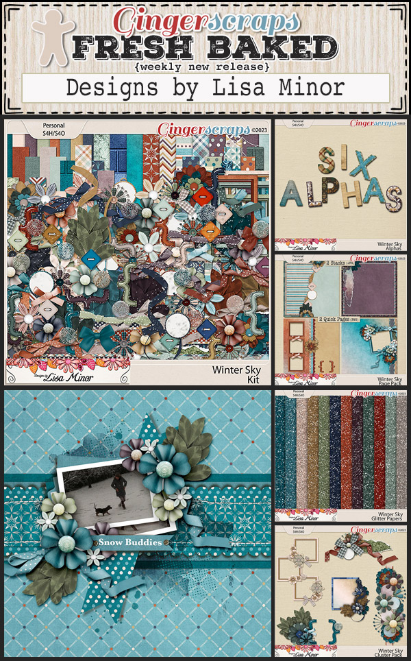
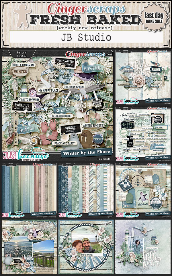
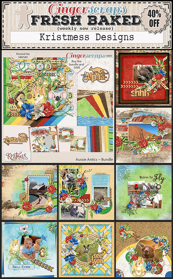
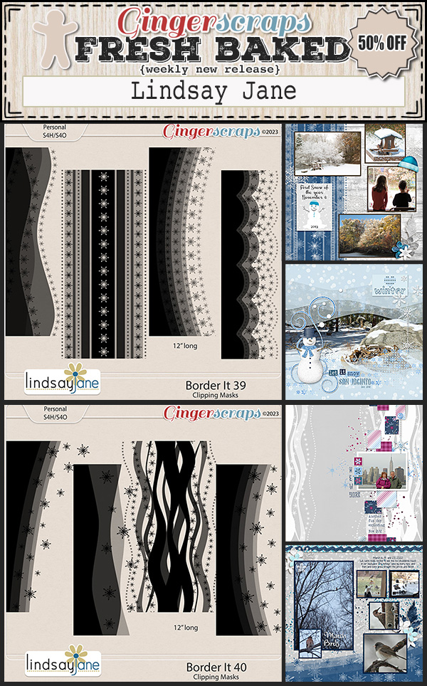
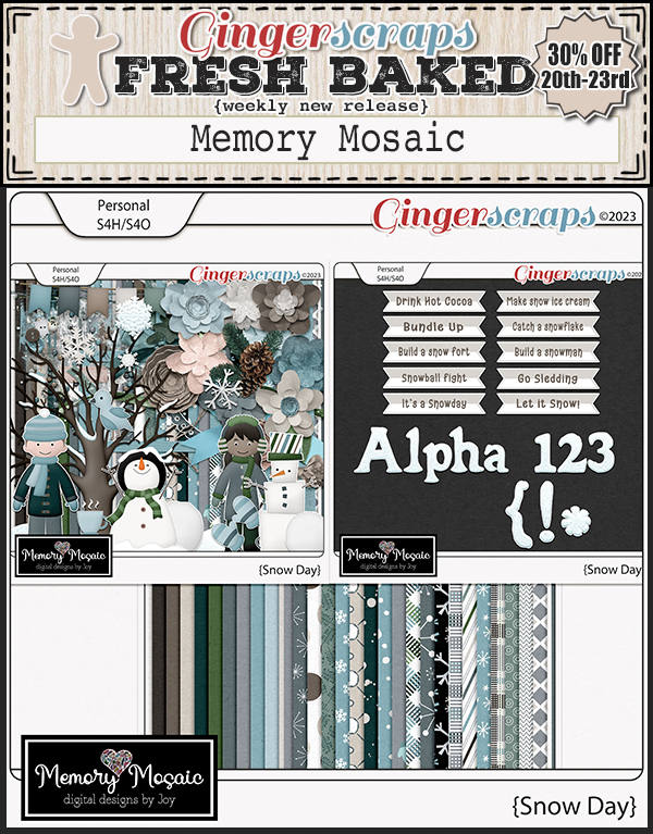
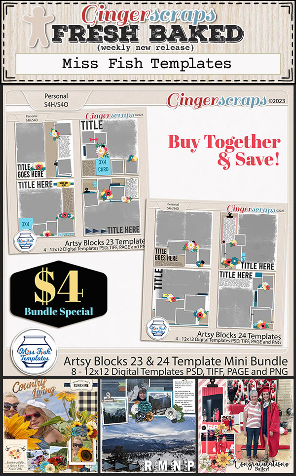
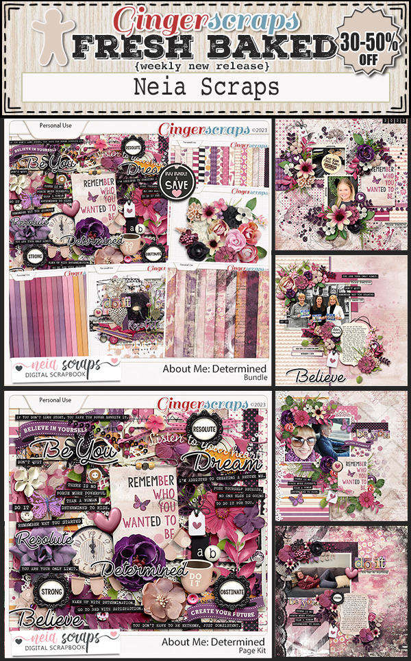
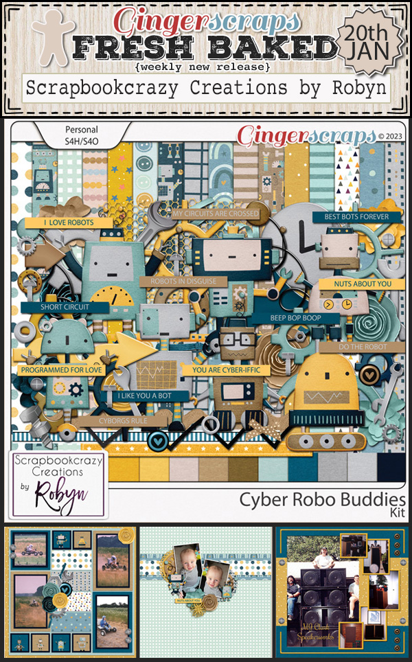
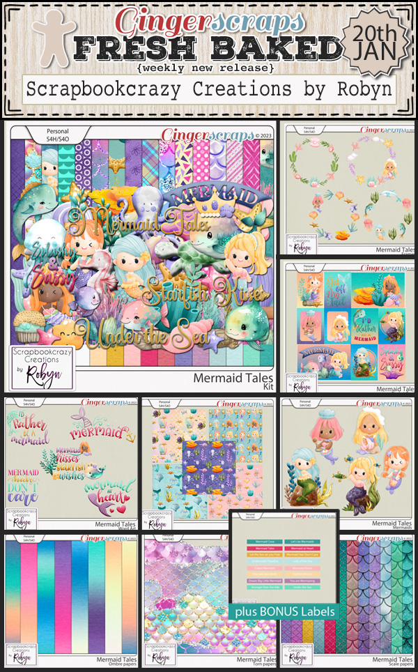
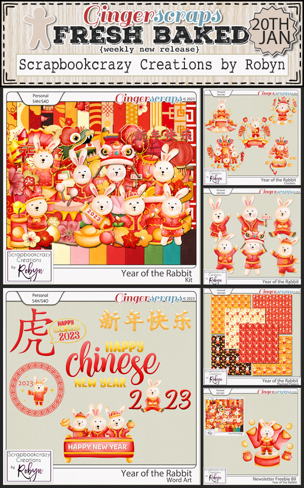
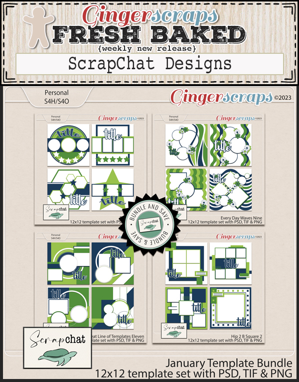
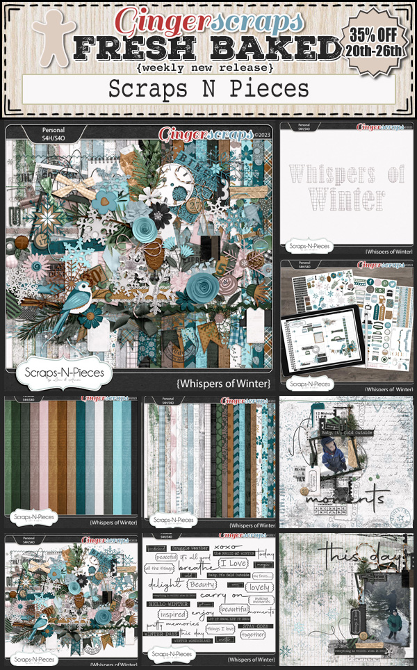
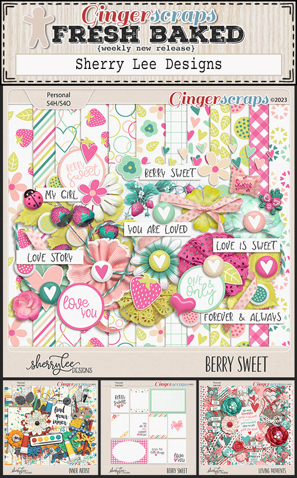
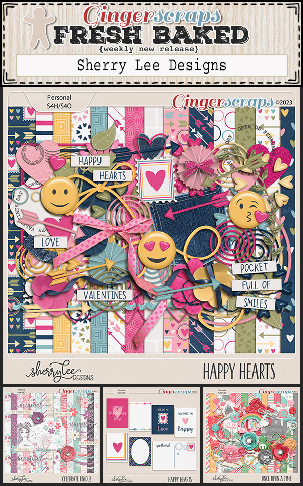
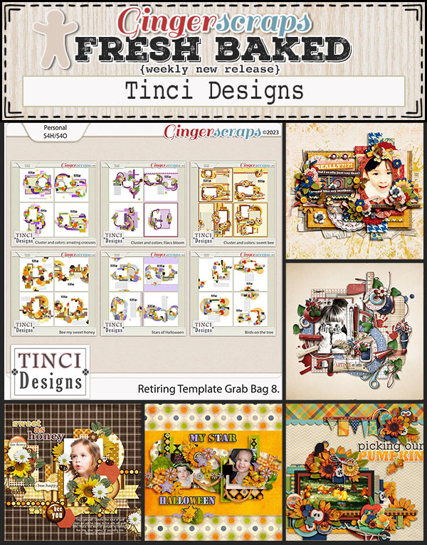
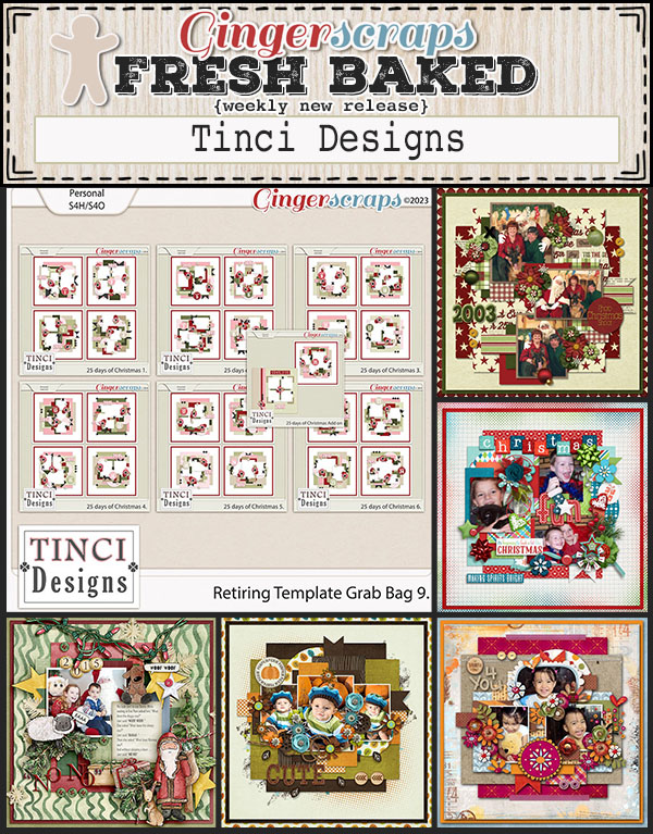
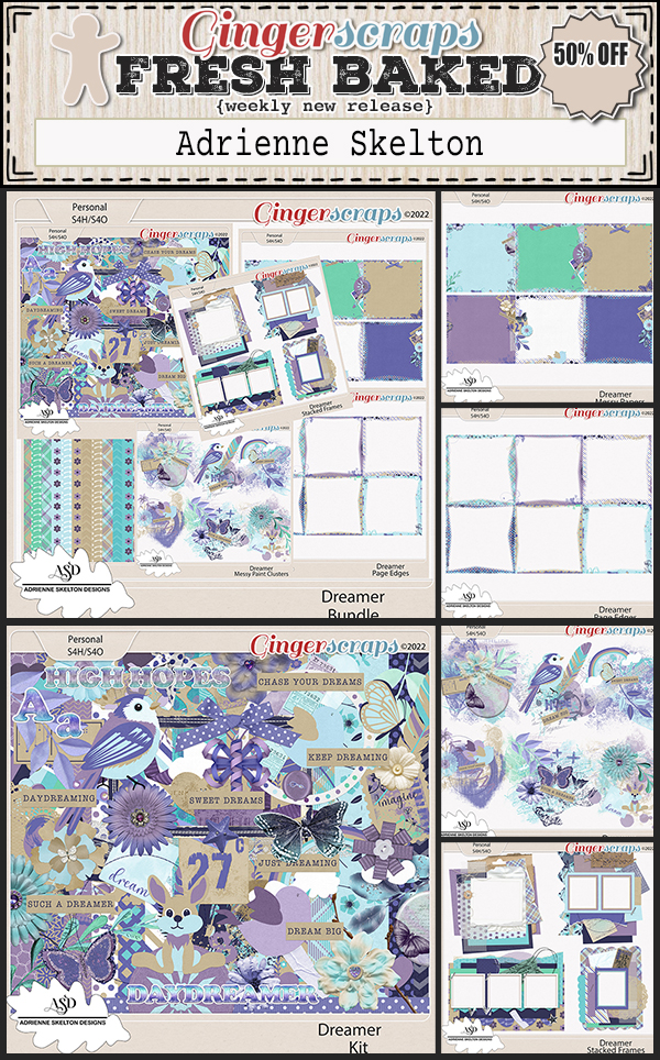
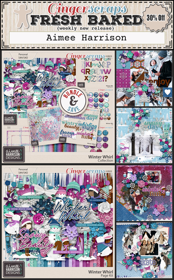
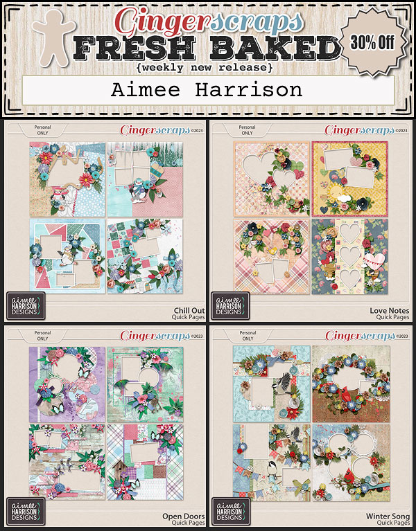
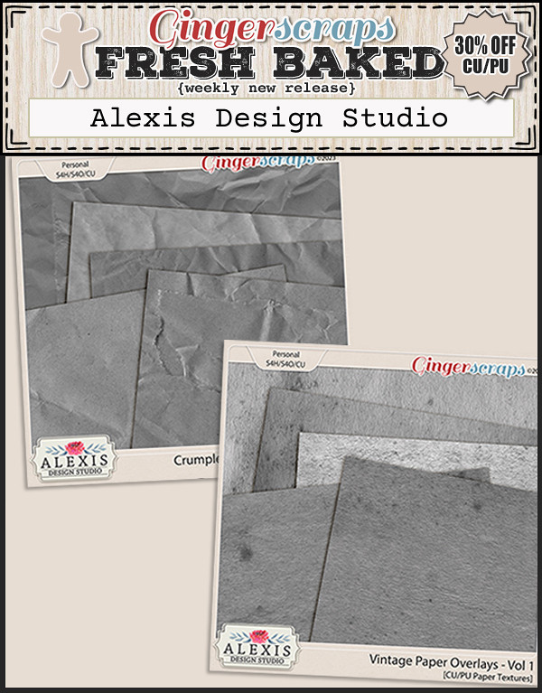
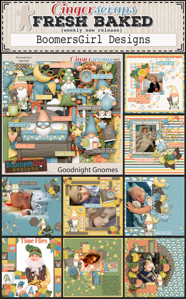
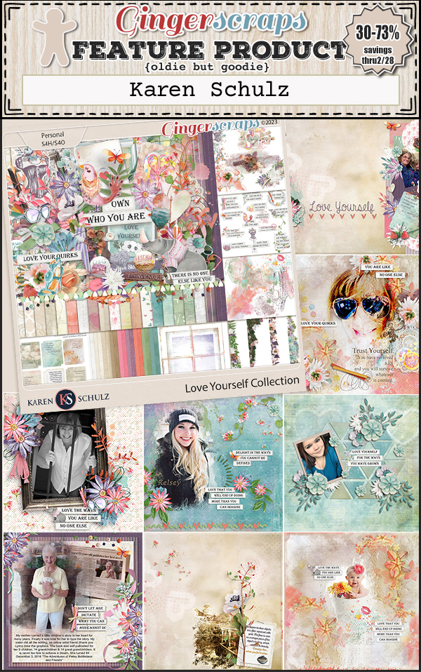
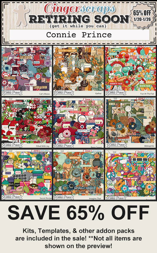
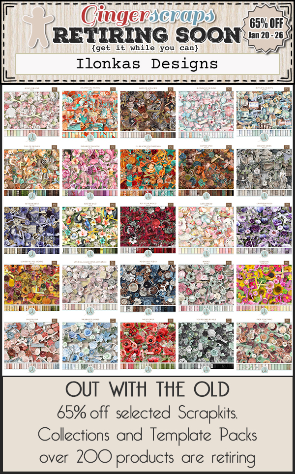
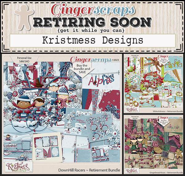
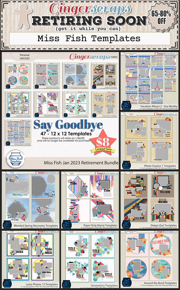
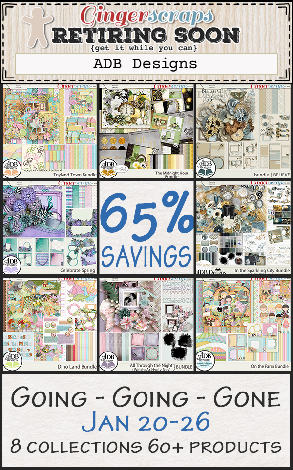
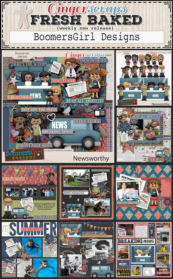
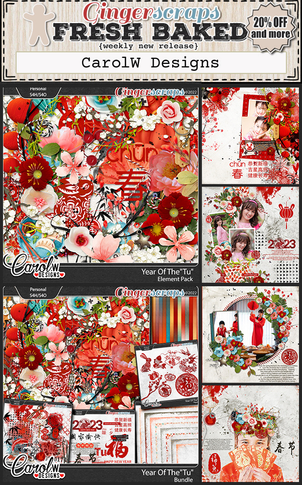
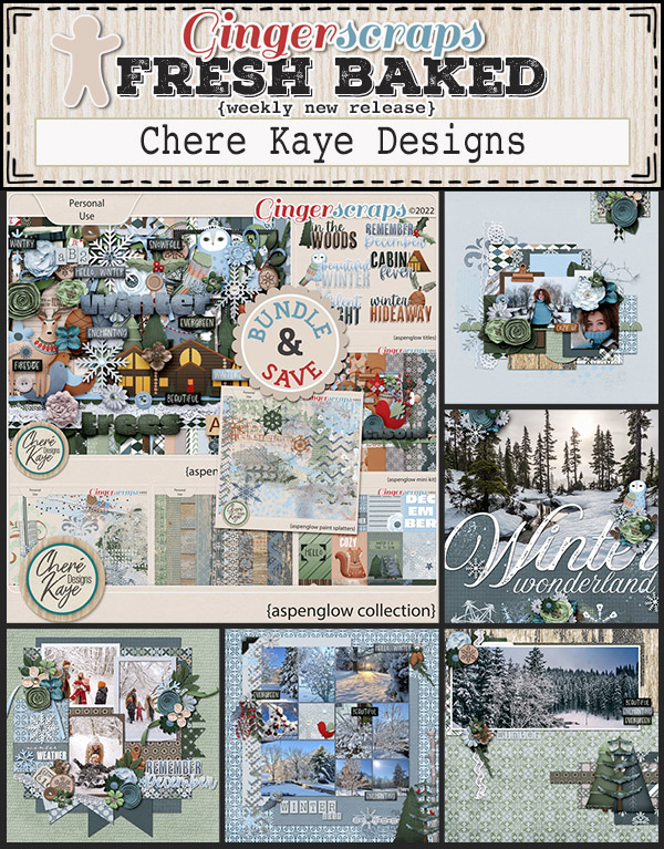
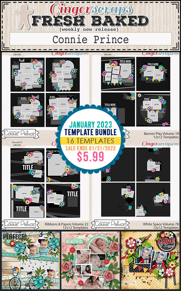
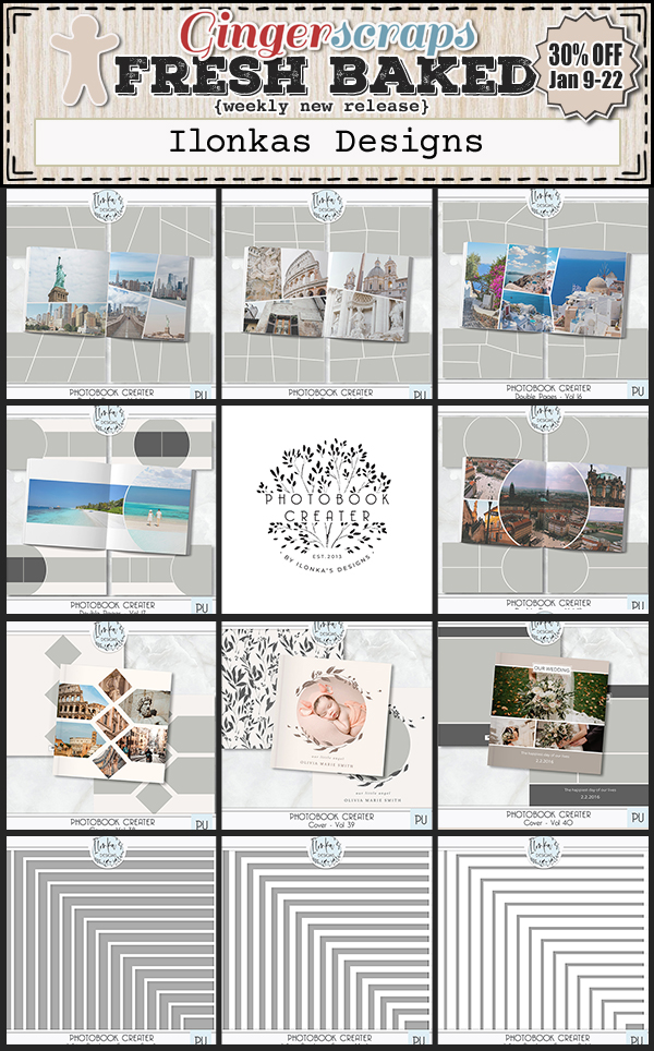
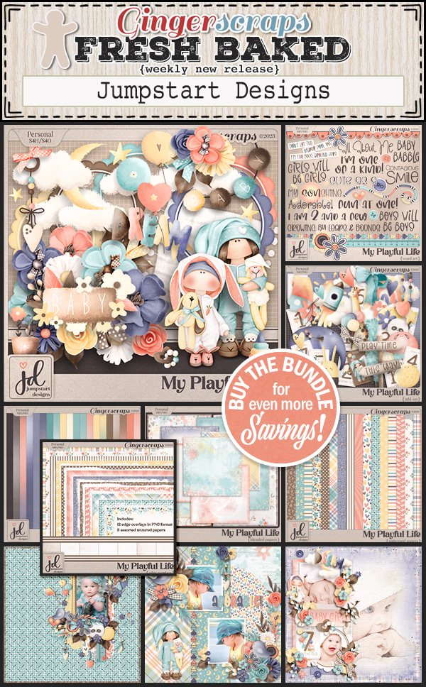
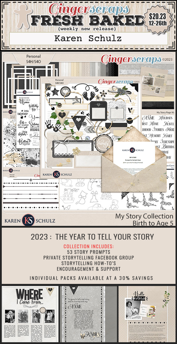
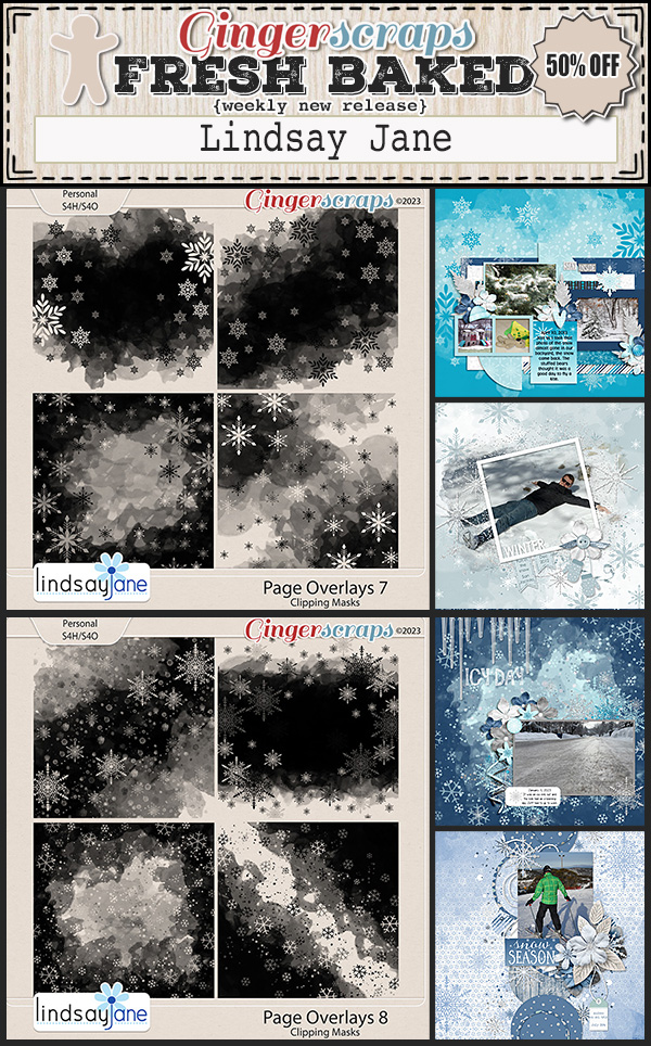
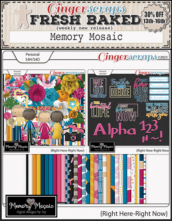
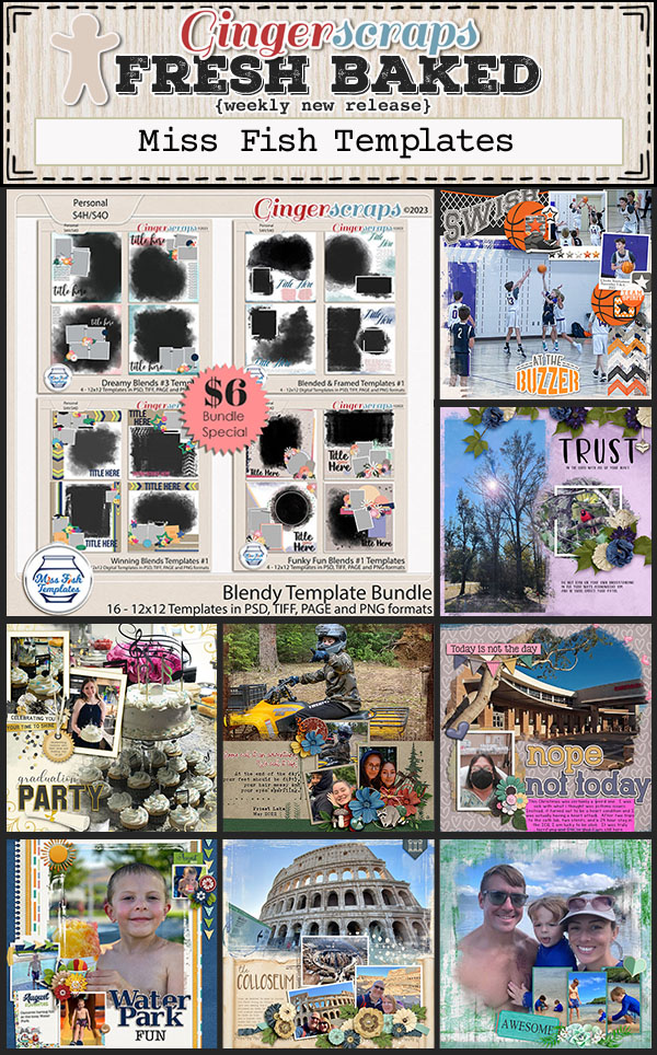
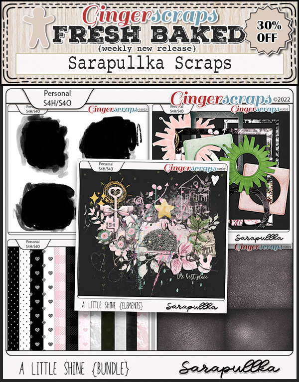
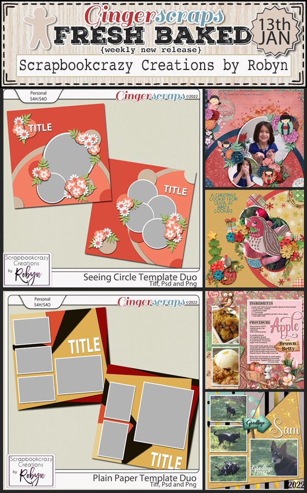
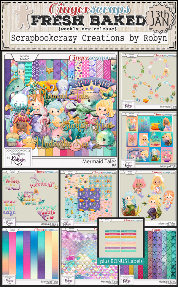
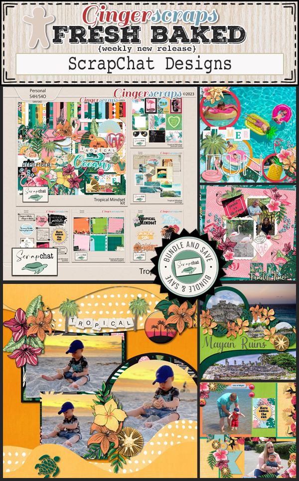
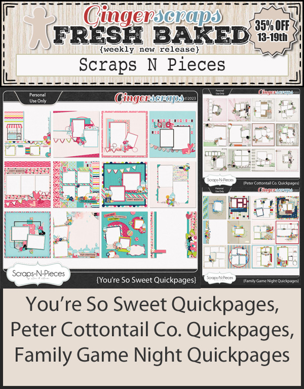
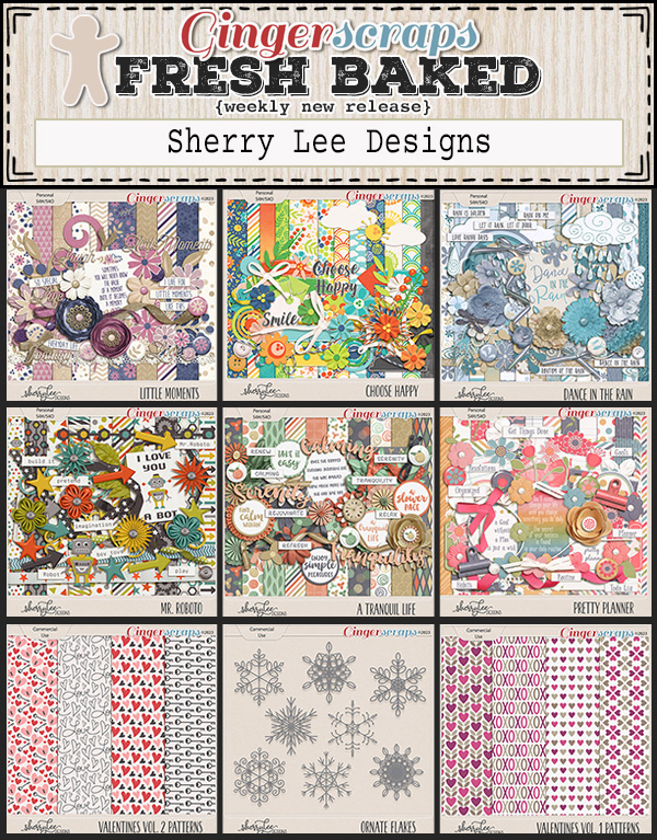
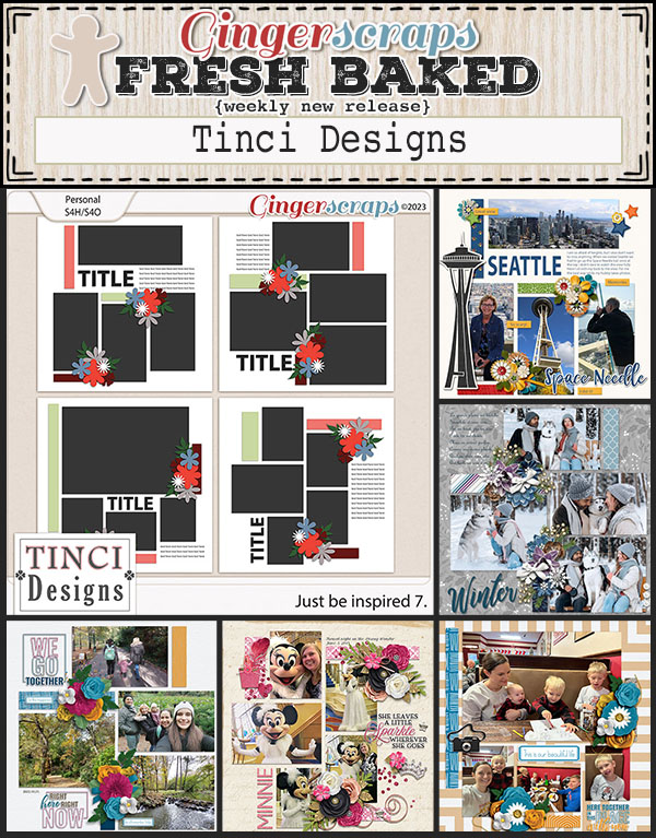
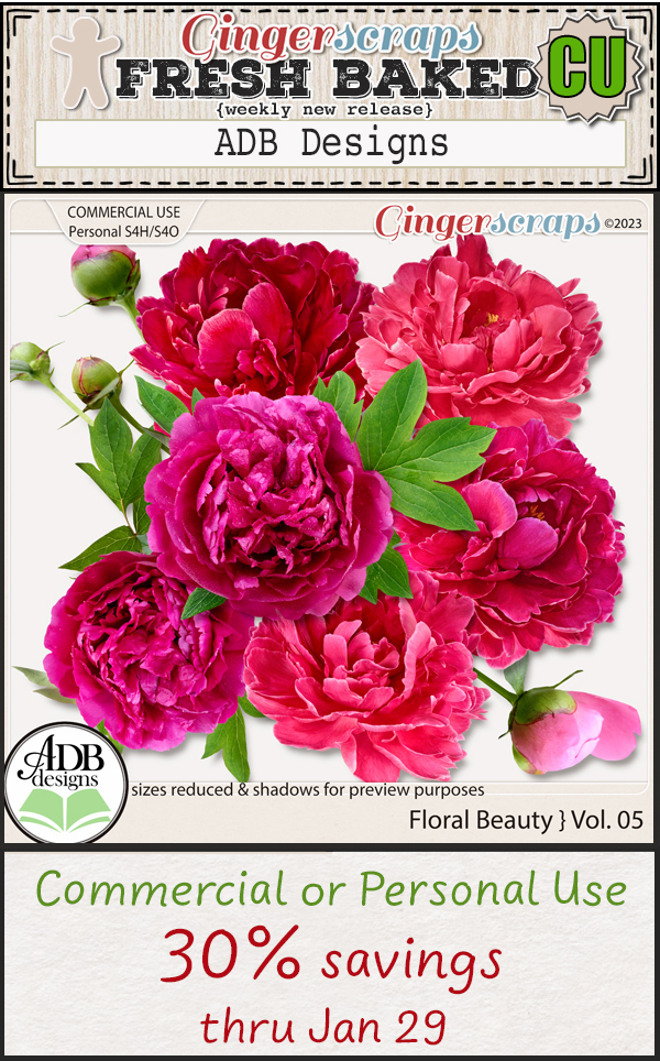
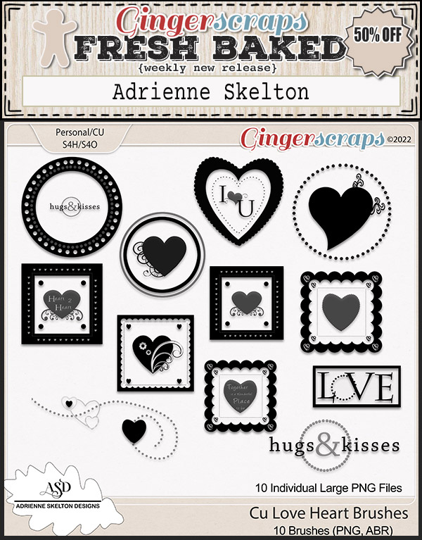
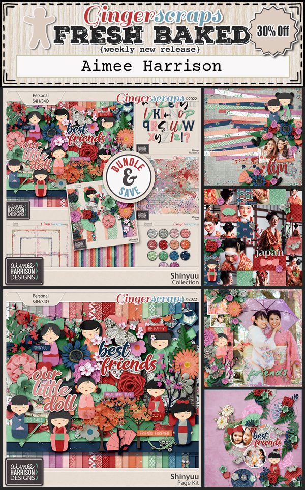
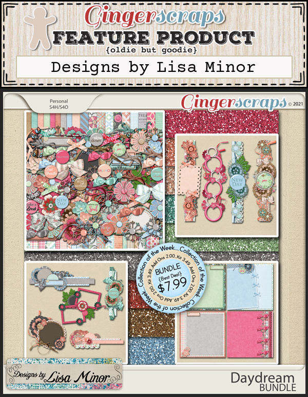
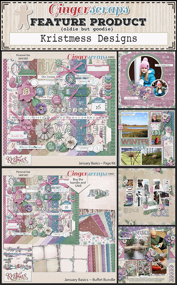
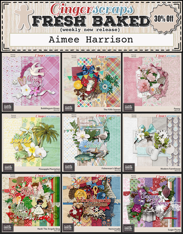
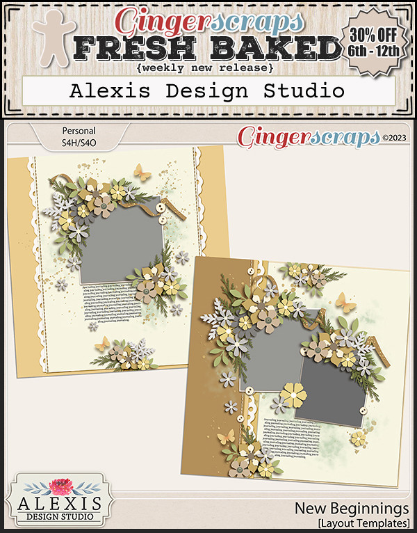
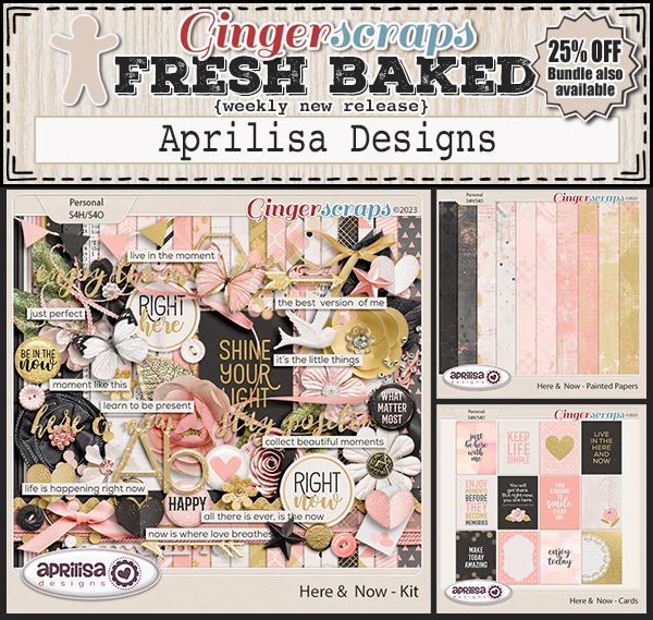
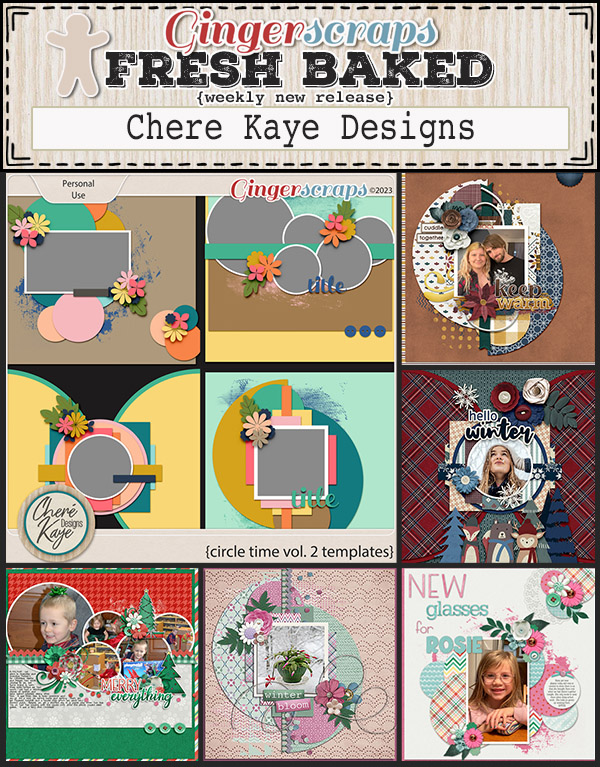
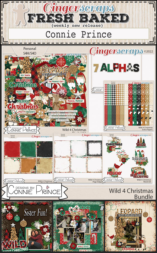
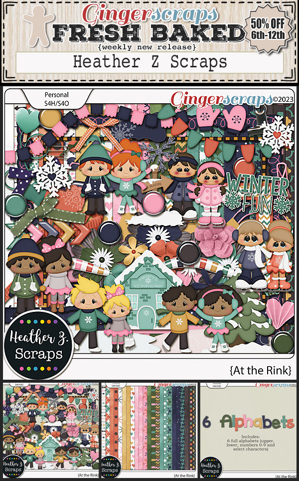
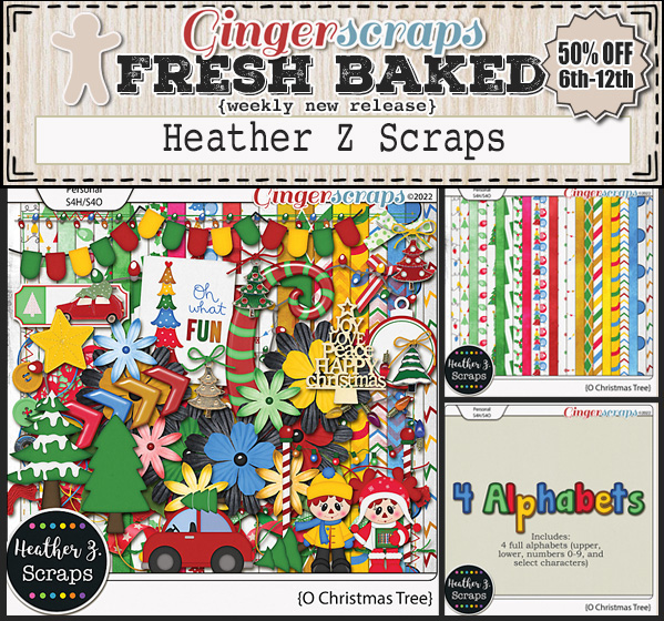
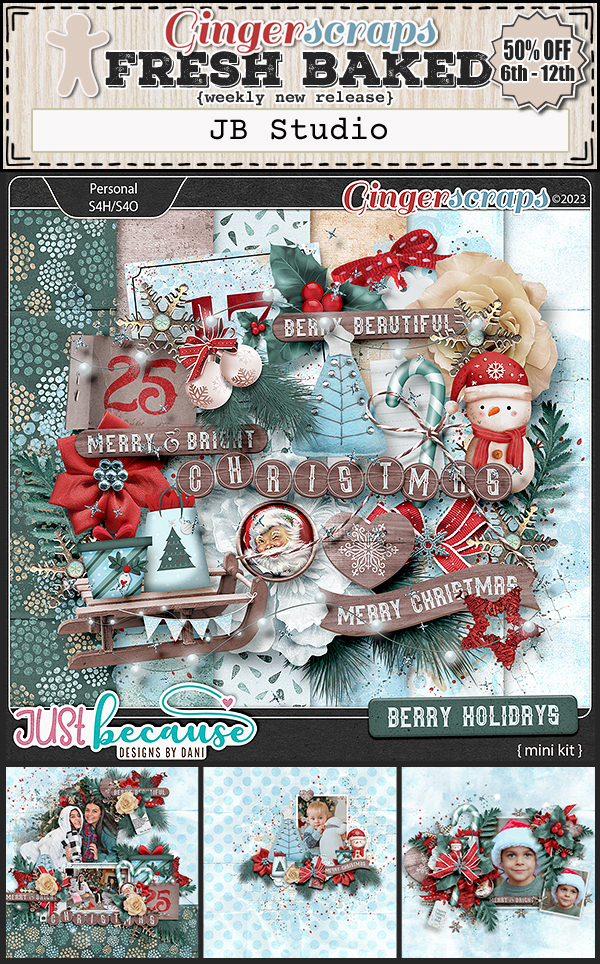
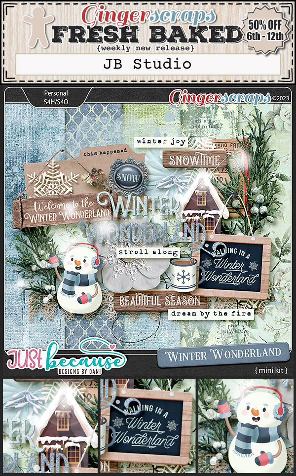
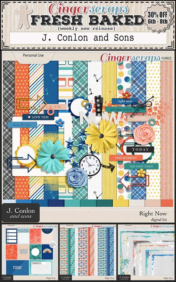
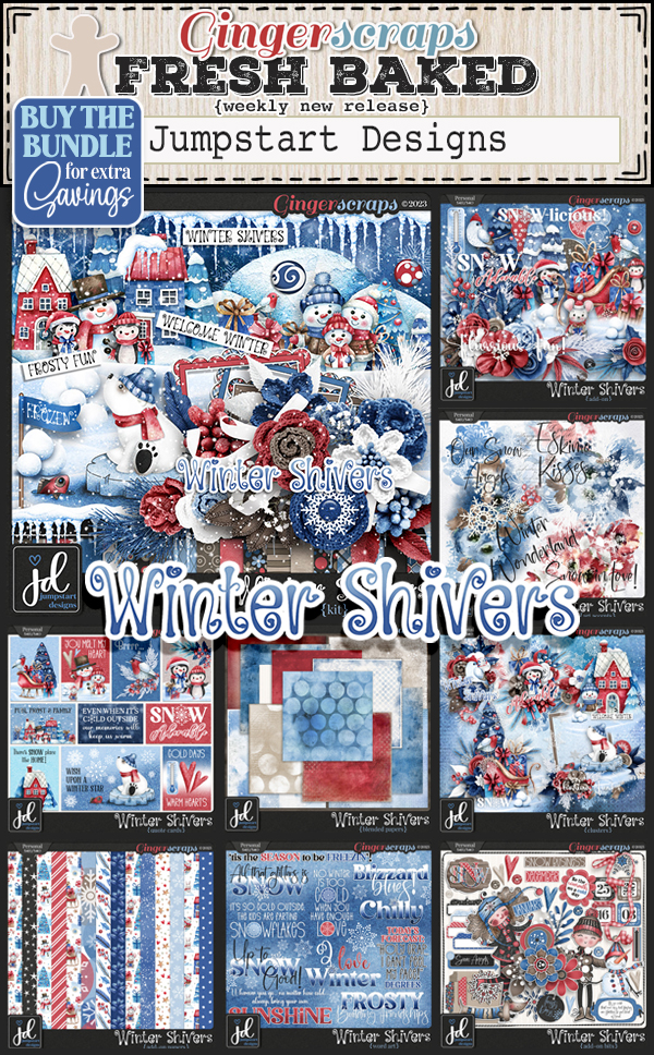
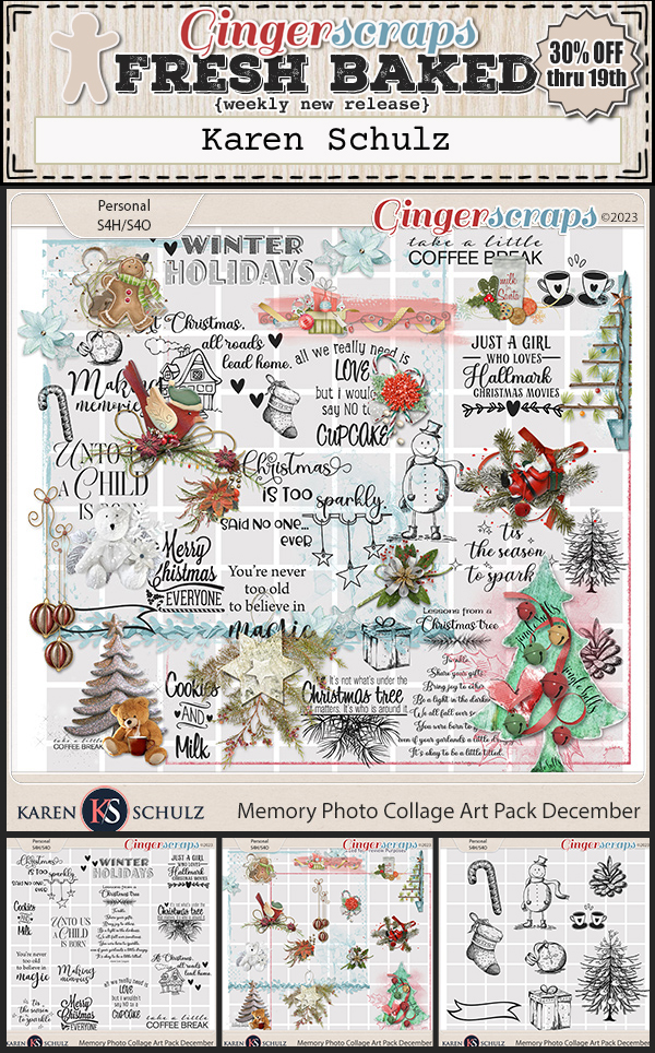
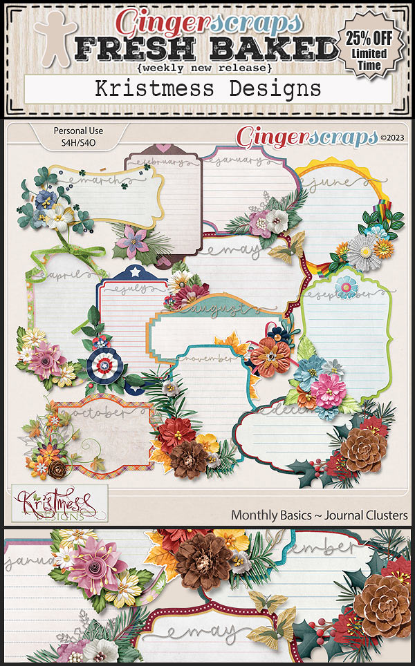
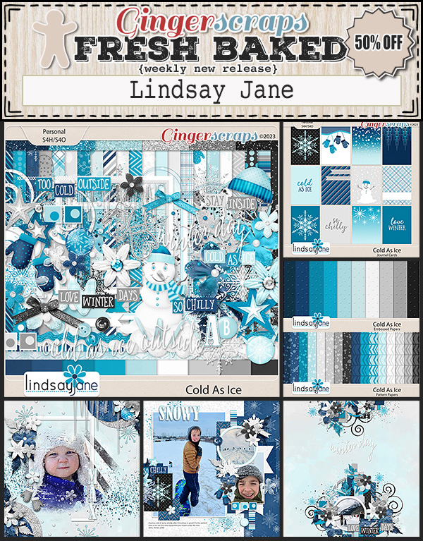
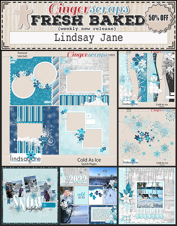
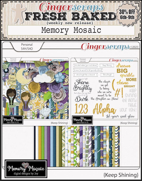
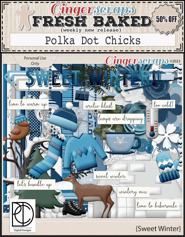
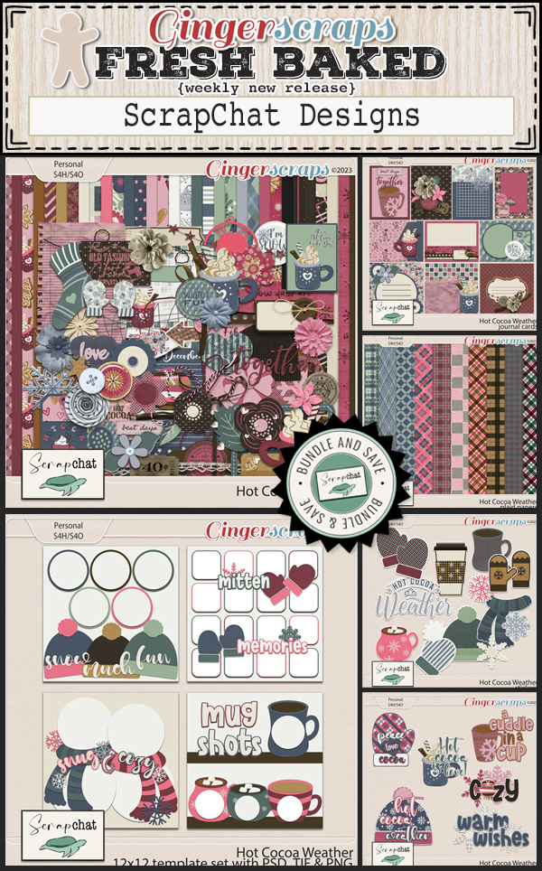
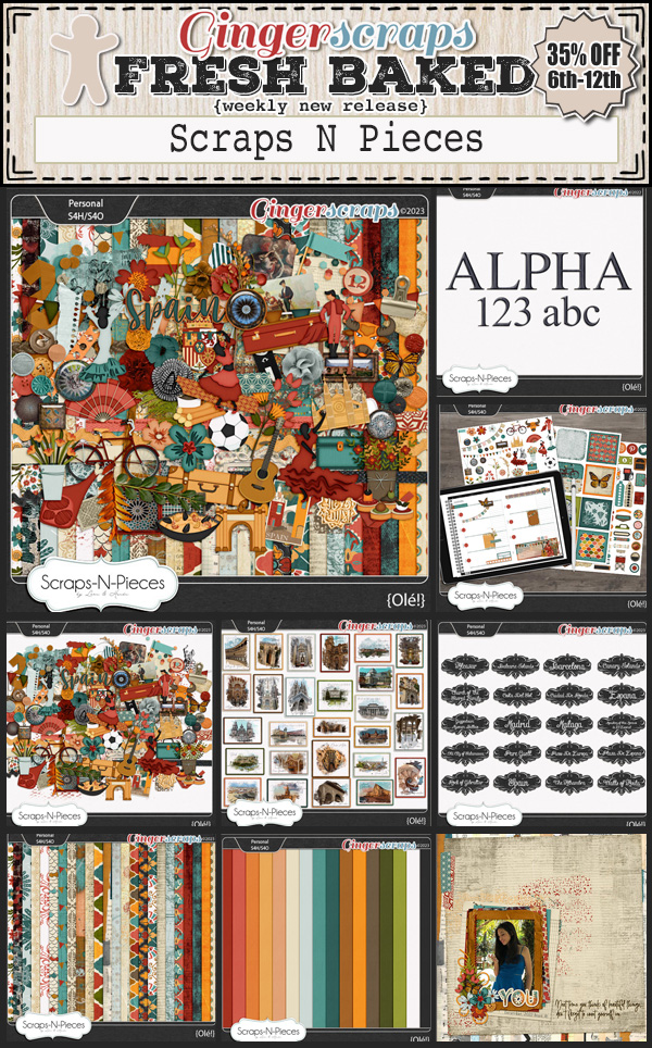
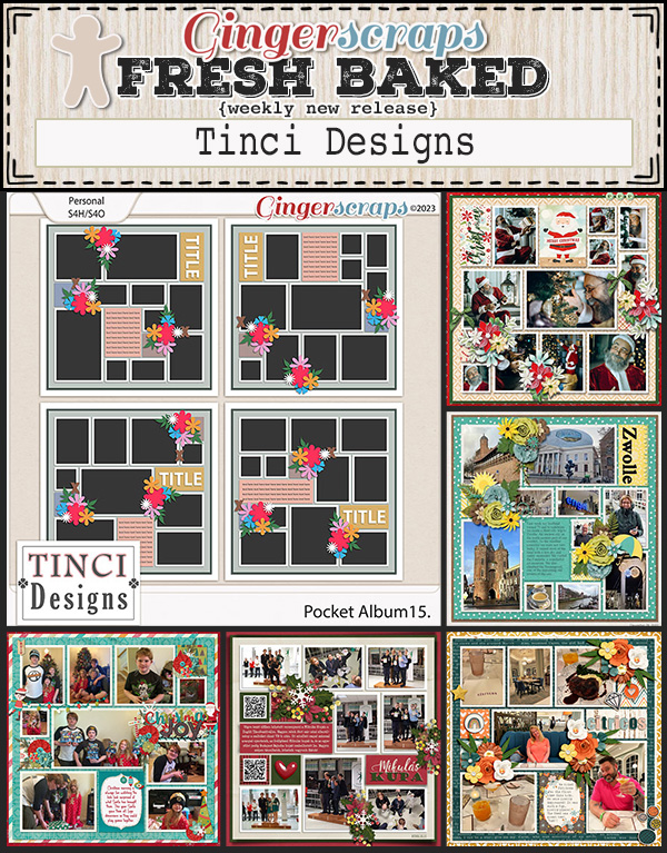
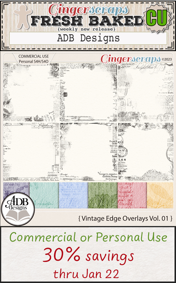
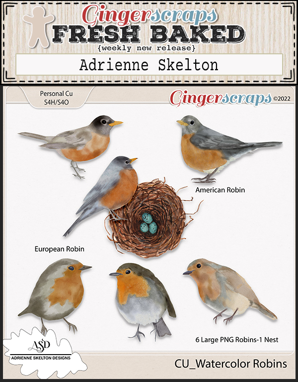
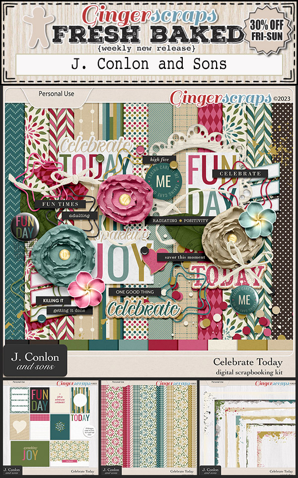
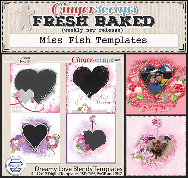
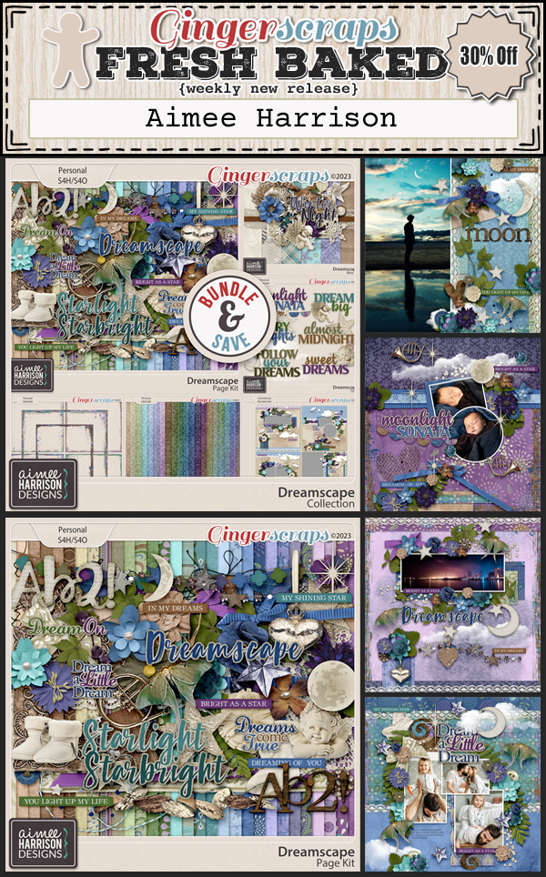
Let’s see what the designers have this week.


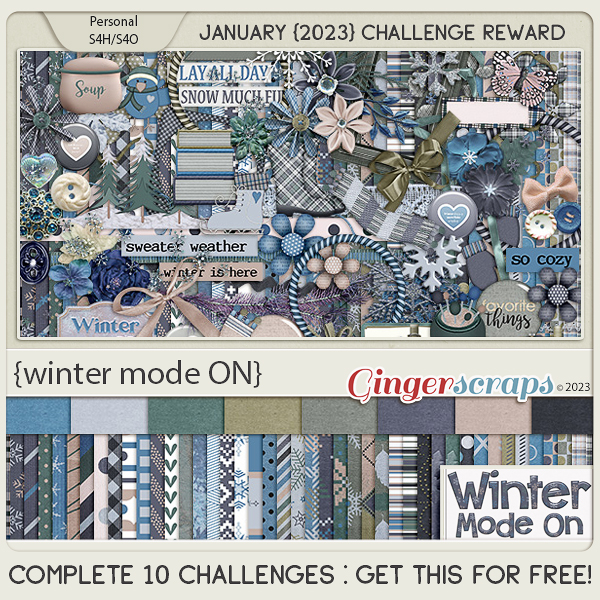
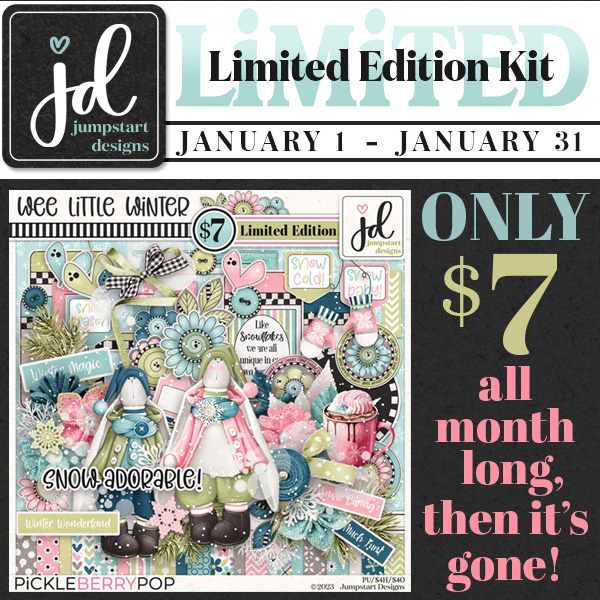
Have you gotten a start on your challenges? Complete any 10 challenges and you’ll get this kit as a reward!