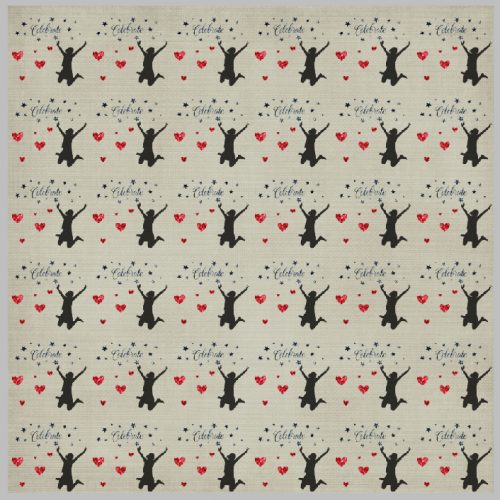
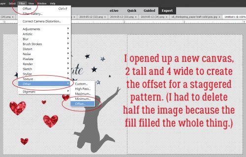
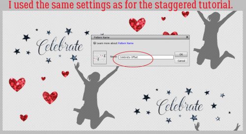
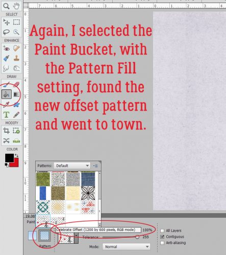
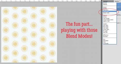
May is almost over which means school is almost out! I am not ready! It seems like the school year flew by and pretty soon spring will be done and summer will begin. Florida is officially in summer. It’s getting into the 90’s already. At least I can beat the heat and scrap to my hearts content this weekend! Our designers have lots of goodies releasing tomorrow! Let’s take a peek!
From Dagilicious


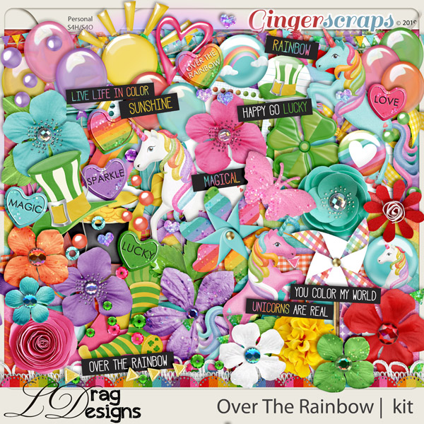
From LDrag


From Tinci


From Lindsay Jane


From Neia


From JB Studio


From Miss Fish


From JoCee


From Aimee Harrison


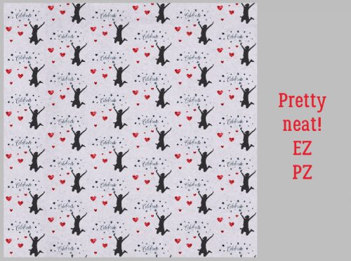
From Snickerdoodle