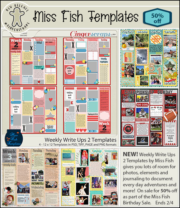
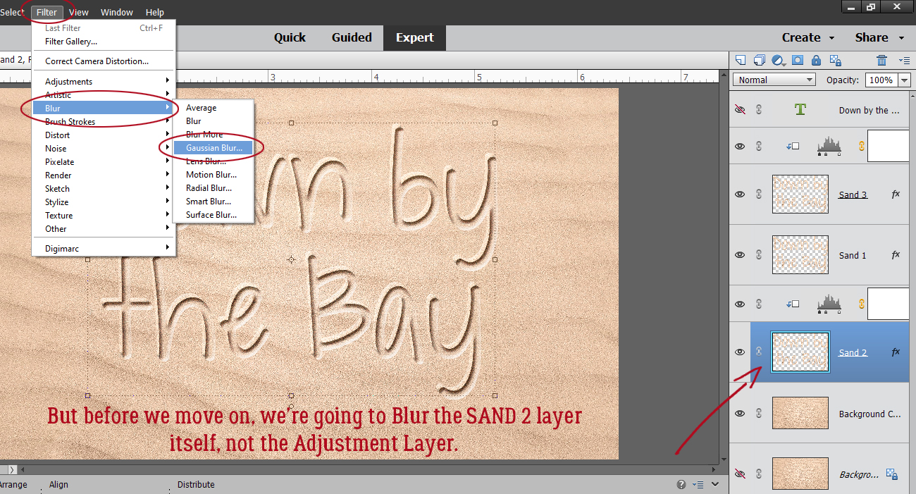
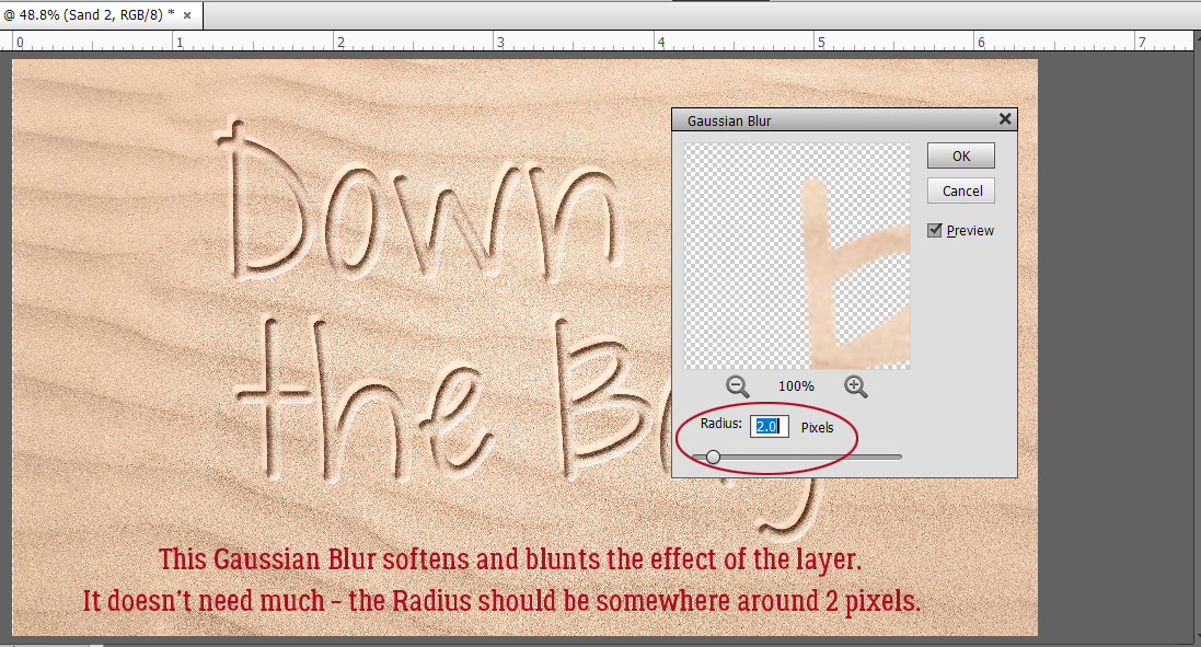
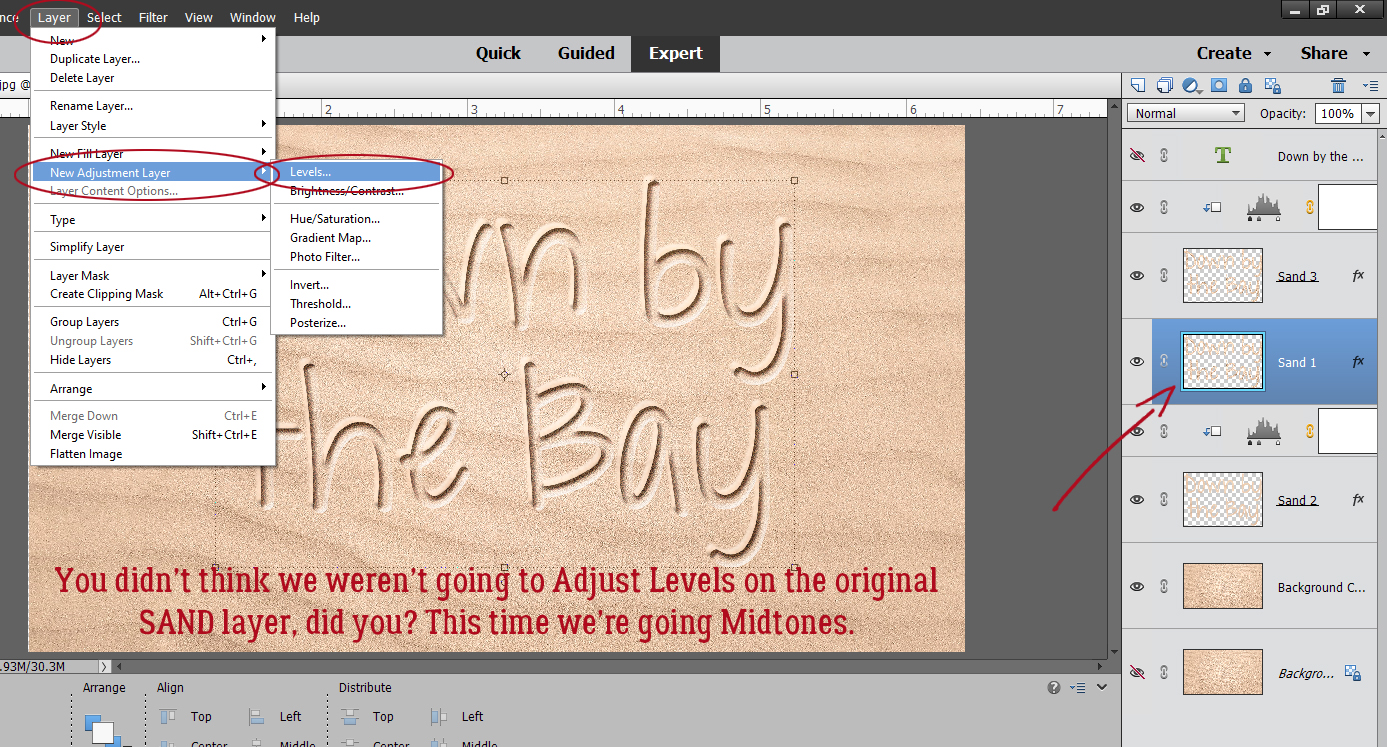
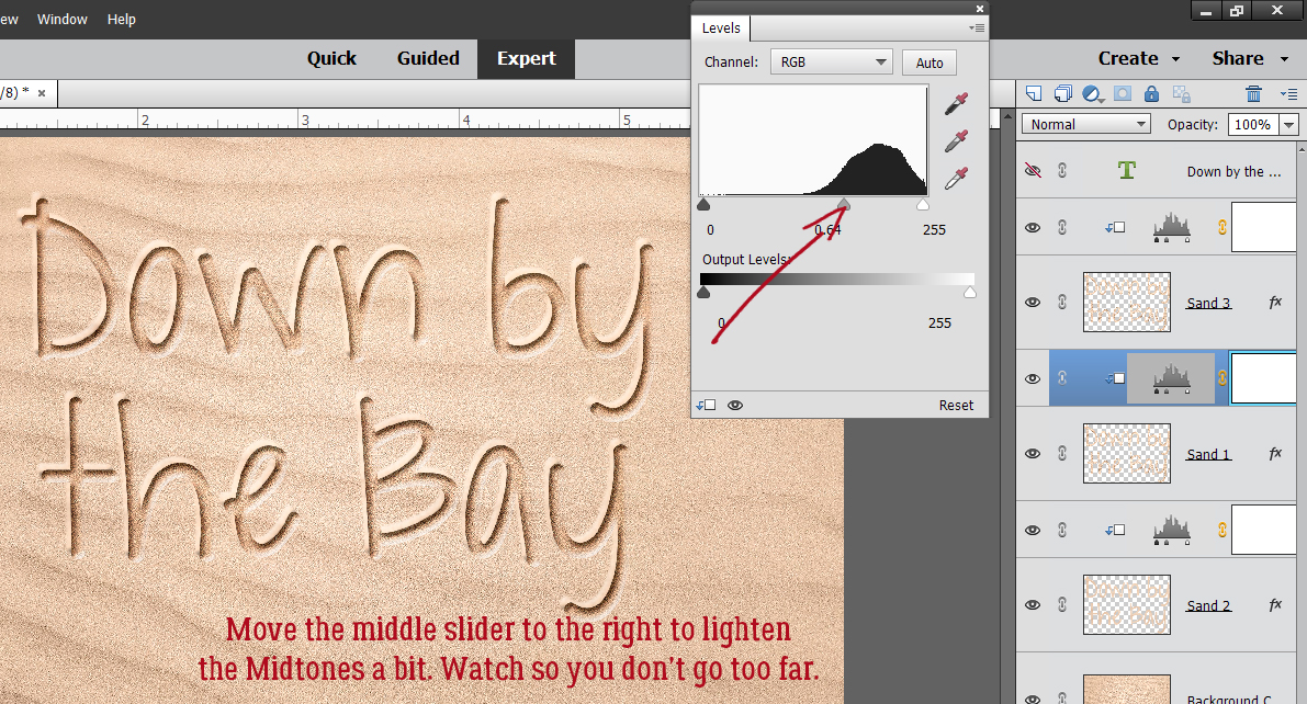
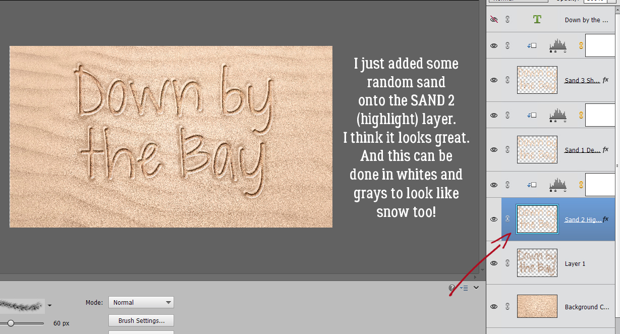
Text Boxes Don’t Have to be Boxes!
![]()
I’m so glad to have a distraction from the train wreck on my TV right now. All that hot air is giving me a headache. Then there’s the odd thing my Photoshop Elements did. It reset all my preferences all by itself. How does that happen?? I think I’ve got everything back to normal now.
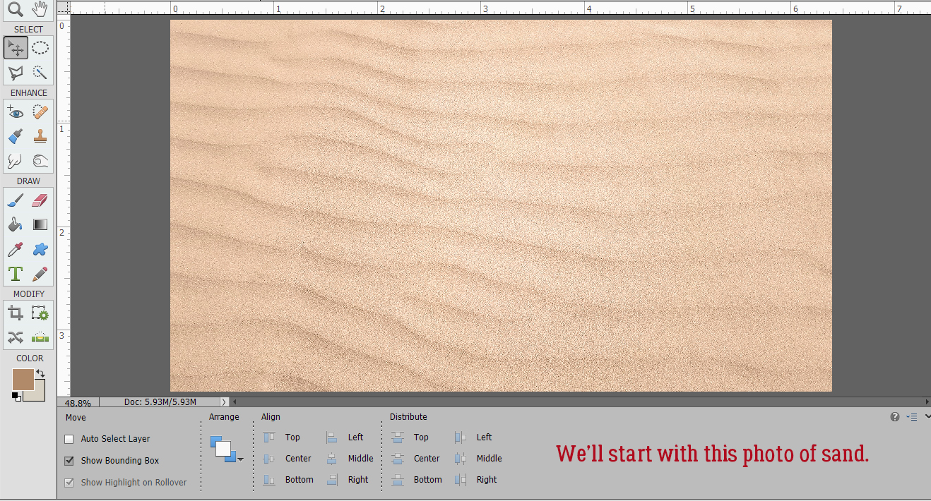
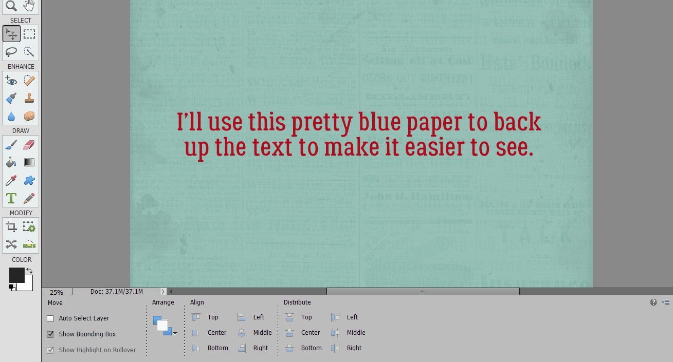
When I got a message from Lisa about putting text inside a shape other than a box, I had to look at all the other tutorials I’d written to be sure I hadn’t already plowed that field. I found a tut about putting text around a shape, but not one for filling a shape. I knew I could build a tutorial around it, but I wasn’t as successful as I’d thought I would be. Her enquiry was about creating a geometric shape that she could then quickly and easily fill with her journaling. Alas, I haven’t succeeded in making that work. But… I can still show you how to use the Custom Shapes tool to create unique text boxes for your layouts. I’ll plop a paper down on my canvas so you can see what I’m doing more clearly. I chose this beautiful blue paper from ADB Designs‘ Antiques Emporium.
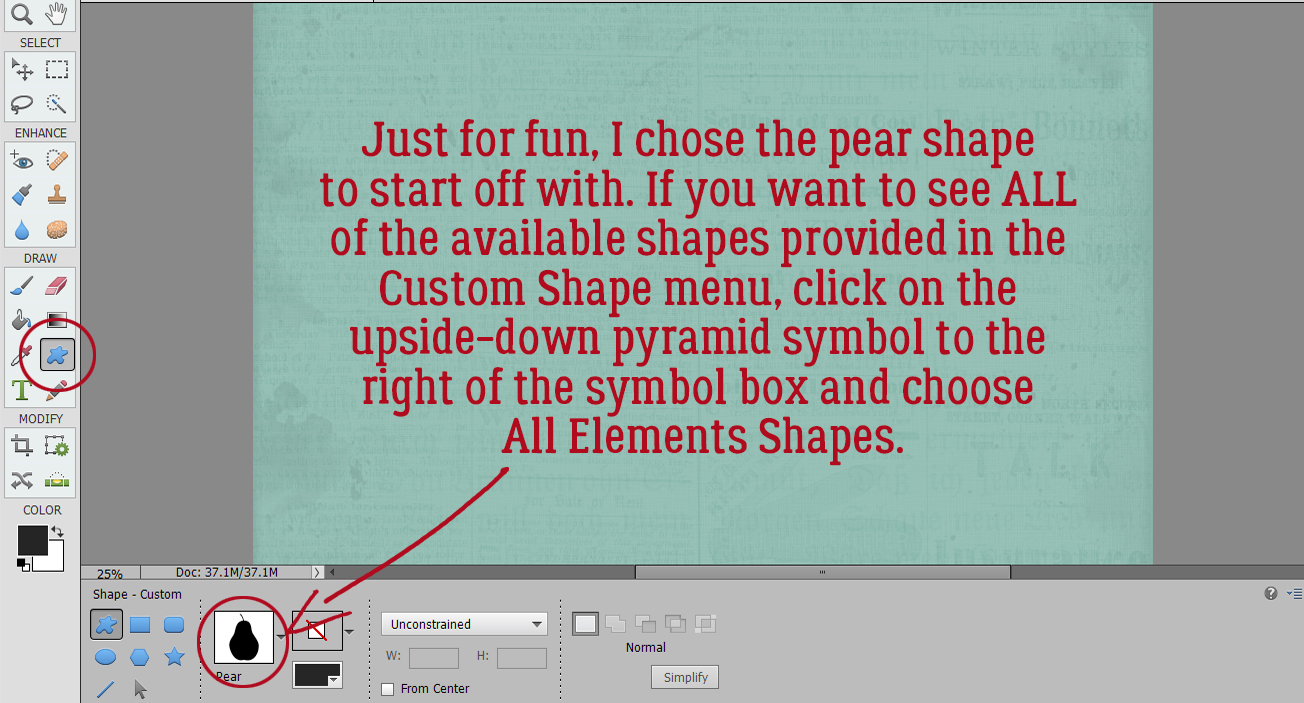
Next I had to choose a shape. The software has a huge assortment of shapes to choose from, but there are a few things to keep in mind when you’re choosing. If you want to use a fancy font, you might want to keep the shape simple. If you want to use a large font, again, keep the shape simple. But remember that you have the opportunity to make your finished text larger and more legible later on in the process. So by implication, the more complex the shape, the smaller and tighter the font will need to be. The default shapes are pretty ordinary, so if you want to see all the possibilities, click on that little upside-down pyramid icon to the right of the image box and from the pull-down menu, choose All Elements Shapes. Just for fun I chose this pear shape for my initial example, clicking and dragging out the shape by moving my cursor over the canvas. You can direct the orientation of the shape while you’re creating it simply by moving the cursor in the direction you want to adjust. You can use whatever colour you want for this step, just pick something that will show up against your background.
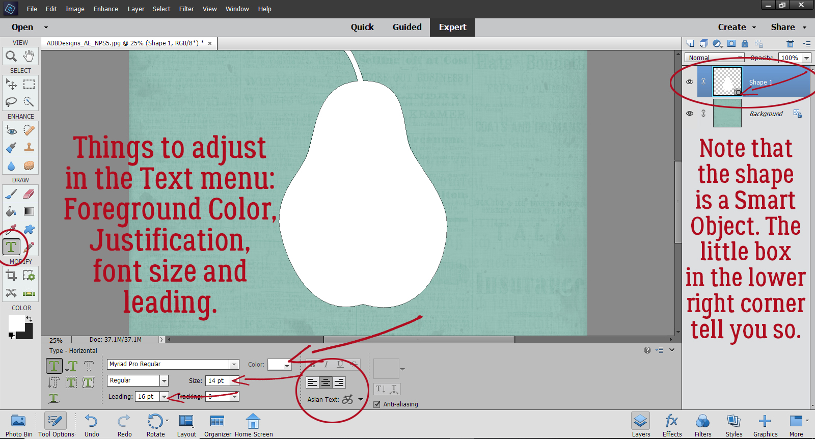
Now on to the text part. Select the Text tool. I’m just going to use the default font, Myriad Pro Regular for my example, and the Horizontal Text tool, but you do you. Choose your font, but before you go any further, check the Size and Leading (space between lines), make sure you’ve got a contrasting colour in the foreground box so you can see your text, and that your text will be centered. You’ll note that the layer with the shape on it is a Smart Object. Whatever you do now won’t change that layer unless you Simplify it. DON’T!
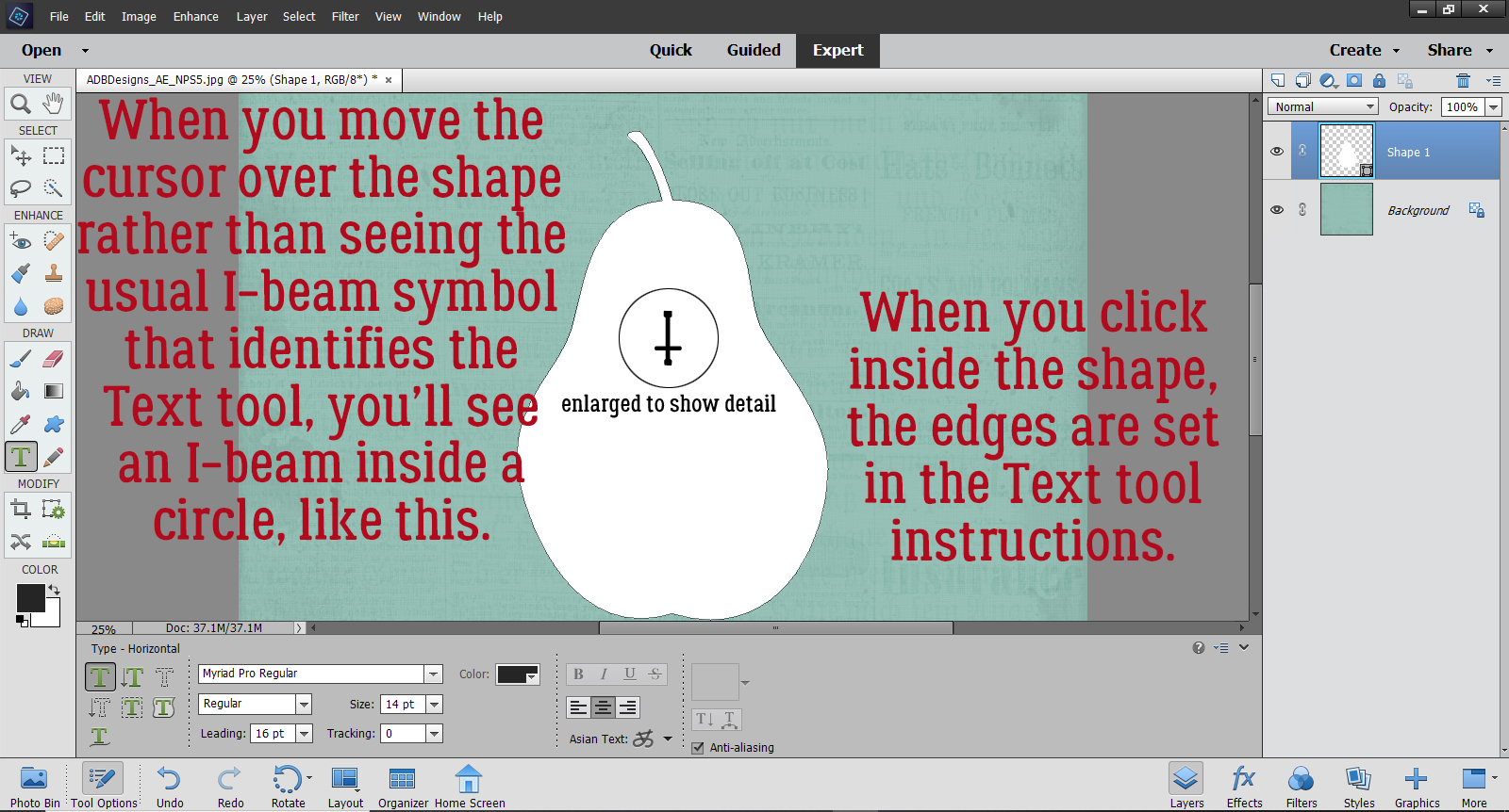
Move the cursor inside your shape, anywhere inside the shape; it isn’t necessary to put the cursor where you want to start your text. When you move inside the boundaries of your shape, your I-beam icon that tells you you’ve got the Text tool active will look like the image – the I-beam will be inside a circle. That’s how you know Elements knows you’re going to text inside a shape, and it turns on the invisible force field that keeps your text inside the shape.
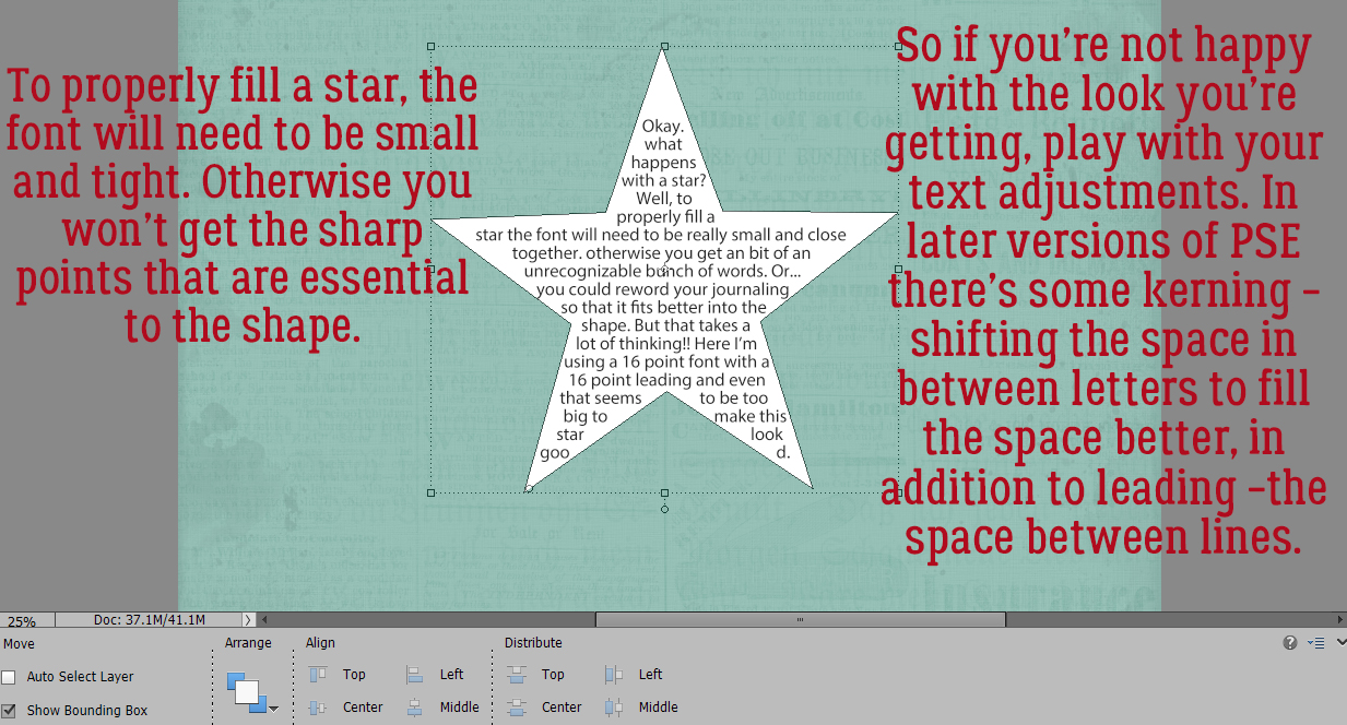
Then just type! The software will keep all the text inside the shape and shift things as needed. If you want to have a very narrow border around your text and a tight shape, you may need to adjust the size of your font, adjust the Tracking (kerning – space between individual letters and words, only available with versions 2019 and later) or to edit the words you use to fill the space better. (I’m free-associating in the text on these images. It might be better if you don’t try to read it!)
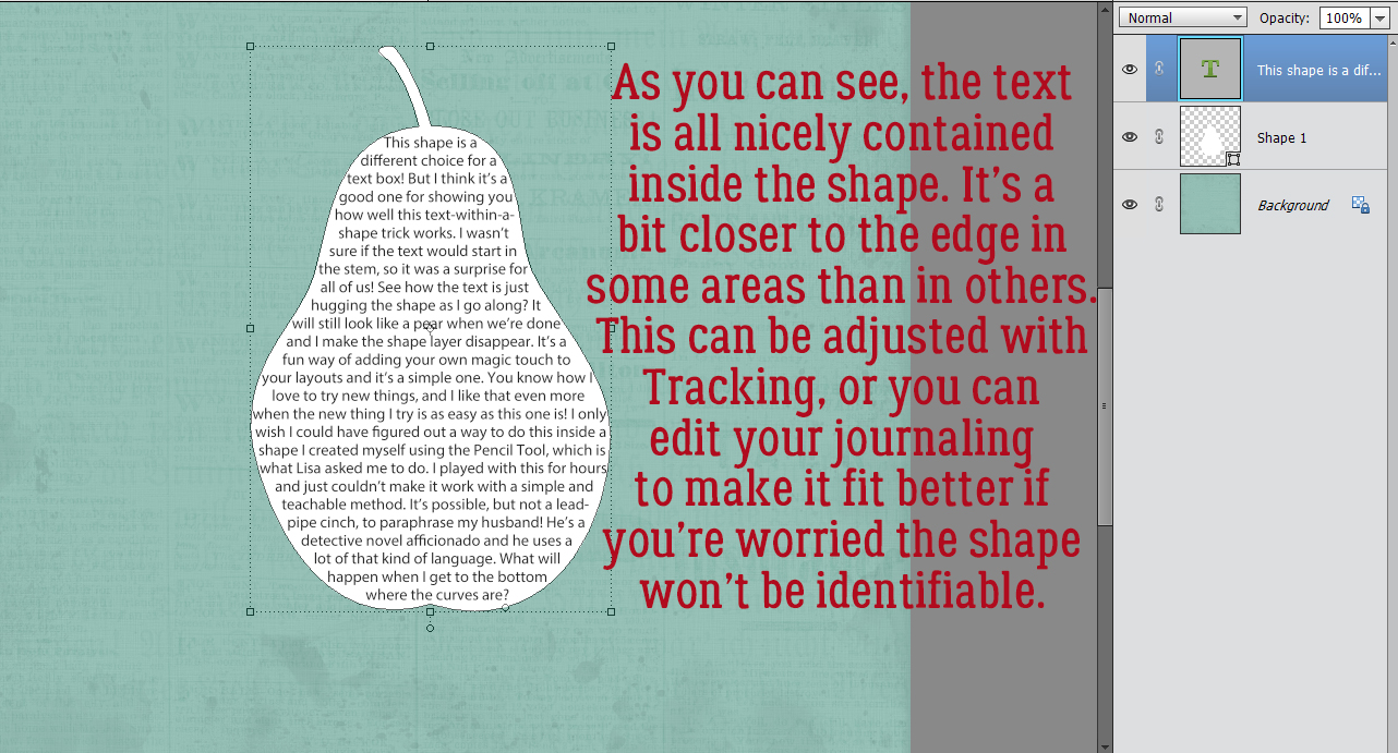
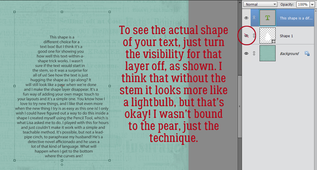
At this point, you know how to do this task! To see what your text will look like on your paper, turn the visibility for the shape layer off and all that you see is your journaling. I was a tiny bit disappointed that no text went into the stem, but if I’d used an almost invisibly small font, I might have gotten that to work.
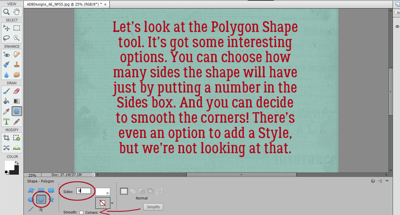
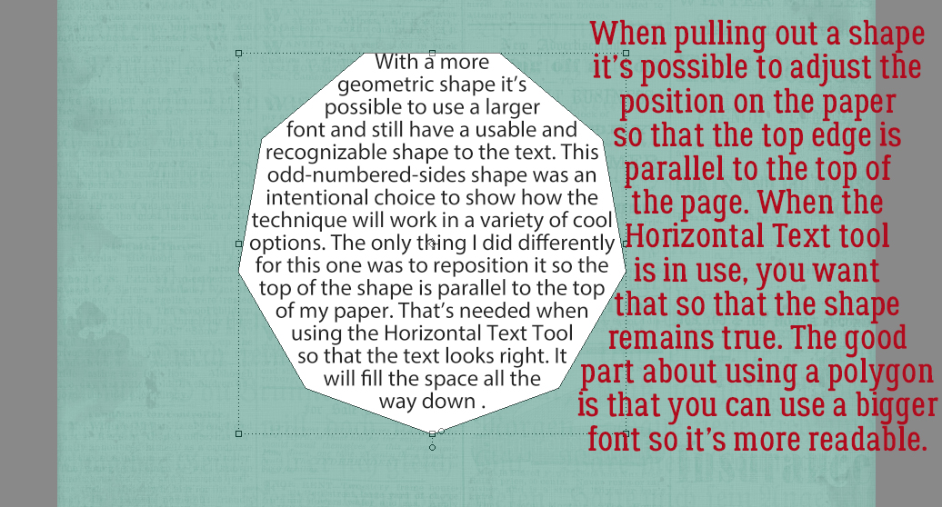
The rest of the images are all just to help you figure out how to use the shapes. Lisa mentioned geometric shapes specifically so I chose the Polygon Shape tool. You might think you’re limited in what shapes you can create here, but you can change the number of sides on your shape and keep them crisp or Soften them. There’s also the option to add Styles to your shape but we’re looking at text, so we won’t go there. Odd numbers are always more interesting than even numbers so I chose 9 sides.
As I mentioned, the simpler the shape, the larger the font can be. And too, it’s possible to adjust the orientation of your shape as you’re dragging it out.
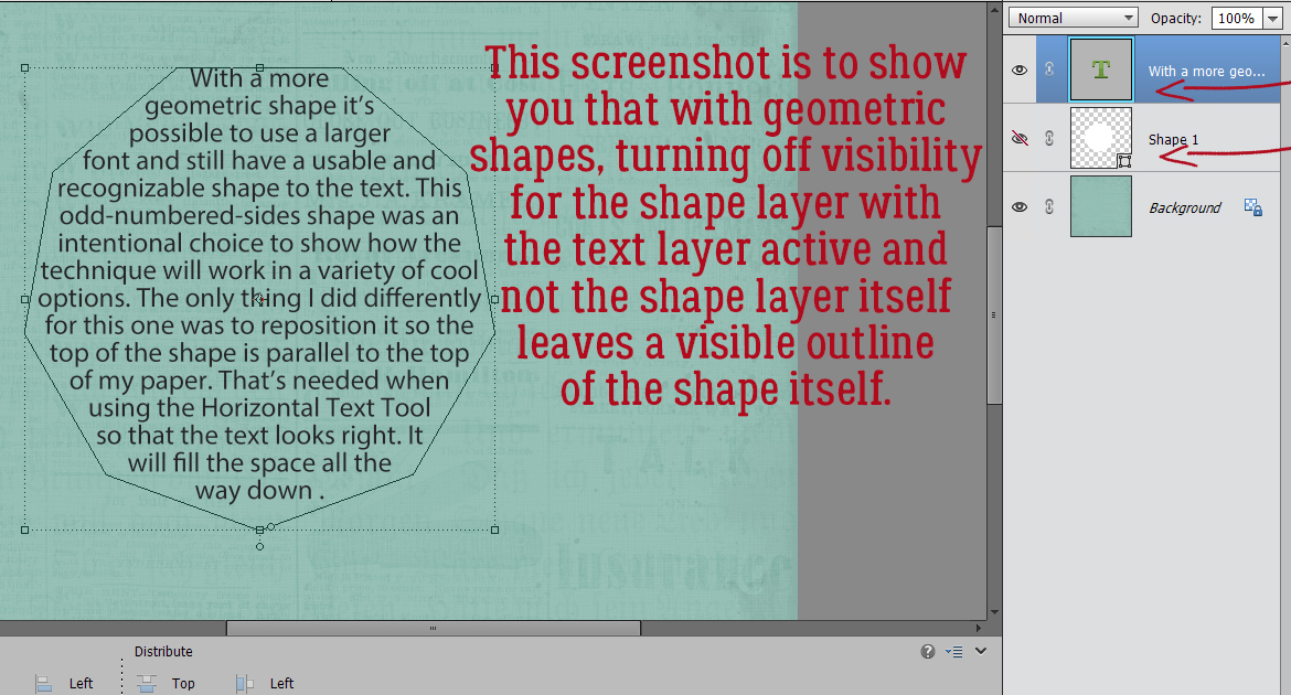
The purpose of this image is just to show you that turning Visibility off for the Shape layer while the TEXT layer is the active layer will leave an outline on your paper. If you’re okay with that you can later exploit having the outline there. If you’re not okay with it, make the Shape layer active and it goes away.
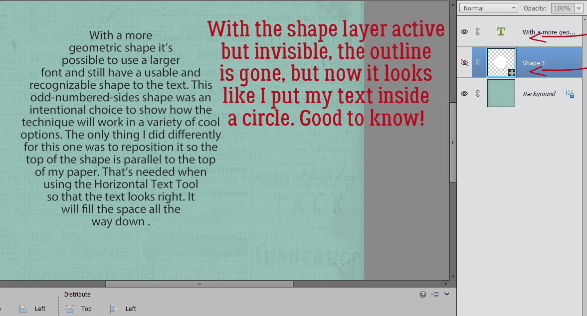
Maybe I’d want to leave the outline there… this looks like I typed inside a circle!
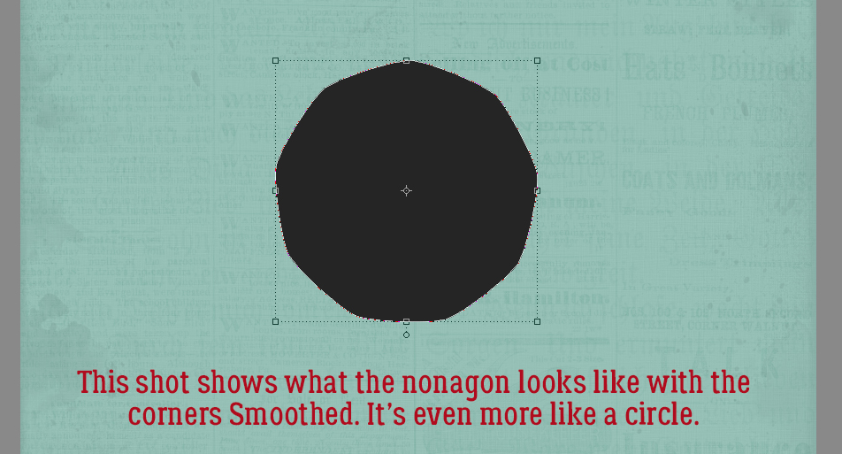
And then there’s the Smooth cornered nonagon… almost indistinguishable from a circle. If I wanted a circle I could have chosen a circle!
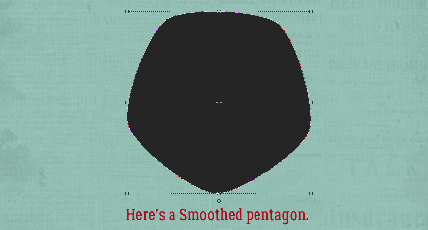
Smooth pentagon…
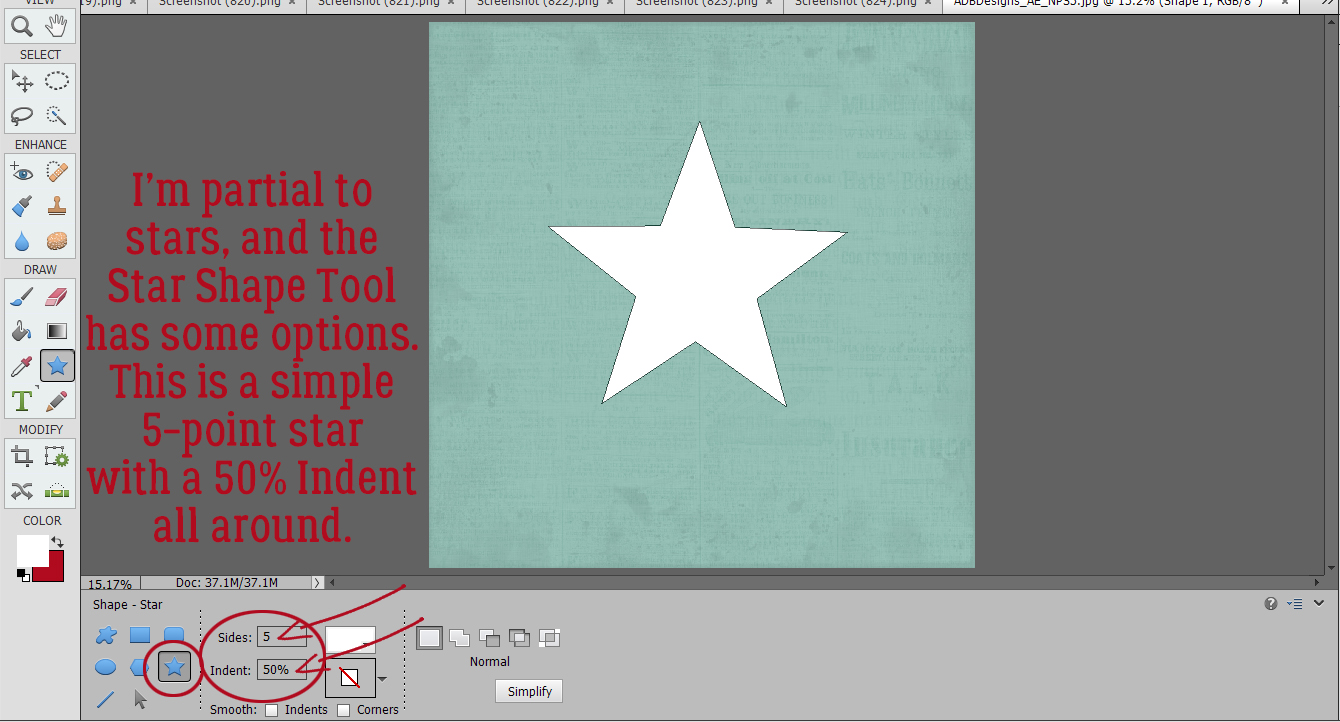
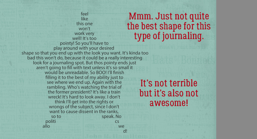
How about stars? I’m quite partial to stars. Even this Star Shape tool has options. This is a basic 5 pointed star with a 50% Indent. I’ll show you some different Indents coming up.
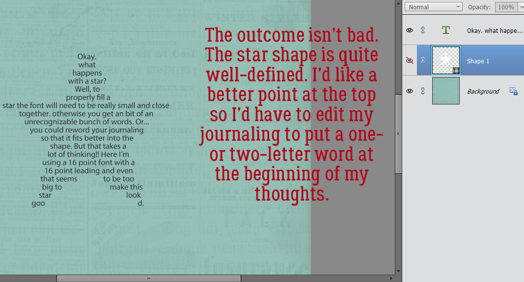
Stars are more complex shapes, so the font size will need to be on the smaller side so the text fills the points better. Again, if it’s not looking right to you, try editing the words you’ve used, or adjusting the font size. If you’re adventurous and have 2019 or newer you can try tinkering with the Tracking so there’s more or less space between the letters or words.
With the Shape layer concealed, the star shape seems well-enough defined. If I’d started the text with a single or two-letter word, it would have started closer to the top of the upper point. You might also note that at the very end, there are random loose letters.
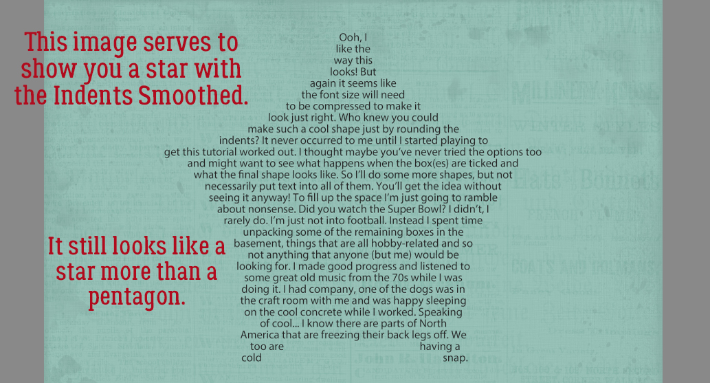
Just by Smoothing the Indents on the same star settings I ended up with this shape. It’s different, and could be an interesting addition to a layout.
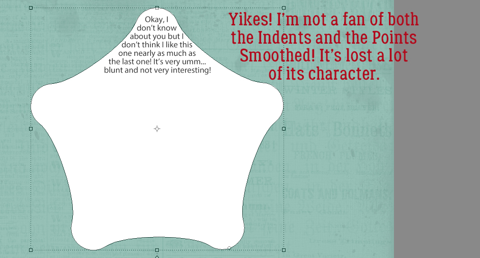
Here’s what that same basic 5 pointed star looks like with both the Indents and the Points Smoothed. Not my jam.
So what happens if you change the amount of Indent? You get something like this! I went from 50% to 90%. Those points could draw blood! See how the letter “I” is all the way up into that top point? This could take a lot of tinkering.
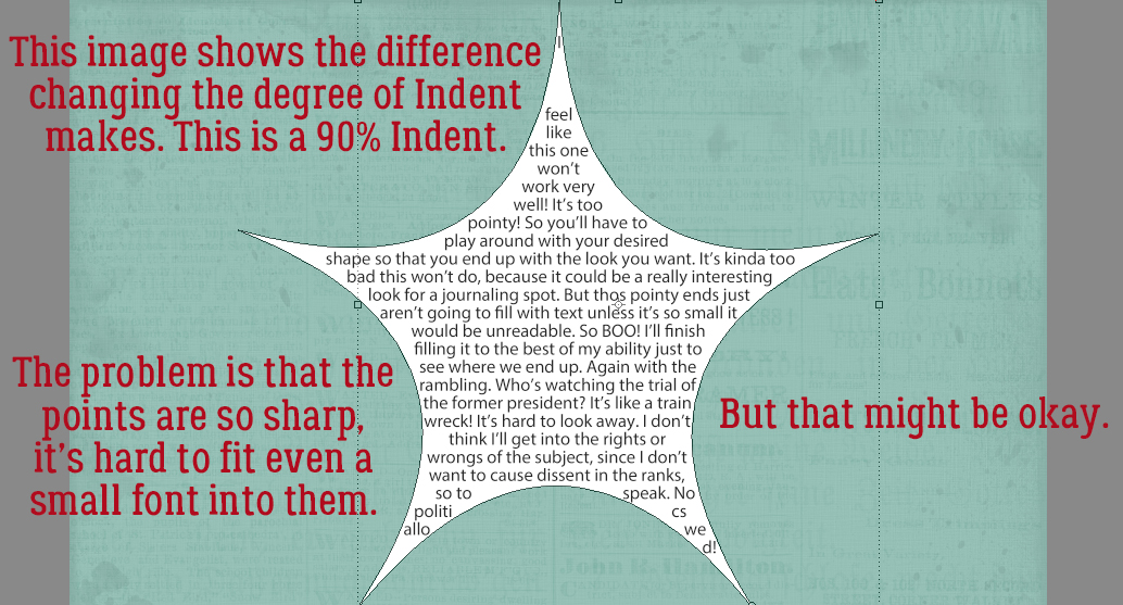
If I turn off the Shape layer, I’m left with this. It’s just okay.
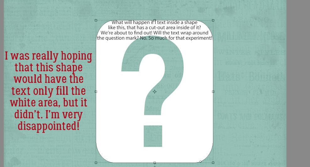
Then I thought, what will happen with a shape like this sign? Will the text jump over the “cut-out” area or not? Not. So disappointed!
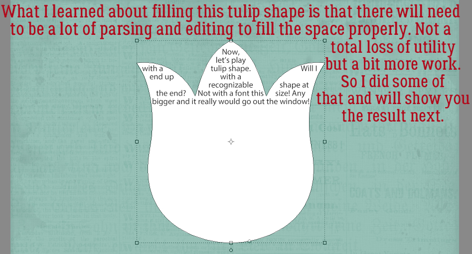
What I learned from playing with this tulip shape is that it too will need some massaging to get it to work well. It ended up not being that bad…
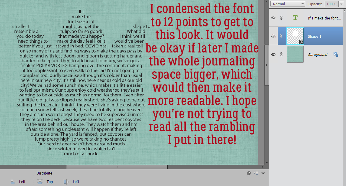
I dropped the font size down to 12 points and was able to completely fill the shape. Now, 12 point type isn’t easy to read on a 600×600 pixel image, but it might be okay if you print out at 12×12 inches. The other option would be to fill the shape and then make the text layer larger.
Can I just leave the Shape layer in there as a journaling blank? Of course! And I can also make it look more intentional too. To make any adjustments to the shape though, other than to resize, it’ll need to be Simplified. (Right-click on the layer then choose Simplify Layer.)
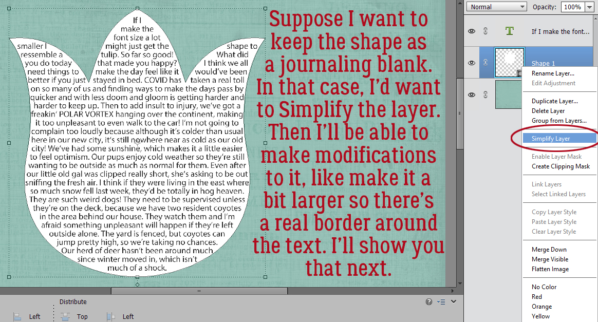
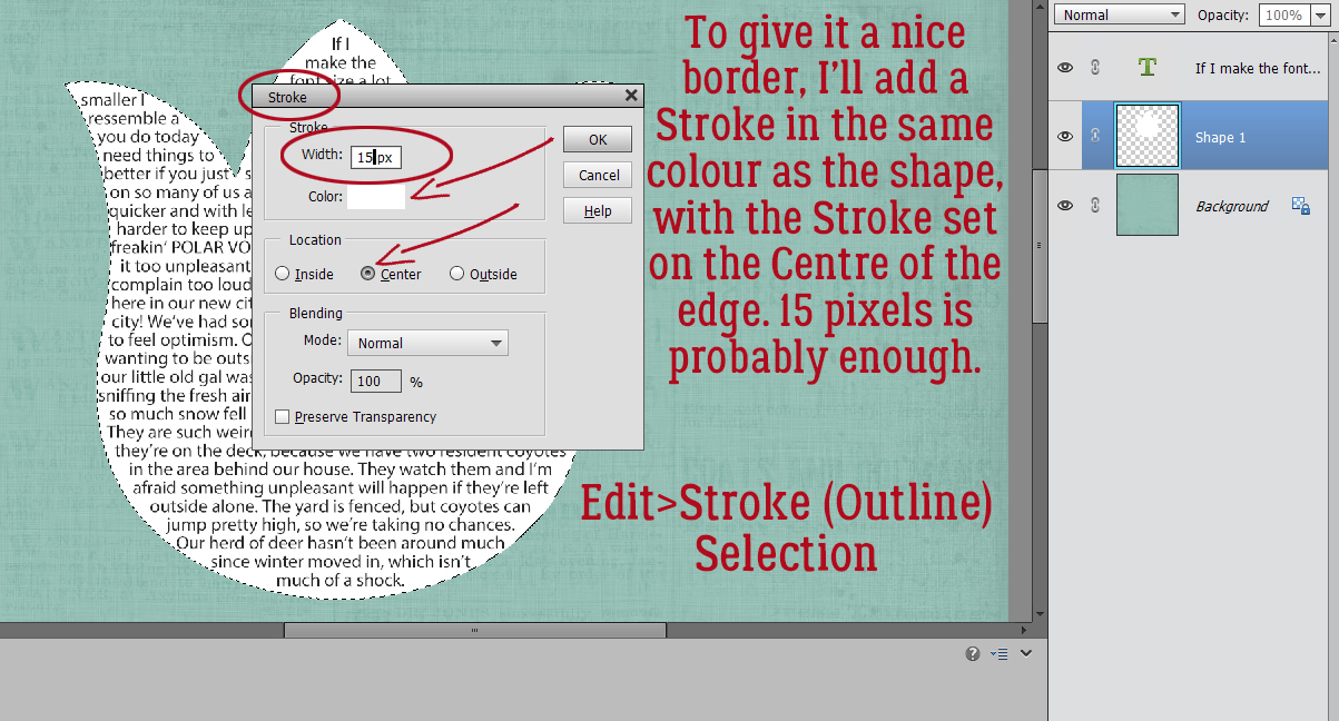
Once the layer is dumbed down, I can add a Stroke to the edge in the same colour to make the shape larger without altering the way the text fits into it. To keep those points as sharp as possible I’ll put the stroke on the centre of the edge rather than outside. The stroke can be as wide as you want, but as you go bigger, the corners will blunt a bit. This tulip doesn’t really have sharp points so it’s all good! Edit>Stroke (Outline) Selection.
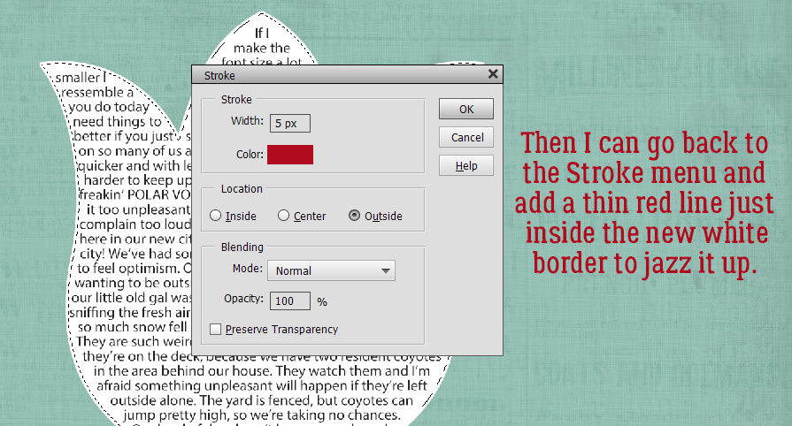
If you think you might want to put a coloured border around your text box, rather than just add a Stroke to the layer, Select the edges by CTRL/CMD>clicking on the shape’s layer thumbnail. Once you have the marching ants around your shape you can add the Stroke that makes the shape bigger, then come in again and add a narrower, coloured Stroke to make your border without having to reSelect the edge. For the coloured border, you can go inside the selection and not worry about it biting into your text, as long as it’s skinny.
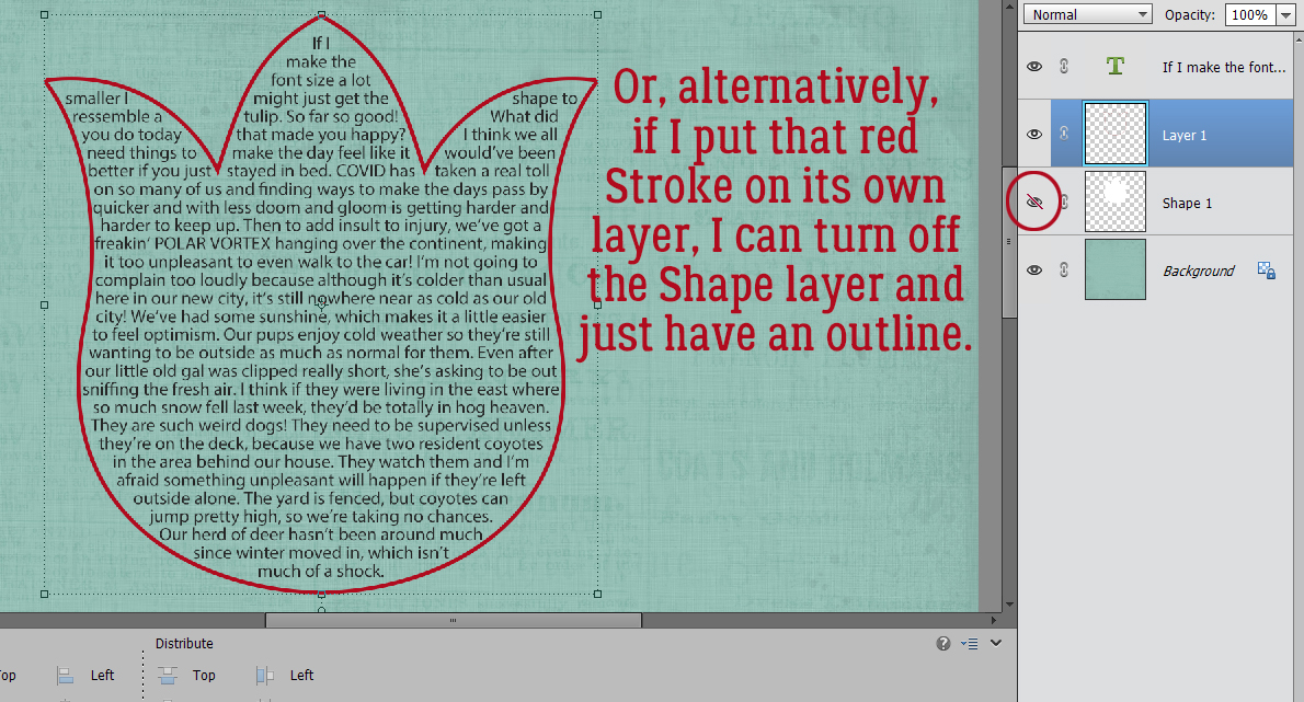
If you’ve put your coloured Stroke on its own layer (and I always recommend that!) you can get rid of the shape layer and still have a nice border!
Lisa, I’m sorry I wasn’t able to find a way to do this with a hand-drawn geometric shape but I think I’ve shown you some options to get closer to the look you’re after.
Hopefully next week it won’t be so blisteringly cold outside and we can all get some fresh air! See you then.
Here is a link to a PDF version of this tutorial: https://bit.ly/3aWs4yN
![]()