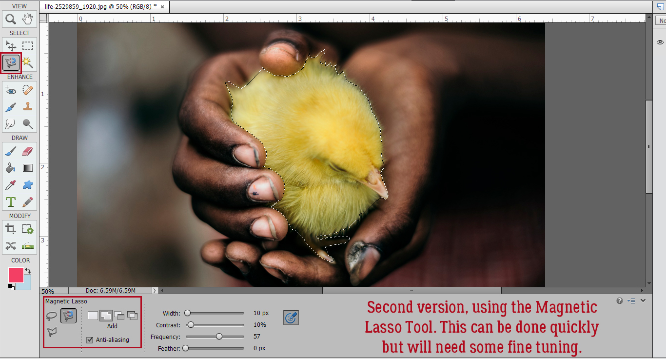
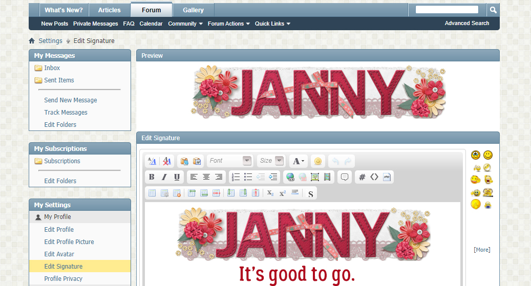
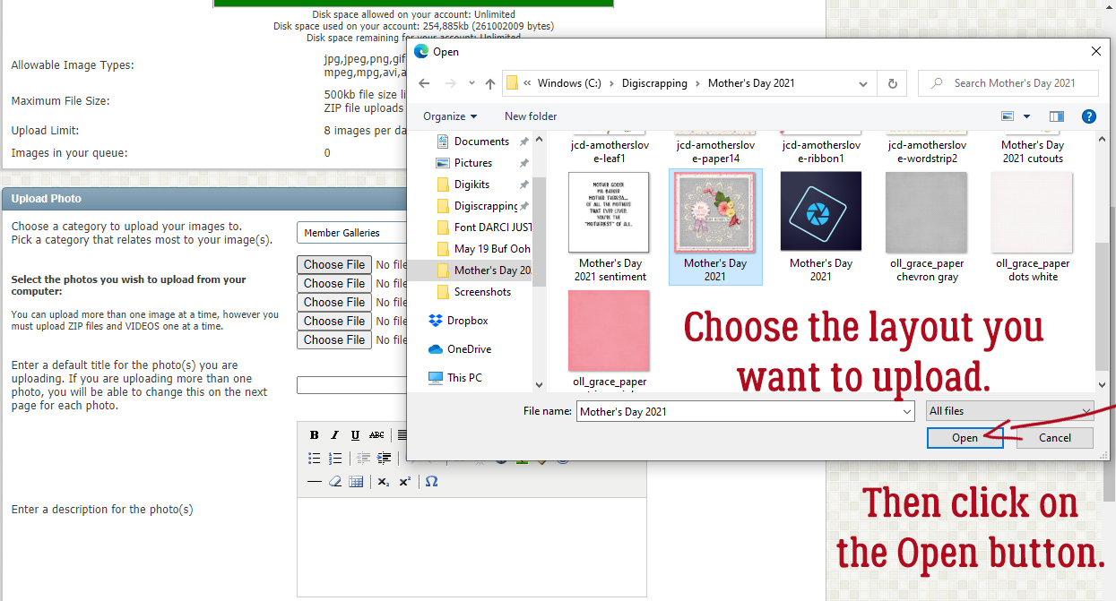
Torn Paper: A Review
![]()
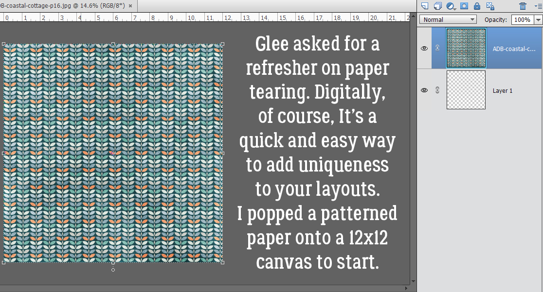
Last week, Glee asked if I could run another tutorial on digital paper tearing, and I’m only too happy to oblige. Since I wrote my first version of this tutorial I’ve streamlined the workflow a bit, which is always a good thing! Work Smart, Not Hard!! This technique uses only tools already embedded in the software and it’s easily achievable by even the very new learner.
Let’s think about scrapbooking paper – the physical properties of actual paper. The best-quality paper is weighty and has a white (or sometimes black) core. It might have a pattern on one side and a solid on the other. It may be smooth as satin or have a lovely texture. When I work with digital papers, my mind sees them as the very highest quality physical paper there is. So this technique will take that into consideration. The patterned paper I’ve used is from ADB Designs‘ Coastal Cottage kit. (It’s no secret that I LOVE Diane‘s papers.)
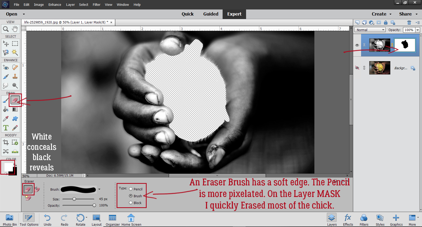
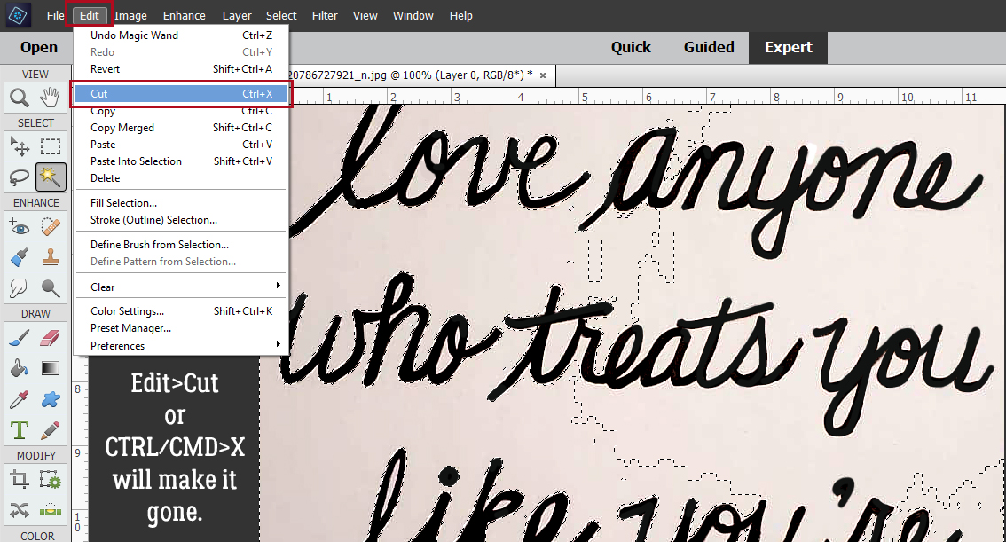
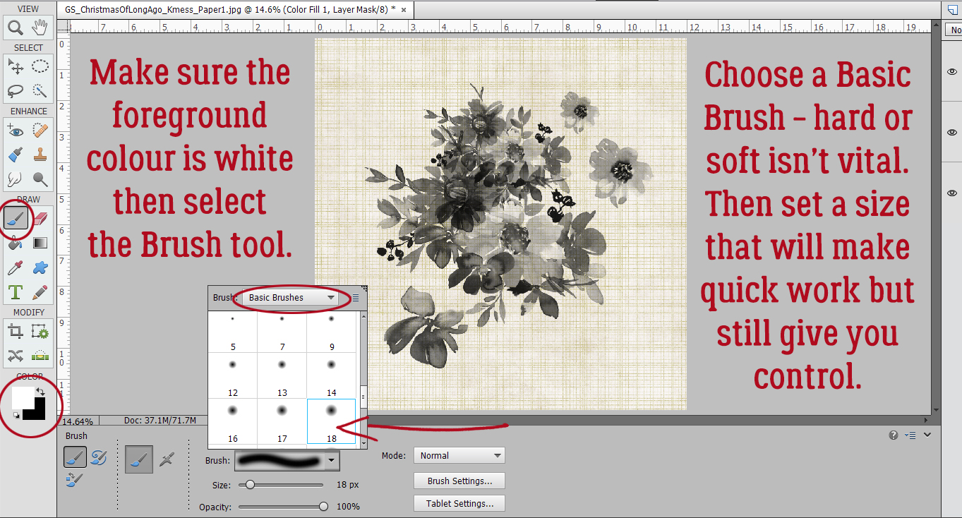
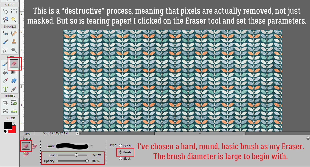
In past tutorials I’ve talked about “destructive” and “non-destructive” methods of altering digital images. With “destructive” methods, pixels are removed from the image and can only be replaced by CTRL/CMD>Z-ing back a bunch of steps. “Non-destructive” methods only hide those pixels by using a mask. They’re out of sight, not gone; they can be easily revealed again if needed. This technique is “destructive” but so is tearing paper! I’ll be using the Eraser tool with a hard, round Brush of a moderate (250 pixel diameter) size at 100% Opacity.
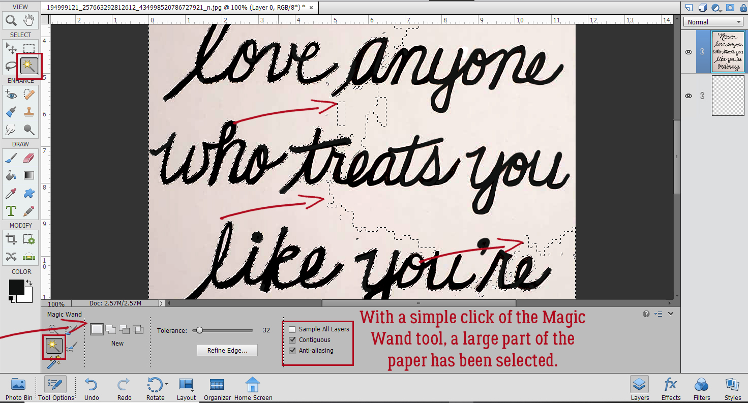
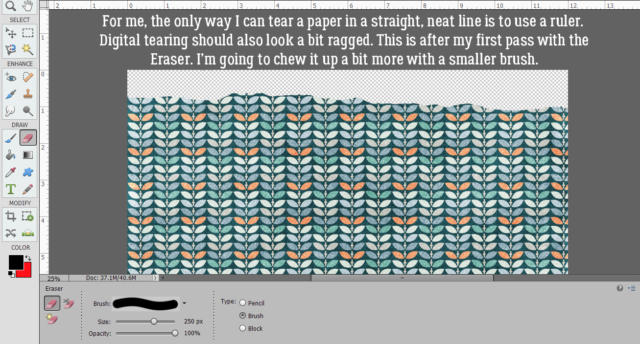
I don’t know about you but I can’t tear paper in a straight line without folding, creasing and using a straight-edge to tear it against. Good thing for this technique, perfect isn’t the goal. Since my imagination has told me this paper is thick and stiff, I already know the tear is going to be jagged and will expose some of the white core. With the Eraser tool, I just chewed off some of the paper.
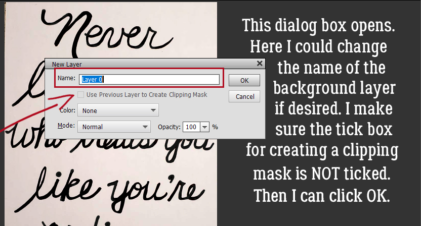
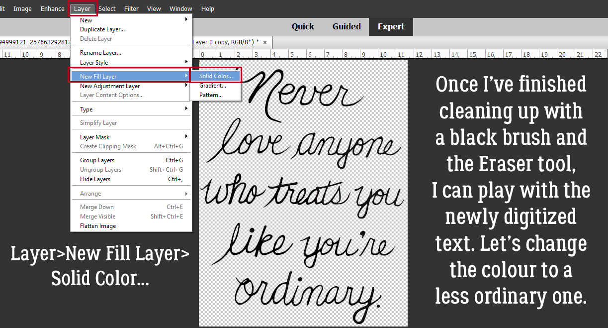
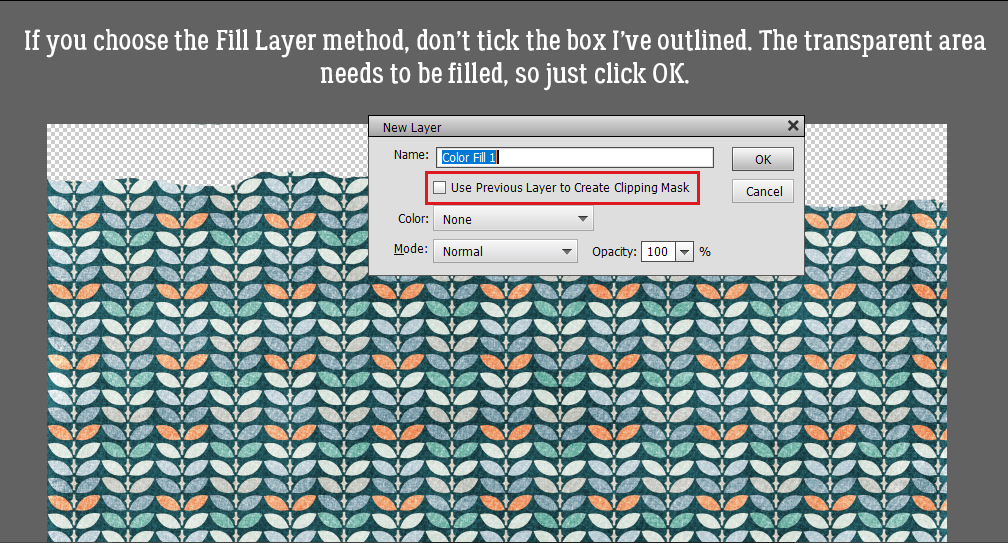
I think I need a higher contrast between my paper and the transparent background layer, so I’m going to add a Fill Layer in black to help me see what I’m doing. You might not need this step. There are a couple of ways to Fill space: by clicking Layer>New Fill Layer>Solid Color or just by using the Paint Bucket tool.
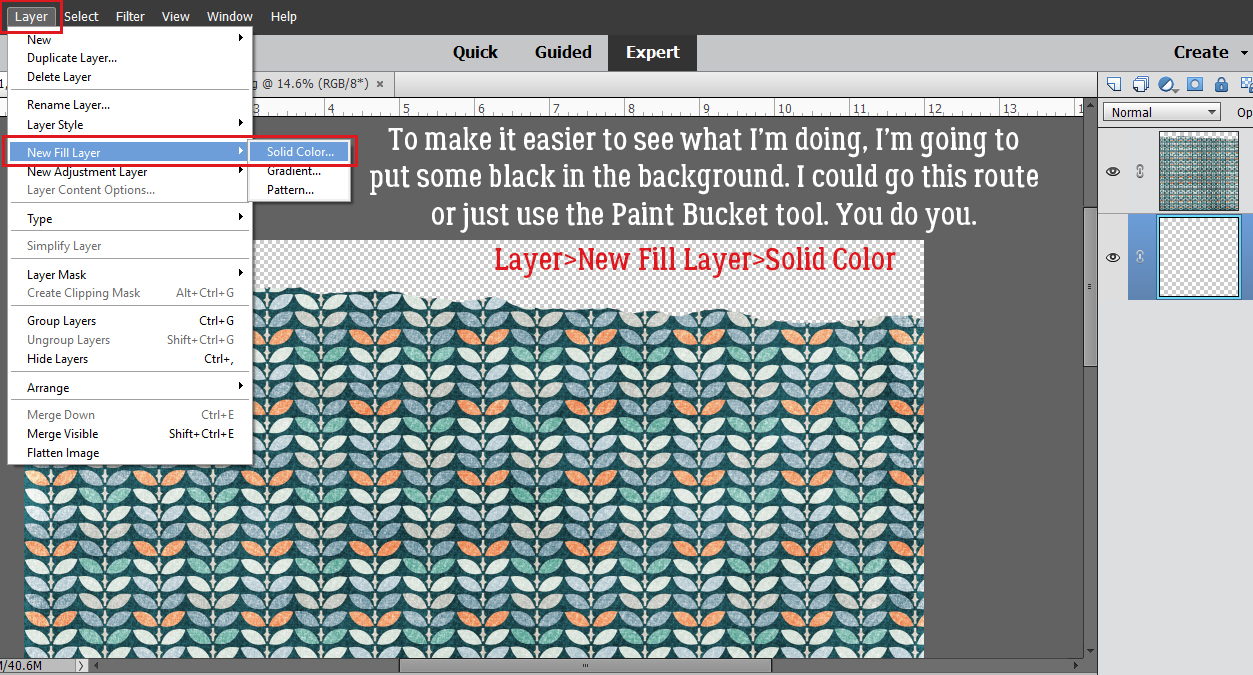
If you choose the Fill Layer method, make sure that box I’ve indicated is NOT ticked. It’s not a big issue when you’re creating your torn paper as a separate project and then adding it to your layout, but if you decide to tear your paper within your layout, it will matter. Here, I want to fill the whole background with black for contrast. The layer is only temporary, but why make it harder for myself?
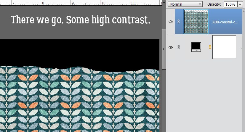
There. Now I can see that torn edge much better!
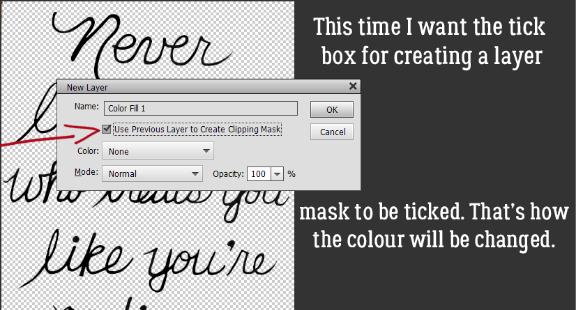
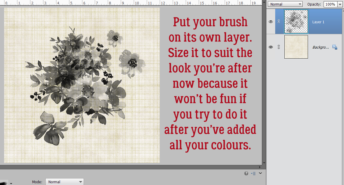
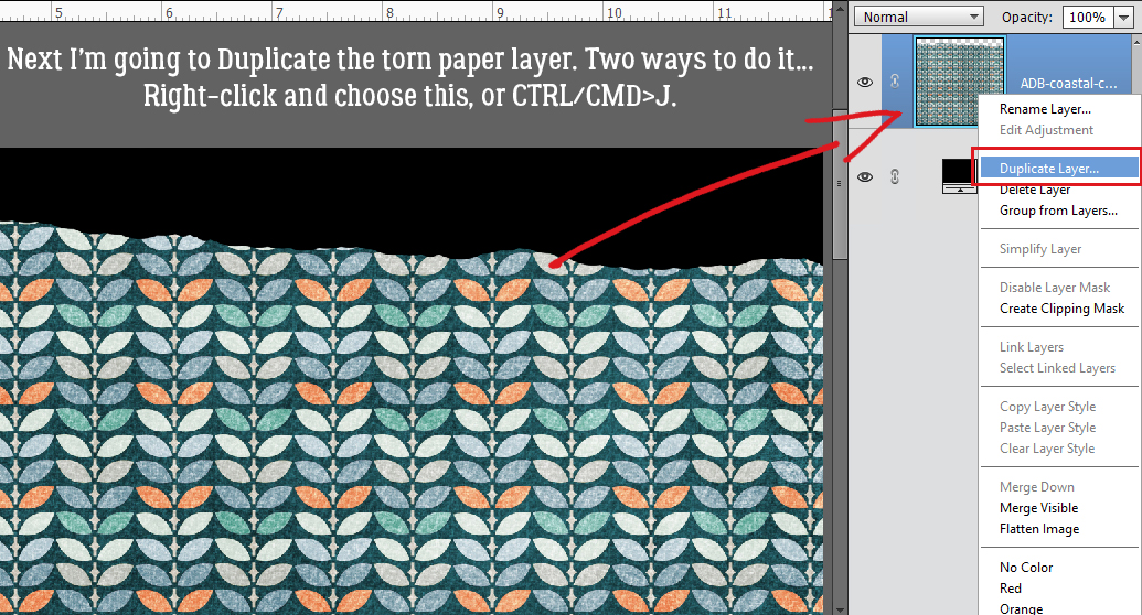
Now for the really creative part! Let’s add in the white core. To do that, I’m going to make a Copy layer of my torn paper. Again, there are a couple of ways of accomplishing that: Right-click on the layer and choose Duplicate Layer and then follow the prompts (I rarely use this method) or CTRL/CMD>J. [If you develop a habit of using keyboard shortcuts you’ll be amazed at how much time and how many keystrokes it saves you.]
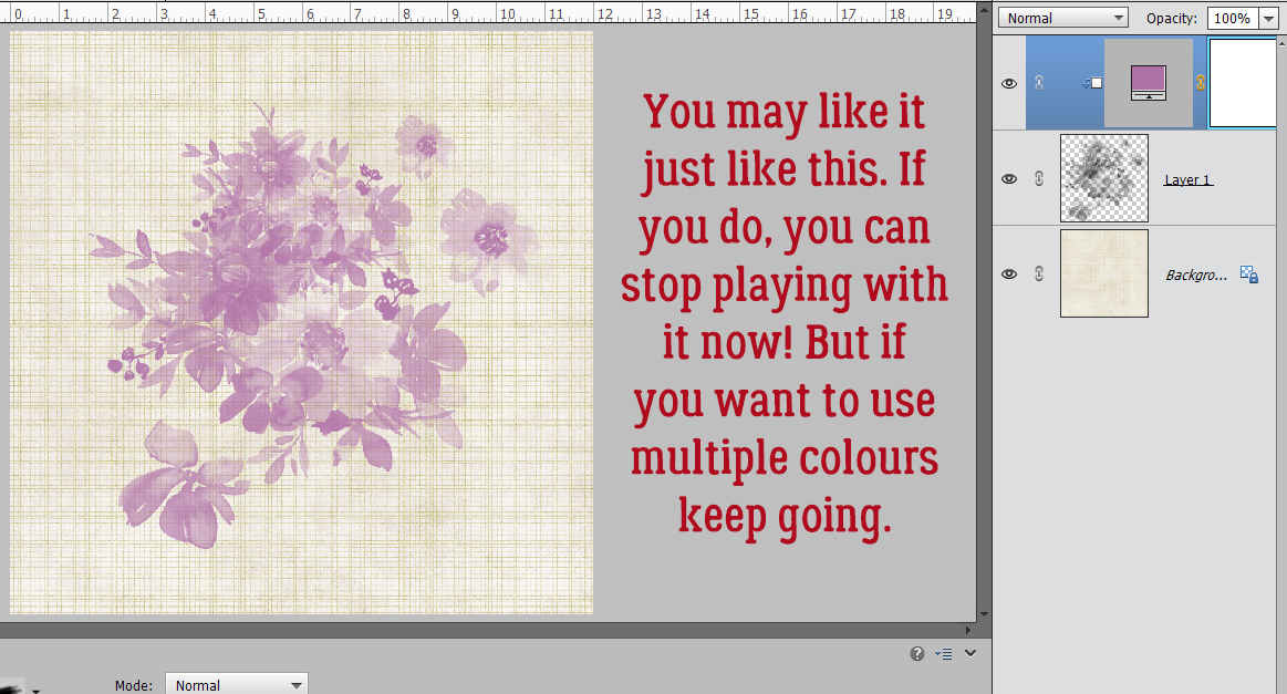
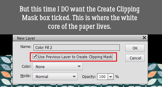
Yes, we did JUST do this, but we’re going to do it again. Only this time I WILL use the Clipping Mask box. I want to Fill the original torn paper layer with white, but JUST the torn paper, not the entire layer. It’s easiest to just use the Paint Bucket tool, but I want to show you the options.
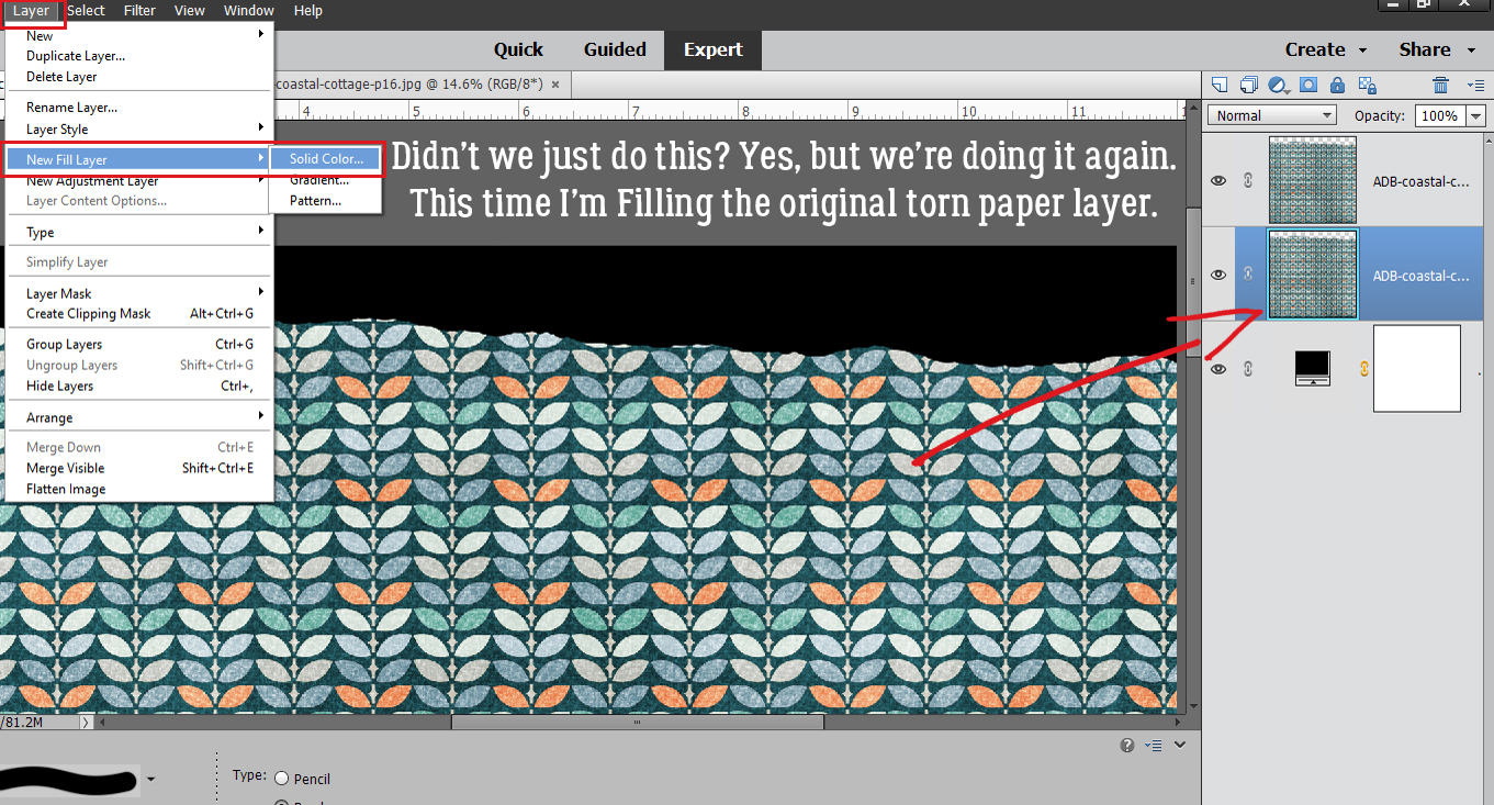
Yep, tick the box!
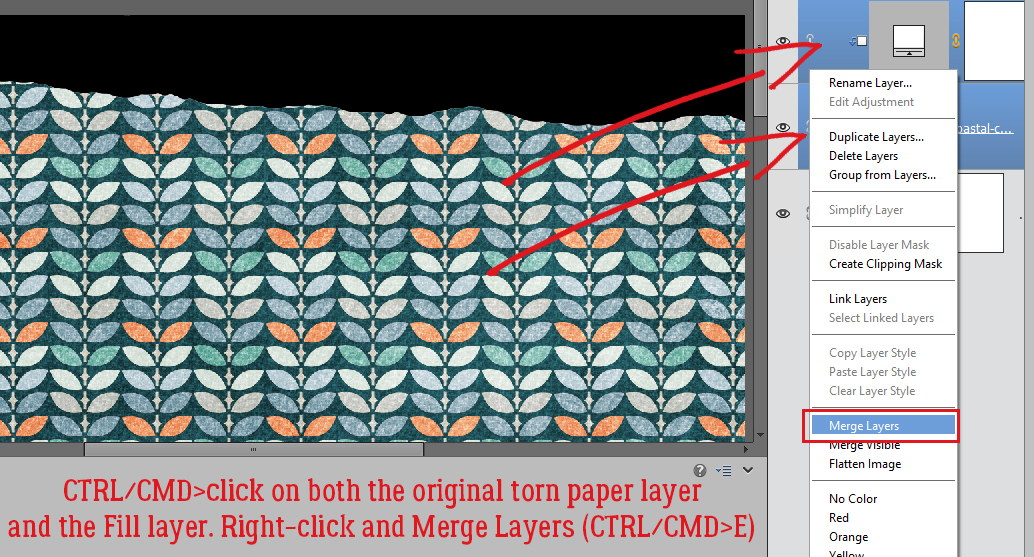
Then I want to Merge the Fill Layer with the torn paper layer (a step that’s eliminated when using the Paint Bucket… WSNH!) so I CTRL/CMD>clicked on each layer then right-clicked to open the layers menu so I could select Merge Layers. The keyboard shortcut for this step is CTRL/CMD>E.
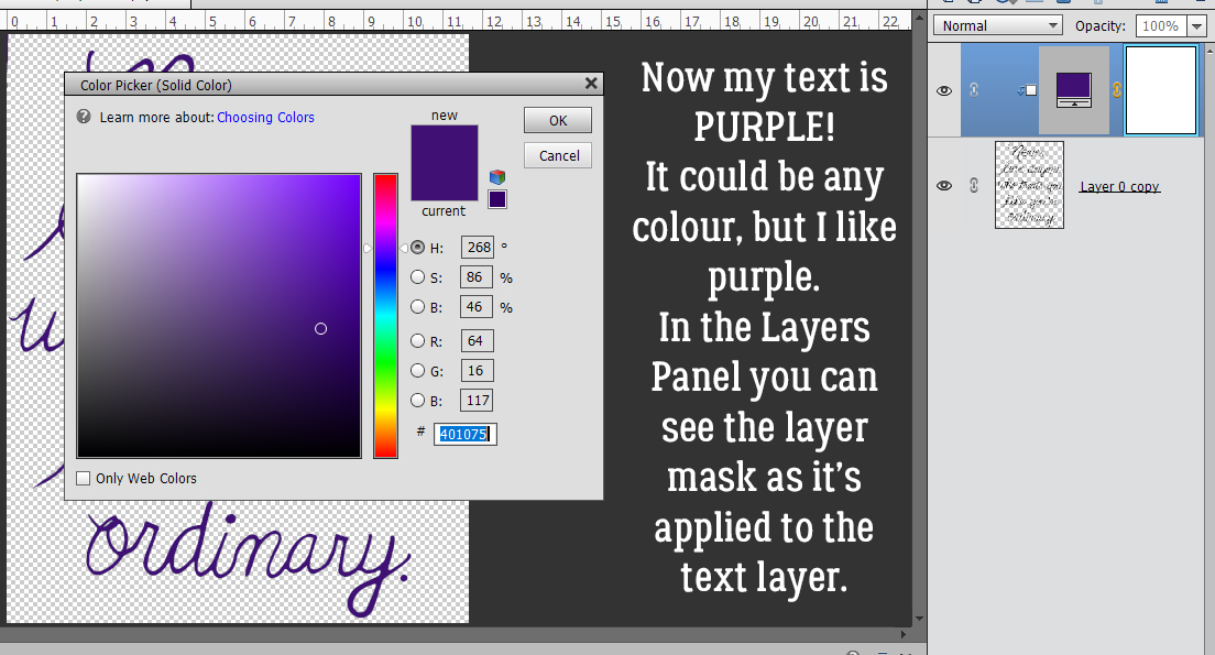
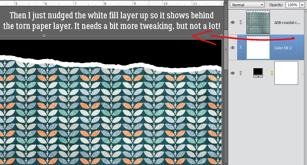
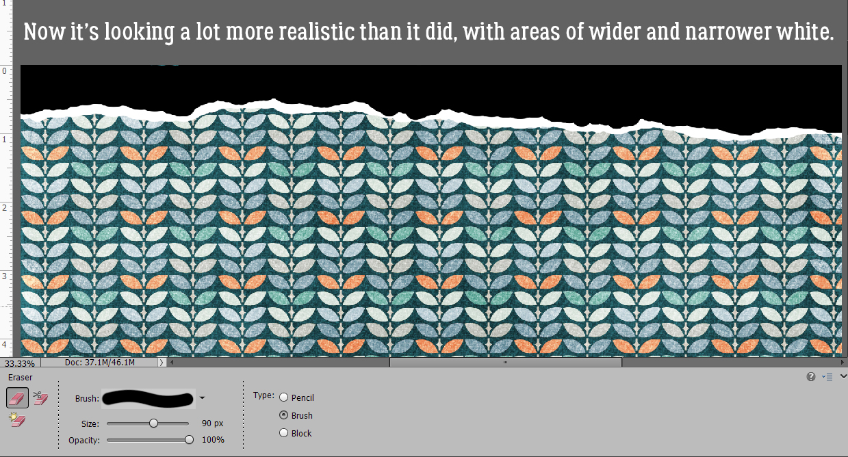
The white core has to be visible (otherwise why have it in the first place!) so I nudged it up a bit with the Move tool. It’s a little too perfect, but we’ll fix that.
When a real sheet of heavy scrapbooking paper is torn, the white core will be exposed to varying degrees, with some wider bits and some much narrower bits. To emulate that look, I went back to my Eraser tool and nibbled away some of the white layer and some of the patterned layer too.
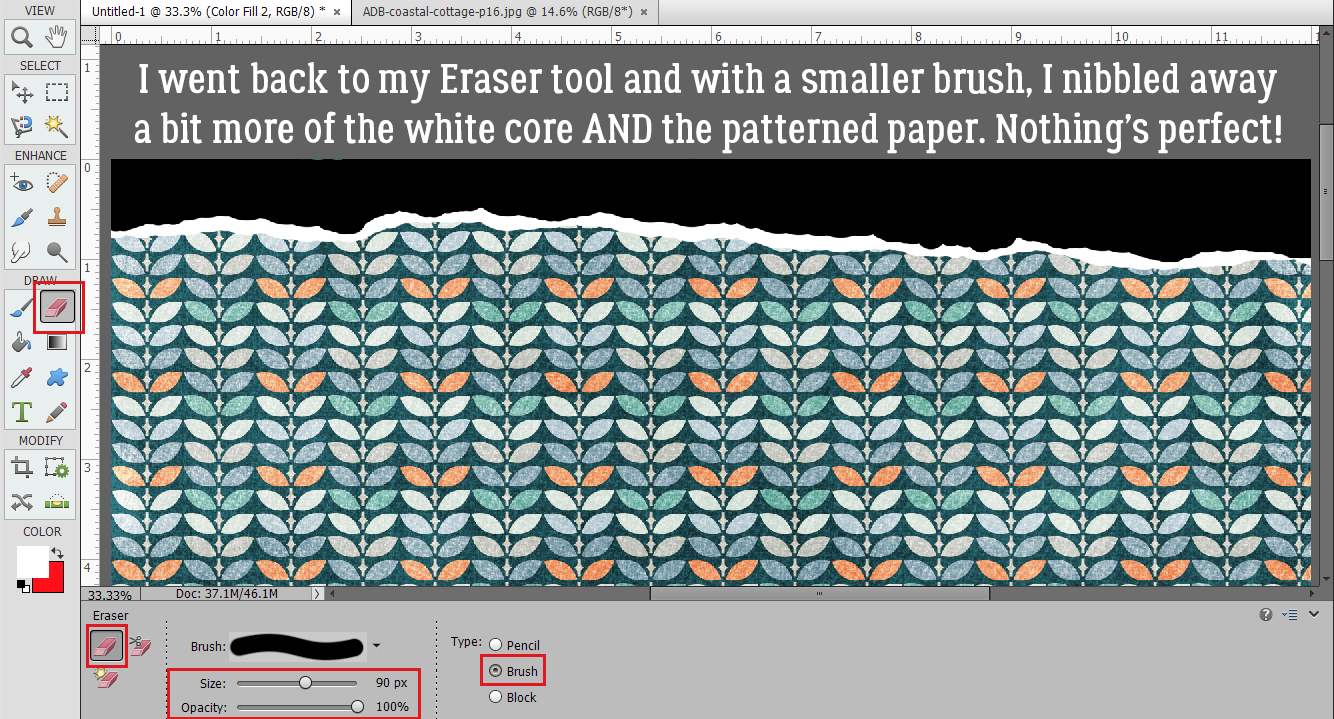
Okay, that’s more like it!
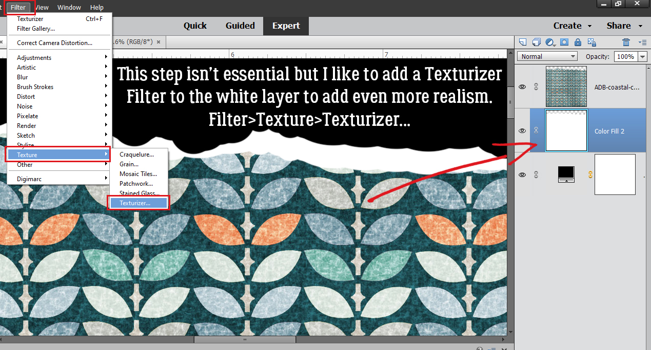
This step is entirely optional. Torn paper isn’t perfectly smooth, and I like to go for as much realism (with the fewest hassles) that I can achieve. So I’ll show you how to add some texture to the white core layer using Filter>Texture>Texturizer.
There isn’t a perfect texture Filter in the toolbox, so I use Canvas. I just want a hint of irregularity on my white core and this’ll do it.
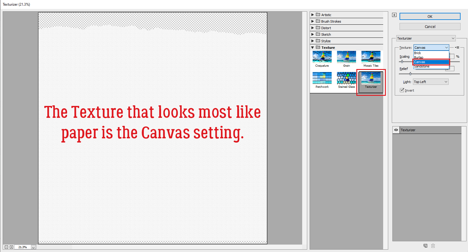
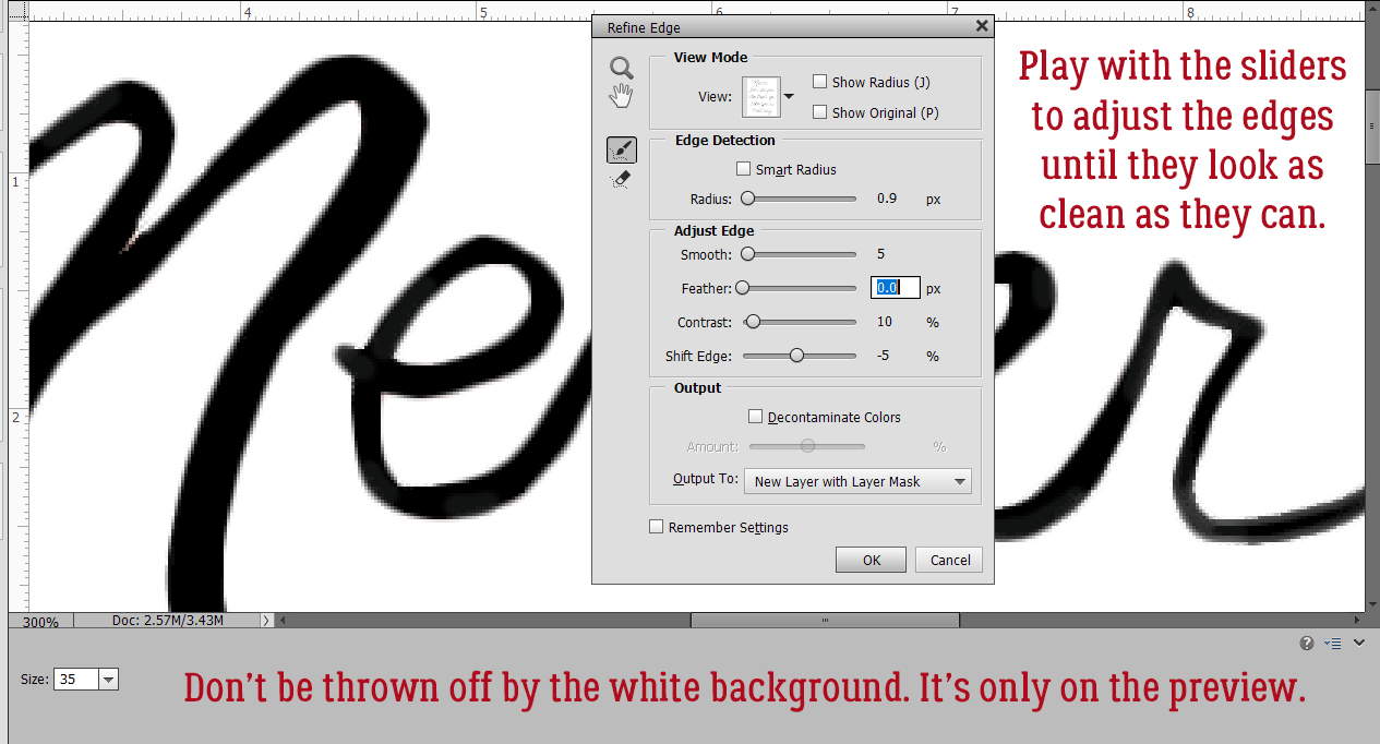
There are some decisions to be made when using Filters. Light Source is a big one. I tend to use Top Left more than anything, so that’s what I’ve chosen here. I Inverted as well, which isn’t as visible as it would be with the Burlap or Brick Textures. Scaling refers to the overall size of the deflections and Relief is how much of a vertical deviation the Filter provides.
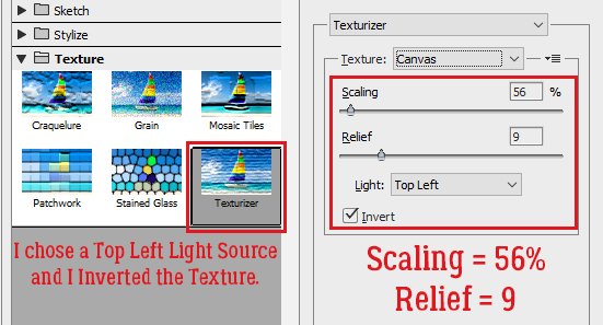
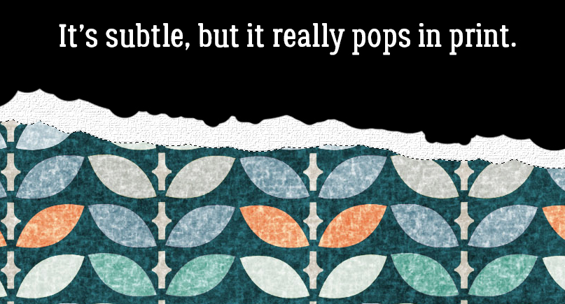
On a computer screen this effect isn’t in-your-face-obvious, but trust me, it pops when you print your layout.
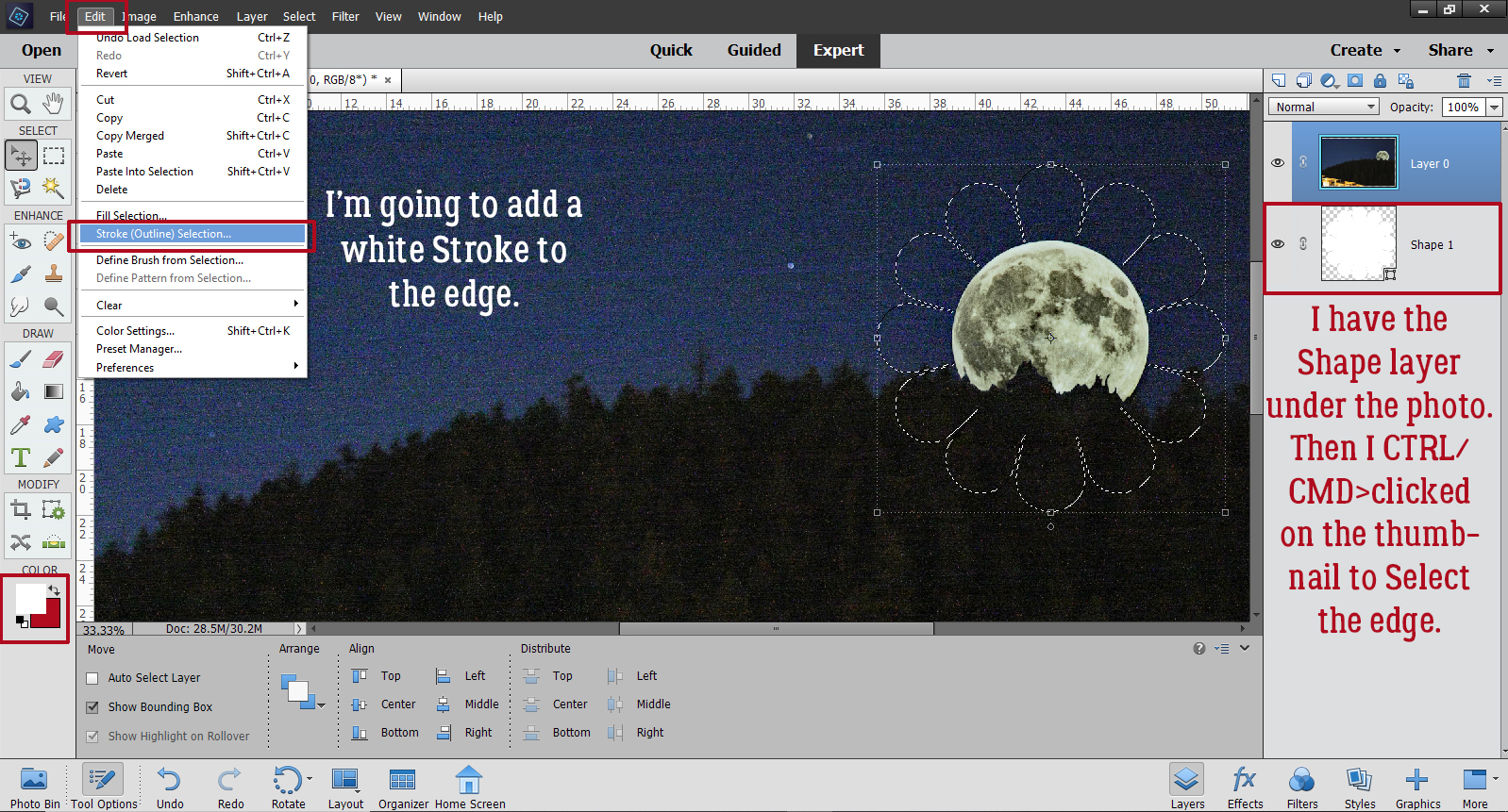
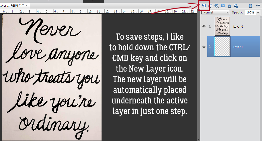
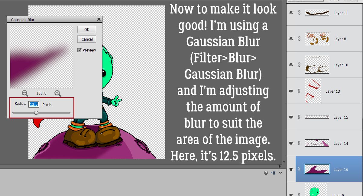
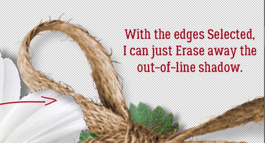
AGAIN? Why?? That torn edge of the patterned paper will cast a hint of shadow. The easiest way to add a new Layer is to click on the sheet-of-paper icon. To add a new layer this way UNDER the currently active layer, hold down the CTRL/CMD key when you click it and it’s done. Otherwise, Layer>New Layer or CTRL/CMD>SHIFT>N will add a new layer above the currently active layer, but it’ll then have to be moved under the torn paper layer.
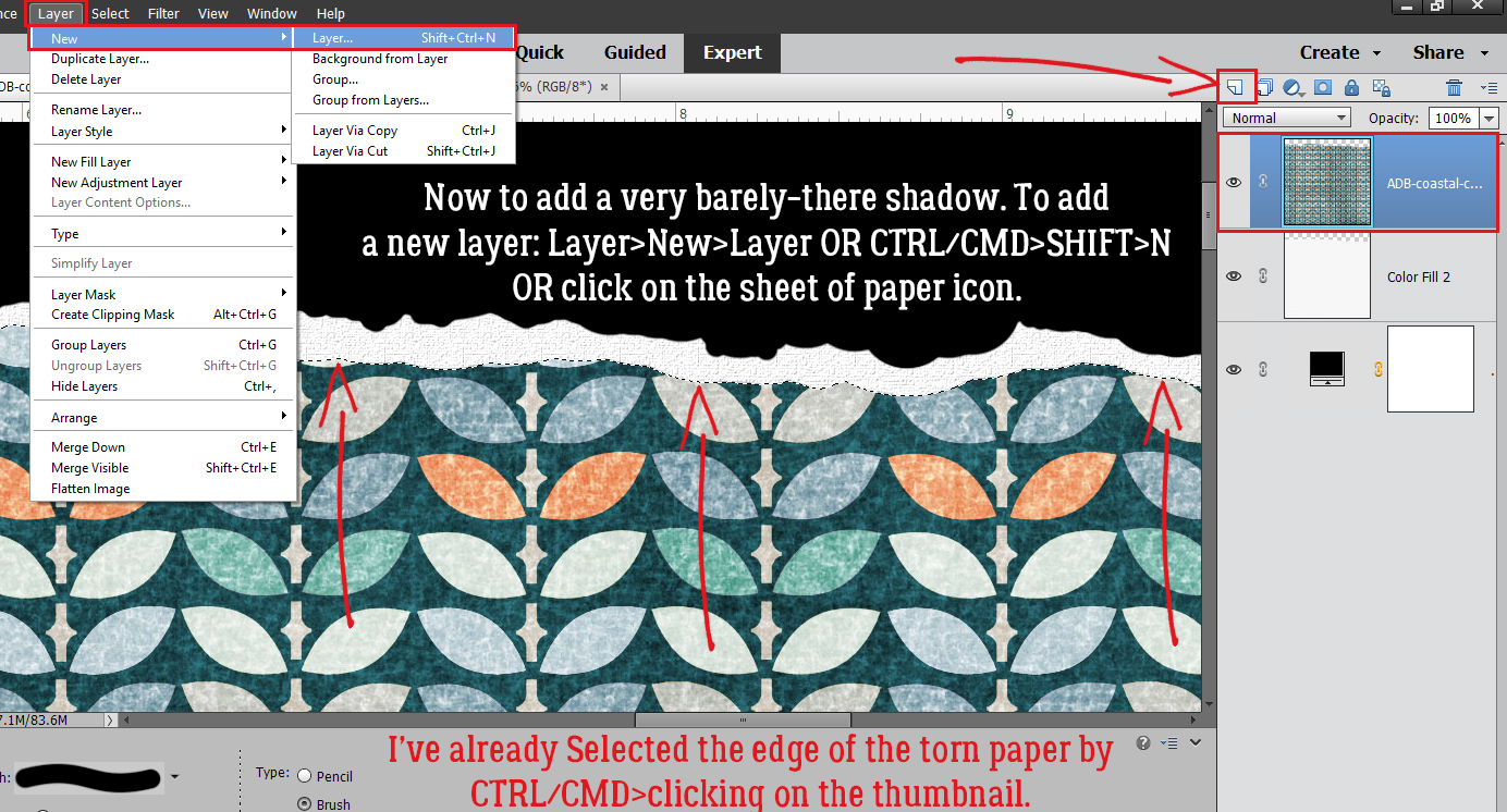
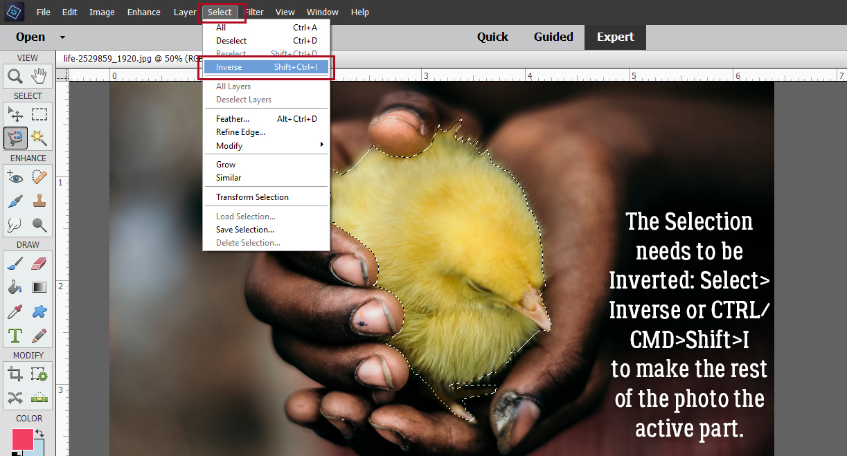
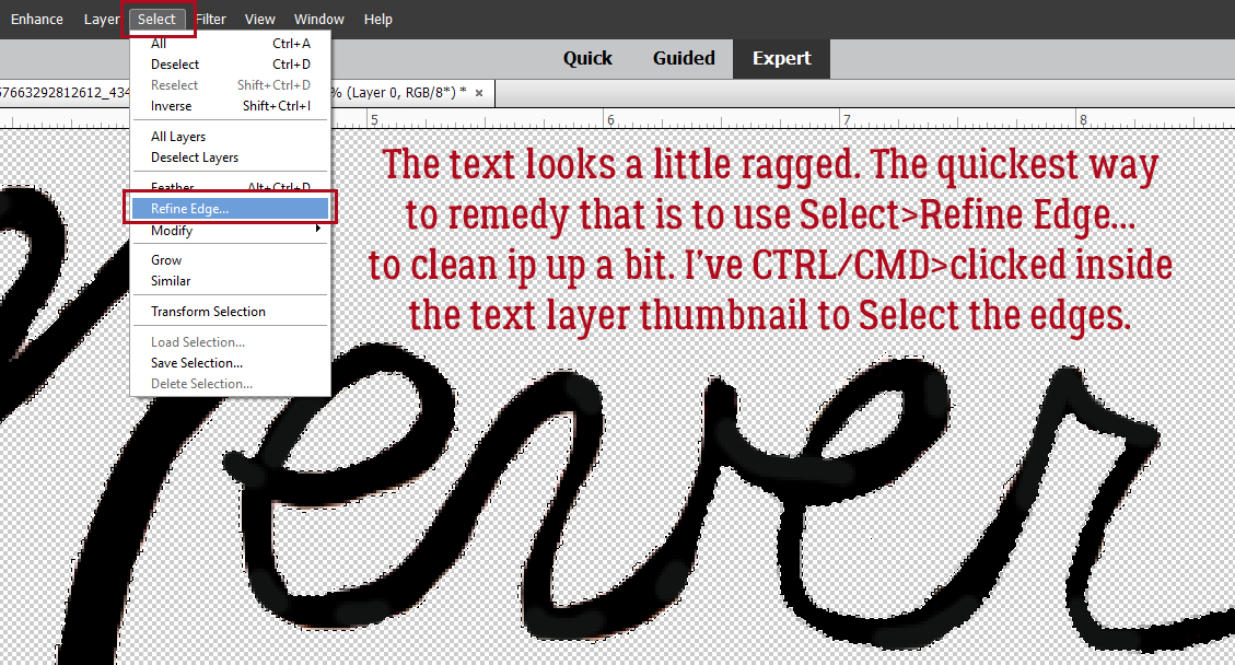
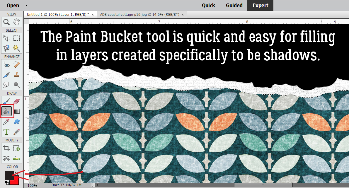
I’m telling you, the Paint Bucket tool is such a nice shortcut! But make sure you’ve Selected the edge of the torn paper by CTRL/CMD>clicking inside the layer’s thumbnail (that little “photo”) before you dump your paint.
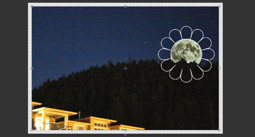
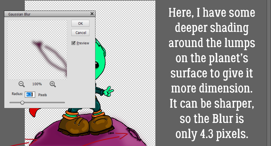
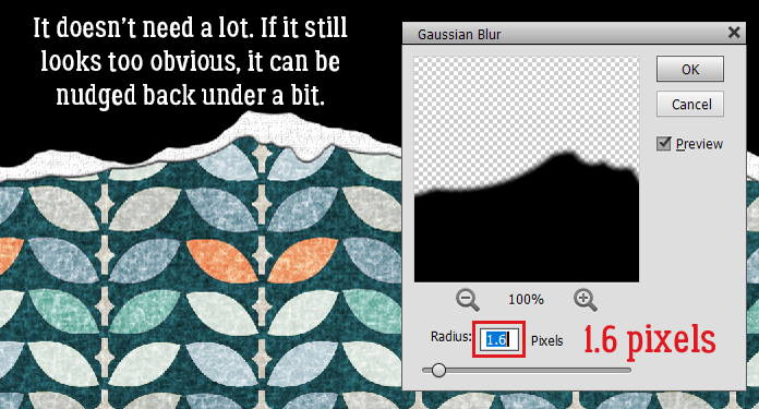
Just as I did for the white core layer, I used the Move tool to nudge the shadow layer up and out from under the torn paper layer. It’s pretty obvious in the image below, but I’ll Blur it a tiny bit and it’ll look much more natural.
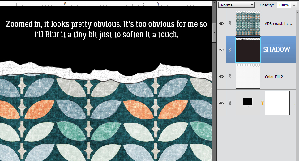
Filter>Blur>Gaussian Blur… is the ticket.
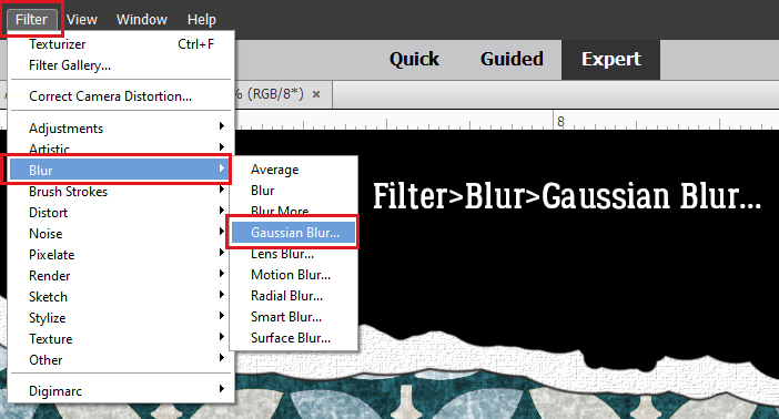
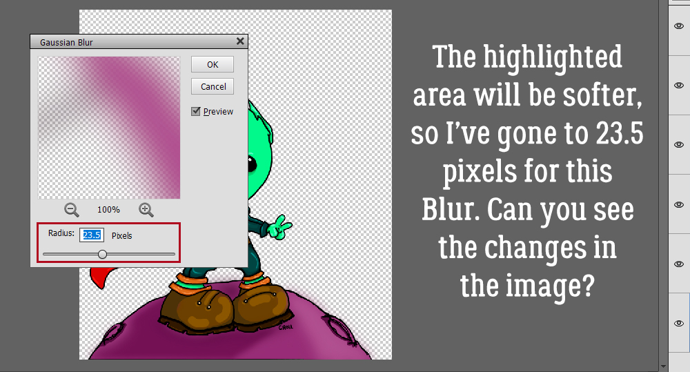
If the shadow layer is Blurred too much, it’ll just make the area where the paper and the core meet look dirty. So don’t go too far!
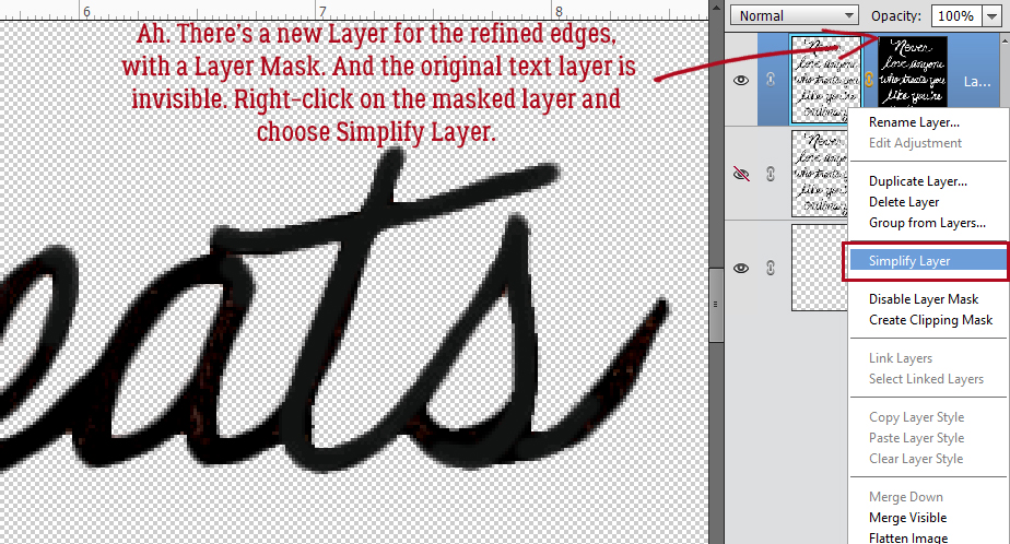
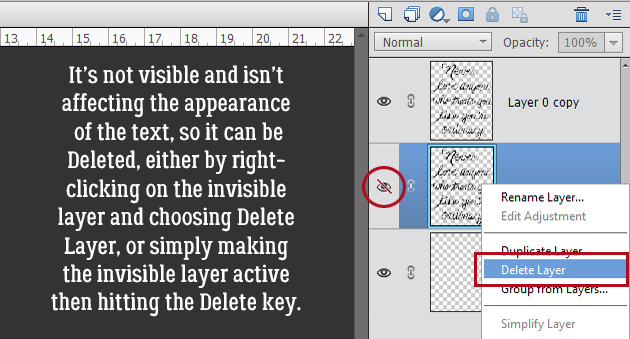
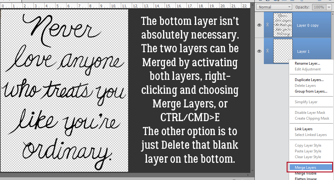
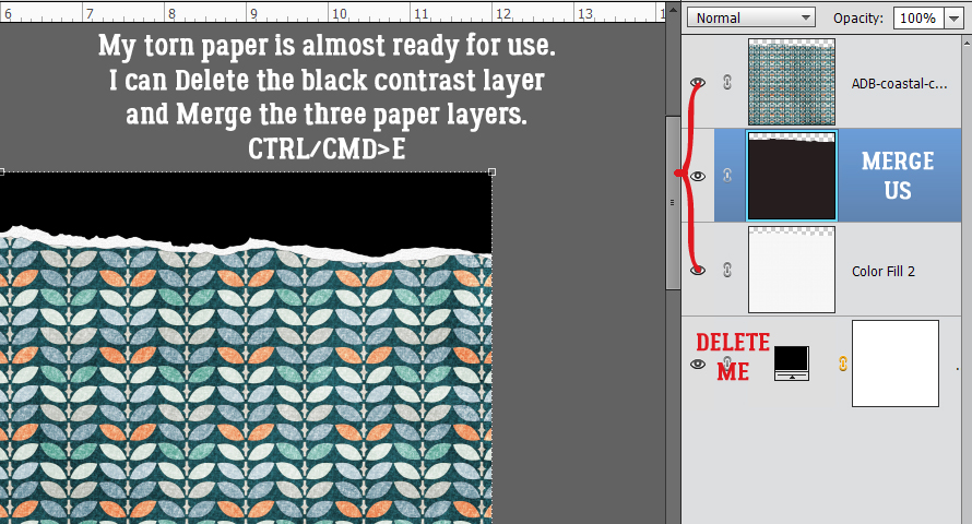
Now all that’s left before I’m finished is to Delete the black contrast layer and Merge the three paper layers together.
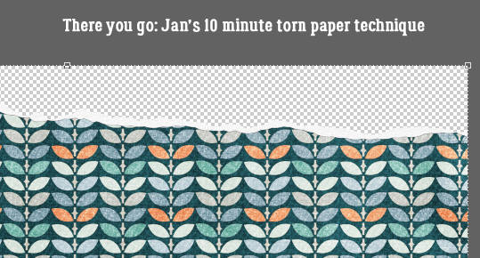
And now my torn paper is ready for use on my layout! It’s literally a 10-minute technique that really adds some interest to the image.
Thankfully the heatdome has moved on and we’re only worried about wildfires out here in the west part of North America. The eastern part is having the opposite problem, with a tropical storm dumping water and creating tornadoes. And still… COVID. I had my first vaccine last Wednesday and knew I was going to react – having had the virus I had antibodies already. I felt pretty awful for about 36 hours, and then magically felt better. The vaccine is proving its worth; 99% of the people who have died from COVID since May have been unvaccinated. Pretty good stats!
See you next time!
PDF Version: https://bit.ly/3xrgE06
![]()