![]()
It’s already the middle of October and you know what that means? It’s Bake Sale time and wow…. have our designers stepped it up this month. Take a look at all these kits available for just $1.

Now, head over to the store and fill up your cart.
![]()
Fall is officially, unmistakably here! It’s chilly outside! Time to grab your favorite hot beverage and enjoy some amazing new products available today! The designers are all ready for Halloween and keeping warm, and now you can be as well!
Remember when you spend $10 in the store, you get a great collab! It coordinates with our MEGA Collab, which if you missed it, is available in the store now!

https://store.gingerscraps.net/GingerBread-Ladies-Collab-Oh-Snap-Cards-Templates.html

Happy Thursday! There’s some awesome goodies coming out tomorrow!!!
From Amy Stoffel

From Laurie’s Scraps


From JoCee Designs


From Dagi’s Temp-tations
From Trixie Scraps


From Little Rad Trio


From Tinci Designs
From Keley Designs


From Neia Scraps


From Miss Fish Designs


From Clever Monkey Graphics

From Bella Gypsy


Check out all the new releases tomorrow! Have a great weekend!

Save
![]()
Happy Wednesday my fellow scrappers. Fall has definitely come to the Carolinas and it’s wonderful. The temperatures are lower (makes great sleeping) and the leaves are starting to turn. Probably my favorite time of year.
Let’s jump right in and see what we have releasing this week.


Some very cute kits coming out. Make sure to shop for these tomorrow and Friday and then watch for the Bake Sale lovelies starting on Saturday.
![]()
Simple Photo Blending
![]()
Last week Carla asked if I would do a quick tutorial on blending photos into backgrounds. There’s always more than one way to do things, some quite easy, others more involved. Today we’re going to look at an easy way to blend photos, with a twist. (Caylynn had a layout in the gallery last week that caught my eye. I sorta kinda copied her example.)
So let’s get started. First, decide what photo you want to blend. I chose a photo I found on Pixabay that had some interesting aspects to it.
Next you want to choose the paper you’re going to blend it into. You can use almost anything for this, but to make it more visually interesting, pick a paper that’s got some grunge, a pattern or an obvious texture. I didn’t know what would appeal to me most so I went to my GS stash and did a tag search for “paper”. A couple of hours later, after I’d gone through them all (well, it took a few minutes) I had several that I wanted to get a feel for. So I stacked up all the papers I’d chosen and turned them off except for the bottom-most. Then I put my photo on top of the stack of papers.
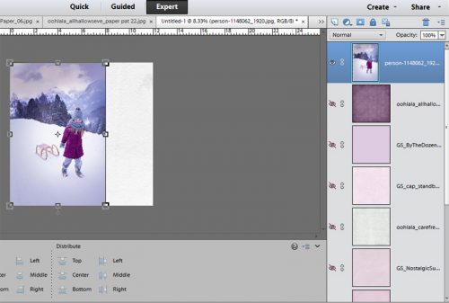
The first step in the actual blending is to lower the opacity of the photo so the paper under it shows through. So I pulled the photo down to 40%.

Then I worked my way up the stack of papers, turning them on bottom to top. The screenshots show some of them so you can see the effect each of them had on the photo.


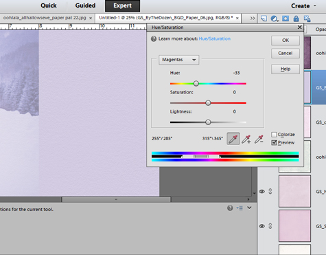
In the end I went with a solid, soft purple paper from the GingerBread Ladies’ collection By the Dozen. But it was a bit too pink to blend well so I adjusted the colour a little. You can click on Enhance>Adjust Color>Hue/Saturation then pull the sliders, or you can CTRL/CMD+U to get there in one step. (You’ve all figured out that CTRL is for Windows and CMD is for Mac, haven’t you? The keyboard shortcuts are the same otherwise.) In the screenshot below I show you how I adjusted the magenta in the paper to a more blue shade. If you look closely at the edge of the photo you can see that the edge almost disappears when I’ve got the colour right.
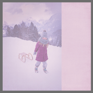
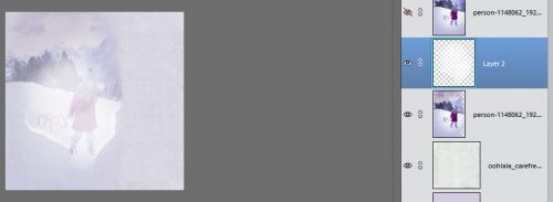
Once I was happy with the colour, I deleted all the other papers… except for one with a pale blue brocade pattern on it from Ooh La La Scraps‘ Carefree. I moved it on top of my pale purple paper and decreased the opacity to 40%. Now I had a nice subtle patterned paper to blend my photo into.
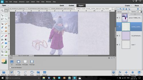
I should back up for a moment here. You could enlarge your photo so that it covers the whole 12×12 paper if you want and just decrease the opacity until you’re happy with it… just like I did with the second paper. If that’s what you want to do, you don’t have to read any further. If you’re reading on – what are we going to do about that very obvious edge? You might notice that in the screenshot below, I have two copies of my photo, with the top one turned off. I’ll explain that later.

The next step, getting rid of the harsh edge, required the use of the Eraser Tool and a soft brush. I have a gazillion brushes, many of which I picked up free from various sources. I chose one of the options from a collection called 20 Spray Brushes. I started off with the brush fairly small and the opacity on the brush quite low. It takes a little longer to get a good effect, but it’s easier to adjust if you go slowly at this stage.
This part is easy but can take some time. Zoom in (CTRL/CMD++) so you can see where you’re working. Gradually erase the edge of the photo so there’s no obvious demarcation between your photo and your paper. You can click-click-click or click-drag or a combination to make it a bit quicker. [Resist the temptation to increase the opaacity of your eraser brush because it’s a lot harder to undo if you go too far.] You can also increase the size of your brush as you go.

Every so often, zoom back out (CTRL/CMD+ –) and take a look at the amount of blending you’ve done. Keep going until the photo looks like it’s part of the paper but there’s still detail visible.

Here’s where Caylynn comes in. Her layout Wanderlust got me thinking. So I decided to take things a step further and show you how using a watercolour brush can add some punch to your blend. Literally.
I added a new blank layer in between my two photo layers. I went to my Brush Tool and selected a collection of Watercolour Mask brushes. (You could use any brush of combination of brushes for this step.) I tried them out for size and shape until I found one that would cover the girl and most of her sled.

Brush settings can be adjusted to suit your purpose. You can change the angle, change the roundness and play with the other settings to really customize your brushes. You’re not committed to anything, because there’s always CTRL/CMD+Z!

Once I had the brush the shape, size and angle I wanted, I made sure the foreground colour was set to white so I’d be able to see it against my layout but it wouldn’t interfere with the colours in the photo. Then I applied my brush to that blank layer. By doing this on a blank layer, you can adjust the size, tweak the angle and even skew the shape to suit your purpose. See how the photo below shows through the brush?
Now that I was happy with the brush. I clipped the top photo to the brush (CTRL/CMD+G). See how it brightened the area of the blended photo?

Then, because I wanted her face to be completely sharp and clear, with the brush/mask layer selected, I made my brush smaller, raised the opacity to 100% and painted over the girl’s face and scarf. (I used red for the screenshot so you could see what I did.) As long as you hold your left mouse button down while you use your brush, it will maintain the set opacity even if you overlap your strokes.
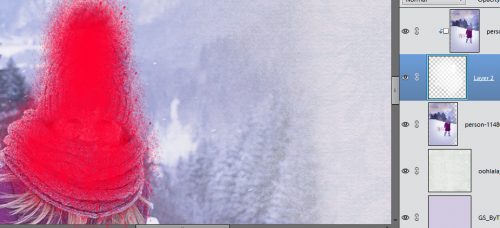
See how much clearer and sharper her face is now?
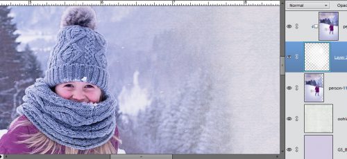
This is what my brush/mask layer looked like after I was finished. I decided to sharpen her whole body and a little of her sled. Once I was happy with how it all looked, I went on to finish my layout.

So there you have some simple ways of blending photos, and a very basic mask-making lesson too! Next Tuesday I think I’ll tackle Danica’s request for some tips on extracting items from photos. It’ll build on this lesson a little, so stay tuned!
![]()
Hello scrappers! Are you fully recovered from DSD and ready to scrap?! I pray that all our scrappy family members that are and have been in the path of Hurricane Matthew are safe-and-sound!
I am here today to help you with just that! We are going to take a look back in the store and look at some oldies…but goodies! What archives? Well, we are going to show you some digital scrapbooking supplies that are in the store that are at least a year old. Usually older than that. Some of us may be new to digital scrapbooking or new to GingerScraps. Some people don’t check the store every week. Basically, things can and do get lost in the weekly shuffle of the store. With that in mind, we are going to go back and look at some great products. Our hope is that you find some great things you might have been looking for; or find something that you didn’t know you needed but totally do now that you see it! 🙂
This month’s From the Archives, we are going to take a look at Doodles. Doodles are a great addition to any digital scrapbooking layout. Usually they have the hand-drawn (or actually are hand-drawn) look to them. Some doodles have paint look to them; and some doodles have little elements with them. You can check out all the Doodles in the store HERE. Here are just a few of them from back in the Archives. Images are linked to the store.


![]()
It’s time to bundle up! Fall is upon us and it’s getting chillier outside! The days are already starting to get shorter. We won’t let that bother us! That just means more time available for us to scrapbook! The designers have such great kits and template series out this week that you won’t be able to resist!
Remember when you spend $10 in the store, you get a great collab! It coordinates with our MEGA Collab, which if you missed it, is available in the store now!

https://store.gingerscraps.net/GingerBread-Ladies-Collab-Oh-Snap-Cards-Templates.html
![]()
I don’t know about you, but it feels like fall is in full force in my corner of the US. Thoughts to everyone in the path of Hurricane Matthew this week.
Let’s see what our designers have coming out this week!


Make sure to stop by the store to see everything releasing!!
![]()
Making Templates Work For You!
![]()
You’ve probably heard a million times that templates really speed up your scrapping, but if you’re new to digiscrapping you might wonder when that kicks in. October’s first Challenge Template from Kimberly of Leaving a Legacy Designs is a perfect way for me to show you how. Why? Because it has several repeating paper blocks!
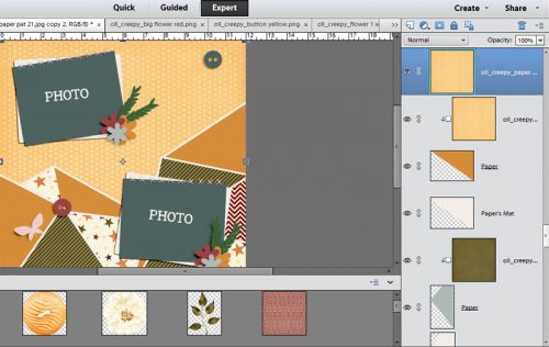
Once again, I’m going to tell you how I do things but of course you’re going to follow your own practices and do things in your own way. When I’m getting ready to create a (non-CT) layout, I select my photos first. I create a new folder for the layout so everything I plan to use is in one spot. (Later I delete the copied files and just keep the finished layout. Otherwise I’d need a million EHDs to store everything!) Then I search my (enormous) stash for a template that will work with them and copy it into the folder. Once I’ve decided, I choose the kit I want to use. For this layout I used Ooh La La Scraps’ October Buffet kit Creepy. I count up the number of different papers, represented by different coloured blocks or circles, the preview shows, and then add one or two more to that number just in case my selections don’t work the way I want them to. Then I go to my kit and start selecting papers, flowers, leaves, stitches, staples, and whatever else I want to include. They’re all copied into my working folder… this is the longest part of the process. Then I’m ready to go! I open the folder contents into PSE and get going.
As I mentioned before I start at the bottom. Feel free to do whatever works for you.
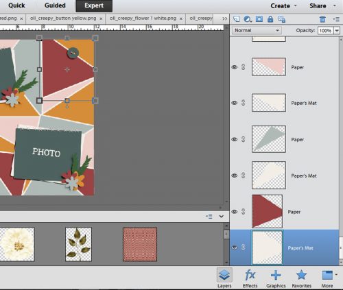
In the screenshot above you’ll see there are 3 papers and 3 paper mats in the layers panel. Below, you’ll see I’ve started clipping papers to the various shapes in the template.
This is where the time saving comes in. The process is the same for whatever is repeated on the template. Remember I said I use keyboard shortcuts? This is where they really come in handy. Rather than right-clicking on my paper layer then selecting Create Clipping Mask I use CTRL/CMD+G to clip the paper to the shape. The next step is to duplicate my paper layer. Rather than right-clicking on the paper and selecting Duplicate Layer.. or selecting it from the drop-down menu from the task bar, I use CTRL/CMD+J and get the same result.
The screenshot below shows you the duplicated paper just above the previous paper shape. Drag and drop the new paper onto the layer just above the next template shape of the same colour, in this case, a dark yellow gold. The keyboard shortcut for that is CTRL/CMD+] (Can you guess how to move the layer back down? 😉 )
Keep doing this series of steps > Copy, Move Up, Clip > until all the template shapes of the same colour have the same paper clipped to them. Then continue to clip papers to shapes in this manner until all the shapes have papers clipped to them. The screenshot below shows what your workspace looks like once the duplicated paper has been created but before it’s been moved into place and clipped. See how it covers up a lot of the template?
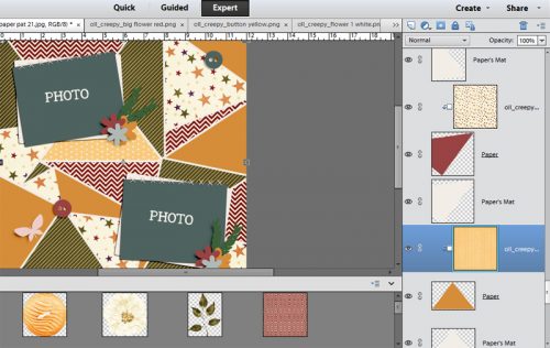
Here’s where there’s another speedy tip that comes in handy. As I mentioned, you can follow the exact same process for those flower shapes, stitching lines, ribbons and so on. The template’s symbols are more for size and placement of objects rather than carved-in-stone directions, so you can cover those shapes with just about anything. Drag and drop your element into place on the template and size it to your liking. Here I’m using a white flower. The speedy secret?
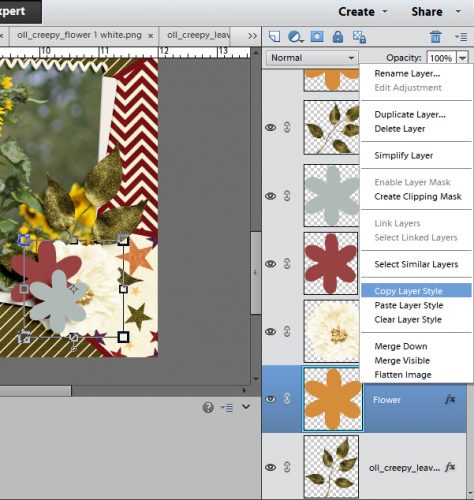
Copy the layer style > right-click on the shape layer and select Copy Layer Style > from the template’s symbol layer then paste it > right-click on your element layer and select Paste Layer Style > to your element. Do this the first time you add an element to the layout and then you won’t have to do it again later for each individual item.
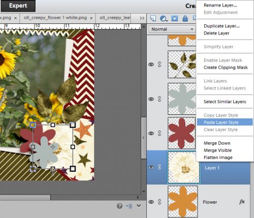
This template has a number of identical flower shapes so I copied the white flower – WITH the shadow layer style included – and moved them into place on the template, moving them up the layers panel so they’re in the right order in the cluster or stack. I also adjust the angles on some of them so they look more naturally arranged (shown in the second screenshot below).
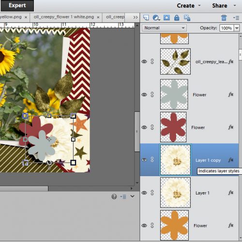
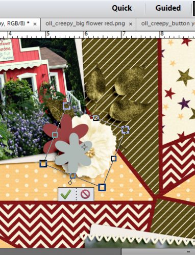
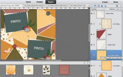
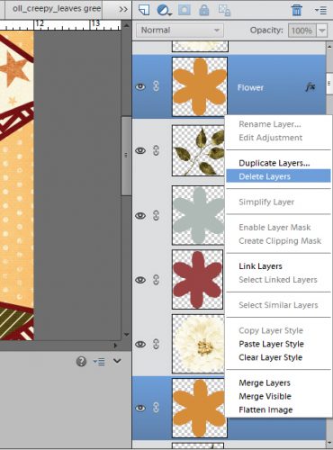
Once the elements I want are in place on the template, I delete the template’s symbol. (Remember to work on a copy so you don’t end up throwing out the whole template!)
Speedy tip – you can delete multiple layers at one time by selecting them all in the layers panel > CTRL/CMD+click on the layers until they’re all selected > then right-click on any one of them to select Delete Layers from the drop-down menu.
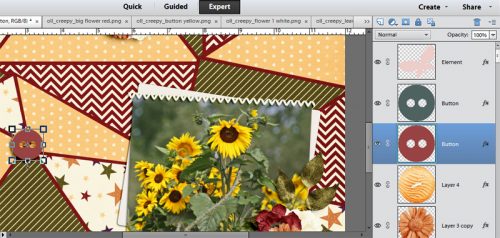
When positioning small items like buttons on templates, it sometimes helps to put them underneath the symbol’s layer in the template so you can have a better idea of size. I like my buttons small so this tip is one I use a lot.
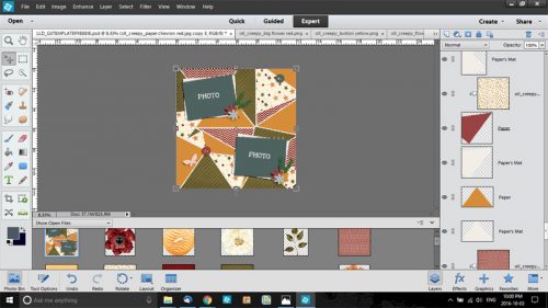
When you’ve added all your chosen papers and elements to the template, you’re done! All of your layers are shadowed (as long as you’re using a pre-shadowed template like this one, of course) and it’s probably taken you under an hour. My final version of this layout is in the gallery. I hope you’re able to follow along with this speedy tut and come to love templates as much as I do!
![]()
![]()
From Seatrout Scraps and Mandy King designing as Across the Pond, “We have been made aware that pp7-12 were missing from the Summer Memories Daily Download. We apologize for this error! You can get these papers here https://bit.ly/2cXO0Ni. Thank you for understanding and have a great day!”
![]()