It’s time for Digital Scrapbooking Day 2016! But one day is never enough, we will be celebrating the amazing art of scrapbooking for one whole week!!
Let’s start right off with the 50% off storewide!!(some restrictions apply)
Please visit the {FORUM} for all the details!
https://forums.gingerscraps.net/forumdisplay.php?1225-Digital-Scrapbooking-Day!-2016! 
What would DSD be without some epic $5.00 Grab Bags? 
https://store.gingerscraps.net/-5.00-DSD-Grab-Bags
We also have a Shop Scavenger Hunt and some fun going on in our Chat Room too! Stop by the forum for all the details!
https://forums.gingerscraps.net/forumdisplay.php?1225-Digital-Scrapbooking-Day!-2016!
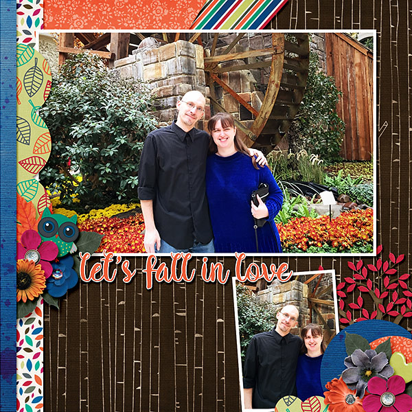
Remember when you spend $10 in the store, you get a great collab!

https://store.gingerscraps.net/GingerBread-Ladies-Collab-Lets-Fall-In-Love.html