Archives for November 2016

GingerBread Ladies Sneak Peeks

Happy end of November. Who is ready for December and the holidays? I am about half ready. I actually have some gifts bought or planned, which is further than I usually am at this point. Today I’m bringing you sneak peeks for the December Buffet and the Fresh Baked releases on Friday.
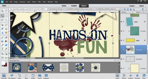
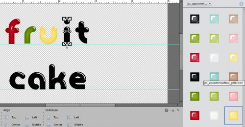
Buffet Sneak Peeks:

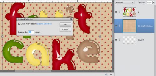
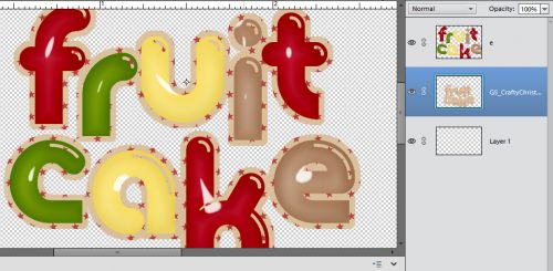
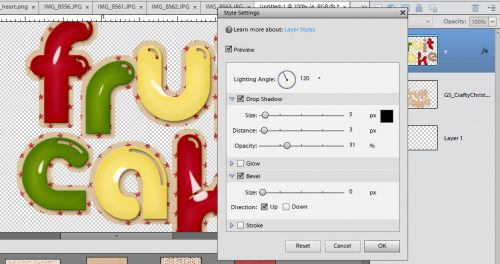
And a few Fresh Baked peeks:

Make sure to head over to the store tomorrow morning to grab the Buffet goodies.

Tutorial Tuesday (Photoshop Elements)

Word Art Wizardry

gs_blog_teachyouiwill_header

Are you ready for a really long tutorial?? There are a lot of screenshots in this one, but only so I can be sure you’ve got the steps down.

If you’re like me, you probably have a good sized collection of word art in your stash. And, if you’re anything like me, you want to make it look unique to you, even though using it as is would be super simple. Let me show you a pretty easy and relatively quick way to customize and jazz up some word art. I chose this one from Jennifer Arbon of Word Art World, who guested at GingerScraps earlier this year. I wanted to use different colours for different sections of it, so I decided how many colours I was going to use – 3, then I made that many copies of the word art.

1

While I was working through my usual process, I discovered an even better way of doing things, which I’ll share with you later, but to start off, I wanted to isolate the paint smears, splatters and hand prints. So I selected the bottom layer in the Layers panel and a hard eraser brush. I turned the visibility of the layers I wasn’t working with off so I could see what I was doing. Then I started erasing. (You might note that I’m not using a layer mask here. I could have, but because I’m working on a copied layer, I didn’t worry about going too far or not far enough.)

2

After about 10 minutes of work, I had what I wanted. I only took me that long because of the complexity of the areas I wanted to keep.

3

Then I moved on to the next layer. I turned the first layer’s visibility off (closed the eye) and the middle layer’s on. And this is when I had a major EUREKA moment. I was dreading having to find and erase all the little splashes of paint that I just knew were going to be hard to see until I applied a shadow or other style to it. So I thought… why not try selecting the image I have left on my bottom layer using the Layer Thumbnail and then deleting it. Just to see what happens. And it WORKED. Don’t remember how to do that? With the layer you want to change selected in the Layers panel, then CTRL/CMD>click on the layer thumbnail – the box with the image in it.

4

If you look really closely at this screenshot, you can see the marching ants around the hand prints and the paint just under the “s”. See also that even though that layer is turned off, the software still selected what is on it. Now it’s just a matter of deleting or cutting out the stuff I don’t want on the layer. Keyboard shortcut is CTRL/CMD>X. Or if you prefer to go the long way, you can click on the Edit tab and select Cut from the drop-down menu.

5

Poof! The paint and handprints are history. Sort of.

6

From here it’s a lot easier, especially since my discovery worked so beautifully. To remove HANDS-ON from the middle layer, I used the Marquee tool. It’s the rectangle symbol in the Tools panel; I clicked and dragged out a rectangle that encompassed everything I wanted to remove without including any part of the word FUN.

7

Simple CTRL/CMD>X and bye-bye!

8

Then I clicked on the Layer thumbnail for the FUN layer. Voilà the marching ants.

9

Here you can see the top two layers visible, with the marching ants around the word FUN. Remember that the top layer is the entire word art, because I haven’t removed anything from it yet.

10

After I deleted the word FUN I could still see an outline.

11

A couple of minutes with a light touch on the eraser and it was gone.

12

I still had to remove the paint and handprints so I selected the Layer thumbnail again (CTRL/CMD>click inside the image box) and deleted the area now outlined with marching ants. (CTRL/CMD>X or Edit>Cut)

13

So now I have the three separate areas of the word art on different layers and I’m ready to colour!

14

If you’ve never worked with Adjustment Layers, prepare to be amazed! I worked from the bottom up in the same way I would have if I was putting together a word art with paper items and paint. Click on the Layer tab, then select New Fill Layer from the drop-down and Solid Color from the fly-out.

15

A new pop-up menu will appear as shown below.

16

Once you’ve clicked on OK, the Color Picker opens. I want the messy part to look like beets or cranberry sauce, so I pulled the colour I wanted from my photo. (Not shown.)

17

After I clicked OK, it looked like this. Not quite what I was looking for. I knew I was going to have to copy the layer and stack it to bring the colour out more. But first I had to Simplify the layer. What that does is make the colour layer and the word art layer a single object.

18

A right click on the colour layer brings up this menu.

19

Then I made 3 more copies of that first paint-handprints layer one on top of the other. See how much darker the red is now? Looks a lot like beet juice!

20

I followed the same process for the FUN layer, only I used green.

21 22 23

For the HANDS-ON layer I wanted to use a dark navy colour so I opened up one of the alphas I was using for my title and with the Eyedropper (Color Picker) tool I chose a spot on the letter that was nice and dark.

24

Then I went on to do the same steps as before.

25 26 27

But when I was done, there wasn’t as much definition for the words as I wanted. So I went ll the way back to my first tutorial and turned the words into stickers. To do that, I started with the HANDS-ON layer and clicked on the Edit tab. Then I selected Stroke from the options.

28

There are some choices to make in this menu. I wanted the white outline to be fairly thin, just barely there, so I went with 3 pixels. I wanted it to follow the contours of the letters but not cover up much of the actual letter so I went with Center. That puts the very center of the stroke on the edge of the object to be outlined, some of it inside and some of it outside. If you put the stroke inside the edges of the item you might hide most of the colour and lose some details. If you go outside there might be some areas that don’t look nice and smoothly curved. It’ll really depend on your own preferences when you’re doing it as to which location you choose. The beauty of digiscrapping is that nothing is ever final. You can try it each way and see how it looks, then if you don’t like it, CTRL/CMD>Z and it’s gone. (If you’re undoing several changes and find you’ve undone something you didn’t want to undo, you can undo the undo by clicking CTRL/CMD>Y.)

29

This is how the stroke looked on that blue HANDS-ON layer. I was happy with it so I used the same process and settings on the FUN layer too.

30

Now it’s time to make the word art into a single layer so when you move it onto your layout, it all goes together. Select all the layers and CTRL/CMD>E will merge them together. Or you can right click with all three layers selected and choose Merge Layers from the pop-up.

31

This is what the finished product looks like on my layout. It’s the layout I did for the second November Template Challenge. The template was generously provided by Krisztina of Tinci Designs. If you’re not playing along with the GingerScraps challenges, you don’t know what you’re missing!

32

Whew, what a marathon! Do you feel like you’ve been through the wringer? You know I’ll be looking for word art wizardry in the Gallery, and I know you won’t let me down!

Next week the lesson will be much shorter, sweeter and simpler, I promise.

gs_footer_jan

Be Pinspired – Christmas Advent Calendar

For those who celebrate, Christmas is right around the corner. I know that for here in the states, we have already been Christmastized since November 1st. That doesn’t mean (for me at least) that we cannot enjoy counting down until Christmas!

That is what we are going to talk about today. Christmas Advent Calendar. What is that?

An Advent calendar is a special calendar used to count or celebrate the days in anticipation of Christmas.

I am going to show you some great examples from Pinterest on making your own Advent calendar. Then I will follow up with some great Christmas goodies from the store. Digital scrapbooking doesn’t have to stay digital, you know! Print those items out and get to gluing!


Here are a few Christmas items from the store. Images are linked!


*BLACK FRIDAY MADNESS @ GINGERSCRAPS*

As we slowly emerge from our turkey comas, it’s time to shop until our fingers fall off, all without having to leave the comfort of our homes. No need to even change out of those pajamas! It’s Black Friday Sales time at Gingerscraps and you are not going to want to miss a thing!

Remember when you spend $10 in the store, you get a great collab!

fwp3222
https://store.gingerscraps.net/GingerBread-Ladies-Collab-Must-Love-Books.html [Read more…]

GingerBread Ladies Sneak Peeks – November 24

Happy Thanksgiving morning to all of our scrappers in the US, and happy Thursday to everyone else. I’m a little late with the sneak peeks this week. To be honest, I was so excited about having four days off work that I totally forgot to post this last night.

Let’s see what our designers are offering this week.

Our designers are working up some awesome sales and goodies for you for tomorrow, and we have a HUGE Black Friday/Cyber Monday sale going on in the GS Store. Make sure to check it all out tomorrow.

Tutorial Tuesday (Photoshop Elements)

Titles with STYLE(s)

gs_blog_teachyouiwill_header

Today we’re going to play with titles again. There are so many ways to make our titles amazing and eye-catching. Using styles is one of those ways. Now some of you may be scratching your heads and asking me, “What the heck are you talking about?” and others might be thinking, “I know what they are but I don’t know how to use them.” That’s all about to change!

Styles are little scripts that tell PSE what to do to alter an object. They can be simple drop shadows, they can be glittery, they can be glossy and everything in between. Katie, the brains and talent behind Just So Scrappy and Ooh La La Scraps, creates a bundle of styles that coordinate with each of her brilliant kits; I’ll be using some of them in my example today. Katie’s bundles usually include styles that can make your object look like acrylic gel, cardboard or felt, cardstock, chipboard, chrome (I KNOW, right!!), dots, embossed, glitter, plaid, stars, stripes or wood. The possibilities are endless!

Since we’re talking about titles and using styles, obviously I’m not going to use the alpha that comes with the kit I used for my layout. I’m going to use a font. I know what look I’m going for so choosing the right font is very important. My layout, for the November Mix It Up Mystery Challenge revolves around my annual fruit cake ritual so I want my title to look like candied fruit, or hard candy. That means my font has to be a solid, hefty, rounded one. If you’re like me you probably have hundreds of fonts and dread having to search for the perfect one. That’s where Wordmark It comes in. It’s a website that shows you what your text will look like in every font you have on your computer, and it only takes a couple of minutes. The image below shows you what the screen looks like. I browsed through the exemplars and decided a font called Glasoor FF 4F Black would work beautifully. (Where do they get these names from?)

wordmark

As I always do, I created my title on its own workspace. I wanted each of the letters in my title to be a different colour so I knew I’d have to put each letter on its own layer. This step isn’t crucial, but it helps to keep things organized. I pulled a horizontal guideline down to align my text on, and then a second one because I planned to put each word on a separate line. Don’t know how to pull a guideline down? I have the rulers visible on my workspace at all times but you don’t need it there to do this. Just put your cursor right up the very top of the dark gray workspace and then click-and-drag the line to where you want it. You can see mine in the image below, the thin turquoise lines. I put the text cursor on the line and started building. I used a 72 point size, which is big enough to see and manipulate easily.

1

It doesn’t matter what colour you use for the text at this stage. You’re going to cover it up with a style later. While I was playing with the base, I selected all 4 letters in “cake” and shifted them as a group, which is shown below.

2

Then I selected the style set I wanted to use. Don’t know how to load styles? If you’re using PSE 10 or higher, it’s simple. When you open the Style panel using the Effects menu, at the right upper corner of the panel is a little icon that looks like several little horizontal lines with a tiny triangle just to the left of them. If you click on that, the following menu pops up. Click on Load Styles then find the folder you have your styles in. Then select the style you want to use and you’re in business.

menu

Once I’d done all that, I selected the acrylic gel style from Just So Scrappy’s Up on the Housetop bundle. (pssst… it’s on sale for $5 right now!) I applied a different colour style to each letter. It would have been more work to do it to each individual letter to select each one from a single layer and apply them, but not impossible. I’m all about working smart, not hard!

3

When I had the letters all styled up, I decided I didn’t like both words ending with red, so I right-clicked on the layers for the “k” and the “e” and selected Clear Layer Style. Then I swapped the red and brown around.

4

Here’s another advantage to having each letter on its own layer. Now I was able to move them around a little to make the title look more interesting.

5

Once I’d gotten all of that done, I wanted to get rid of the guides. So I clicked on the View tab and unselected Guides from the drop-down menu. (Did anybody notice I also had a vertical guide in this screenshot? I had thought to line up the two words, but didn’t like how it looked.)

6

When I was happy with how it looked. I selected all the layers (keyboard shortcut: click on the top layer, hold down the Shift key and click on the bottom layer) then merged them onto a single layer. (CTRL/CMD+E) I thought it looked pretty good, but was afraid it was going to get lost on my layout. So I decided to put a paper outline around it.

7

I dragged a paper onto my workspace, making sure it was underneath my title, then with my paper layer still the active layer, I held down the CTRL/CMD key and clicked once on the thumbnail for the layer with the title on it. That put some marching ants around the letters, as you can sort of see below. Then I clicked on the Select tab, chose Modify and Expand from the drop-down and fly-out menus. (You might remember that from a previous tutorial, if you’re a faithful reader.)

8

I wanted the paper border to be visible, but not ridiculously huge so I typed 10 into the Expand by:_ pixels box. That shifted the marching ants away from the edges of the letters.

9

Then all I had to do was cut the rest of the paper away. To do that I first inverted the selection by clicking CTRL/CMD+X (the long way: right-click anywhere on the workspace and choose Invert Selection. Then go to the Edit tab, choose Cut.)

10

But I still wasn’t happy with it. I knew I needed to shadow the letters so they’d look more like candy. And I’d layered them on top of a piece of paper so there was a need for some definition. Then I decided to try a Bevel, which looked quite odd until I dragged the size down to 0. Then I liked it. I had to adjust the Lighting Angle because I was using a template (rotated and tweaked a bit) and wanted the shadows to agree with each other. That step isn’t shown, but it was discussed in last week’s tutorial on drop shadows.

11

One last thing I had to do before I moved my title onto my layout was to merge the layers so it would move as a single object. Remember how to do that? Select all the layers then click CTRL/CMD+E. Once I’d put it onto my layout I resized it and moved it around a bit, and was done!

That’s all for this week. Next week I’ll have some other tips, tricks and techniques for you. Keep your eyes open!

gs_footer_jan

Let’s Celebrate – Thanksgiving!

Thanksgiving is next week here in the States; and was last month in Canada. I don’t know about you, I never scrap my photos right after I take them. I usually sit on them for a while. With that in mind, I am stopping by today to show you some great digital scrapbooking supplies for scrapping your Thanksgivings. Be it next week, last month, or years ago! (If Thanksgiving isn’t something you would scrap, but you would like to scrap things you are thankful about, check out THIS POST.) I am going to just jump right into show you the great items. Of course if you are looking for something else besides what is here on the blog today, GingerScraps has a section dedicated to all things Thanksgiving!  All of the images below are linked.


Fresh Baked: November 18, 2016

Happy Friday! The holiday season is just about upon us, but that does not mean that the designers are slowing down their designing. They’re gearing up for the new buffet, but not just that! They have some wonderful goodies for you this week, too!

Remember when you spend $10 in the store, you get a great collab!

fwp322
https://store.gingerscraps.net/GingerBread-Ladies-Collab-Must-Love-Books.html [Read more…]

Gingerbread Ladies Sneak Peeks – 11/18/2016

Can you  believe it’s the middle of November? Seriously….where is this year going? I have a few fabulous sneak peeks to share with you this week. Also, make sure you check out the GS fan page. Many of the designers give chances to win their kit before it’s released.

Now…for those sneak peeks.

Make sure you check the store on Friday for these and more.

And….. stay tuned to the blog for a special Black Friday/Cyber Monday announcement.

Tutorial Tuesday (Photoshop Elements)

Text Talk – LETTERPRESS!

gs_blog_teachyouiwill_header

Hey, all you Gingerscrappers! It’s Tuesday again and time for another little lesson to take your layouts up a notch. Glee posted a comment on one of my layouts in the gallery and she mentioned that my text looked like letterpress. She’s got a great eye… it’s the digital equivalent and it’s super-simple to do. I knew I was going to need a quick topic for this week because of the hectic, crazy schedule I’ve had at my real job and her comment just fit the bill perfectly. So let me show you how to turn text into letterpress.

For those who aren’t sure what that means, it’s how print looks when it’s typed with an old-fashioned manual typewriter on soft paper. It’s indented and the edges appear quite crisp. Maybe you’re wondering why you’d want to create this effect. Well, it makes your journaling more visible. It has some shadowing and texture, it adds depth and detail to your text and catches attention. It’s something people who were paper scrappers will love to see in the gallery. And perhaps most importantly, it GROUNDS your text. Text should never “float”… it can’t float when we paper scrap, and it must not when we do it digitally. For this reason, your text layers should be on the layer immediately above the paper or tag or label or whatever you’re applying it to, otherwise it’s going to look odd. And we don’t want that!

I like to use this technique on typewriter fonts like Typical Typewriter (used in the example), F25 Executive, Underwood 5 and similar fonts. But it also looks great with handwriting fonts, especially if you use an inky blue – it looks like you’ve scribbled it down with a ball-point pen. I know you’re going to try this!

0

Once you’ve typed out what you want to transform, you’re going to click on the Styles tab and select Bevels.

1

As you roll your mouse over the little thumbnails a label with the type of effect the style will create will pop up. You want to select Simple Emboss.

2

This is what it looks like. Downright horrible!! This is where the magic happens…

3

Double-click on the fx icon on your text layer. This box will open up. You want to grab the slider for Size and drag it to the left.

4

The default is 21 pixels. I like to go down to about 5 or 6. But you can go all the way to 0 and it will still alter your text visibly.

5

Then click on the box next to Down and look! It’s now “debossed” and looks dramatically different. That’s all there is to it!

6

I wanted to have the labels on all three of the tabs on my layout looking alike, so once I had my text typed onto the appropriate layers, I right-clicked on the layer where I’d already “pressed” the text and selected Copy Layer Style as shown.

7

Then I selected my new text layers and right-clicked on them. Then I selected Paste Layer Style and all my tabs looked alike.

8

This handy technique literally takes only seconds once you’ve done it a few times. What are YOU going to use it for?

The layout I’ve screenshotted for this tut was created with the Daily Download kit Just Be from Laurie’s Scraps and Designs. There are links posted here on the blog every day that let you pick up the pieces of the kit. If you’ve missed the first half of the month, the full kit will be available for sale in December. It’s got a wonderful colour palette and I enjoyed playing with it. Laurie is in the Designer Spotlight this month and is hosting the Designer Spotlight Challenge. Check it out!

Til next week, GSers!

gs_footer_jan