Archives for August 2017

Free Pop Culture Fonts

Happy Saturday everyone! Since you all seemed to really enjoy the last free fonts we found for you, I thought we would do another edition this week. There is a theme to this week’s fun and free fonts we found you. Pop Culture! I thought it would be a fun twist.  So here they are. (links below the image)

Top Title & Bottom Link | Waltograph

Far Away Galaxy | Star Jedi

Catch Them All! |  Pokémon

You’re a Wizard! | Harry P

Grumpy Fowl | Angry Birds

Assemble! | Avengeance Heroic Avenger

I have a 9 year old son who is basically obsessed with all of these. Well, Harry P was for me if I am being honest. 🙂 I had all of these in my font stash already. We would love to see your layouts made with these fonts. Make sure to upload them to the gallery and come back and link us up in the comments.

Check back next Saturday. We will be showcasing some fun Pop Culture digital scrapbooking supplies to go along with these fonts. I also have more of these fun pop culture fonts in my stash. I will be back in the future with some more.

Fresh Baked: August 11, 2017

Welcome back, Friday! You were missed! This week, the designers are feeling the end of summer vibes and back to school blues! There are some great templates and kits, including ones to celebrate Picture Day! It’s a great time to check out the shop!

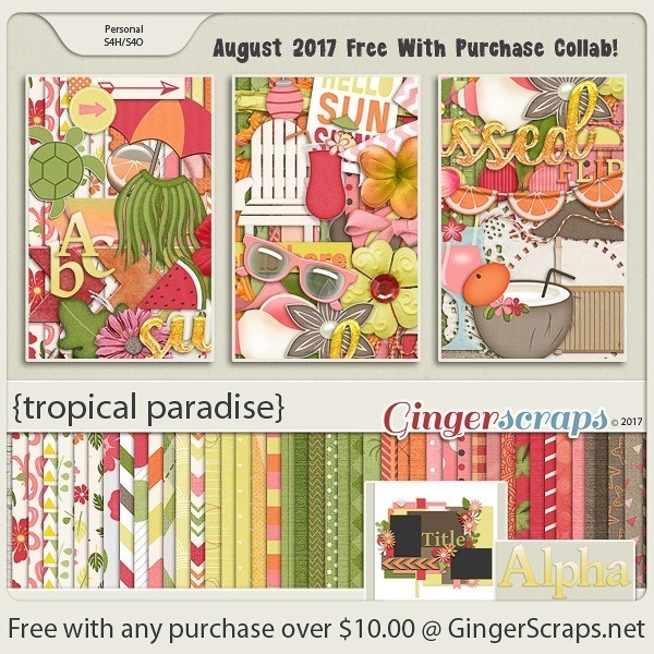
Remember when you spend $10 in the store, you get a great new collab!

fwp_thumb_thumb
https://store.gingerscraps.net/GingerBread-Ladies-Collab-Tropical-Paradise.html

[Read more…]

Sneak Peeks August 10th, 2017

Happy Thursday! In my area, the kids went back to school! I can’t believe summer vacation is over! Soon it will cool off and the weather will be nice again. Hopefully with school starting, there’s more time to scrap! This week our designers have some awesome kits and templates!

From Neia Scraps

From Luv Ewe

From Dagi

From Tinci

From Joyful Expresions

From Miss Fish

From CathyK

From JoCee

From Lindsay Jane

From Aimee Harrison

From Heart Strings Scrap Art

Have a wonderful weekend!

Tutorial Tuesday (Photoshop Elements)

Reflections

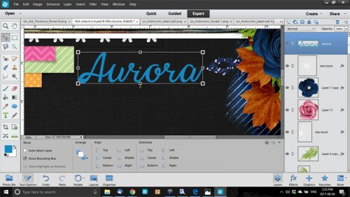
Once again, Glee has outed me! She saw my finished layout in the Gallery and just knew today’s tutorial would relate to how I created my title. I used a pretty but fairly simple script font called Black Olives. It’s an upright font so I chose the Italic Text tool option. The colour was pulled from the sky in my photo.

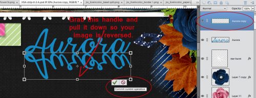
After I had my text the size I wanted it and in the spot I wanted it, I simplified then duplicated the text layer. CTRL/CMD>J, remember. Then I “grabbed” the handle at the top centre of my bounding box – make sure yours is on! – and pulled it straight down. The Move tool options include a spot to Constrain Proportions; if you select that, it will automatically size your image. If you look at the numbers in the boxes, one will say 100% (for example) and the other will say -100%. But for this technique you don’t have to constrain proportions if you don’t want to. You can make it whatever height you want. When you’re happy, hit the check-mark.

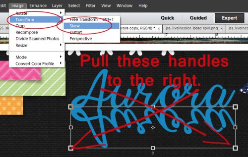
The next step I took was to Skew the image. Image>Transform>Skew takes you there. Then I pulled the lower corner handles a bit to the right. You can eye-ball for this step, or you can turn on the grid (CTRL/CMD>’) to help you do it evenly. But only if you’re really… umm… particular.

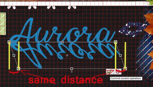
And I am. I turned on the grid so I could move those handles about the same distance. I also nudged the skewed layer down a little, as you’ll see in the next screenshot.

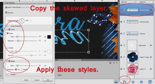
If you’re a faithful reader you’ll know that I’m rarely satisfied with basic. I went on to jazz things up a little by applying some special effects. I made a copy of the skewed layer then added some panache. The fx button at the bottom of your layers panel includes some basic styles, such as Drop Shadows, Glows and Bevels. By selecting any one of those you’ll have access to all of the default settings as shown below. I used a commercially available style set, but the settings below will give you the same effects. Check the Glow and Inner boxes, with black (000000) for the Colour. Set the Size to about 18 and the Opacity to about 13. Then go down and check the Bevel box, Direction up and Size at 24. You can see that the topmost skewed layer looks a little shiny with some dimension to it.

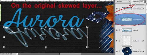
Then I went down to the original skewed layer and decreased its Opacity down to 28%. I wanted some of the blue to remain, but the shiny dimensional stuff to be most visible.

Then I merged the two skewed layers.

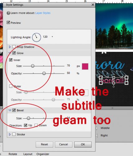
I chose another font, this time a simple sans serif one called Caviar Dreams. I pulled a pink from one of the papers I used then added some special effects to it too. The Glow and Inner boxes are checked again, Size is at 70 and Opacity at 50. The Bevel is set at 24 and Up again.

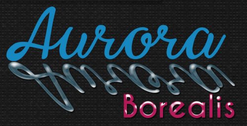
I decided a little drop shadow on the two fancy layers was needed because of their dimension and the end result looks like this.

You know what’s the best part? You can do this to almost anything! You can create a mirror image of a photo, an element, a brush (on its own layer, of course!), make an object look like it’s casting a really long shadow… so many ways you can make this work for you! Give it a whirl. I know you’ll find some really creative ways to use it and to combine it with other cool techniques. See you in a week.

Let’s Celebrate Back to School!

It is that time of year again where I live. My kiddo started back to school on the 3rd! I of course took those obligatory 1st day of school photos. Then compared it to last year’s. Only to get slightly sad at how much he has matured over the year. It also got me thinking about scrapping those back to school photos. With that in mind, I found some great digital scrapbooking supplies here at GingerScraps just for that! I thought that even if your kiddos are not going back to school this week, a lot of us have those photos to scrap!

Did you know that we have an entire section in the store just for Back-to-School and learning? Well we do. You can find that HERE. I am going to showcase just a smidgen of what the store has to offer for back to school. There are pages and pages of them. All images are linked. Hold on to your hats. You are about to be inundated with lots of digital scrapbooking goodness!


Do you have a budding artist in your family? Or maybe your preschooler is just learning how to color inside the lines? This kit is perfect for scrapping all your child’s drawings and artwork! The colors are straight out of the basic box of crayons and the papers include lots of fun patterns, many with a doodled look. The elements have a crafty feel and of course include crayons of many colors. You’ll have fun documenting those special masterpieces with this kit!


Back to school just got so much more fun! Whether it’s the first (or last) day of school, field trips, candid photos or school activities, this kit has everything you need to create lasting memories! It’s packed full of adorable characters, tons of school-themed elements, bright colors and so much more! The color scheme includes red, orange, yellow, green, blues, purple, black and white.


A collection for guys and gals of all ages who study or just love math and numbers.


From our August 2017 guest designer Joyful Expressions. Make sure you grab it before it is gone! – With a focus on curiosity, discovery and learning, the Curiosity collection by Joyful Expressions will spark imaginative and creative science and education-themed scrapbooking projects that are perfect for your school, museum, field trip, or science class photos.


[Read more…]

Fresh Baked: August 04, 2017

It’s already the first Friday of August! How does that happen so quickly? Well, the designers know how to manage their time well because they have some amazing kits and templates coming out for you this week! No matter if you have pictures of a trip to England to scrap, or you need that perfect template to document that special person in your life, there’s a kit or template, ready in the store, waiting for you!

Remember when you spend $10 in the store, you get a great new collab!

fwp_thumb
https://store.gingerscraps.net/GingerBread-Ladies-Collab-Tropical-Paradise.html

[Read more…]

August Designer Spotlight

LAURIE’S SCRAPS AND DESIGNS

Greetings GingerScrappers! This month’s Featured Designer is Laurie of Laurie’s Scraps and Design. She’s got a HUGE sale running until the 15th and a fabulous Daily Download for y’all, so make sure you check it out.

Let’s get to know Laurie a little better. She granted me an interview today!

1… How long have you been designing?

Since 2008 but I took a 4 year break in between.

2… What is your design process?

I start with solid papers, then pattern, then frames, foliage, flowers, other non themed elements, then themed elements. But I mix it up depending on what theme the collection is.

3… What do you use to create your designs? (software, hardware, etc)

PS CC

4… Describe your design workspace.

I got a nice new drawing 2 in 1 laptop a little while ago. (I LOVE IT!) I sit at my kitchen table so I can watch and help the kids when they need me.

5… What motivates and inspires you as a designer?

My kids, other designers, and life in general

6… What kit currently available in your GingerScraps store is your favourite? Why?

I have been changing my design style lately so all of my recent ones have been my favorite… but if I had to choose one, I think it would be “Walk the Plank“.

7… Do you craft outside the digital world?

I love to when I have time, but it has been a long time since I have time for it.

8… What is the last book you read?

Uhhhhhh…. I can’t remember! Reading has never been my thing. I like to create instead.

9… Tea or coffee?

Neither… don’t like the taste of either one. The closest I get is Kombucha. I brew my own kombucha at home!

10… Do you have a guilty pleasure?

Sweets…. mainly cupcakes and chocolate. I LOVE CUPCAKES!

11… If time travel were possible, where would you go and why?

OOOHH, this is a hard one. I am married to a history teacher, so all time periods are interesting to me now. But I would have to say the 1920’s…. the culture and historical events are so interesting to me.

12… What’s your favourite thing about GingerScraps?

I love all the great customers who are involved and participate in the challenges and post layouts using my designs. I live to see how my designs are used!

13… If you could have any super power, what would it be?

Invisibility… so I can hide from screaming kids when I need to!

Thanks Laurie!

Sneak Peeks August 3rd, 2017

Happy Thursday! It’s AUGUST! WOW! My son goes back to school in two weeks! Our designers have tons of great stuff coming out! And you thought it would be a quiet week since the buffet (which is still 50% off until Saturday0 debuted two days ago!

From JoCee

From Lindsay Jane

From Tinci

From Joyful Expressions

From Miss Fish

From Heartstrings Scrap Art

From Aimee Harrison

From Dear Friends Designs

Have a wonderful weekend!

Tutorial Tuesday (Photoshop Elements)

Dodge and Burn… NOT an Action Movie

Awhile back, Ellen (gmae) asked me to think about a tutorial on dodging and burning. I couldn’t think of how to introduce it at the time, but I’ve come up with a way!

Dodging and burning are old-school photography techniques for selectively adjusting exposure of photos to bring out details that weren’t all that evident. In the darkroom, it was done with a piece of cardboard (at least that’s how I did it back in the day).  [I cut a round hole in a solid piece of mat board (for burning) and taped the cut-out circular piece to a thin piece of very stiff wire (for dodging).] First the photographer would print the desired negative on photo paper and examine the exposure. Then another print would be made with some fancy footwork to correct areas of over-or-underexposure. Dodging involved holding the end of the thin stiff wire with the cardboard over the area of the photo that was overexposed and then exposing the paper while keeping the wire-and-cardboard dodger moving. This decreased the amount of light that hit that section of the paper, so those blown details could be seen. Burning was done similarly but was concentrated on the under-exposed areas by moving the hole in the cardboard over the dark spots, allowing MORE light to hit that area of the paper. The cardboard in both methods had to be kept moving at a reasonably constant rate so as to prevent the obvious demarcation lines the enlarger would leave on the image. It was time-consuming, wasted a lot of expensive photo paper and was definitely a skill not everyone excelled at. To be honest, I totally failed at it! So it’s a WONDERFUL thing that dodging and burning can be done digitally and done well without a lot of fuss.

My first demonstration will show you how to make things like tags look like they’re stickers and washi tape look realistic, complete with that appearance of something thicker underneath it. I’m using CathyK‘s July Daily Download Back to Nature here. (If you missed it you can still get it, it’s in the store!)

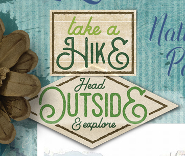
I want this tag to look like it’s a sticker and it needs a little ridge where it overlaps the photo.

To make this technique easier on yourself the first couple of times you try it (until you get the hang of it) I suggest you position your item so that you can see the edge of the object underneath at both ends, as I’ve shown. But don’t worry about having it horizontally arranged because this will work no matter what the angle.

Now select the Sponge tool. It’s actually 3 tools in one… the Sponge, Dodge and Burn are all accessed through there. The keyboard shortcut is simply hitting the letter “O“. You can use that to toggle between the three tools. Neat, eh?

The Dodge tool is the one we’re going to start with. The icon looks like that little paddle the optician uses to check your vision.

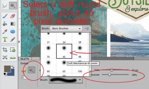
One of the important controls for this tool is hidden behind the Brush menu. It’s the one that lets you choose between Highlights, Midtones and Shadows. It defaults to Midtones, and that’s where you want it. Select a soft round brush of about 45 pixels in diameter and set the exposure (there’s that word again!) to no more than 30%. You’re going for a REALLY subtle effect, so start off light and build if you need to.

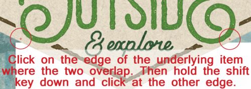
I learned something new while I was preparing this tutorial. Set your brush at the edge of the item UNDER your tag/sticker/tape and click once. You want it to overlap onto the layer underneath it a little so fix a reference point in your mind to help you later. Then move your brush cursor over to the other side of your tag/sticker/tape, hold down the Shift key and click again. Bingo! You’ve got a straight line of brush on your image!!

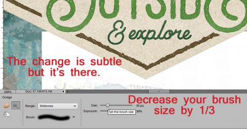
It’s really hard to see the change, but trust me, it’s there. Now decrease the size of your brush by about a third. Repeat the click-shift-click manoeuver again.

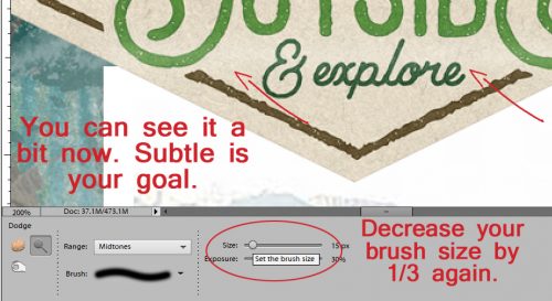
Once more with feeling… again decrease the size of your brush by a third (that’s why I chose 45 pixels… makes the math easy). Then click-shift-click one last time.

If you look really closely at my example, you can see the faint but definite lightening along the edge of my photo.

It’s actually easier to see from farther out.

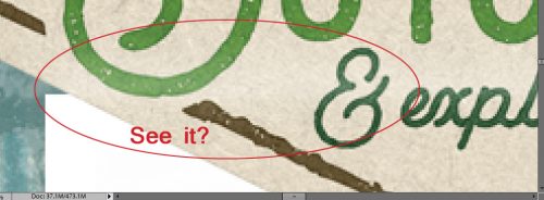
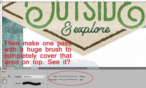
Now we’re going to Burn the part that overlies the photo. The Burn tool looks like someone making an “OK” sign with their hand. I left the size of the brush at 15 pixels with the exposure at 30% and used the very same click-shift-click to lay down a darker line.

Then I followed that up with a HUGE brush that covered the whole part of the tag that sat on top of the photo. The first pass set the edge, the second pass created a bit of a shadow that makes it look so much more real.

Here’s a zoomed-in view…

and a zoomed-out view. What do you think?

On my finished layout, I dropped another tag on top of this one and did the same technique with it. You can see the effect below.

Okay… let’s pretend we’re in the darkroom and we have this photo on our workspace. How can we use the Dodge and Burn tools to make it look better?

I darkened his eyes, his nasolabial folds (those grooves from his nose to the corners of his mouth), his dimple and the folds in his ear using the Burn tool with a small brush size and a light touch. The photo looks a little sharper, at least to my eyes.

Then I used the Dodge tool to bring the highlights back. Wherever more light would hit his face was dodged a smidge – the tip and bridge of his nose, the top of his ear, the apples of his cheekbones and a small section of his forehead. I also hit the catchlights in his eyes and brightened the whites a bit too. You could use these tips to make the eyes in your portraits sparkle: Burn the irises a bit, then Dodge the white and catchlights for some real drama. Just remember, if you’re not happy with how your images look, you can always Undo! CTRL/CMD>Z is the most useful tool in your arsenal! (Wanna know another way to use the Dodge tool? To soften crowsfeet!)

Now let’s look at what we can do with colour photos.

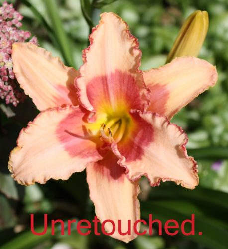
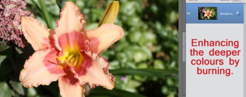
I went over the throat of this daylily with the Burn tool to deepen the fuchsia areas a bit.

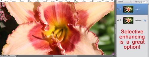
Then I went over the areas where the light hits and Dodged up the highlights. I worked on a copy of my photo so I could move from the original to the edited one and see how the changes looked.

And boom! The throat’s fuchsia is darker, so there’s more contrast, and the stamens and ruffled edges are lighter and stand out more. I LOVE being able to selectively enhance my images!

I’m not sure if this is what Ellen was looking for when she asked about dodging and burning. If it isn’t, I’m sure she’ll let me know. Have fun y’all, see you next week!

Fresh Baked: August 01, 2017

Happy August! The month of so many wonderful things! Chocolate Chip Cookie Day! Apples. Back to school prep! The days start getting a little shorter, and the nights start to get a little cooler. There’s something special about August!

It is the First of the month, and that means the revel of our new Buffet!!

Don’t forget to check out the Buffet Bundles, one easy click to add bundles of Buffet goodies to your cart, and an amazing value too!

[Read more…]