Archives for August 2021

Tutorial Tuesday (Potpourri)

Colour Palettes, Swatches and How to Use Them

Hey ladies! Welcome back!! Did you know that my very first Tutorial Tuesday Blog post appeared FIVE years ago yesterday? I never dreamed we’d still be here, learning new things together after this long. It’s amazing! [And I already have topics lined up for the next two tuts. Crazy!!]

This week I’d like to shine the light on colour – challenges, swatches, palettes and colour codes. I had a request for this info, but I can’t find the original correspondence so I can’t remember who asked for it. My apologies. Essentially, her questions were how she could save swatches and how she could make better use of those alpha-numeric colour codes the Color Picker assigns to the rainbow. [It’s raining here today – something that hasn’t happened much for more than four months. Rain is on my brain.] So let’s talk.

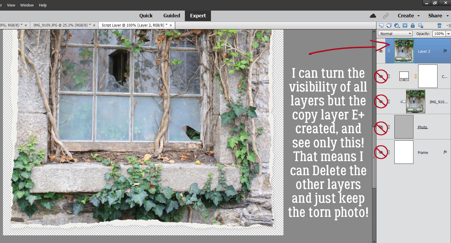
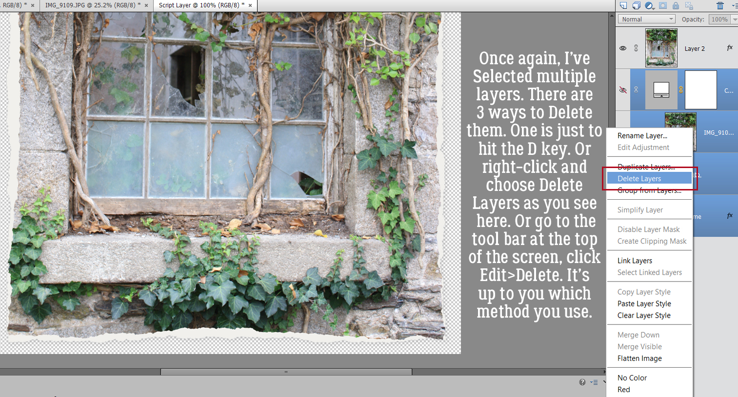
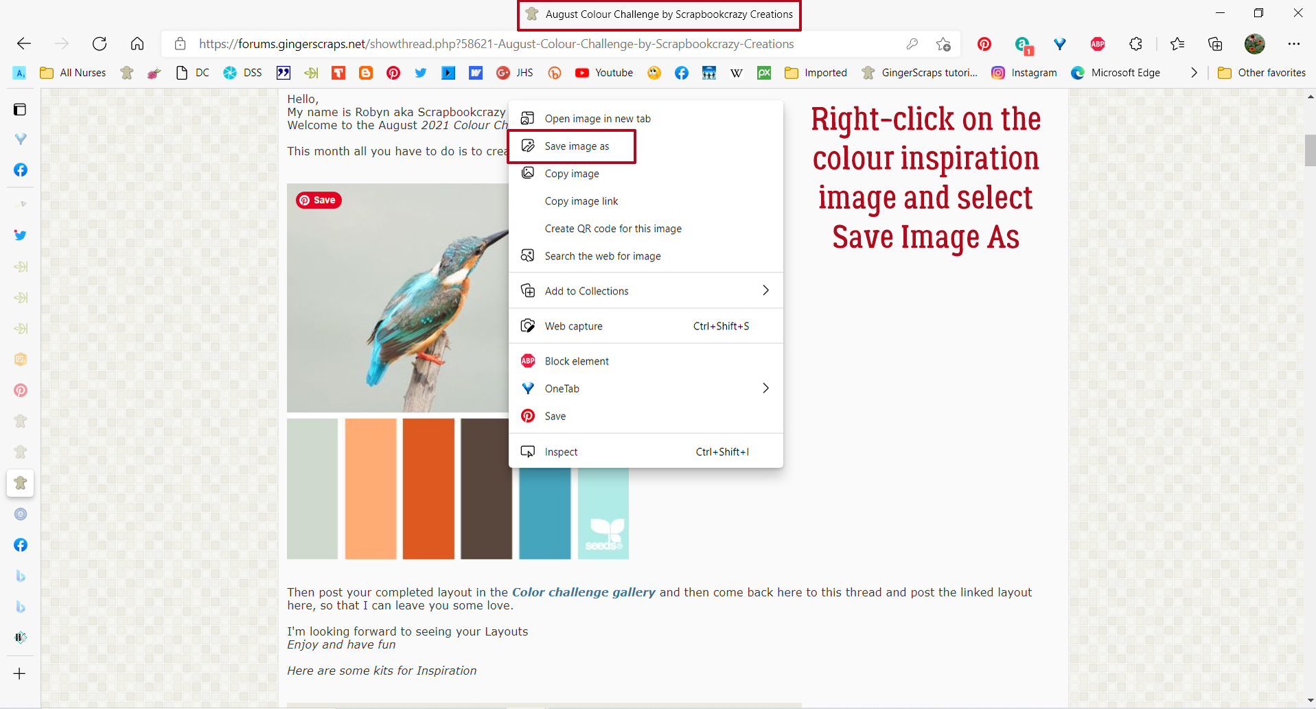
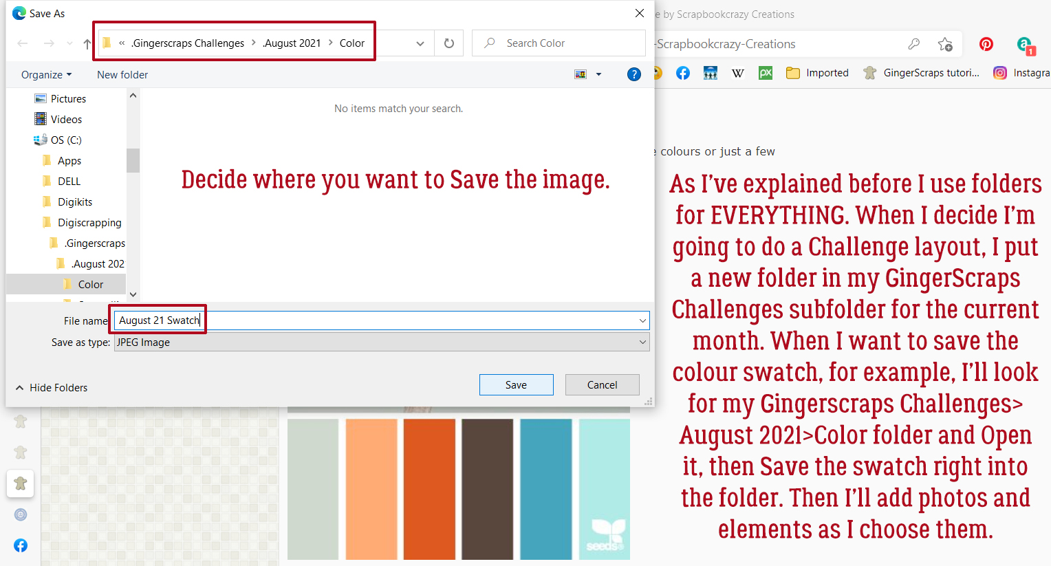
Our friendly GingerScraps designers host the Forum Challenges, as you know. Each month there’s a Color Challenge, where the hostess provides the Challenge palette, most often by supplying a swatch, but sometimes it’s a photo or simply a list. I’m a Color Challenge nerd, 100%. If there’s a swatch in the Forum thread, there will be a swatch somewhere on my layout. I typically tuck it under the edge of a paper or photo, but it’s there if you look for it. This is how I make it part of my workflow. I right-click on the image in the thread and select Save Image As from the dropdown.

Usually at this point I’ve already decided I’m doing a Color Challenge and have created a subfolder to put all my pieces-parts into for ease of access. So it’s easy for me to decide where I’ll put the swatch image. I renamed it here for clarity but I don’t bother when it’s just for me.

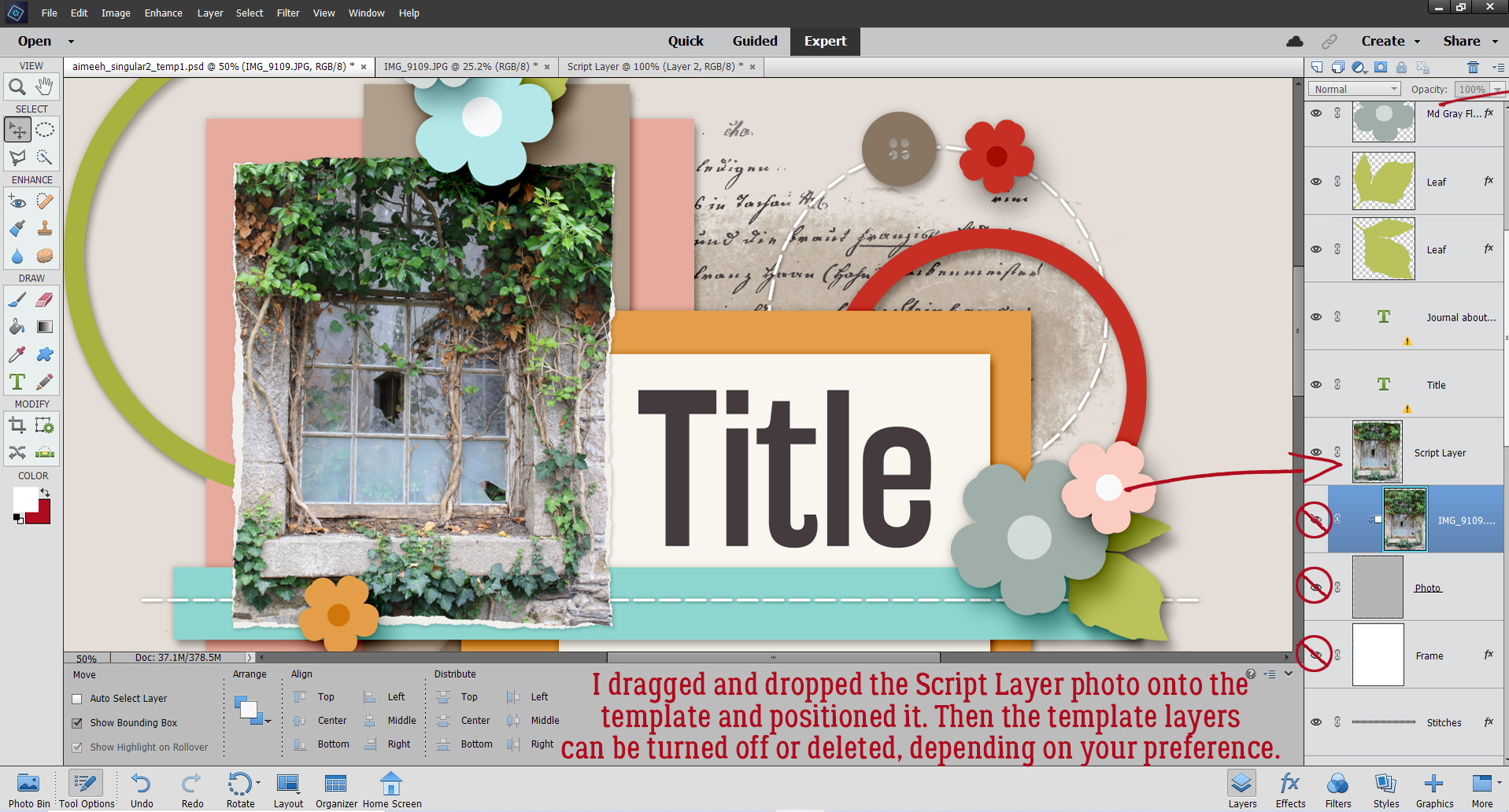
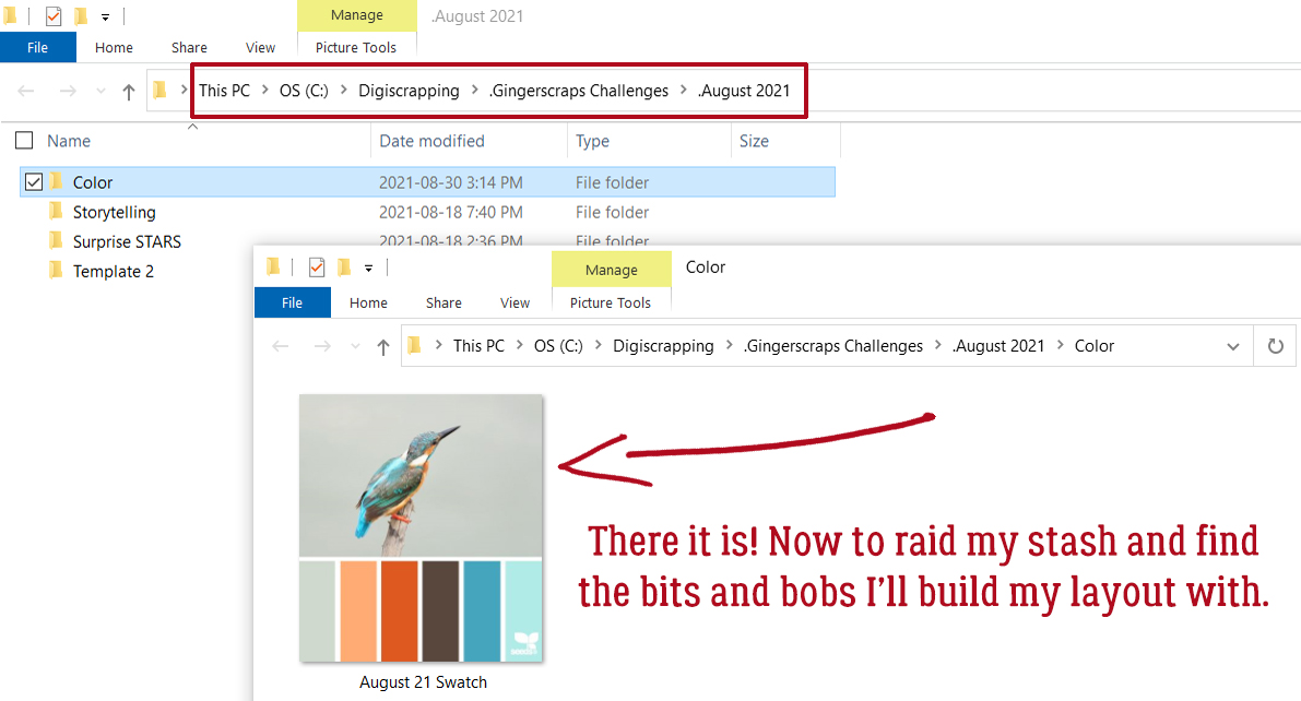
Now that it’s in my Challenge folder I can go to my stash and pick my papers and elements. This palette reminds me of my daughter’s wedding, so I chose some photos from that folder then paired them with Ooh La La ScrapsJust Breathe and Pocket Full of Sunshine. The colours aren’t a perfect match but they’re in the ballpark.

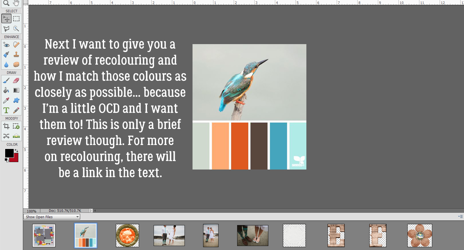
I’ve already done a tutorial on recolouring so this next part will be mostly just review. If you want a more detailed look at the subject, you can look here. In the context of this tutorial you’ll see how I use the swatch to get my chosen elements to match the colours as closely as I can.

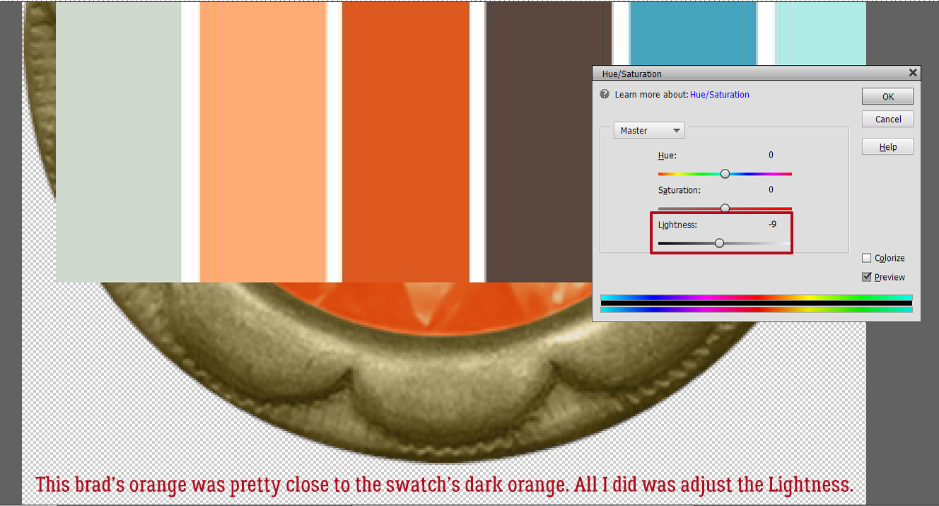
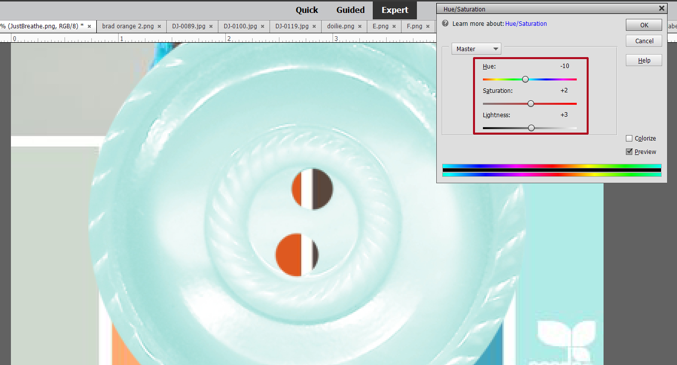
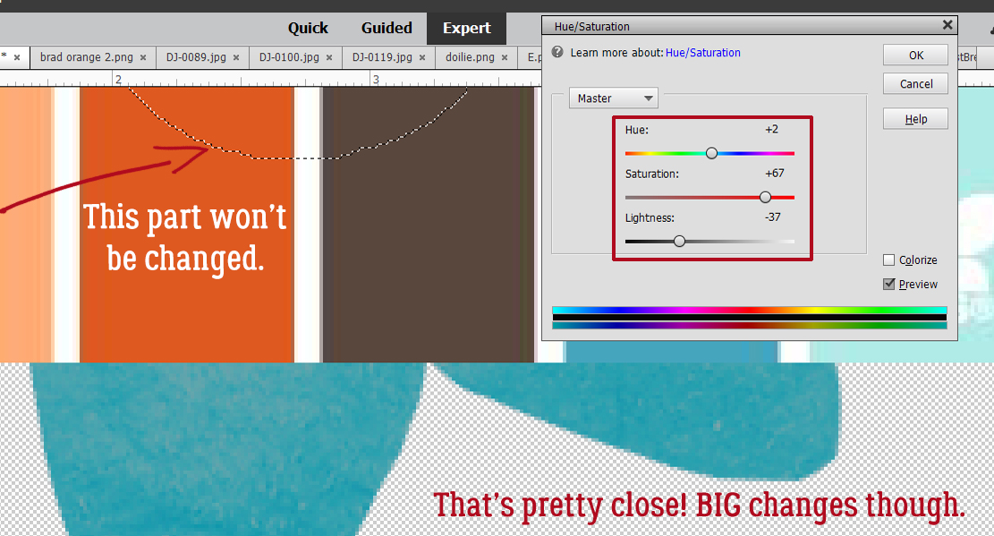
I start by dropping the swatch on top of whatever it is I want to adjust and moving it around so the colours touch. Sometimes no adjustment is necessary. To easily adjust colour, click Enhance>Adjust Color>Adjust Hue/Saturation… [CTRL/CMD>U] then play with the sliders. For this orange brad, I just needed a minor tweak of Lightness and it slid right into place. Once I’m happy with the change, I Delete the swatch layer – it’s still in my Photo Bin so don’t worry about it getting lost. The changes I’ve made to the brad will be kept until I close Elements.

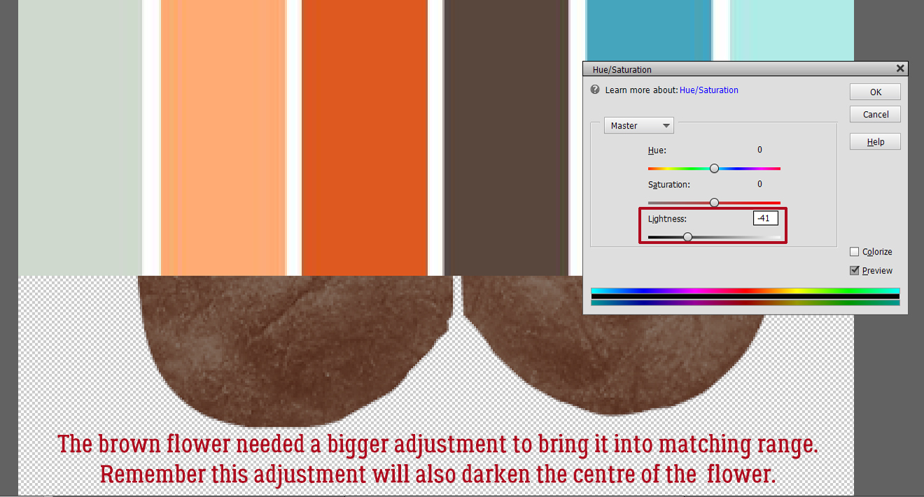
Here I’m adjusting the brown flower. It took a bit more convincing to change. Just remember that any colour adjustments you make to something composite like this flower will be made to the entire object unless you exclude some parts.

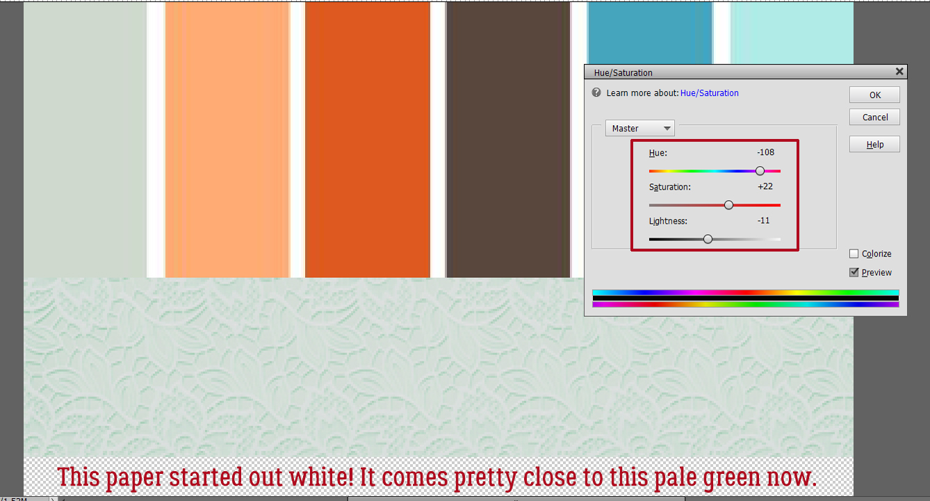
Can you believe this paper was originally a bright off-white?

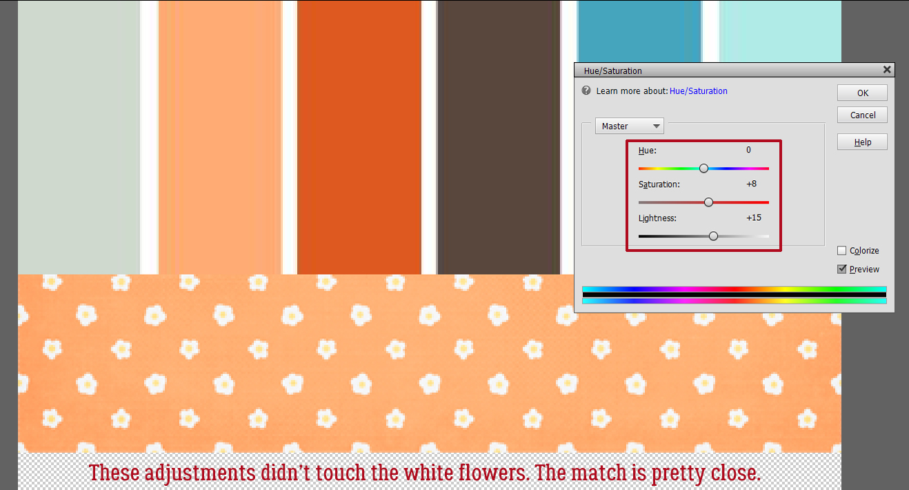
I was happy to see that making these adjustments to this paper didn’t touch the white flowers. I like the contrast.

This button looks pretty good too!

Here’s a quick refresher on selective recolouring; I don’t want to change the button in the middle of this flower. I used the Magic Wand took to outline it with those marching ants.

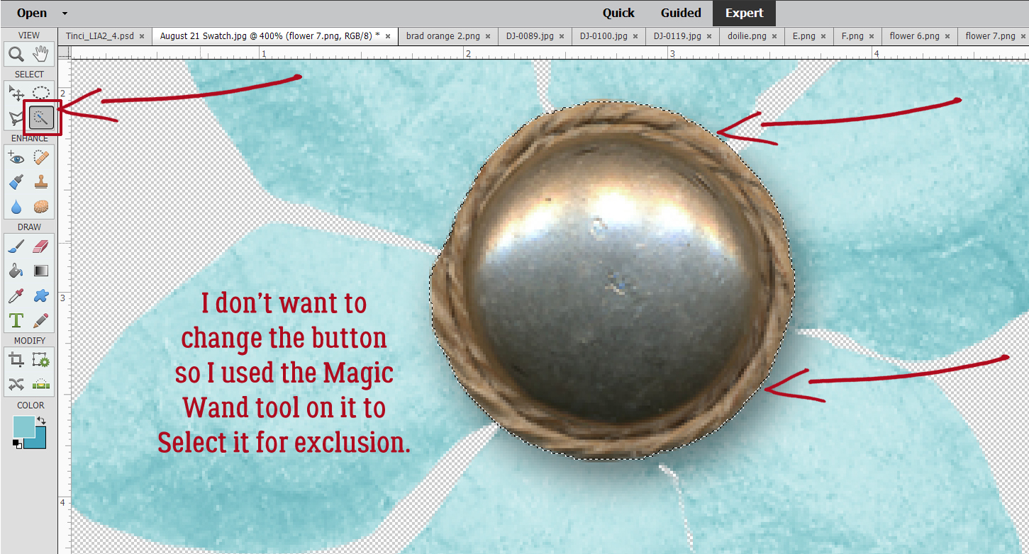
Without this step ALL that would be altered is the button. So I Inverted the Selection: Select>Inverse [CTRL/CMD>SHIFT>I]

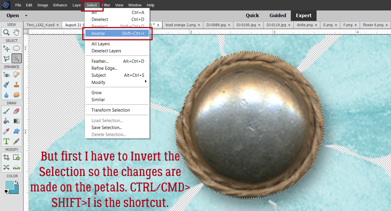
Here you can see the marching ants around the button Selection. It’s not being touched by the adjustments made to the petals. They needed a lot of persuading!

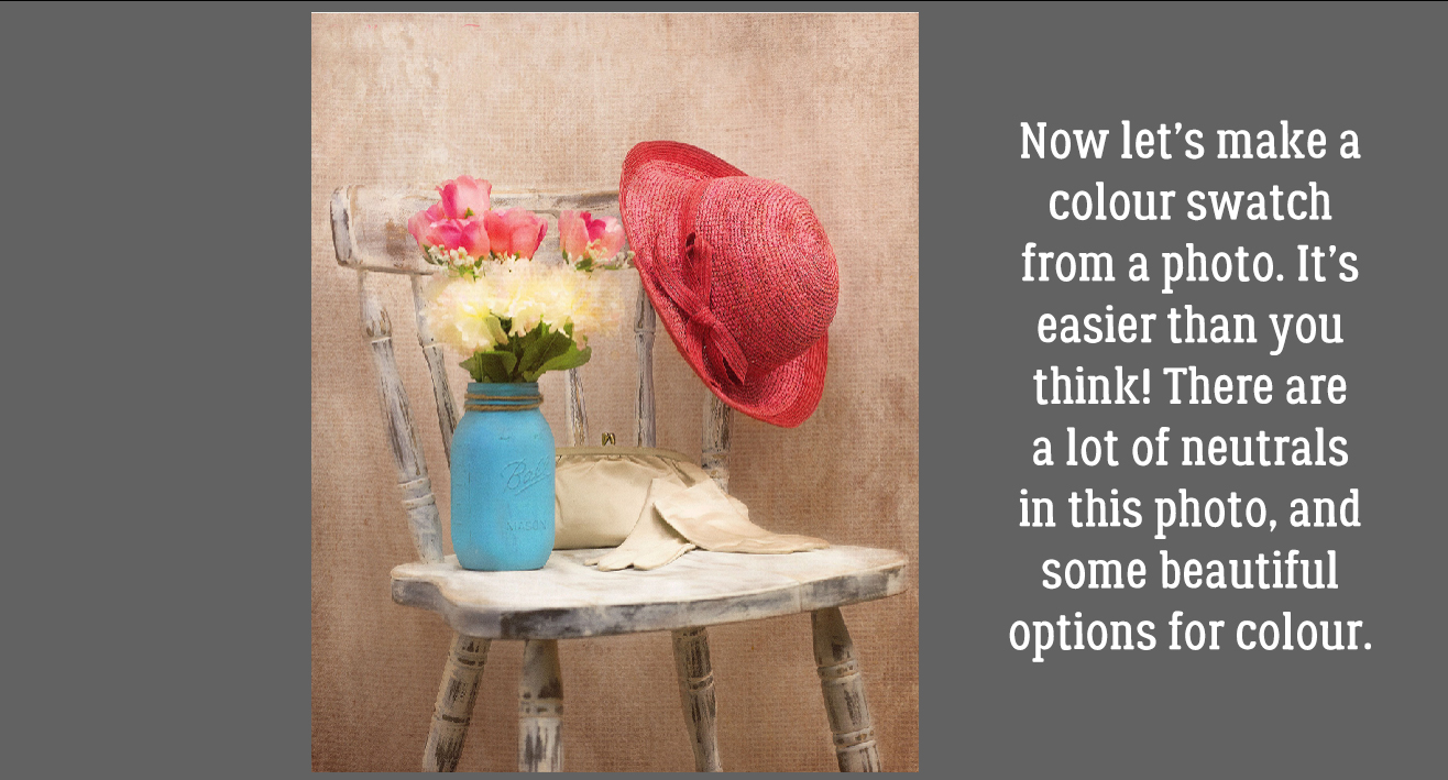
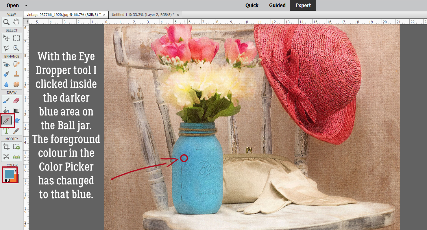
Now let’s make a swatch of our own! It’s easy to do, and can really make a difference to your work. This photo has a lot of neutrals in it, but the Ball jar, flowers, hat… they’re all beautiful.

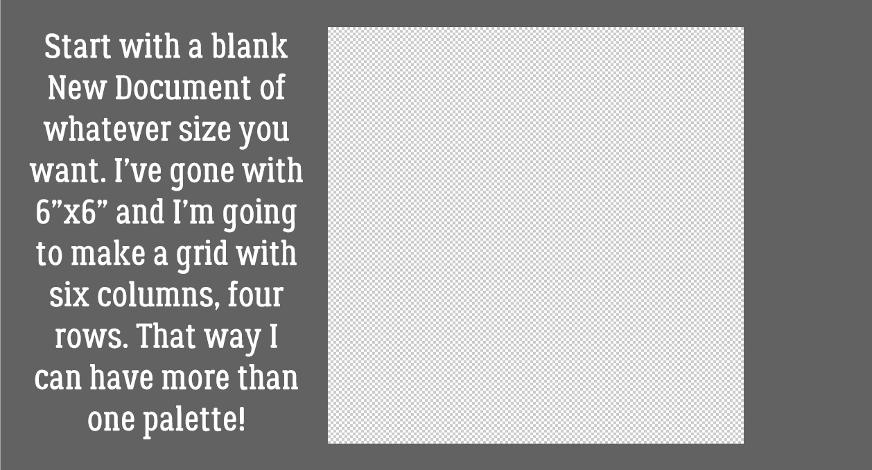
Start off with a blank New Document [CTRL/CMD>N] of whatever size you think will work based on how many colours you plan to add to your palette and with a transparent background. Make it something that is easy to divide. I’m making a grid with six columns and four rows, for a total of 24 colour blocks.

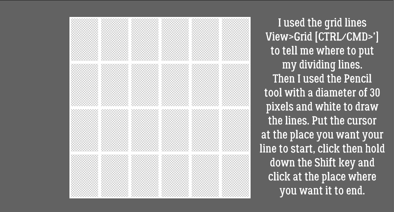
Elements has many hidden tools like the Grid. It’s activated by clicking View>Grid [CTRL/CMD>’] The parameters of your grid can be personalized in the Edit>Preferences menu. Mine are set to a major division every inch with guidelines every 1/4 inch. Using the Pencil tool with a diameter of 30 pixels and white in the foreground, I clicked at the top of the canvas at the 1 inch mark then held down the SHIFT key and clicked again at the bottom at the 1 inch mark. Then I worked across the canvas in the same way until I had 6 columns all 1 inch wide. Then I worked across, putting my lines at 1 1/2 inches apart.

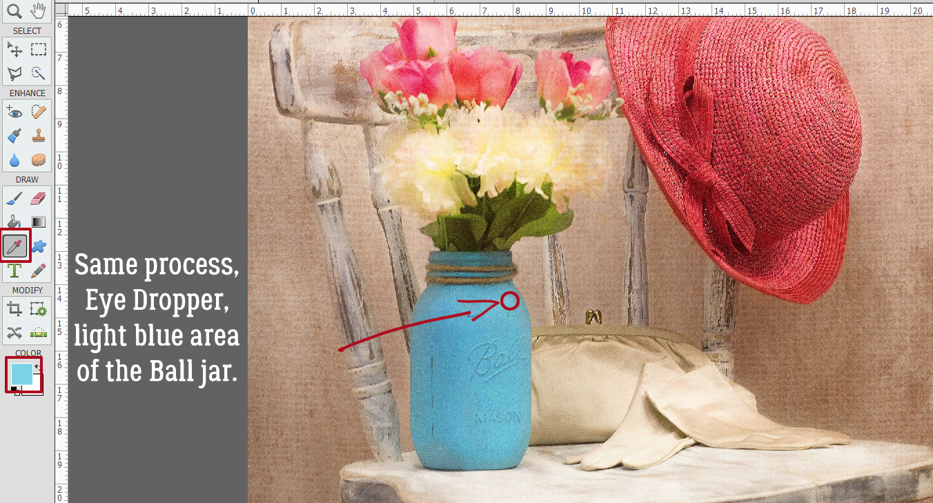
I used the Eye Dropper tool [CTRL/CMD>I] to choose a spot on the darker, shadowed area of the Ball jar.

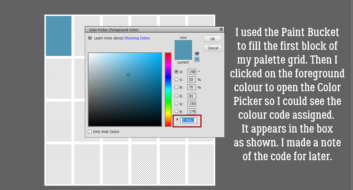
Next I used the Paint Bucket tool [CTRL/CMD>K] to fill the first block on my grid with that blue colour. I want to include the colour code on my swatch so then I clicked on the foreground colour – the darker blue – and made a note of the code in the box shown. If you trust your memory you don’t need to write the code down… I typed the colour code on top of the block in white and then Simplified the text layer – right-click and Simplify Layer. Why? If I didn’t, and I later needed to change the colour of my text for better visibility, ALL the unsimple text boxes would change too. No bueno!


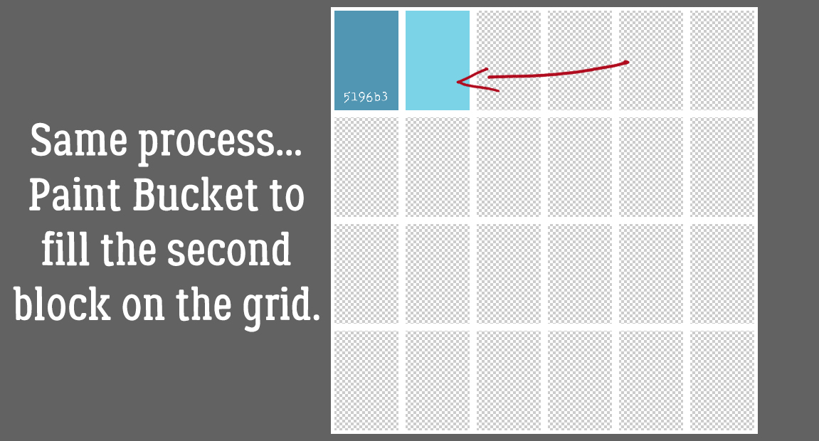
Following the same process I used the Eye Dropper to pick a spot of lighter blue.

And filled the second colour block with the Paint Bucket.

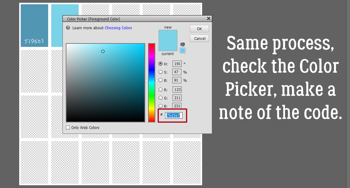
Then getting the colour code from the Color Picker.

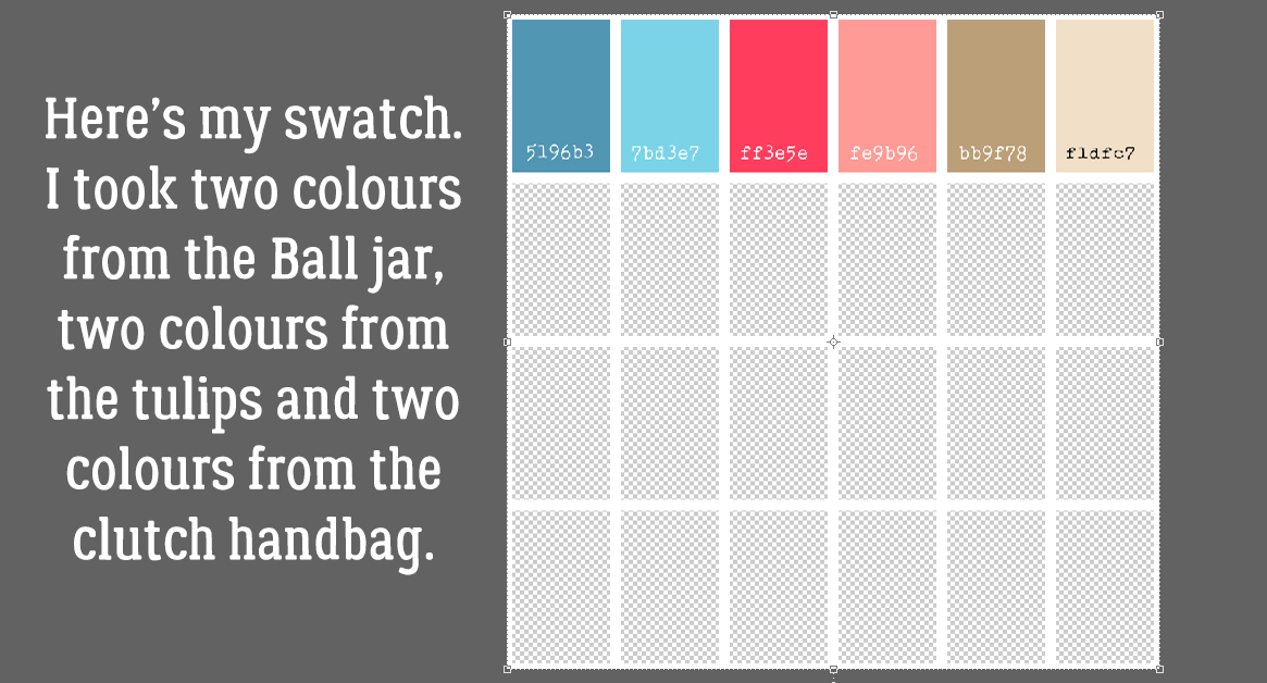
And here’s my palette derived from my Pixabay photo. I picked colours from the Ball jar, the tulips and the satin clutch purse. You might have chosen differently, and isn’t it grand that we’re all unique?!

Curious about the layout I built this tutorial around? It’s here.

Have fun with colour!

PFD Version: https://bit.ly/2WDWxyi


Fresh Baked: August 27, 2021

Can you believe we are at the last Friday in August? It’s almost time for fall here in the Northern Hemisphere and I for one am ready for fall temperatures.

Remember when you spend $10 in the store, you get this great kit for free.

Let’s see what our designers have new for us this week.

Have you picked up the Monthly Mix for August? Just a few more days to get it at this great price.

How are those challenges going? Just 10 completed challenges gets you this great reward!

Tutorial Tuesday (Photoshop Elements)

Faking the Wood Burning Look

Last week Ellen (gmae) sent me this message:

Hi Jan, The above YouTube is for wood burning in Photoshop. He talks through this way too quickly for me so it will take me a few stop and go’s to get the directions down pat to try in Elements but I can see it being great for rustic, western, and camping titles. Since its from Photoshop not Elements there are some things he says to do that may take some figuring. My first attempt not so wood burning looking. Has a lot to do with the styles he puts on at the end I think. Just an FYI if you look at this.

Well, you know how much I love a challenge! And this one was a doozy. As Ellen said, it’s all about the styles he puts on at the end. Because this tutorial is adapted from Photoshop AND a 7 minute video, there are 46 screenshots so I can show each step clearly. That doesn’t mean it’s hard or will take all day. I just want to be sure even the most inexperienced user can follow along.

I’ll be demonstrating using a word art file from Word Art World‘s Jen Arbon. The woodgrain paper is from the GingerBread LadiesCabin Fever collab kit. If you’d like to use your own text or image, the technique will be exactly the same. [Simplify your text layer though!]

To start off, I made a Copy of the word art layer. You can right-click on the layer and choose Duplicate Layer then click OK on the pop-up, or you can use the keyboard shortcut CTRL/CMD>J. [It’s been awhile since I explained the keyboard shortcuts. These are simple keystrokes that take the place of several steps using the other methods of achieving something. I use Windows, which has a CTRL key. On a Mac, it would be a CMD key. Windows uses ALT and Mac uses OPT. So when I show you a keyboard shortcut I’ll give you both Windows and Mac keys.]

Next I created a new blank layer BETWEEN the two word art layers by holding down the CTRL/CMD key and clicking on the New Layer icon [looks like a sheet of paper with a corner dog-eared] from the top left of the Layers panel. The CTRL/CMD key tells Elements to put it UNDER the active layer.

With the blank layer active, I made the layer solid white: Layer>New Fill Layer>Solid Color

Since I’m filling the whole layer with white the box for Use Previous Layer to Create Clipping Mask can be unticked.

There are a couple of ways to choose a colour from the Color Picker: click on an area of a photo/paper/element with the Eyedropper tool, click on a spot inside the colour swatch or type in the colour number. Pure white is “ffffff“.

Then I Merged the white layer with the word art Copy layer: SHIFT>click on the two layers then right-click and choose Merge Layers or even simpler, CTRL/CMD>E.

Now I have three layers, with the wood paper on the bottom of the stack and the black-and-white word art layer on top as shown. I want to Select just the word art on the black-and-white layer so I CTRL/CMD>clicked on the layer thumbnail [the little image on the left of the layer in the panel] of the word art with the black-and-white layer active. See the marching ants?

I want to Modify the Selection. I clicked Select>Modify>Expand as shown.

I only want it to Expand by 1 pixel.

To fill that hairline space with black [in the foreground colour box] I clicked ALT/OPT>D and Elements did the work.

Next I Inverted the colours so the word art is white on black by just clicking CTRL/CMD>I. This tutorial has a bunch of things I’ve never tried before. This is the first one. Filter>Stylize>Wind.

This menu opens up. Make sure the Method is Wind. The Direction doesn’t matter at this point. You can see in the Preview pane what the Filter will do.

This Filter will be applied two more times. Elements will remember the last Filter used, so you can click Filter and Wind will be right at the top. Or, even easier, just click CTRL/CMD>F. Just make sure it’s applied three times in total.

This is what it’s supposed to look like. Don’t be alarmed!!

Now I’m going to do the Filter step again. Because I’m going to make a change to the settings I can’t just CTRL/CMD>F my way there.

This time the Direction has to be changed so the streaks go the opposite way.

Here’s after the first hit with the Wind Filter. The change isn’t very obvious.

So I hit it again two more times! CTRL/CMD>F and CTRL/CMD>F.

Wow! But don’t worry, that’s what it should look like!

And then I Inverted the colours again so the word art was once again black-on-white. CTRL/CMD>I.

I’m not done with Filters yet. This time I’m going to add a Filter>Blur>Gaussian Blur to the mix.

But not too much of a Blur… just a Radius of 1 pixel.

The black is a bit harsh, so I clicked Enhance>Adjust Lighting>Levels. Keyboard shortcut: CTRL/CMD>L.

And I changed the Output Level from 0 to 72. That grays the black a bit, but not too much.

Remember Blend Modes? They’re such a great tool!! I changed the Blend Mode to Color Burn by clicking on that bar above the Layers panel that usually says Normal and choosing Color Burn from the dropdown list.

Now the sugars in the wood look like they’ve been caramelized!

It’s a little TOO obvious, so I dropped the Opacity of the layer to 60%.

Once again I Selected the edges of the word art by CTRL/CMD>clicking on the word art layer thumbnail with the altered word art layer active. Then I did something else I’ve never tried before… Select>Feather to soften the edges of the caramelized areas just a teensy bit.

I gave it a Feather Radius of 2 pixels. Everything about this needs a light touch.

With the edges still Selected, I added a new Fill Layer. Layer>New Fill Layer>Solid Color. This new Fill Layer will be the base for the next few steps.

Again, I didn’t need to tick the Use Previous Layer to Create Clipping Mask, because only the Selected areas will be filled. On this settings menu, I dropped the Opacity of the Fill to 40%.

The Color Picker opened, and I wanted pure black. The code number for black is 000000.

After I created the Fill Layer, I Simplified it so the mask went away. Right-click on the layer and choose Simplify Layer.

Next I made 2 Copies of this black Fill Layer and turned Visibility for the top two Copy Layers off. I wanted to see what was happening to each active layer, starting with the original Fill Layer. [In Photoshop the next several steps can all be accomplished on the same layer, but Elements isn’t that skillful. Each step needs its own layer. *Where have you heard that before?*]

To the bottom Fill Layer, I added a Bevel Style. Click on the Styles button at the bottom of the Layers panel then choose Bevels. From the dropdown menu choose Simple Outer as shown. [If you hover the cursor over the thumbnails in the dropdown, a description box opens so you know what’s what.]

Each of the Styles has a default setting, but you can easily change the settings by double-clicking on the fx icon on the far right of the layer. The settings menu opens. Here I changed the Lighting Angle to 130°, the Drop Shadow settings to Size 29 pixels, Distance 13 pixels, and Opacity 22%, then the Bevel settings to 20 pixels and the Direction to Down.

Next I activated the first Copy Layer just above the layer I last worked on, but this time I chose Styles>Inner Shadows.

I double-clicked the fx icon and from the settings I made the Lighting Angle 147°, Size 50 pixels, Distance 4 pixels and Opacity 20%.

Then I changed the Blend Mode for this layer to Linear Burn.

It’s looking pretty good!

I wanted just a bit more depth to the image so I activated the top Copy Layer and from the Styles menu I chose Outer Glows.

I used Simple from the menu as shown.

After double-clicking on the fx icon, I adjusted the settings: Lighting Angle 130°, Size 21 pixels and Opacity 25%.

The Outer Glow layer looked odd on top so I moved it to the bottom of the Copy Layer stack and lowered the Opacity to 10%. This took a bit of experimentation based on what I wanted to see.

Last but not least, I turned the original word art layer’s visibility back on. I’m quite pleased with how it turned out.

Some comments: The way this technique looks in the end will depend on several factors. If you use a smooth wood paper, your burned area will be smooth too. If you use a darker or lighter wood paper, you may need to fiddle with Opacity to get the looks you want. Obviously, doing this to a darker wood will result in darker burned areas, and it may be hard to see. On a lighter coloured wood, it may look too black, and again, you’d need to make some tweaks. I scrapped my work (and about 100 screenshots) 4 times before I was comfortable with this enough to show it to you. Don’t be afraid to make some of your own decisions! If you’re not happy with it, make some changes!!

PDF Version: https://bit.ly/3zAdEQ4

Fresh Baked: August 20, 2021

Happy Friday. Are you ready for a great store sale?

*Summer Retiring Products*

65% Off Select Category

{August 20-26}

*IMPORTANT NOTES*

This sale will end promptly at 11:59pm (Eastern Time) on the August 26, 2021.
Please download your purchase! These products will be deleted from our shop and servers approximately 45 days after the close of this sale. Once they are gone, they will be gone for good.

https://store.gingerscraps.net/2021-Summer-Retiring-Products-65-OFF-SALE

Remember, any $10 spent in the store gets you this great kit for free.

Now let’s see what our designers have going on this week.

POLKA DOT CHICKS

MEMORY MOSIAC

Remember any 10 challenges completed will get you this kit as a reward.

Tutorial Tuesday (Elements+)

How Can I Run an Elements+ Script on a Template?

I found this Forum post from DianeInOz that referred to a previous Blog post where I mentioned I’d had to upgrade my Elements+.

After reading a recent GS blog post, I discovered the elements + add-on and downloaded it! I have been playing all morning and searching everywhere, but I am having trouble. When I run scripts (lets say “torn edges”) and I click on a layer (say a single photo), open the script box, hit run. It runs the script on the whole layout instead of just the one layer so the edges of the 12×12 layout look torn, but the photo layer is just the normal photo.
Does anyone know if these scripts can be done on just one layer in a layout??!?

What a great question! Right away my wheels started spinning and I had to try something that I thought might work. And it DID! So I’m going to show you all what I did and hopefully it’ll help Diane too.

In my example I’m using a template from Aimee Harrison‘s Singular V.2. I’m intrinsically lazy, so if there’s a quick work-around, I’m going to find it.

After I clipped my photo to the photo spot so I’d have a frame of reference, I selected the three layers that make up the photo spot. When you want to select multiple layers that are all stacked one on top of the other like these are (or are in side-by-side order in a folder, for example), hold down the Shift key, click on the first layer then on the last layer. All the layers in between will show a blue flag in the Layers panel as shown. [If you want to select multiple layers or objects that AREN’T stacked or in order, hold down the CTRL/CMD key and click on each of the things you want to select.] Next I’m going to Duplicate the three photo spot layers. There are 2 ways of doing this. One is to right-click then choose Duplicate Layers… and the other is using the tool bar at the top of the screen, click on Layer>Duplicate Layers… Which one you use is up to you.

This dialog box opens up. Select New from the Document menu and give it a name (or don’t – it’s all up to you). I named my new document Script Layer.

And here they are! As you can see, Elements has created a new document the same size as the template, it’s kept the photo spot layers the same size as on the template, and put them in exactly the same place. This might be a valuable thing in another situation (like creating a title that will fit exactly in the spot designated for it) but for this purpose only keeping the photo spot layers the same size will be a time-saver.

Here’s where the let-Jan-do-the-experimenting-so-you-don’t-have-to aspect comes into play. When I just ran the script on the new document, it put the torn edges around the 12×12 background. Not what I want. So I tried Cropping the new document down to the very edges of the photo, on the photo layer itself.

Now on to the fun part! When you install Elements+ it embeds itself into the Elements menu so you can find it quickly. Click on File>Automation Tools>e+ Scripts.

To find the Torn Edges Script, click on the pull-down menu bar to select Edges. This menu opens and Torn Edges is near the bottom. Select it, and click on the green, rightward-pointing arrow as shown. Stand back and let E+ do its magic!

After the Script has run, this is what it has done. That solid white background might present a problem. Time to do a bit more experimenting….

Okay, I’m back. Problem solved. Onward and upward!

AHA! I can turn the visibility for all but the Copy layer E+ created of my photo, with the torn edges preserved. That means they can be Deleted.

So I did just that!

All that was left was to move the new torn-edges photo onto the template. With the original photo spot still in place, it’s just a matter of positioning the Script Layer photo and either turning off the photo spot layers or Deleting them. Another choice that’s left to you.

This tutorial only looks at a single Script. But it has applications for other purposes too, so don’t be afraid to try it if what you want to see isn’t what you’re getting. Have fun with it!

Next week – God willing we’re not under wildfire evacuation – we’re ironically enough going to play around with digital wood burning. Meanwhile, I’m praying for more rain.

PDF Version: https://bit.ly/2VYjP1U


$1.00 Bake Sale & $2.00 Tuesday OPEN NOW!!

Who is ready for the best deals around digi-land?! It is time for our monthly $1.00 Bake Sale & $2.00 Tuesday!! Whoop Whoop! These are deals you will not want to miss!

Remember, any $10 spent in the store gets you this great kit for free.

 Here are this months $1.00 Bake Sale deals!

While you are in the shop, don’t forget to stop by out weekly $2.00 Tuesday section! These deals will expire at 11:59Pm Eastern Time on Tuesday 

Have you picked up the Monthly Mix for August. It makes me want to go somewhere just to take travel pics!

Remember any 10 challenges completed will get you this kit as a reward.

Fresh Baked: August 13, 2021

Here we are in the middle of August already. Is school starting where you are? I’m starting to see a lot of  first day of school pictures. It’s a little bit of normal in our still crazy world.

Remember, any $10 spent in the store gets you this great kit for free.

There are some great new kits this week. Let’s look at see what our designers have released this week.

JB STUDIO

AIMEE HARRISON DESIGNS

Have you picked up the Monthly Mix for August. It makes me want to go somewhere just to take travel pics!

Remember any 10 challenges completed will get you this kit as a reward.

Tutorial Tuesday (Potpourri)

Which Template Format is Best for You?

Let’s see how smoothly this goes. The new laptop is all set up but I’m still getting used to how it works. Forgive the haphazard formatting of my screenshots, I’m also learning to use a new version of Photoshop Elements. One thing I was thrilled to learn is that I can screenshot the little pop-up messages I see when I hover the cursor. That’s going to be helpful with tutorials going forward. You’ll see a couple of examples today!

Tanya posted this comment on last week’s tutorial:

Jan, I was wondering about template files and if you could answer my questions on those because designers list many different formats and I don’t know which is best to keep. TIFF, PSD, PNG. If you can do an upcoming article on the differences and I guess advantages or disadvantages of each type. Since it’s basically the same information, I want to optimize what I actually use storage space for. If you have already done this sort of tutorial, can you link up in the comments instead.

First, why are templates so popular? Easy! They make Working Smart Not Hard so easy! They give you a roadmap to build your layouts upon and tell you where everything goes. You can whip up a beautiful layout in very little time and if speed’s your thing, templates should be in your arsenal. But templates are NOT engraved in stone and they don’t stifle creativity, because you can do whatever you want with them.

I know I’ve talked about template formats before, but mostly in passing rather than directly. So today we’re going to look them a little more closely. I’m sure when you first started digi-scrapping, you opened up a template download and just looked at the contents in confusion. Below is an image of a template download I haven’t yet organized with my own preferred method (and yes, I DO realize it’s a year old). The only thing I’ve done with it is to extract the contents. As you can see there are a bunch of things in it: a folder labeled with the file tag PNG, an image of what the template looks like, a blank sheet of paper with the file tag .page, a Photoshop icon, another image of what the template looks like and a folder label/preview. We’ll start with the PNG folder and work our way through the template download left to right.

PNG refers to Portable Network Graphic. You’ve seen that tag on literally every element in your digi stash. PNGs are on transparent backgrounds and can be manipulated in a lot of ways. When talking about templates though. this is the most versatile format in that it’s usable on any platform. About the only thing that matters is that they show the location of an element on the finished page. Look below; each of the PNGs in the folder is on a 12×12 transparent background. And there are LOTS of them. In this template they’re numbered in reverse order from the top down. The very last PNG is the background. This method of layout building would be a real challenge for me because a) I work from the background out and b) Elements needs a “pin” for layers, something that tells it where in the layer stack a newly added item goes. It would be quite frustrating for me to have to continually reorder layers but if it’s what I had I’d make it work.

Here you can see what I mean about order. This is PNG #1, but it’s the very top item on the page – the centre of the flower in the upper left of the layout at the top edge of the larger photo. The PNG layer shows the use where on the page to put the element it’s a placeholder for.

Here you can see a couple of the layers I’ve created from the PNG files. Some layers aren’t visible, as you can see. Using the PNG method of layout building, you’d stack all of them in the correct order into layers, then replace each object with your chosen object. Then the PNG layer you’ve just replaced is either turned off or deleted.

There are more layers visible in this image. As the text describes, I’ve reordered them in numerical order to have them layering properly. In retrospect, what I’d do when using PNGs as a template would be to just stack them in reverse order to begin with, starting at the end of the queue and layering as I go. That may eliminate some of the “pinning” issues. Having a transparent background behind each of the PNG elements means PSE has no sense of how to layer things; it needs some sort of fully opaque reference or pin to orient itself.

Next in the folder is an image of the template. It’s basically a preview of the template in JPEG format – Joint Photographic Experts Group. (Don’t ask me how they came up with that as a file name. I don’t know!) It’s how we most commonly save our photos and finished layouts; one thing to bear in mind when using this format for any purpose is that it’s a “lossy” proposition. This format compresses images somewhat, and in compressing, some of the detail is lost. Each time you make adjustments to a JPEG and save it again, you’ve lost a tiny bit more of its clarity. I do like to have a 600×600 pixel JPEG of my templates to use as a “shopping list” when I’m deciding what I want to include in my layouts. For that purpose I’m not worried about sharpness.

The next item in the template folder is tagged as a .page. This format is supported by a very limited number of applications, like Storybook Creator and Artisan. I won’t pretend to know anything about this format, so I’ll link you up with a tutorial if you’re just learning either of those applications. Kate Hadfield has a good one here.

Ah. Now we can talk about the format I use ALL the time! PSD Photoshop Document – is an Adobe Photoshop/Photoshop Elements proprietary file type that won’t open in other applications. It creates a fairly large file, in this case it’s 7.04 MB.

This format preserves all the layers and all the adjustments that have been made to those layers; this includes layer masks, fill layers, blend modes, opacity changes and layer styles, including drop shadows. That’s why the files are so weighty. When you save your layout in this format, you can go back any time and make changes – let’s say you’re planning to print your layout and you see a huge, obvious spelling error that you CAN’T leave. No problem. Open up the PSD, correct your spelling and save the corrected version in whatever format you want.

Okay, I’m going to admit I had to do some research on TIFF files. TIFF stands for Tagged Image File Format. These templates are considerably smaller files than PSDs; this template is slightly less than half the size at 2.91 MB. Many scrappers choose to only keep and use the TIFF format to save space on their hard drives.

In some ways they’re like PSDs, since they can also preserve layers and layer styles, you use them in a similar way to create layouts and neither format can be displayed as is on web platforms. UNlike PSDs they’re not proprietary and are supported by a broad range of graphics applications.

When saving your layouts as flattened (all layers merged) TIFFs rather than JPEGs, using LZW compression doesn’t result in a loss of image data, thus maintaining more sharpness and detail. This is the best way to save your layouts for PRINTING, but not for online posting because, as I said a moment ago, this format isn’t compatible with online display.

The second-to-last item in the folder is a cover page/folder label preview image. I usually don’t hang on to them but I know there are a lot of scrappers who use them. (I’d rather save the hard drive space for my PSDs.)

Last, but not least, there’s a terms-of-use document where Juli (Miss Fish) tells people how they can (legally) use her templates. Very important information!! I typically only keep one copy of each designer’s TOU, since they don’t change much over time.

So there you have it. File formats in a nutshell. I hope these descriptions help you understand them better and help you decide which format will work best for you. Happy scrapping!

PDF Version: https://bit.ly/3lpO22x

Fresh Baked: August 6, 2021

Happy Friday everyone! Have you been watching the Olympics? Do you have a favorite event. I always enjoy the Gymnastics and Swimming, but found myself watching the new skateboarding as well.

Don’t forget that if you spend $10 in the store you get this great kit for free. It’s perfect for the summer under the stars pictures.

Let’s see what kind of goodies our designers have for us this week.

POLKA DOT CHICKS

MEMORY MOSAIC

Have you gotten a jump on your challenges for August? Any 10 completed challenges gets you this kit as a reward!

Tutorial Tuesday (Potpourri)

Let’s Talk About New Computers

or… How NOT to Set One Up.

First, I want to thank all of you who reached out with good thoughts for my Dad. He’s not quite 100%, but he’s a ton better than he was. He’s had two minor procedures, and will have some more imaging done at the end of this week but it looks like they’ve solved his most recent problem. I know our days with him are numbered, but I’d really like as many of those days as possible to be comfortable ones.

Okay, so on to letting me be a shining example of what NOT to do when setting up a new computer… I’m working on the crumbling one right now, praying that the screen doesn’t fall completely off before I’ve sorted out the new one. Wish me luck!

First things first. Set up the basics. Get your email manager working. Import your address book. Send a test message. Then move on to the browser. If you have a Google account, your favorites and passwords can be automatically added. You’ll need the browser to get new downloads of your apps. Next you’ll want to install the software applications you use all the time to make sure you have space for them on your drive. A little caveat here: Some of the software you use may be quite out-of-date and might not run on your new machine. I ran into this with Photoshop Elements 2019. I had no trouble downloading the software, since Adobe knows me. ( 😉 ) But the operating system on my new laptop is the most recent update of Windows 10 and something in it isn’t compatible with a new install of PSE 2019. I couldn’t install it. I wasn’t all that anxious to change the compatibility setting for it so I could run it, although I know how to. It felt like a slippery slope to me. So. I upgraded to PSE 2021 and will be sharing the things I discover within it with all of you! (That meant I also had to upgrade my Elements+ to the 2021 version. And while I was at it I updated my Main Type font manager to a paid version so I’ll have the capacity for more fonts – and to force myself to classify them all. It was an expensive weekend.)

The biggest part of setting up a new system is copying all the important files from the old one and moving them into their new home. The easiest way is to copy the files onto a removeable storage device, such as a CD or DVD (for those who still have a drive for those!), a thumb drive or an external hard drive and then pasting them into the new device. I can’t stress enough the value of using a clean, empty device for this step. I used an EHD that I’d already used to back up a bunch of files. But I wasn’t thinking about how the EHD has no ability to think for itself and I ended up with literally thousands of duplicate files. The EHD didn’t know I only need one copy of everything. I discovered my screw-up when I sent my digikits and digiscrapping folders to my new 1TB laptop and was told I didn’t have enough space for them! So I looked at the Properties of each folder and found out the folders on the EHD were more than twice the size of those on Crumbling Laptop. If I’d started with an empty drive, I could have avoided all that wasted time. Oh, and before I forget: If the new system asks you if you want to Compress your files to save disc space DON’T DO IT! Before I figured out that my EHD backups were duplicating everything, I made that mistake and now I’m trying to figure out how to UNDO it before I add anything else to the chaos.

Another option for transferring files is to use an application, either purchased or free, that will do most of the work for you. Windows 10 has an option for Nearby Sharing over Bluetooth and/or WiFi. Cloud-sharing is possible through Dropbox, Google Drive or OneDrive if you’re so equipped. I tried it with one set of files and couldn’t make it work for me. So I did the EHD route.

That leads into setting yourself up for success. Take the opportunity to clean up EVERYTHING before you do any copying! Find and eliminate as many duplicate files as you can. If you routinely rename files for ease of retrieval, make sure all like files have been appropriately renamed. For example, I have a large library of styles. The designer of the brush names the file according to what they prefer. I like to give them names that tell me what type of style – glitter, gloss, wood, shadow, water and such, who the designer is and what kit or other information I may have for it. A sample would look like this: Glitter Just So Scrappy Let Freedom Ring. I also changed the file names on my brushes to something that actually tells me about the brush set, like ADS Feb 21 Challenge heart. I went through my GingerScraps digikit folder and removed all the kits from designers no longer with the site, putting them into a new folder so I’ll still have them but won’t be tempted to use them for challenges. I went through all my photo folders and eliminated as many duplicates as possible. And I went through all my digiscrapping folders and deleted all the copies of templates and such to bring the size of each folder down to something reasonable. [I use a folder system for everything and copy the items I plan to use into them so it’s all together. And I save the finished layout as a PSD file in case I need to make changes. Those folders can be pretty hefty!]

Transferring files from one device to another takes time. A lot of time. Even if there are no hiccups. So plan ahead if you can. [Obviously, if your system fails altogether, that’s not an option, but maybe having a clean backup of all the good stuff isn’t a bad idea.] Make sure you have a protected spot where both old and new are close together just to reduce the amount of up-and-down-back-and-forth you have to do. You’re also going to need some time to learn how the new system does things. I’m moving from an HP Windows 10 system to a Dell Windows 10 system, and there are a few things that don’t seem to work the same way even though the operating system is unchanged. [One interesting difference is that I can pair my phone to send and receive texts through my laptop!] So if you have an option, don’t start the process if you have any kind of deadline looming. Just to be on the safe side!

Is it smoky where you are? We’re surrounded by wildfires and have been stuck in a dense layer of smoke and ash for more than a week. Our airport had to close, no flights in or out, because the smoke was interfering with both ground-based and aerial instruments. Today it’s finally starting to dissipate – we can see the sky again, although it’s still pretty thick closer to the ground. And it’s hot. Not as hot as it was during the Heat Dome, but hot nonetheless. We finally has a bit of rain on Sunday. For the month of July this area received 0.3 mm of rain – essentially none; July was the 7th month in a row with substantially less precipitation than is our norm. Climate change is scary.

Okay, cross your fingers and toes! I’m jumping back into file transfers… as soon as I figure out how to decompress the files I’ve already moved!

PDF Version: https://bit.ly/37iTJsb