Archives for October 2021

Fresh Baked: October 29, 2021

Well friends, we’ve made it to the end of October. That means Christmas is less than two weeks away. YIKES. I haven’t even thought about Christmas shopping. Two months is a long time, but with the way 2021 has been flying, it will be here tomorrow. Good thing we still have a bunch of new fall goodies in the store.

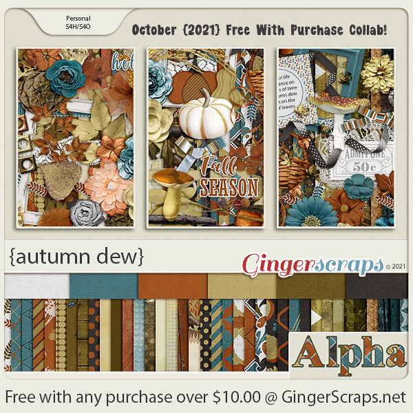
Remember, any $10 spent in the store gets you this awesome fall kit for free.

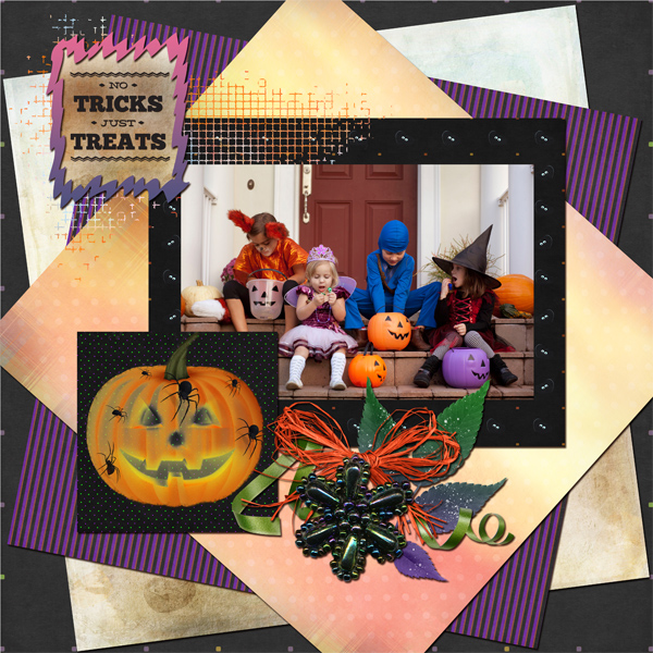
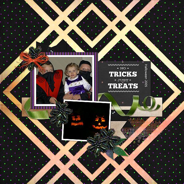
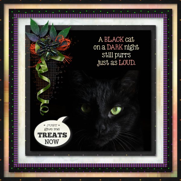
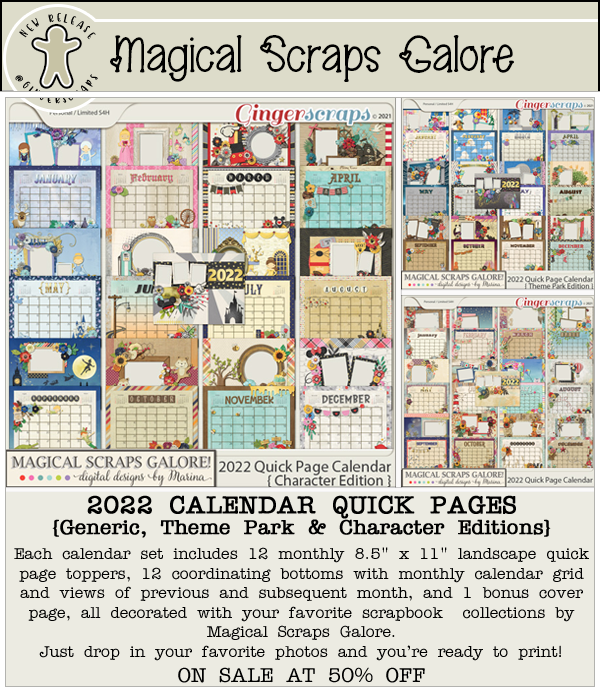
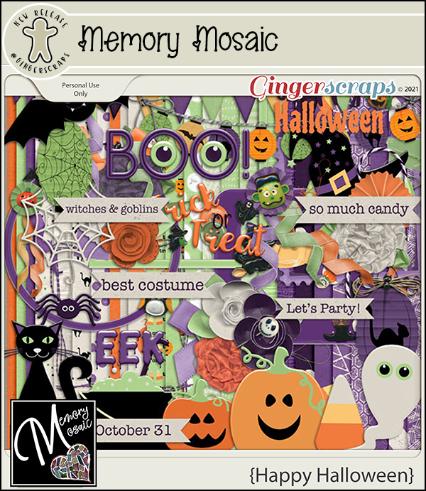
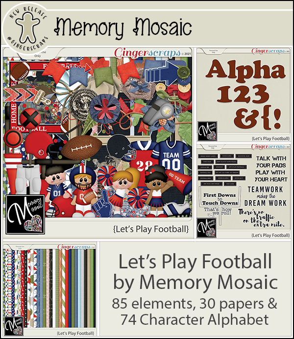
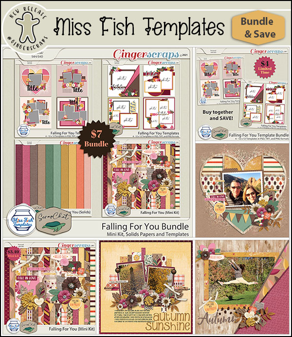
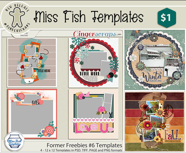
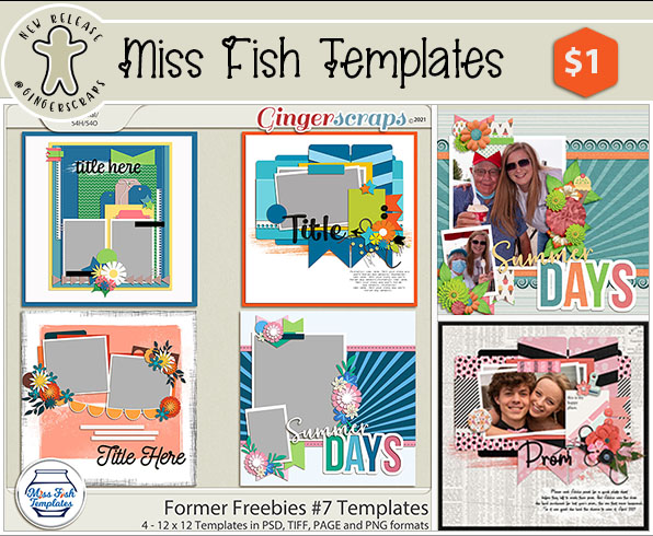
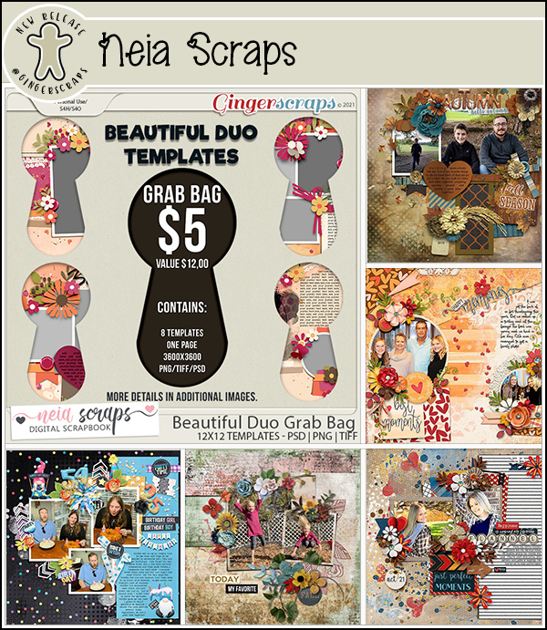
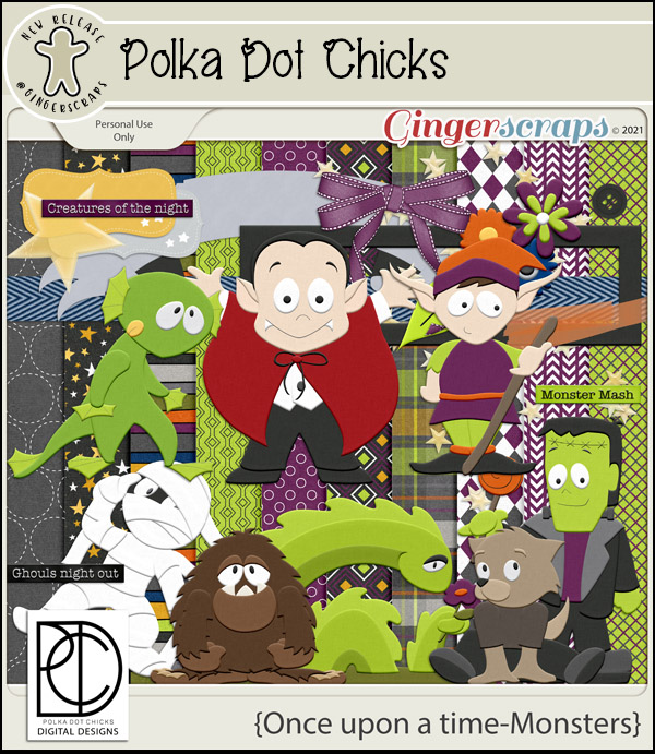
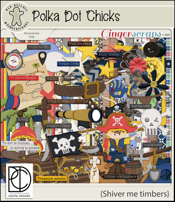
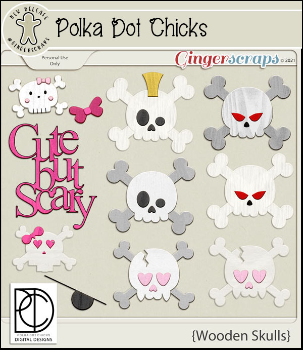
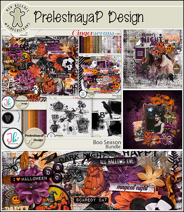
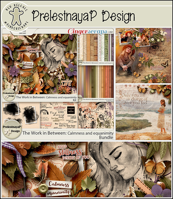
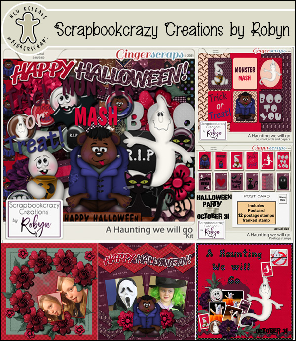
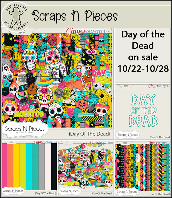
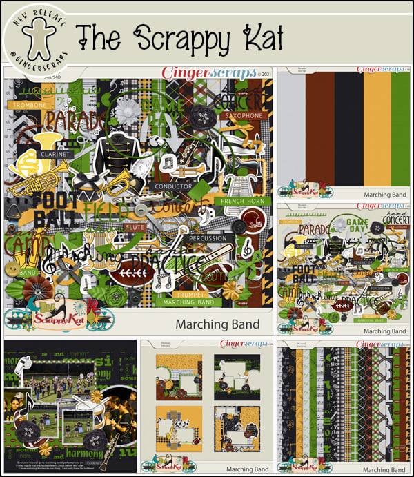
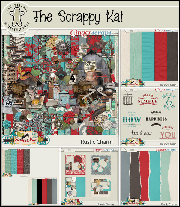
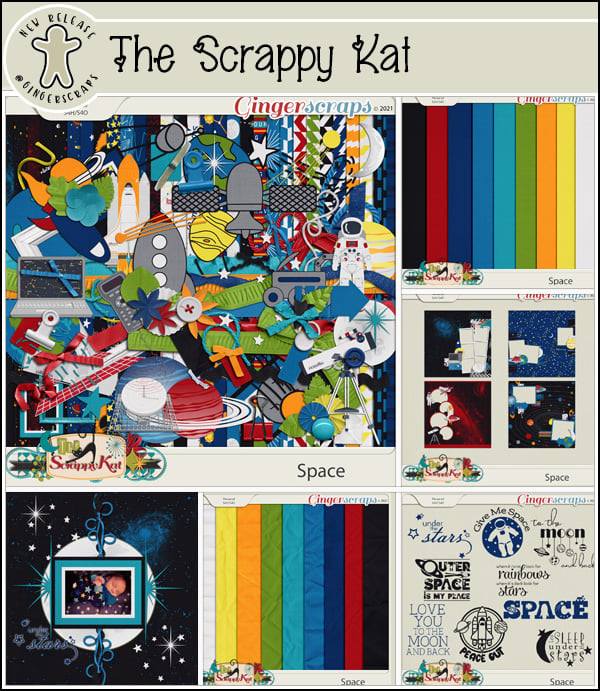
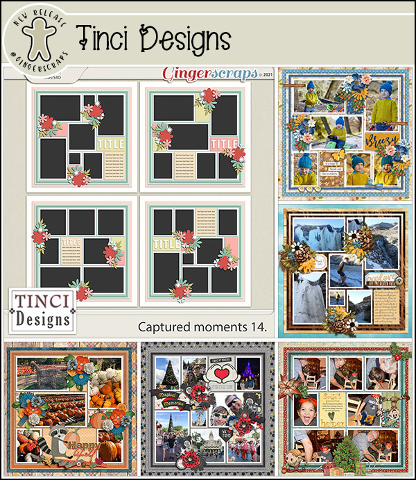
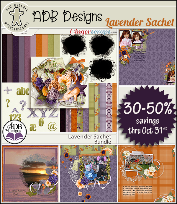
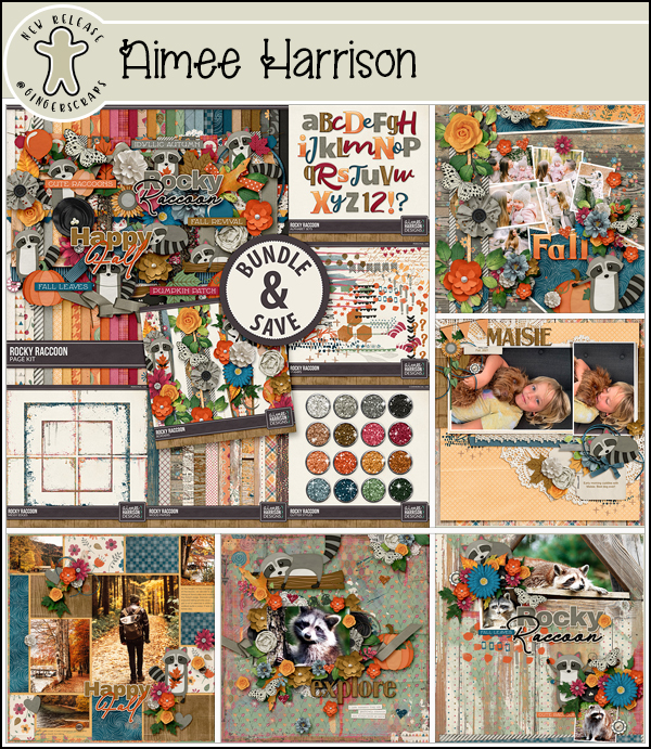
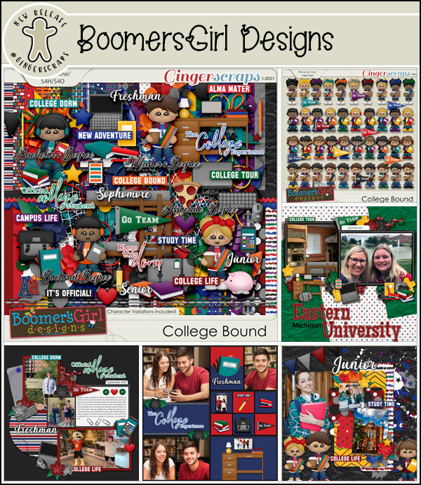
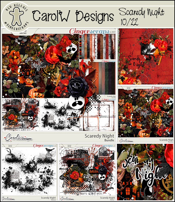
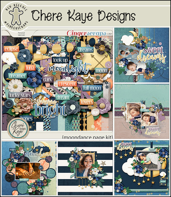
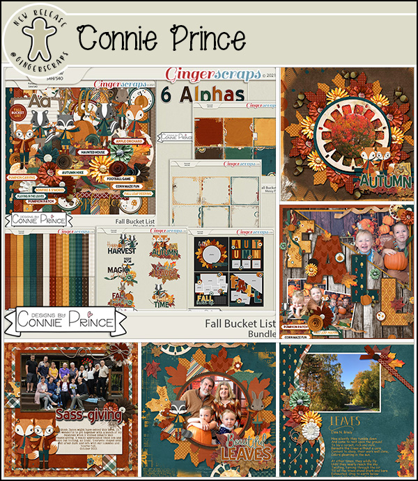
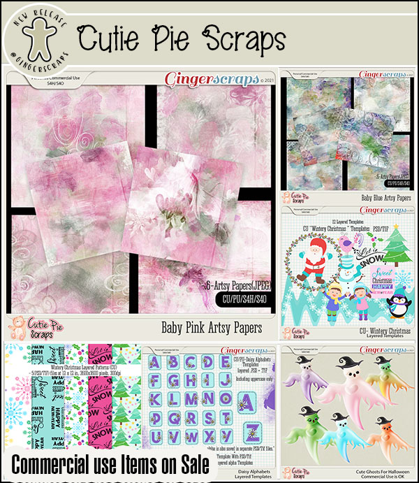
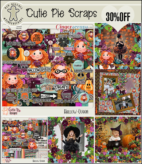
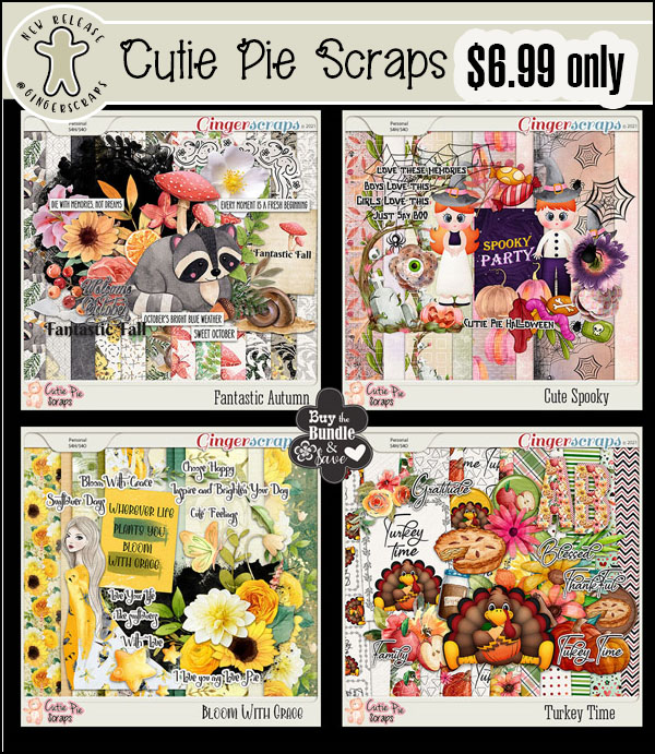
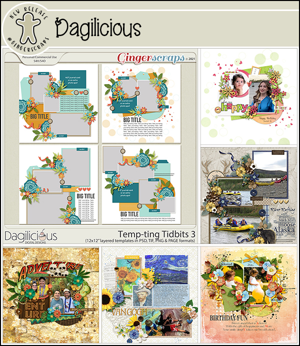
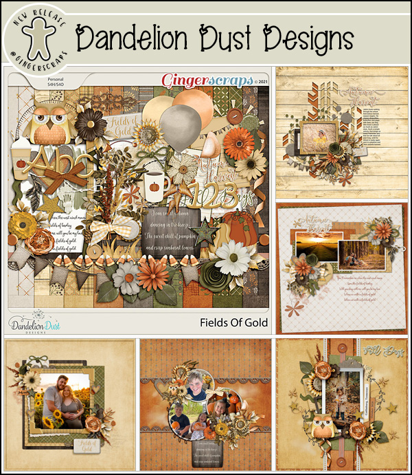
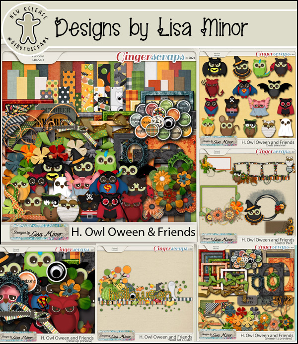
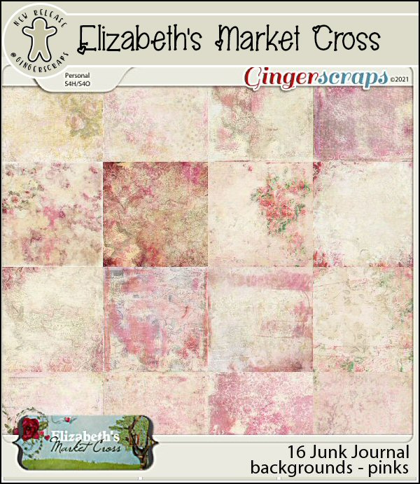
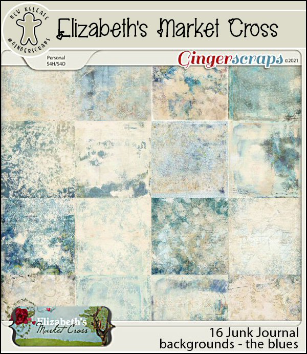
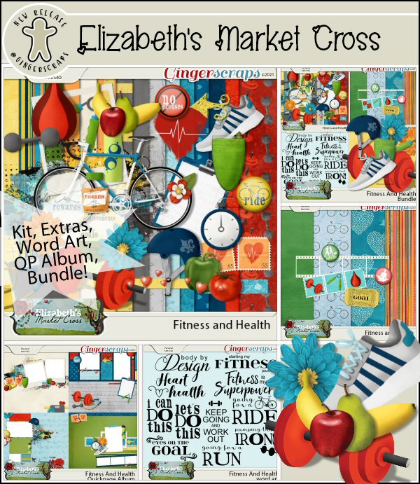
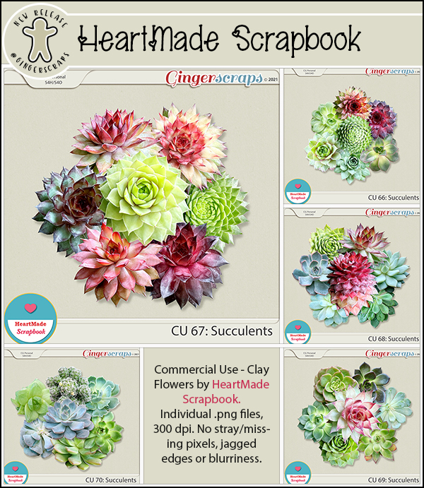
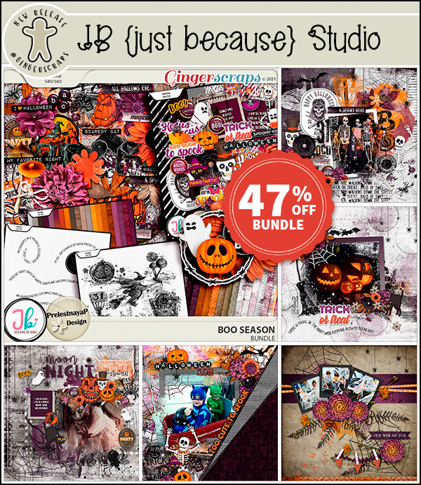
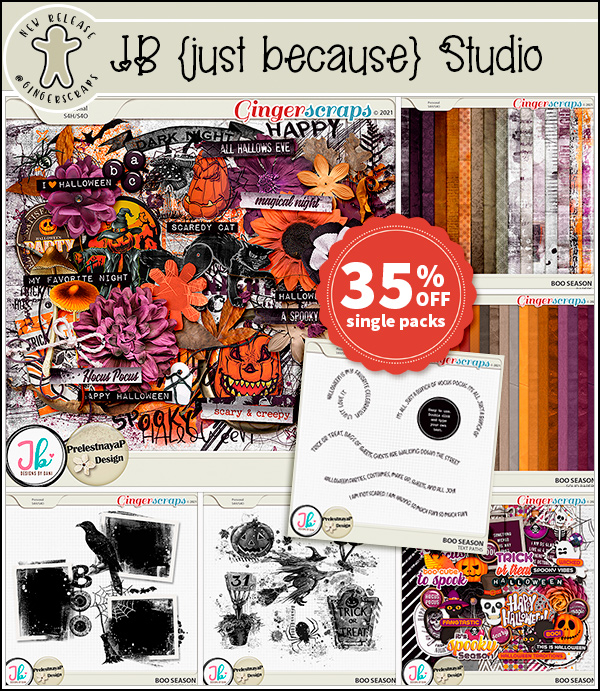
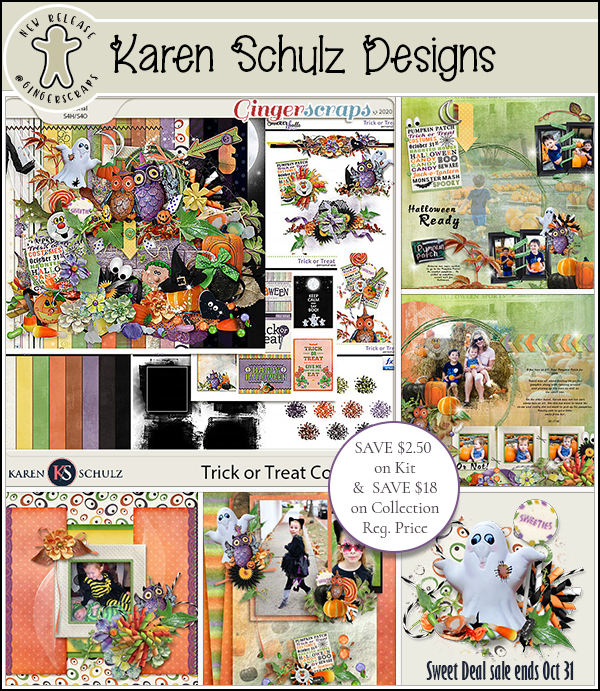
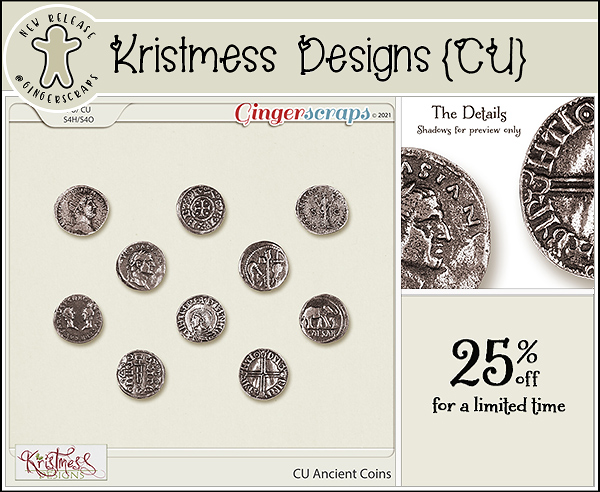
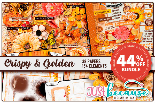
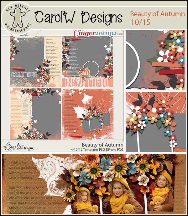
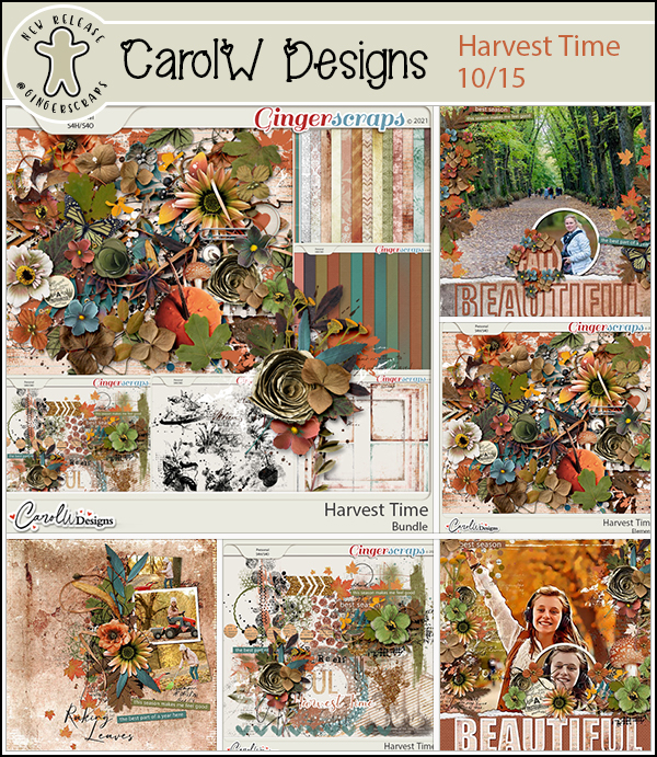
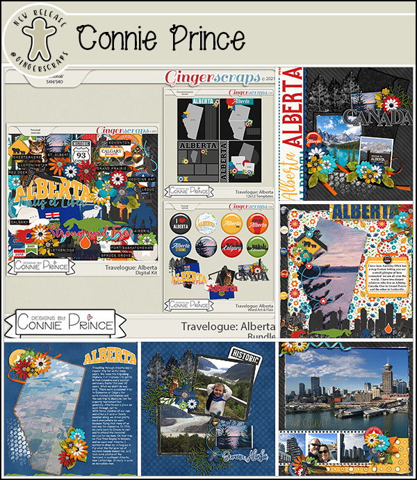
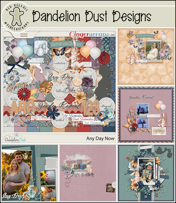
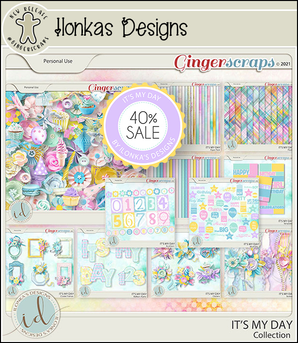
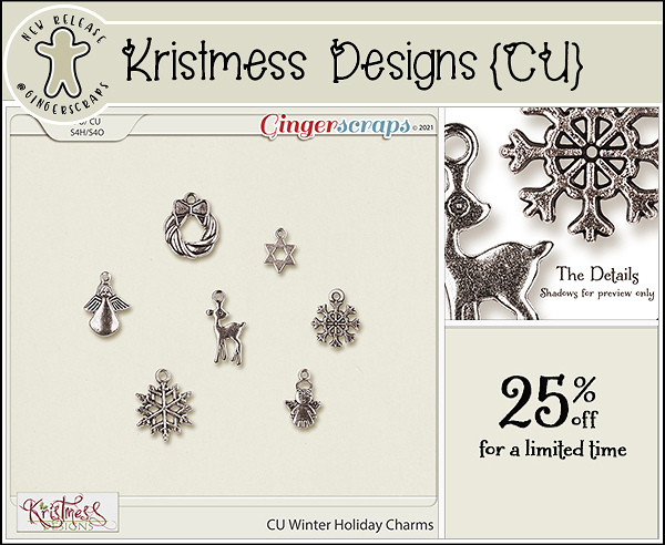
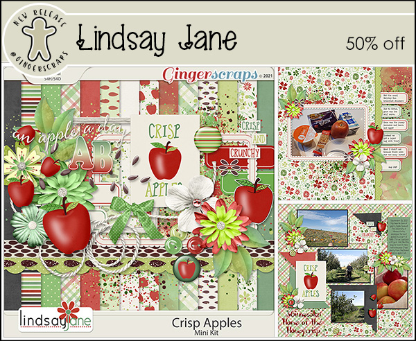
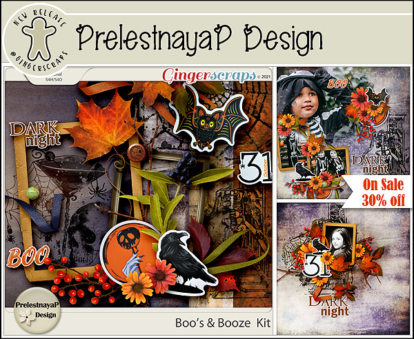
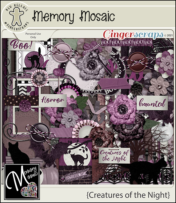
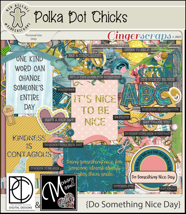
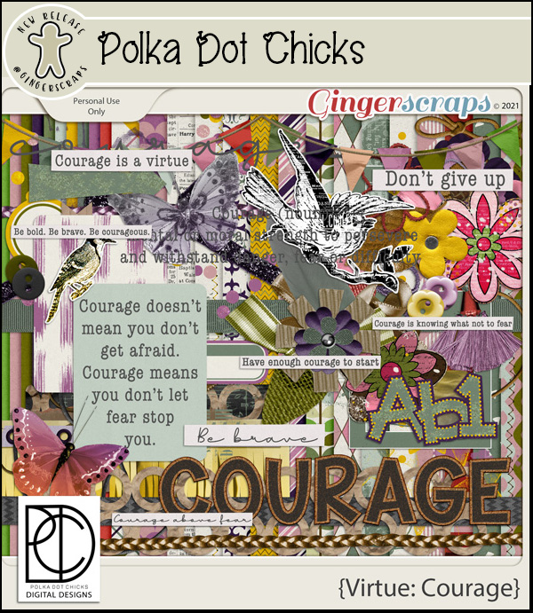
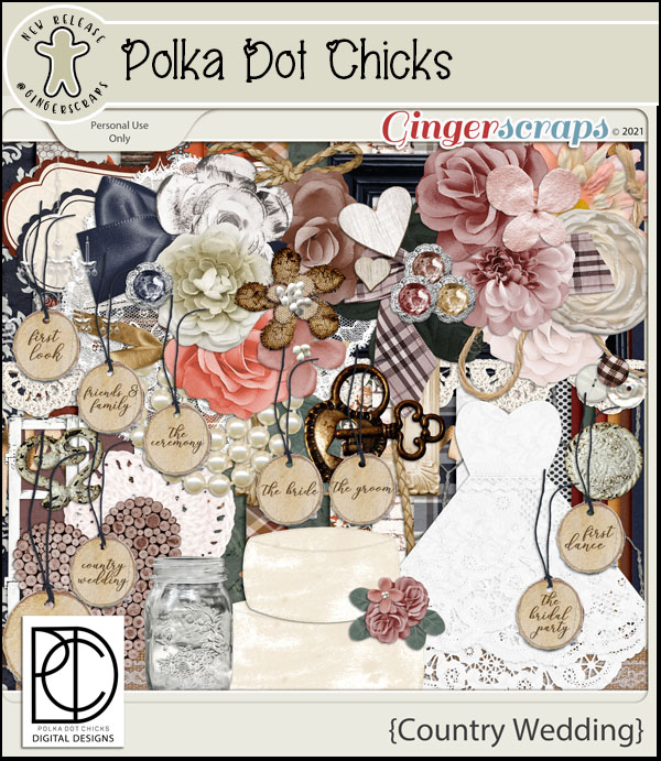
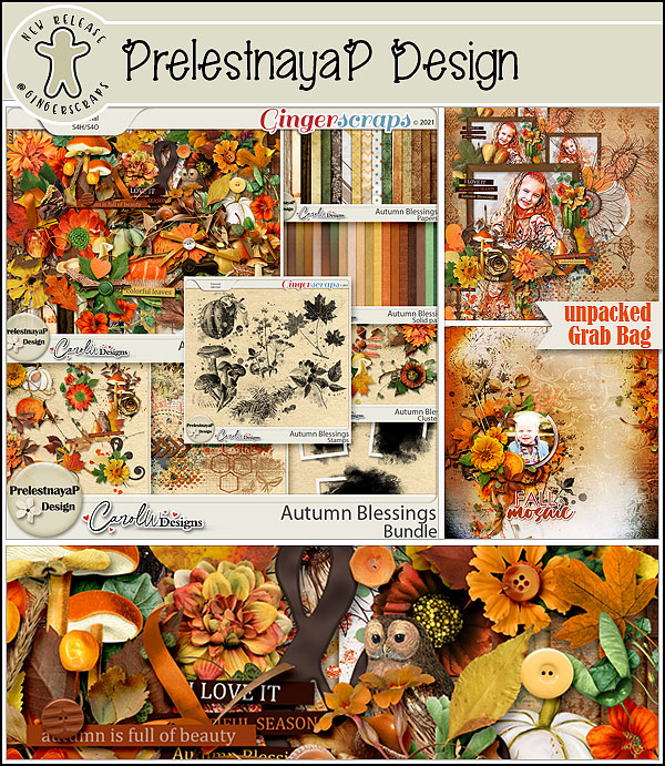
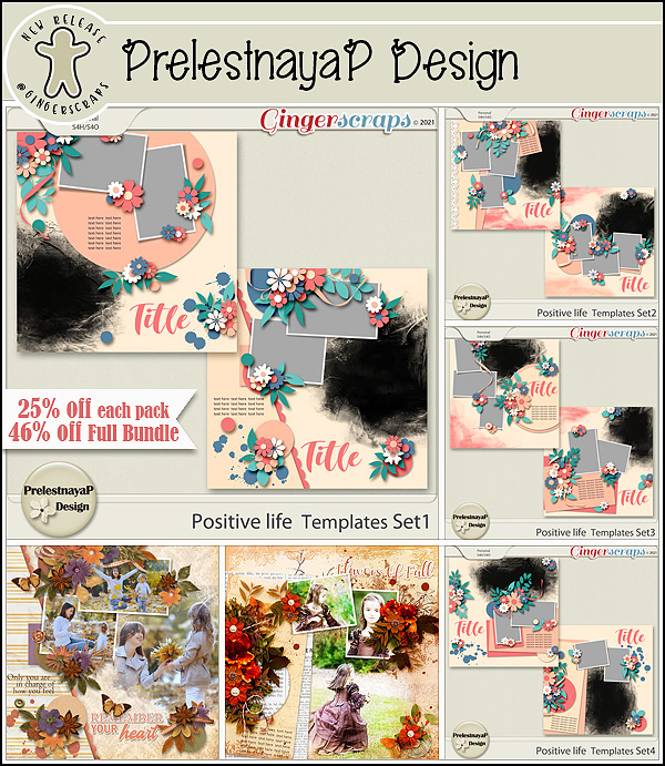
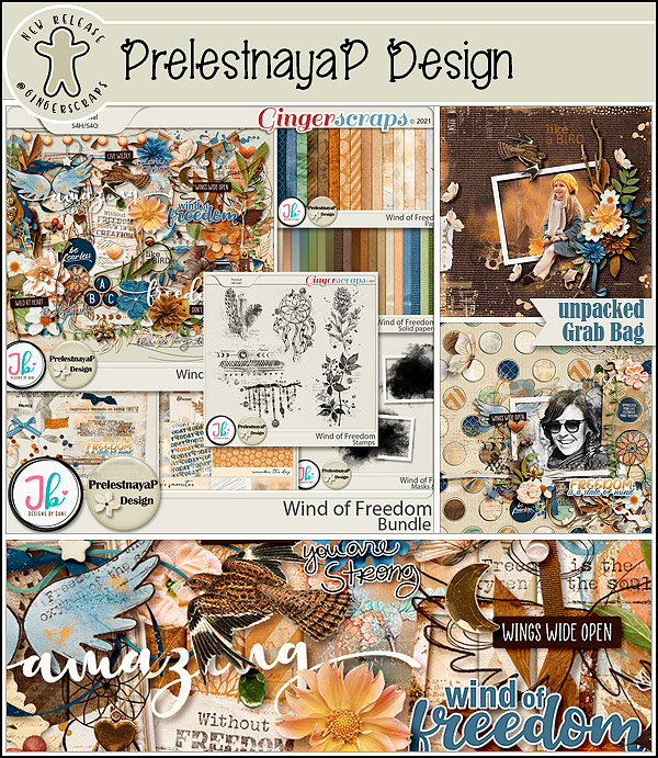
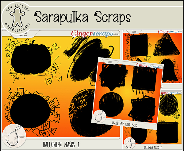
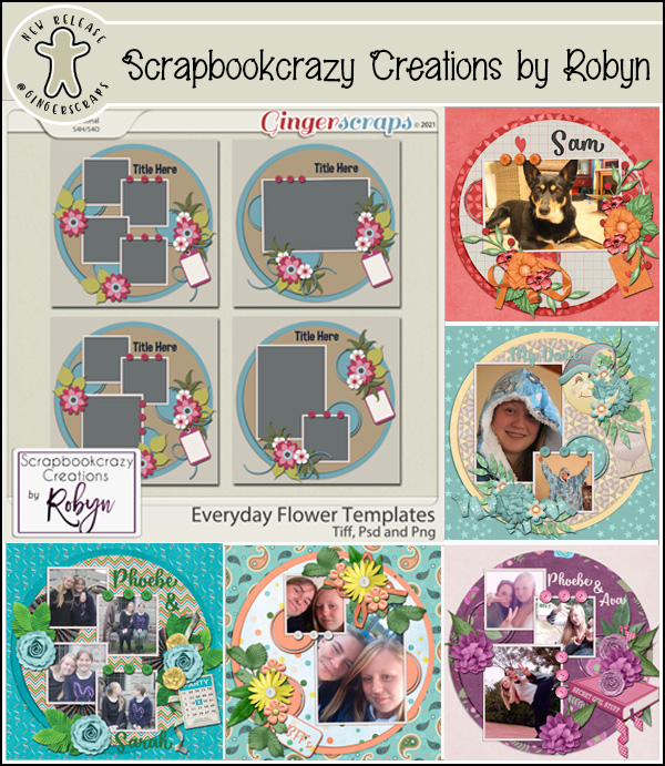
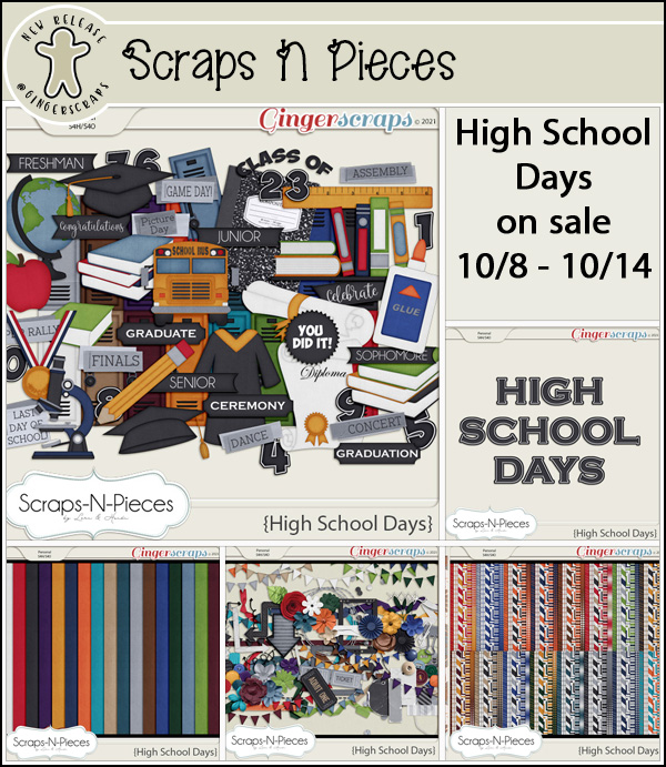
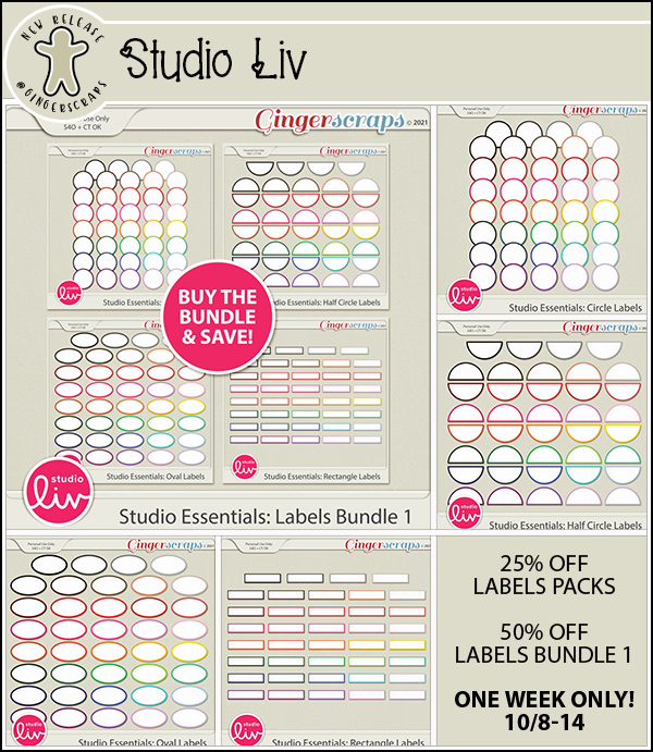
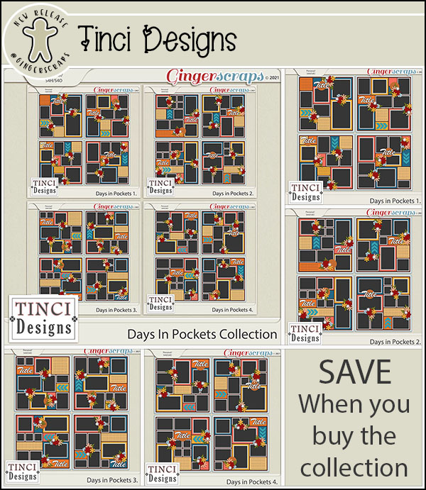
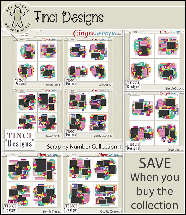
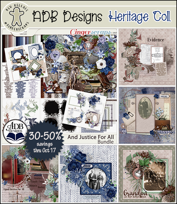
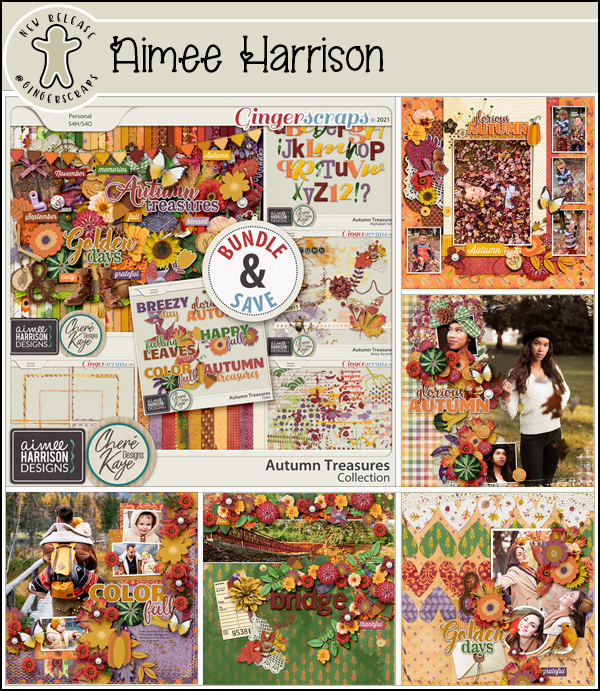
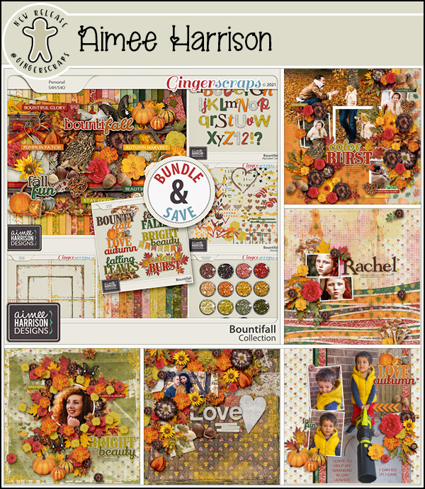
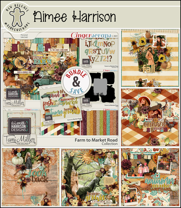
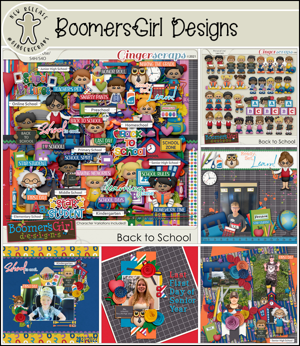
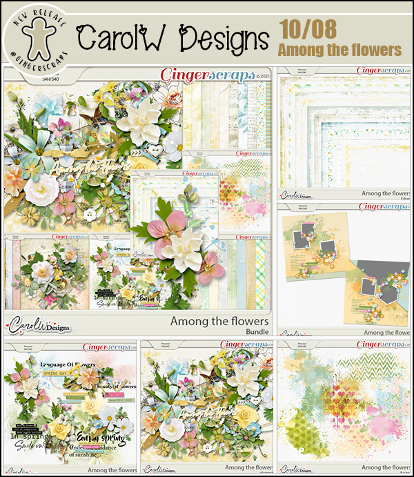
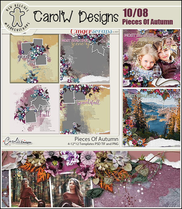
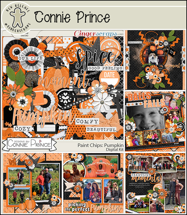
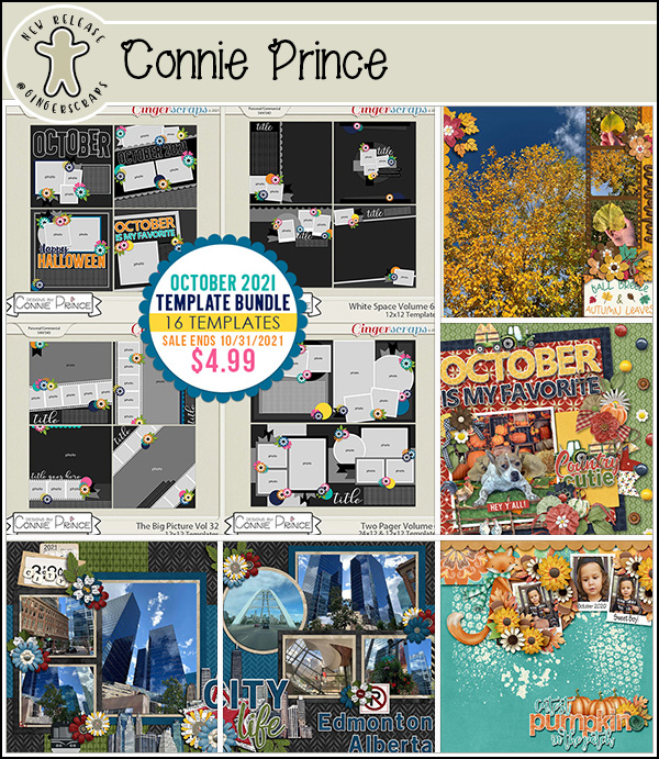
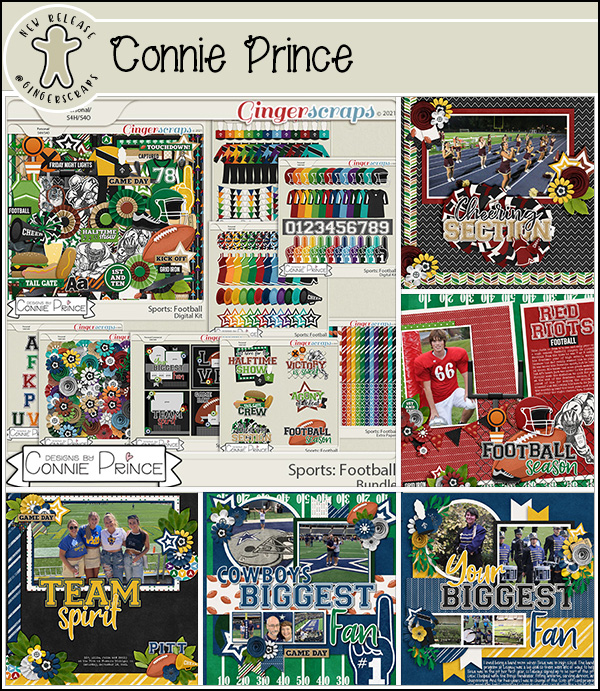
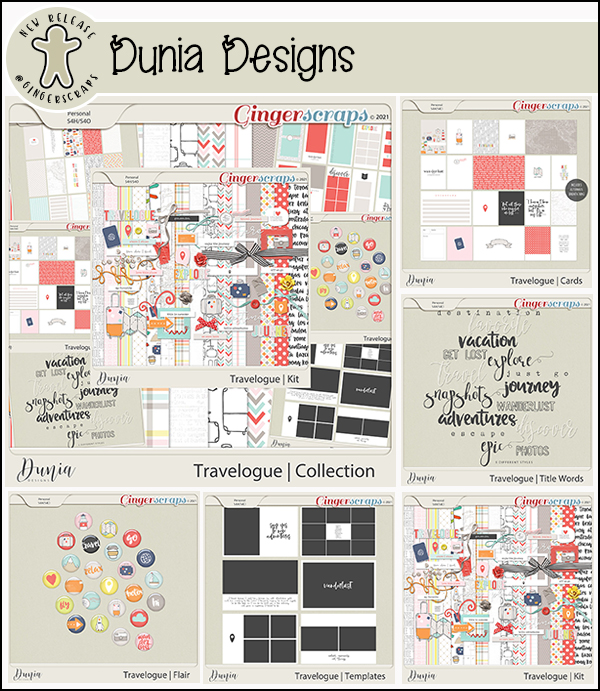
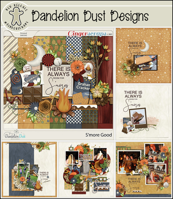
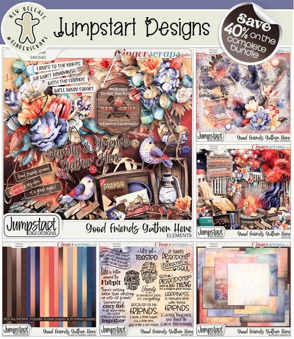
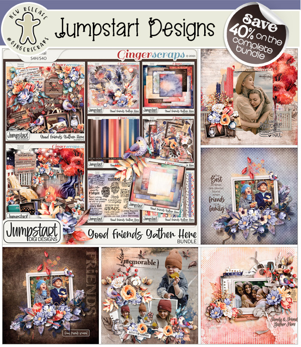
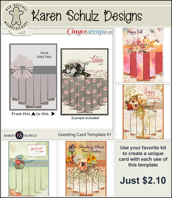
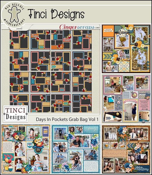
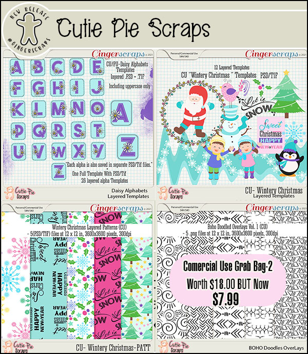
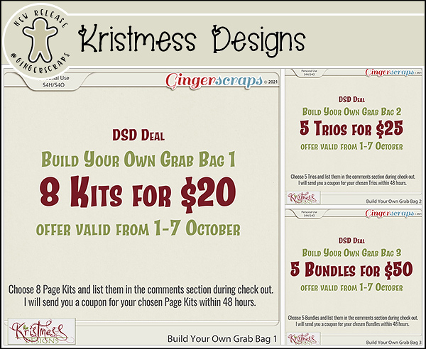
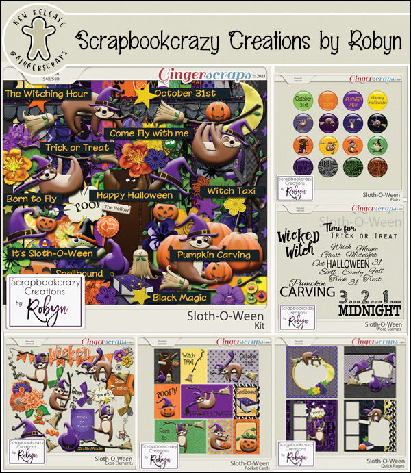
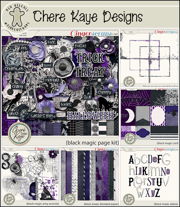
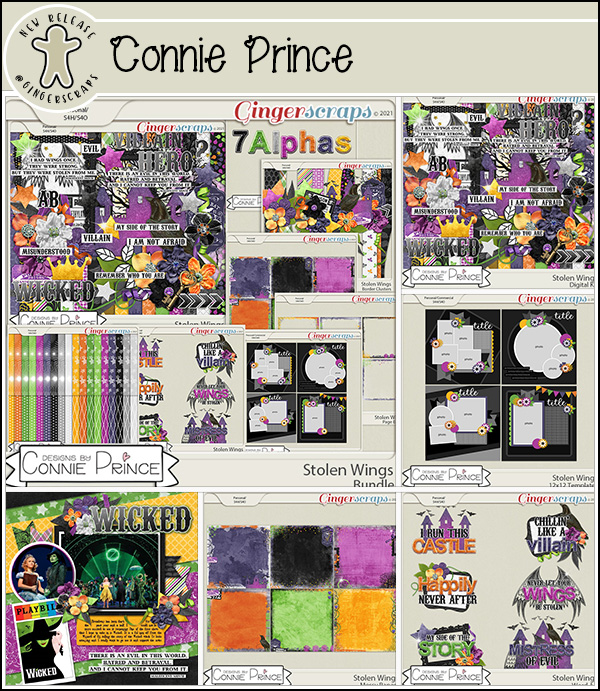
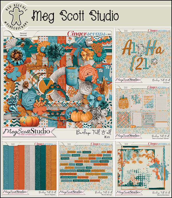
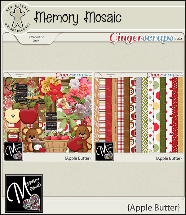
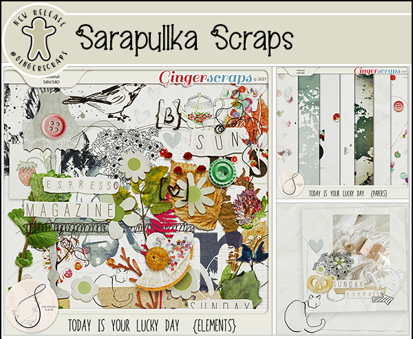
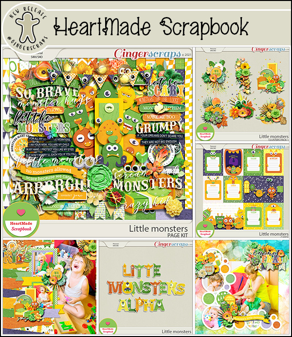
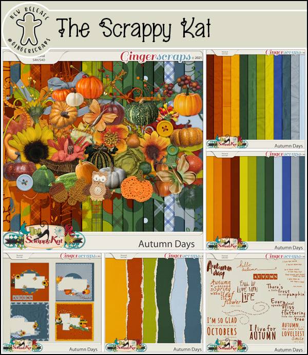
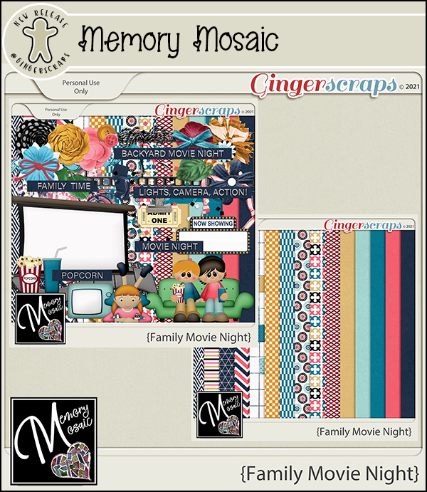
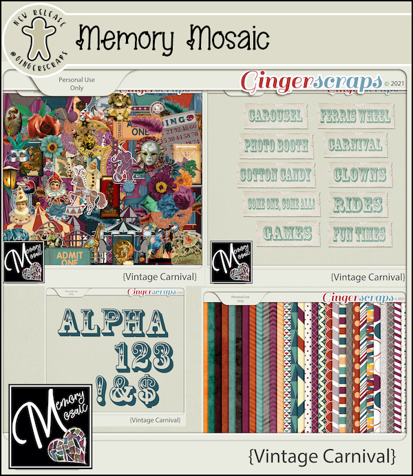
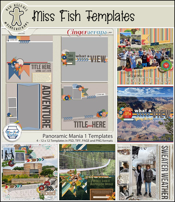
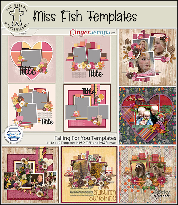
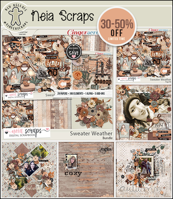
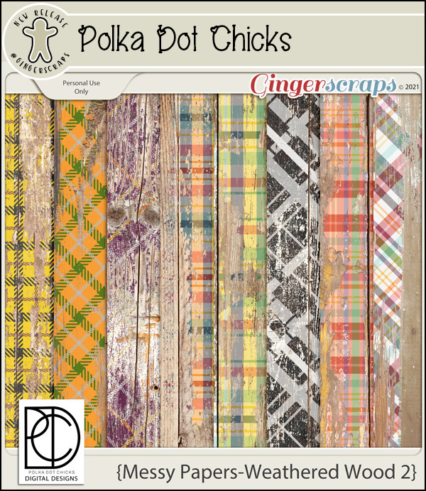
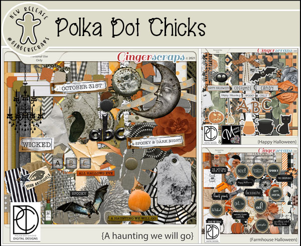
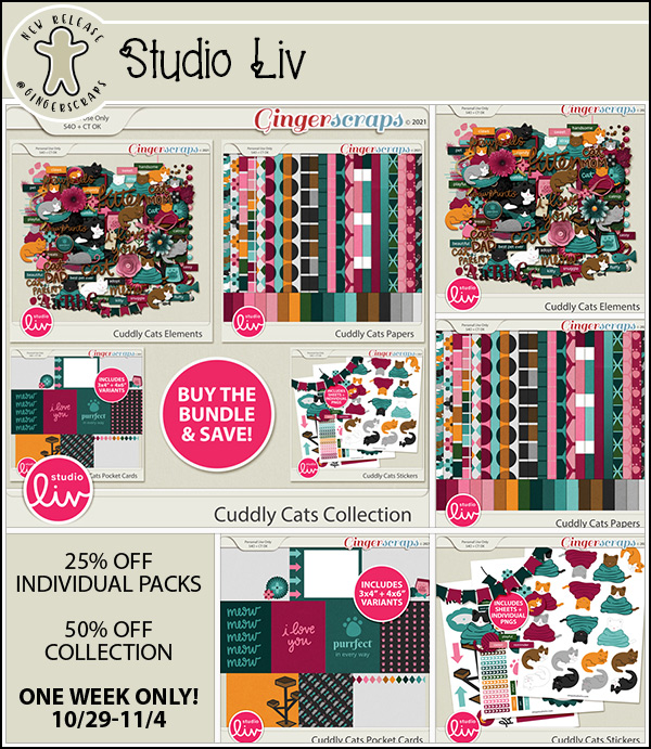
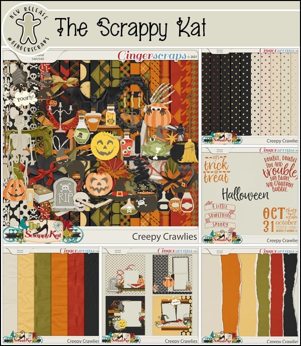
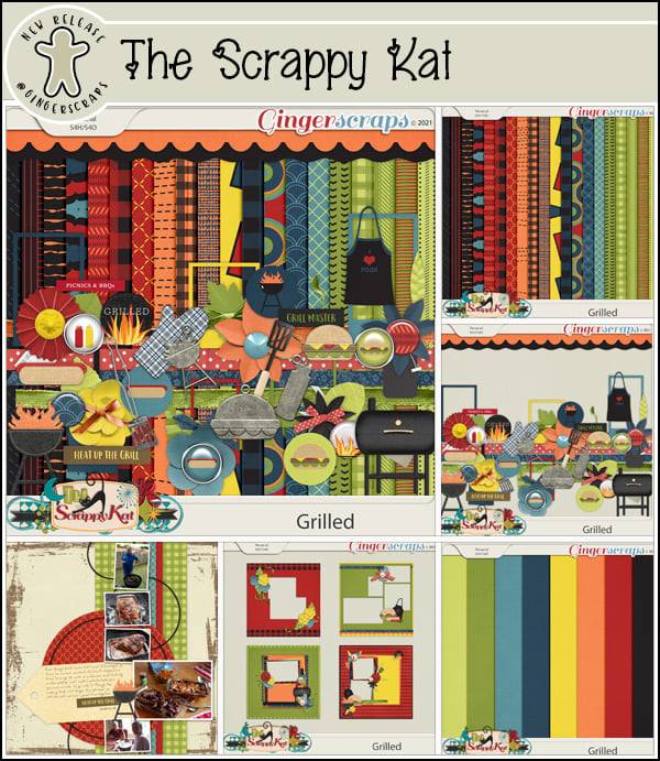
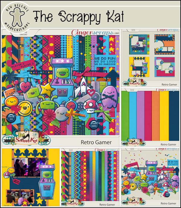
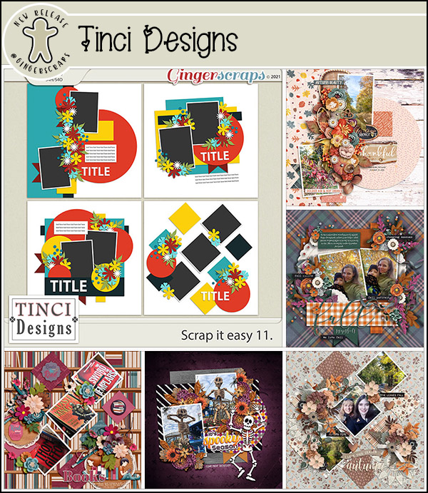
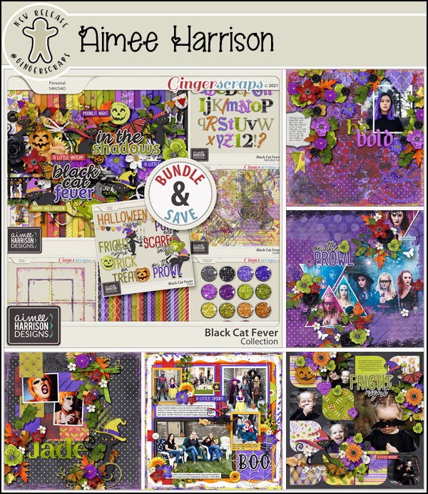
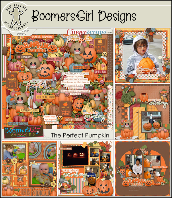
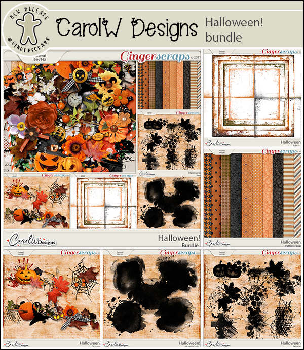
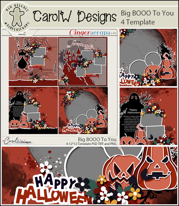
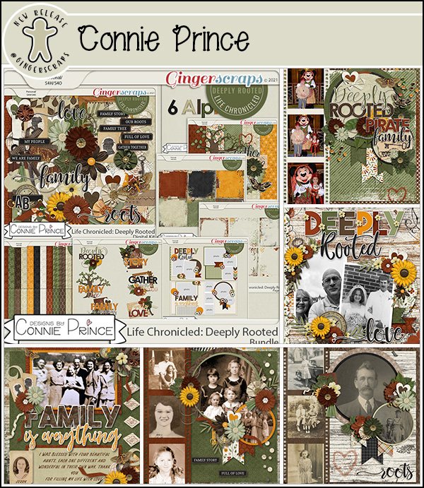
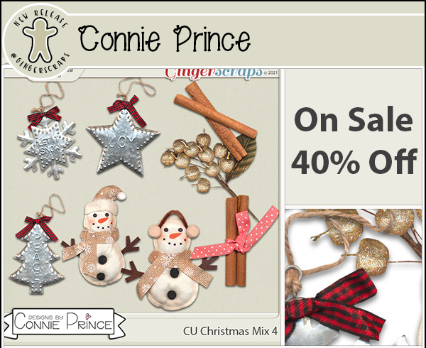
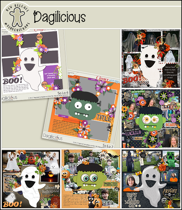
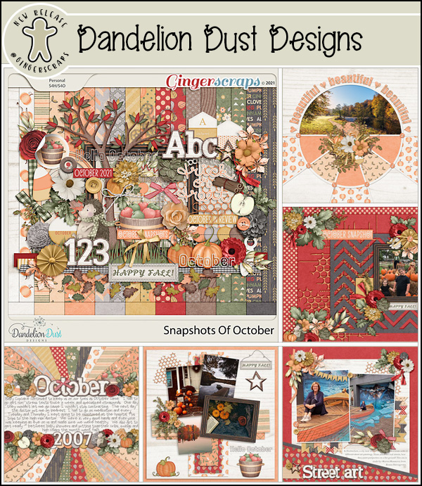
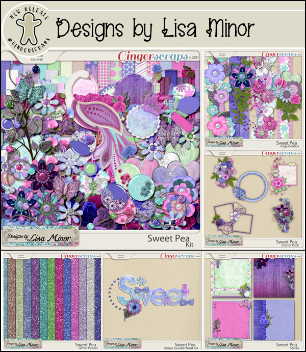
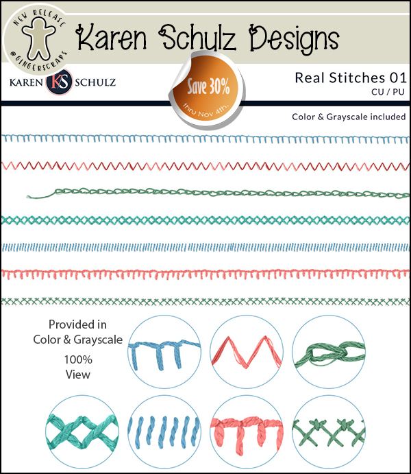
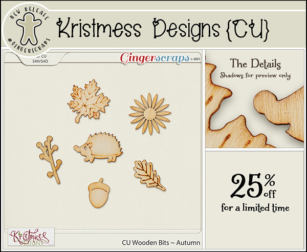
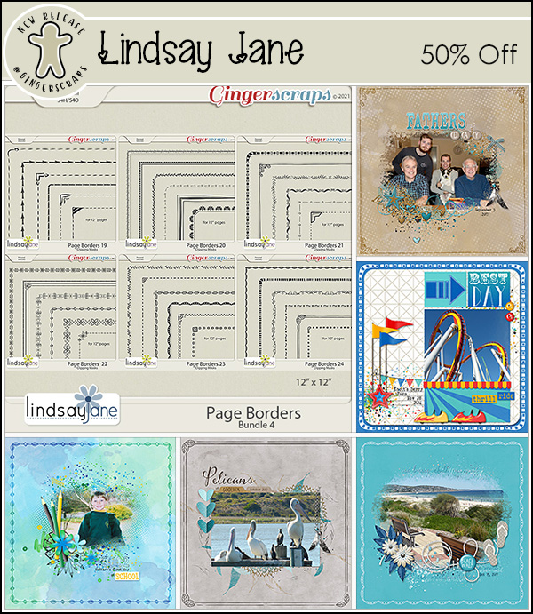
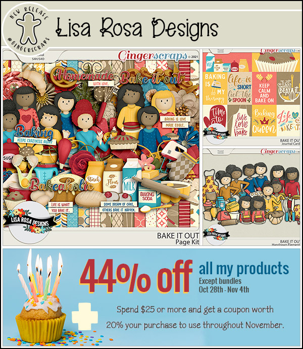
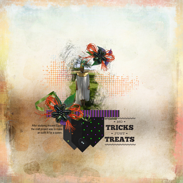
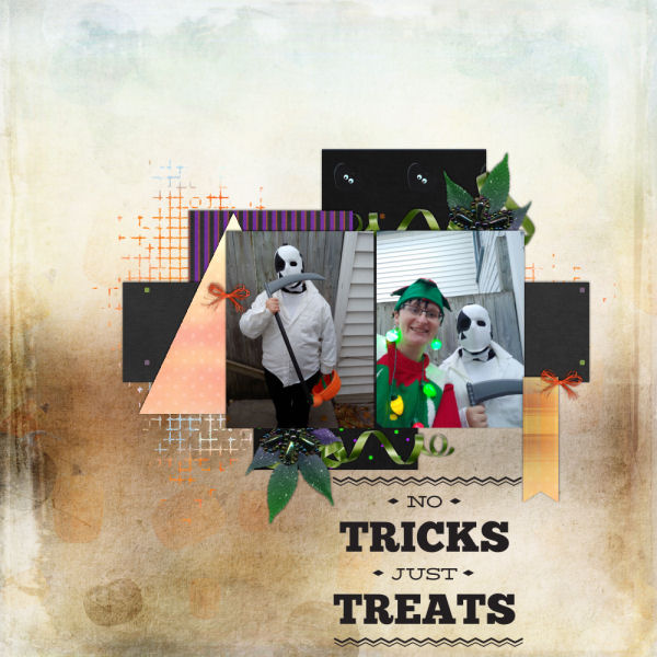
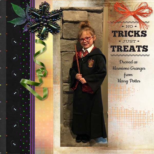
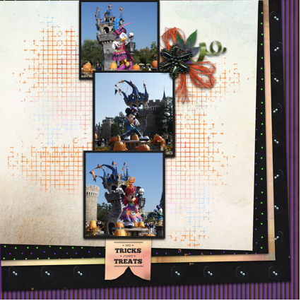
Let’s see what the designers have for us this week. I see fall and Halloween and other random topics.

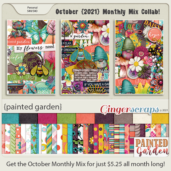
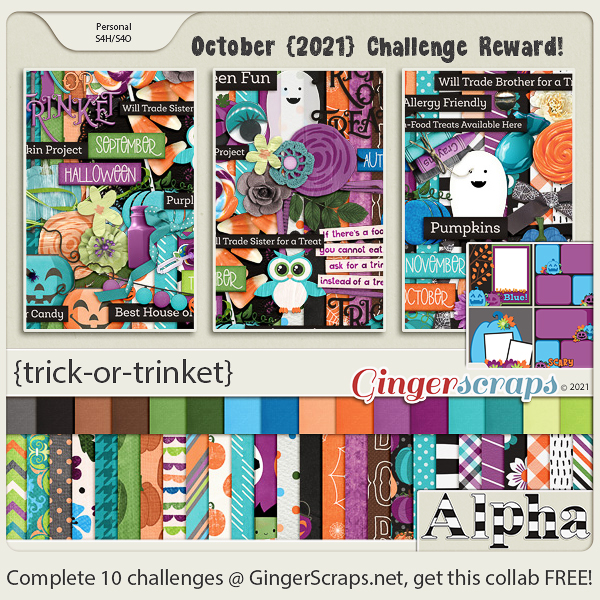
How are those challenges going? You still have a few days to get them completed. Any 10 completed challenges gets you this great collab as a reward.

Tutorial Tuesday (Individual Style)

Use It All! Challenge Spotlight

The response to my Jumpstart Your Layout Challenge post showcasing YOUR layouts and YOUR individual style was so good, I’m going to choose one Challenge each month and shine a Spotlight on it. It’ll be the last post of the month and I think it’ll be really a lot of fun! This month I’ve chosen another Challenge that includes a FREE mini-kit, the Use It All Challenge with Karen Schulz.

Each month Karen provides a mini kit – shown above – but for this Challenge, ALL the items in the mini MUST be included in your layout. Karen’s Challenge minis are add-ons to larger kits she has in her store, so if you like the mini you’ll LOVE the full collection! (Find Trick or Treat here!) [Pssst… Karen has a little surprise in the download, but I’m not going to include it in the upcoming layout showcase. Only those layouts using the 6 papers, 5 elements and 1 word art in the preview are shown.] Let’s have a look at how YOU have been inspired by this mini!!

In this layout, willow has given us a layout that isn’t about Hallowe’en. I had to really look to see how she blended the arty background paper with the much brighter orange-and-plaid paper, so skillfully was it done. Her beaded flower clusters frame her masked photo and the graffiti piece grounds it.

Sweetpea2020 has used a variety of paper shapes to mat her photos. The pops of orange draw the eye and the curly ribbon provides a frame for them.

Here, Flighty-188 has also blended the arty paper with the brighter orange-plaid paper but in reverse, and she’s given the graffiti the look of an actual piece of screen. Add in the raffia bow in the upper left corner of her photo and the cluster in the opposite corner, and she’s made great use of a visual triangle to create movement around the layout.

AlyciaIN‘s layout made me smile. Her little Hermione looks like she’s levitating! The basics of her layout are similar to Flighty-188‘s but with the paper borders’ straight edges, it looks quite different. Can you see a visual triangle here?

This simple layout isn’t as simple as it looks! khoskins has stacked the papers in a pleasing arrangement, and turned the graffiti into a pretty anchor for her photos. I like how she framed her photos with black paper to bring them into focus. She also created her own custom tag using the brighter orange paper and word art very creatively.

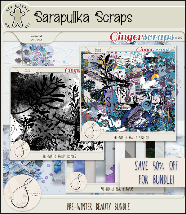
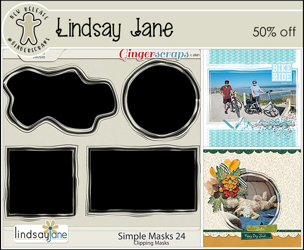
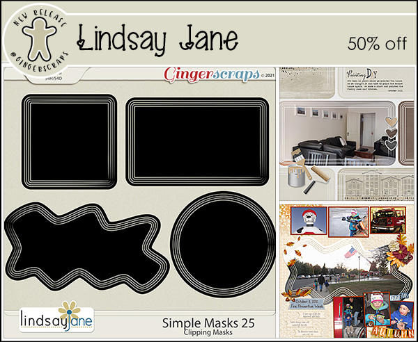
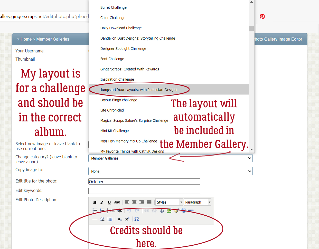
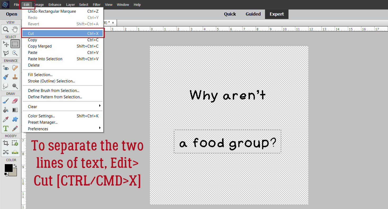
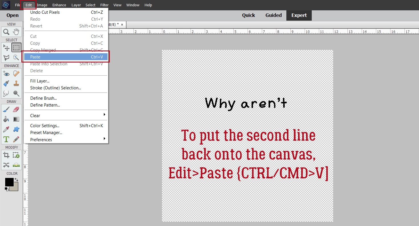
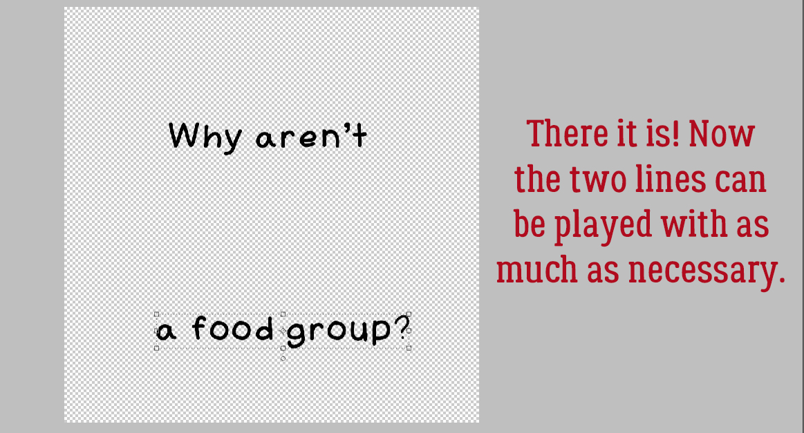
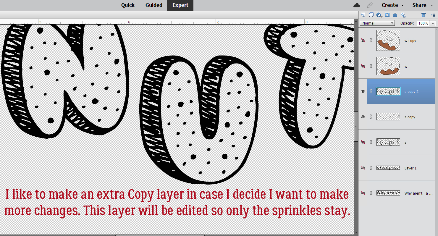
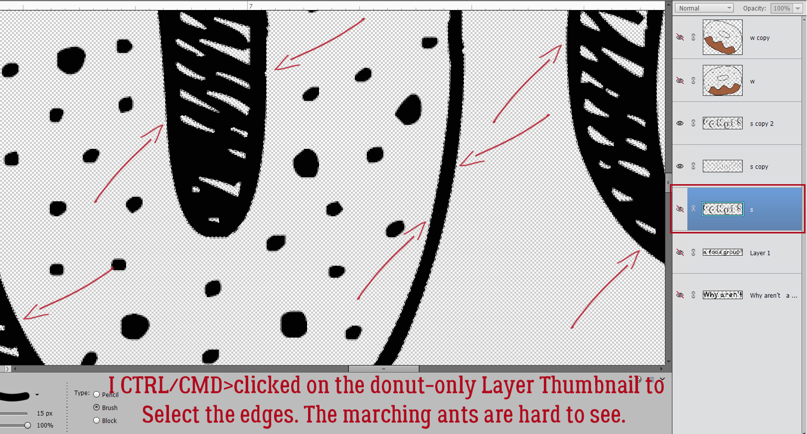
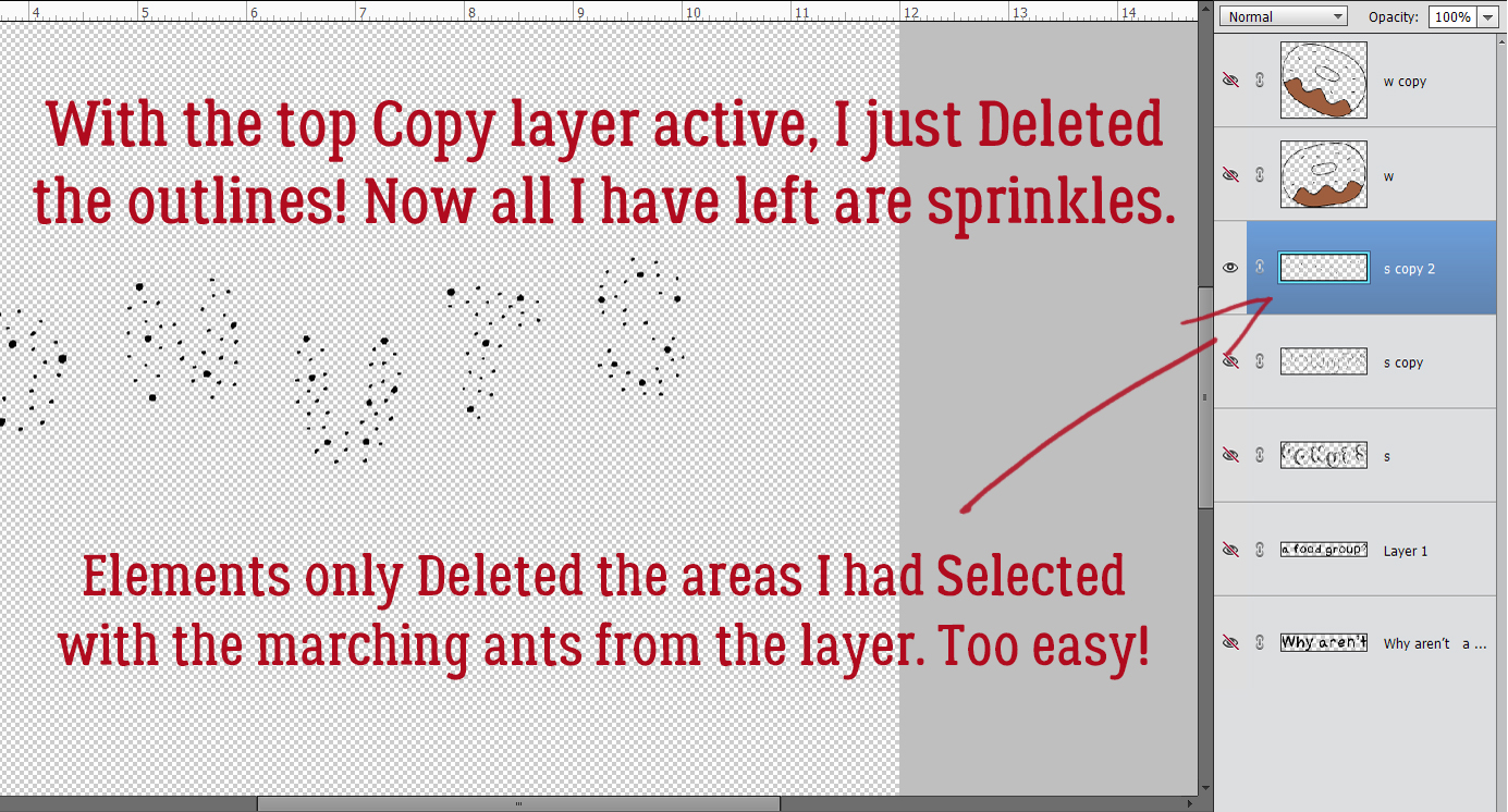
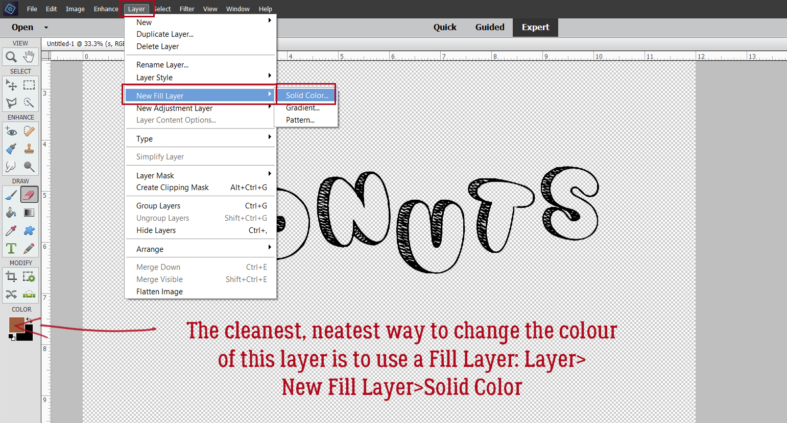
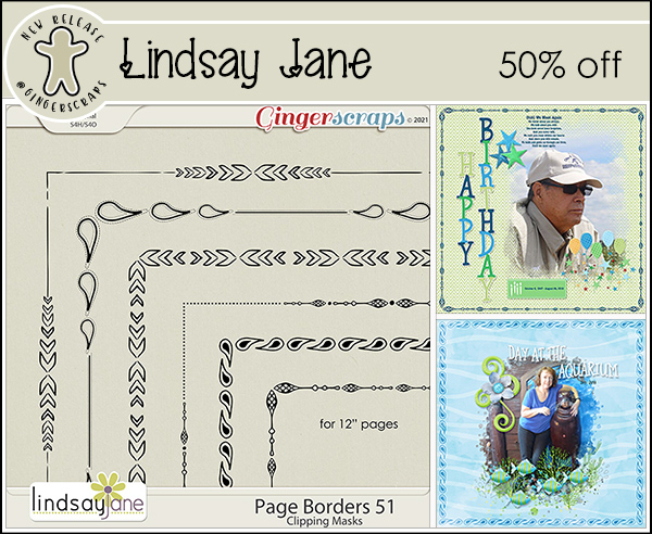
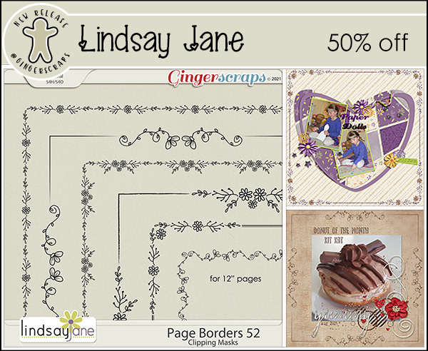
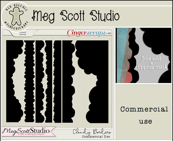
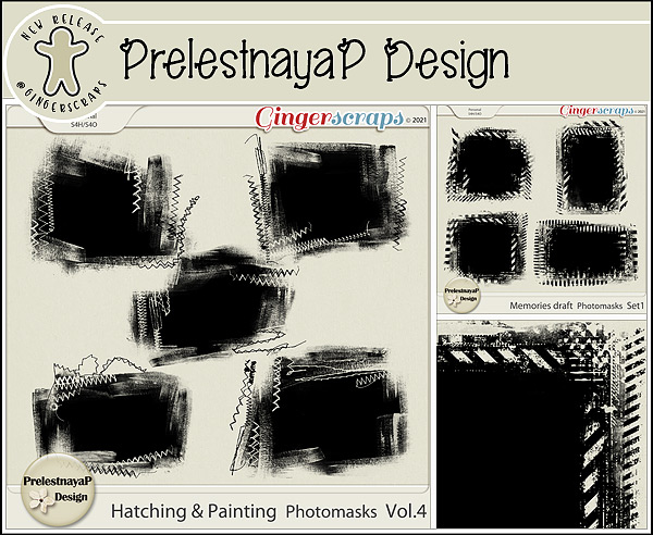
By clipping the lighter-coloured paper to a mask on a black background, KatL has cleverly drawn the eye right to that grinning Jack. Placing the beaded flower off-centre on the raffia bow adds interest to the cluster and tilting the word art is a nice, informal touch.


The way galaviktor has spread out the sheets of paper form a pattern that frames her photos nicely. Creating a brushed border for the word art, she’s pulled the colour variations from the arty paper into focus.

Isn’t Zelda just the cutest girl on four legs? For all its simplicity, NHSoxGirl‘s layout is very eye-catching, and the heart paper behind the word art has a lot to do with it.

The interlocking paper-strip squares AJRandom has created here both ground and highlight her photos. I like how she’s tucked the ribbon between the photos and then anchored them with the beaded flowers. I just noticed that she’s positioned the paper with all the eyes on it so that only one set of eyes is peeking at us. LOVE it!!

What can I say about greenfiend27‘s layout? It’s genius! Her paper borders are shadowed beautifully to give the appearance of papers overlying each other. Blending the graffiti into the paper behind it and using it to anchor her cluster shows her creativity. Having the ribbon dangle adds focus to her cat’s beautiful eyes and her clever alterations to the word art is just the right whimsical touch. A+!

Can you believe that October will be over the next time we meet? There’s snow on the mountains already but none here in the valley yet. It’s crazy how quickly time flies. Considering how awful this year has been for so many people, I’m thinking the sooner 2021 is in the rearview mirror, the better.

PDF Version : https://bit.ly/2ZZoWAO


Fresh Baked: October 22, 2021

Welcome to another Friday!! They just seem to come faster and faster don’t they? We are almost at the end of October and the fall temperatures have become more prevalent and we’re starting to see some of the leaves change colors. 

Don’t forget, any $10 spent in the store gets you this kit for free.

Let’s see what new items our fabulous designers have for us this week.

Have you picked up the October Monthly Mix? I love those little gnomes.

And remember. Any 10 completed challenges gets you this great kit as a reward!

Tutorial Tuesday (GingerScraps)

Giving Credit where Credit is Due

Or: Editing your Gallery images

Hi again ladies! Today I want to talk about something a bit more serious than usual. I’m going to do a Featured Challenge post next week, and have been perusing the Gallery to check out the layouts I want to include. I noticed that there are quite a few layouts that don’t include any credits; whether it’s an oversight or intentional, I don’t know. But I do know this. The Terms of Service at pretty much EVERY digiscrapping website that hosts a Gallery, and the Terms of Use included  by every designer in every kit include a requirement for providing proper credit to the designer(s) of the content the scrapper uses. I know that when I see a layout that’s exquisitely created, I’m going to look at credits to see which kit(s) the scrapper used so I can go shopping! If we think about it, giving credit to someone whose products inspire us and help us improve our skills should be automatic, as a courtesy if nothing else. And really, who wants to be accused of theft of intellectual property? Those who are new to our hobby may not realize they’re missing a step. And then there’s the well-known GingerScraps Gallery glitch that deletes some of the things we add to the first Upload screen that’s easy to overlook. (I think that might have been fixed, it hasn’t happened to me in a while.) But what can you do if your layout posts to the Gallery without that important information? Let me show you!

Here’s the layout I created for the Jumpstart Your Layout Challenge this month. At the bottom of the layout inside the red oval, the only detail that appears is the title I gave my layout. OOPS!

A quick word about titles… if you use a special character like a # or a @ or a ? for example, the Gallery uploader will lose everything you’ve typed AFTER the first of those characters. It’s going to mess up your Member Gallery but if you know ahead of time that will happen you can remember to follow these steps to fix it. Other things that may need to be changed in your layout’s details could be typos, omitted information, or an error on the layout itself that you’ve corrected already but the image you’re seeing is still the one with the mistake. When you click on My Photos and then choose the layout you need to fix, scroll down past the image until you see your avatar on the left, as shown. In that User Options box, click on Edit Photo.

When you upload a Challenge layout, if you want it to count for the Challenge Reward, it must be posted in the current month’s (and year’s!) Challenge Gallery. The website’s uploader default is to place uploaded images in the Member Gallery, which is fine, but not for being rewarded! (It’ll also sometimes default to the last Gallery you chose, or some other random Gallery, so check and see where it’s going!) This first change I’m making is to put my layout in the Jumpstart Your Layouts October 2021 album.

This next (optional) step is especially useful for people who create for designers on their Creative Teams. The layout can be Copied to other Galleries just by making a selection in the second dropdown. There’s also another advantage to using this Edit part of the uploader. If you put your layout into multiple albums when you first upload them, EACH of those copies will count as one of your 8 permitted daily uploads, but if you Copy them with the Edit feature, they only count once! Yeah, it’s an extra step and it’s a bit of a drag, but it’s a lot better than getting told you’ve already used up all your uploads for the day on only 2 or 3 layouts.

Okay, so let’s pretend you spotted a glaring typo in your title – maybe I spelled my title OTCBREO because I was tired, in a hurry and wanted to get my layout into the Gallery so I could go to bed. I get up this morning to several comments on my layout, all of them politely ignoring OTCBREO, but I’m still upset with myself that I didn’t notice it. So I open up my saved PSD version of my layout, fix my title, save it with a slightly different file name (more about that in a second) and now I want to post the corrected version instead of the trashed one. I can click on the Choose File button and select the corrected version to replace the other one. [If I didn’t Save my corrected layout with a slightly different file name, the uploader won’t know the image has been changed, and it’ll use the original one. So if you end up having to do this kind of big correction, add a number to the end of your file name and the uploader won’t be confused.] I can also fix the title if I notice it’s missing some special characters, or if in my addled, sleep-deprived state, I used the mis-spelled title here too. I also have the ability to add my credits here too, in the Photo Description section. Last, if I’ve changed my mind and don’t want to share my layout with the world after all, I can Delete it. It and everything I’ve typed about it will disappear forever. There’s no way to UNDO this step, so be really sure you can’t Edit it before you take this drastic step. When all the needed adjustments have been made, Submit changes.

Now everybody can see which kit and template I’ve used for my layout. The only time it’s not necessary to include credits is if you’re using Commercial Use products. Oh darn… I just realized I forgot one very important credit! Back to the Edit screen…

I neglected to give credit to my dear friend Sandy, the photographer who rescued Beau so that Beau could rescue her. She has graciously given me permission to use her photos for scrapping and deserves to be recognized for her talents too!

Now, which of this month’s Challenges should I Feature next week?

PDF Version : https://bit.ly/3xD8rqw

Fresh Baked, $1.00 Bake Sale & New Designer @ GingerScraps!

Hello Scrappers! We have a packed newsletter for you today! Our Weekly Fresh Baked goodies, The $1.00 Bake Sale is OPEN and we have a new designer! 

Remember when you spend $10 in the store, you get this great kit for free.

First up, lets look at this weeks New Releases!

I’m so excited to announce that Dagilicious has come out of retirement and opening up shop exclusively at GingerScraps! We are so happy to have her back!

Here is a little bio from Dagi: “My name is Dagmar aka Dagi and I am a mom to two wonderful boys and quite a few of pets too! I have discovered digital scrapbook back in 2008 when my first son was born and I got addicted. I’ve always had a thing for templates, so, since 2012 I have been creating my own. My goal is to make scrapping your memories a little bit easier and faster, because, as you know, there’s always a lot of photos and none can be left behind.”

The monthly $1.00 Bake Sale is OPEN!

Remember any 10 finished challenges gets you this great kit as a reward.

Tutorial Tuesday (Photoshop Elements)

Custom Word Art using Only Fonts!

Greetings and salutations! Yesterday was Thanksgiving in Canada, which isn’t quite the event our neighbours to the south have grown into, but I still spent part of the day in a food coma. Let me offer you a little tip – don’t wait too long to buy your turkeys. Demand here was significantly greater than supply; even Costco didn’t have any turkeys this weekend. If you see turkeys in your supermarket, grab one! But I digress…

As you may recall, at the end of my last tutorial (with the childish fonts and dingbats) I said I’d show you how to use fonts and dingbats to create your own word art. You might also recall my inspiration was my grand-daughter. The little girl who eats like a lumberjack… I’m using Cookie Dough, Amateur Comic Regular and MTF Sweet Dings Regular today. For more guidance on how to choose fonts that will look good together, I have a tutorial for you here.

When I’m creating things like this I always use a 12×12 canvas with a transparent background. I like the larger image so I can see better how it all works together and the extra room for tweaking. The end result can easily be resized later.

I’m going to start with Amateur Comic Regular. It doesn’t matter what colour I use, because I’m going to change it later. But I do want it centered and I want both Asian Text and Anti-aliasing on. The Asian Text control helps with kerning – spacing between individual characters. In later versions there is a kerning control, labeled Spacing but it doesn’t work quite as well as actual kerning. The Anti-aliasing control gives your fonts smooth, clean edges; it just diminishes the jaggedy pixels you’d see with larger text.

When using fonts the resulting layers need to be Simplified before you can manipulate them, so that any changes to that layer only affect that layer. If I typed out this text but didn’t Simplify the layer, then changed the font (as I’ll be doing in a minute) this layer would change to that font too. So always remember to spell-check. grammar-check then Simplify by right-clicking on the layer in the Layers Panel and choosing Simplify Layer from the dropdown menu.

I may need to make some further placement adjustments to this text, so I opted to break up the layer into two chunks of text. With the Rectangular Marquee tool, I outlined the second line.

Next, I Cut that line away from the first line: Edit>Cut [keyboard shortcut: CTRL/CMD>X]

And then without any further ado, I Pasted it back onto the canvas: Edit>Paste [CTRL/CMD>V]

Now I can move each line around, resize and reposition as needed.

I changed my font to Cookie Dough. For this word, I’m going to put each letter on its own layer for now. (If you don’t intend to make many changes to the text, you won’t need to do these steps.) So I typed a D, Committed the Operation and then carried on. You can toggle between the Move Tool and the Text Tool by clicking [V] for Move, [T] for Text.

I wanted the letters to be a little off-kilter and shifted them around until I was happy with their positions.

At this point, I’m planning to turn the letters into donuts so I’ll need to Simplify each layer. Because I was only rotating the letters before, I could wait until everybody was where I wanted them then I could Simplify in one step instead of 6. I Activated all 6 layers by clicking on the top letter layer, holding down the SHIFT key and clicking on the bottom letter layer. Then I right-clicked and chose Simplify Layer. Boom!

The layers can now be Merged into a single layer.

I added a MTF Sweet Dings Regular donut. Dingbats are drawings that correspond to the alphabet. The donut’s the letter W.

And of course, I Simplified the layer…

… made a Copy layer: right-click>Duplicate Layer>OK [CTRL/CMD>J] and used the Paint Bucket tool [K] to Fill the bare donut part with a golden brown colour. More about that step in a bit. I made some Copies of the DONUTS layer [CTRL/CMD>J] so I can separate out certain elements of the text for enhancement. I added a Layer Mask – click on the icon at the top of the Layers panel that looks like a blue square with a white circle in the centre – to the bottom DONUTS layer so I can remove parts of the image without actually deleting the pixels. This is the best way to remove parts of an image because if there’s an OOPS!, the accidentally-erased part can be painted back in. Remember, black conceals, white reveals – THE BACKGROUND. Using the Eraser tool and with white in the foreground I removed all the sprinkles. To paint back an OOPS, toggle to black in the foreground [X] and fix it.

To make the Layer Mask part of the layer just Simplify Layer. Right-click in between the mask and the image thumbnail.

Next, I just want an outline of the frosted area of each letter. With a Layer Mask, I removed the sprinkles and the cakey parts. It doesn’t have to be perfect because the other layers will conceal any wobbles.

I like to make more Copy layers than I think I’m going to need, which usually is a good idea. Here I’m going to just leave the sprinkles, but I’ve already done the hard work.


I CTRL/CMD>clicked on the layer thumbnail (the tiny image of what’s on each layer at the far left of the layer in the Layers panel) for the first DONUTS layer with no sprinkles. That Selected the edges of that layer. See the marching ants?

Then with the topmost Copy layer active, I just Deleted what I Selected. [CTRL/CMD>D or just hit Delete] and voilà! All that’s left are the sprinkles.

Now to get some colour into the picture. With the first of our DONUTS layer active, I’m going to add a Fill Layer. The reason for this is that the results are much cleaner than if I used the Paint Bucket. Layer>New Fill Layer>Solid Color.

Tick that Use Previous Layer to Create a Clipping Mask box and let Elements do the work.

The Color Picker opens and I chose a nice golden brown.


The Fill Layer and the layer it’s clipped to need to be Merged, so click>SHIFT>click on the two layers, right-click and choose Merge Layers [CTRL/CMD>E]

The frosting layer will be Filled with white using the Paint Bucket tool [K].

Make sure you’re not going to leak!

I also used a Fill Layer to make the sprinkles layer pink. I won’t show screenshots of those steps because that’s unnecessarily repetitive! But I will show you screenshots of the Fill Layer for the Amateur Comic text. I want it to be pink too.

I decided the pink text lacked a bit of presence so I’ve chosen to add a white Stroke to the outside. Edit>Stroke (Outline) Selection.

8 pixels makes a nice stroke for titles. I’ll position it to the Outside so it doesn’t hide any of the pink.

I think it looks good now.

I went on to use the Paint Bucket to frost the dingbat donuts, change some of the sprinkles to purple and position the layers so they look right. Then I Merged all the layers. To have my word art (and work!) saved for later, I’m going to Save As> [CTRL/CMD>SHIFT>S].

I have a Jan’s Elements folder on my laptop, so that’s where I’ll put it. I named the file Donuts Word Art and will save it as a PNG so the background stays transparent.

Smallest/Slow Compression and No Interlace will preserve the word art for me in the cleanest and neatest format so I can use it as the title for my layout.

I’ve been told there are a LOT of new members of the GingerScraps family, so I’m going to do a few basic tutorials in the coming weeks to help them feel more comfortable here. Stay tuned!

PDF Version: https://bit.ly/3FNtvOy

Fresh Baked: October 8, 2021

Did you all have fun during the DSD party? There was so much to do. Did you find some great bargains?

Remember when you spend $10 in the store, you get this great kit for free.

The designers have been busy. There are a lot of new things in the store this week.

POLKA DOT CHICKS

MEMORY MOSAIC

AIMEE HARRISON DESIGNS

CHERE KAY DESIGNS

AIMEE HARRISON DESIGNS

TAMI MILLER DESIGNS

Have you gotten a jump on those challenges with the new goodies from DSD? Remember any 10 finished challenges gets you this great kit as a reward.

Tutorial Tuesday (Fonts)

Fun Fonts for Layouts about Kids

It’s been a while since I did a post about fonts. I didn’t really think there were that many more “types” of fonts to explore but Ellen (gmae) pointed out to me that there are categories I’ve overlooked. I have to tell you about this because it blew my mind totally. Ellen has created a spreadsheet of ALL the tutorials I’ve posted here – all 240-some – and made it sortable by a bunch of different terms. The amount of work she put in just boggles my mind! An unintended result of all her work is that she’s made some very important suggestions about where I could take you all next. One of those suggestions was to explore some fonts specifically suited to layouts about children. So I spent some time at dafont.com, looking at hundreds of fonts and selected this baker’s dozen along with five sets of dingbats I think you’ll like. (And while I was there, I came up with some new categories to share later!) Okay so let’s get a look at what I like. PS… each font name is linked to the website for one-click access. And they’re all FREE!

First up is Cookie Dough. What kid doesn’t love cookies (other than my second daughter)? This would be a great choice for a title or for some custom word art.

Eye Monsta made me think of my two grandsons right away, especially A-boy. J-man is more cerebral and a bit less inclined toward monster-like behaviour. It’s another title-suitable font but is legible enough that it could be used for both subtitles and journaling too.

I like how solid Childhood is. It looks like it’s been filled in by a child and has a bit of grubby awesomeness too. Multi-use fonts are worth the download.

Space Out comes in two different styles. It’s another good title/word art font, don’t you think?

This font, Crayon Kids, looks like an older child was the writer. It can be fun for journaling and subtitles. It would also be a good choice for word art, when combined by a more fancy font.

I LOVE Calvin and Hobbes!! Did you see the cross-over to Bloom County? An adult Calvin (click to view) is tracked down by Opus and it’s perfect!

This cute font would make a good title, but is also legible enough for journaling. Helloo Kidos will be joining my collection.

Tiny Friends is like Eye Monsta… very child-oriented and fun. And it has so much potential for creative alterations!

I think Childhood Memories looks like it was hand=printed by an older child/teen. Great choice for journaling.

I like Amateur Comic for journaling too. It’s a bit less organized than Childhood Memories, but still easily read.

Another good font for journaling and subtitles is Gilles’ Comic Handwriting. It’s a nice blend of careful and a bit rushed.

Who doesn’t adore Lego? Toys comes with four different versions and has a lot of potential.

I think the name of this last font is totally appropriate. It’s Kindergarten!

Now I’ve got some dingbat collections for you. What are dingbats? They’re accessed as fonts, but instead of letters, each character is a drawing. They’re really a lot of fun and have a multitude of possibilities. The first set is called Seaside Things. The drawings are child-like, but not necessarily childish.

When my own kids were small, they all loved the Mr Men books. We had a box full of them and when I saw this set of dingbats, I was transported back to bedtime stories.

We can’t leave the girls out. Little Miss is a companion set to the Mr Men books and the dingbats too!

DT Rachel’s Toys is a bit more of a detailed set. I think there are a lot of ways these can be used.

And our last dingbat collection is MTF Sweet Dings. They’re all so cute!!

I’ve barely scratched the surface of the incredible choices you can find at dafont.com. There are other sources for free fonts too, if you’re interested. Next week I’m going to use two of the fonts and one of the dingbats to show you how to create your own word art. See if you can guess which ones. [Hint: I’m going to use it as a title for a layout featuring my granddaughter.] See you soon!

PDF Tutorial: https://bit.ly/3iBte7w

Designer Spotlight October 2021

Have You Met Christie (Scrappin’ Serenity)?

I’d like to introduce you all to Christie Dawn, whose wonderful designs are sold at GingerScraps under the Scrappin’ Serenity banner. We had a nice chat so I could know what to tell you about her. Here’s a transcript of our chat for your perusal.

J: Christie! So nice to see you! Let’s get comfy and get to know each other. First, tell me, how long have you been designing?

C: I started dabbling in 2009 and opened my first store in 2010! Wow…hard to believe it’s been 11 years!

J: Hey, that’s about the same time I started learning about digital scrapbooking. When I look at those first layouts, I cringe. I know why I wanted to start digiscrapping – saving money, not having to clean up, and being able to use kits over and over and over. What made you decide to design?

C: I was a stay at home mom, and I just needed an outlet.  I loved Scrapbooking, so I figured I might as well try it.

J: I didn’t actually start paper scrapping until 2005, long after my kiddos were grown up. When they were little I did things like counted cross-stitch and crochet. If digiscrapping would have been a thing then, I’d have been all over it! What do you use to create your designs?

C: I mostly design in Photoshop Elements 13, I should probably upgrade, but it still works, so why change!?

J: No kidding! If it ain’t broke… I do all of my digital stuff on a Dell laptop, sitting in a wing chair in my living room. Would you mind describing your design workplace?

C: Most of the time I work at home, downstairs, on my desktop.  But I do have a laptop I bring when we go camping and have worked from the RV many times.

J: My “other” creative space is a work-in-progress; I have so many boxes I haven’t even opened after our move… 17 months ago. Organizing it all is a big job! But back to you. Which of your current kits in the GS shop is your favourite? What makes it so?

C: Currently my Favorite Kit is – Gamer Girl.  We are big time gamers in my family!

J: My husband is a big gamer too. I’m not. Words with Friends is enough for me! Do you sing, or dance in the shower? I’ve been known to dance in mine a time or two…

C: Definitely Sing!  If I were to dance in the shower it would probably lead to a visit to the ER. lol.

J: I can relate – it didn’t end up in the ER but I discovered the shower base needed some no-skid strips that way. Here’s another odd-ball question: If time travel was possible, would you go back in time or ahead? Why?

C: I would go back in time and spend more time with my Granma.  Miss that lady so much!

J: I’d love to spend a few hours with my mom’s paternal grandmother. Maybe then I’d know more about her than just her name… Do you have a favourite colour? Are there any colours you really DON’T like?

C: Purple, Pink, Teal or Black are my favorite colors.  I tend to dislike oranges, yellows, and reds.

J: We’re kindred spirits! What would your dream car be?

C: A 1967 Mustang! We actually found one on FB market place and bought it about a year ago…but it still needs a lot of work!

J: How awesome is that?! Will you paint it purple? You don’t have to answer that. Last nosy question. If you could only eat one meal for the rest of your life, what would it be?

C: Love me some Sushi!!

J: You can have ALL of mine. Thanks for letting us peek into your world. Now I should spend some time outside before it gets too cold. Enjoy your month in the Spotlight!

Faithful readers, Christie is hosting the Designer Spotlight Challenge this month and is providing all of us with her Daily Download kit. And… she has this little gift for everybody. Check it out!!

Well. 2021 is 3/4 over already! I know most of us will be happy to have this year in the rear view mirror. See you again soon!


Fresh Baked: OCT 1, 2021, DSD, NEW Guests, NEW Free With Purchase, Monthly Mix, and More

Welcome to October! I thought we had a lot going on last month. This may set the record for biggest post we’ve done. When you have the Buffet, Fresh Baked and DSD all on one day, it’s bound to be a big deal.

First a peek at the fun going on in the forum and the store for DSD. There are a so many things happening. And these colors. I so love these for fall.

The designers have outdone themselves for DSD.

Don’t forget to check out the Buffet Bundles. One easy click to add bundles of Buffet goodies to your cart.

Look at these colors. With it being October, there are a lot of Halloween kits in this Buffet grouping.

We also have new Fresh Baked Items.

POLKA DOT CHICKS

MEMORY MOSAIC

Remember any $10 spent in the store gets you this great collab. Are you ready for some {autumn dew}?

This new Monthly Mix kit is just so cute. I love the little gnomes.

Now to the Octoberr Daily Download Sneak Peek. This month’s Daily Download is from Scrappin Serenity.

https://gingerscraps.net/gsblog/2021/10/dd-oct-1-3/

We have TWO Guest Designers for October!

Dunia Designs

Bio:

Hi girls! My name is Dunia. I’m originally from Brazil but living for the past 5 years in Michigan. I live with my DH my three kids and my dog Chewie. I’m addicted to coca-cola, chocolate, books and binge-watching series
I’m a designer for over 7 years and I love to create fun, colorful and useful stuff for you to keep your memories alive. And I’m so excited to be a guest at Ginger Scraps this month!

The Scrappy Kat

Bio:

Hello, my name is Katina Curten, but I’m also known as The Scrappy Kat. I have been a digital scrapbooking designer since May of 2009. You may remember me from my 2 previous stores, Stuff to Scrap and Scraps N Pieces. Once those stores closed, I took a 5 year hiatus to raise my son. Now that he is a teenager and I have more time on my hands, I am back to designing. Digital scrapbooking is one of my true loves and I’m so glad to be back at it and to being a part of the wonderful digiscrap community that I missed so much once again.

Take a look at the new challenge reward kit. If you complete any 10 challenges this month, you get this gorgeous collab as a reward!