Archives for February 2023

Tutorial Tuesday (Photoshop Elements)

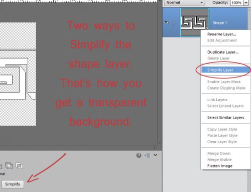
Quick Trick: Content-Aware Fill

PDF Version : https://bit.ly/3SLuyWj

We all have those photos that just don’t… quite… make us happy… but the memory is important. I have a lot of photos from my two visits to Ireland where the subject is ancient and meaningful, but the trappings of modern life just intrude. Cars, signs. poles, wires, you know what I mean. If they’re in the photo it’s because I couldn’t get the image without including them. Here’s how I make them disappear.

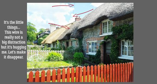
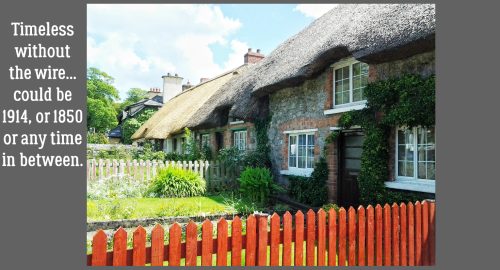
Okay, so the wire in this photo isn’t really that bad. But it bothers me enough that I’m going to eliminate it. These thatched cottages in Adare, County Kerry, have been there for at least a couple hundred years, long before electricity and cable TV. In the past, I would have used a combination of Spot Healing and Clone Stamping to hide it, but not any more!

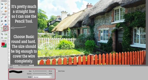
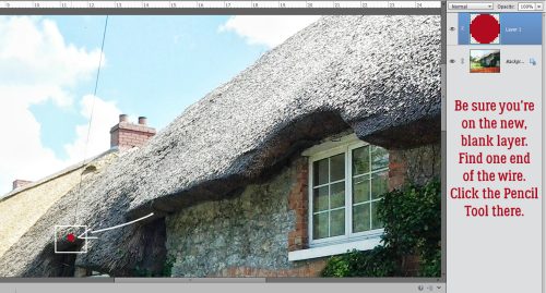
First, I’m going to make a mask for it using the Pencil Tool. Since it’s essentially a straight line, that’ll work well. I chose a hard, round brush a bit wider than the wire.

This mask needs to go on a new blank layer so that its’ edges can be Selected in the next step. So I plopped down a new layer.

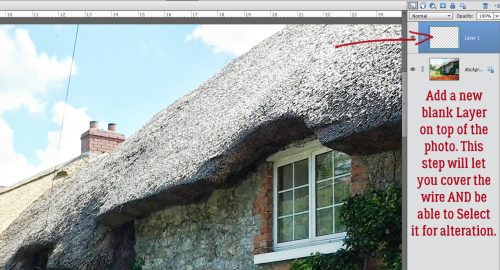
Next, I put the tip of my pencil down at one end of the visible wire and clicked.

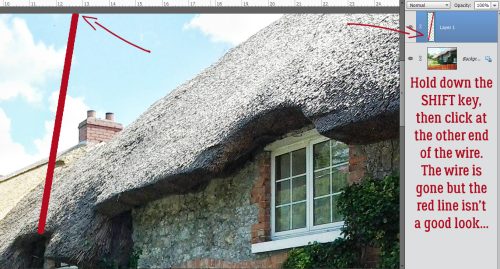
Then, holding down the SHIFT key, I put the tip of the pencil down at the other end and clicked again.

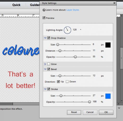
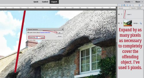
By clicking on the mask/red line Layer Thumbnail (the little image that shows what’s on the layer), I’ve told Elements I want the edges of the line Selected. That turns on the marching ants. Then I clicked Select>Modify>Expand so I can be positive I’ve gotten ALL of the stuff I want gone covered.

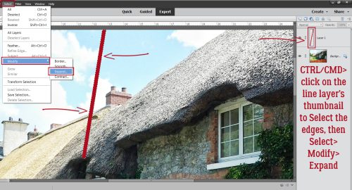
It doesn’t need to be expanded much. 5 pixels for this is enough. That’ll move the marching ants away from the original selection by 5 pixels in each direction.

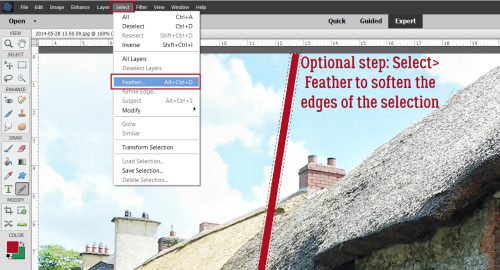
This step is optional, but I feel like it’s needed here because of the straight, sharp line. The edges could be visible in the finished image and I’d rather they not. Select>Feather or CTRL/CMD>ALT/OPT>D will open a new option menu.

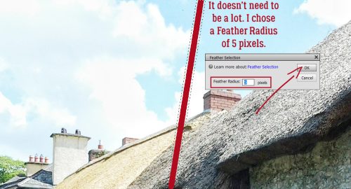
The edges just need a touch of softening so a Feather Radius of 5 pixels is likely enough.

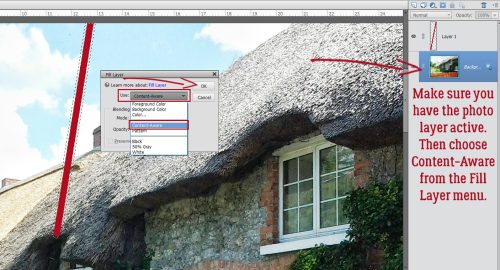
Now, prepare to be amazed! Make sure your photo layer is active – not the mask layer – and click Edit>Fill Selection…

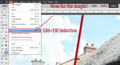
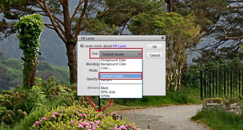
Choose Content-Aware from the Fill Layer options menu. Content-Aware Fill was introduced in Elements 13, so if you’re using an earlier version, it won’t show up for you in the options. Sorry…

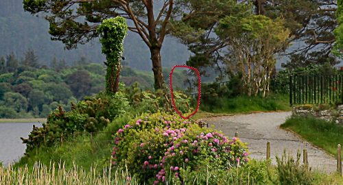
The image speaks for itself.

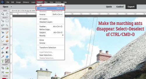
To turn off the marching ants, click Select>Deselect or CTRL/CMD>D. And it’s done!!

I took the original photo in May 2014, but now, it could be any year.

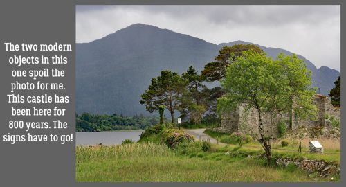
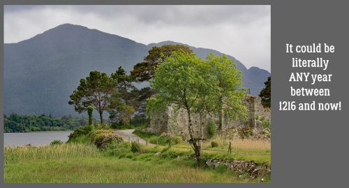
I’ll just show you another quick way to eliminate distractions before we go. It’s thought this castle was built around 1216 on the shore of Lough Leane, near Killarney, County Kerry by an Anglo-Norman named Roche. Over the last couple of centuries it’s fallen to ruin. And those signs have GOT to go!!

This time I used the Lasso Tool to draw a rough circle around the sign and post. As long as the line you create with it crosses itself you’ll be able to “close the loop” and have a specific Selection. Don’t be too fussy, because it doesn’t matter!! (**You won’t have a red line around your loop. I did that to make it easier to see where I’ve got my marching ants.**) Then again, Edit>Fill Selection…

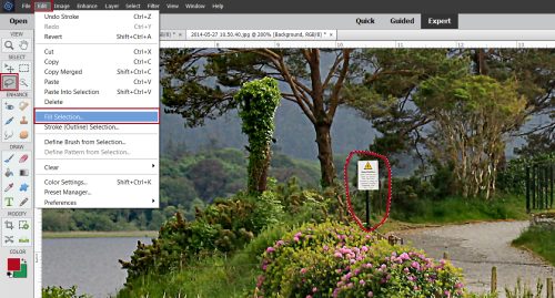
And choose Content-Aware again.

A really close look will tell you Elements has Cloned the shrub to the left of the Selection to fill the space, but the average eye won’t notice.

The owners of the property has tried to make the “historical marker” thing blend in with its surroundings, but it’s a fail for me. So let’s disappear it too.

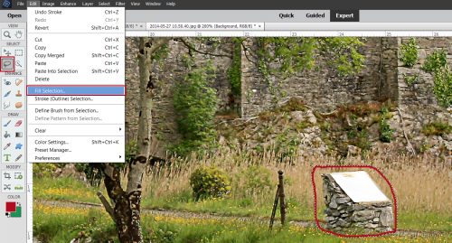
Back to Content-Aware.

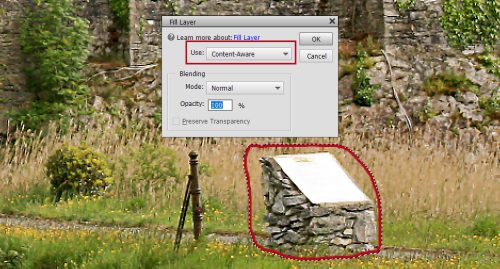
Hmm. Elements has Cloned part of the fence post and it looks dumb. It’s outta there!

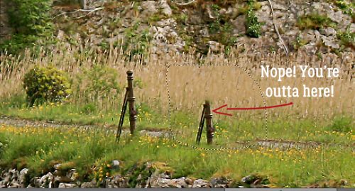
I made a new, smaller selection to capture only the offending fence post and Filled it with Content-Aware and now it’s perfect!

Now that I’ve started, I’m hooked! I’ll be spiffing up a LOT of photos, and getting much better results, in the coming days.

Anybody jumping into the Scrap-a-Thon? Since my son has finally recovered from his injury, life is back to normal for us and I should be able to take part. So excited!! See you on the weekend with the Designer Spotlight.


February 24, 2023: Fresh Baked

Welcome to another Friday. It’s almost March and you know what that means? It’s almost Scrap-A-Thon {2023} time.

Remember if you spend $10 in the store, you get this great kit for free.

Let’s take a look at what we have new in the store this week.

How are those challenges? Complete any 10 challenges and you’ll get this kit as a reward!

Tutorial Tuesday (Individual Style)

Challenge Spotlight: Word Art

This month we’re looking at Word Art, the challenge sponsored and hosted by Cheré Kaye Designs. The supplied word art looks like this:

Now, you’d be forgiven for thinking you have no possible use for word art, but there are so many ways to be creative with it if you just give yourself permission. I’m going to show you, in the order they were posted, the first 16 layouts posted to the Word Art Challenge Gallery using this exact word art so you can see some of the ways it can be made your own. Each layout is linked to the Gallery so you can get a better look or offer some good vibes to the scrapper. Just click on the scrapper’s Forum handle!

The first layout is from demma_b13. She’s used the word art exactly as it was designed, pulling the colours for her layout from it and adding some photos of a very sweet little gnome to go with her kit selection. I like how she’s “painted” the big heart over the edge of the top photo. That touch of transparency is divine!

Here, trinanne has used the word art as is too, but made it the focal point of the layout, surrounded by photos of her loved ones.

As you can see, scrapcrazy has departed from the traditional. A simple layout about a very handsome dog needed something a little less “romantic”, so she recoloured everything to work with her photo and kit choice. I’m intrigued by the gradient effect she’s used on the outline for “love”. So cool!

Here again, the unaltered word art is supported by the colours in both the photos and the kit dkane has chosen. Just gorgeous!

For her layout, lulutoo has recoloured the letters in “love” to coordinate with the russet and peach tones of her kit. Those colours work so nicely with her vintage-looking photos.

When I first looked at alexandergirl68‘s layout, I didn’t notice that the mask she used makes a heart, I was so caught up in the photo of that precious baby! For the word art, she dispensed with the white border, pulled from the varied shades of russet ink for the letters, and added a shadow to make them look cut from cardstock.

branma has left the word art unchanged and used the same background paper as trinanne to show off her photos. Those pops of black add dimension and interest. The depth of her shadow gives the word art a embossed appearance.

Here, dhariana has recoloured the word art, ditched the white border and added a stitched border to the “love”. Clever!

Look at these kitties! The nuzzles! alasandra has clipped two different papers to the letters in “love”, while sticking closely to the original palette.

When creating her layout, firstoscartgrouch used the colours in the word art for inspiration, leaving it as it, but adding some flowers and a bunny sniffing them to replicate the subject of her photos.

I like how larkd has incorporated the word art into her clustered border. The purple in “hello” is the only place purple appears on the layout, causing it to draw the eye to her photo.

Here’s a novel idea! Not only has chigirl recoloured the word art to coordinate with her layout, she’s turned it into a tag.

The word art’s original colours wouldn’t work at all with ranchcreations‘ photos, so she clipped a paper to it. By using a brown paper for the word art and for the brad border under her square photo, she’s bringing the eye right to her large photo.

The word art on nimble4u‘s layout looks like it’s made from something very sturdy and offset with those foam tape things paper scrappers and card-makers use.

I would have known this is a KatherineWoodin layout anywhere! Katherine is so diligent about chronicling life every day; I stand in awe. She recoloured to pick up the colours of the boys’ uniforms and their basketballs. The way she’s shadowed it, it looks like it could be acrylic, not paper. Good job, Katherine!

We’ve seen quite a lot cats this time around! (I’m not a cat person, but know a few.) Our last layout is from lebjs, where the word art is as designed. She’s cleverly used strips of white as whiskers to give her main photo the appearance of a cat’s face. So sweet!

I wish someone would have used some layer styles to really customize the word art. Maybe I’ll do a mock-up to see how it would look.

I have a question for you all about dating your layouts. Do you include the date? How do you do that? Do you have a preferred method of including it, such as using a tab or paper strip? I’m working up an idea passed on to me by gmae (Ellen) and need your input. Please send me a private message (ObiJanKenobi) and share your wisdom!

February 17, 2023: Fresh Baked, NEWSLETTER HOP and BAKE SALE!

It’s Friday! I hope you have all had a great week!

We have a special treat for you, our 2023 Newsletter Hop!
You can hop around our designers newsletters and collect tons of fun free goodies!

{2023} Newsletter Hop!

Remember if you spend $10 in the store, you get this great kit for free.

Let get a peek at some of the new kits items in the store this week.

We also have the Bake Sale going on! A lot of great kits in this sale. 

Tutorial Tuesday (Photoshop Elements)

Pattern Files, Custom Shapes and Styles Mash-Up (Replay)

PDF Version : https://bit.ly/3IMNvoc

Well, my son hasn’t bounced back from his infection the way I’d hoped. He’s fine… just not back to normal, so that means I’m not back to normal either. I’m feeling a little depressed and unmotivated. Hence the reprise of an older tutorial. This one came about when Ellen (gmae) and her sister Carol (gnana96) wanted to learn more about using Photoshop Elements in more creative ways. Since we’ve been talking about Styles a lot lately, this seems to be a good fit.

I don’t have the original screenshots any more, so I’ll caption the images where the red type on gray background makes them impossible to read.

First thing I did was open a blank canvas so I could experiment.

Time to play around with some of the lesser known and underused features of Elements

One of the items Ellen mentioned was shapes. I touched on the Shape tool in the tutorial about rounded rectangles, but there’s a LOT more to it than that. Let’s look at the Custom Shape tool, the one that looks like an amoeba. Below is a screenshot of where to look for the tool in the Tool panel, as well as what the menu looks like. As you can see, there are a number of categories; if you know what kind of shape you’re looking for you can zero in by selecting the category and carrying on. I usually look at them all.

That little window holding all the thumbnails is teeny-tiny and only shows about 12 thumbnails at a time, so I made the window bigger. There’s a wedge-shaped collection of dots in the upper right corner of the window frame that I clicked and dragged on to make the window really big. Now I could get down to business.

For this demo I decided to choose a Grecian key shape. To create your shape, you put the cursor on your work surface and drag it across the screen. You can adjust proportions by moving that cursor around or you can tell Elements that you want to “constrain proportions” by clicking on that control bar I have circled below then entering in the dimensions you want. You can set it to create the shape from the centre out, or from one corner. If you’re particular or you have a specific idea in mind then select the controls you need to make the software work for you.

Grecian key shape… nice for a border

There are two ways to Simplify this shape layer. You can select it in the Tool options panel (for Elements 14 or later), or you can right-click on the layer in the Layers panel and select it there. Why Simplify the layer? That’s how you get a transparent background! With a transparent background, your shape becomes a “smart object” that you can move around, resize, rotate, skew and any other alteration you can think of. You want to have as much control and as few CTRL/CMD>Z moments as possible.

Two ways to Simplify the shape layer. That’s how you get a transparent background.

We’ve talked about Styles a lot lately, so this is just a review. There are dozens of embedded styles in the software; they’re found in the Effects panel you open by clicking on the big fx button at the lower right of your workspace. We’re focusing on the Styles section of this set. Open up the menu by clicking on that little bar the arrow indicates and select Patterns to see this menu. These files have .asl as their file type. and are stored in the Presets folder of Elements on your computer. Hover the cursor over the thumbnails to see what Elements calls each pattern.

Let’s look at two different Pattern Styles on identical shapes

The software needs to know where you want to put the Pattern Style, so CTRL/CMD>click on the layer thumbnail to select the contents of the layer. Voilà… marching ants!

This Pattern Style gives the look of polished copper

CTRL/CMD>click on the layer thumbnail and get those old marching ants

This is what the Copper Pattern Style looks like on the Grecian key shape. To apply the style double-click on it.

This Pattern Style gives the look of polished copper

I wanted to show you one more of the choices from that menu, so I selected the top strip of the Grecian key shape.

Marching ants on the unaltered layer for a side-by-side comparison

Hmm… dry mud? Why not!

Wow!

Let’s just refresh our memories about those style files several of our GingerScraps designers include in their collections. (Aimee HarrisonMiss Mis DesignsJust So Scrappy/Ooh La La ScrapsKristmess and Magical Scraps Galore are the ones I can think off right off the top of my head.) I used a different custom shape for this part.

Refresher on Styles… two ways to Simplify

I’m going to apply a glitter-gloss style from Miss Mis Designs’ collection called Hustle and Heart.

The menu for that Style group looks like this.

You’ll notice that this type of Style adds some dimension and reflected light to the shape.

There are many embedded Style categories, as I mentioned. What do the ones in the Complex styles folder do? (OMG, I have a typo on my screenshot! Oh well…) This particular style adds dimension, reflected light and drop shadows all with just a double-click.

Here’s another Complex style that looks like enameled or epoxy’d metal. Think of the ways you could fiddle with that!

Ellen also had Swatches on her list. There are a few choices with this one. To see the swatches you can click on the Window tab at the top of your screen and select them from the drop-down menu. Or, if you’re in the Text tool clicking on the Color box as shown will open up the same menu. I rarely use this feature because it’s so much easier and more satisfying to use the Color Picker tool (eye-dropper) to select a colour from either my photo or one of my papers/elements. The sky’s the limit with that method; this one is quite limited.

Here’s a happy little accident I experienced while I was experimenting. I checked out the Wow styles way down at the bottom of my (lengthy) styles list and the Wow Neon style looks like that fancy coloured Niobium wire.

See what I mean?

The style adds a drop shadow, which I felt might be a bit too far from the text for wire, so I opened up the fx menu on the layer to tweak the shadow and noticed that I had the option of changing the colour in there too.

Pulling the shadow in closer to the text looks like this. There are other ways of amping up this look too, by copying the original layer above the one the style is applied to and then applying another style to that layer, playing with the opacity until it looks incredible.

Now to the heart of Ellen’s question. Pattern files. Those ones with .pat as the file type. There are some designers who include a .pat file along with a .asl file in their kits. There are also a number of embedded .pat files in the software. I wasn’t able to find a shortcut for installing these files, so below I’m going to give you the steps for installing them manually. After you’ve extracted the .pat file from your downloads, copy the file (CTRL/CMD>C) then in Windows Explorer, look for the path I’ve shown. C:> Program Files (x86)> Photoshop Elements> Presets> Patterns. then paste the file into the folder. (CRTL/CMD>V)

Now let’s play with some .pat files! When you use a font for anything, you have to Simplify the layer before you can make any alterations to it. Don’t worry if you forget this step, because Elements will remind you. But ONLY with fonts!

Now how do we access those Pattern Files? By using the Pattern Stamp tool, of course! It does the same thing as the Clone Stamp tool, but rather than stamping a sample from the image you’re cloning, it uses a pattern. If you use the keyboard shortcut <S> you can toggle between Clone Stamp and Pattern Stamp easily.

The Stamp uses Brush tool options to select the area it covers. I used a hard square brush for my sample, but it really doesn’t matter what shape you use. You’re just going to click and drag the brush over the item you want to use the Pattern Stamp on anyway. Make sure you have NORMAL selected in the Mode box, otherwise you won’t see the effect you think you should.

This is where Elements hides those .pat files. There are several defaults, and any that you’ve installed into the Patterns folder will appear in the menu.

The Pattern Stamp will cover everything unless you select where you want it to go. So make sure you’ve selected the areas to apply your pattern to.

Do a quick visual check to make sure all the settings are correct.

Click and drag your Pattern Stamp brush over your selection… Bingo!

It looks neat, but I want it to look even neater, so I added a Bevel.

I used the Simple Inner bevel to add dimension.

Then I added a stroke to the resulting rounded text.

And here’s how to find the .pat files you’ve installed. My experience with those that come in kits is that they’re generally just glitter, but I only have the two you see below so what do I know?!


I haven’t completely wasted the last two weeks; I’ve been watching Facebook reels (lots of reels… so many reels!) of Photoshop tricks that I just may be able to replicate in Elements. It’ll take some experimentation but I think I should be able to make them work. Stay tuned! Next week I’ll be letting YOU shine in the Challenge Spotlight.


MEGA $2.00 Tuesday!! February 14, 2023

Happy Valentine’s Day!! I hope you have been enjoying all the love from our  2023 Newsletter Hop! You can hop around our designers newsletters and collect tons of fun free goodies! Be sure to subscribe to all the newsletters (full list in the forum) to get totally spoiled by our designers!

{2023} Newsletter Hop!

We also have something SUPER special in honor of Valentine’s Day our $2.00 Tuesday is a MEGA sale this week! There are a TON of super sweet deals for you to grab. TODAY ONLY!

Here are just a few of the goodies in the $2.00 Tuesday MEGA Sale, be sure to visit the shop to see all the products included in this sale. 

Remember if you spend $10 in the store, you get this great kit for free.

How are those challenges? Complete any 10 challenges and you’ll get this kit as a reward!


February 3, 2023: Fresh Baked and NEWSLETTER HOP!

Happy Friday. We have big things for you today so we’ll just jump right in!

We have a special treat for you, our 2023 Newsletter Hop!
You can hop around our designers newsletters and collect tons of fun free goodies!

{2023} Newsletter Hop!

Remember if you spend $10 in the store, you get this great kit for free.

Let’s see all the new goodies in the store this week.

How are those challenges? Complete any 10 challenges and you’ll get this kit as a reward!

Tutorial Tuesday (Fonts)

More Hearts and Flowers Fonts

PDF Version : https://bit.ly/3k05qOr

It’s been a rough week at our house, meaning no time for me to do anything really inspiring. But I’ve been seeing a LOT of inspiring Valentine’s Day projects so I had a thought… Surely there are some great new Valentine’s Day fonts and dingbats that y’all can use those Styles we talked about last week to make REALLY fabulous. And there are!! I’ve got eleven FREE fonts and six dingbats for your scrapping pleasure, from dafont.com. (If you want any of these, just click on the font’s name and you’ll be linked up.) Ready?

Couple Valentine is a fancy, all-caps font that would be perfect for pretty much any application. Titles, subtitles, journaling – all of it! I love that.

This romantic script font, Mybook Again, is another multipurpose gem. I could see this on wedding invitations, all kinds of wedding favours and Valentines. It’s beautiful, don’t you think?

I really love these bubble fonts like Romantic Love. There are SO many ways to use them and so many things you can do to zhuzh them up.

Pink Valentine is so retro and cute! It brings me right back to my teenage years when I still had rose-coloured glasses.

This font could be right out of a fairy tale. Lovaline Story is another versatile font that is suitable for any purpose.

Candy Kisses would make beautiful titles. Beyond Valentine’s Day and weddings, I’d probably use it for baby layouts.

Beauty Heart is a lovely farmhouse-type font. I’d love to see it with a glossy Style so it looks like candy.

I like the heart ligatures on Finding Love. It’s yet another all-purpose font with infinite options.

Ooh, here’s a swashy script called Jully Julia. It’s perfect for subtitles and journaling.

I don’t know that I’d use You Are My Valentine for journaling, but it would be good for titles and subtitles.

I was looking for dingbats when I found Quirky Love. It’s already pretty fabulous, and has potential to be even more so! Doesn’t it look like leather?

Now for the dingbats. Heart Salads is the first set I’ve found that has an anatomical heart in it.

I can see so many things that can be done with Romantine Dingbat. Yes, most of them involve hitting them with a Style… or three.

I love these heart emoji dings, don’t you? Fluffy Hearts Ding just makes me smile.

PW Little Hearts covers the gamut of things we love. That heart-with-the-ball-of-yarn would make a great element for a cat layout.

These are pretty romantic hearts in Vanlentines Day TBF. I think my favourite is the solid heart with the stars along the right side.

Last, but not least, we have Merciful Heart Doodle. I might use this one to create a border. What would you do with it?

Now I must run… gotta deal with all the errands I’ve put off for the last week while my son has been sick. Hopefully I’ll get ’em done before the rain turns to snow…

Designer Spotlight: February 2023

It’s Miss Fish!

Many of you will already know Juli, aka Miss Fish. Lately she’s moved past mainly template designing and is bringing more of her talent to entire kits. I know I’m happy to see that! She’s also been in the Designer Spotlight before, so we talked about some different things this time to keep it fresh. (Since we both have the same first initial, I’m going by “O” today.)

O: Let’s get the bread and butter out of the way. What motivates and inspires you as a designer?

J: I love designing templates that make me want to stop what I’m doing and scrap a page. I often will plus in my own photos
and some elements to make sure designs will look good for my customers.

O: Segué ahead… What one word would your friends and family use to describe you?

J: Busy! Lol…I work full time, plus I design and we like to have fun with friends and travel. I’m not one to just plop down and relax.
I go all the time!

O: It can be exhausting, right? I enjoy traveling too, so why don’t you describe your perfect vacation.

J: Anywhere in Europe close to a train station so I could go on different adventures every day.

O: So is that what you would do if you won the lottery?

J: YES! I’d quit my day job and travel full time. I’d bring along my laptop so I could design and scrap in my free time.

O: Oddball question, that I can probably guess the answer to: are you more likely to dance or sing in the shower?

J: Sing.

O: Yep, called it! Do you have a green thumb? What do you grow?

J: Yes. Currently growing Brussel sprouts, cherry tomatoes, peppers, arugula, and some herbs. Plus my cat’s favorite, carnations.

O: I’ve grown broccoli but never Brussels sprouts. Now I don’t have room for much but I have some flower boxes and a small bed in the front yard. Most of my blooms are purple, white or pink. What are your most favorite and least favorite colors?

J: My favorite color is blue. My least favorite color is orange.

O: Oh, I don’t like orange much either, or yellow. Hence they’re not prominent in my garden! {Except the Stella d’Oro lilies the developer planted. They can stay. What would your dream car be?

J: Something red and fast but in an SUV size, maybe a Porsche?

O: That would be amazing! My daughter had a BMW SUV, but didn’t love it so she’s driving a VW Tiguan now. If you could change one thing about yourself, what would it be?

J: I would make myself able to actually remember words and why I walked into a room.

O: I can definitely relate! Aside from necessities, what one thing could you not go a day without?

J: My phone. I’m embarrassed to say how attached I am to it.

O: I’m finding myself falling into that habit too, at least until my eyes start protesting. If you had a warning label, what would yours say?

J: Caution: probably crabby, feed for best results.

O: Hahahahaha!! Me too! Let me get you a snack, girl!

Before we disappear with our treats, I want to remind everybody that Juli is not just the IN the Designer Spotlight, she’s hosting the Designer Spotlight Challenge this month AND is providing the Daily Download on the Blog too. Each snippet of the Daily Download is available for 5 days; if you miss one or two and are heart-broken, don’t worry. The entire kit will be available for purchase in March. (Egad, did I really just say that?)

February 3, 2023: Fresh Baked

Welcome to Friday everyone! I hope your week has been good and your February is starting off well.

Remember if you spend $10 in the store, you get this great kit for free.  I’m totally craving pancakes now.

Let’s see what the designers have this week.

Have you gotten a start on your challenges? Complete any 10 challenges and you’ll get this kit as a reward!