Archives for February 2025

Fresh Baked Friday @ GingerScraps: February 28, 2025

Hey everyone, I hope today find you well!

There are some exciting changes are coming to GingerScraps. While our forum and gallery are temporarily offline as we transition to a brand-new platform, the shop remains open with new products every week and all our usual sales and specials. Plus, the blog is open with new content posted daily to keep you inspired! We can’t wait to unveil the new forum—it’s going to be an amazing upgrade!

I’ll keep you updated in our newsletters and on the GingerScraps Facebook page. In the meantime, join our private GingerScraps Facebook group to chat with your GS friends, share your layouts, and get tons of inspiration. Stay tuned—great things are ahead! .

 We will be postponing the Spring Scrap-A-Thon until the new forum is up and running. I do not have an ETA yet, we might just wait till April 1st, that seems like the best idea at this point.

As always, I’m here and happy to help! If you have trouble with anything or questions reach out to me via the support ticket system.

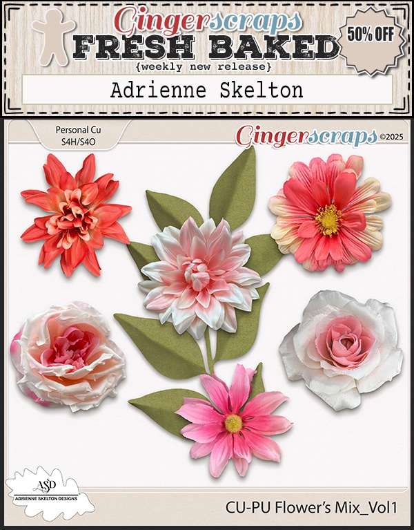
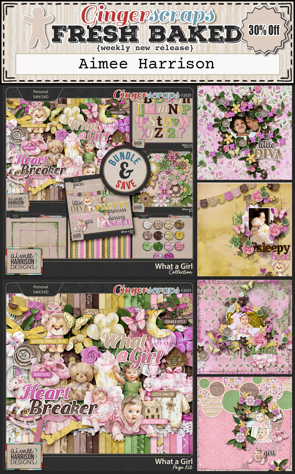
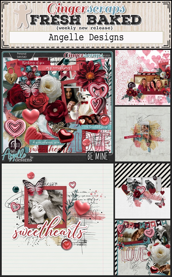
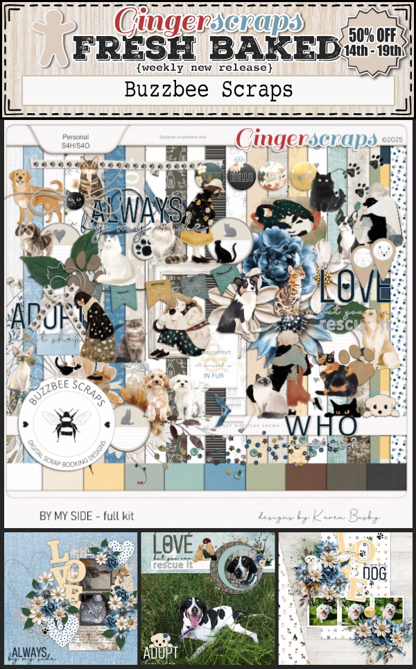
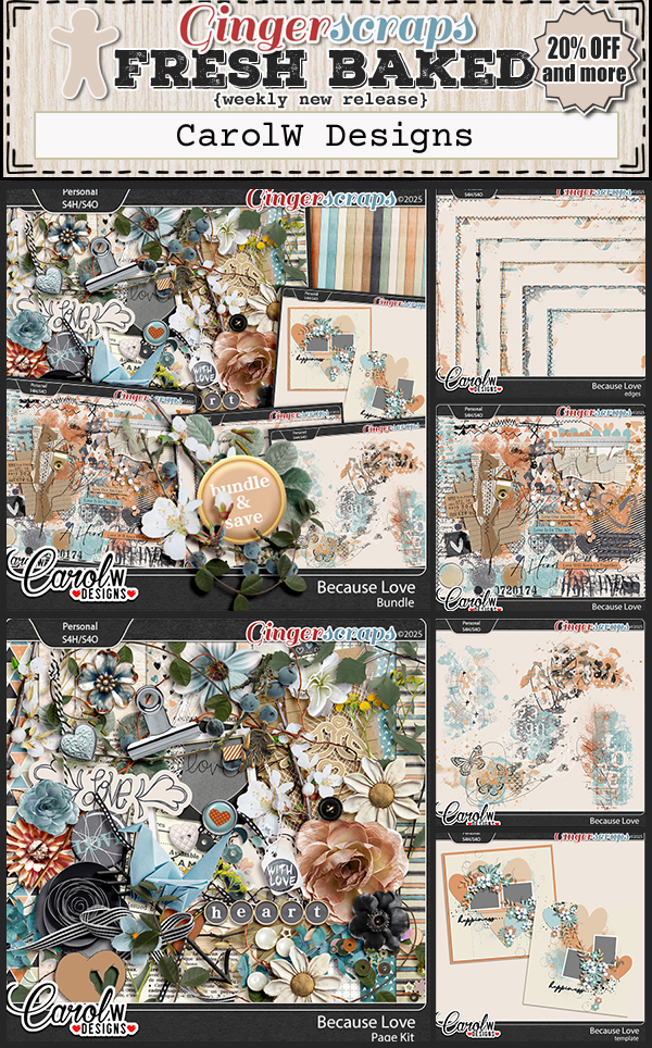
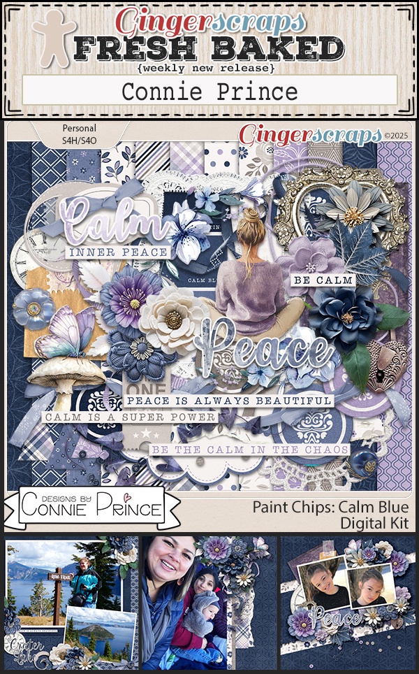
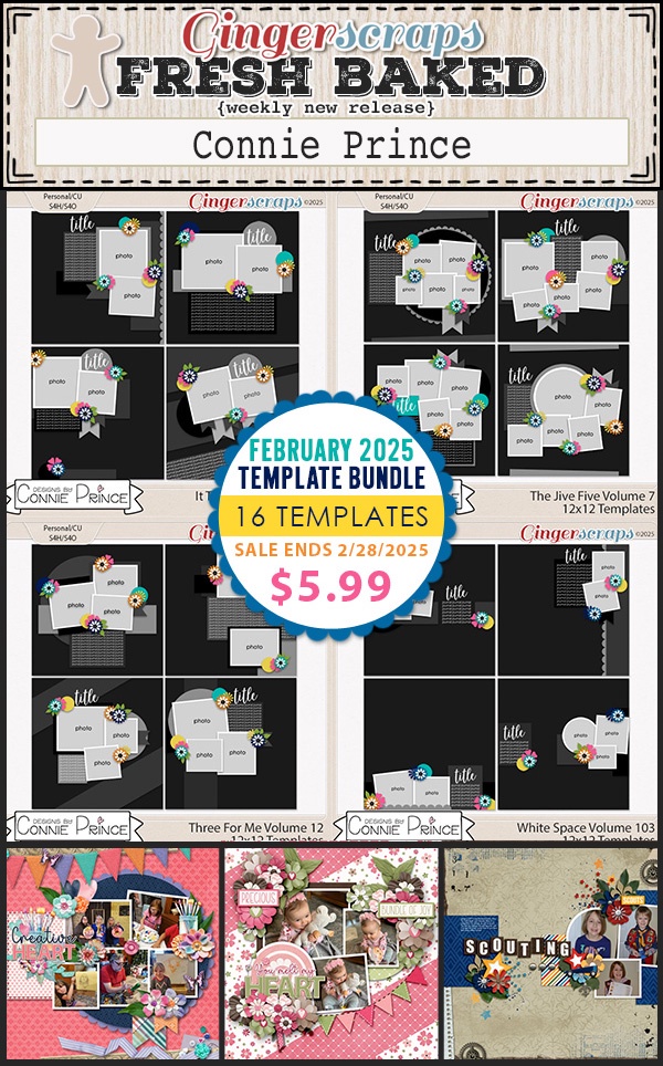
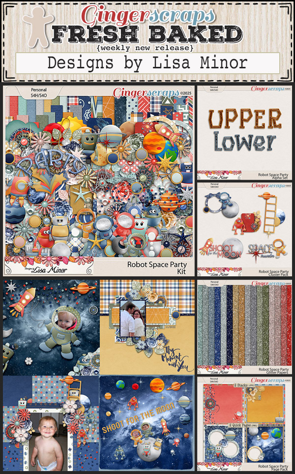
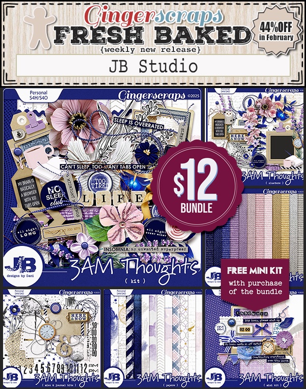
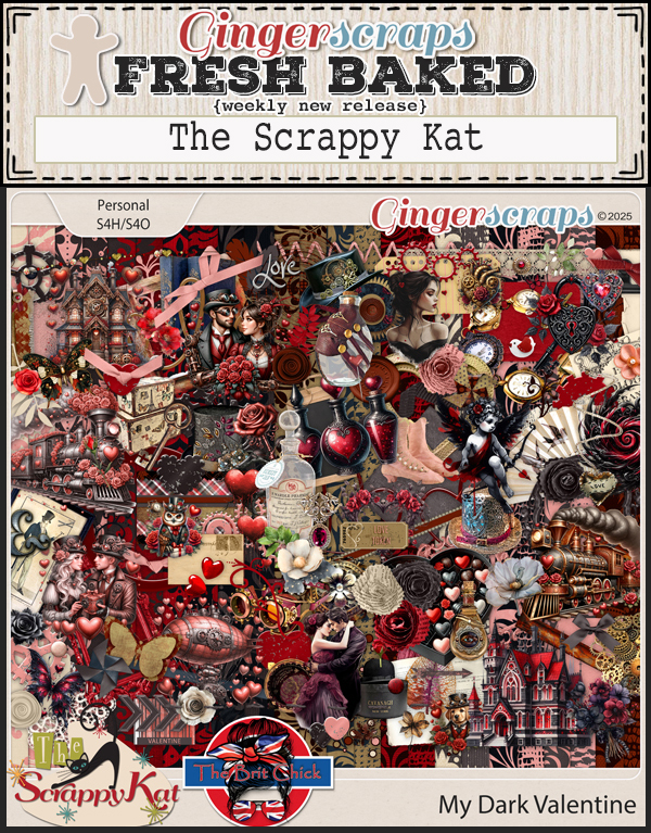
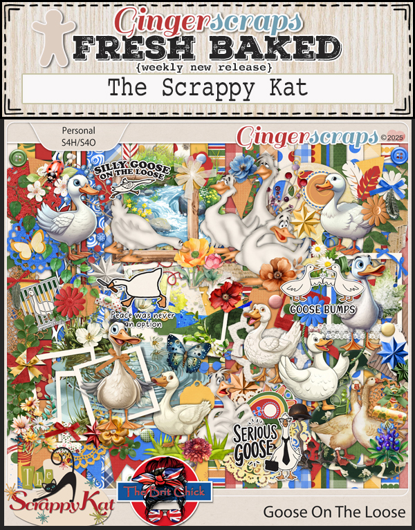
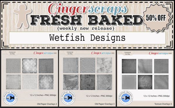
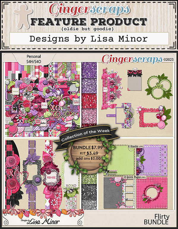
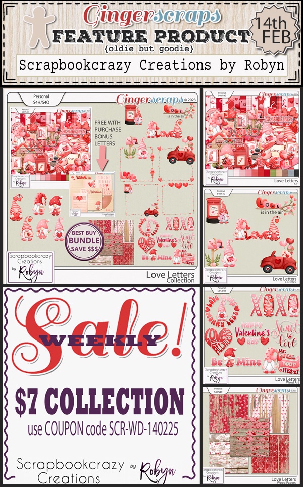
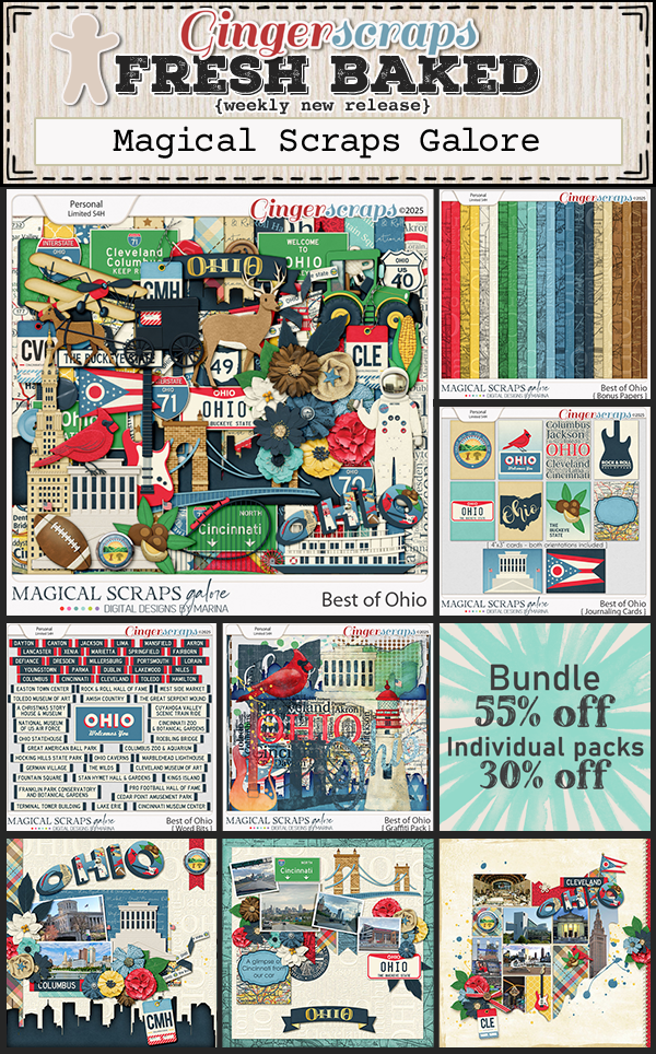
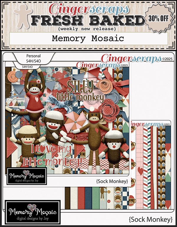
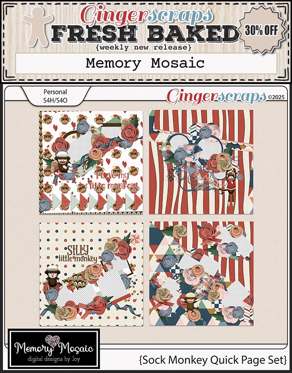
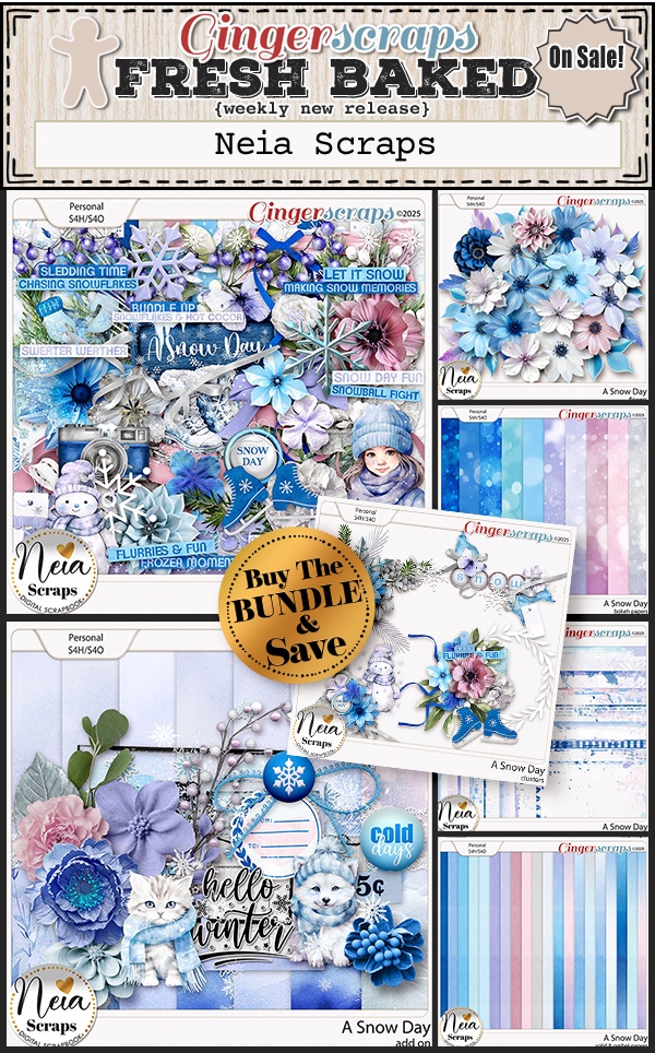
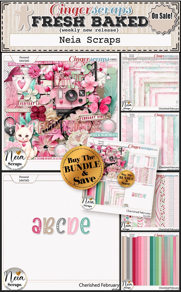
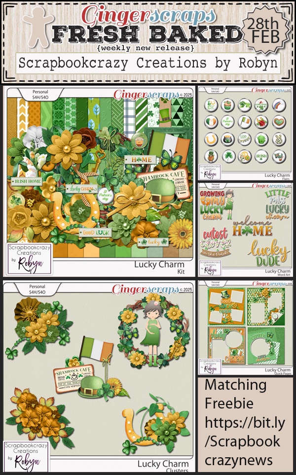
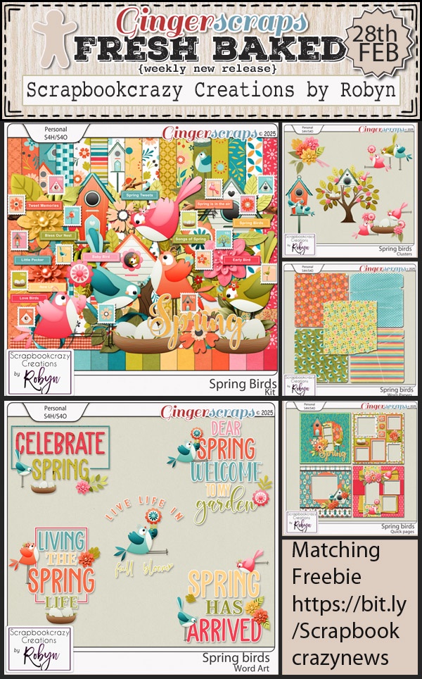
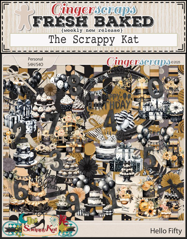
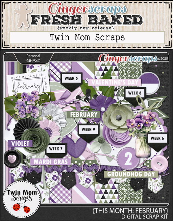
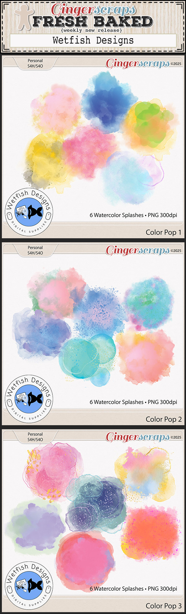
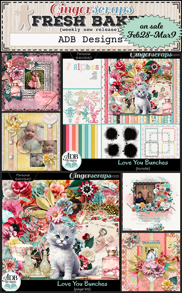
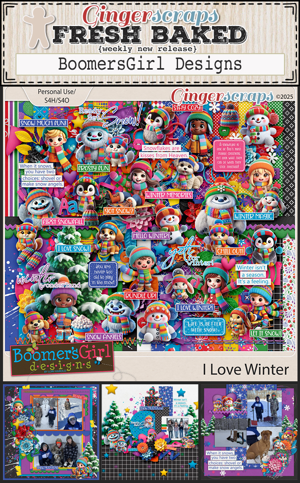
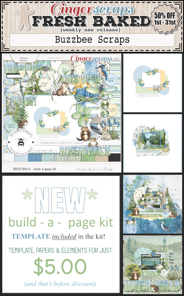
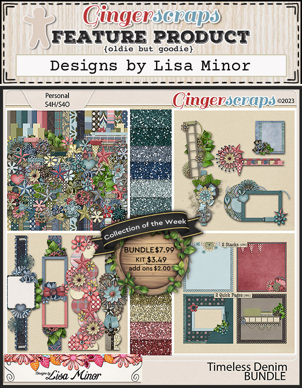
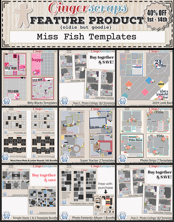
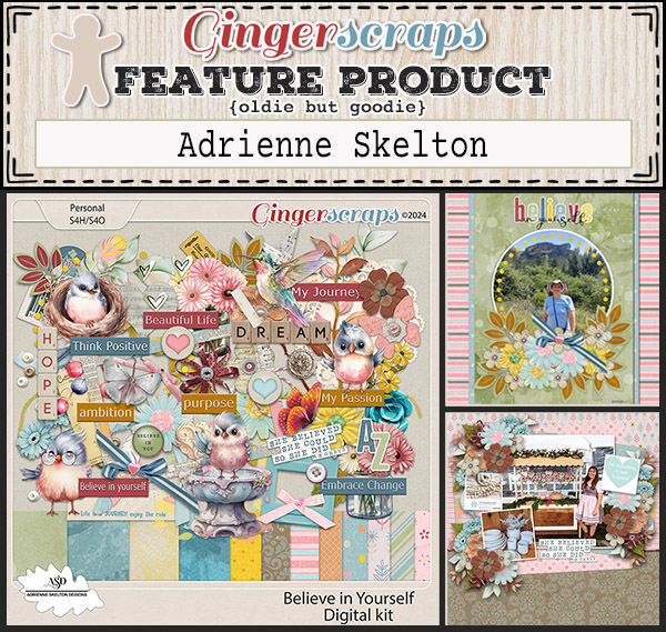
Are you all ready to see all the beautiful products our designers have for you this week!?

Today is the last day to get this collab for free when you spend $10 in the store.

Today is also the last day to grab the February Monthly Mix at this price.

Let’s see what is new for this week.

Don’t forget to get your challenges uploaded. Complete any 10 challenges and you will get this collab as a reward.

(Or a variety of other choices, visit the forum for all the details).

Tutorial Tuesday (Photoshop Elements)

Quick Trick: Dupe a Graphic Novel Look

On Sunday I was with my son while he watched an adventure/comedy movie on Netflix. When the movie ended and the credits started rolling, I noticed the producers had turned some stills into graphic novel images, and the idea for this tutorial was born. Turning a photo into a graphic novel cartoon is really easy! This is the photo I chose to play with.

First thing I did was make two Copies of the photo. You can right-click on the photo layer then choose Duplicate Layer>OK twice of you can use the keyboard shortcut CTRL/CMD>J twice. Your call. [I make these Copies so each manipulation is on a separate layer and can be further tweaked to obtain my desired results.] Then I turned the visibility for the top two layers off so I could concentrate on the bottom, original layer. “Close the eye”. You don’t HAVE to do that if you choose not to.

With the BOTTOM LAYER active, click on Filter>Sketch>Comic…

This is the Filter interface, and the default settings. Comic  >> Soften = 4  >> Shades = 5.14  >> Steepness = 1.4 >>  Vibrance = 0.5 and Thickness = 1.4. You can move the sliders around to see what each does and choose the look you like best. I kept the defaults.

Next, activate the MIDDLE LAYER and again click Filter>Sketch>Graphic Novel…

The defaults for this one are as shown: Painted Gray  >> Darkness = 4.64  >> Clean Look = 4.4  >> Contrast = 0.52 and Thickness = 1.43.

I did some adjusting here. Painted Gray  >> Darkness = 3.87  >> Clean Look = 4.4  >> Contrast = 0.82  >> Thickness = 1.21 and Smoothness (1/2).

Then I changed the Blend Mode to Overlay. Click on the bar at the top left of the Layers Panel and choose Overlay from the dropdown menu.

There’s one more Filter to add.

I moved to the TOP LAYER, and made sure my Color Picker was set to Black in the Foreground, White in the Background. [This is important so don’t forget to check! I learned it the hard way.] Then I clicked Filter>Sketch>Halftone Pattern…

The result isn’t super-visible here but if you could zoom, you’d see it easily. The defaults are Size = 4  >> Contrast = 50  >> Pattern Type = Dots.

Ah, there it is! I adjusted the Size to 6 and the Contrast to 40.

Again, I changed the Blend Mode to Overlay. Then I turned the other layers back on.

If I want to, I can adjust the Opacity of each layer, change the order of the layers and make other adjustments as I wish. I think I might go a bit farther with the original Comic layer, and maybe with the Graphic Novel layer too, and make it even more cartoon-y. I can do that by adding another Filter to each layer. But for a 5 minute exercise, it looks pretty good!

See you all in March!!

Fresh Baked Friday @ GingerScraps: February 21, 2025

Hi scrappers! Have you visited the Welcome Wagon area in the forum to get your new exclusive goodies from our designers?

Love Blooms in the Welcome Wagon is officially HERE! Our members-only forum area is overflowing with love, and our amazing designers have created the cutest freebies just for you!

Here’s how to join the fun:

1. Register or log in to your GingerScraps Forum account.

2. Head over to the Welcome Wagon area.

3. Visit each participating designer’s thread to find a sweet message and a FREE, exclusive product!

Don’t forget to check out the Fresh Baked new releases while you’re grabbing your freebies.

Join the Fun & Grab Your Freebies Now!

With love,
The GingerScraps Team

Spend $10 in the store and you’ll get this great collab for free.

Take a look at the new challenge reward kit. If you complete any 10 challenges this month, you get this gorgeous collab as a reward! (Or a variety of other choices, visit the forum for all the details).

Tutorial Tuesday (Individual Style)

Challenge Spotlight: Wild About Styles

It’s already the third Tuesday in February – which is almost over! – and time for YOUR chance to shine! Today we’re looking at one of our new Challenges, Wild About Styles, which is hosted by Wetfish Designs. It’s an intriguing Challenge where Wetfish provides a free-for-the-month set of Styles for use in the Challenge; this month the set contains 12 different maps. Yes… Maps. And the goal is to use more than one for your layout. She’s even provided us with a sample layout!

Let’s see how our GingerScrappers used the Styles for their layouts… Remember, each layout is linked to the Gallery so you can take a closer look and perhaps leave a comment. Just click on the Scrapper‘s user name (it’s bold, underlined and in living colour) to jump right to the layout. They’re posted in the order they were uploaded to the Challenge Gallery; there may be others in the Forum thread that aren’t in the Challenge Gallery, as I discovered last month.

Our first participant is nimble4u. She’s used at least 6 – no, make that 7 – of the Styles, applying them to each of the papers from the Tinci Designs template she chose. How’s that for following the rules? 😉 I don’t read Dutch, but she’s obviously travelling.

Alasandra has used so many I can’t keep track. She has applied them to her frames and some of her embellishments; that really customizes her layout. She, too, used a Tinci template (I have hundreds of them, so I recognize them right away) and the theme of her layout is travel, but in a more generic sense.

I’m sensing a pattern… lm44west also applied the Styles to the papers here. Her paper layers don’t have distinct shadows so it’s a bit difficult to separate them. I *think* she’s applied a different Style to each of the characters in her title.

Pixel Palette‘s used a subtle hand for her layout; by blending a large map with a floral paper she’s created movement in a layout about the single most impactful moment in travel history. She also applied Styles to her title and behind her smaller photo.

I could totally see this layout by greenfiend27 on a classroom wall somewhere. It’s literally an “animals of Australia” poster, complete with a map-Styled frame.

KatL has used two map Styles for sure. Her aerial photos are well-showcased with map mats.

With another variation on a theme, pbhill has used several Styles applied to her paper mats… and that great banner! The Styles she chose draw from the colours in her photo.

Katherine Woodin is most of us right now, am I right? So much of the continent is snowed in and freezing. She applied a Style to her background and title, and when I zoomed in I think she’s even blended map Styles into her photos. Very interesting effect.

Anybody who knows msbrad (Michi) knows she LOVES to travel and takes hordes of photos. She was a teacher in another life, so she also follows rules. 😉 Lots of different maps are visible here, even if you don’t zoom in! I love how she’s got a bike with tulips sticker to echo her bike with tulips photo. Made me smile.

Jill went simple, applying a Style to her background then blending a photo into it. She Styled her title, and perhaps the word strip in her cluster. The hiking/camping elements she’s clustered look so real!

At first I thought trinanne had only used a single map Style here – which is PERFECTLY oriented to her subject, but then I took a closer look and she’s applied a semi-transparent map Style to the frames around her photos. That bread bowl… now I’m hungry!

I’ve downloaded the Styles, and now I’m inspired to create a layout. Are you?

Love Blooms FREEBIES + Fresh Baked Friday at GingerScraps!

Happy Valentine’s Day! We love and appreciate each and every one of you, and today, we’re celebrating with something extra special!

Love Blooms in the Welcome Wagon is officially HERE! Our members-only forum area is overflowing with love, and our amazing designers have created the cutest freebies just for you!

Here’s how to join the fun:

1. Register or log in to your GingerScraps Forum account.

2. Head over to the Welcome Wagon area.

3. Visit each participating designer’s thread to find a sweet message and a FREE, exclusive product!

But that’s not all… It’s Friday, which means Fresh Baked new releases are in the shop today too! Don’t forget to check them out while you’re grabbing your freebies.

We hope your day is filled with love, happiness, and lots of scrappy fun! Celebrate Valentine’s Day the GingerScraps way—with creativity, community, and plenty of love. Let’s make this a Valentine’s to remember!

Join the Fun & Grab Your Freebies Now!

With love,
The GingerScraps Team

This month’s Free with Purchase kit is perfect for all your Valentine’s Day memories. Spend $10 in the store and you’ll get this great collab for free.

Let’s see what we have new this week.

Take a look at the new challenge reward kit. If you complete any 10 challenges this month, you get this gorgeous collab as a reward! (Or a variety of other choices, visit the forum for all the details).

Tutorial Tuesday (GingerScraps Forum)

Greatest Hits! A Forum Roadmap for Newbies

This post originally appeared on May 15, 2018. We have a LOT of new GingerScrappers and new-to-digital Scrappers who might find this information useful. I’ve made sure it’s up-to-date… well, except for the photos. I wish I still looked like that. 😉

Before I get rolling, I should add this explainer for those self-same newbies. When I write a tutorial, I want it to be accessible for everyone, no matter their digital experience or skill level. So I use both images and text, lots of repetition and way TMI sometimes. I also include both Windows (my system) and Mac keyboard shortcuts wherever possible. So when you see “[CTRL/CMD>…]” or “[CTRL/CMD>ALT/OPT…]“, CTRL is for Windows keyboards, CMD is for Mac; ALT is for Windows, OPT is for Mac.

You’ll want to have at least two browser tabs open to GingerScraps so you can move between them as we work through the lesson.

My Profile has a series of options for telling others who you are, and it’s pretty straight-forward so I’m going to skip that part. First I’d like to show you the quickest, easiest and least taxing method of adding a photo to your profile. Since I already have a profile photo, the steps show how to change the photo, but they’re exactly the same for getting one out there for the first time, there just won’t be an image there for you to change. Make sure you’re on the Forum page and click on the Settings button.

On the left side of the Settings page is the menu that allows you to customize to your heart’s content.

Under the My Profile heading, click on the Edit Profile Picture button.

I’m going to pretend that the photos you’re seeing are recent. (They’re not. 🙁 ) As I said, I already had a profile photo so I changed it to allow you to see how easy it is. You can use photos from a website by using the first box, labeled Option 1. So if you have a photo you like posted to Flickr, (or FacebookInstagram etc) for example, you could copy the URL (Uniform Resource Locator) where the photo is and paste it into that first box. To do that you would open a browser tab to the place where your photo is, highlight the text in the address box at the top of your browser screen then right-click and select Copy (CTRL/CMD>C); then go back to the tab with your Settings menu open, put the cursor in the first box (If you have a photo online…), right-click and select Paste (CTRL/CMD>V). Alternatively, if you have a photo on your computer that you’d like to use, then you’d use Option 2. Click on Choose File next to that second box (If you’re uploading a photo…), then find the photo on your computer.

I’m giving you a peek into my cluttered mind and messy desktop here. Yep, I have LOTS of browser tabs open, all the time, and I have a long list of links on my Toolbar. [2025 update: Nothing has changed.] I’ve found the folder with my photo in it, then chose the photo I want to use. As the screenshot says, SIZE MATTERS. For profile photos, which are the ones people will see when they look at your PROFILE, not your Forum posts, your photo must be no larger than 300 x 300 pixels or 976.6 kilobytes, whichever is smaller. You can hover your cursor over the image in your folder to see the dimensions of your photo so you won’t make the mistake of choosing a photo that will be rejected.

After you’ve clicked on the thumbnail image of your photo, click on Open.

Once you’ve opened your photo you can see how it’ll appear on your profile. I decided I didn’t like this one after all. But if I had liked it, I would have clicked on Save Changes and carried on.

I just followed that first step again to choose a different photo, Opened it and Saved the Changes.

Yes, that’s what I like!

Now we can work on the photo people see in the Forum when you post questions, comments or layouts. This photo is called an Avatar. It doesn’t have to be a photo of you, it can be anything you want it to be. I’m rather partial to Bitmojis myself.

In the same Settings menu, click on Edit Avatar. Here again, you can use an online image, say from Facebook, Instagram or Pinterest. The steps to do this are exactly the same as for the Profile Picture… with one significant difference.

As you can see in the screenshot, I have photos of me, flowers from my garden and memes I found online and saved for later. The photo I chose to use for my Avatar for this lesson is one that was taken at a wedding in Jamaica 10 years ago. I checked to make sure it would work as an avatar by hovering my cursor over it. [I recently updated my avatar to a much more recent, less flattering photo.]

Here’s where that significant difference comes in. The MAXIMUM size for avatars is 150 x 150 pixels, or 1.91 megabytes, whichever is smaller. Since I’d already checked that out, I knew this photo would be fine and I clicked Save Changes.

Let’s do a Signature now. A while back I wrote a tut about creating original signatures for the Forum; you can find it here. I always save my signature files as .pngs so if I have rounded corners, elements extending out from the main part of the siggie or I want a transparent background, it’ll look the way I want it to when I use it. I also save them slightly smaller than the maximum size allowed because I want it to be a footnote, not the focus! For this feature, you will need to post your signature image to the Gallery, where you’ll get the image location data to put it into your profile. Have that Gallery tab open to your siggie. The screenshot below shows the existing signature and the Editor.

I like my signature to be centered at the bottom of my posts, so I click on the icon shown below. To remove my old siggie from March’s Signature Challenge, I clicked on the image that is now blue in the screenshot. Then I hit the Delete button on my keyboard and it went away.

Then I went to my Gallery tab and right-clicked on my May Signature Challenge signature itself. This option box opened up, where I chose Copy Image Address.

Moving back to the Settings menu browser tab, I clicked on the Insert Image link as I’m showing you below.

Then I pasted the data I copied from my Gallery image into the box and clicked OK.

In the screenshot, you can see both the old siggie and the new one. You have the choice of Previewing it or just Saving it.

Here’s a Forum post with both my new Avatar and my new Signature on it.

These methods work identically when you want to post a layout to a Challenge thread in the Forum. I highly recommend having two GingerScraps tabs open in your browser and simply moving back and forth between them, Working Smart, Not Hard. Go to your layout in the Gallery, right-click the image, Copy Image Address then navigate back to the Challenge thread. Select that Insert Image icon, paste the Image Address into the box and click OK. It doesn’t matter if you’re on the first page of a thread or the last, you can compose your post at the bottom of the screen and the site will automatically move it to the end of the thread.

Personally, [you’ve seen my messy desktop!] I use two separate windows when I’m doing these tasks to reduce my post-COVID confusion. [After almost four years, I’ve learned a lot of ways to compensate for the “gift that keeps on giving”. Sadly, my vision changes aren’t that easily overcome.]

I hope the weather where you are isn’t trying to kill you! We’ve had a longer-than-usual cold spell that hopefully is going to moderate by the weekend.


Fresh Baked Friday @ GingerScraps: February 7, 2025

Good morning fellow scrappers! Can you believe Valentine’s Day is right around the corner? Do you and your significant other or friends do anything special to celebrate? If you do, take some pictures and use some of the new kits out this week to scrap your night out (or in). You can even use this month’s Free with Purchase kit. Spend $10 in the store and you’ll get this great collab for free.

Let’s see what we have new this week.

Take a look at the new challenge reward kit. If you complete any 10 challenges this month, you get this gorgeous collab as a reward! (Or a variety of other choices, visit the forum for all the details).

Tutorial Tuesday (Fonts)

New Valentine’s Day Fonts!

I’ve been under the weather since Sunday and have been supporting a friend whose had her fourth surgery in 3 years just recently, so I opted for a font post for this week. But it won’t disappoint! I did a meander through the Challenge Forum the other day and noticed that the theme for many of this month’s Challenges is “love”. I found some completely free fonts and a few dingbats for you at Dafont.com that dovetail with that theme that will give your layouts a real boost.  Each font is hyperlinked for you, just click on the font name (bold, coloured and underlined) to grab them. Let’s check ’em out.

Darling Girl is my favourite of these, I think. It’s elegant, modern and completely legible. The free version is a demo version, so not all of the glyphs are in the zip file. But there are enough to make it worth the download. It’s versatile enough too that it could work for both titles and journaling.

Valentia has ALL the glyphs a girl could want. Its scripty look would be perfect for word art, subtitles or journaling.

Marithe is another really flourish-heavy font. The swashes are very ornamental, and there are lots of them!

I like First Love for titles. It would look great with a slightly beveled, glossy Style, or even with a metallic Style. Of course, the hearts could be Filled with pink or red to add a ton of character to it.

When I saw Enamor, I instantly knew what I’d do with it. I’d fill all those doodles with a chalk style so it looks like a blackboard. It’s an all-caps font, and would be fabulous for titles and word art.

Hello Besty Sans is a bit more of a simple bubble font. It has a folk-art look and is pretty versatile.

Better Spring Script is another variation with lots of swoopy, swashy flourishy upper case characters. There aren’t any lower-case embellies, but it wouldn’t be hard to create them.

I really appreciate multi-purpose fonts like Beauty. All the curly heart glyphs you see here are in the file!

The very imaginatively-named Be My Valentine is another script font with lots of potential. It would make gorgeous sticker-type titles – and you KNOW how much I love that! But it also is suitable for journaling. All the glyphs a girl could want are in the file too.

Now for some dingbats. This one is called Blustina Extras (which implies there’s a Blustina font… I’ll see if that’s true.) There are hearts, swooshes, banners, sparkles and even a butterfly in this collection.

So, the Blustina font is just… meh. You can check it out for yourself and decide if it’s worth the download.

Beloved is a collection of bold, hand-drawn hearts. They can be jazzed up with glitter or a glossy Style or even a wire Style for some very cool elements.


And our last dings are these, called Heart Salad. I don’t know if I’d use the Grey’s Anatomy heart, but the others I definitely would.

If you use any of these on a layout, I’d love to know, so drop a comment so I can get a look!


DD: FEB 3

https://bit.ly/4gdWLPx

Follow Dani on her Facebook Fan Page and her Facebook Group.

Follow Cindy on her Facebook Fan Page and her Facebook Group.

Remember, the download is kept up for 5 days, and then it is taken down. If you miss pieces, the kit will be available for purchase on the first day of the following month.

Starting in February, most months will have two daily download kits for you. Each zipped file will contain two folders, one for each designer.

Post expires at 10:00am on Monday February 9th, 2026

February 2025 Designer Spotlight

Cindy Ritter

Welcome to Part One of this month’s Designer Spotlight! [Excuse my pyjamas, I had a lousy sleep last night and haven’t yet ruled out a nap…] Cindy Ritter and I recently had a nice chat over slushy margaritas where she shared some insights into her creative process and maybe one or two personal details, too. Let’s get into it!

J: Cindy! Nice to chat with you again!! It’s been a minute. I’ve noticed lately that you’ve brought us some absolutely fabulous new collections. Tell me, where does your inspiration come from?

C: Usually music, I am very in tune with music emotionally and that often fuels my creative process. My recent “Reflections” collection is a great example. Inspired by the song My Distorted Reflection which is a song about self-acceptance. I’m also really inspired by colors, emotions and occasionally by random cool words.

J: Music has the ability to cut through all the distractions in life, doesn’t it? I hadn’t heard that song until you mentioned it. Tracked it down on YouTube and WOW! You really nailed it with this collection. [Insert enthusiastic applause here.] I feel like this collection is a bit different from many of your previous kits. Has your style evolved?

C: My style has gotten quite a bit more artsy. If I had to describe it in three words, they would be artsy, grungy and emotional. Since learning to use AI I find I am doing a lot more unique papers and elements and using less purchased CU. I’m also creating more hand-painted and hand drawn art than I used to. I prefer to create something unique that isn’t available anywhere else.

J: You’re certainly doing that! It must be so satisfying. Now, there’s no mystery as to your design “brand”. But IS there a story there?

C: There is no secret in the name, but there is a zebra hidden in my logo. A zebra is the mascot for people with rare diseases and health issues. I have several. In spite of them I have a very good life full of joy and people who love me.

J: AH! I wondered what the zebra meant. Over the 24 years of my pediatric nursing career, I cared for quite a few kids with rare conditions, and my son is a zebra too. Maybe you should create a “resilience” kit. That’s something ALL of the zebra folks have in spades. Your designs are already inspiring, but is there something specific that excites you  about how others use your work?

C: I love how creative they are! It’s also really cool to see my creations used in ways I wouldn’t have thought of, often the layouts are so much more beautiful than I even imagined!

J: There’s no limit to the creativity of our GingerScrapping community; the ingenuity of some of them is quite intimidating… but also aspirational! While we’re talking about aspirations, if you could live in any of the fictional universes, which one would you choose?

C: The Forgotten Realms, yep, I’m a D&D nerd!

J: Ha! My husband has always lived in a fantasy world, but I’m never sure which one he’s inhabiting this week. Lately he’s been talking about Tolkien a lot, so I guess he’s a Hobbit… What’s a movie you can watch over and over and never tire of?

C: Burlesque, I love the soundtrack!

J: And we’re back to music… What’s your theme song?

C: Beauty in the Struggle by Bryan Martin.

J: I haven’t heard that one, but I relate to the title. What’s your favourite way of unwinding after a day on the struggle bus?

C: Snuggling up with my cats, a cold beverage and a good book.

J: I’m not a cat person, and my dog Maeve isn’t a cuddler, although she’s good company. My mother has been terrified of cats since she was a small child, and so cats weren’t part of our world growing up. I always saw my mom as incredibly strong and fearless until I brought a kitten in the house and she broke a toe trying to get away from it. That’s also when I knew she didn’t really have eyes in the back of her head…

C: I believed my mom had special “mommy magic” that allowed her to always know what I did wrong. As a result, I was a pretty good kid, lol.

J: I relate to that too! Whenever I asked her how she knew I’d misbehaved, she’d say, “My spies are everywhere.” And I had no reason to doubt her! This has been fun! Before our audience departs though, I want to make sure they’re completely filled in…

Cindy is hosting a Designer Spotlight Challenge in addition to her regular monthly Word Art Challenge. You can find details in the Forum – just click on the hyperlink (bold, coloured, underlined) text! Don’t forget to check out her Store!!

And of course, Cindy has a special and entirely free Daily Download kit for us for the month. If you’re new to all this, the Daily Download is just what it says… the kit is broken up into smaller chunks and the bits are available for download for a limited time and the links are found here on the Blog.

As I mentioned awhile back, we now have TWO Designer Spotlights per month (most months… more about that in a minute), and this month our second Designer is Dani of JB Studios. I haven’t heard from her yet, so perhaps she doesn’t have time for a chat… which is A-OK! It’s always voluntary. As of now, we only have one Designer scheduled for May and for November. If you’re on a Creative Team for a Designer who ISN’T on the list, maybe nudge them. I’ll make it worth their while. 😉