Happy Valentine’s Day!! I hope you have been enjoying all the love from our 2023 Newsletter Hop! You can hop around our designers newsletters and collect tons of fun free goodies! Be sure to subscribe to all the newsletters (full list in the forum) to get totally spoiled by our designers!

{2023} Newsletter Hop!
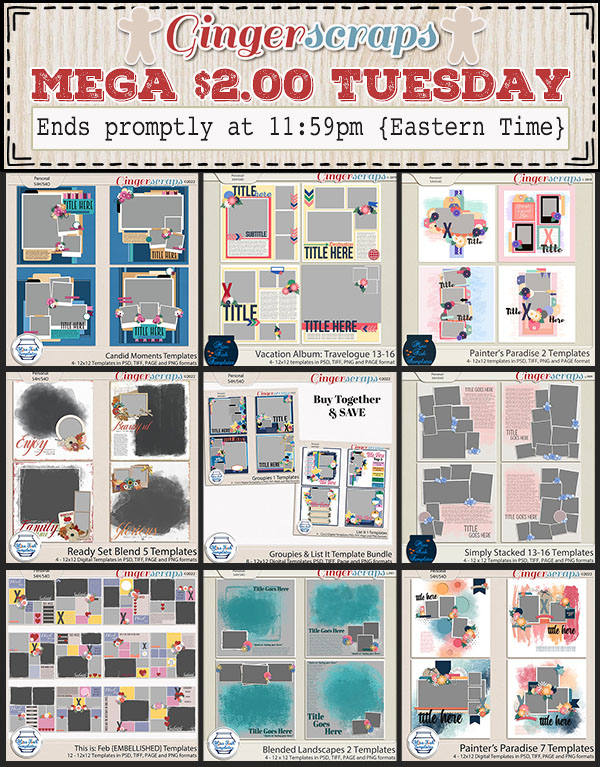
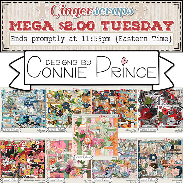
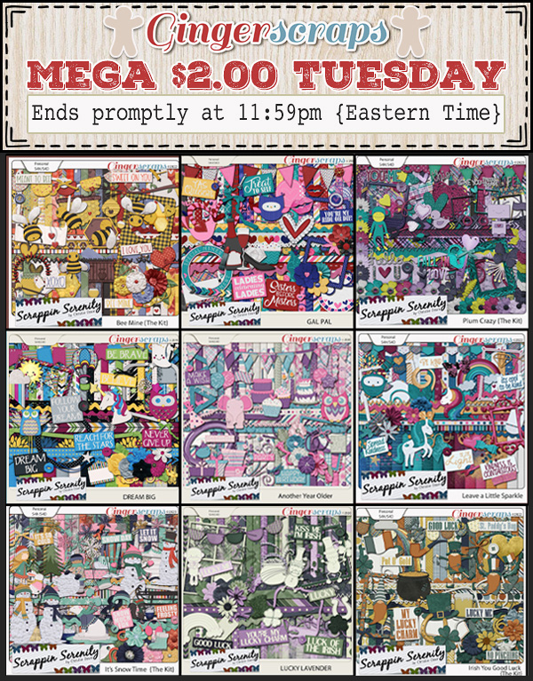
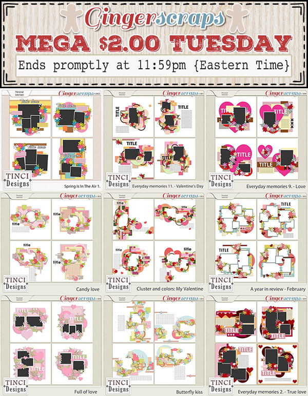
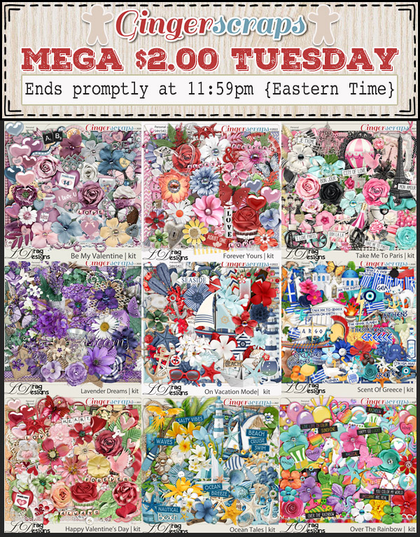
We also have something SUPER special in honor of Valentine’s Day our $2.00 Tuesday is a MEGA sale this week! There are a TON of super sweet deals for you to grab. TODAY ONLY!
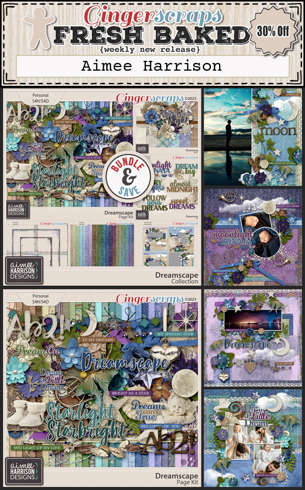
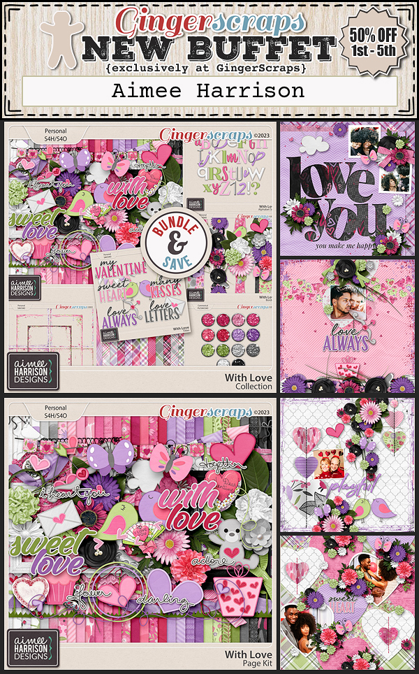
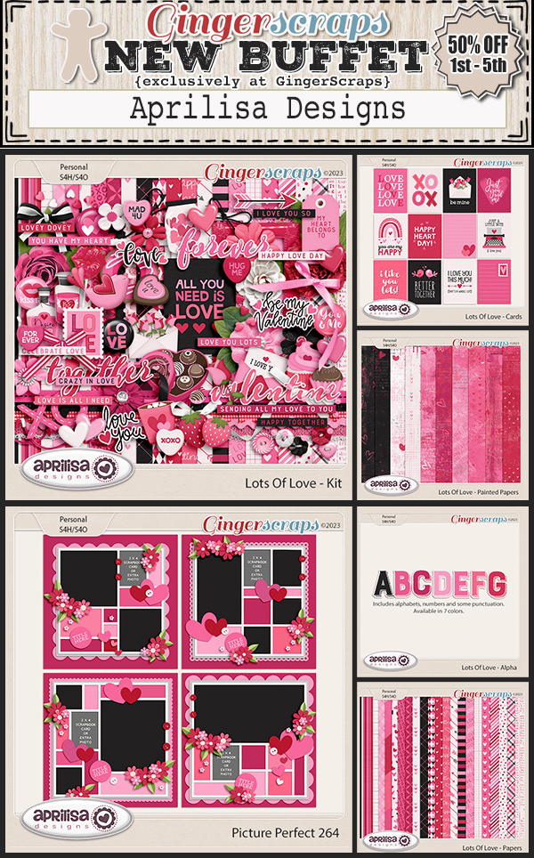
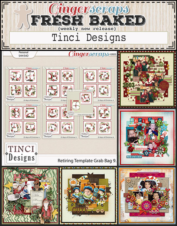
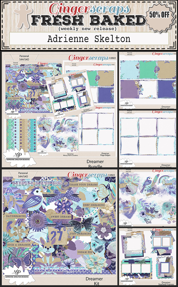
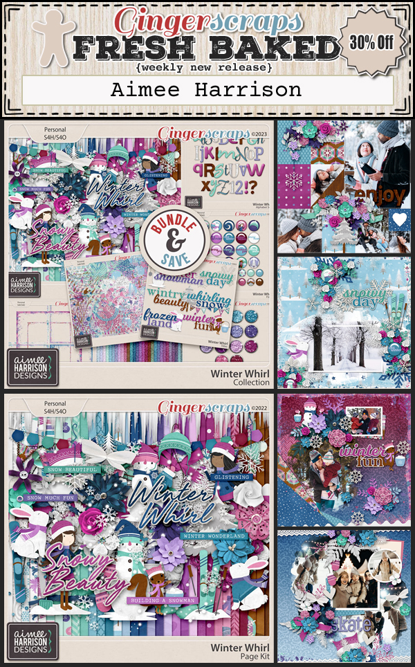
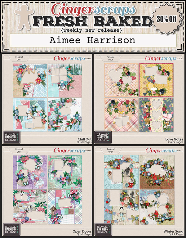
Here are just a few of the goodies in the $2.00 Tuesday MEGA Sale, be sure to visit the shop to see all the products included in this sale. 


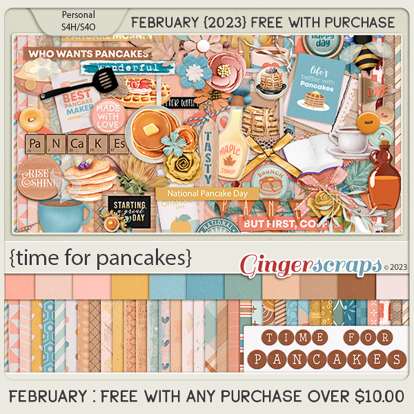
Remember if you spend $10 in the store, you get this great kit for free.
How are those challenges? Complete any 10 challenges and you’ll get this kit as a reward!