Hello lovely scrappers! We have a special treat for you, our 2022 Newsletter Hop!
You can hop around our designers newsletters and collect tons of fun free goodies!
All you need to do is sign up to receive the list of newsletters BEFORE February 22, 2022.
Please visit the GingerScraps forum thread for a complete list of all the participating designers!
{2022} Newsletter Hop!
*REMEMBER* scroll down to the bottom of the newsletter for your freebie from the site.
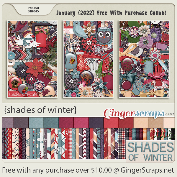
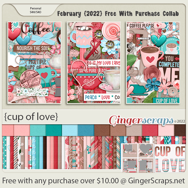
Don’t forget you can get this awesome kit for free when you spend $10 in the store.
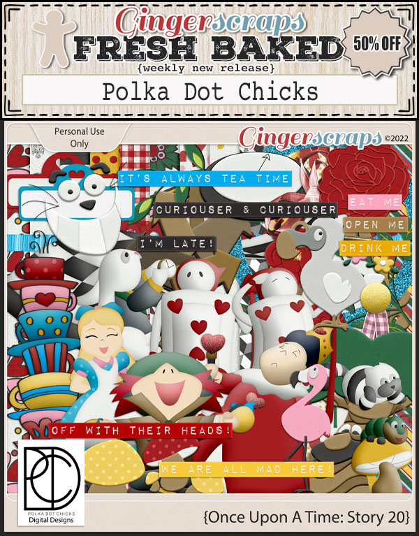
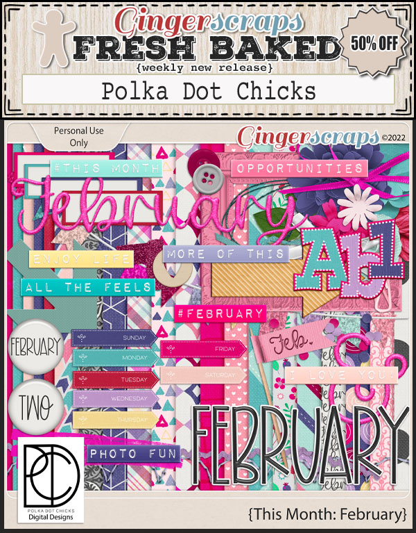
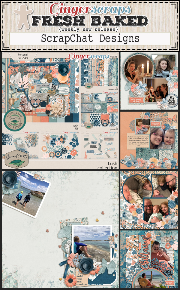
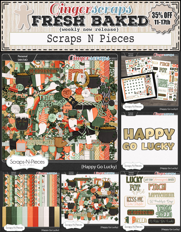
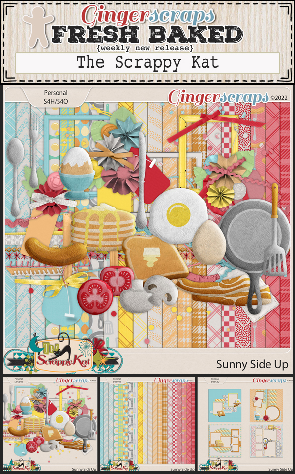
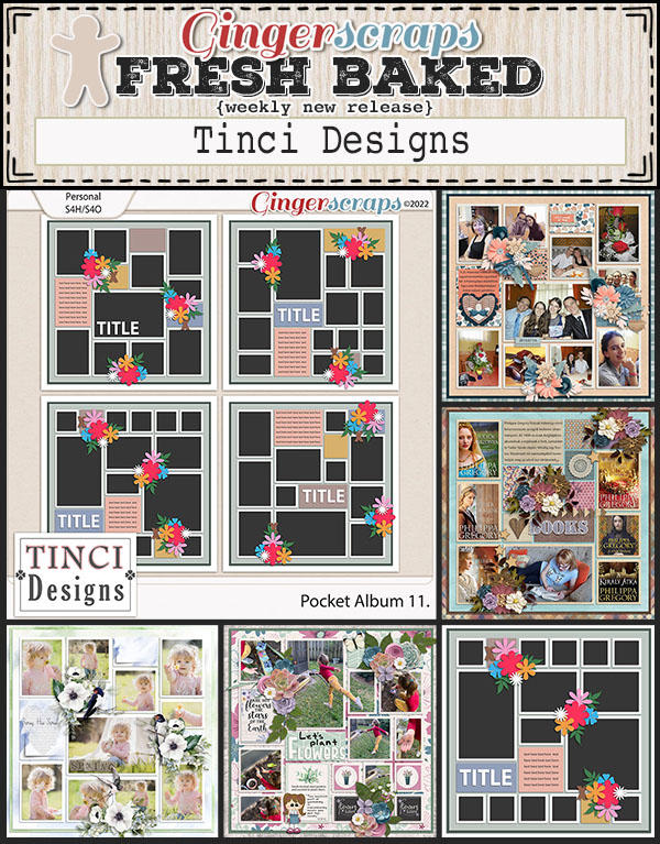
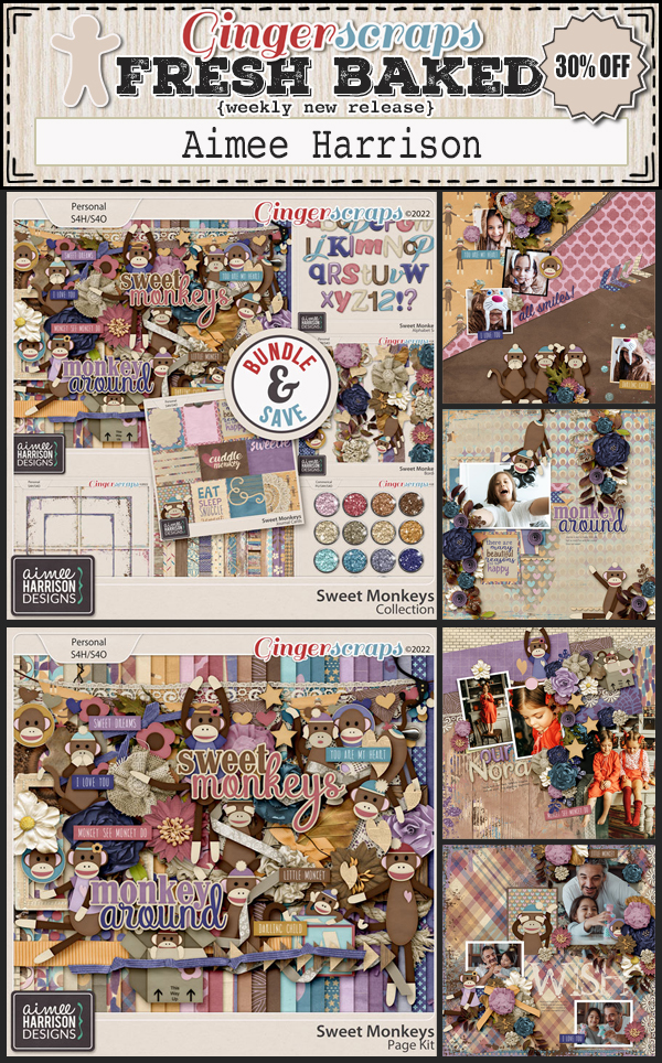
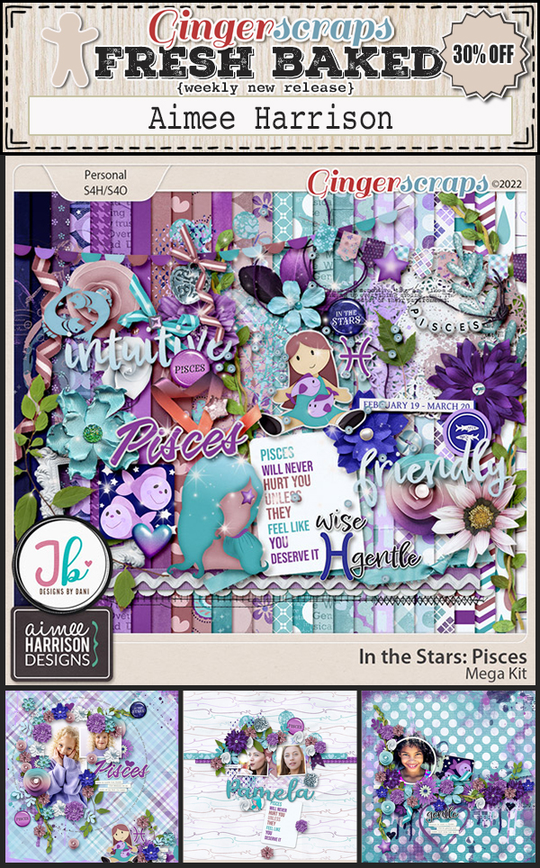
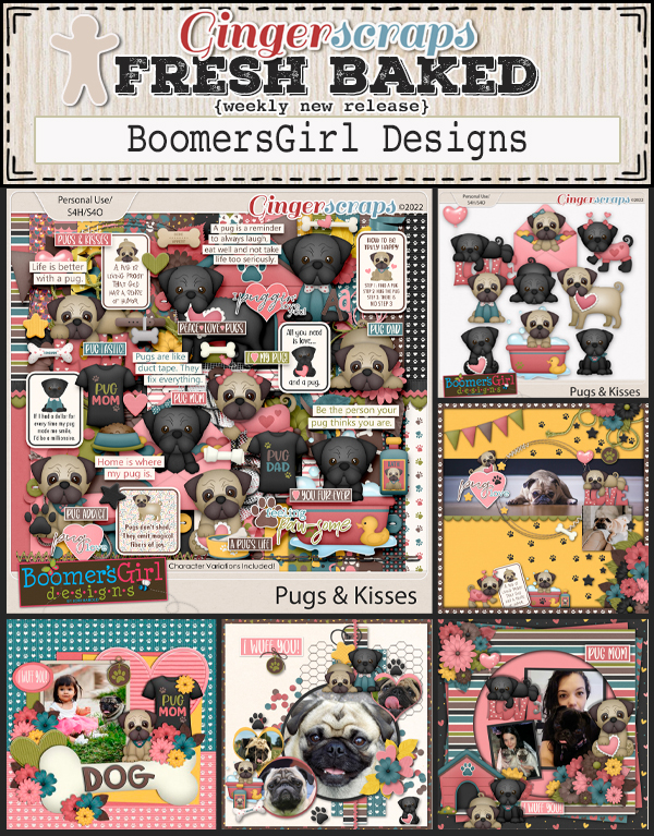
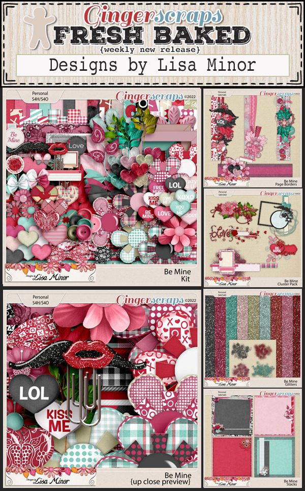
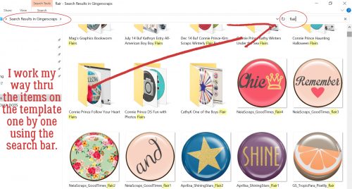
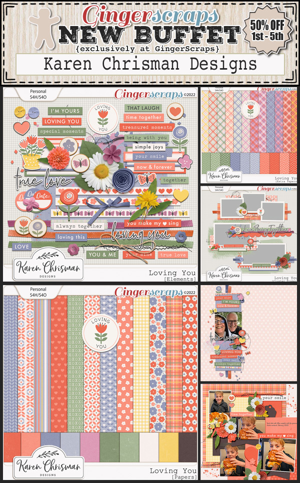
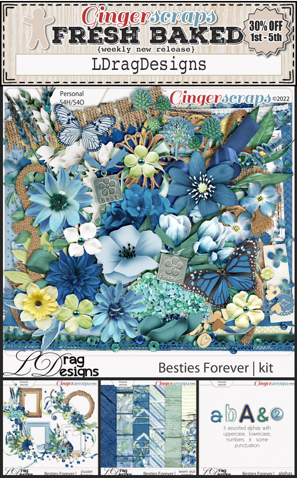
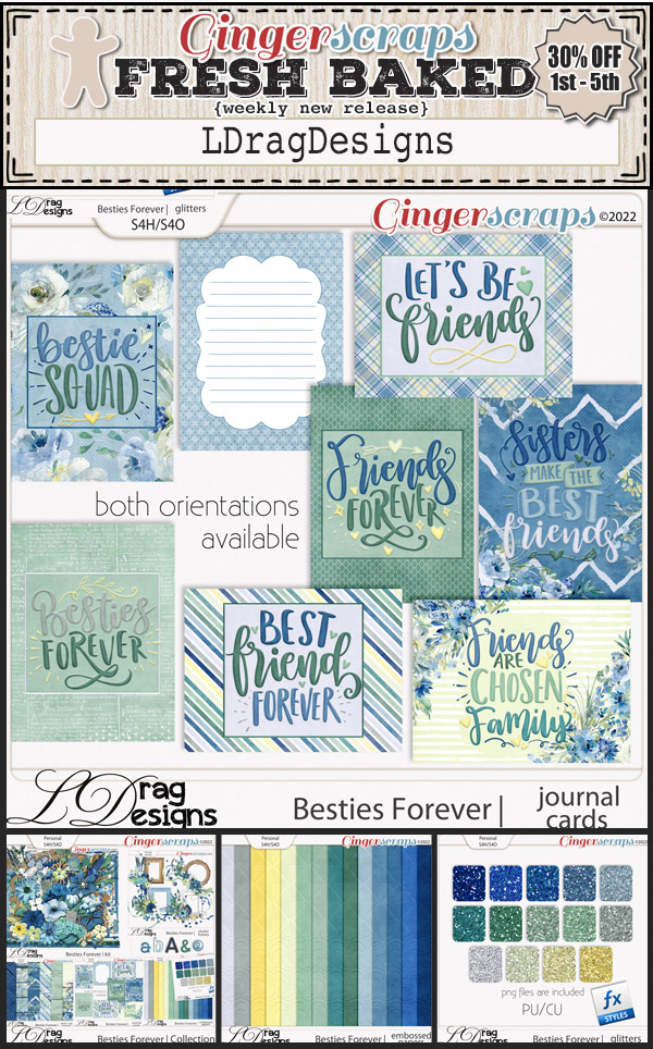
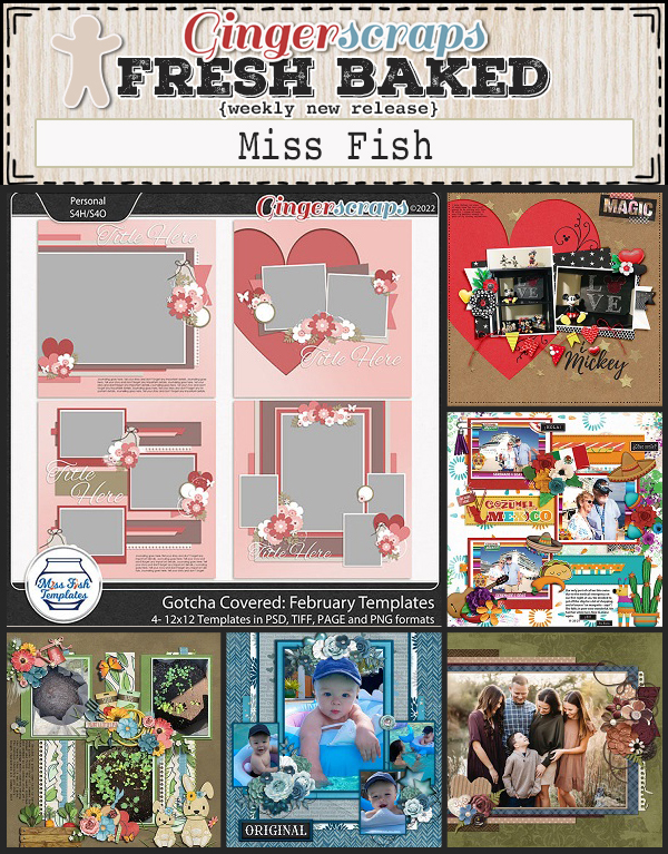
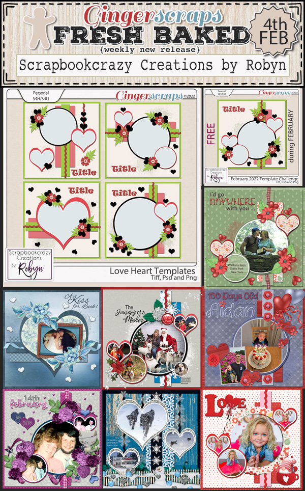
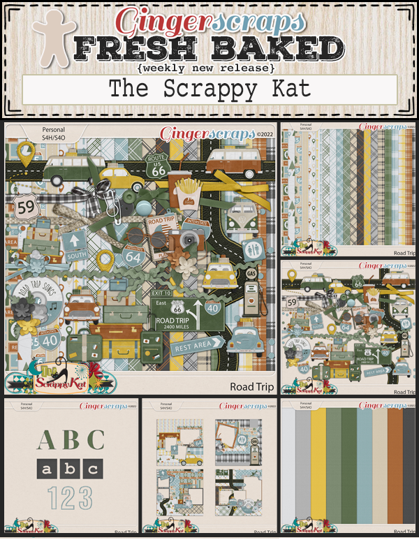
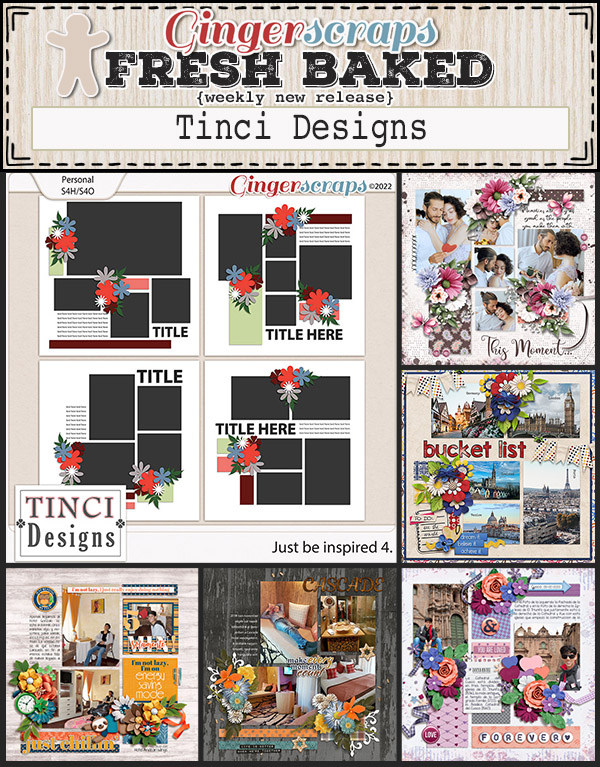
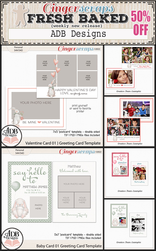
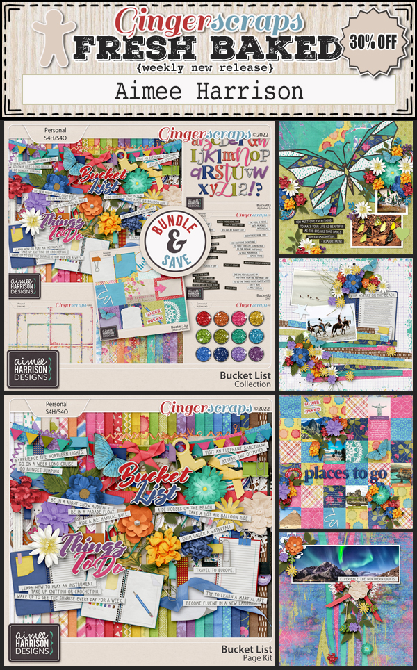
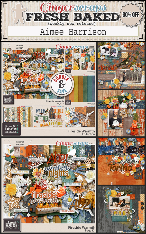
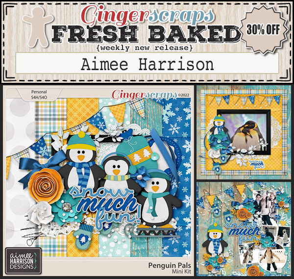
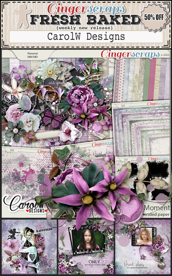
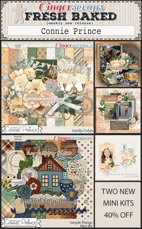
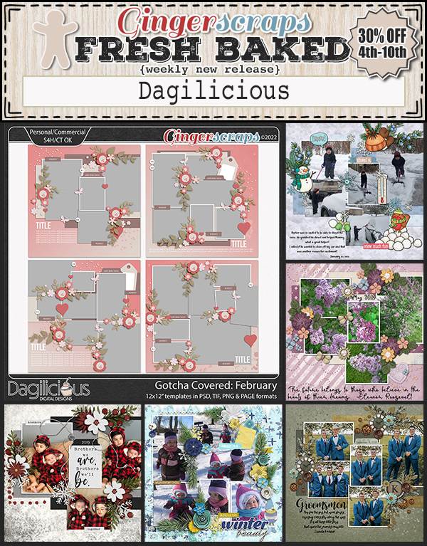
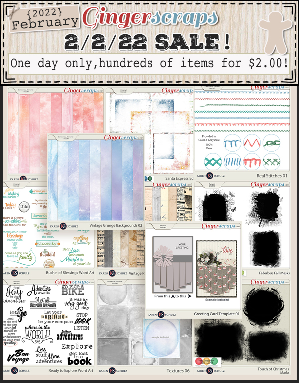
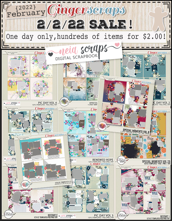
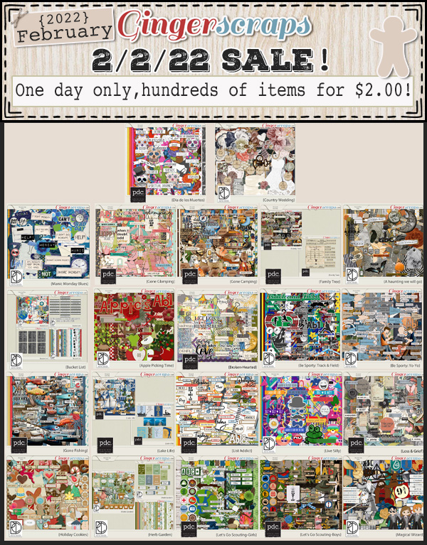
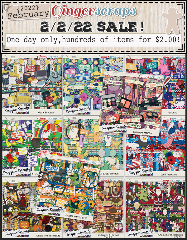
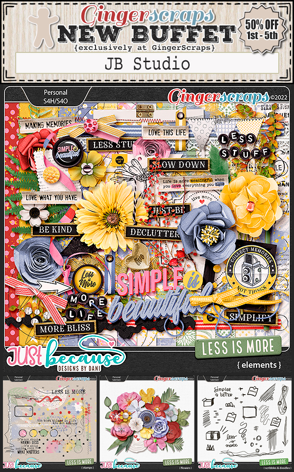
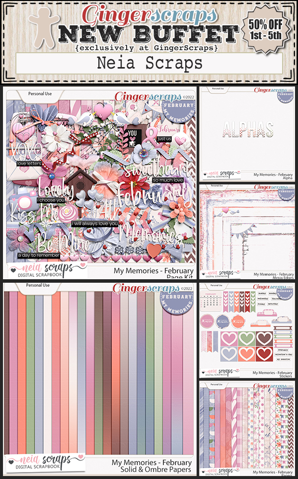
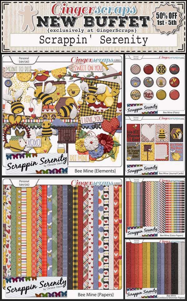
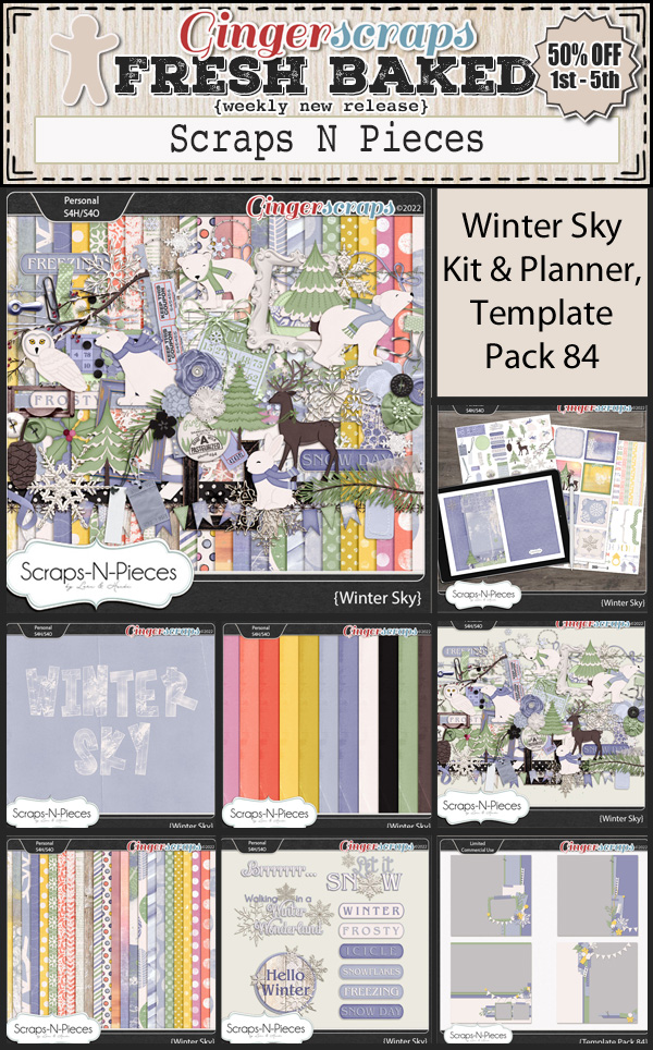
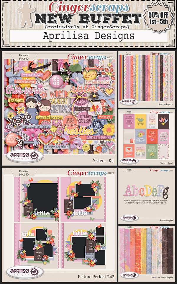
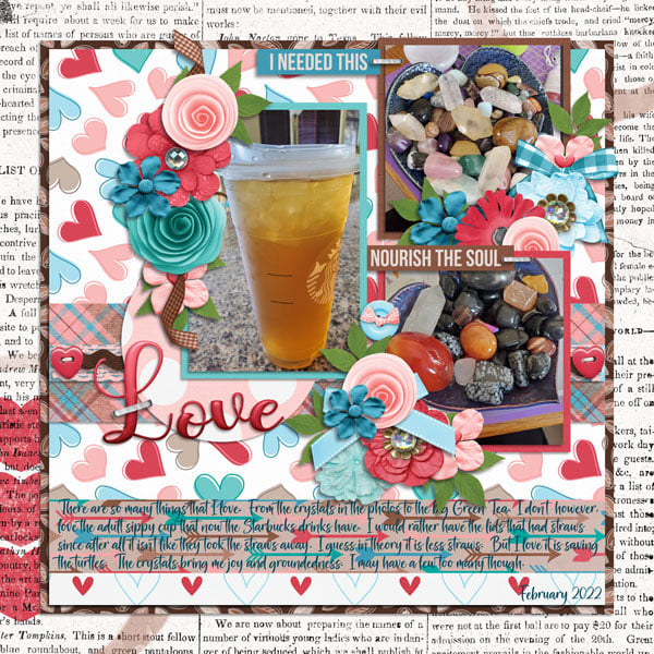
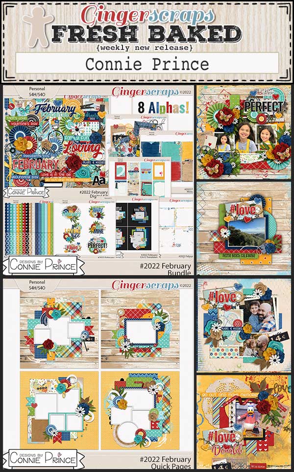
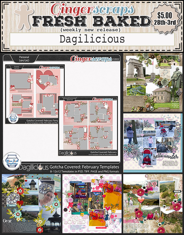
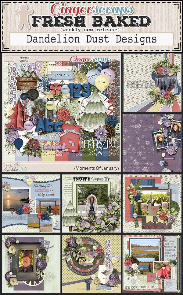
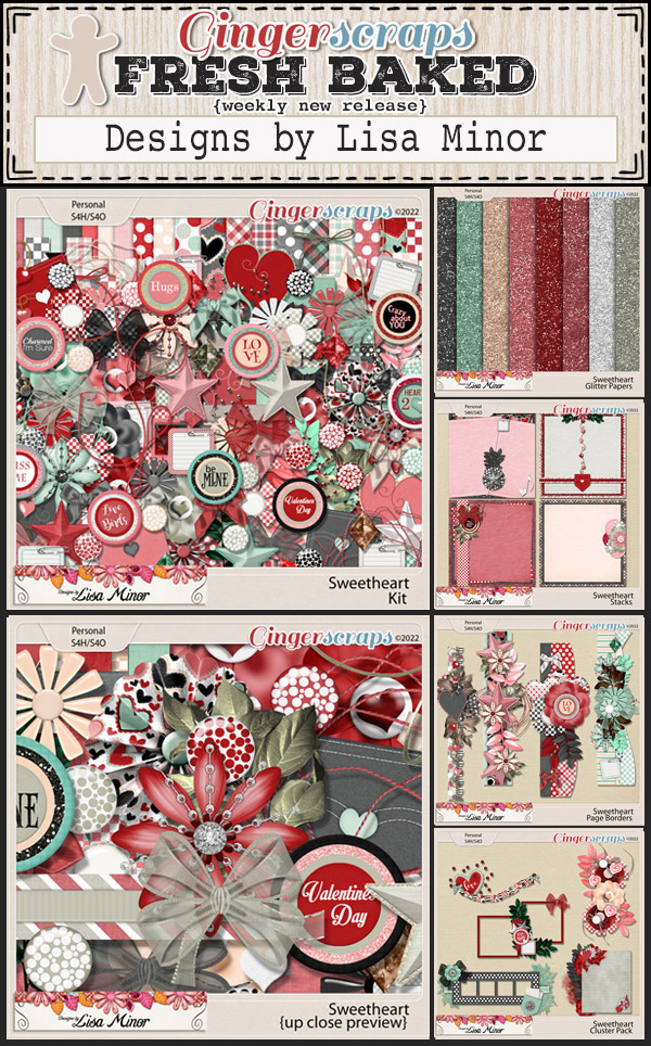
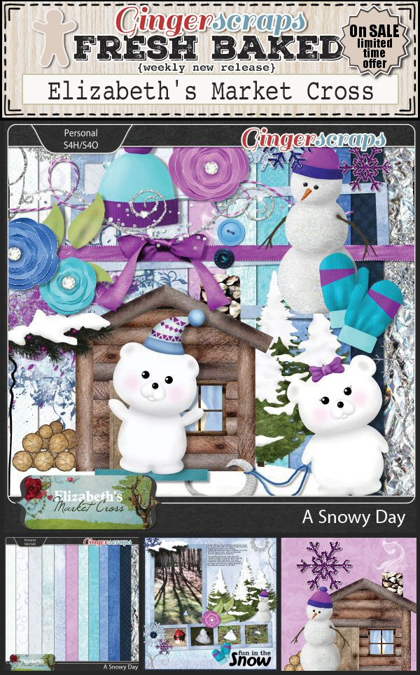
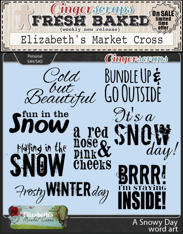
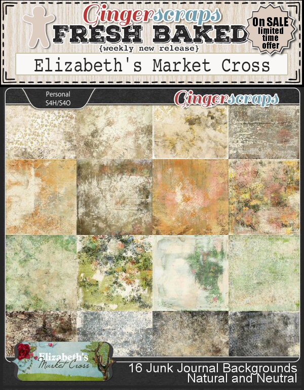
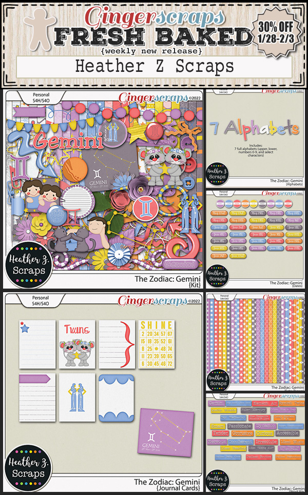
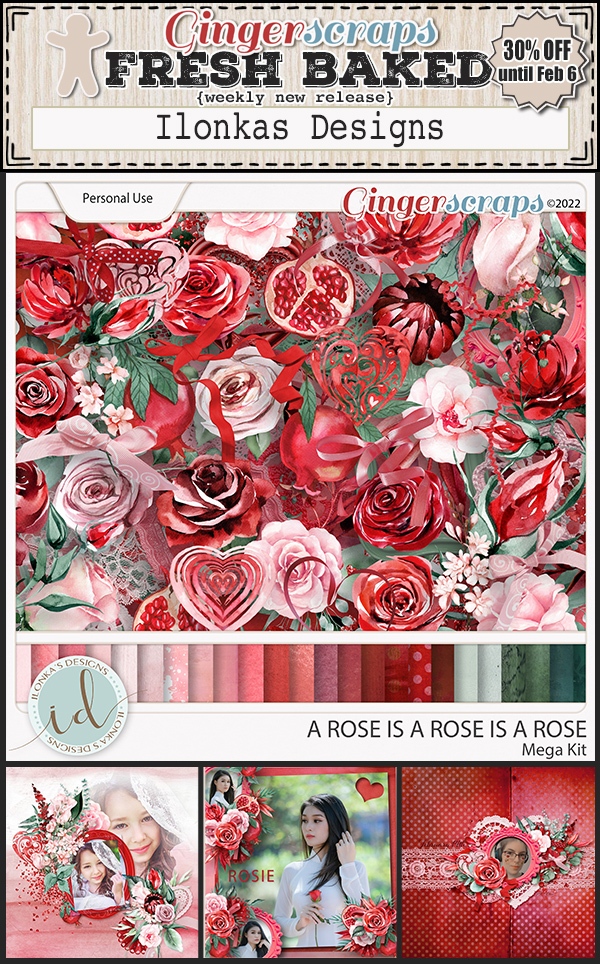
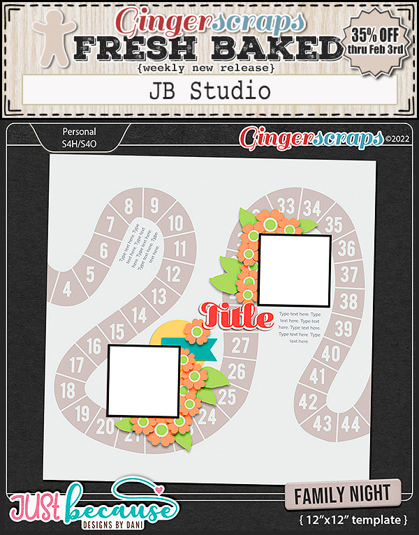
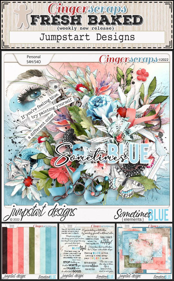
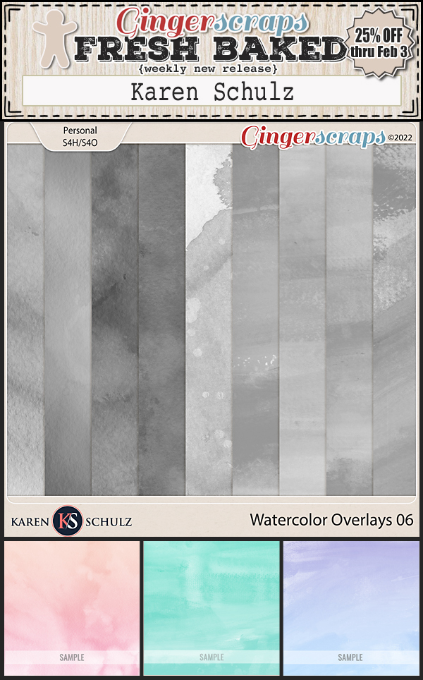
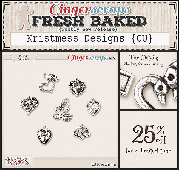
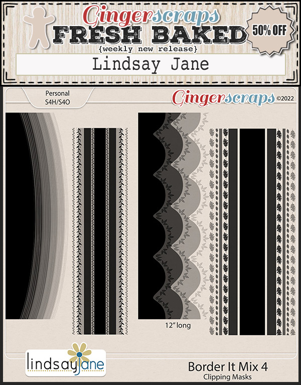
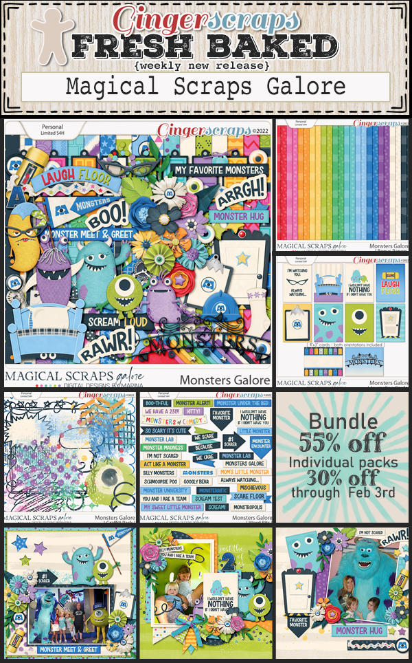
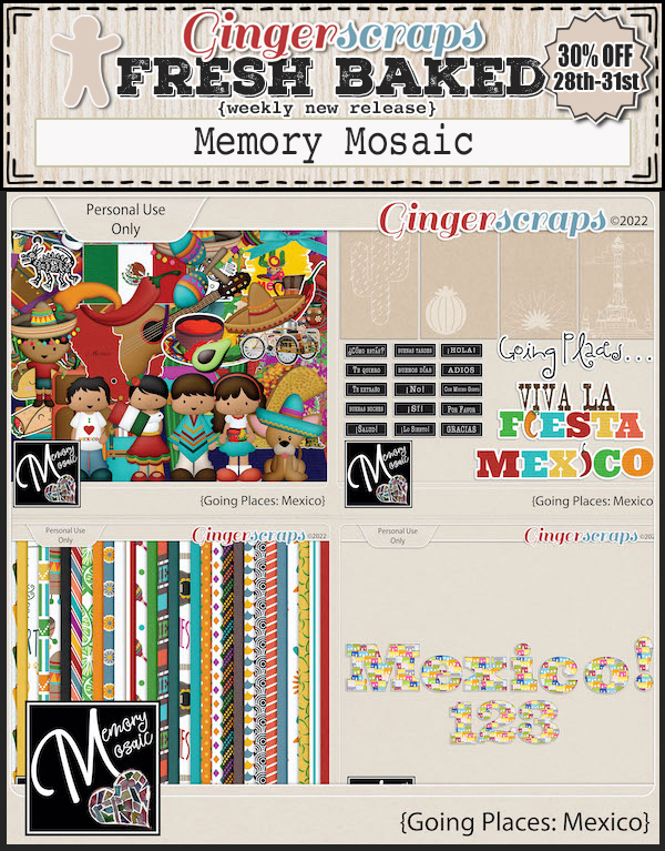
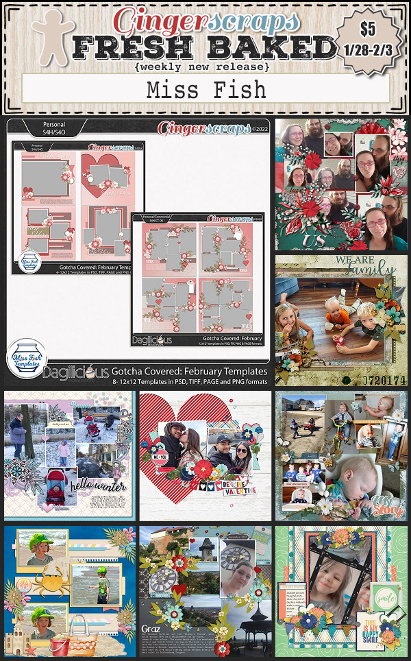
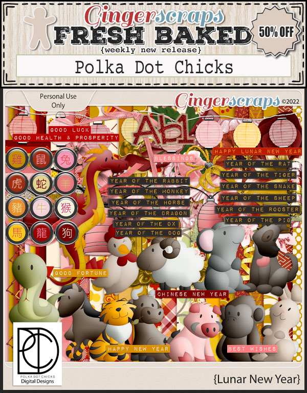
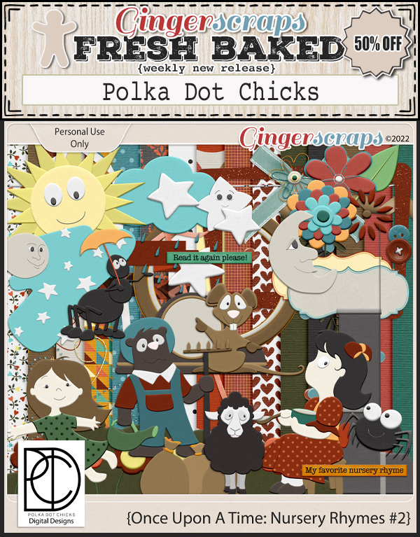
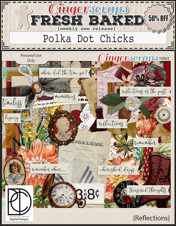
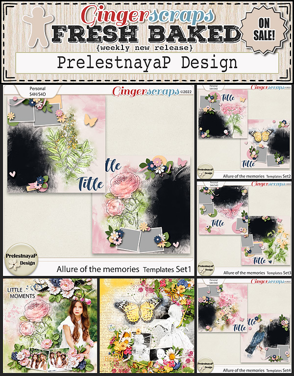
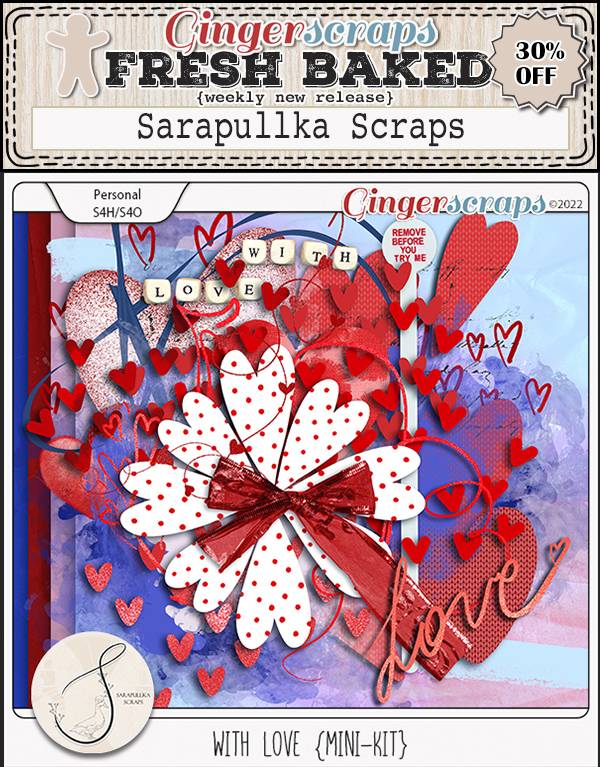
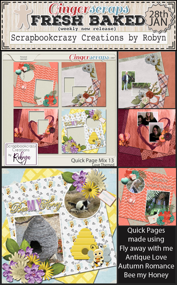
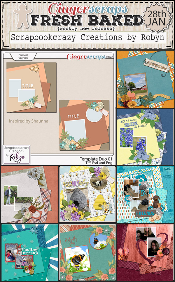
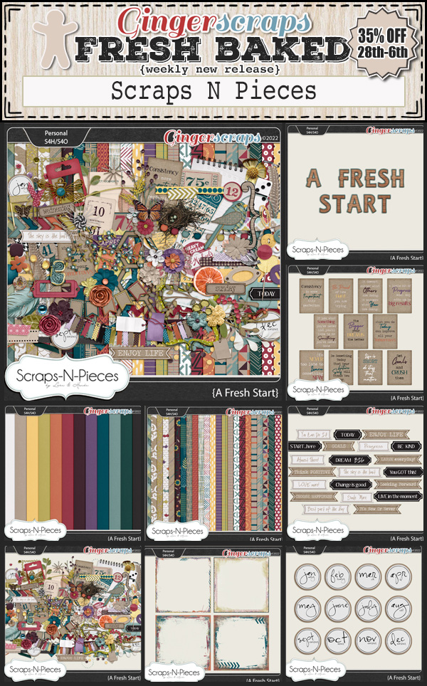
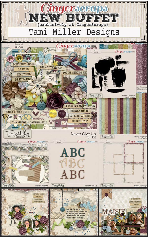
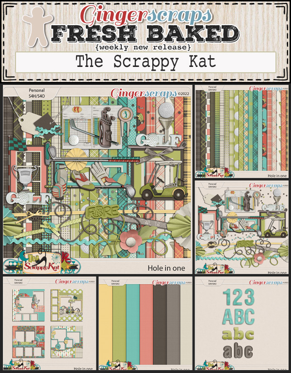
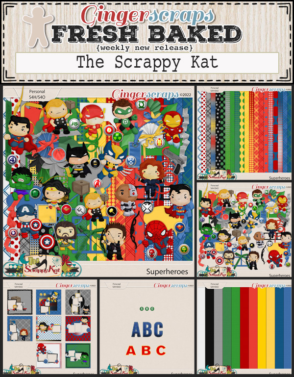
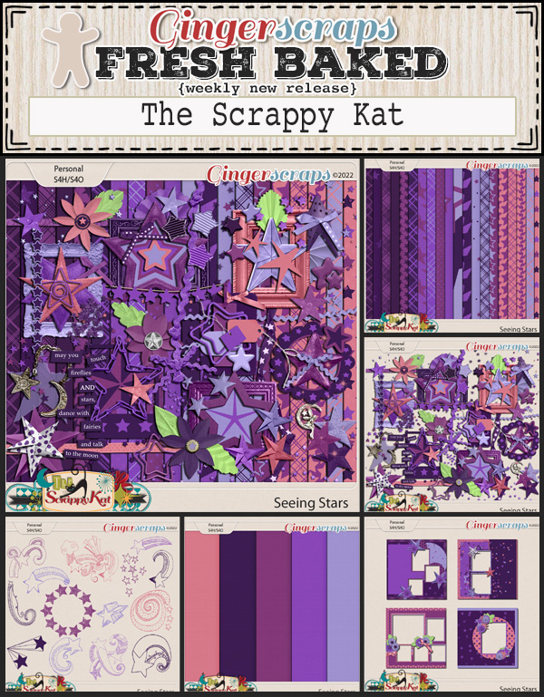
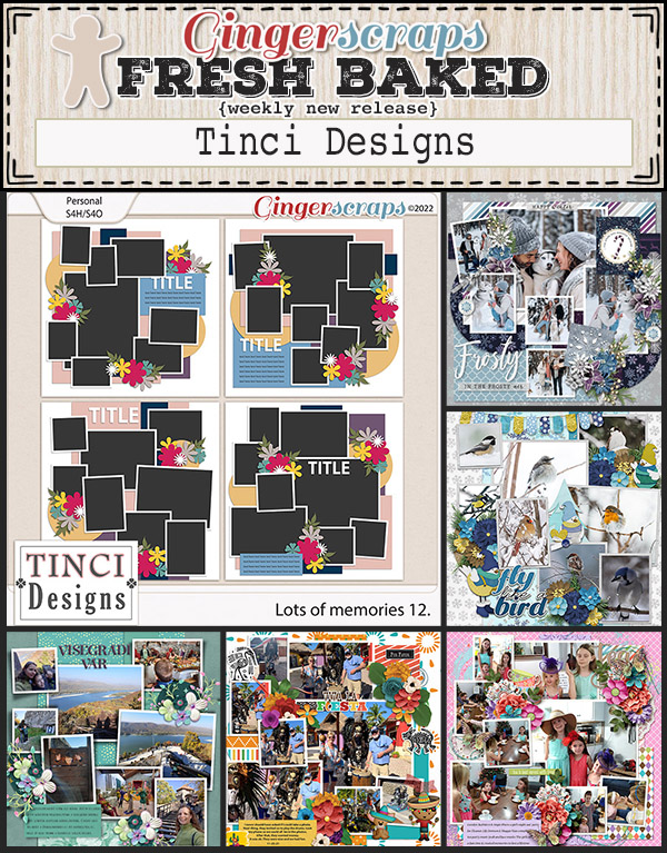
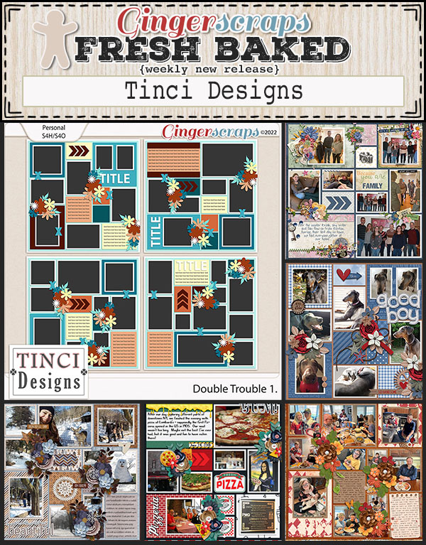
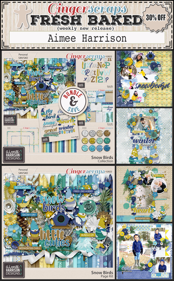
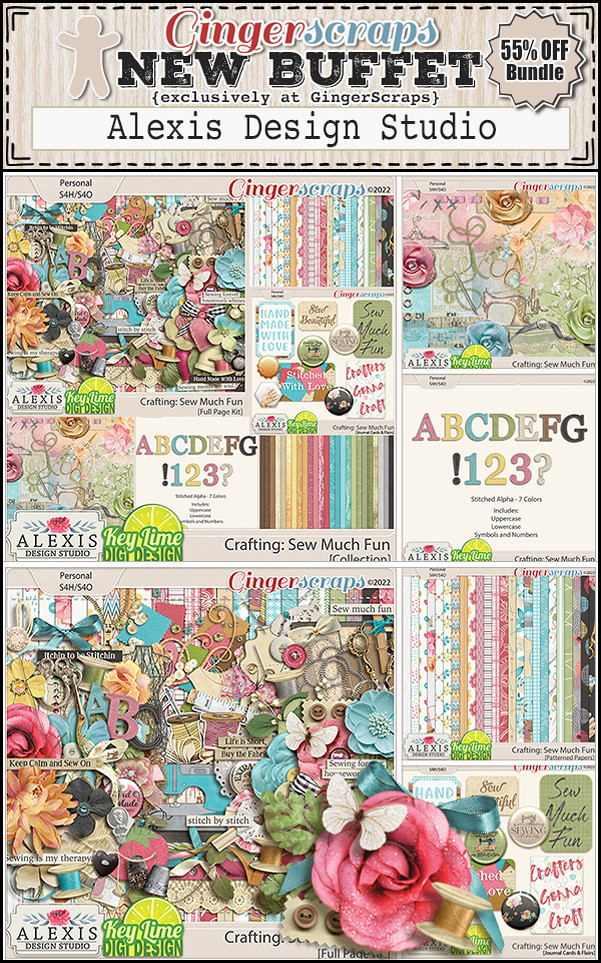
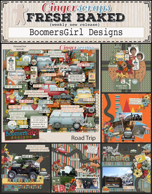
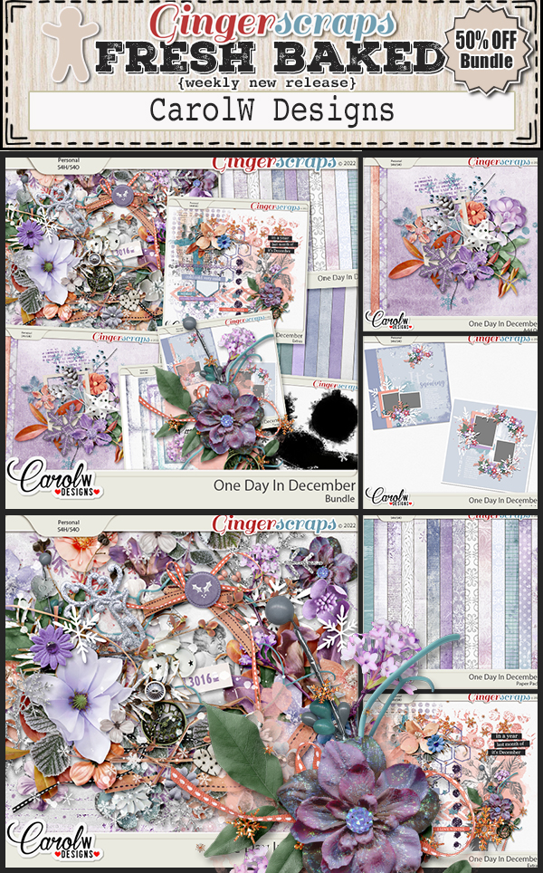
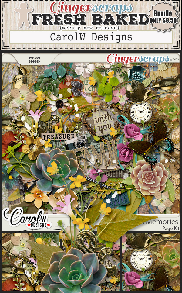
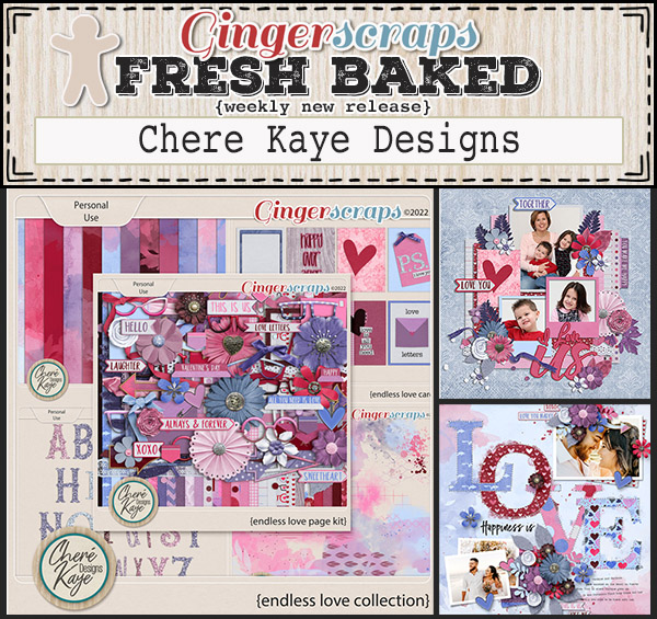
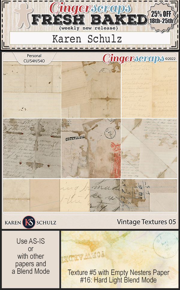
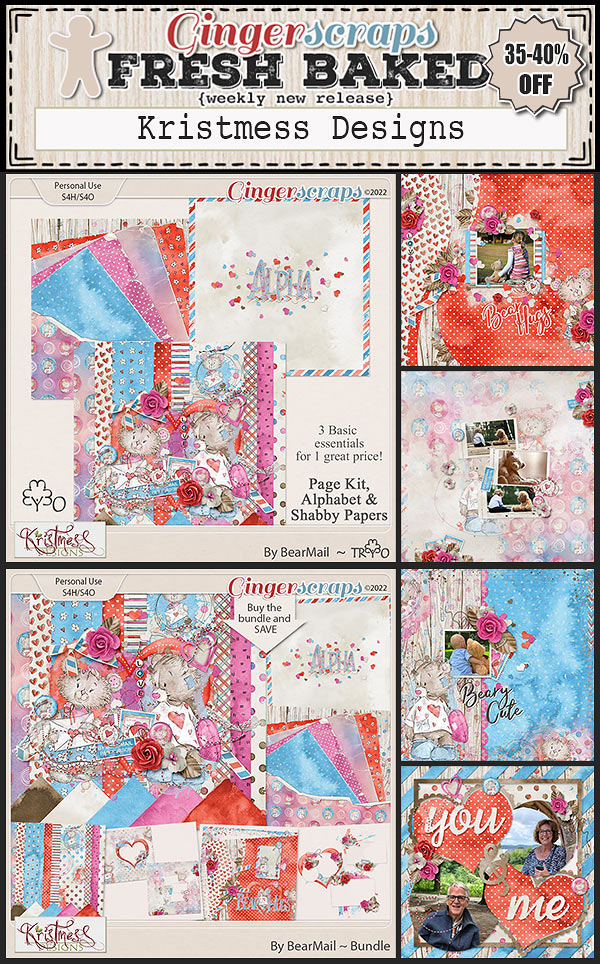
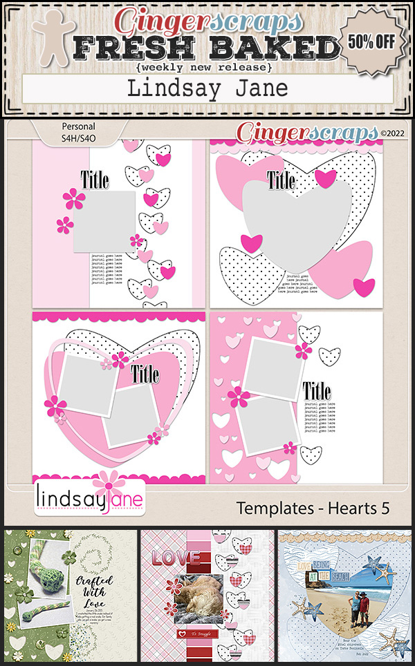
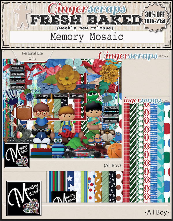
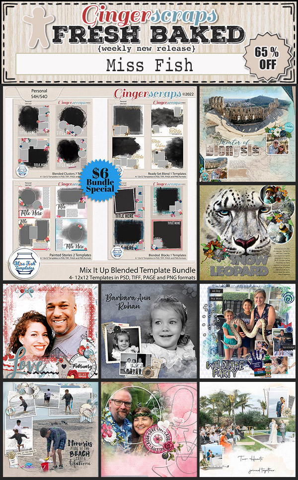
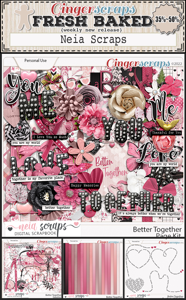
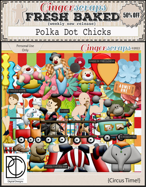
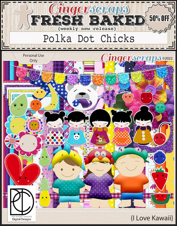
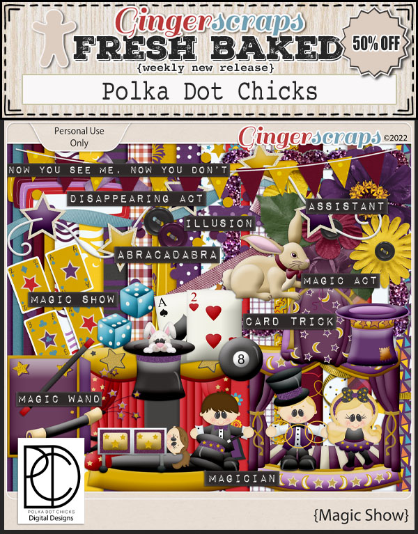
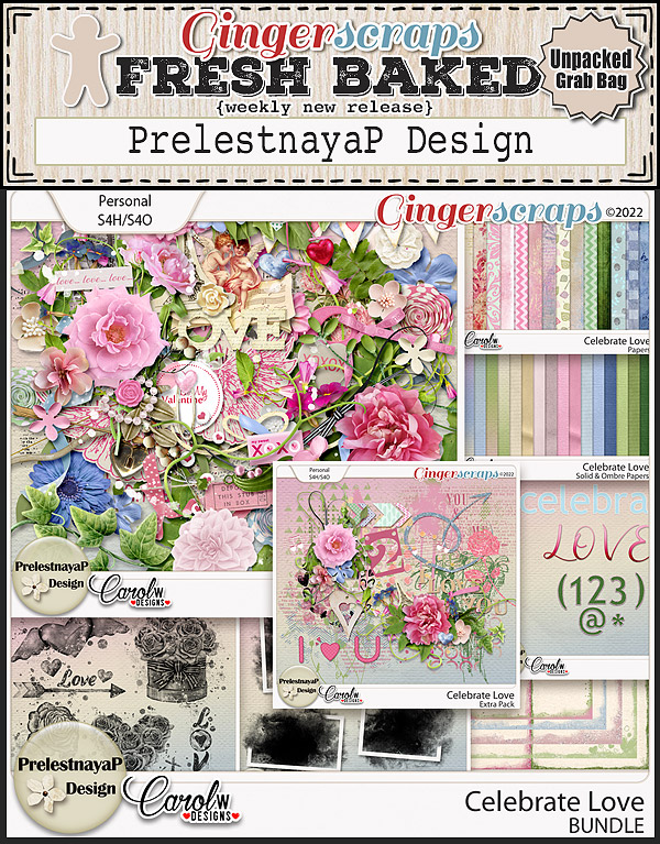
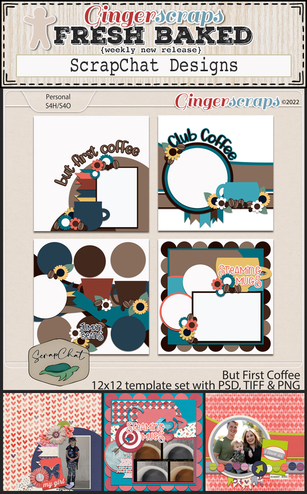
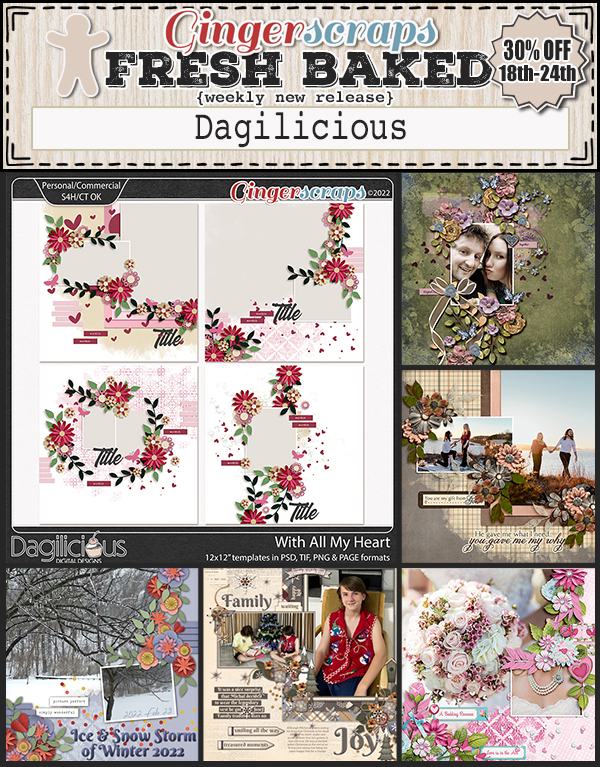
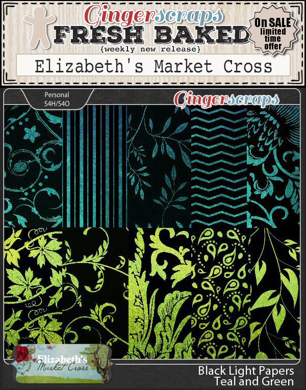
Let’s see what our designers have for us this week.


Have you grabbed the February Monthly Mix? It’s got some fun elements.

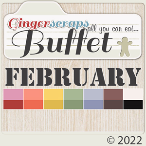
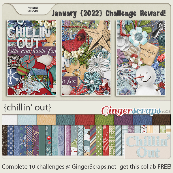
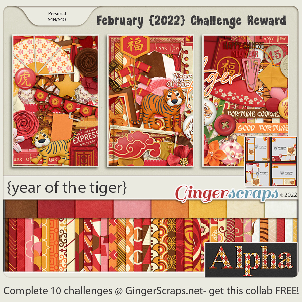
How are those challenges going? Complete 10 challenges and get this kit as a reward.
Don’t forget to grab your newsletter freebie as part of the hop.

DOWNLOAD LINK: https://bit.ly/3BaUkup