Getting More Mileage from Your Templates… Easily!
![]()
I know this is a ridiculously hectic time of year for everybody. And I also know that in a few short weeks all of us will have a plethora of new photos to scrap. So this quick little tut will show you how to make a template do double duty. Templates already help to streamline the process, and any time they can be modified to accomplish more than one purpose, it’s a bonus.
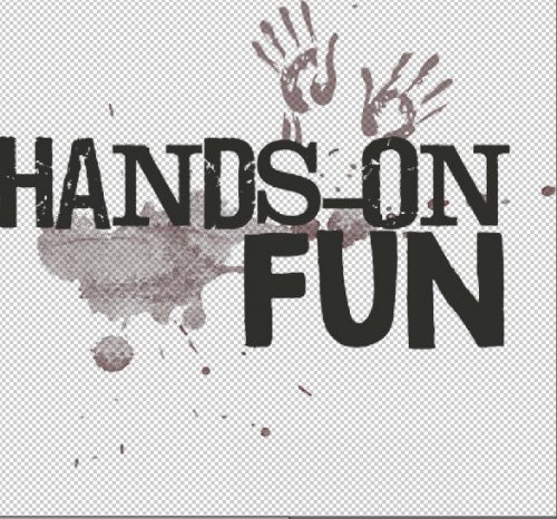
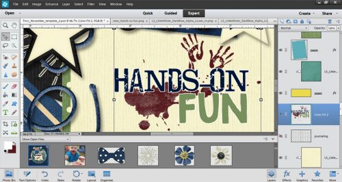
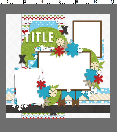
I had some very sweet photos of my daughter and youngest grandson that I was dying to make into a 2-page spread for the December Buffet challenge; I wanted the layouts to look similar but not identical, and I didn’t have a lot of time. So I found a template that would work really nicely for my photos in the lovely A Year in Review – December set from Krizstina of Tinci Designs, shown below. I’d already decided that Winter Whimsies from the amazing Katie – Just So Scrappy – would be perfect with my photos.

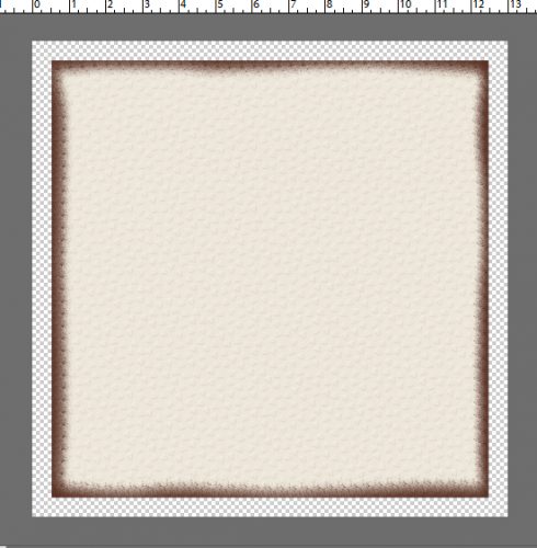
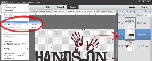
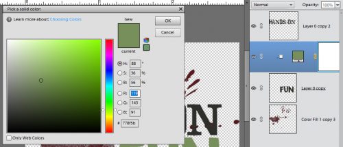
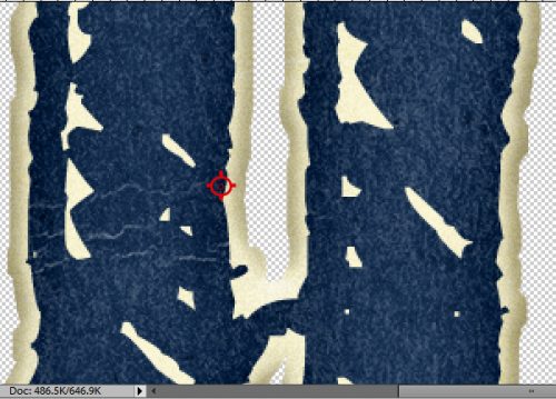
I knew I wanted to have the backgrounds identical to each other, in terms of papers used. So I turned off all the layers but the main paper blocks. A quick way to do that is to run your cursor over the eyeballs and up the column in the Layers panel while holding down the left mouse button. That’ll turn off every layer you run the mouse over.

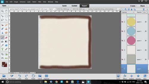
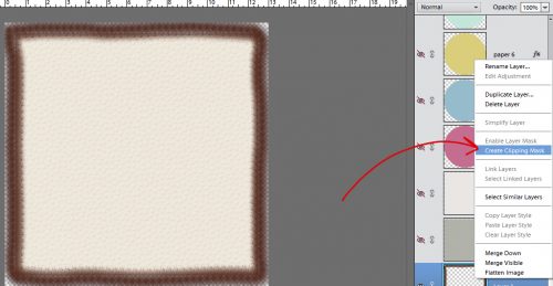
If you look where the arrows are pointing you can see the eyeballs have been closed. I clipped my papers to each of the template’s main paper layers and this is what it looked like. Kinda blah, I know, but it gets better!

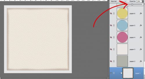
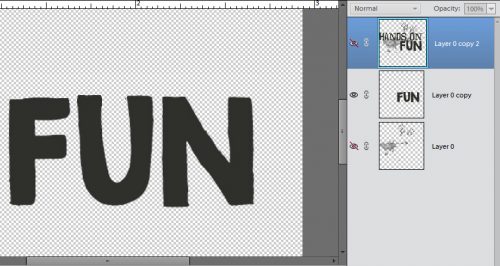
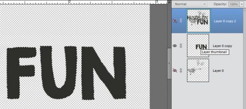
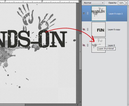
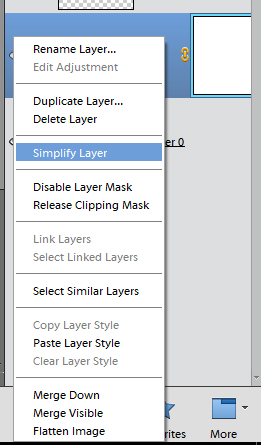
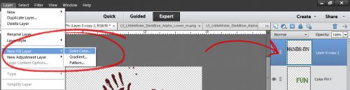
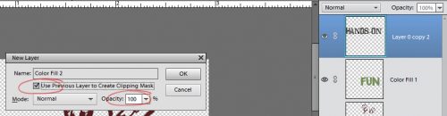
I’ve mentioned before that the symbols used by designers of templates aren’t RULES. They’re suggestions. You can substitute any manner of things for the flowers (for example), you can move them around if you find they’re covering up your photos in the wrong places, you can duplicate them or delete them and play with the any way you want. In a lesson down the road I’ll show you how to combine two templates into one smashingly unique layout. But back to the lesson at hand. I’ve turned on all the layers that were invisible before. This is an important step, because I want to know where all the place holders are later, when I use the copy of this layout I’m going to make in a second.
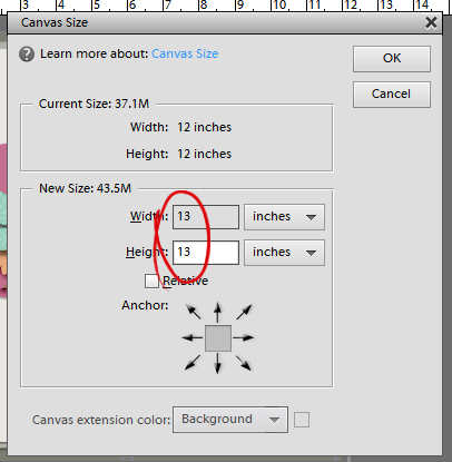
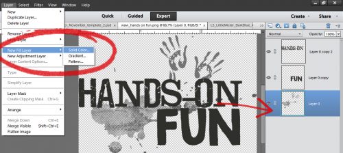
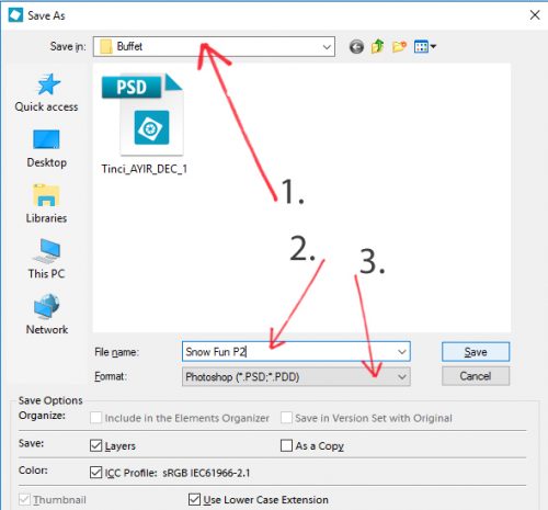
I took the steps shown below (oh, you know that’s a lie, I used keyboard shortcuts), and I saved the PSD file with the papers added in. I renamed the file so it wouldn’t overwrite the original template. I might want to use it again some day. For those of you dying to learn keyboard shortcuts, they’re actually right there in plain sight. CTRL/CMD>Shift>S is the quick way of getting to the Save As menu.

I’m going to share a little workflow tip with you now. I always make a folder for each of my layouts. Then I COPY the items I want to use into the folder so they’re all together and I can see how they’re going to look. When I’m ready to work on the layout, I open the folder and select all the items in it into PSE. Then when I’m all finished, I save the final layout in that folder both as a PSD file and a JPEG. When I’m positive I won’t need to make any changes (spelling, layers I forgot to shadow, weird little not-quite-right things I notice when I post to the gallery, you know what I mean) I can delete the rest of the things in the folder (BECAUSE THEY’RE COPIES) to save memory. That’s what I’ve shown you below.
In this step, I selected the folder I was saving to (1.) then renamed the file so I’d know which one was which (2.) and made sure it was still in PSD format so it could be changed later (3.)
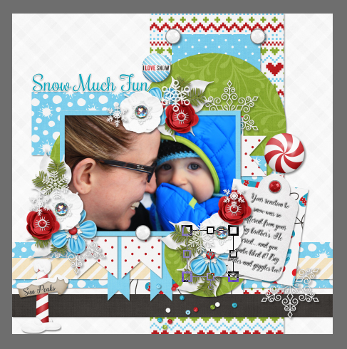
Here’s my first finished layout. (The gray border is the background of my workspace in PSE, not part of the layout.)

After I saved that layout as I explained above – with the layout name instead of the working file name! – I opened up the working template again. As I said, I wanted it to match the first one, but look different. I followed the steps shown below to flip the whole template horizontally so the paper strips would line up perfectly.

Then I went ahead and moved some things around a bit, eliminated one of the photos, used a tag instead of another of the photos, enlarged the one that was left, changed some of the elements I used and ended up with this!
Here are the two layouts side-by-side, just the way they’ll be in Aaron’s birthday album of his first year in pictures.

There you go… short, sweet and to the point. Have a great week… I’ll be thinking up something new to share with you next week.
![]()