Hi fellow scrappers. Hope your week is starting off well.
Today we’re focusing on the A Year Of Blessings Challenge and the first Template Challenge.
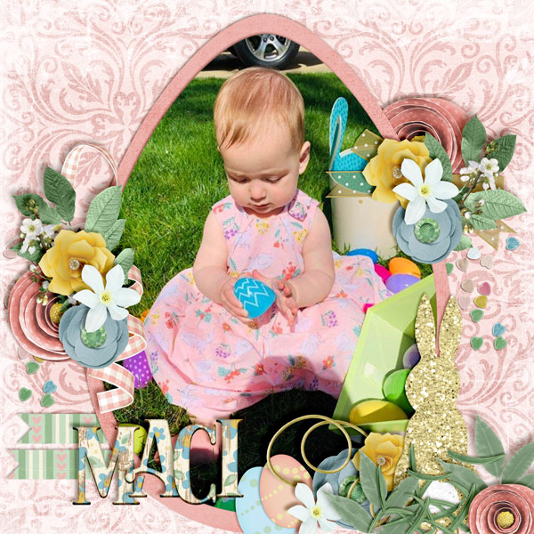
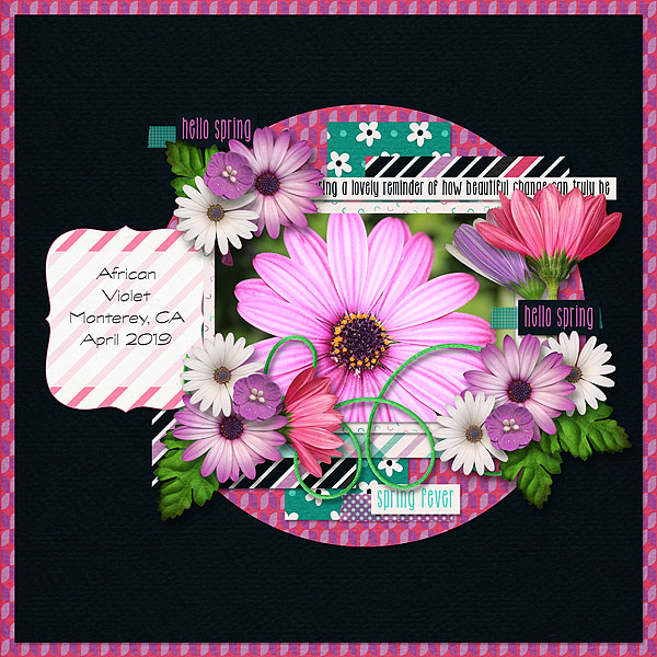
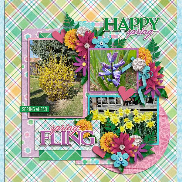
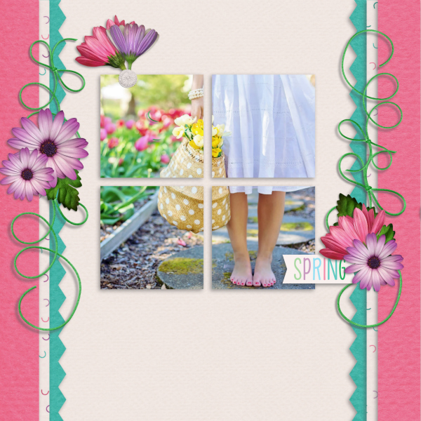
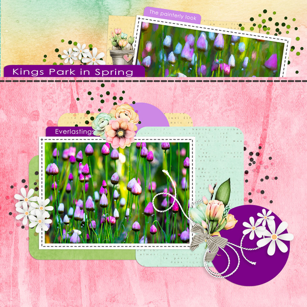
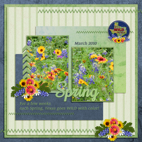
First up is the A Year of Blessings Challenge. This month it is hosted by Luv Ewe Designs. Her challenge to us was to scrap flowers. That is a perfect subject for me because my husband loves to photograph flowers. While we were vacationing in Lake Lure, NC in Jnue of 2018, we got to experience their Flowering Bridge. It was a super experience. Here is my take on the challenge and a few others I’ve chosen from the gallery.

From Grace:
From Dannisa:
From ktmoonblue:
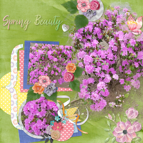
Aren’t these beautiful?
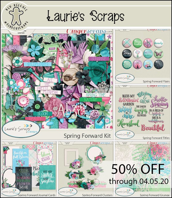
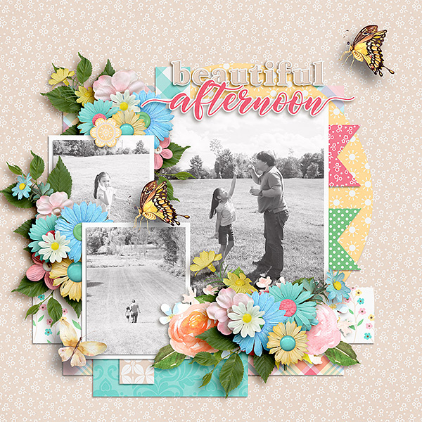
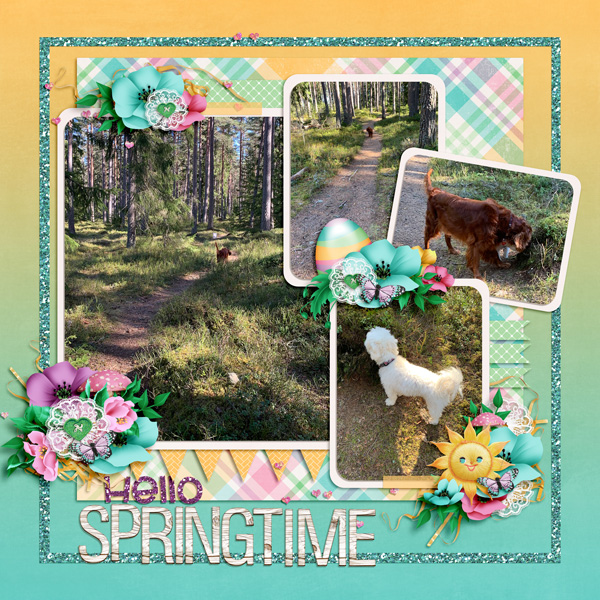
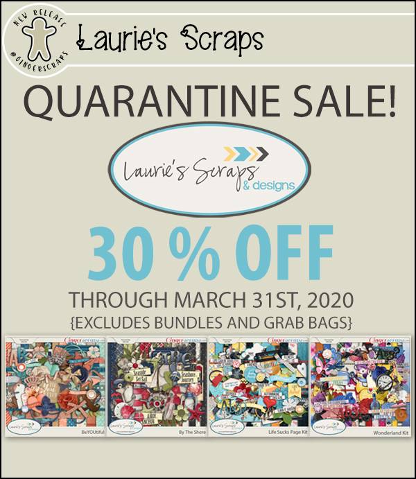
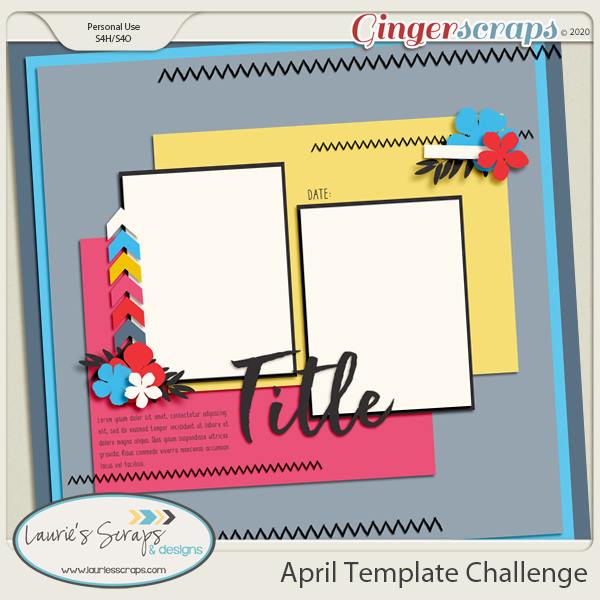
Next is one of my favorite challenges each month. The Template Challenge. There are two of these each month. This month the first challenge is hosted by Laurie’s Scraps. Look at this gorgeous template that she has provided for us to use.
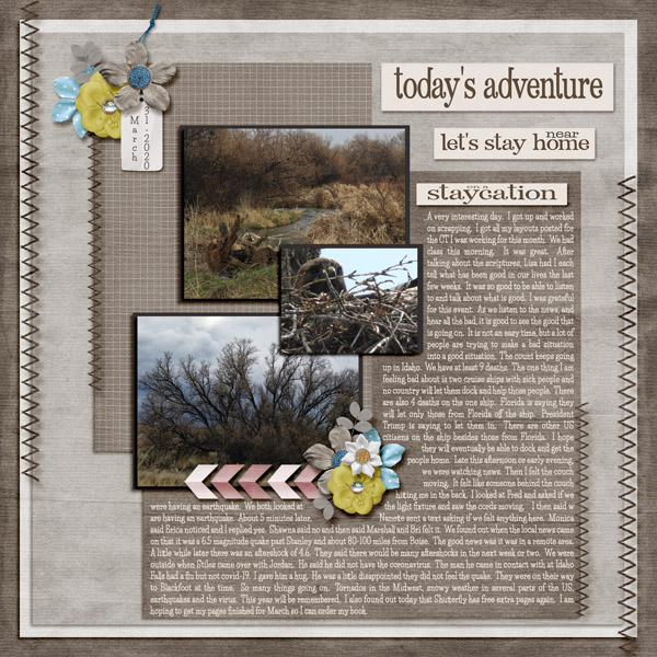
I love working with templates so these fall right into my wheelhouse. I had a blast pulling out some older pictures of my kids. They are now much older than this.

From KatherineWoodin:
From pjm117:
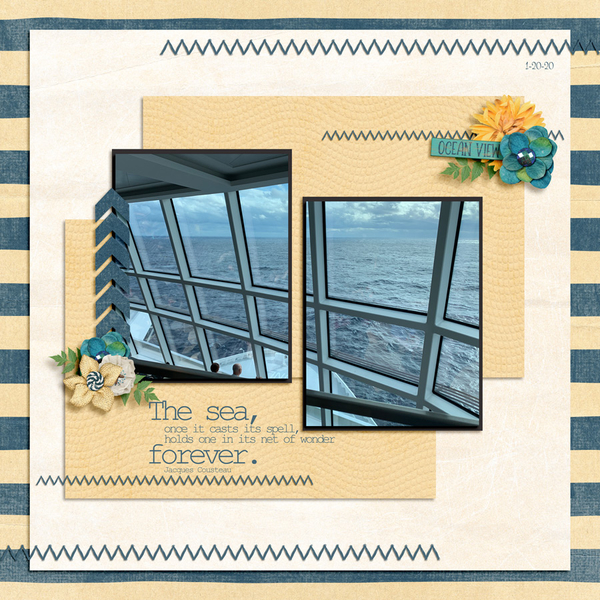
From poki04:
So much fun playing with these.
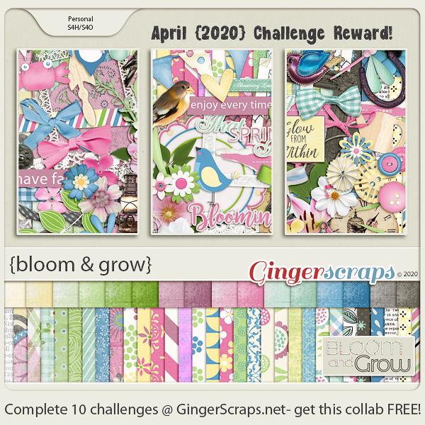
Remember, any 10 challenges completed will get you this full kit!
I’ll have an other challenge spotlight on Wednesday!