Decluttering Isn’t Just for Homes
![]()
It’s January. It’s bone-chillingly cold in some parts of the world (like HERE!) and unseasonably warm in others. The holidays are over, and winter stretches out in front of us like a long and bumpy road. There’re no truly exciting events on the horizon, so what’s a girl to do? Well, the flyers are filled with supplies for organizing our stuff… But for digiscrappers, we don’t need to buy anything. It’s all right in front of us! I think now is a good time to talk about organizing our stuff, and maybe actually making some effort to get ‘er done. This is how I do it, but I know y’all have your own way of doing things, The important part is to DO it!
It’s not as important where we start as that we actually DO start. For me, the place to begin will be with all the new kits I’ve amassed but haven’t unzipped. This is actually my New Year’s Resolution, to unzip and relocate my supplies as soon as I download them. I was keeping up just fine until my dogs started fighting in the house and I had to spend a lot of time keeping them away from each other. I have a backlog, and I WILL attend to it ASAP. I use Extract Now, a free rapid unzipping app that makes the unzipping part pretty easy. I make folders within my download folder into which I unzip the new goodies, which eliminates a couple of steps in the process, and it works pretty well. I still go through each of the subfolders, deleting all the duplicate previews and things I know I’m not going to use (like alpha sheets!). If the kit is templates, I delete the PNG files and the TIFF files, and I add to the name of the previews to include single or double and the number of photo spots the template includes. That lets me put a keyword like “single4” in the search bar and Windows will find all the previews with 4 photo spots. Once I’ve arranged my folders the way I like them, I move them en bloc to my digikit folder for the store or designer as appropriate. Then my download folder should be empty. Until I fill it up again!
The way I sort my digikits is primarily by store or by designer’s creative team, with the exception of Heartstrings Scrap Arts… I have so many of Bryony’s kits I need a separate folder just for them. Having said that, my GingerScraps folder is ENORMOUS! (24.6GB without the kits sitting in my downloads folder. Thank heaven I have a 2TB drive on this laptop!) I rename each kit’s folder: DesignerNameKitName, unless it’s a Buffet kit, then it’s MonthYearBufDesignerNameKitName. That makes it easier when I’m doing a store challenge.
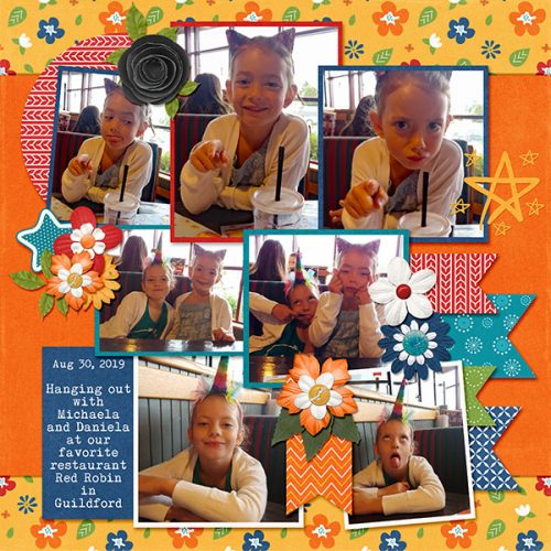
I try to organize my photos as I take them, so the job isn’t too daunting. I don’t care for the Organizer that comes with Photoshop Elements so I don’t use it. But it can be very useful for both organizing and retrieving your photos. The Help menu can give you some ideas about how to maximize your efficiency. The way I file my photos is in folders… what else? I create a new folder for the current year, and a subfolder for each month. I download a lot of photos from my daughter’s Tiny Beans album where she posts pics of my grandchildren. Those I rename with a suitable tag so I can run a keyword search later. If I’m looking for photos of Aaron, I just type in his name. These photos go into the folder for the month and year they were taken so I have some frame of reference later. I have a folder for the photos my friend Sandy takes and graciously allows me to ‘steal’ and one for the photos I download from Pixabay. My Pixabay folder is broken down into subfolders by topic: Kids, Insects/Flowers, Animals, Portraits, Scenic and such. This method of filing makes it a lot faster to find what I’m looking for.
I also organize my layouts. I have folders for each month’s challenges, with subfolders for the challenges themselves. When the year is over, they all collectively are filed in a folder for the whole year. Then again, I have some folders that have copies of the finished layouts for my daughters’ weddings, my grandkids’ first years, all of my Ireland layouts and for the creative teams I’m on. It’s all about finding things later!
Since I set up this new(ish) laptop back in September, I haven’t taken the time to go through my 1400+ fonts and retag them for MainType. That’s something I really need to get on with! It’s a daunting task, but you know what they say. Focus on the first step. I know the time I spend on it now will decrease the time it takes me to find the one font I’m looking for later. The best part of MainType is that I decide what my tags are, based on MY workflow – how I search for things. And like everything else, if I work at it as I add new fonts, the amount of time I spend on it will go way down. But just writing about it is giving me a rash, so let’s move on!
One caveat. If you’re going to delete duplicate files, make sure you only delete the ones you’re not going to want to search for later. I made the mistake of using a Windows utility and chose the wrong metric so it removed a LOT of my original templates and left me with the PSD files for the last layout I used them for. Retrieving the original template takes a lot of time but is necessary when I use the search feature to find previews for my desired number of photos.
I’m interested to hear how YOU organize your stuff. So please, share your secrets!!
![]()