X-Fonter – a Powerful Font Manager
![]()
PDF Version : https://bit.ly/3Z81CLe
First off, I apologize in advance for the lateness of the hour. I’ve had a MILLION interruptions today and am desperately playing catch-up. Now, on to the tutorial!
There has been a lot of chatter about font managers, both for digital scrapbooking and for Cricut users. I’ve used High Logic MainType for a few years and ran a tutorial on it a while back. Recently I got this PM from Kathi (aka granny5pics):
Hi Jan,
1) I have used the free version of X-Fonter for awhile and last month bought version 12.0.1 because I could no longer find it on my computer! Now I have forgotten how to load a font sample into a “Collection” I have created. Are you familiar with X-Fonter and how it works? Do you or designers have a font management program you like?
2) Why do some font folders show an example of the font and others do not?
3) Which is better to load–a .tff or .otf font file?
So, of course, I downloaded the free trial version and took it for a test drive. Let’s discuss.
1) The reason why Kathi couldn’t find X-Fonter on her computer is because it has a self-destruct after 30 days. Every time the app is accessed, it has a countdown timer and a reminder that if you plan to continue to use it, you have to buy it. The most recent version is 12.0.1, as she said, and today’s price is $35 (discounted from $40). Follow along for the Collection part.
2) Font folders on your hard drive may not always show a thumbnail of the font. I haven’t found an answer to why, but I looked at my own folders and there are quite a few that didn’t come with the thumbnail. So a font manager can be a handy way to see what those fonts look like before deciding to use them. Or try wordmark.it which will pull all your fonts and show them to you online. It doesn’t store any of your information so don’t worry about it being safe.
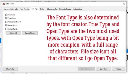
3. The difference between .otf and .ttf formats starts with where they originated. Microsoft/Adobe created OpenType – .otf, Apple created Truetype – .ttf. I always choose .otf format because the fonts are somewhat more complex, with all the glyphs and library options right in the file. TrueType has better screen quality so is more suited for electronic documentation while OpenType is better for print. The difference in file size is negligible. So it basically comes down to planned use and personal preference.
Now, how does this X-Fonter work? If you’ve used MainType you’ll see the interface is pretty similar, but the features are quite different.

I went through each tab and button one at a time to get a good look at what’s under the hood. Under View, the first two choices are pretty self-explanatory. Other than moving the boundaries of the windows, these are the only interface adjustments. First big advantage to X-Fonter is this! Font Compare lets you look at 2 fonts at the same time so you can choose the one that works best for your purpose.

The display windows are your access to the comparison. The first font you choose will automatically go in the top window. Click on the bottom window and choose your second font.

Options… hmm. There are Options? Browse Folders just takes you to your operating system’s directory.

Default Settings look reasonable to me. Check for Update on Startup keeps you running the most recent model.
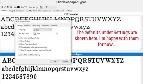
Installing gives you control over what your computer does when you install fonts, either from a download or from a storage device. It might be worthwhile to Copy Files to an dedicated X-Fonter folder.

And then if you decide you’re never going to use a specific font again, you can Uninstall! By having a copy in your X-Fonter folder, you can load and unload without installing if you choose to later.

Under View Fonts there are several options, including what you want for your Preview Text. It’s handy having system fonts colour-coded so they can be skipped over easily.

Unless you’re a real IT maven, the Database tab is purely ornamentation.

This Settings tab is where you can customize what you see on your screen. You can change the Text Colour, Background Colour or leave it black on white.

Have a look at the Text menu. Another advantage to X-F! I use French text all the time and have memorized the most common ASCII codes I use, and others I look up on a table, but having this ability is huge!

This is what I mean.

But how do I get the ASCII character onto my project? Choose the character – let’s use a GBPound symbol – and right-click, then choose Copy to Clipboard.

Then with your Text Tool active, click on your project where you want your Pound symbol then Paste (CTRL/CMD>V). Easy peasy!

On to Pangrams. You can choose from 4 different sentences containing every letter of the alphabet.

Don’t you love Filters? You can winnow 1000 items down to a few dozen. Just be aware that when you end your X-F session by closing the app, all your filters will go too unless you Save Filter…

Aha! System fonts can be filtered out!

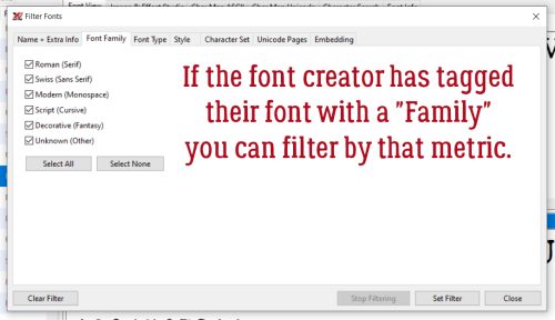
Are you familiar with Font Families? X-F uses Roman (Serif), Swiss (Sans Serif), Modern (Monospace), Script (Cursive), Decorative (Fantasy) and Unknown (Other) and will filter for either of those terms.
Font Type has already been covered above, somewhat. Raster Fonts and Vector Fonts are used by a range of text-based applications such as Photoshop and Cricut.
Then there are Font Styles… how handy is this?

These Tools aren’t typically applicable to digital scrapbooking, except maybe Duplicate Font Search…

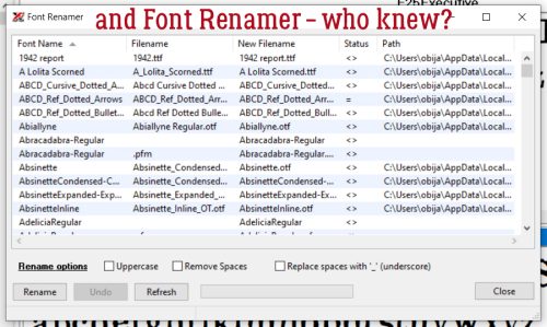
I’m not sure why someone would want to rename a font, since the creator chose its name, but maybe changing it to something that makes sense to the user?
For the people who like to have hard copies, under the Print button you can print out all the fonts on your system, or only certain ones. You can choose just a sample of the font, or the entire character map. Hey… school supplies are on sale – grab a binder and some page protectors!

Next to the Print button is the Create Font Book button. Yes, you can group all your fonts into categories and create an online library of your Font Books.

Third from left is an Options button, and it’s identical to the Options tab.

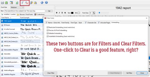
In the middle are a Filters button and a Clear Filters button. Self-explanatory.
Now to Collections, as Kathi was asking about. Here, YOU decide what your descriptors are. I’m going to create 2 Collections, Creepy and Fairytale, as part of my test drive.

I scrolled down my font list until I found my first Creepy font. I right-clicked on the font’s name then chose Add to Collection>Creepy. Then I continued scrolling until I found another font that met the criteria, adding it, and so on. I ran into a snag with some of the fonts I have, because X-F wasn’t able to “locate the path*” to those fonts, which meant it couldn’t add to a Collection. I’m not sure how it found the fonts in the first place without a path, but what do I know?

That’s where Tags* come in. Font Tags lets me search for the type of font I’m looking for by yet another method. Edit Font Tags doesn’t mean the font already has a tag; it’s how you access the Tag process.
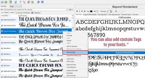
I chose this cute font called Beyond Wonderland to Tag with Fairytale by right-clicking on the font name and choosing Edit Font Tags then typed in Fairytale.

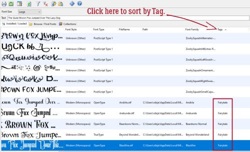
To use Tags to find my desired group, I had to push the boundary of the font preview box over until I could see the Tag heading, then click on it.
Now for the critique. I wasn’t able to get X-F to run on my laptop simply by opening it once I had it installed. I had to Run as Administrator. I shut it down when I was done with my screenshots, but wasn’t able to get it to run again. I got a message that I had 29 days left on my free trial, it read my font files then disappeared. Multiple times. Even after I added it to my Taskbar. I tried all the tricks I know to make it work, without success. Windows Troubleshooter declared it incompatible with my operating system (Windows 10) and tried running it in Windows 8. Again without success. So I’m doubtful I’ll pay $35 ($50 in Canadian currency) for it. It’s impressive when it works, but…
![]()