![]()
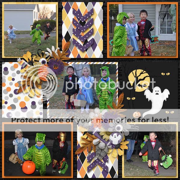
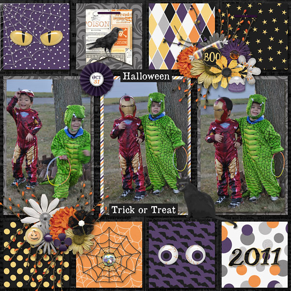
Good morning all! It is that time of year again. For those who celebrate, Halloween will be here before we know it. I bounce back-and-forth between Halloween and Christmas being my favorite holiday. Looking at my stash, you would think it was Halloween. I just have to have all of them! I keep telling myself, “You have plenty of Halloween goodies, La’Shawn!” Then…I buy more. I am excited to share with you all today the fun Halloween goodies we have here at GingerScraps. I should have posted this on Saturday. The weekend got away from me. So, we get to brighten our Monday with fun Halloween digital scrapbooking supplies.
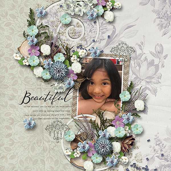
In case you didn’t know, or that you are new here at GingerScraps. You can find anything you look for by searching in the store. You can also find a lot of holiday goodies in the HOLIDAY section. Of course there is one just for all things spooky and HALLOWEEN! I am going to try not to overload your visual senses too much…I did warn you though it was one of my favorites. (all images linked)

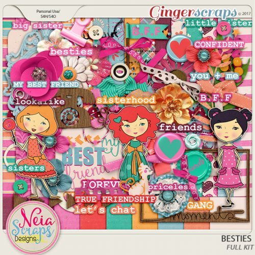
Boo by Neia Scraps Designs is a perfectly spooky and cute Halloween collection. Jam packed full of watercolor elements, spooky creatures of Halloween, bits of candy, and a bone cracking alpha. Not to mention the leaves, ribbons, and pretty spooky flowers. A go-to Halloween collection!

This super fun set of WordArt clusters was made as part of Eeek Collection. This collection is all you need for all your Halloween photos. It’s full of unique elements both spooky and not!!

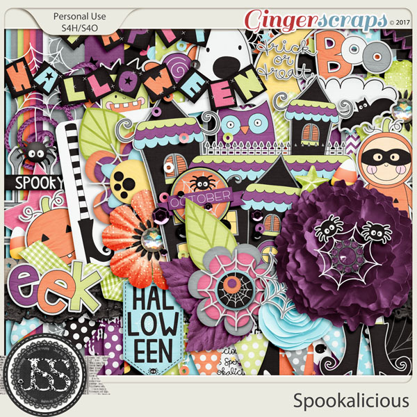
Creating arrangements is so much fun, but also time consuming. Take an advantage of pre-made arrangements and speed up your scrapbooking process to have more time for your dearest 🙂 This wonderful pack was made as part of Happy Halloween Collection.

Happy Halloween! Boo to you … and you, and you! Let’s celebrate Halloween with this “not-so-scary” collection, inspired by one of the special parties held at Magic Kingdom. In bright Halloween colors, this collection overflows with themed elements, including the special decorations found in the park such as banners and pumpkins, mouse-eared ghosts and bats, Mickey and Minnie’s Halloween hats, a spooky castle, the signature party fog, a bubbling cauldron, fireworks, plus the highlight of the party: the Headless Horseman!, among many other ghoulishly fun goodies and patterns.

All Hallows Eve – Digital Scrapbooking Kit by Ponytails Designs Witches, werewolves, ghosts, and ghouls… they’re all out on Halloween! Prepare to be scared!

Creative scrapping made easy! Ever wanted to create more arty pages or Art Journal-style pages but not sure how to start? Try out these easy-to-use templates. These templates combine traditional scrapping with a bit of arty fun. Clip photographs or papers to the masks, recolour the paint layers or clip paper to them too!
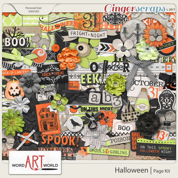
This “Halloween” digital scrapbooking page kit features a set of 30 high-quality Halloween-themed 12×12 digital papers, each saved as individual .jpg files. Also included are 66 coordinating elements, 17 word art images, and an alpha set with numbers and lowercase letters, each saved as individual .png files. This product is for personal use, scrap-for-others, and scrap-for-hire purposes only.

Halloween is all about tradition: dressing up, making jack-o-lanterns, and trick-or-treating. One of the most iconic images associated with Halloween is a black cat and Hallow Kitty pays tribute to this fantastic feline. This kit pairs the traditional black and orange color palette with olive, cream, and brown for a subdued seasonal feel. Warm, autumnal flowers and leaves pair nicely with thematic elements like cauldrons, pumpkins, a toad, a crescent moon, a broom, and the eponymous black cats themselves. Hallow Kitty plays nice with other favorite fall photos, making it more versatile than a lot of other Halloween kits. So give yourself a treat today and scrap a page with Hallow Kitty – no tricks needed!

With 93 unique elements, 26 papers, 6 cardstocks and a full alpha, The Boo Crew is jam-packed with treats for you to use to dress up your Halloween scrapbooking layouts, cards and party invitations.

An exclusive design by Paty Greif. The Happy Halloween Digital Full Kit contains unique images to turn your projects even more wonderful. Hand-drawn and colored at the highest quality by Paty Greif Design Studio. The files have a resolution of 300dpi for an optimum printing quality.


Spooky and ghostly, in the Dead of Night. The perfect collection for any haunted house lover!

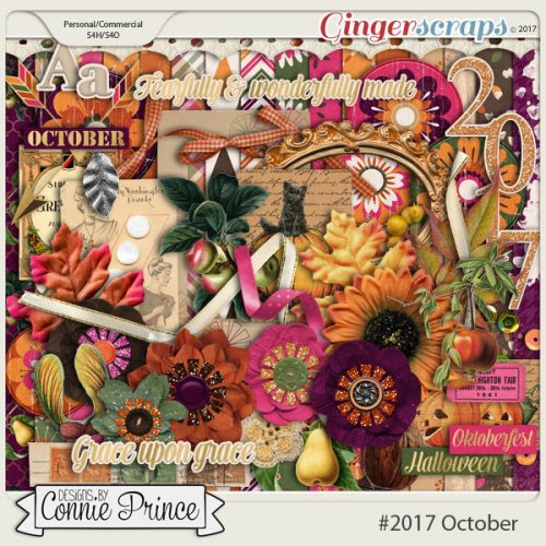
As the days grow cooler and the nights grow longer, the colors grow bolder and the wind starts to holler… It’s clearly Halloween season and time to scrap some spooky stories. Whether you’re one of those people who lives for Halloween or just need a pop of color before winter colors, it’s time to scrap your favorite stories with My Life… October. This bold, brightly-colored installment of your favorite series is heavy on the Halloween cheer. Skeletons, jack o’ lanterns, ghosts, sugar skulls, spiders… There are just so many treats in this kit! This kit also has a few tricks up its sleeve, including word strips for the best parts of October. As always, My Life is also packed full of bold patterned papers (which are so versatile that you can use them year-round), bright solids, grungy newsprint papers, a newsprint alpha, and all the flowers, ribbons, banners, and bows your scrappy heart desires. My Life… October makes it easy to finish your scrapping and get back to snacking on Halloween candy… or just making memories.
These are just a small sample of what you can find at GingerScraps to scrap your Halloween photos. I hope you all have a fun, safe & dry Halloween this year. Make sure you take lots and lots of photos! Then….you know what to do! Scrap em! Happy Halloween!
![]()


 \
\