Merry Christmas Eve Eve! It’s crazy that it is already Christmas. We here at GingerScraps hope you and your families have a wonderful holiday!
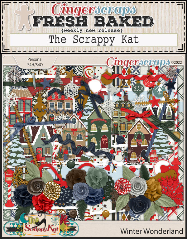
Spend $10 in the store and get this great kit for free!

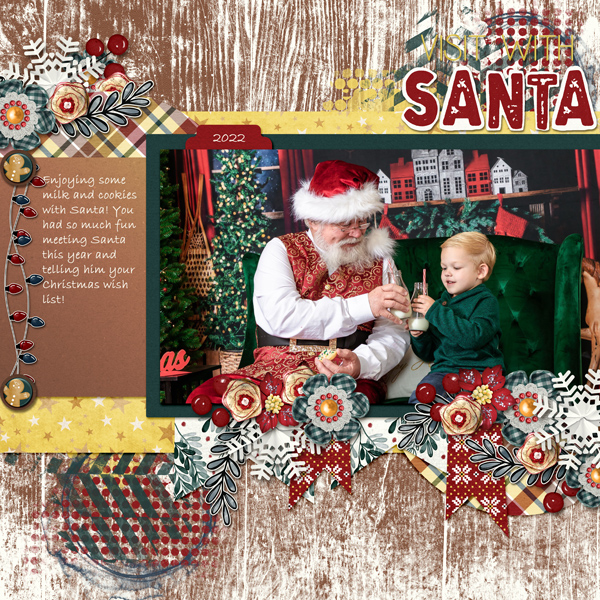
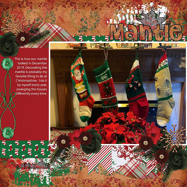
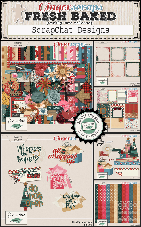
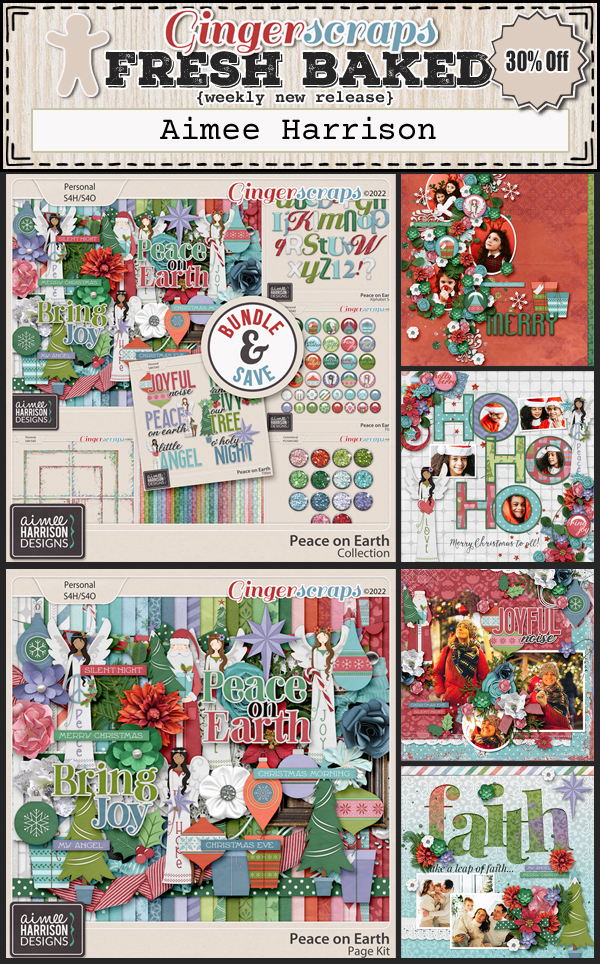
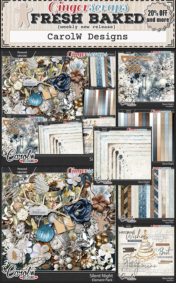
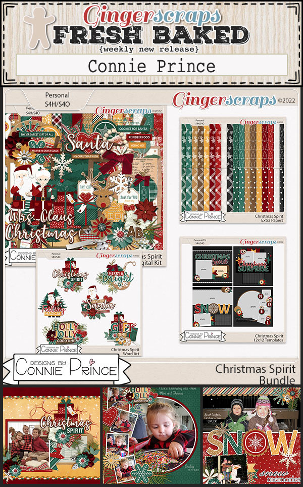
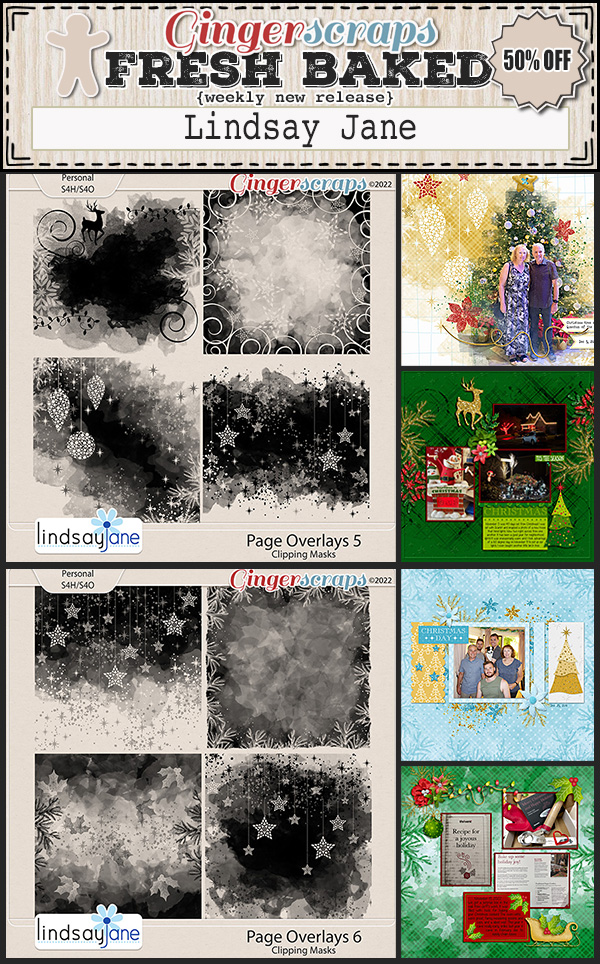
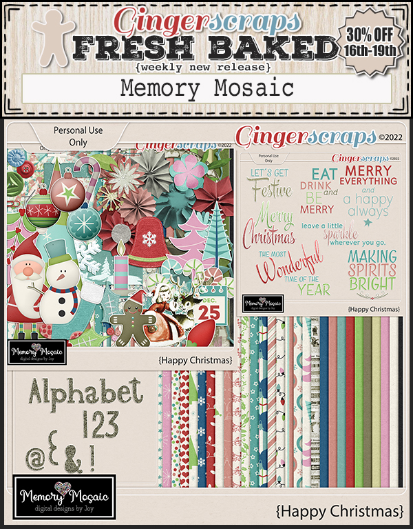
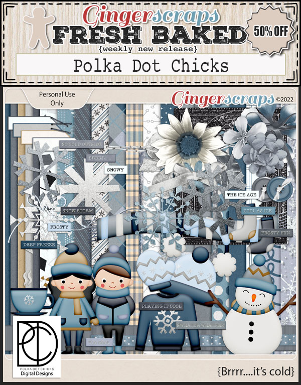
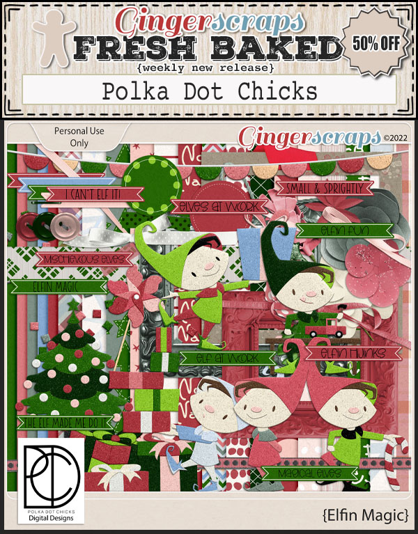
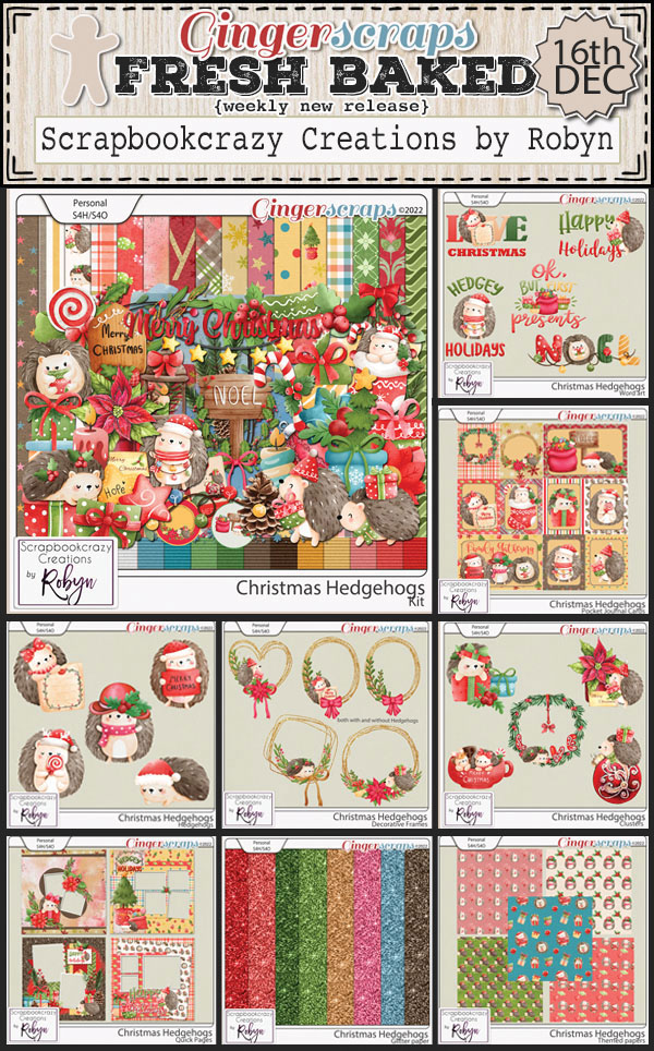
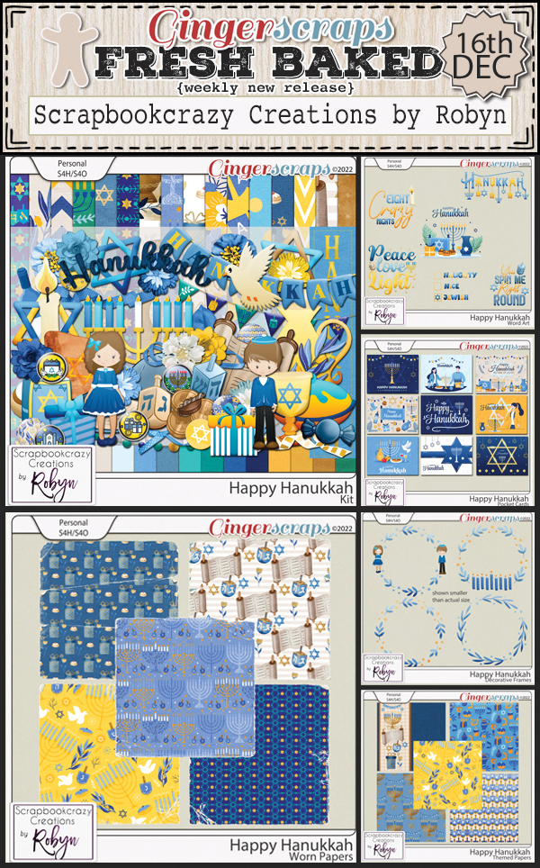
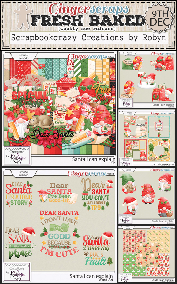
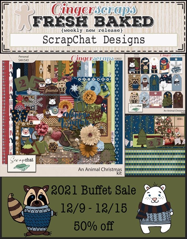
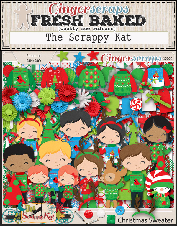
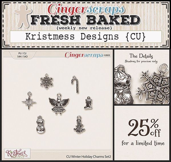
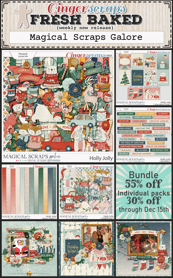
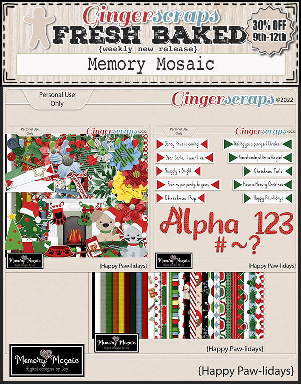
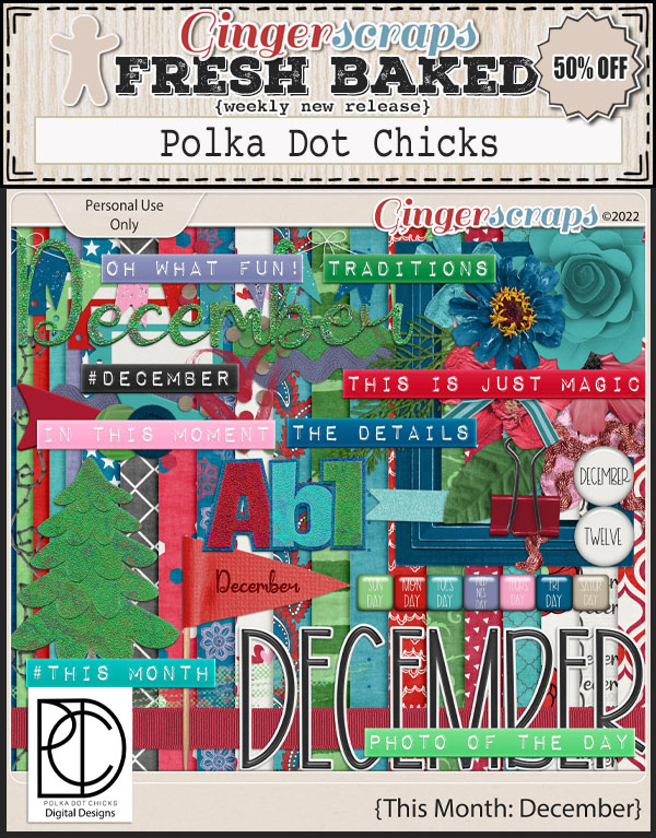
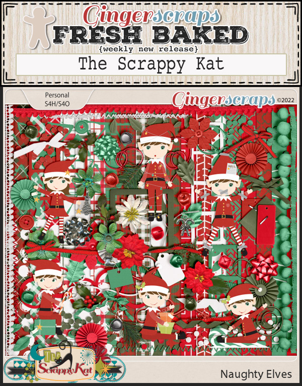
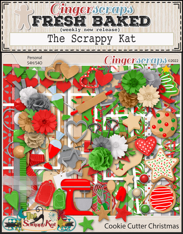
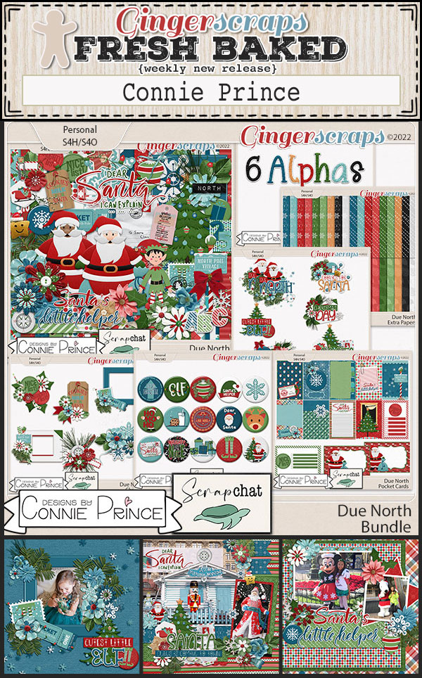
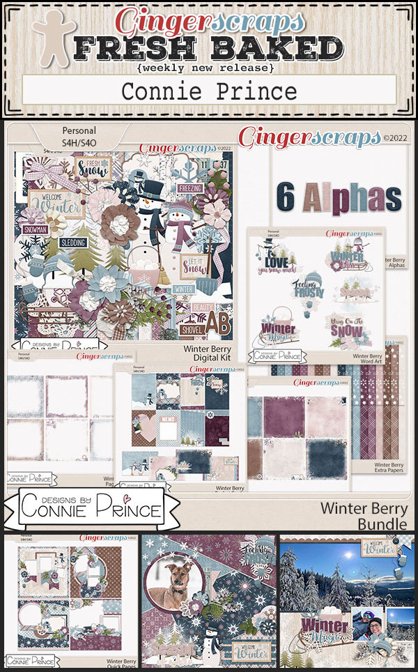
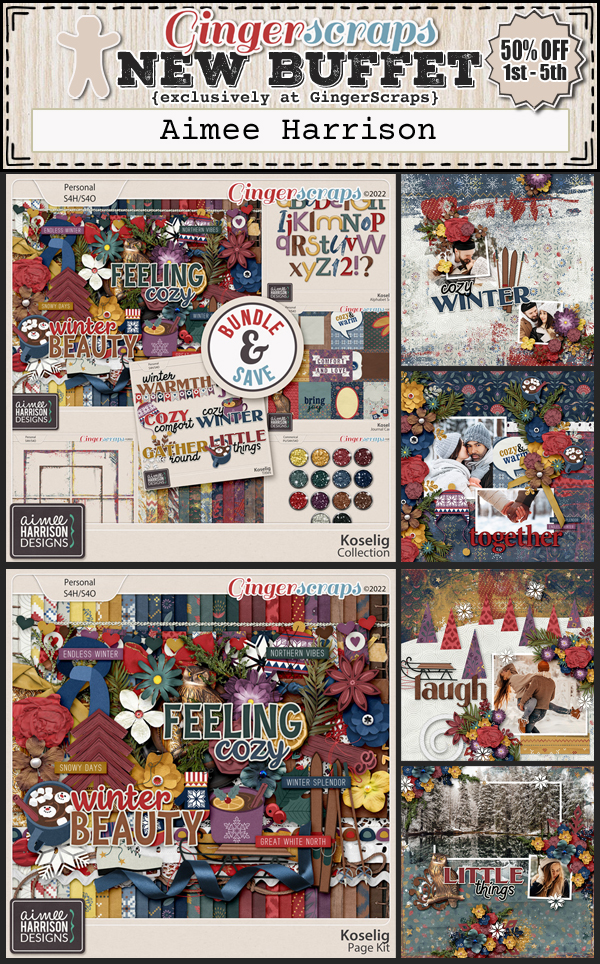
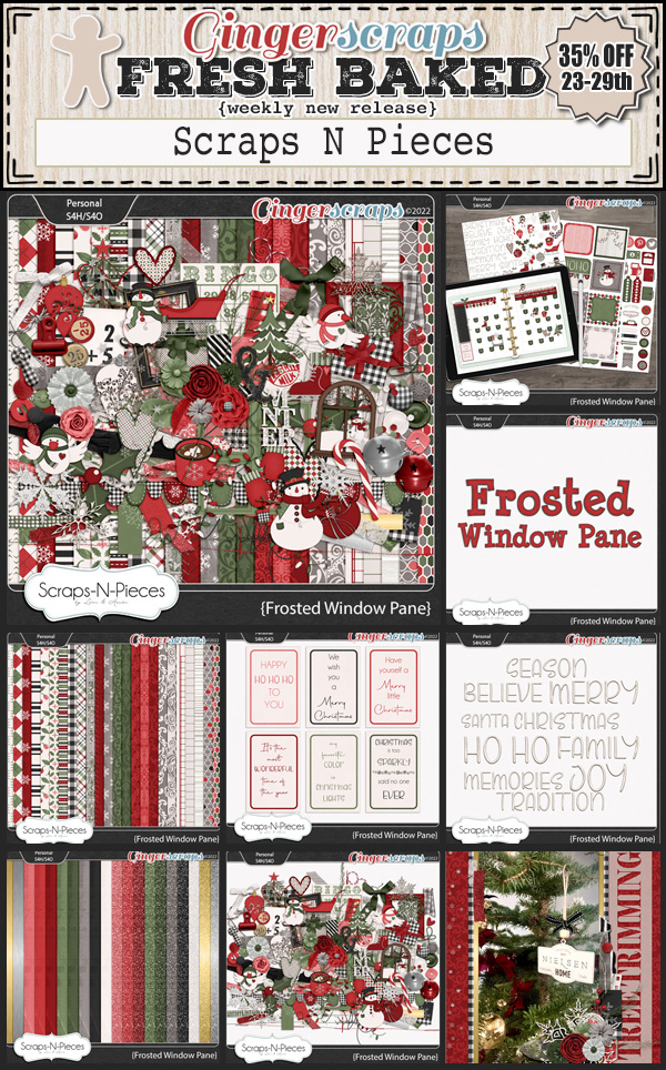
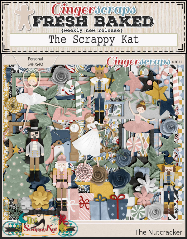
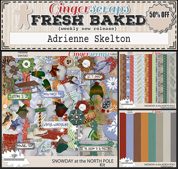
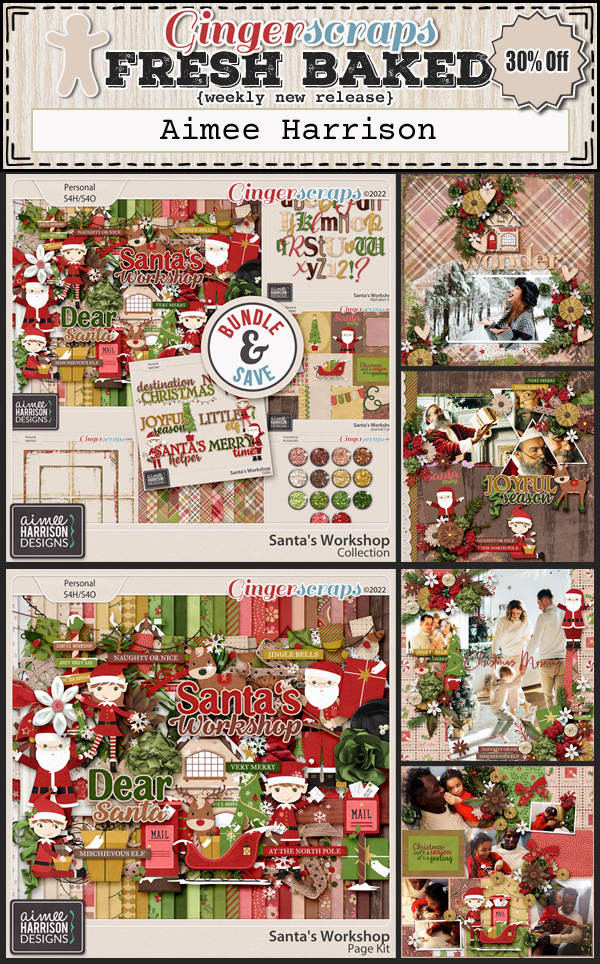
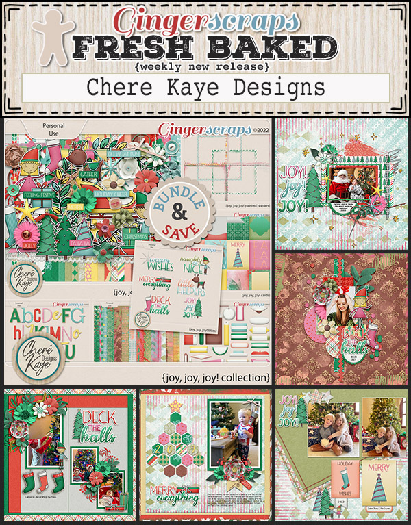
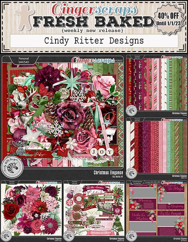
There are so many Christmas kits in the store this week.


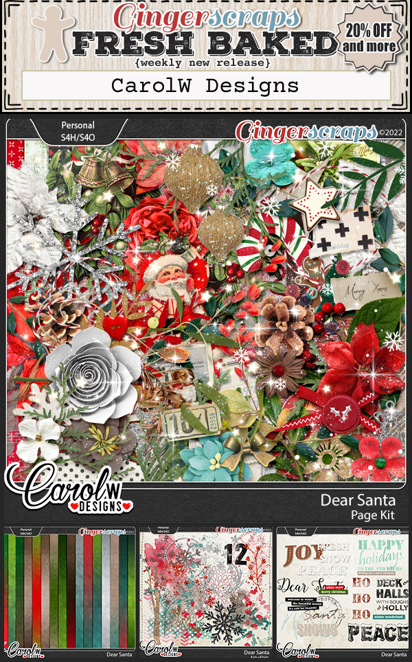


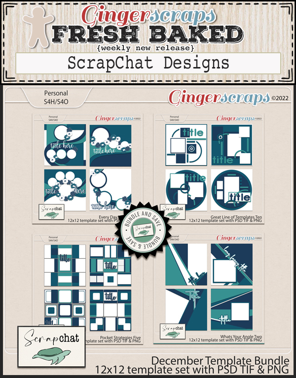
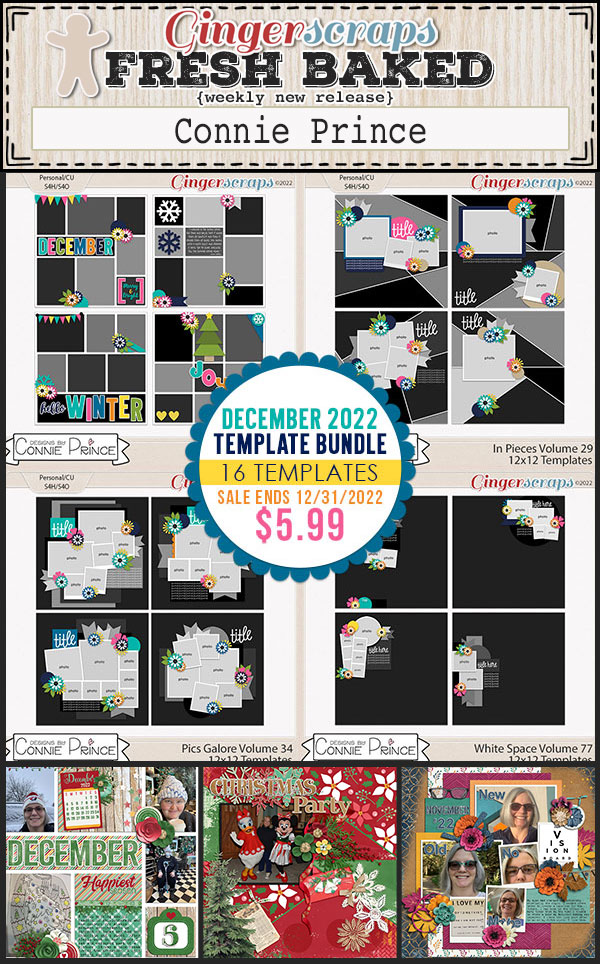
Are you getting those challenges done? Complete any 10 challenges and get this kit as your reward.