Creating a 3D Metallic Look on 2D Shapes
![]()
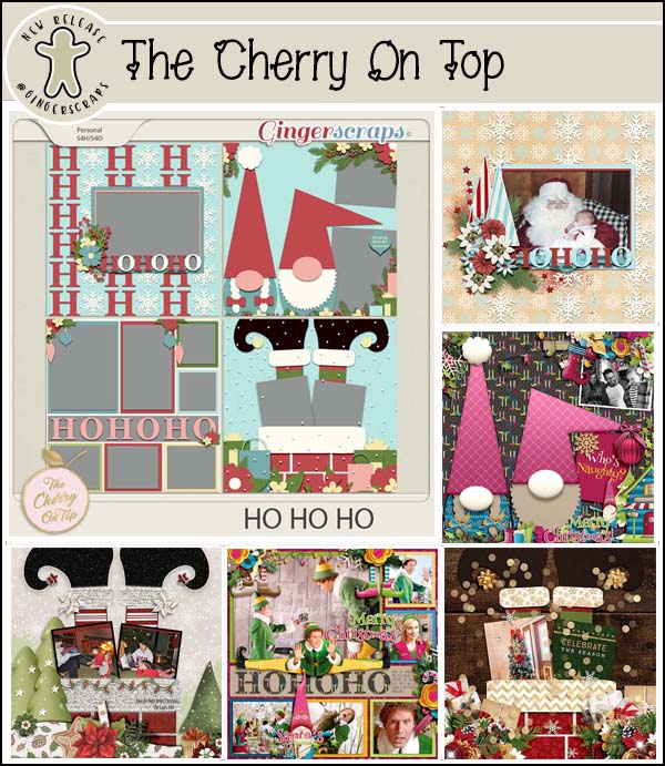
We made it! This is the last Tuesday of 2020… and I’m sure none of us thought we’d ever get here. It’s been a long, long year. This is also my 200th Tutorial Tuesday post! I definitely never thought I’d have that much to share with you, but thanks to the women who approach me with questions, I’m still going. This week’s tutorial is the result of a query from Bernice (bkasko). She’s a planner, and she found a beautiful planner template set created by Lisa, the Cherry on Top. She was particularly attracted to the template that looks like a multi-ring binder, but she wasn’t having any luck creating a realistic metal effect for the rings. She’d tried a bunch of things and wasn’t happy with the results so she asked me what she could try. Off I went to find out. I watched a bunch of videos based in Photoshop, which of course are useless to Elements users. But… because I’ve been learning all the ins and outs of Elements so I can teach them to you, I was able to come up with an Elements method by playing with some of the less-commonly accessed features in the software. Let’s see what I’ve done.
First I had to decide what kind of 2-dimensional image I was going to play with. I chose a brush (it’s NOT a reflection of anything, however!) that lends itself nicely to a metal effect.
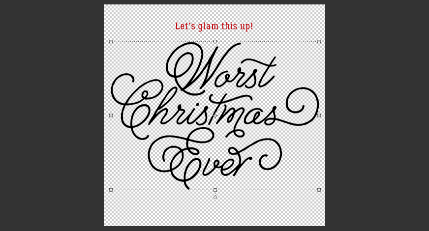
A very important part of this technique is to work on a transparent background, with your 2D image on a new, blank workspace. As you see in the screenshot, my brush is on a transparent background; if you’re using a template, Duplicate the layer with the item you’re metallizing onto a new document, then move it back to the template when it’s finished. Now, this brush is a little anemic when it comes to presence. So I added some padding to it.
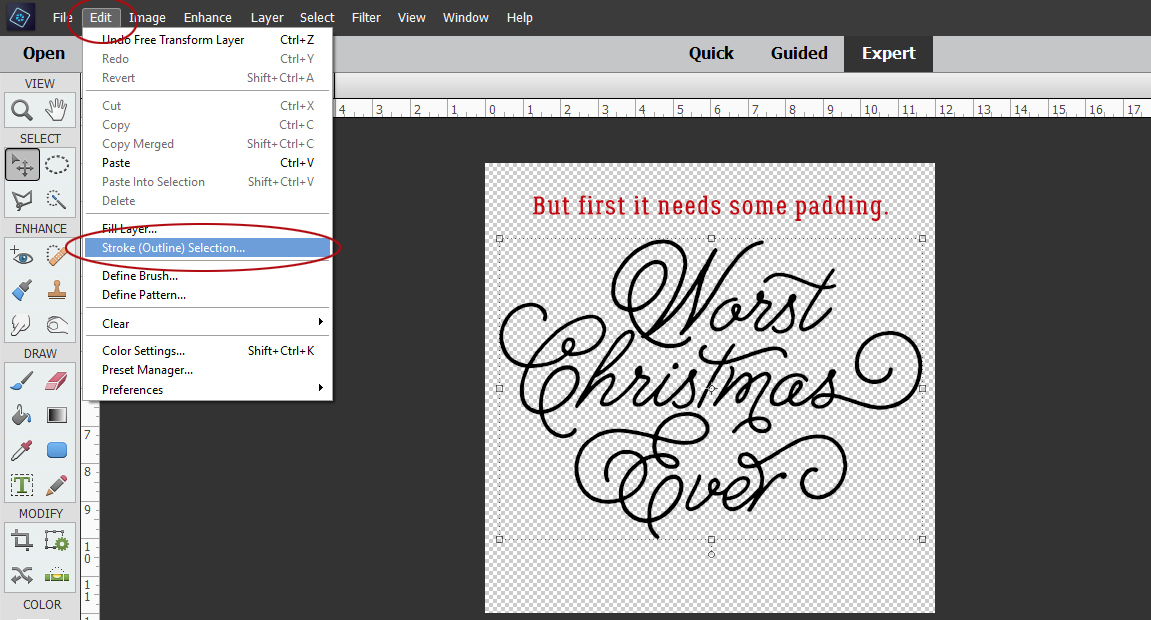
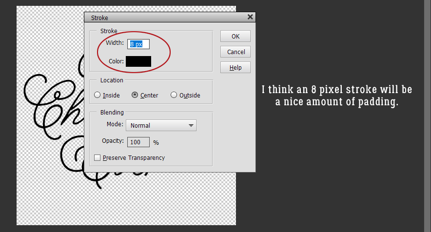
I used an 8 pixel Stroke centered over the brush to just beef it up a bit. Not so much that the clean lines were lost.
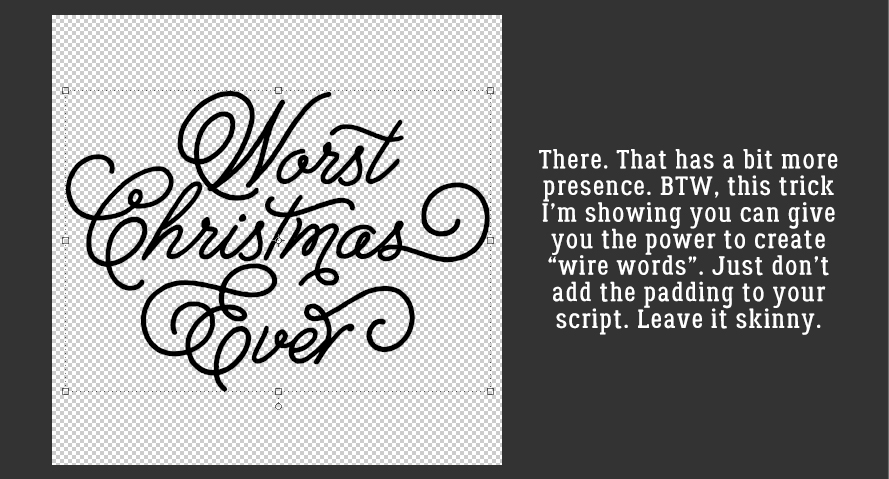
Yes! That’s more like it!
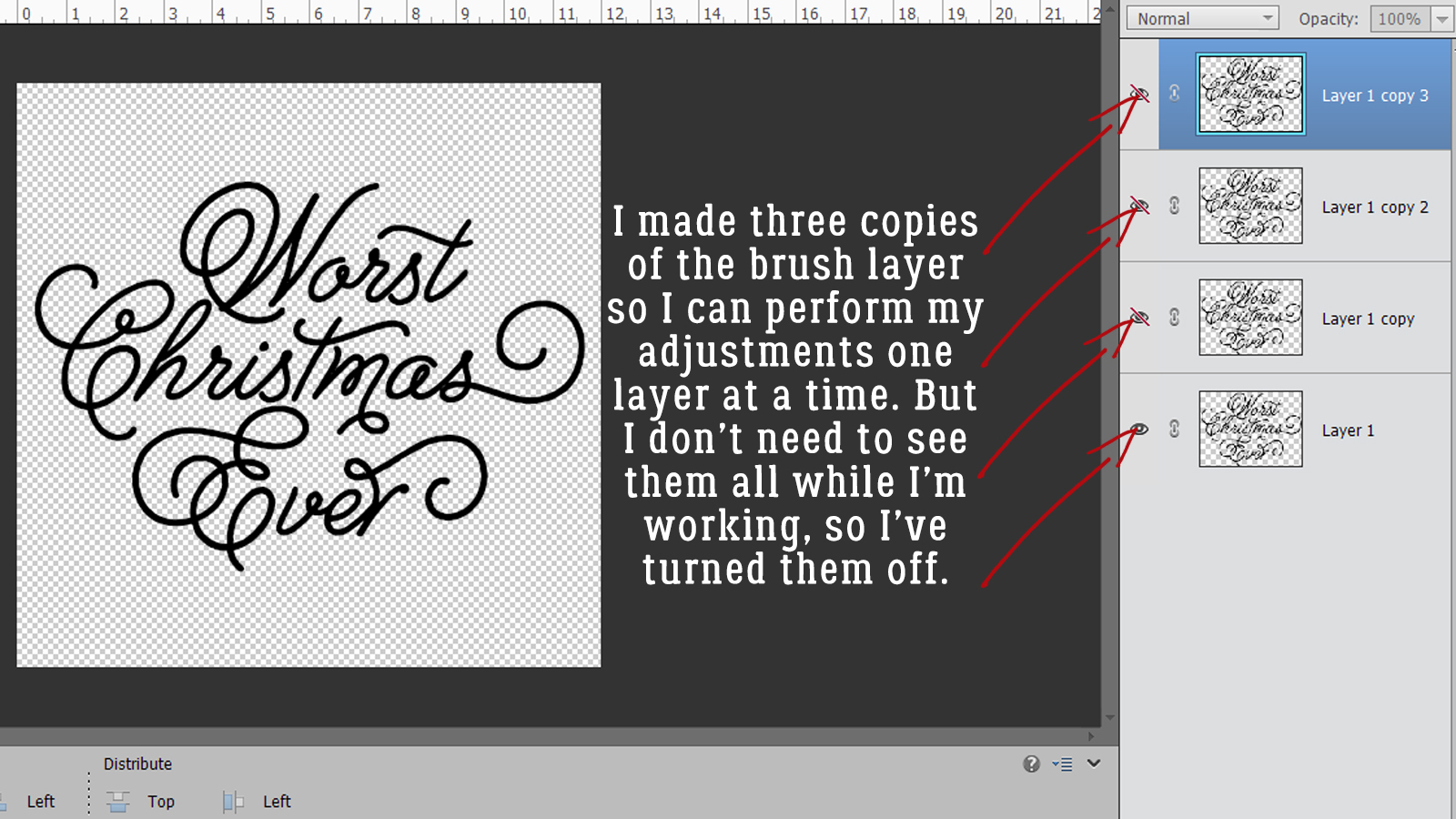
Then I made 3 copies (CTRL/CMD>J) of the original layer. To keep them straight in your mind you might want to rename the layers but that’s not essential. I also turned off visibility to all but the layer at the bottom.
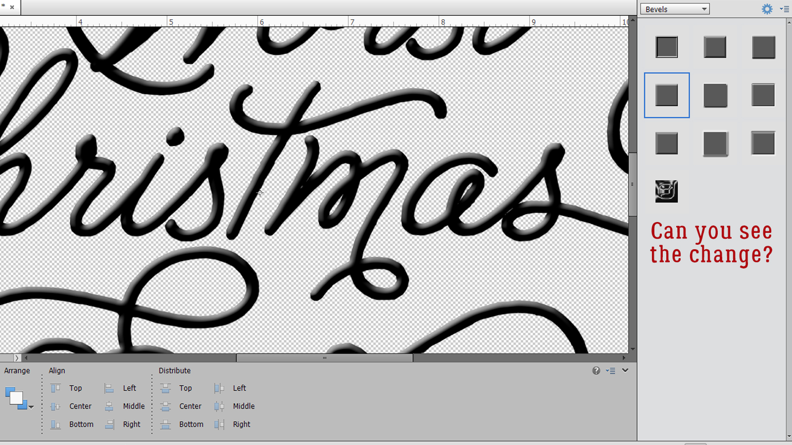
I really find it helpful to Zoom in and out while I’m working on this kind of project. Keyboard shortcuts: Zoom In CTRL/CMD>+ and Zoom Out CTRL/CMD>-. The first adjustment I’m going to make to my image is to add a Bevel. Click on the Styles button at the lower right of the workspace then choose Bevels from the pull-down menu. The Bevel shown inside the red box is the Simple Inner Bevel and that’s what I used.
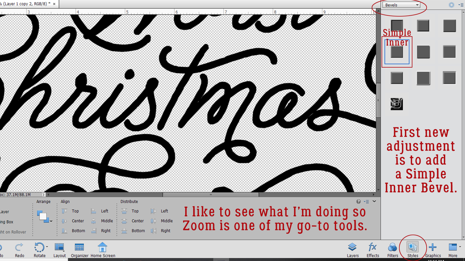
You can see that there’s now some rounded dimension to the brush. Cool, right?
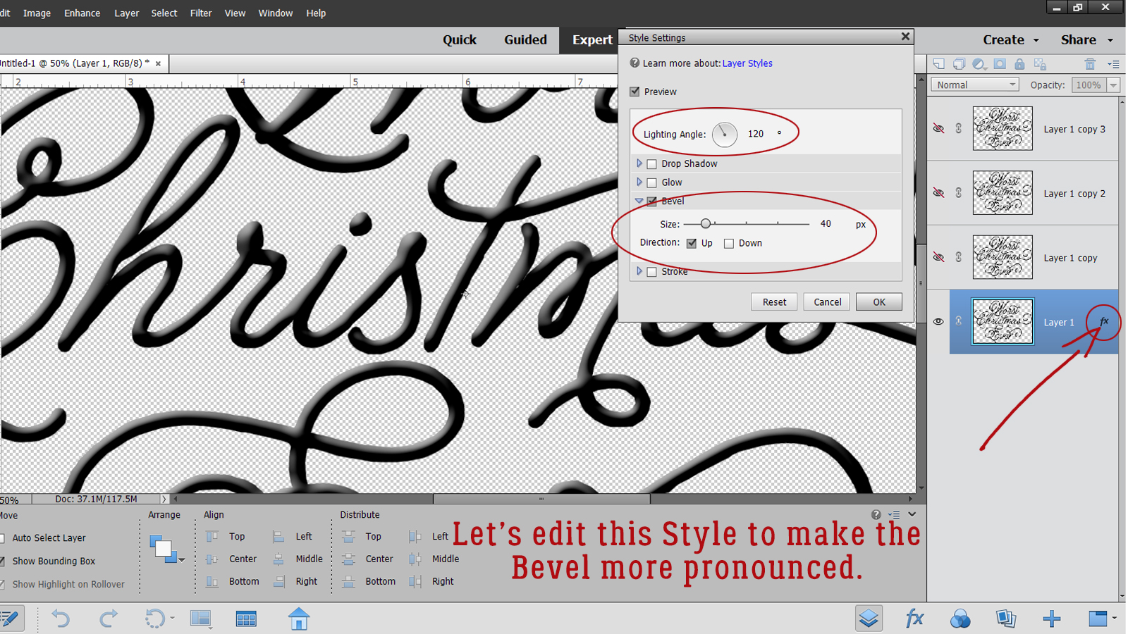
Editing Layer Styles adds so much creativity and possibility to our work. To open up the Edit menu, double-click on the fx icon on the layer. The new menu shows you what you can change about that Layer Style. The defaults for Bevels are Lighting Angle 90°, Size 21 pixels and Up Direction. I adjusted the Lighting Angle to 120° and the Size to 40 pixels.
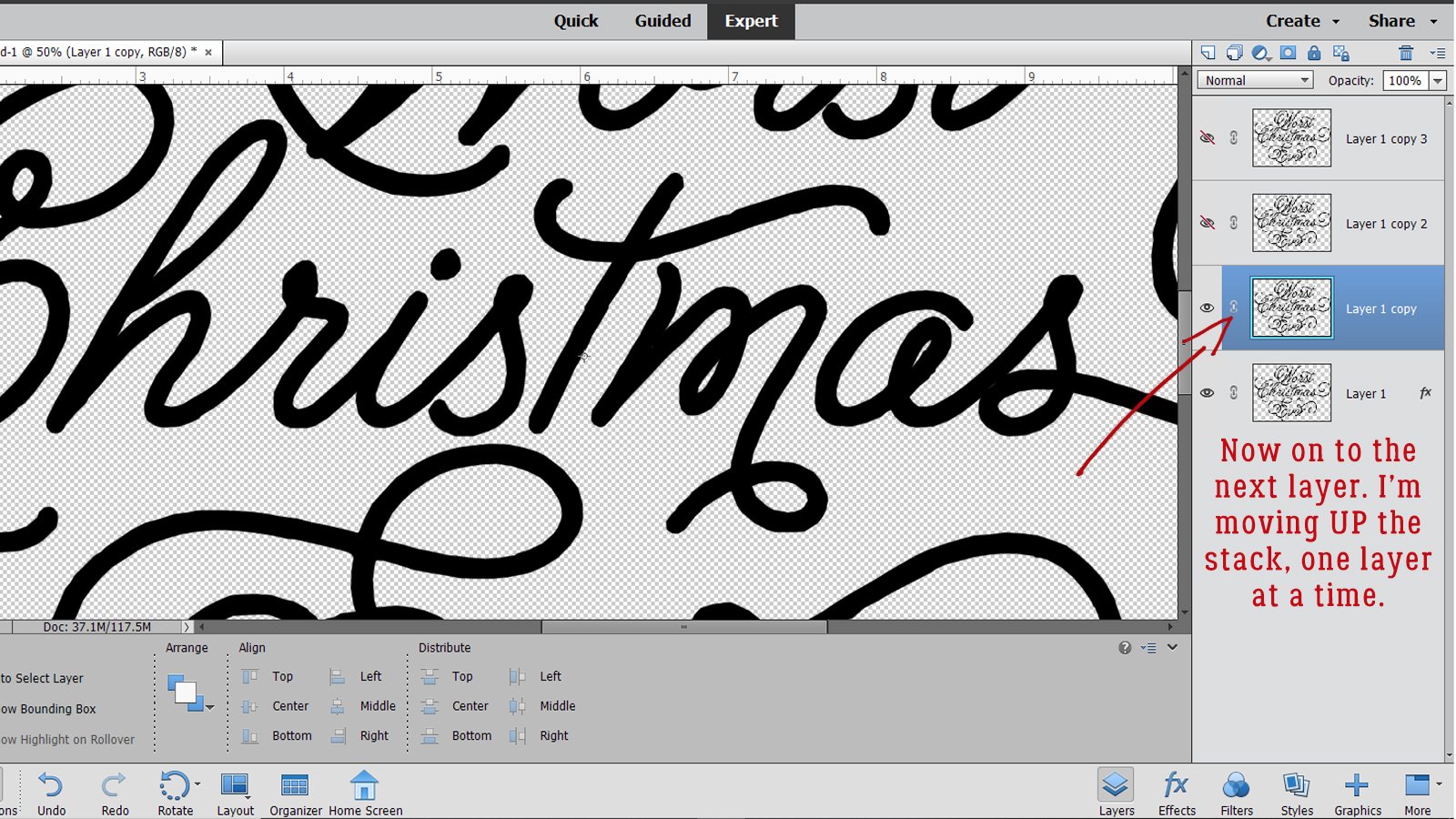
Next, I moved UP one layer to Layer 1 Copy. Visibility is on.
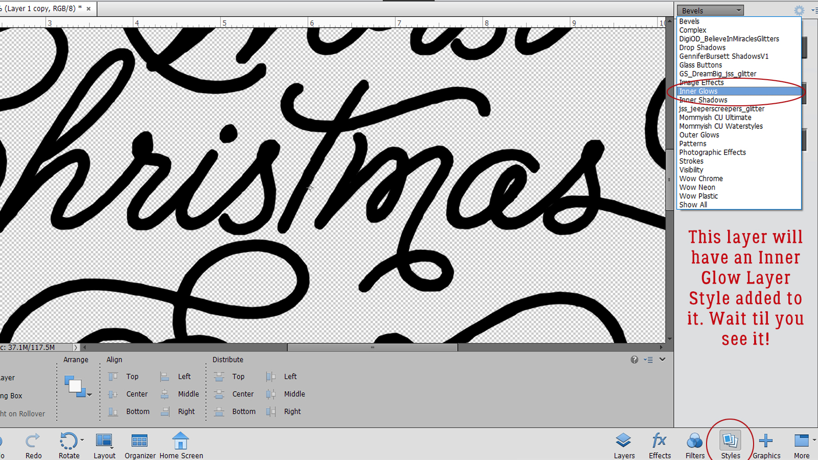
Still in the Styles menu, I chose the Inner Glows function.
From the Inner Glows options, I chose the Small Border Glow.
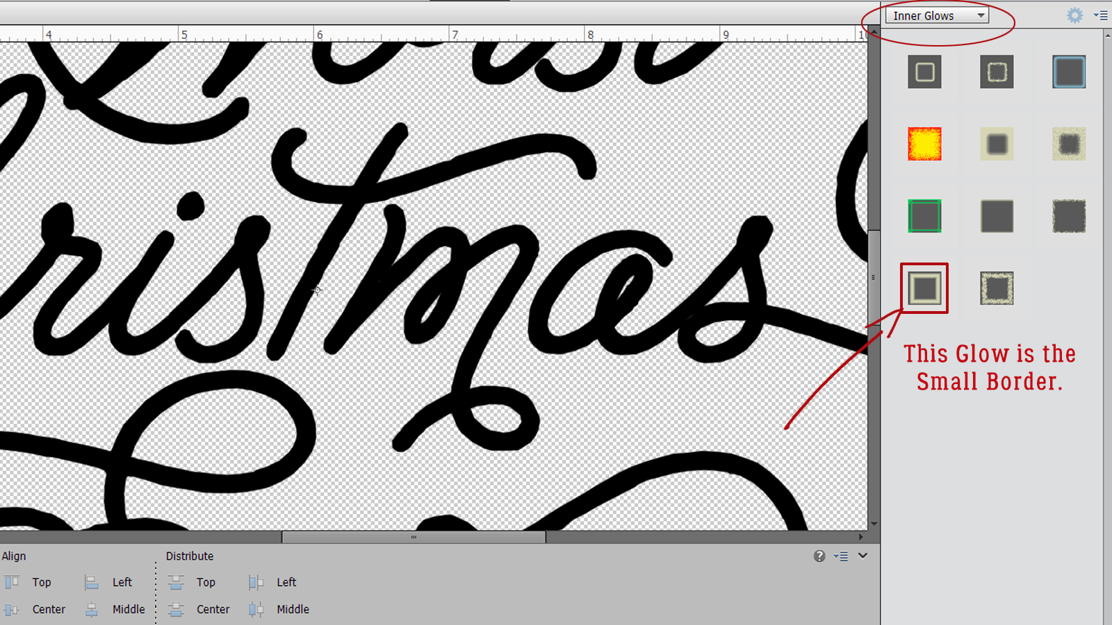
Huh! Look at that! There’s some definite dimension there now! (It looks a bit like epoxy right now.)
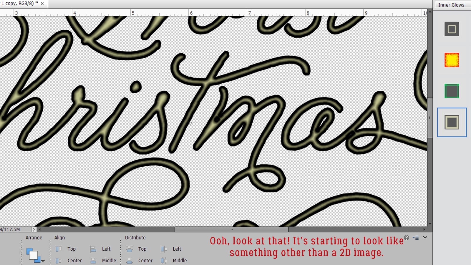
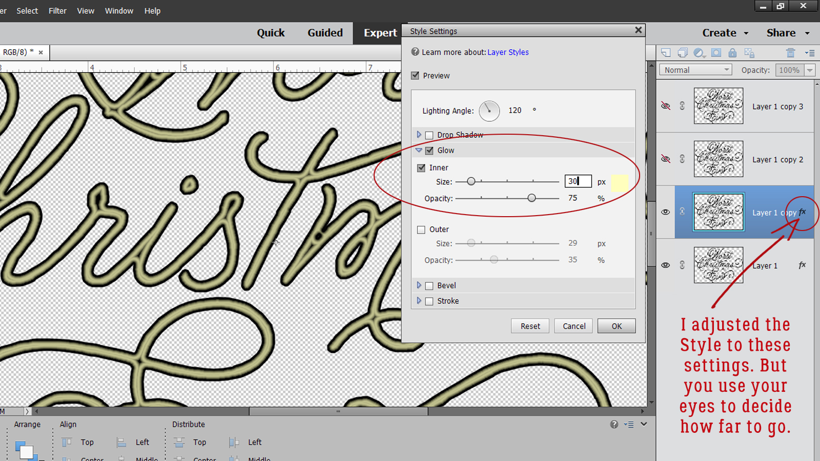
I’m going to Edit this Style too. Double-click on fx and adjust the Size and Opacity of the Glow. This is an active process and your preview will change as you make your adjustments so you can see what you’re doing. It’s also possible to change the colour of the Glow by clicking on the colour swatch and choosing another colour. Pure white is “ffffff” for those you like to be precise.
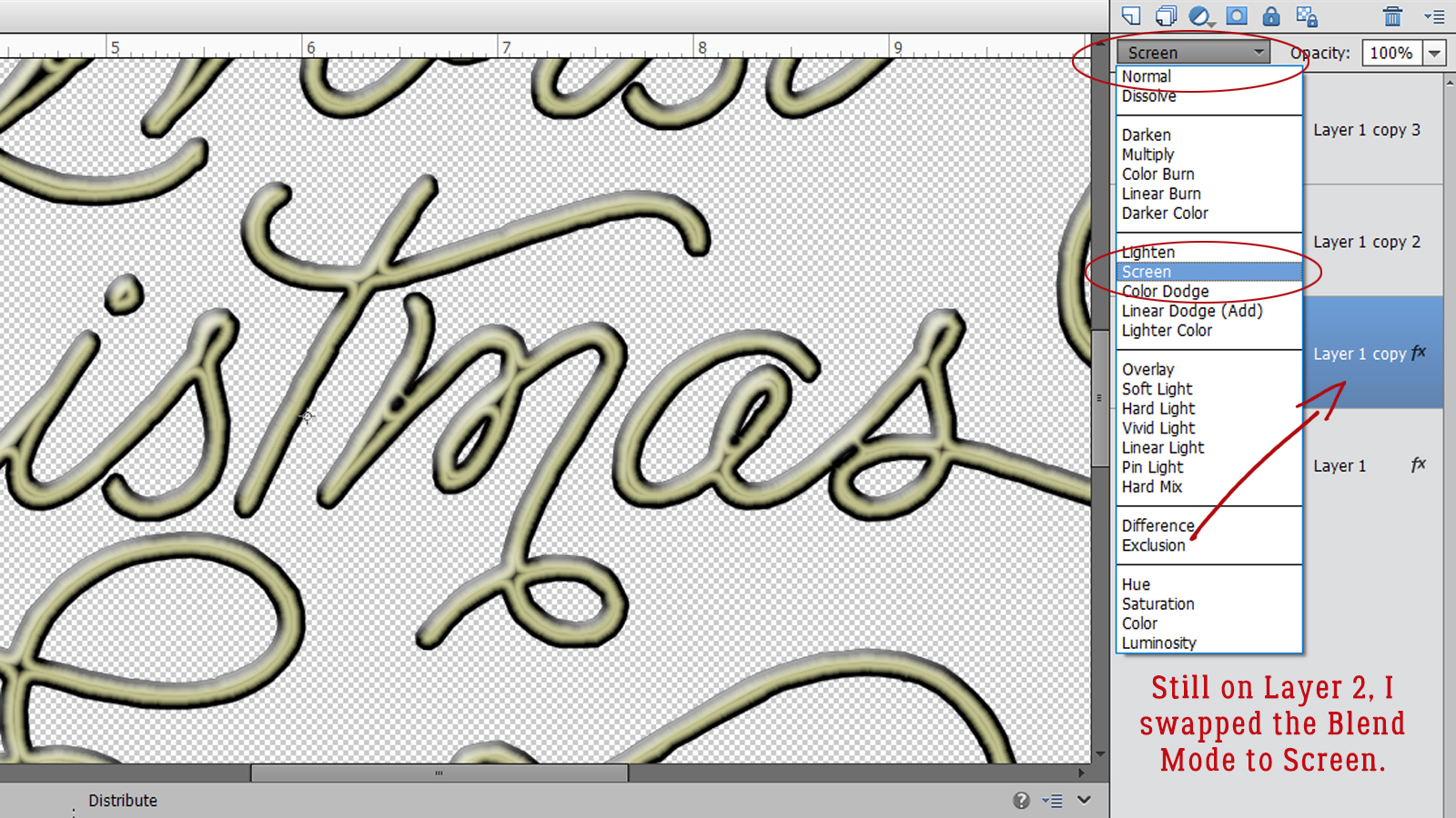
Now to change the Blend Mode for the Inner Glow layer to Screen. This lightens the layer and gives it the contours of the layer below.
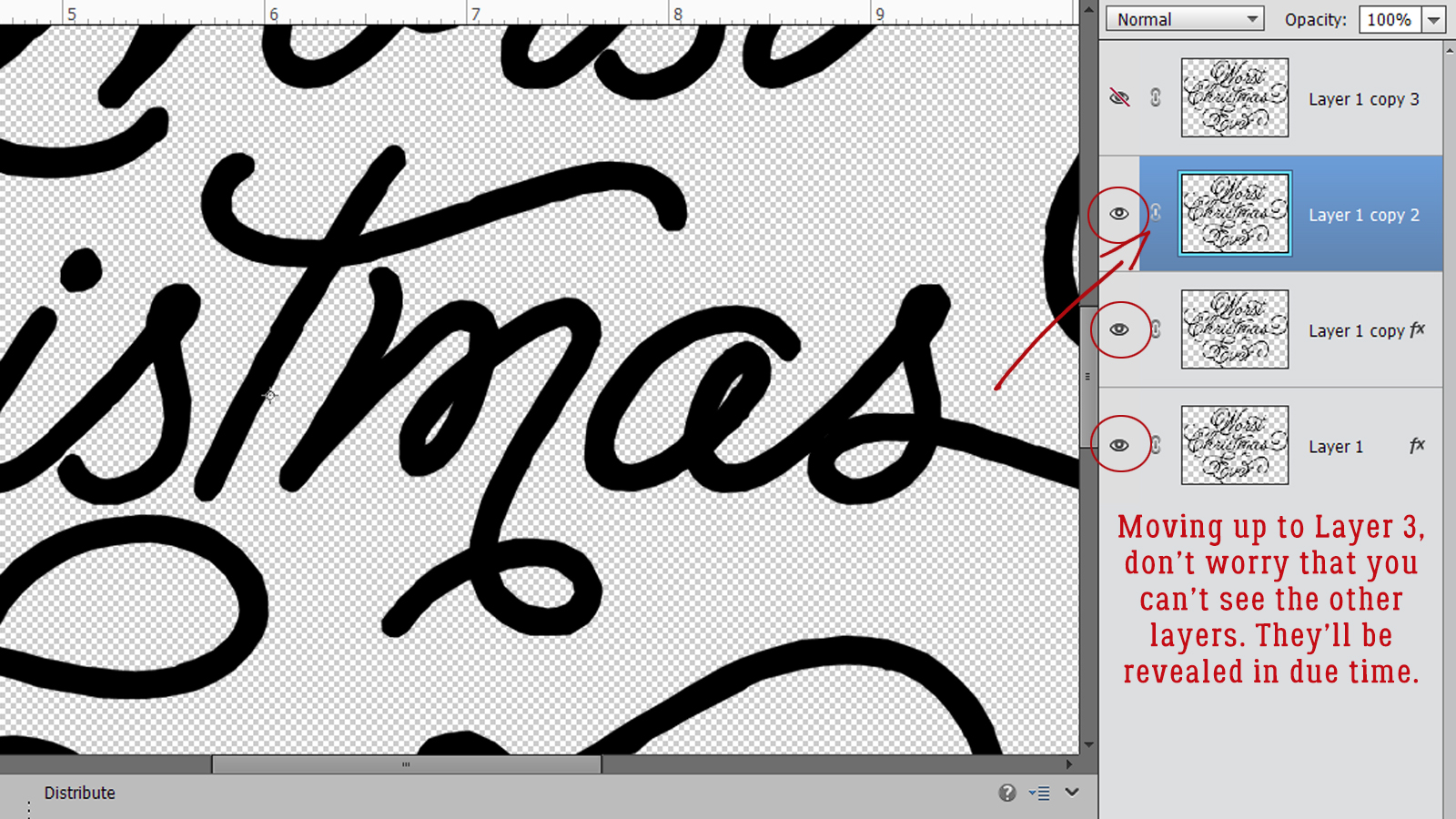
Moving up to the Layer 1 Copy 2 layer, I turned the visibility back on. Don’t worry that all the work you’ve done so far isn’t visible. It will be!
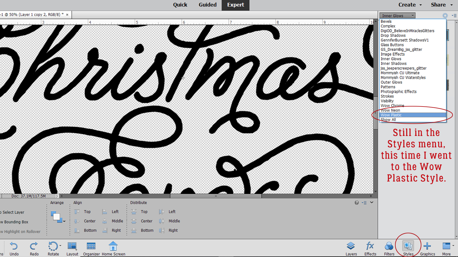
For this layer I’m going to add a Wow Plastic Style.
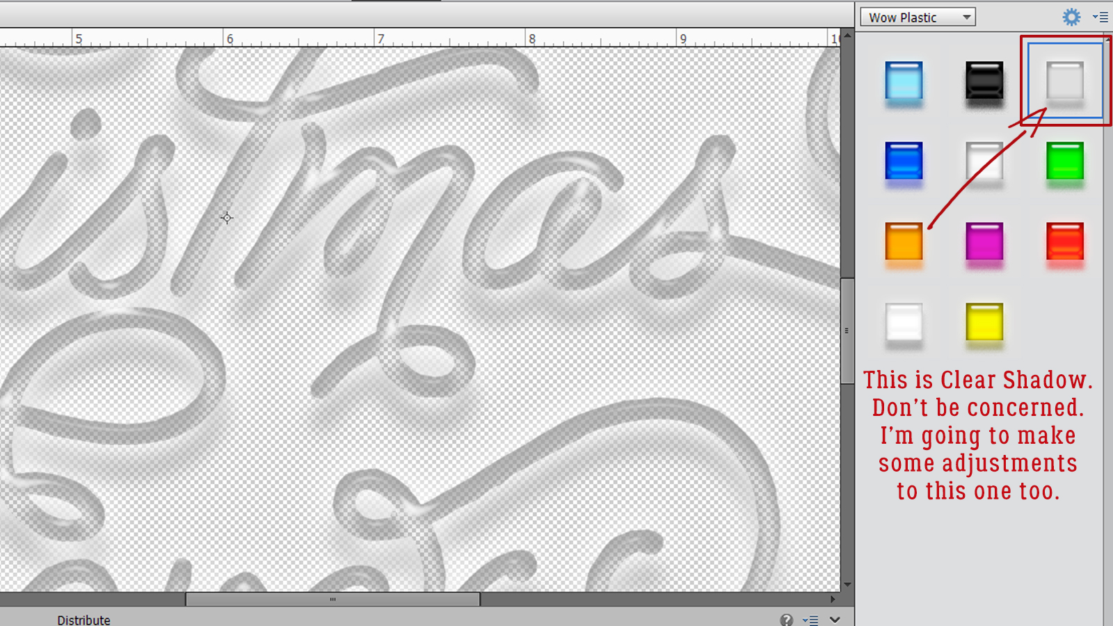
The two layers at the bottom of the stack are off. The Wow Plastic style I used is the Clear Shadow style. Right now it looks ummmm… bad! But it’s easily fixed.
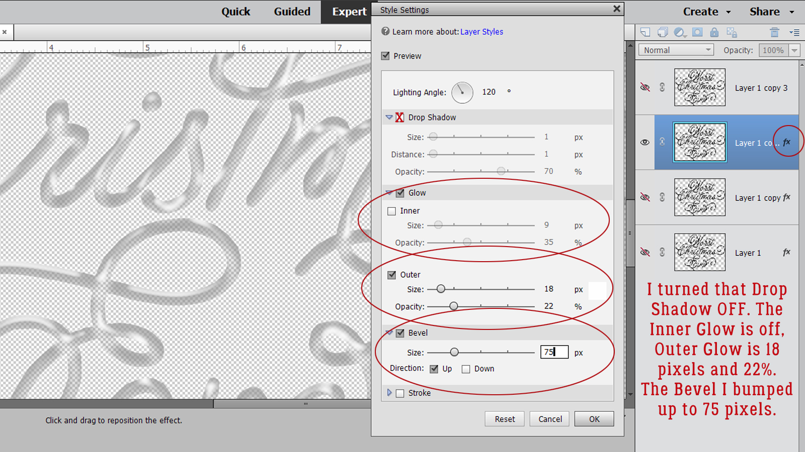
First thing I did in the Edit Style menu was to turn off that honking huge shadow. This style uses an Outer Glow, which I adjusted so that the Size is 18 pixels, the Opacity is 22% and the colour is pure white. Then I increased the Bevel on this layer to 75%.
Here’s where I sorta dropped the ball. I missed a screenshot. I’ve moved up to the Layer 1 Copy 3 layer and now I’m going to add another Inner Glow.
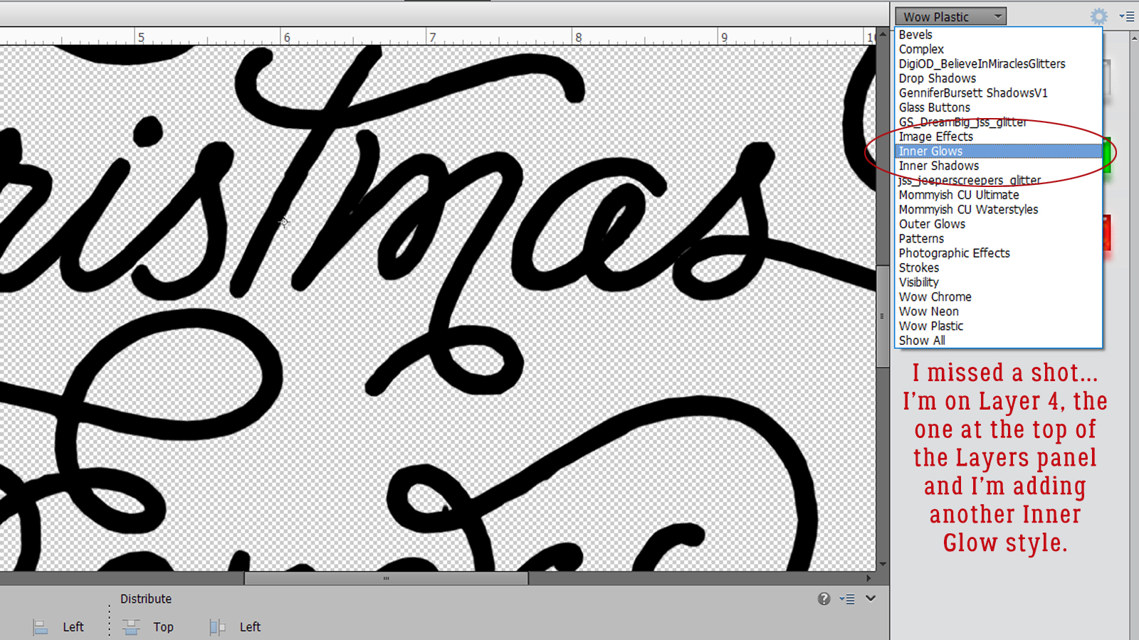
Again I used the Small Border Glow.
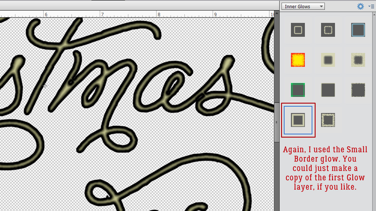
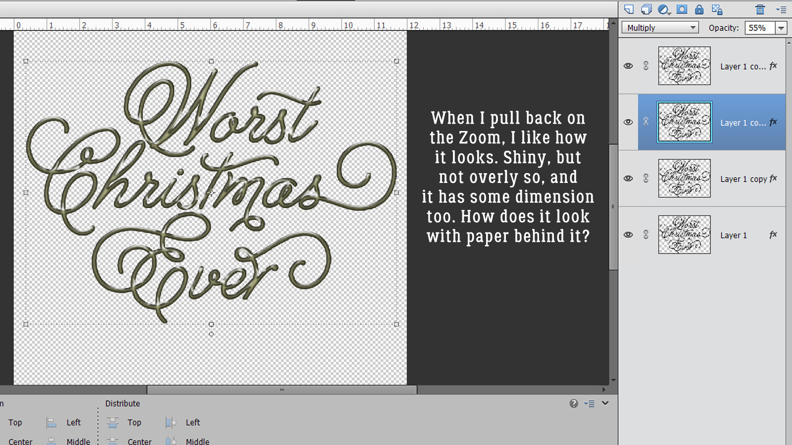
But this time I changed the Blend Mode to Multiply. This Blend Mode darkens but maintains the contours. Then I dropped the Opacity of the layer to 55%. Up close it doesn’t look too great.
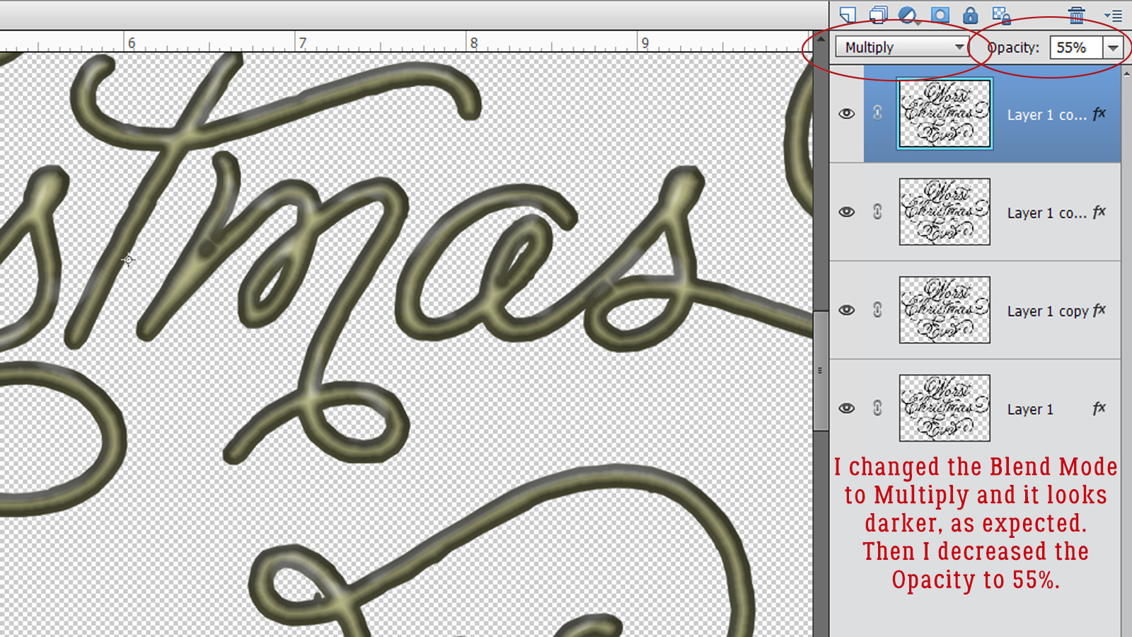
But when I moved the Multiply layer down one space so it’s under the Wow Plastic layer, it looks a lot better!
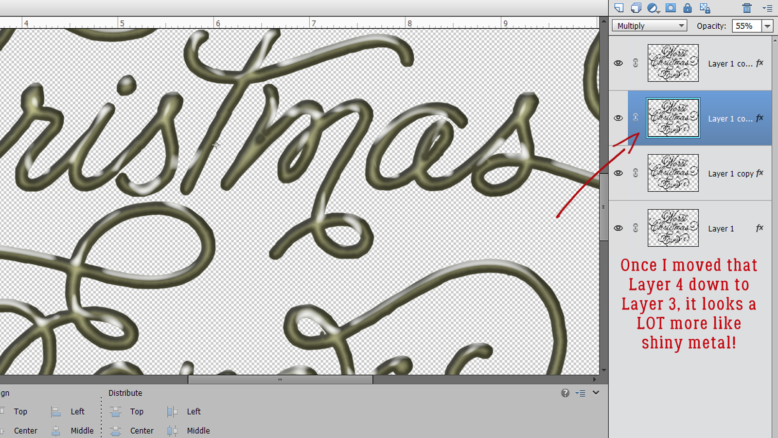
Then when I pull the Zoom back, the full effect is much more visible. It’s shiny, but not liquidy-shiny. And it has 3 dimensions. 23
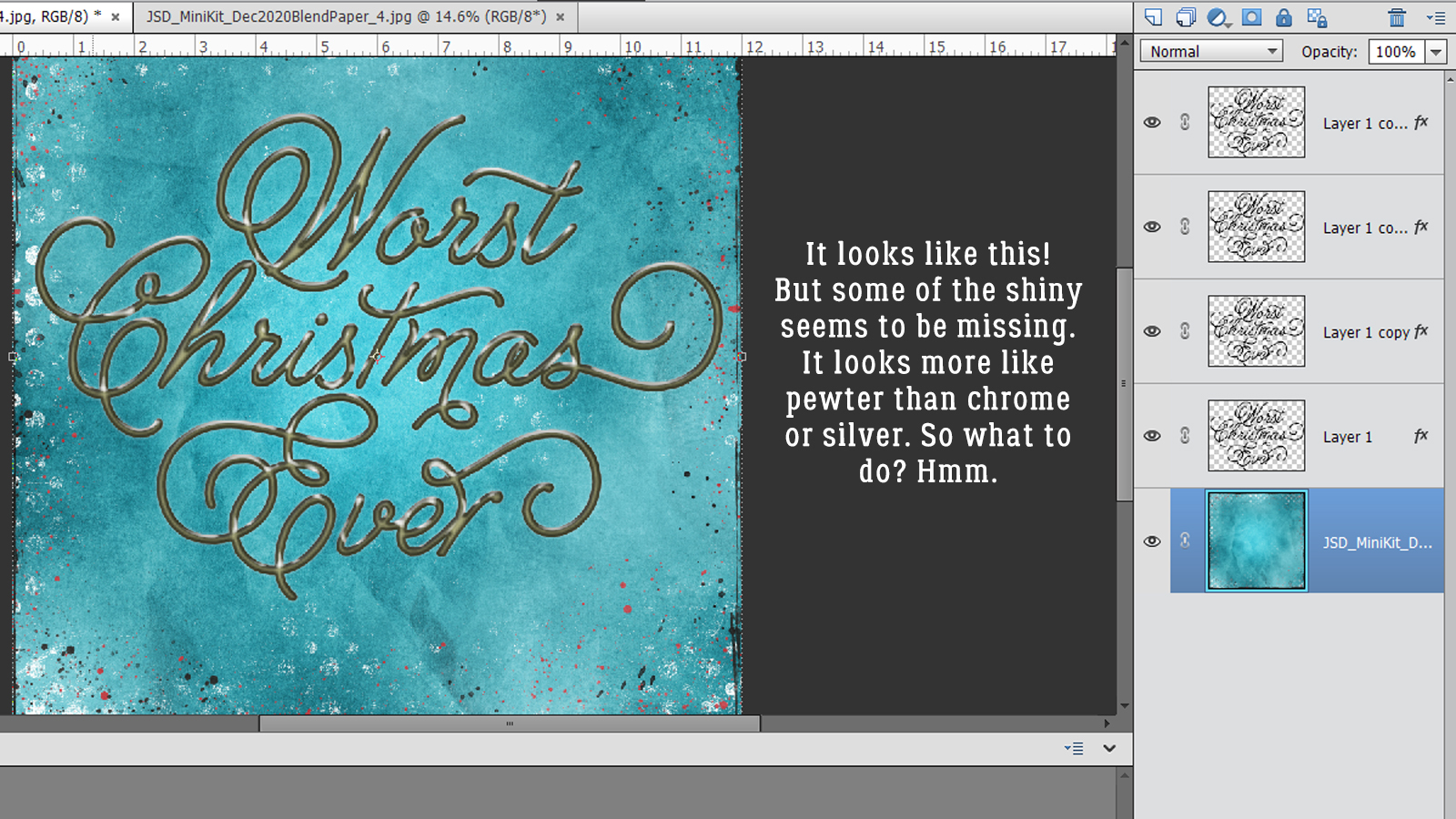
I popped a paper (from the December Mini Kit Challenge created by Jumpstart Designs) underneath it. Just to see how I like it. To me, it looks more like pewter than chrome or silver. What to do…?
I Zoomed back in and played with the Opacity of the Multiply layer and settled on 40%. It looks more silvery now.
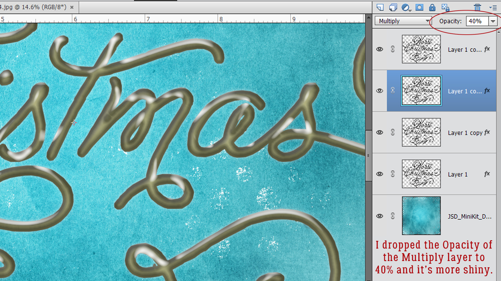
Okay! I think that looks better. This technique will work on any template object you’d like to metallize. And if you apply it to a scripty font, you can create wire words!

Bernice, please let me know if this was the look you were seeking. To all of you, Happy New Year!! Let’s all hope 2021 is an improvement on all things. See you next year!
![]()
