Archives for May 2021

Fresh Baked: May 28, 2021

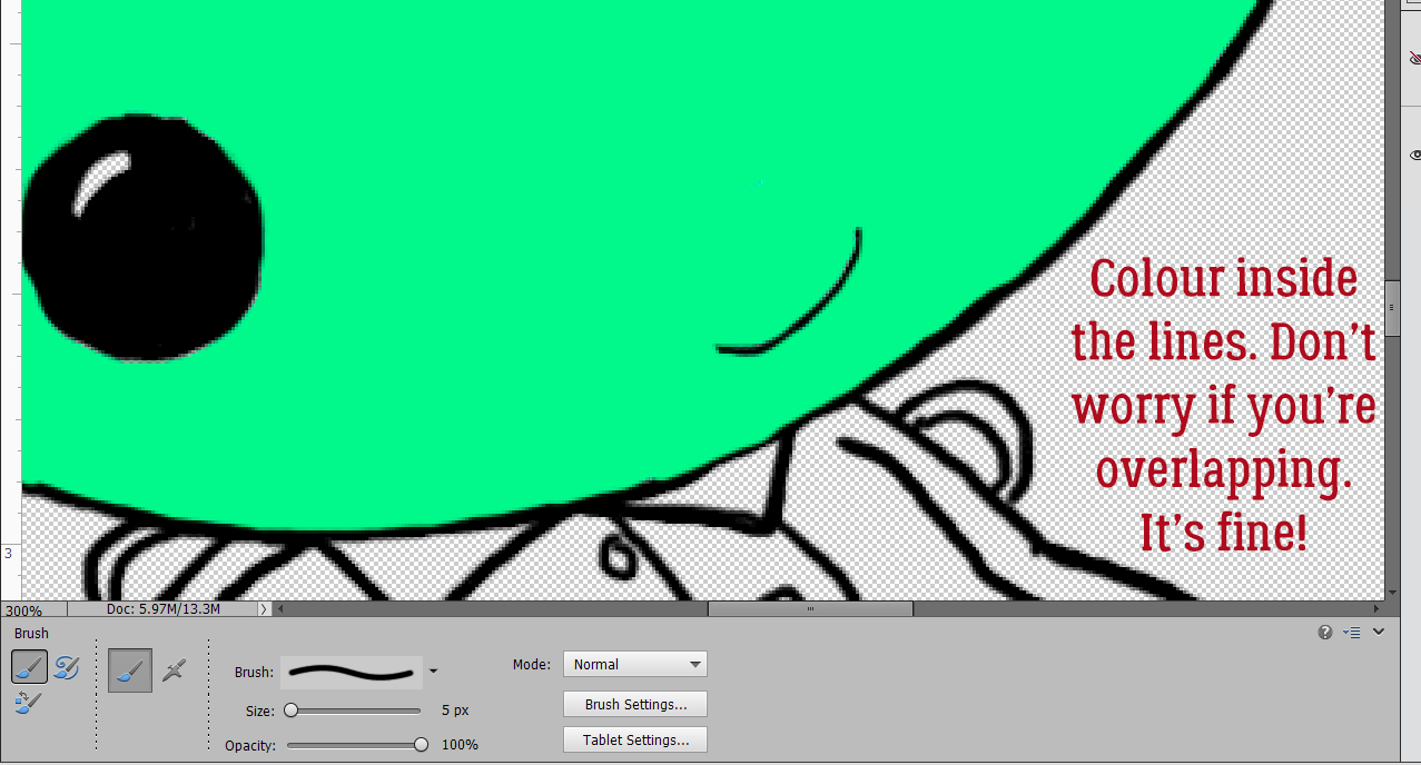
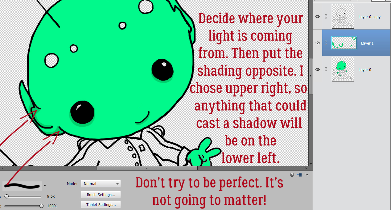
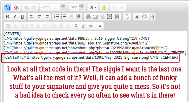
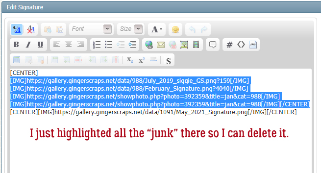
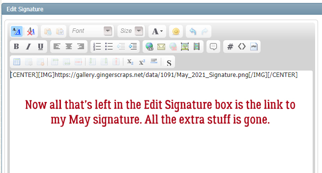
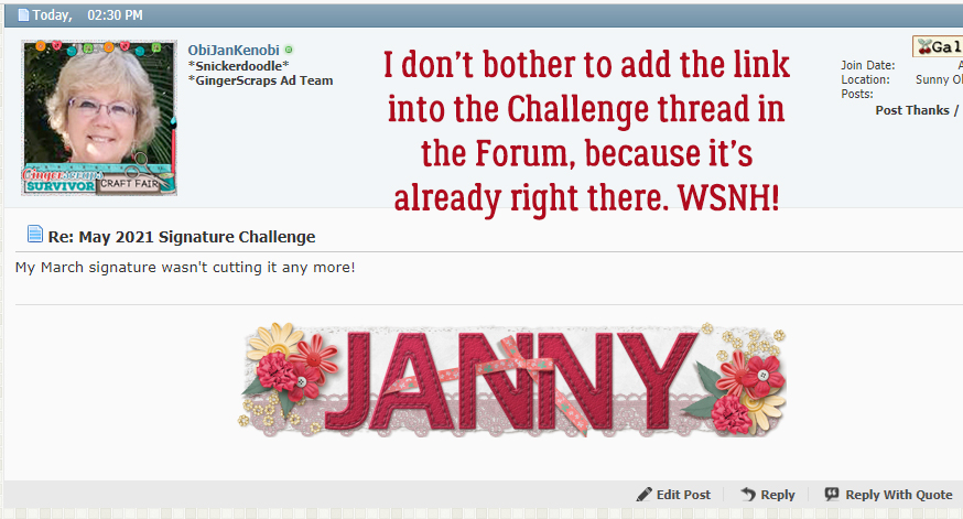
Well here we are at the last Friday of another month. Crazy how these things are just flying by. The way it’s going, the holidays will be here before we know it. I know…hush, right?

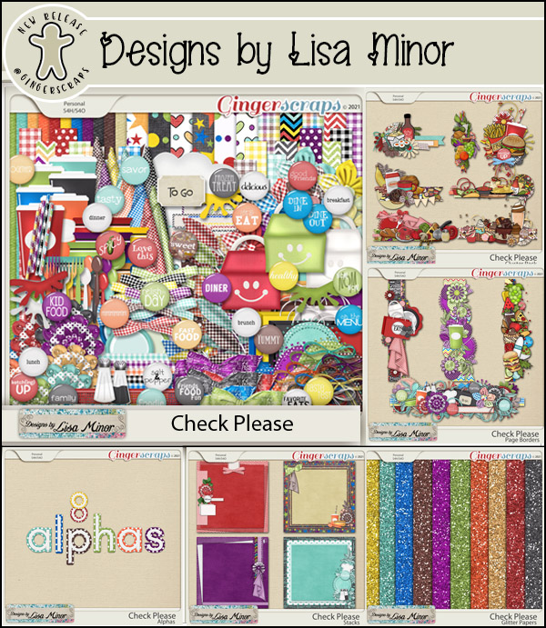
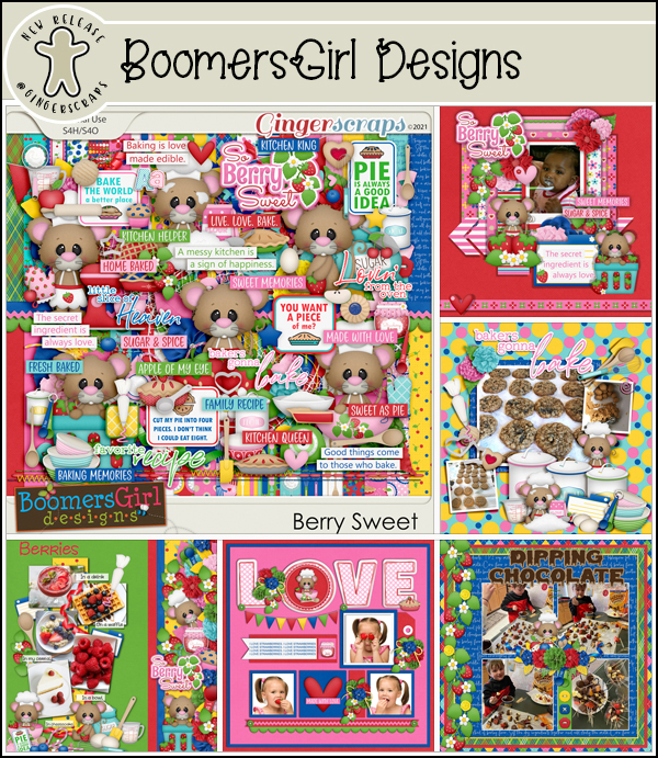
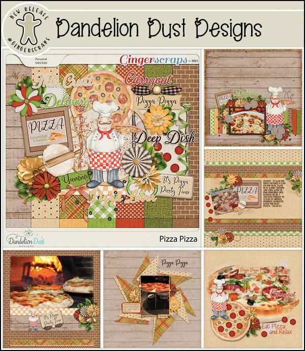
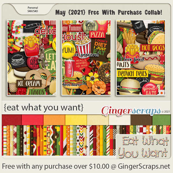
Have you shopped and gotten your Free with Purchase kit for May? Look at all these food elements! Makes me hungry just looking at it.

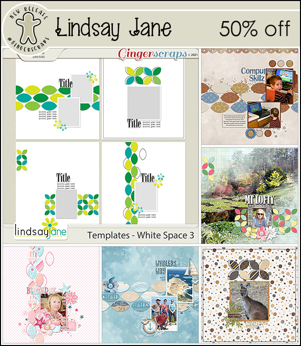
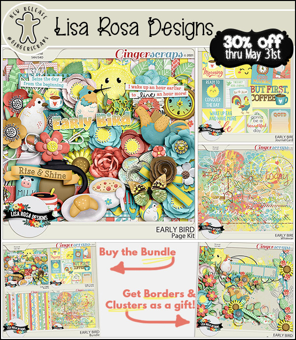
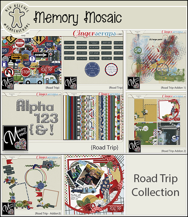
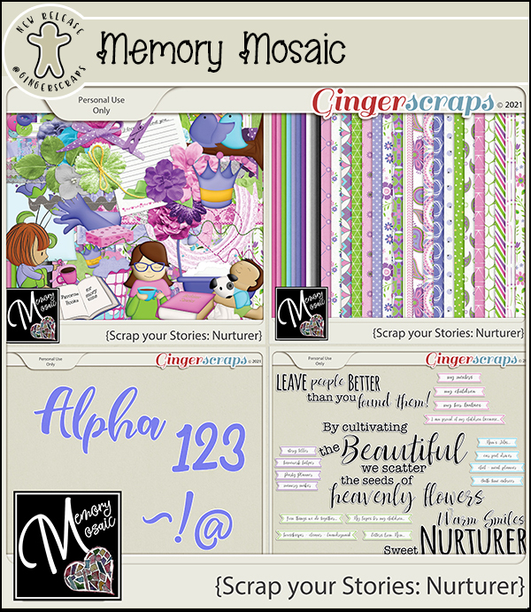
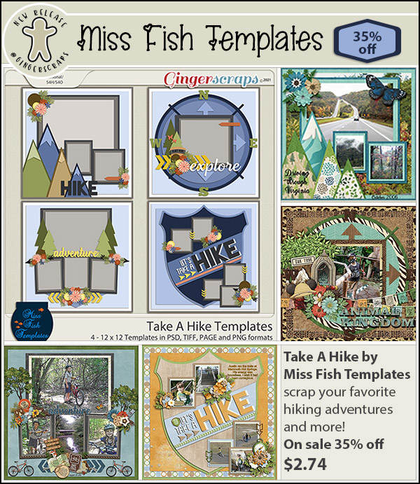
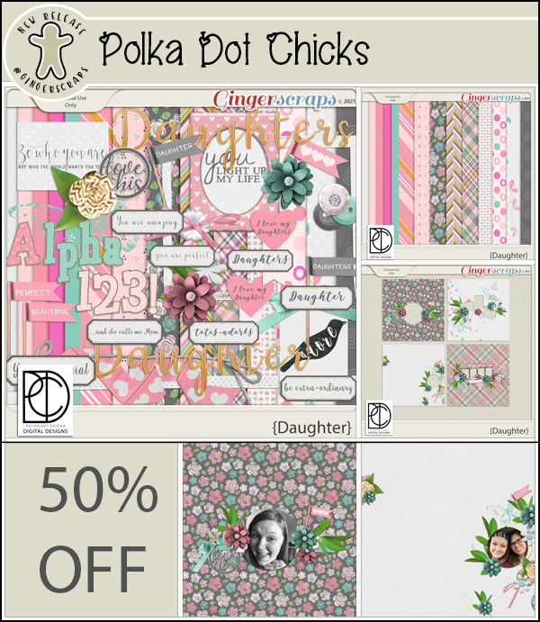
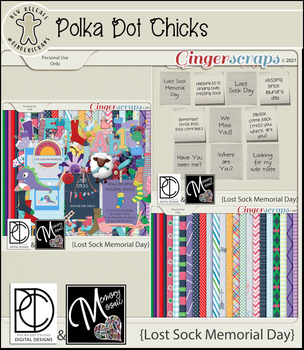
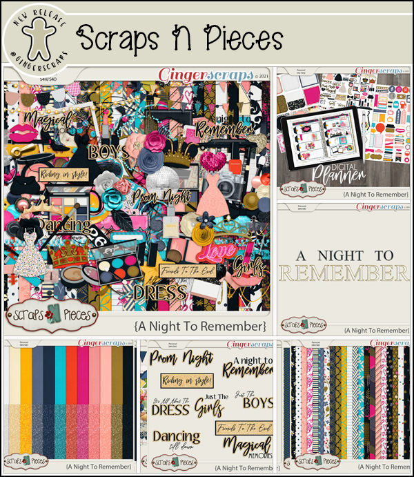
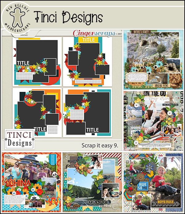
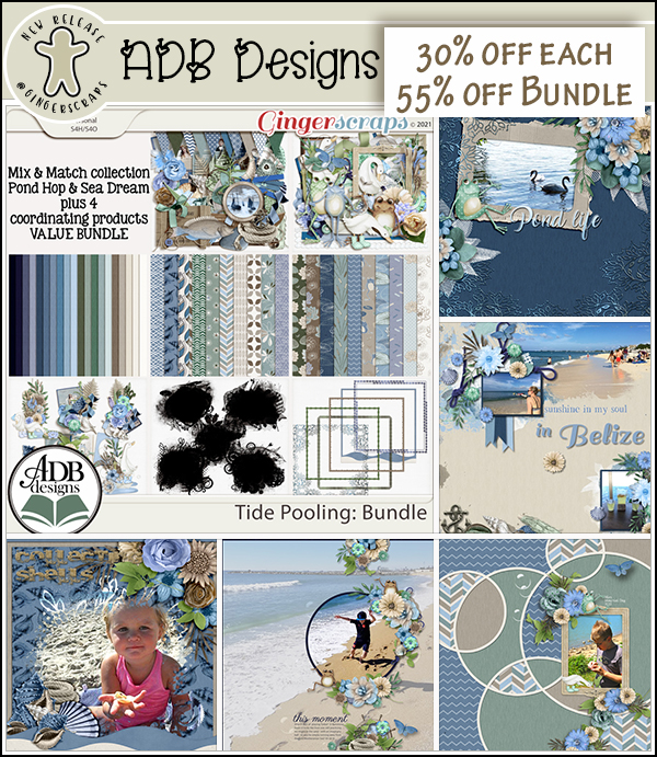
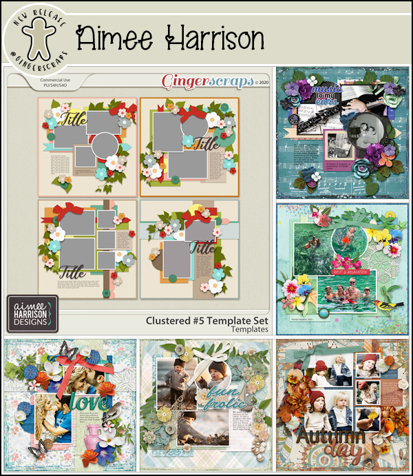
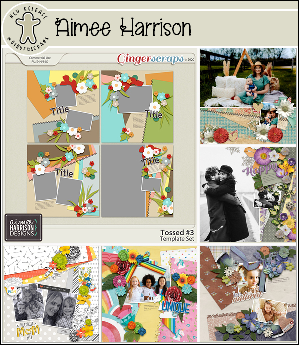
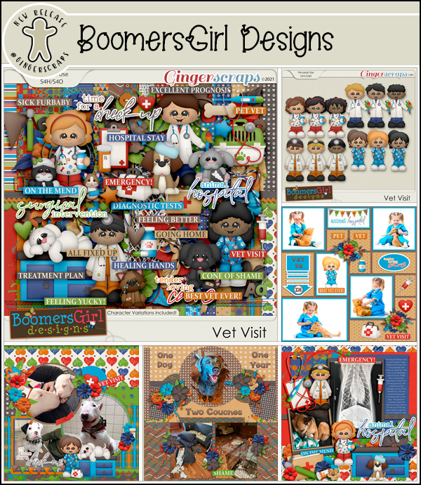
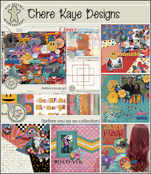
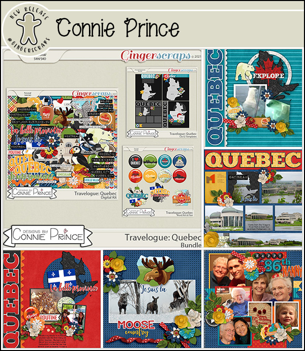
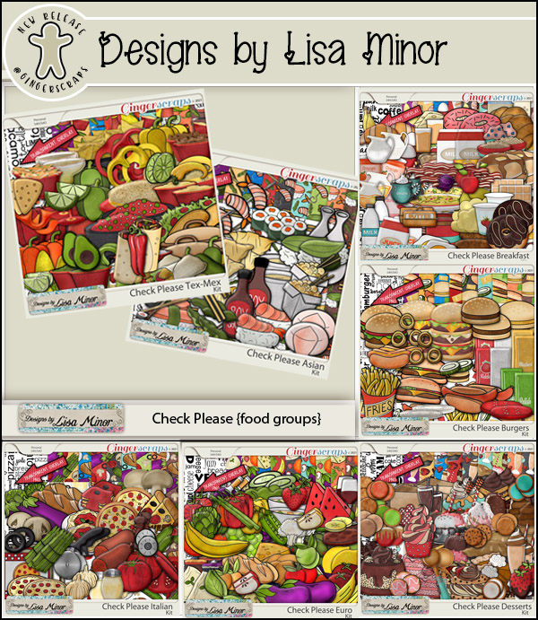
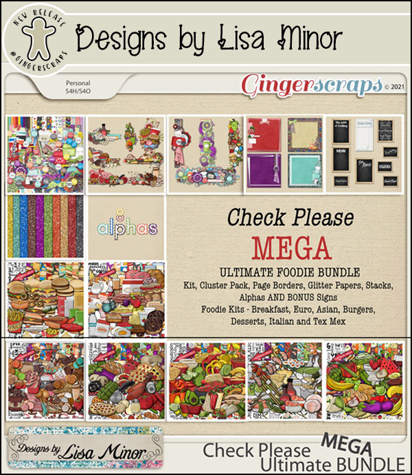
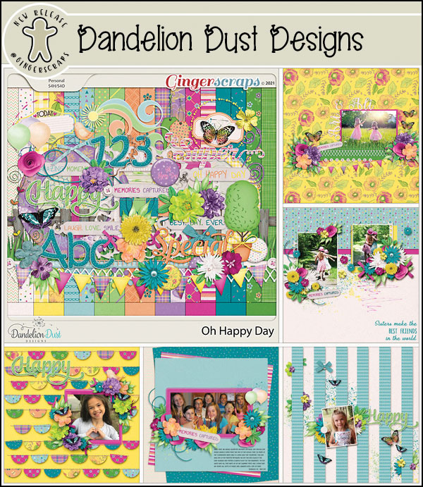
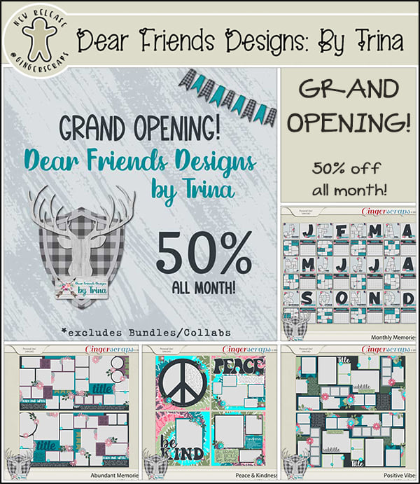
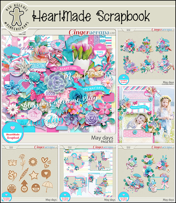
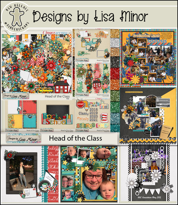
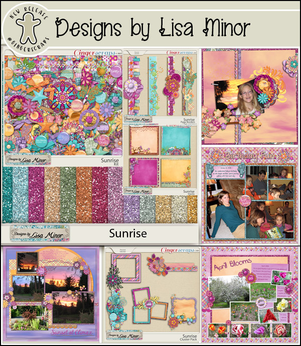
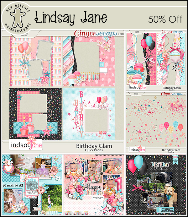
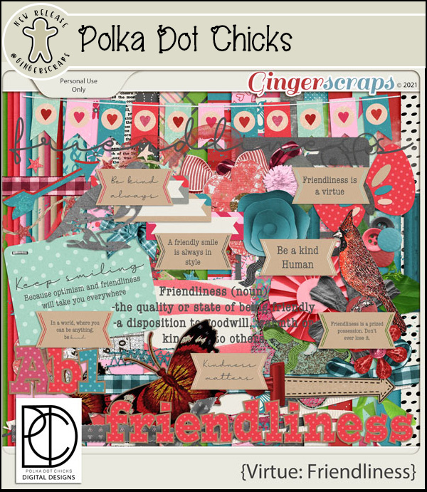
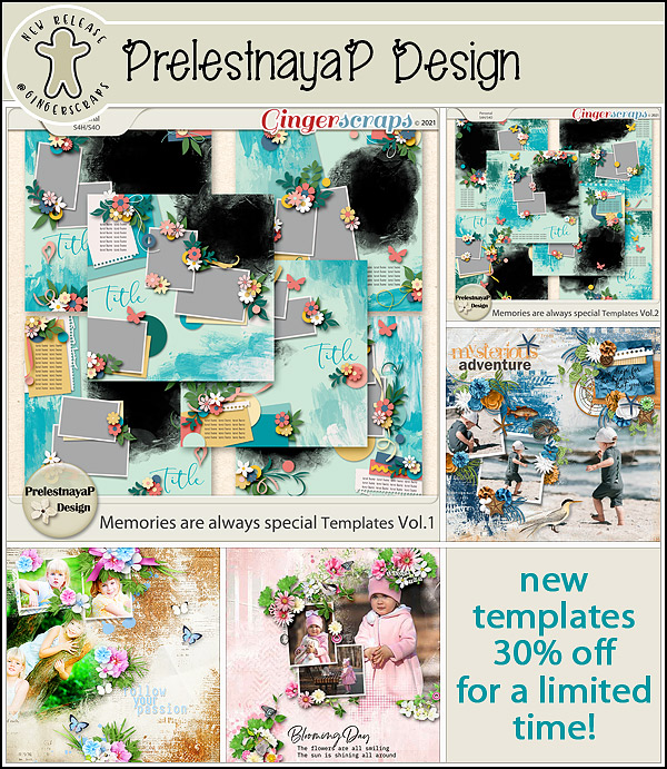
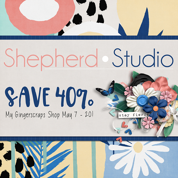
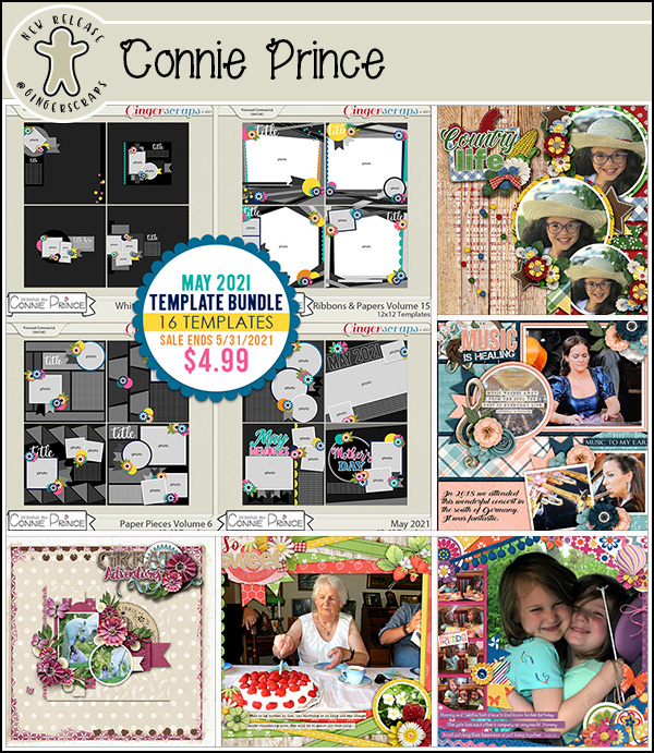
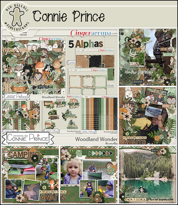
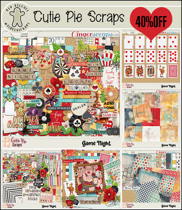
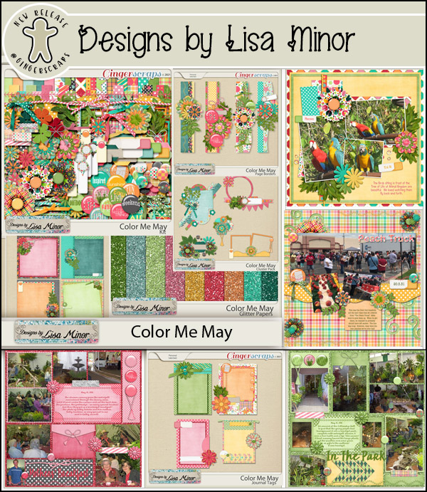
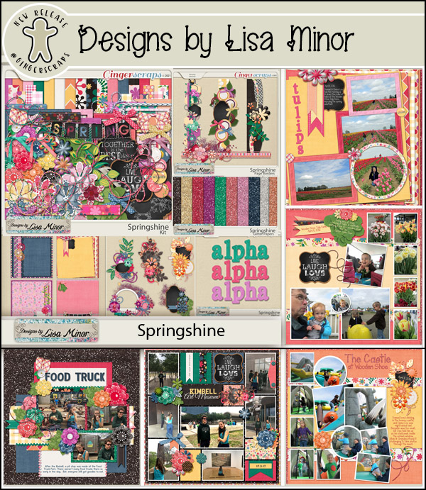
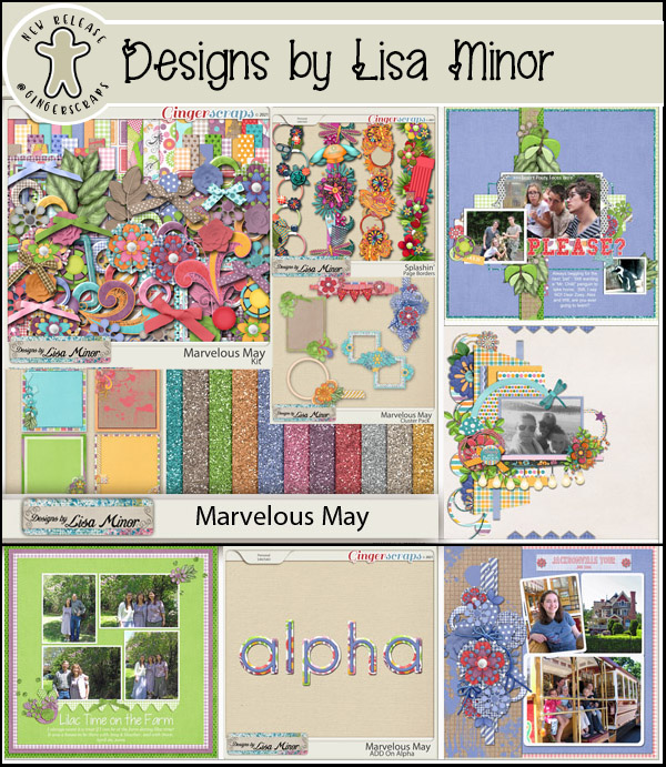
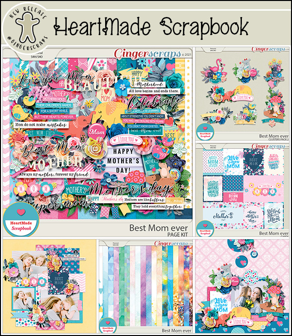
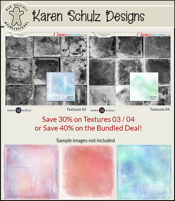
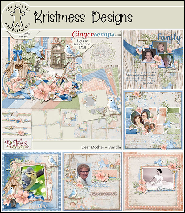
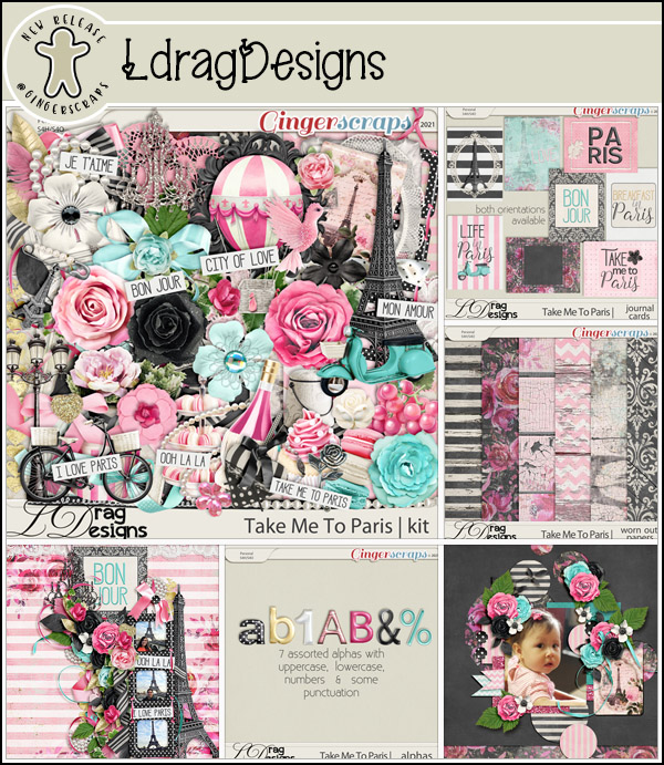
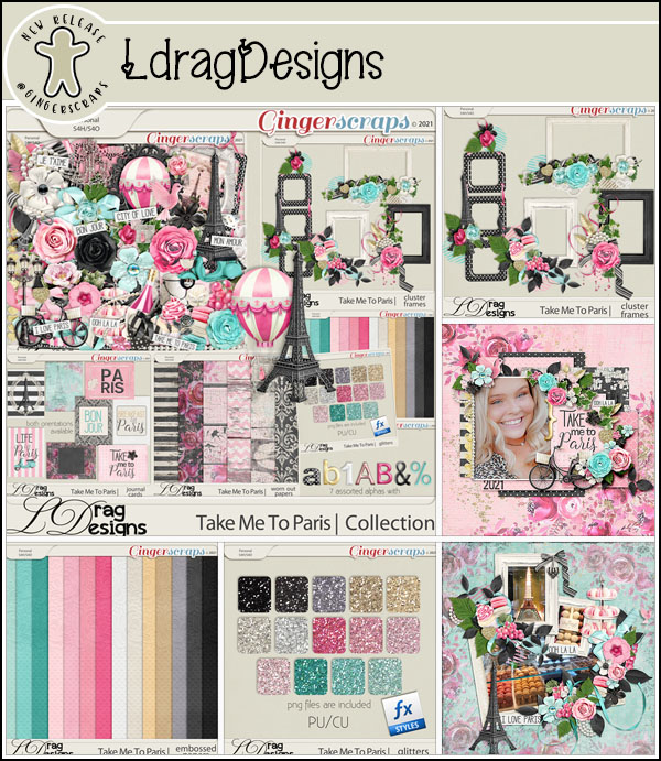
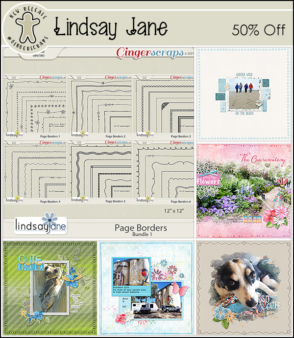
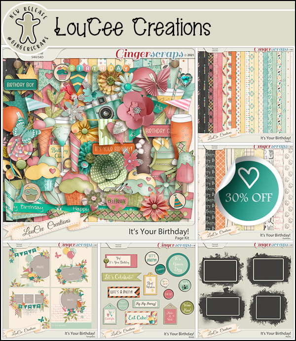
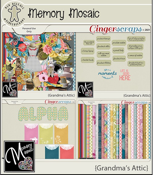
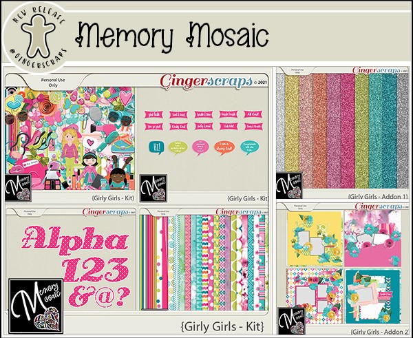
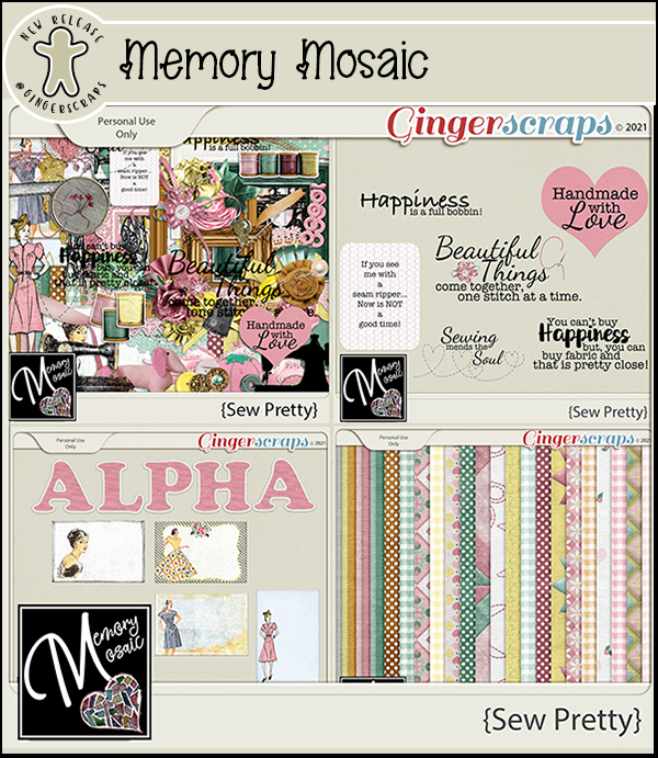
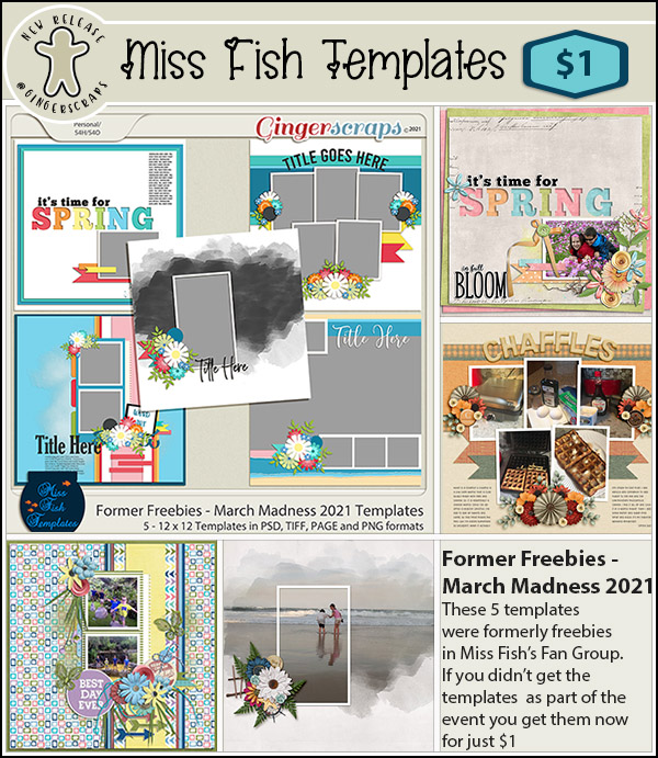
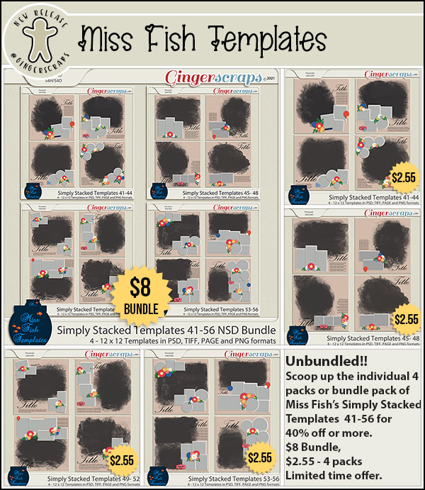
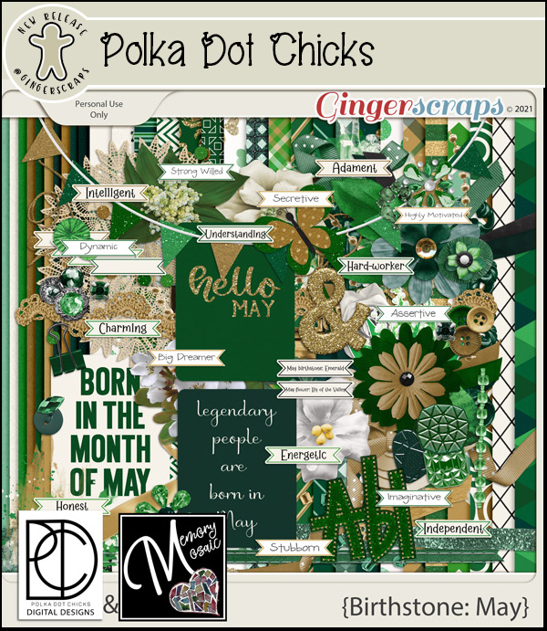
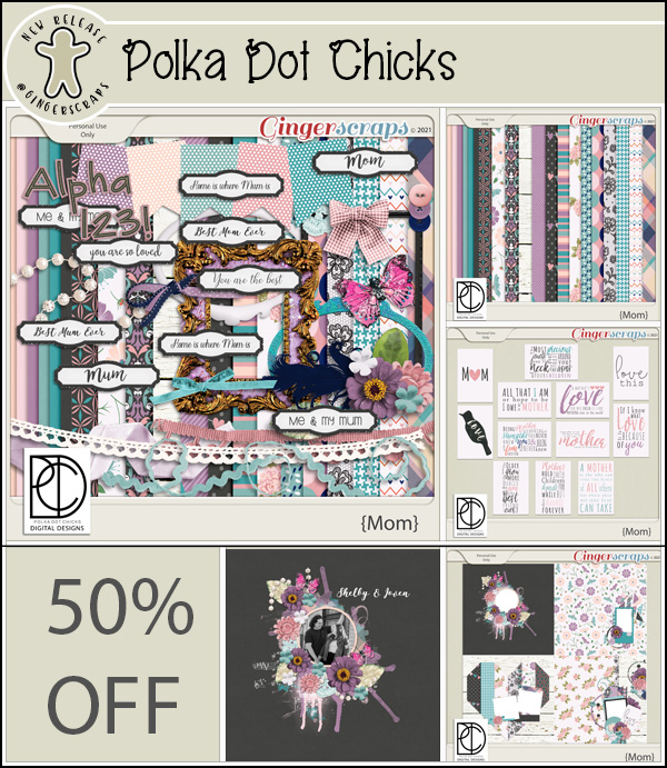
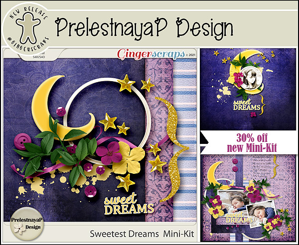
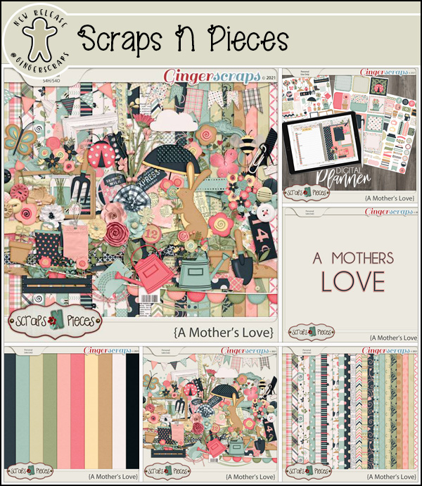
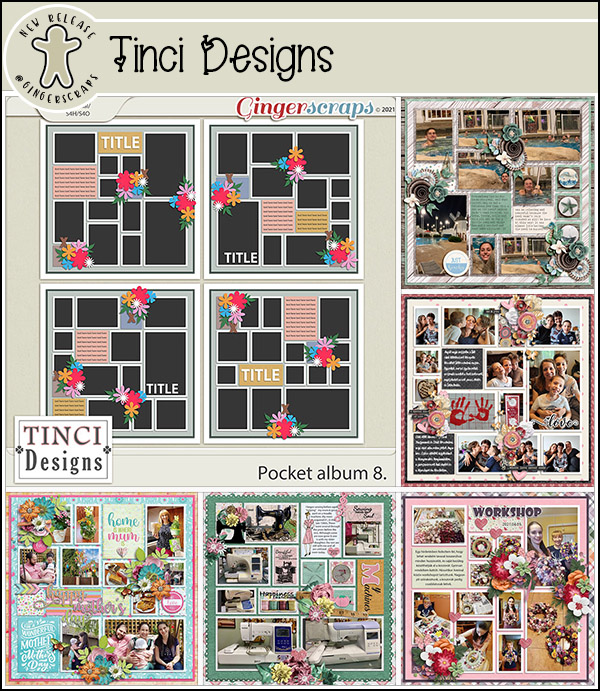
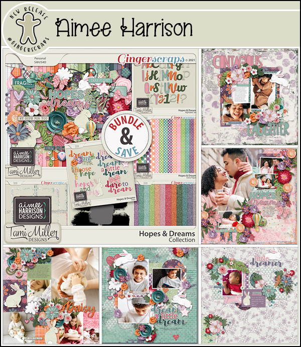
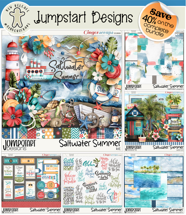
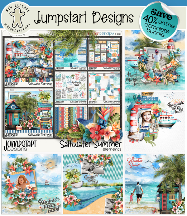
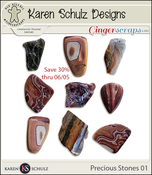
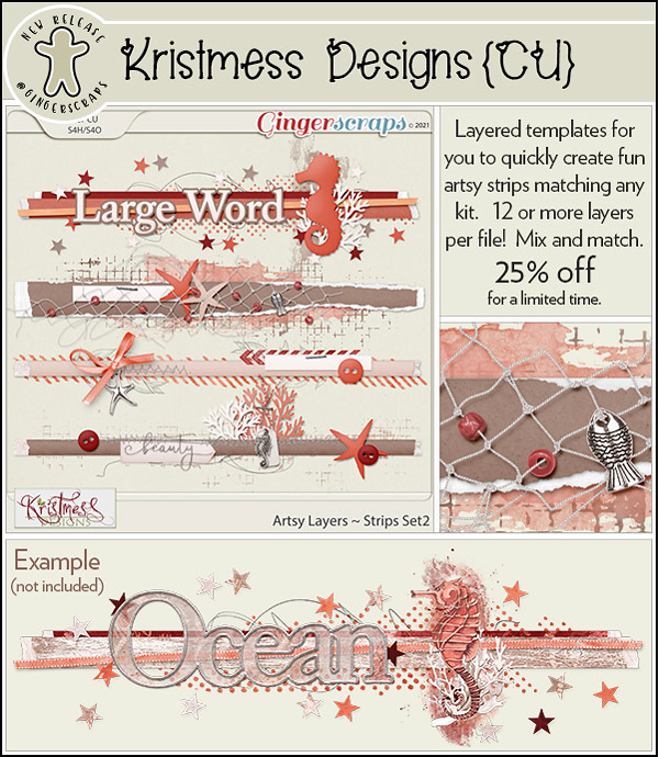
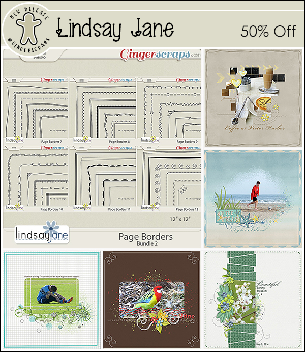
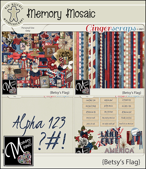
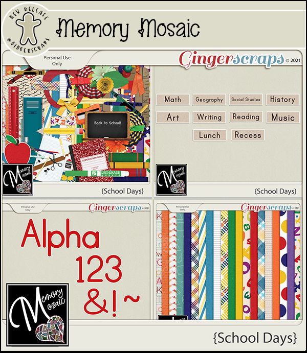
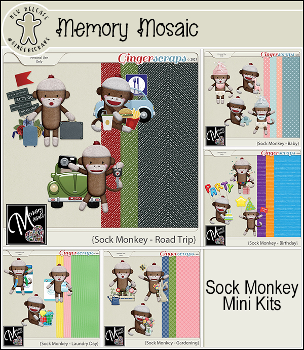
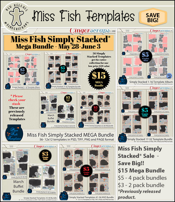
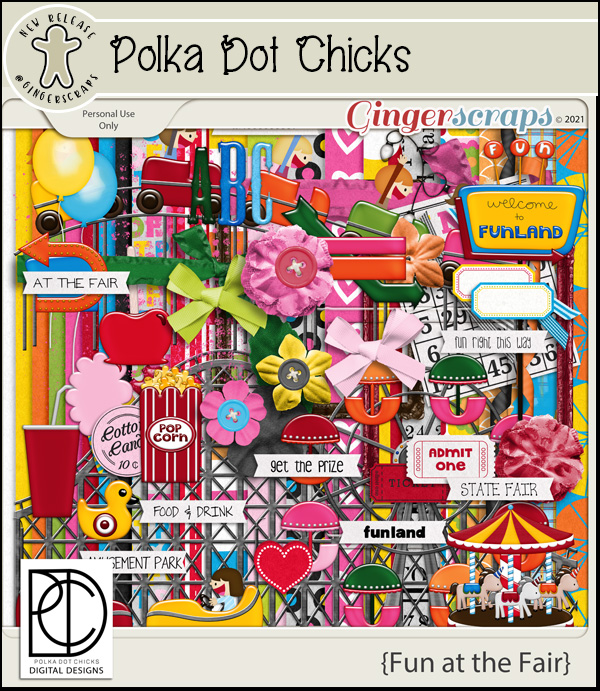
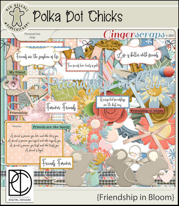
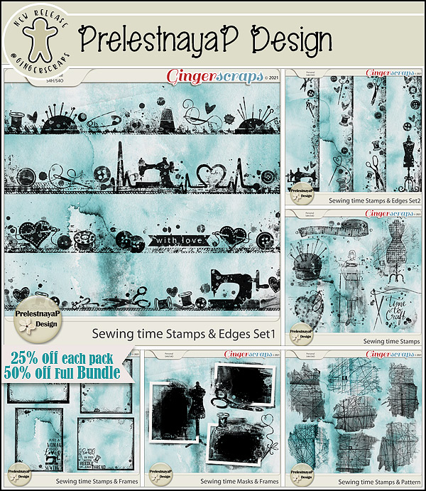
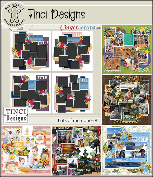
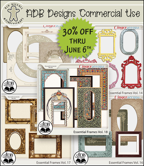
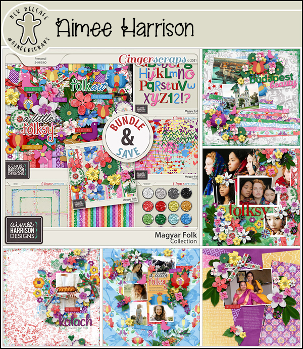
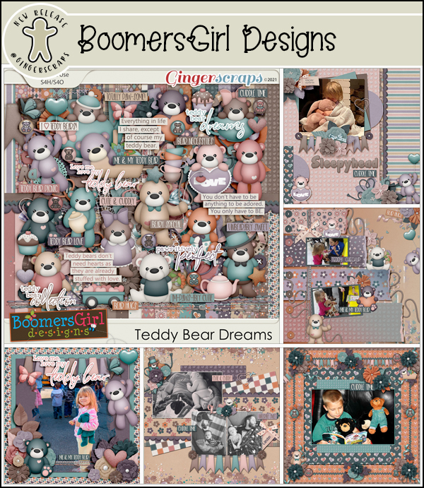
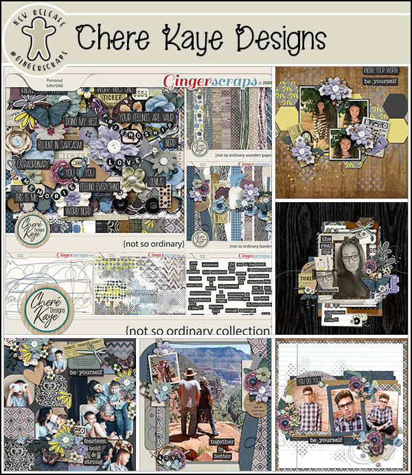
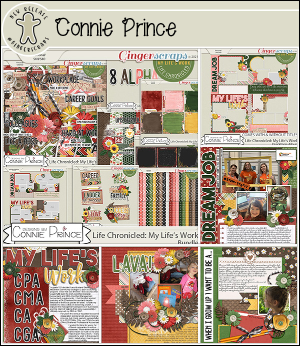
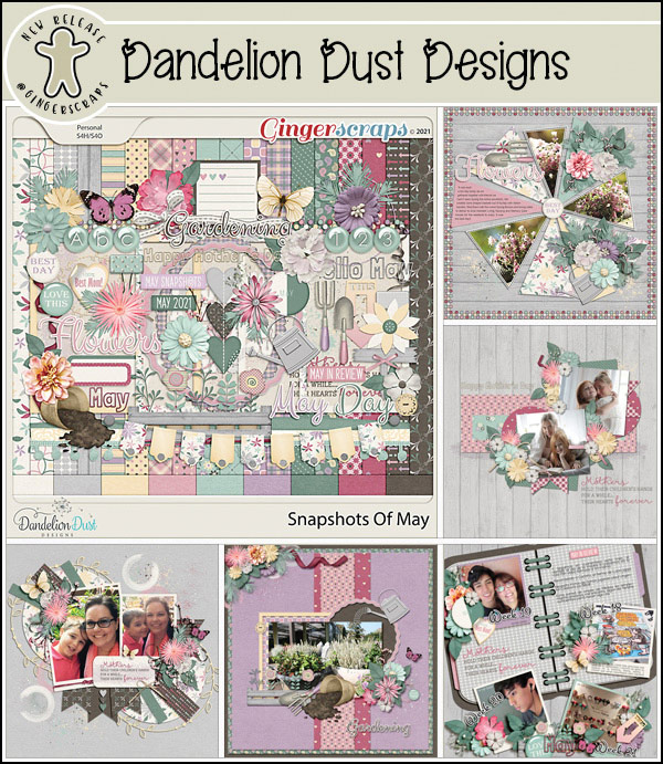
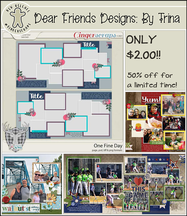
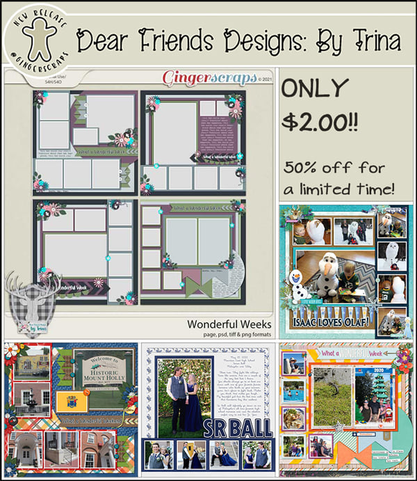
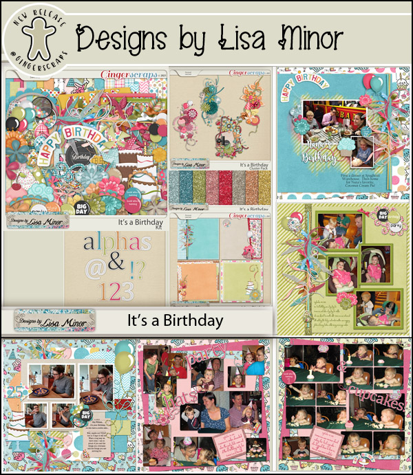
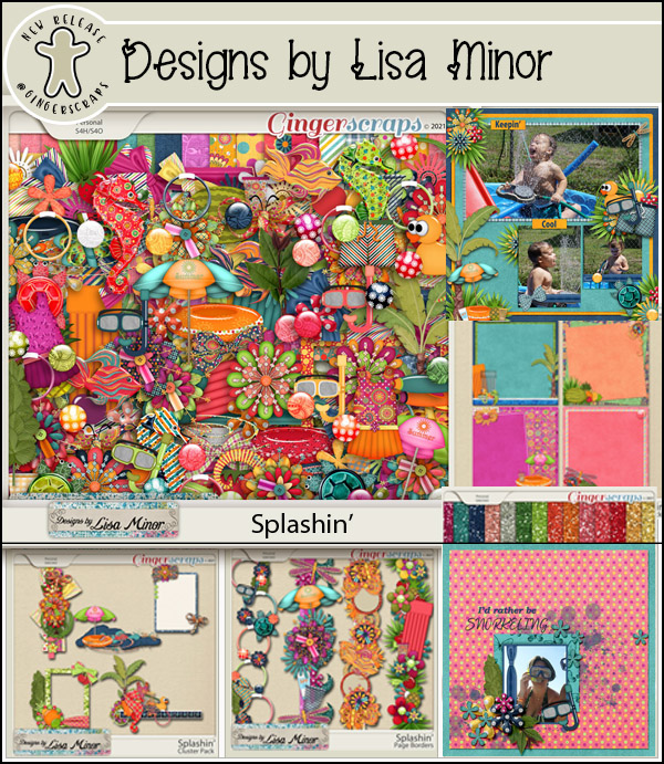
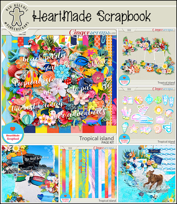
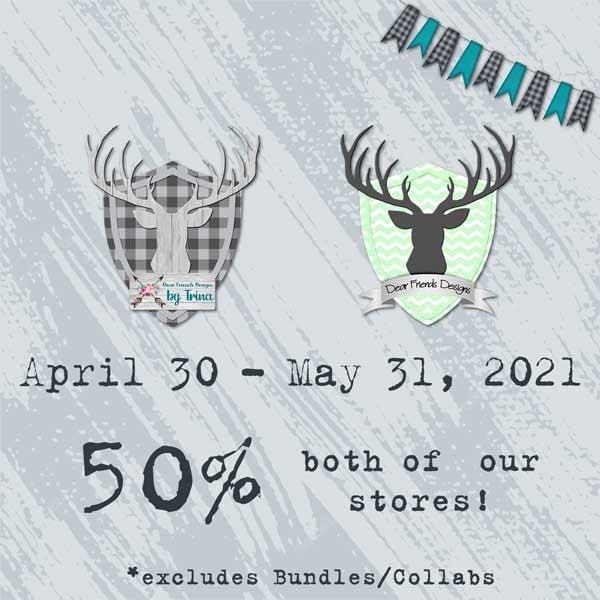
And let’s see what our designers have. I see a few in here I want to grab!

Dear Friends Designs by Trina

Dear Friends Designs

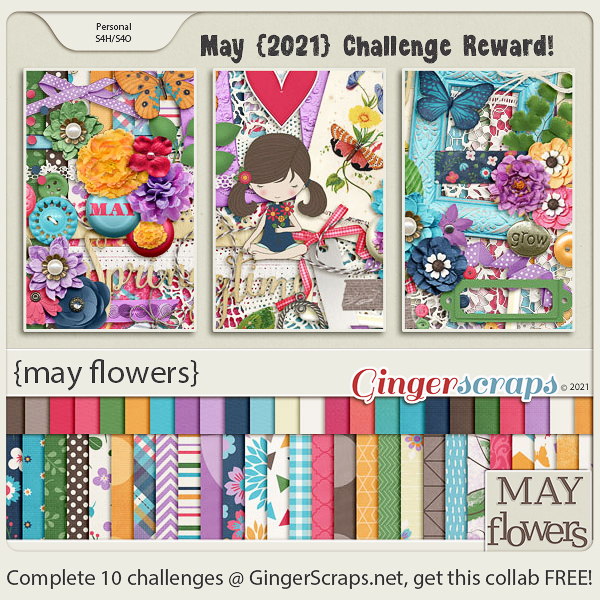
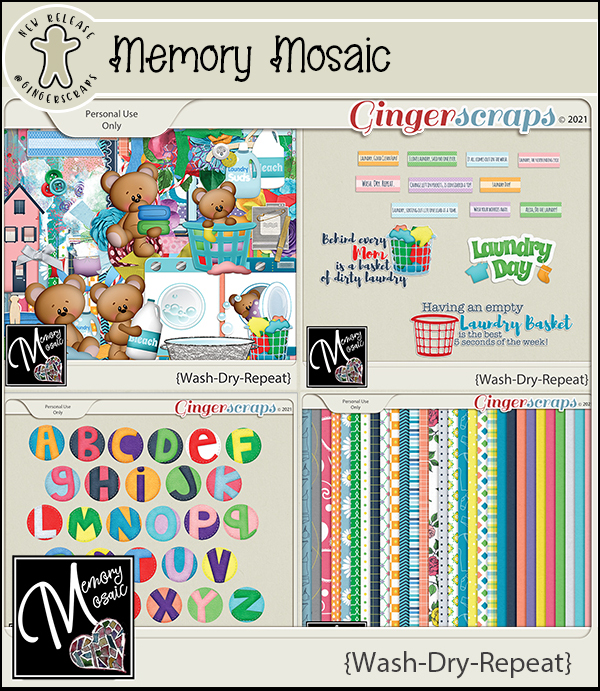
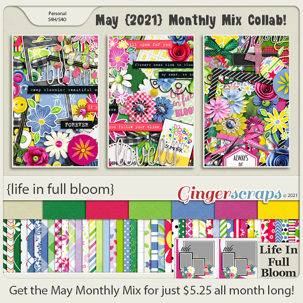
Just a few days left to get those challenges done. Any 10 completed challenges gets you this great kit as a reward!

Tutorial Tuesday (Photoshop Elements)

Digital Stamps in Living Colour

Do any of you belong to Font Bundles or Design Bundles? I love their monthly Dollar Days sales, although I already have more than 1600 fonts and I don’t have a Cricut… I’m also a sucker for digital stamps in addition to my enormous collection of rubber and acrylic stamps. But so far I haven’t found the right combo of paper, stamping ink and coloured markers so my stamped images always end up smudged and smeared. I thought, “Is there a way I could colour a digital stamp or a PNG image from Design Bundles using Photoshop Elements?” I had a podcast I wanted to listen to and some free time so I played with an image from Tiddly Inks, drawn by Cristy Croll, and figured out a method that worked really well. It can be adapted for doddles and brushes too. Read on!

First off, the image used for this technique must be a PNG on a 100% transparent background. You can see in the screenshot above that only the outline of the space alien is visible. While it IS possible to use a digital stamp with the outline filled with white, it’s a lot more work, as you’ll see as I work through the colouring process. I made a Copy (CTRL/CMD>J) of the untouched stamp and turned off visibility (for now). It will become the “clean” outline later.

This step won’t work as readily with a white-filled outline. It would involve Magic Wand selection and lots more steps. Doable, but time-consuming. As the screenshot below says, as long as the areas I’m planning to fill are completely closed by the outline, I can use the Paint Bucket tool to fill the area. If the outline has even a microscopic gap in it, when the Paint Bucket is dumped, the paint will escape and fill the entire canvas. (UNDO!!) If that happens, I’ll switch to a small, hard black Brush and close the gaps. I’m going to do all the solid Paint Bucket filling on the bottom outline layer. My little green man has some exposed skin around his ankles.

I found that the Paint Bucket sometimes didn’t fill right to the outline, leaving a faint blank rim around everything. So I switched to a smallish hard round Brush with my green colour in the foreground and painted away the blank spots. I didn’t worry about colouring outside the lines, because I have that lovely, clean outline layer set aside.

As long as my painting didn’t actually go outside the outline, I didn’t worry about it. Where I couldn’t quite get into tiny spaces cleanly, I switched to the Eraser tool and tidied up. I toggled back and forth between Brush and Eraser quite a bit.

I decided I could work with the top layer visible. See how the outline is much cleaner? I used a black Brush on the top layer to make the eyes a little less jaggy.

Once I had all the green areas filled and neat, it was time to add some dimension. Working with alcohol inks on paper, this step can be a real challenge for those just learning how to blend and add depth. Digitally, if I make a mistake, I just have to Undo until I’m back at the point where I messed it up. Up to this point in the process, I’d say not more than 10 minutes had passed. I clicked on my foreground colour to open the Color Picker tool and chose a darker value of the original green to begin shading.

For the technique to work well, all the shading and highlighting will have to be done on its own layer. You’ll see why as we move along.

Before I did anything else, I had to decide where my light source was, the same as when creating custom drop shadows. I chose the upper right corner, so shadows will fall to the lower left. Then I Brushed on my shading, based on what my eye saw as contour.

I felt that there needed to be a bit more depth to the shaded areas, so I chose another, darker value of my green and Brushed a narrower area right at the edges of the contours.

I realized that if I added a new blank layer BEFORE I opened the Color Picker, I wouldn’t forget to put each new colour on its own layer. The beauty of having each colour on its own layer is that I can move the layers up or down the stack to achieve the best look. You can see the added depth from the new darker colour quite well.

Now for some highlights! I added a blank layer then selected a light value from the Color Picker.

This colour will go on the areas of the image that are rounded or raised, and therefore reflecting more light.

When I was happy with the skin areas, I moved back to the bottom image layer to Fill his uniform.

Following the same steps as for the skin, I shaded and highlighted the uniform. Don’t worry about how stark these steps look. They won’t be when I’m done!

I continued Filling and contouring the image, moving between layers as needed. I went with a magenta planet, and then used deeper values to add a drop shadow to my alien.

Now for the really fun part! To blend all these edges, I’m going to use a Gaussian Blur Filter. Filter>Blur>Gaussian Blur. The Preview will show what’s happening to the edges, and I can watch it on my actual image as I go along. If the edges of the layer I’m Blurring aren’t visible in the Preview pane, all I need to do is click my cursor on the actual image somewhere that overlaps the edge and it’ll appear. Using the slider, I adjusted the Radius of my blur so that the edges began to blend nicely. 12.5 pixels looks good.

The highlighted area of the planet would be softer in real life, so for that layer, I pushed the slider hard to the right. 23.5 pixels looks right to me.

Those lumpy spots needed some deeper shading, and Blurring this layer too much will make the effect pretty much vanish. So the Radius here is only 4.3 pixels.

Blurring isn’t the only way to make this technique look good. Don’t forget the power of Blend Modes!

I tried several Modes before settling on Multiply. I haven’t Blurred these layers yet, and it looks pretty ghastly, but not for long.

I did the same with the darker green shading layers. These steps are completely personal preference. If it isn’t making your image look better, don’t do it!

I worked my way up the green layers and Blurred them.

The skin dimensional areas only needed a Radius of 4.5 pixels.

I moved from segment to segment, Blurring as I went.

When I got to the last layer of the planet and the alien, I was pretty satisfied with how it looked. Now to add a starry sky to the background!

To make less work for myself, I added a Blank Layer BEHIND the bottom image layer so I could Fill it with colour and let the image do the hard work.

I found a starry brush in my stash. It’s from Key Lime Digi Designs (it was a Challenge brush) and it’s the perfect touch! The stars are, of course, on their own layer. Then I applied a glittery Style from the GingerBread LadiesDream Big Monthly Mix collab to the stars to make them even more twinkly.

When I was finished, I Saved my creation as a PSD, just in case I look at it later and want to tweak it further. I plan to use it for my grandson’s birthday card, so it may need a little touch-up. I know this isn’t going to be widely popular, but I enjoyed the process and will be doing it again. It took me about the same amount of time it would have taken with alcohol inks or coloured pencils – not taking into account the versions I ruin before I get one  like – so there’s that…

PDF Link: https://bit.ly/3q7sQQU

Fresh Baked: May 21, 2021

Happy Friday!! I hope you have had a great week.

Remember, when you spend $10 you get this great kit for free.

Let’s see what our designers have this week!

Polka Dot Chicks

Memory Mosaic

Have you grabbed the May Monthly Mix yet?

And how are those challenges going? Any 10 completed challenges gets you this collab as a reward.

Tutorial Tuesday (Photoshop Elements)

Updating the Custom Cluster

Regular readers might recall a tutorial from a long while back on interweaving elements into a more complex and natural looking cluster. They may also recall another tutorial about “shaving” drop shadow styles. Somehow it never occurred to me that the two could work together to make the task of customizing clusters much quicker and easier. But here we are! I know this is going to up my game a lot, especially when I’m weaving ribbon into the alphas I use in my signatures. Let’s see what I’m talking about.

Here’s a cluster I tossed together using Aimee Harrison‘s Secret Garden kit. It’s okay, but it could be better.

After I took a good look at the various components of my cluster I identified a few spots where I could add some interest. First, I’m going to tuck the burlap ribbon in behind the petal I’ve indicated. The blue flower layer is the active layer. I CTRL/CMD>clicked on the layer thumbnail for the burlap ribbon to Select the edges of the ribbon. Then I double-checked that I’m working with the correct layer, the blue flower layer.

Rather than having to be super-careful about what parts of the blue flower I remove with the Eraser tool, as I would with my previous method, I only have to Zoom in and move cautiously on the area where the blue flower’s petals overlap. With the edges of the ribbon Selected, only those parts of the active layer inside the marching ants will be Erased!

Let’s bring the ribbon in front of these petals. The only sticky spot is right at the intersection of all those petals.

One swipe with the Eraser tool completely revealed the ribbon, putting it on top of the petals.

I’m also going to tuck the ribbon behind the edge of this leaf.

Did you notice that I also put the small white flower’s petal behind the leaf? I just had to change the active layer to the white flower and Erase where the leaf is. There are a few other spots where I’ve made some tucks or lifts. Can you see them?

**So what happens when it’s time to add some shadows? Well… parts of the layers may have been removed and the shadow will look funky, like this one. I’ve used a custom shadow on its own layer here, but this also will happen with drop shadow styles so be aware of it when you’re working.**

After I’ve Smudged and Blurred the shadow layer, I CTRL/CMD>Clicked on the large white flower layer to Select the edges. Then I Erased the shadow that shouldn’t be overlaying the petals.

With all the elements in the cluster Shadowed, I felt the (very OCD) urge to add a suggestion of a shadow where the leaf overlays the small white flower at the lower left. But it’s probably something no one will notice so feel free to omit this step! What I did was activate the shadow layer for the leaf then used the Marquee tool to enclose the part of the shadow I wanted to move into place. I made a Copy of that part of the shadow (CTRL/CMD>C) then I Pasted it (CTRL/CMD>V) onto the layout, which created a new layer. I moved that layer up the stack of layers until it was on top of the flower layer. Some additional Erasing was needed so I CTRL/CMD>Clicked on the leaf’s layer thumbnail, activated my little new shadow layer and Erased the part that wasn’t in the right place. Easy peasy!!

There are so many ways this will elevate your layouts! Give it a try and let me know how it works for you. And of course, if you have tips for making it easier or better, our readers will be thrilled!

Here is the PDF version of this tutorial: https://bit.ly/3oyB8QR

 
Link to PDF: https://bit.ly/3gL52On

$1.00 Bake Sale NOW OPEN at GingerScraps!

It’s time for the monthly $1.00 Bake Sale at GingerScraps!! The perfect time to pick up some beautiful goodies for only $1.00!! 

Remember when you spend $10 in the store you get this super fun collab as a gift!

Now it’s time for the amazing $1.00 Bake Sale items!!

We are at the half way point for the month! Time to get busy on all the monthly challenges. If you complete 10 challenges will get you this great collab as a reward.

Fresh Baked: May 14, 2021

It’s Friday! Whoop Whoop! Time to have a wonderful weekend and make some memories, don’t forget to take lots of photos for scrapping! 

Remember when you spend $10 in the store you get this great and fun collab as a gift!

Now it’s time for the amazing new Fresh Baked goodies!

Dear Friends Designs

Dear Friends Designs by Trina

Are you getting a good start on your challenges? Completing 10 challenges will get you this great collab as a reward.

Tutorial Tuesday (GingerScraps)

Let’s Talk Some More About Siggies

It sounds like there were a lot of people who learned something new from last week’s tutorial about using the GingerScraps Gallery. Music to my ears!! And, as sometimes happens, that tutorial led to a request for some help with another feature at GingerScraps. Corinne said, “Since Jan did a really nice job of explaining how to upload photos to the gallery, I am wondering if she could tackle the unknown world of signatures? How does one go about designing and uploading? Thank you! CorinneGinger and I discussed it and we decided it would be a good idea to do some review. I first discussed signatures in the Sizzling Signatures! post. Then last December we talked about adding links to your signatures in THIS tutorial. So some of today’s tutorial will be review, and who knows, I may have something in here that you didn’t know!

What’s a signature? What’s all the fuss about? Signatures are those beautiful little images seen at the end of posts in the GingerScraps Forum. They’re a big deal! They have their own monthly Challenge, after all. Each month the GingerBread Lady facilitating the challenge will provide a theme or some other required element for the month that form the basis to all the new siggies for that month. For May, ChristieDawn wanted to see flowers. Signatures can be as detailed or as simple as the user likes. You’ve probably seen some really fancy ones, and some really unfussy ones. They’re pretty good at showing the user’s personality and scrapping style. Some users make theirs with alphas from their stashes, like I usually do, while others make theirs with fonts. It’s completely up to the user! Now let’s get into the tutorial…

Let’s talk about the rules for using signatures at GingerScraps first though. Perhaps the most important rule is that your signature cannot link to or advertise any other shop/site. It’s fine if you want to link to your personal blog, newsletter, Facebook or the like. Also make sure your signature is suitable for all ages and audiences. If it would offend your grandmother, don’t do it. Let’s stay classy, y’all! The other important rule is the maximum size for your siggie. The guidelines say 700×150 pixels, but the Gallery has a maximum 600 pixel limit, so it’s easier and a lot less work if you just keep your signature at or under 600 pixels wide. I like to make my siggie a little smaller than the max, coming in at around 500×107. That makes it a little less in-your-face. More about that down the post. As to the shape of your signature, it doesn’t have to be a rectangle. I like to use Custom Shapes as the basis for mine. As long as the shape you choose fits into the max dimensions, you’re golden.

This bit is a little refresher. Did you know you can create and save preset file sizes? I’m going to show you how to do that. I have a 12×12″ preset for my layouts, and a 3500×750 pixel preset for my signature files. Why did I choose those numbers? Simple math. It’s 5 times the maximum size of the signature file; I work on a BIG canvas so I can see what I’m doing and make sure I actually like my results before I Resize and prepare to upload. Now, here’s how to create your own preset: File>New>Blank File

There’s what my New File menu looks like. You can see my siggie preset on there.

Starting from scratch, type in the dimensions as shown when the New File menu opens. You want Resolution at 300 pixels/inch for sharp images, RGB Color set, and the Background Contents Transparent. (Why? So that your signature file can have a clean background when you use it as your Forum siggie!)

Constructing your signature is just like creating a layout, only with different dimensions. If you need help visualizing how to create them take a look at the ones in the Signature Challenge Gallery. So what to do with your finished creation? I always save my layouts and siggies as PSD files initially in case I have to fix something. That doesn’t happen much with the siggies, but I often find typos in my journaling! Make sure you give your file a name.

Then I Resize my file to fit the desired parameters. There are two ways to get there. Image>Resize>Image Size will get you to the menu, or CTRL/CMD>ALT>I works for those who like keyboard shortcuts. When the menu opens up, type in your desired width in pixels and Elements will automatically set the height. In the middle of the menu you can see the actual size of the final product. Scale Styles, Constrain Proportions and Resample Image should be checked to get the very sharpest and best final image. As well, choose Bicubic in that box at the very bottom. Then click OK.

Then I Save the RESIZED image as a PNG. This is where having the transparent background comes in. Let’s say you have a flower or a bow that extends outside the main body of your siggie. If you Save As a JPG, the background will be stark white and when your signature shows up in your Forum posts, it’ll be visible. But by having a transparent background and a PNG file, it’ll look like it’s actually part of the page. For my siggie I used a paint smear with alligatored edges then clipped a paper to it. You’ll see what I mean a few screenshots down the road.

To preserve as much detail as possible in a tiny file like this (see the edge of it peeking out from behind the dialog box?) go with Smallest/Slow Compression and no Interlace.

Now for the fun part!! Let’s upload and add it into your Profile. If you need a review of uploading, see last week’s Tutorial. I work with two GingerScraps tabs open, one to the Gallery and one to the Forum for this part. You can click on the Settings button in either tab, but you’ll need to access your signature image in the Gallery, so I do this step in the Forum tab.

Along the left side of the GS interface you’ll see My Settings and almost at the bottom of that section Edit Signature. Click that.

This looks a little busy. It is. This is where the Edit Signature control panel lives. If this is your very first time adding a signature, you’ll still be following most of these steps, you just won’t be deleting the old one. If you’ve already got one up, you’ll see the existing signature above the Edit box, and again inside the Edit box. Right-click on the one INSIDE the Edit box and either select Cut from the dropdown menu or CTRL/CMD>X (or even just hit Delete) to remove the old one.

Pop over to the Gallery tab and right-click on the image of your signature. Choose Copy image link from the dropdown.

I like my siggie centered under my Forum posts, so I click on the Center format button (circled on the left) and then I click on the icon that looks like a photo being stretched at the corners (circled on the right).

When the Insert Image dialog box opens, right-click on the blank bar in the middle and select Paste (or just CTRL/CMD>V) to tell the site where to find your image.

Now I have my new signature in the right place, but before I click on the Save Signature button, let’s look at what’s actually there.

Click on the button I’ve outlined, which switches the editor to source mode. I wasn’t aware of this until Ginger mentioned it, so I had to check out what it does.

Holy cow!! I had no idea all those previous links were still in there!! That explains some of the gobbledygook I’ve had showing up with my siggies. The only thing that should actually be there is the very bottom one.

I highlighted all the junk and Deleted it.

Yes, that’s more like it… just the May 2021 signature is there. NOW I can click Save Signature. If you’re new to all this, maybe try Preview first to see what it’ll actually look like.

There. All good!

If you’re entering the Signature Challenge, the next images are for you. I don’t bother to put my signature file into my Challenge post in the Forum because it’s going to show up anyway. Whey have two of them in the same place? Of course, you do you. Here you can see that the lace extends past the bottom of the clipped paper and some of the flower petals and beads spill off the base. The messy edge of the clipped paper isn’t really visible unless you really squint.

Here’s a quick tip for adding your layouts to the Cookie Jar thread. I type out the name of my layout as shown. Then I highlight the text as shown by holding down the left mouse button and dragging the cursor over it. Then I click on that globe/chain icon.

I pop back to the Gallery tab, which should still be set to my siggie, and Copy the text found in the destination bar at the top of the screen where the Universal Resource Locator is. (Hold down the left mouse button, drag the cursor over the URL, right-click and choose Copy, of CTRL/CMD>C.) Return to the Forum tab and Paste the URL into the bar as shown. Click OK.

Now the name of my siggie is linked to the file in my Gallery and a simple click on it will take the viewer right to it!

I hope this was easy to follow. If not, please don’t hesitate to ask questions!!

Here is the PDF version of this tutorial: https://bit.ly/3ocHqWe

Fresh Baked: MAY 7, 2021

Happy Friday!! Have you all recovered from iNSD? There were some great sales and fun going on. Personally, I’m ready for the weekend because it means vacation for me. I have a beach calling my name.

Remember when you spend $10 in the store you get this great and fun collab as a gift!

There are some great Fresh Baked items this week. A few designers have special kits for Mother’s Day.

Dear Friends Designs

Dear Friends Designs by Trina

Are you getting a good start on your challenges? Completing 10 challenges will get you this great collab as a reward.

Tutorial Tuesday (GingerScraps Gallery)

Uploading Your Layouts to the Gallery – Step-by-Step 

Sometimes we forget that we’re being joined by new GingerScrappers all the time. And we forget that not everybody has expert computer/web skills. Suzanne Powell has the added challenge of health-related obstacles and she asked if she could have some very straight-forward instructions on uploading her layouts to the Gallery. Well, of course she can!! Let’s get her up and running…

We’ll start right at the beginning, with the Home Page. Across the top, just under the site banner, is a navigation bar with buttons for each of the high-traffic areas on the site. Right in the middle is the Gallery button.

Clicking on that takes us to… the Gallery Home Page. There’s a link to the rules for the Gallery, which explain maximum image and file sizes, very important information that I’ll expand on at the end. The dark blue navigation bar has all the required Gallery functions and a counter that keeps track of all the comments left for your layouts. Just to the left of the counter is the Upload Photos button.

The Gallery command centre looks like this. At the top are some reminders about Gallery limits. It also shows how many images you’ve begun to upload process for but haven’t yet completed. (YES! It’s possible to batch-upload, but that’s a topic for another time.) In the middle of the page is where all the choices are made. I usually start by deciding which Gallery (aka album) my layout belongs in.

Right at the very top of the drop-down that opens when the little arrow is clicked is the Member Galleries area. Each person who has a Gallery at GingerScraps has her own Gallery. Every layout a member uploads is automatically sent to the Member Gallery. Each of the GingerBread Ladies has a Gallery, and each of the Challenges has a Gallery. More about that in a second. Unfortunately, it’s not possible to Members to create their own online albums in the Gallery, but it is possible to add specific layouts to one’s own personal My Favorites album.

The typeface for these Galleries is very small, and Suzanne is having particular trouble with that. Did you know you can Zoom in on your screen the same way you can Zoom in on your layouts? Holding down the CTRL/CMD key and clicking the + sign Zooms in to 110%. The sharpness of the display is affected a little but not enough to be an issue. A second click on the + sign brings the size to 125% and a third click to 150%. Reversing it is easy, CTRL/CMD and the – key does the job.

Before we move on, be aware that navigating the Gallery list isn’t as simple as it sounds. You may have to scroll (slowly) down the list to find the one you’re looking for, particularly if you’re uploading Challenge layouts. You want to be positive you’re putting it into the correct YEAR‘s Gallery. When missdamsel goes looking for your layouts to verify your monthly Cookie Jar count, she won’t include it if she can’t find it! The problem with the Challenges yearly galleries is that they’re not in chronological order, so take the extra minute or so to make sure you’re in the right place!

Once you’ve chosen the Gallery you’re uploading to, it’s time to upload that layout! Click the Choose File button and then find your layout. As you can see, I use a folder system to keep everything easily located. It looks cumbersome but I find it really streamlines certain parts of the process. Click on your image, then click the Open button.

Once you’ve selected the image for upload, this menu opens up. This is a busy image, so I’ve numbered each of the things that need some expansion.

  1. Make sure you’ve got the correct Gallery! you can change it if you need to.
  2. Make sure you’ve got the correct image!
  3. Give your layout a name.
  4. In the Description box, break down your layout and provide credits to the Designer(s) whose product you’ve used. You can also include your journaling here if it’s hard to read on the (itsy-bitsy) image, and any other detail you think is important.
  5. Decide whether you want other Members to be able to make comments on your layouts, and whether you want to be notified when someone gives you some love. (Who doesn’t??)

When you’re satisfied you’ve got everything the way you want it, click Upload/Submit.

Almost there! This seems like a redundancy, but it’s a vital step. If your image is too big, this is where the system will tell you so. The maximum size is 600 x 600 pixels for the image and 500 kB for the file size. Check to see that your layout thumbnail is there. Sometimes the Gallery Gremlins toss out your credits, or they don’t like your title, especially if you’ve used punctuation or a special character. As you can see, part of my title is gone, because I had an apostrophe in it. Everything from the apostrophe on – poof. BUT!! I can add all of it back in here and it’ll be fine. My credits are right there. Perfect. And here’s where you can decide if you want to put your layout into more than one Gallery. The caveat to that is this: each of the Galleries you choose here will count as an individual layout for your daily upload limit, which is 8 images. If you’ve got several layouts you’re uploading at one time, you’ll get a message telling you you’re over your limit when you’re really not. Never fear… ObiJanKenobi has a work-around! Just select a single Gallery in this step. Then, when you’ve completed the process, you can go back and Edit Photo, adding in all the Galleries you want. Easy-peasy! This is also where you can add in some keywords describing your layout, such as the Challenge name, or some other descriptor that will be searchable later.

When you’ve filled in all the blanks and have all the information you need in there, you can click Process.

And there it is! The most recent layout added to my personal Gallery is first on the list. The title is correct, the image is correct and it’s all good!

Would you like a tutorial on batch uploading? Or do you think you can figure it out on your own? Lemme know!

Before I go, I want to give a shout-out to the one and only GINGER who gets these tutorials into PDF form so you can save them to your own computers. I think it’s been a game-changer!

{This is Ginger jumping in to add the PDF … Awe thanks for the shout-out Jan, you’re the best!}
Here is the PDF version of this tutorial: https://bit.ly/3vCfa1u

Designer Spotlight: May 2021

Miss Fish and Shepherd Studio!

What a hectic day today is… {inter}National Scrapbook Day, the May Buffet, all the new Challenges and of course, the Designer Spotlight. I’m running behind, as usual, but I’ve got the goods on the two amazing GingerBread Ladies in the Spotlight this month and they’re coming right up! Juli is the oh-so-talented brain behind the Miss Fish template empire and Jenn is the creator of Shepherd Studio.

Welcome to the GingerScraps Blog, ladies. Let’s get to know you both a bit better.


Jan: Can you describe your workspace for us?

Jenn: It desperately wants to be clean, but it’s usually not.

Juli: This year I expanded my workspace to two locations in my house. I have a downstairs workstation in our Family Room so I can design while my husband and I watch TV. I also have a workspace in my work-from-home office space in the sitting area of our master bedroom. This way I can design at lunch and early in the morning. I find it’s nice to be able to move between spaces to get a break throughout the day. I use a laptop and have an external hard drive that I move between stations to keep all my designs.

Jan: I can really relate Jenn! What one word would your family and friends use to describe you?

Juli: Helpful – I always like to help my family and friends.  If you are having a party, I’m your girl.  Invite me over and I’ll cook, help you set up, clean and anything else you need. 

Jenn: Sincere

Jan: I like to think I’m a bit of both. Jenn, what would your perfect vacation look like?

Jenn: Someplace cold with beautiful natural scenery (fingers crossed I get to Antarctica some day!)

Jan: Ooh, have you been to Canada? There are so many places here that are amazing in winter! Juli, this is an oddball question, but a fun one. Are you more likely to sing or dance in the shower?

Juli: Definitely sing.  If I danced in the shower I’d probably fall!

Jan: A year ago my answer to that would be the same as yours. Our new house has a huge walk-in shower and I’ve been known to do a little dancin’ in there! So, now that spring is upon North America, do either of you have a green thumb? I’m going to make the rounds of the garden centres with my daughter next weekend.

Jenn: I do and I used to plant flowers and plants for my grandparents every Spring. They’ve both been gone for many years now and I haven’t planted much of anything since. But our yard blooms every Spring and turns the most beautiful shades of green. I like to think it’s because they’re shining down on us.

Jan: My yard is always a work in progress. I love getting dirty. What did you want to be when you were small? 

Jenn: A paleontologist – I still have a deep love for all things dinosaur.

Juli: I wanted to be a teacher.  Part of my full-time job is teaching doctors and people on my team – so my dream kind of came true.

Jan: I never really saw myself in a teaching role, but here I am… Nursing involves a LOT of teaching and I like to think I’m pretty good at it. Tell me, Juli… What’s your dream car?

Juli: An Audi R8 convertible in red.

Jan: That would be a sweet ride for sure! Jenn, who would you choose to play you if a movie was made about your life?

Jenn: Kate Winslet!

Jan: She’s fabulous. And beautiful! Imagine if you won the lottery. What would you do?

Jenn: Retire and travel the world.

Juli: I would quit my real-life job and start a consulting company.  I’d also buy a house on the water and a boat so my husband and I could spend more time relaxing. 

Jan: Nice!! I’m really jumping around here… thank you for just going with it. Juli, what are your favourite and most hated colours?

Juli: My most favorite colors are blue and yellow.  My least favorite colors are brown and orange.

Jan: I don’t love brown or orange either! Still your turn – What celebrity would you like to meet at Starbucks for coffee?

Juli: President Obama. I’d love to hear what it was like to be the first black president and what his plans are for the future. 

Jan: He’s a fascinating man. That would be an experience for sure! We’re almost done… now for the hard questions. If you had a warning label, what would yours say?

Jenn: Occasionally spicy!!

Juli: My warning label would say just do what she asks and everything will be just fine.  Otherwise, watch out! 

Jan: Mine would be a mile long! And to close out our chat, the really dreaded question: if you could change one thing about yourself, what would it?

Juli: I would change my weight. I’d love to be back to the size I was in college.  Then exercising and staying fit would be so much easier! 

Jenn: I’d love to be in better health.

Jan: I think you’re both in good company there. Thank you so much for sharing a little peek into your inner selves, and for sharing your talents with us too. Remember GingerScrappers, the Designers in the Spotlight also provide the monthly Daily Download, links found here on the Blog, AND s/he/they host the Designer Spotlight Challenge (linked above) too. Enjoy your Spotlight, ladies! Thanks again!!