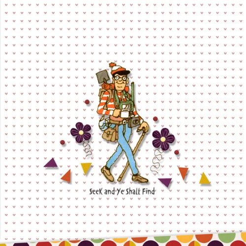
Challenge Spotlight: Created With Rewards
![]()
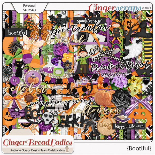
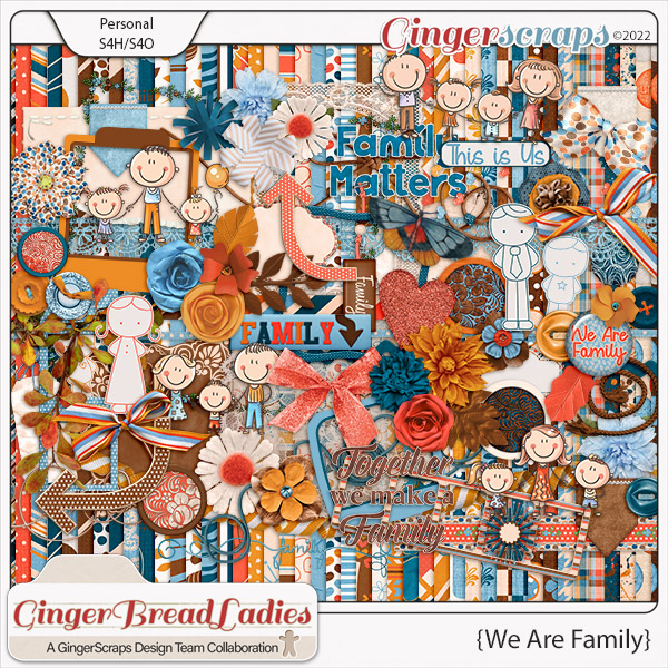
Here we are, at the third Tuesday of the month again. Crazy how time flies!! This month our Challenge Spotlight falls on Created With Rewards. For those unfamiliar, each month our GingerBread Ladies – the GingerScraps Design Team – work together to produce two Rewards kits, one for completing 10 Challenge layouts and one as a Free-with-Purchase. The Created With Rewards Challenge requires participants to use only the previous month’s Rewards kits; templates are the exception – they can come from anywhere. For October 2022, the Free With Purchase kit is called Bootiful; the Challenger Reward is We Are Family. Let’s see how our intrepid GingerScrappers have risen to the occasion. The layouts are in the order they were posted; each is linked to the Gallery – click on the scrapper’s nom de plume and you’ll jump right to the Gallery, where I hope you’ll leave some words of praise.
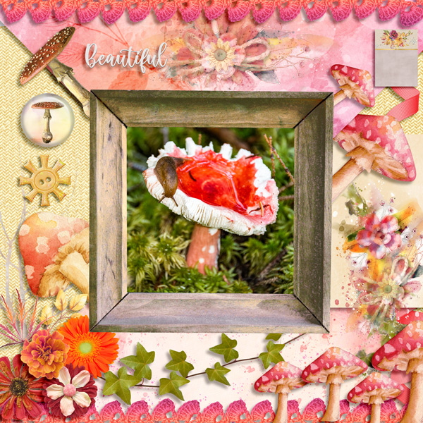
Our first layout is from Dovedesign. Her layout has a good portion of white space. She used Bootiful and took it off-theme, which is awesome!
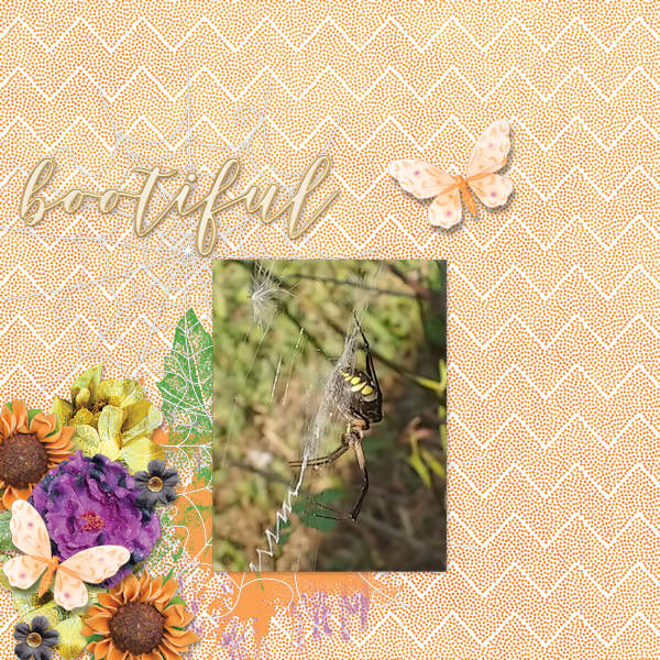
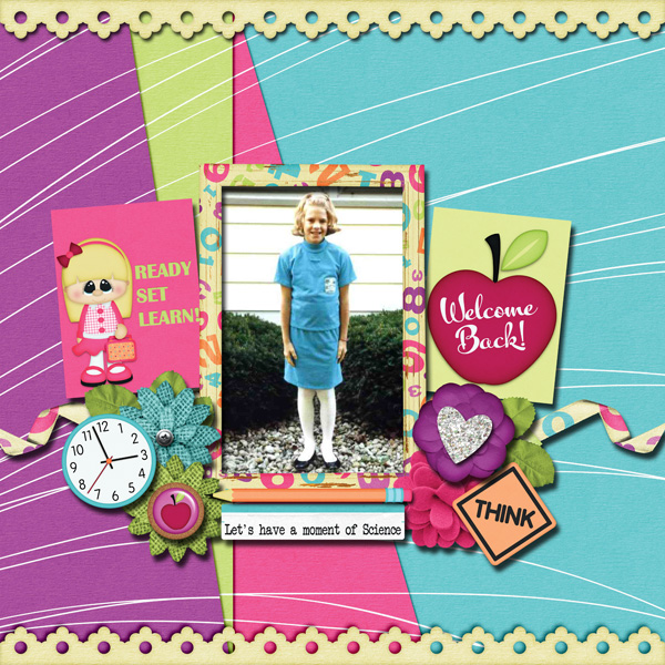
Next up is this CUTE little Hallowe’en layout by Jill. I really like the spiderweb base for her paper cluster. She too used Bootiful.
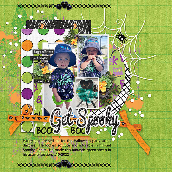
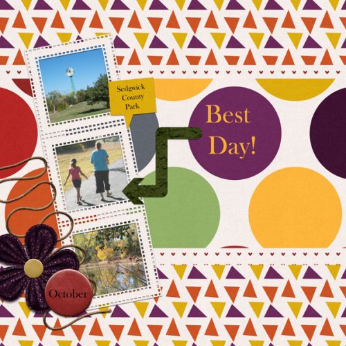
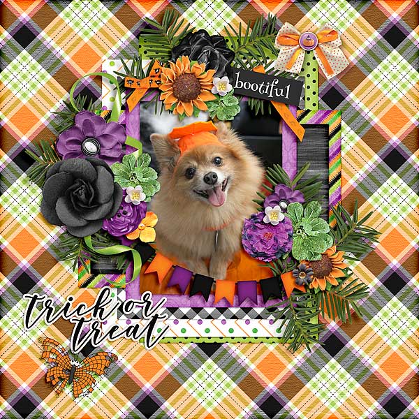
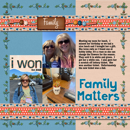
For this layout, becky_a has used a block style to anchor her photos and added some seasonal clusters. Bootiful is getting lots of airtime!
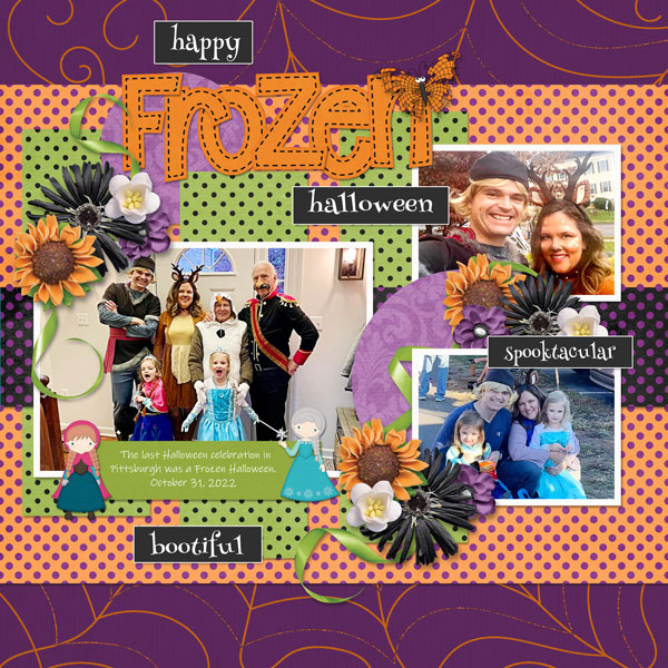
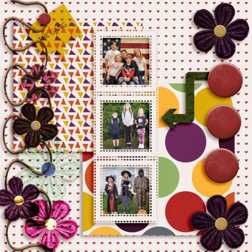
Ah! Finally We Are Family makes an appearance. I like how hiddenartist has stacked papers in several ways and positioned her clusters to frame her photo.
I love how fontaine has used blended masks to such good effect here. The green and orange contrast beautifully and the little Bootiful witch and warlock are cute additions.
See how kabrak1207 has turned a very theme-specific kit into an all-purpose one? Without the word strip and sticker, it’s hard to tell this started out as a Hallowe’en kit.
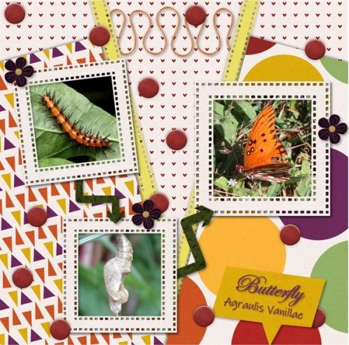
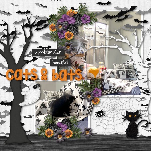
This looks like greenfiend27 went to a lot of trouble adding all those little bats! I think they’ve been cut from the background paper and individually shadowed. Impressive!!
I love how Katherine Woodin used the Hallowe’eenie kit for a fall layout that has no Hallowe’en flavour at all.
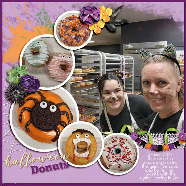
What a clever riff on the donuts mum23ms has in her photos!
Here’s another mainly purple layout using Bootiful. The pops of orange breoni has added, along with vignetting some photos, give the layout depth.

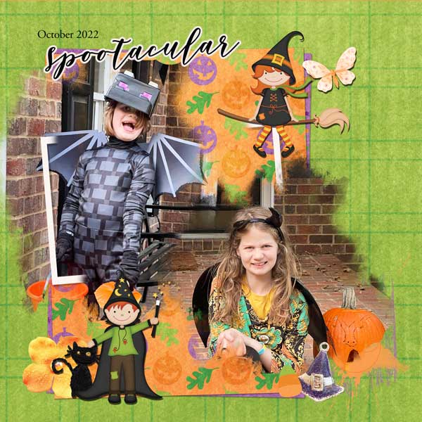
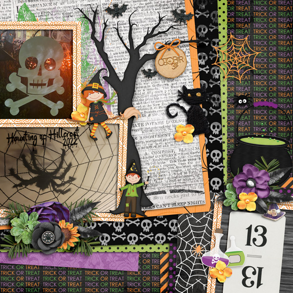
Look at all the spookiness angbrey has injected into her layout! I love how the elements move the eye around and right back to the photos.
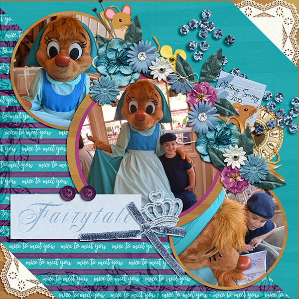
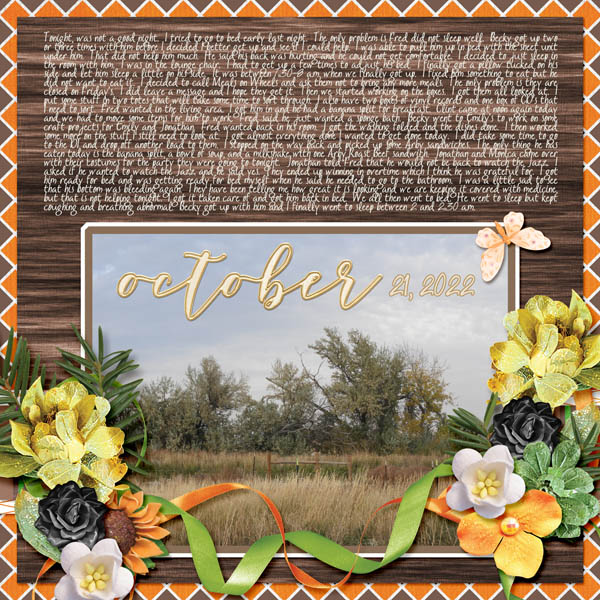
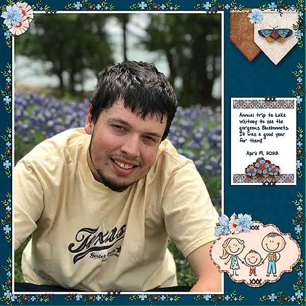
Here’s another look at We Are Family. The way gadawg83 has echoed the bluebonnets in her photo with her tiny-flower borders is perfection.
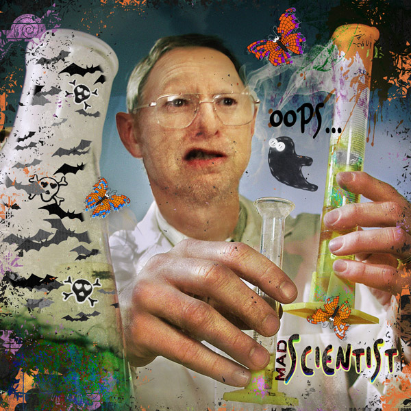
Tbear has used some incredibly inventive techniques here to give the impression that the beaker has bats painted onto the glass. And maybe I’ve been watching too much paranormal investigation TV, but I think I see a ghost flying out of the test tube!
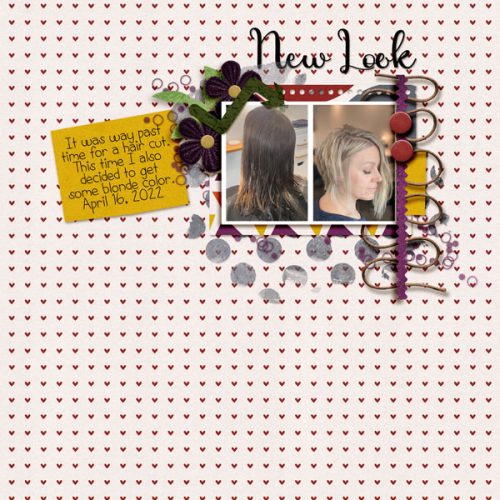
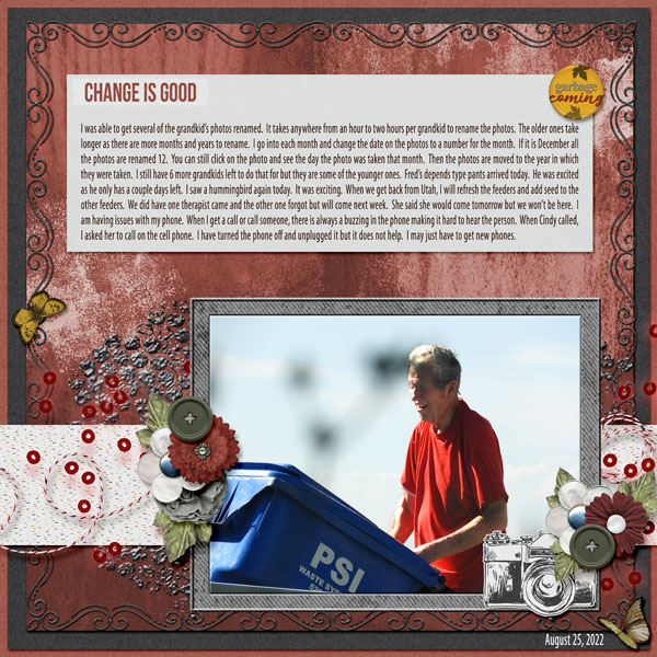
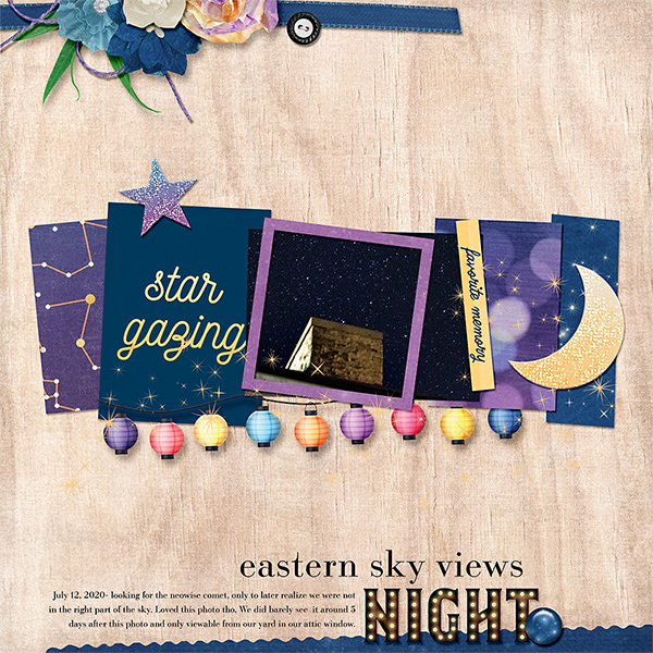
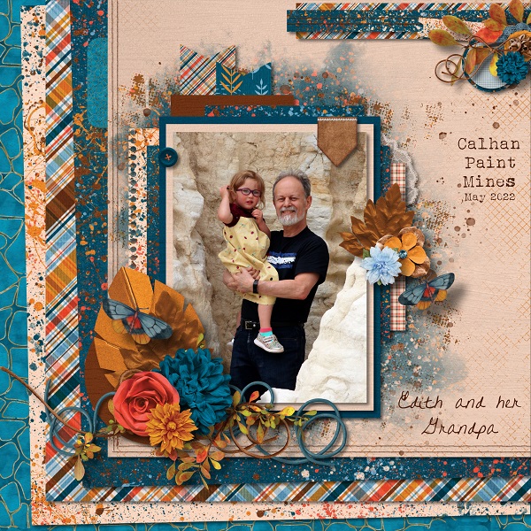
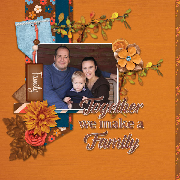
Tamsin McAtee went for complementary colours here, with her orange and blue palette. I like how she picked out the brown from the ceiling in her photo and included it in the elements she used from We Are Family.
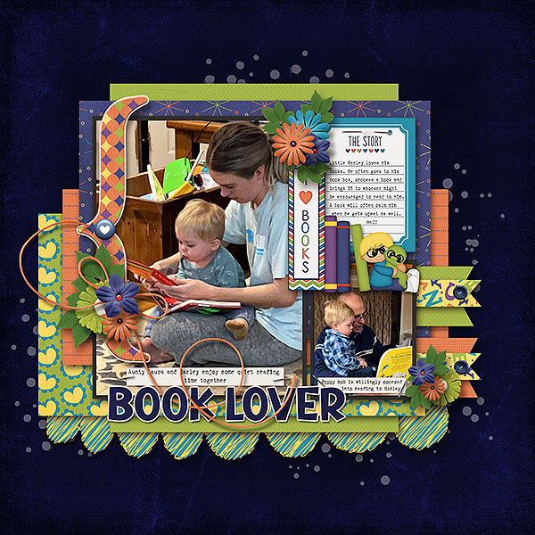
Our last layout comes from mom2triplets04. She too has used We Are Family and kept her layout simple, focusing on the photos and her journaling.
I find it fascinating that more than 75% of these layouts were created with the Free With Purchase kit. It tells me there was a lot of traffic in the shop in October, and that’s fantastic! It’s also really interesting to see how different scrappers’ visions are when it comes to using a single kit. It’s inspiring!!
See you next week for Quick Trick Tuesday.
![]()