Archives for June 2020

Fresh Baked: JUNE 26, 2020

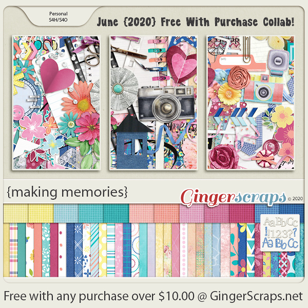
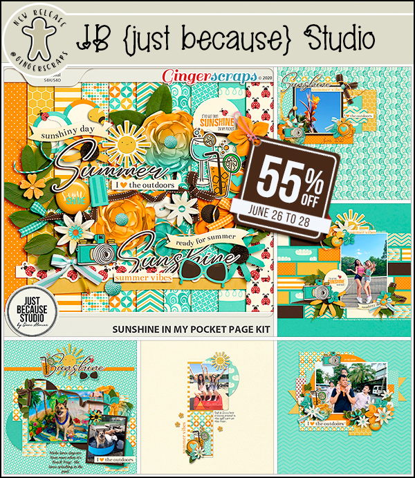
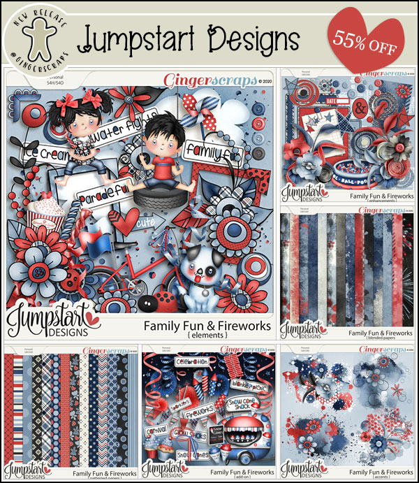
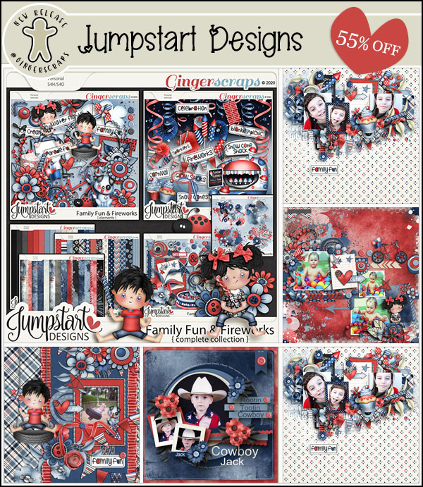
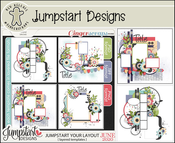
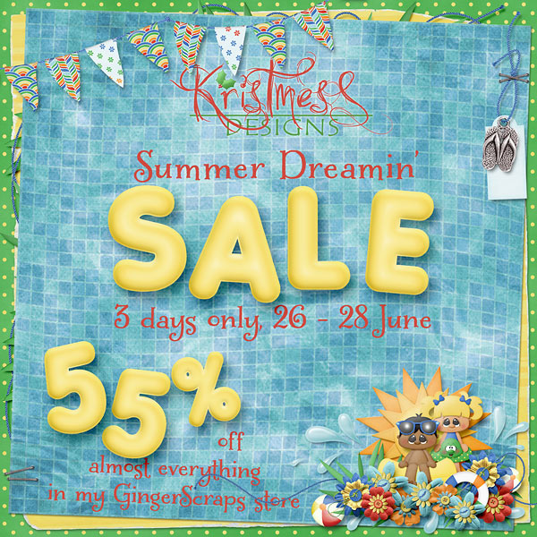
Happy end of June. Crazy isn’t it? With the end of June, though, comes an A-M-A-Z-I-N-G sale in the store.

Remember, any $10 spent in the store and you get this awesome kit!

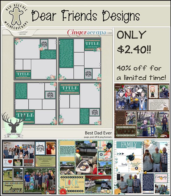
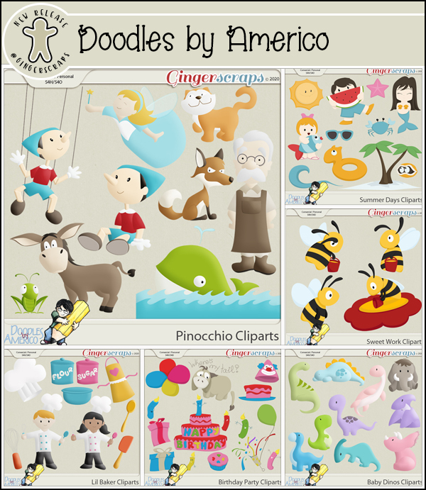
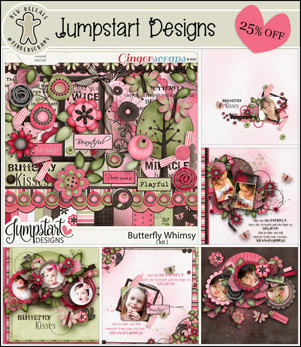
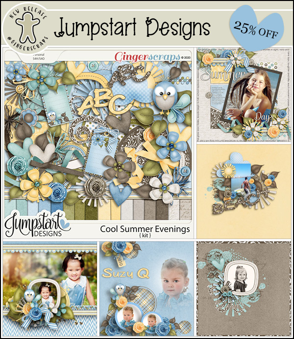
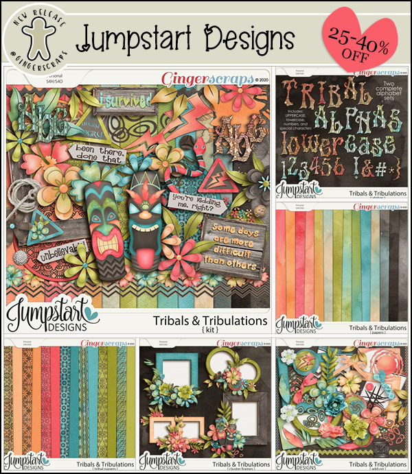
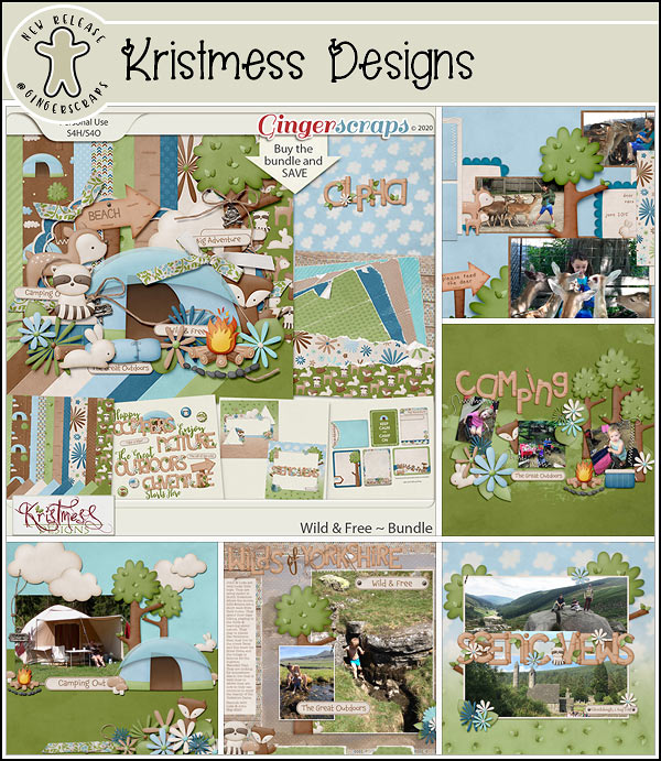
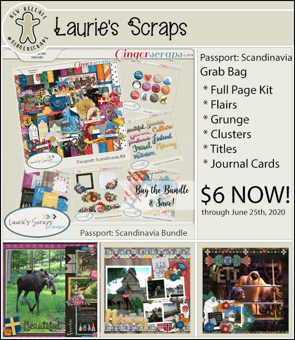
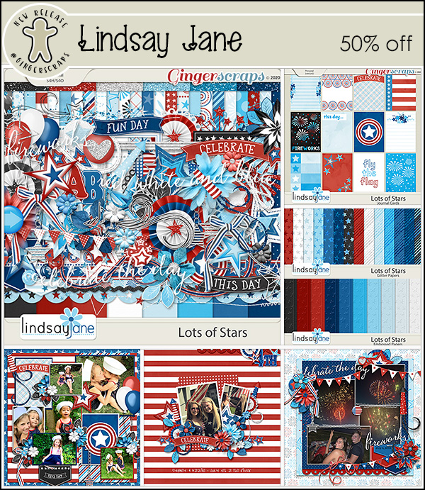
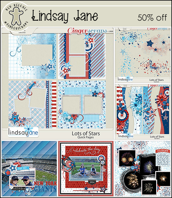
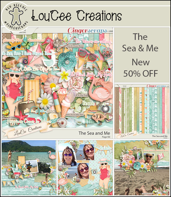
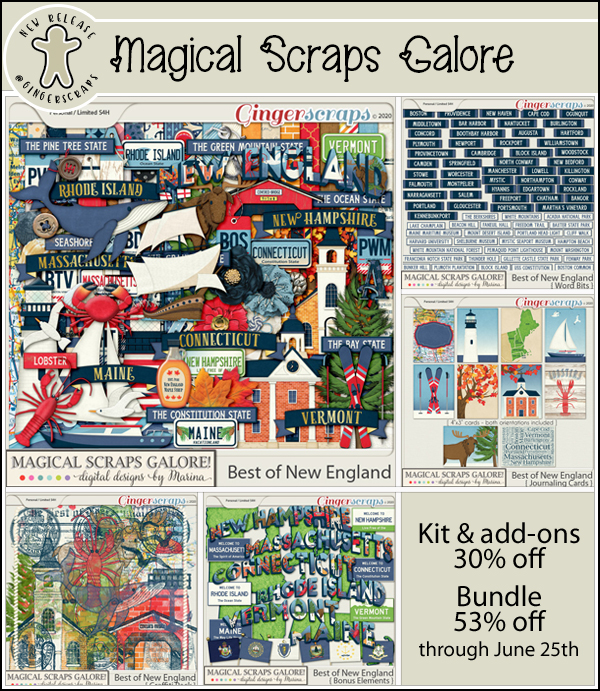
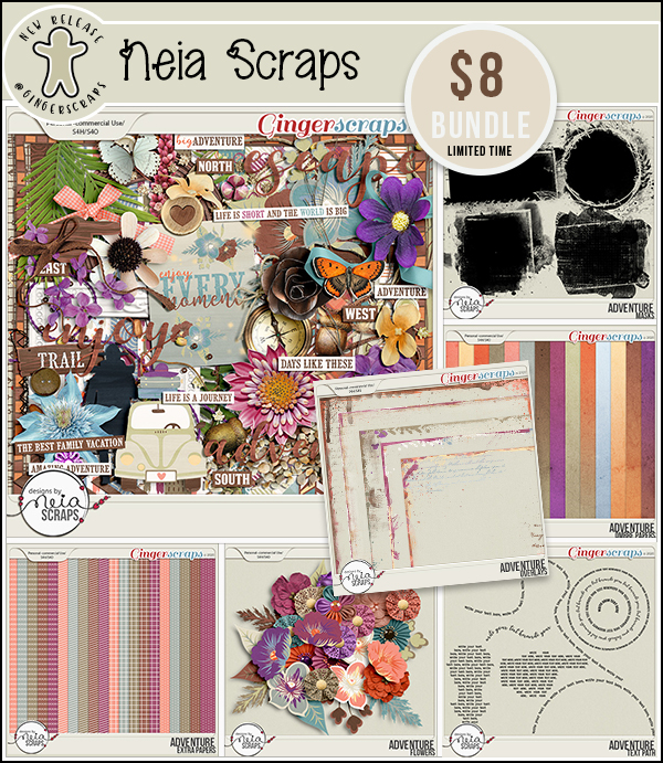
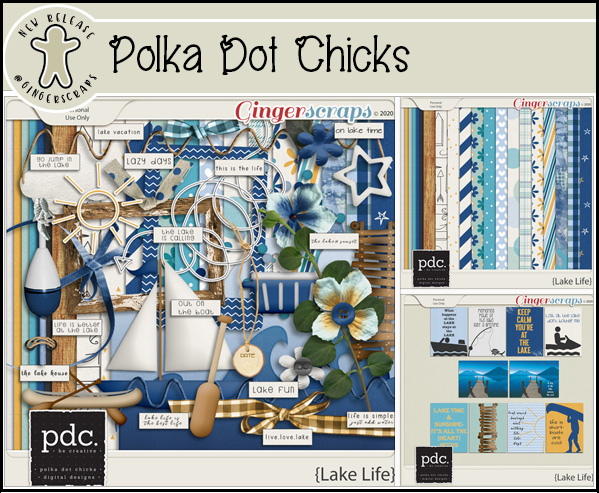
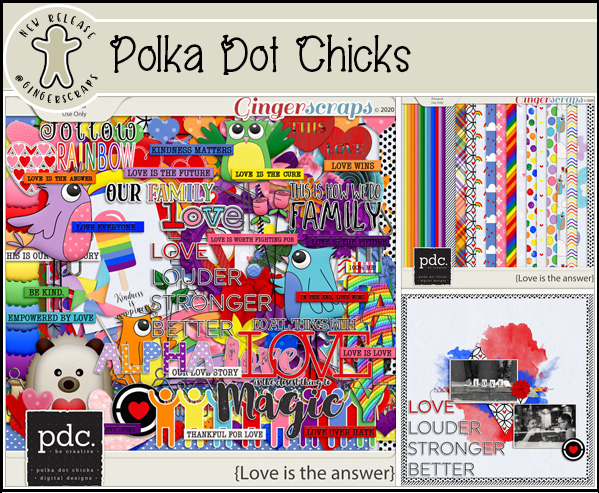
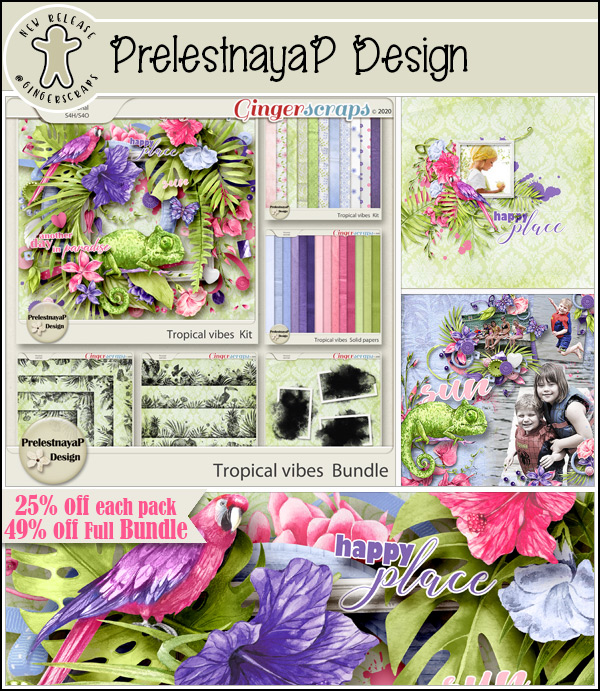
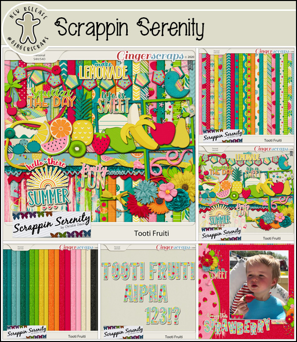
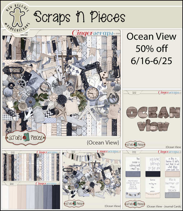
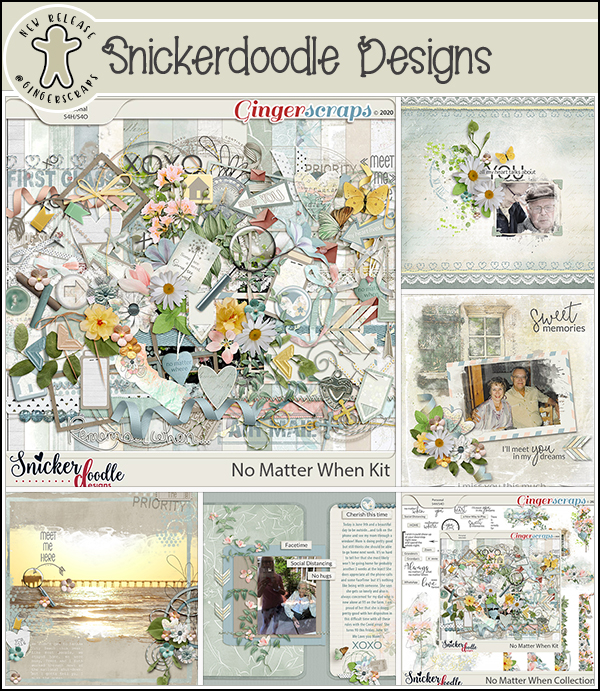
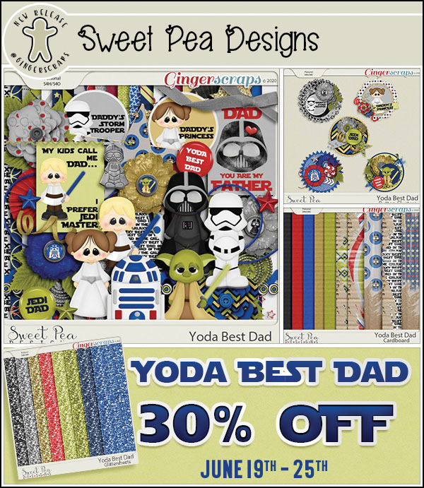
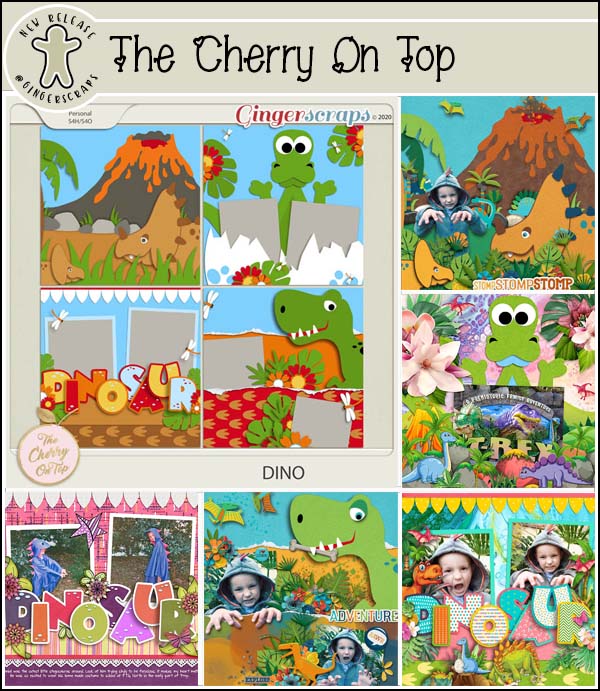
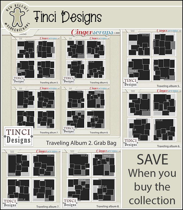
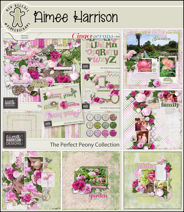
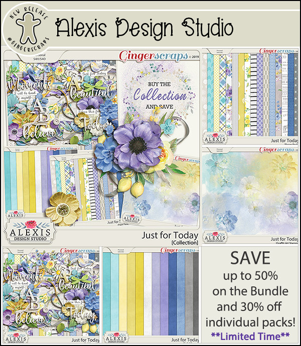
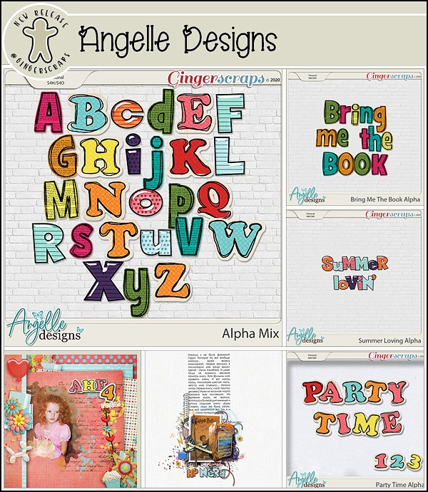
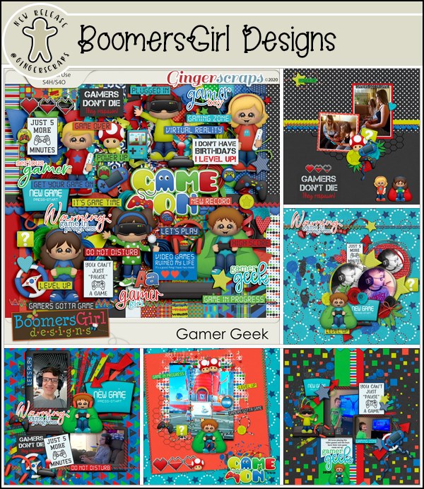
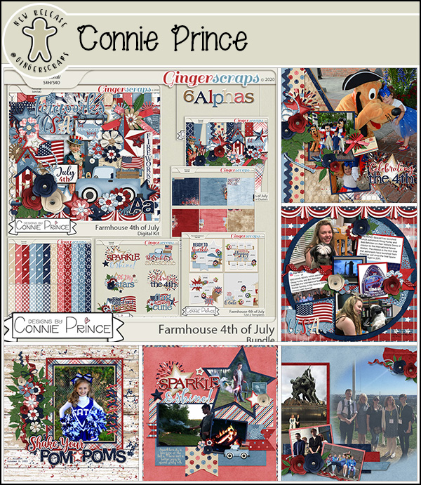
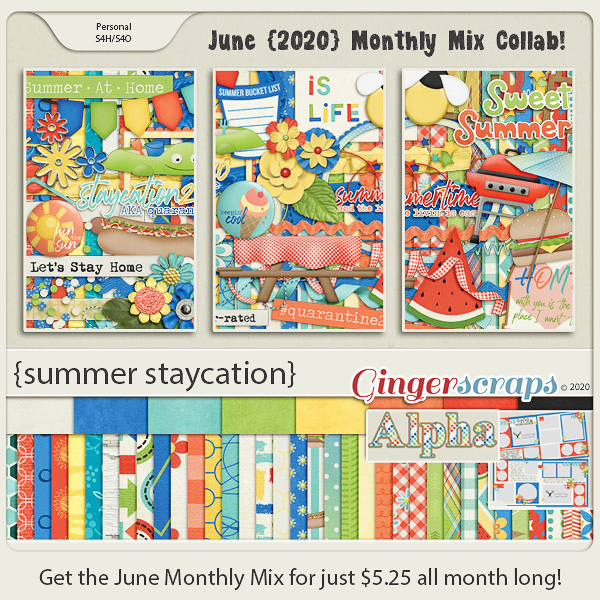
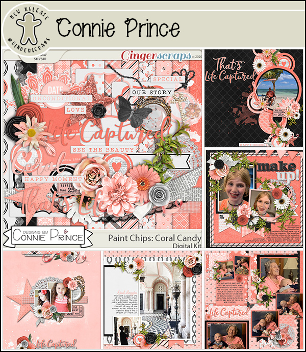
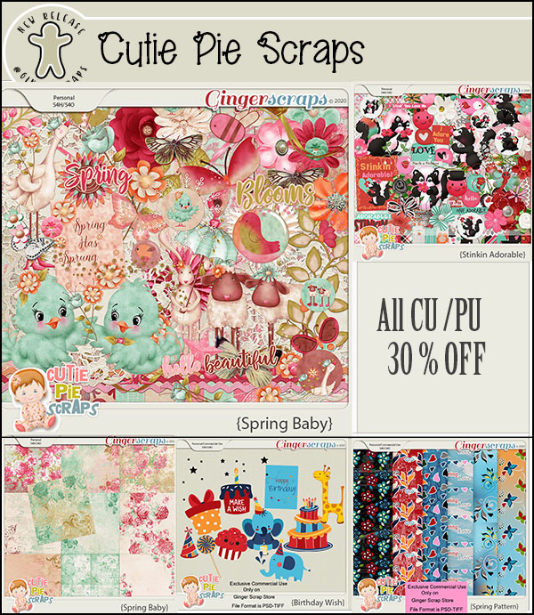
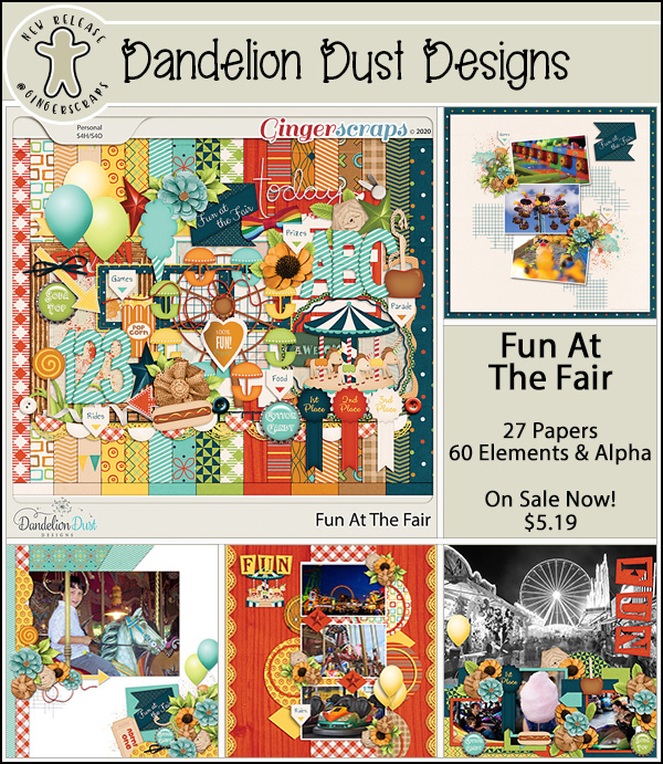
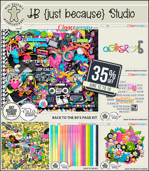
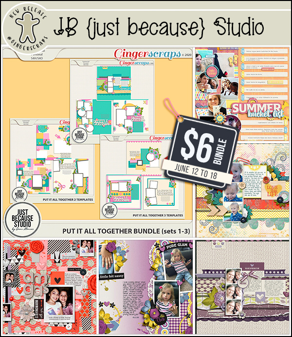
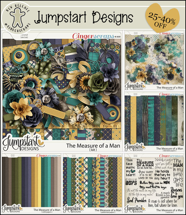
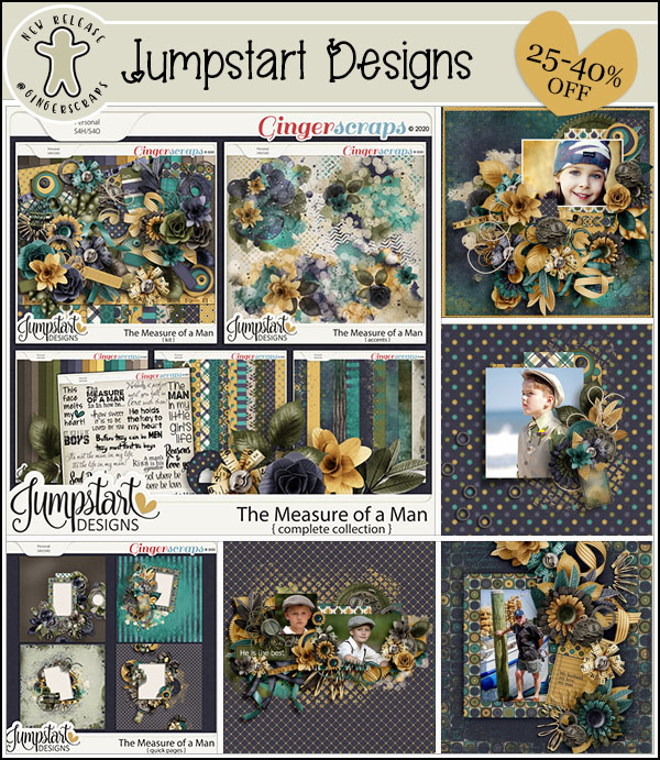
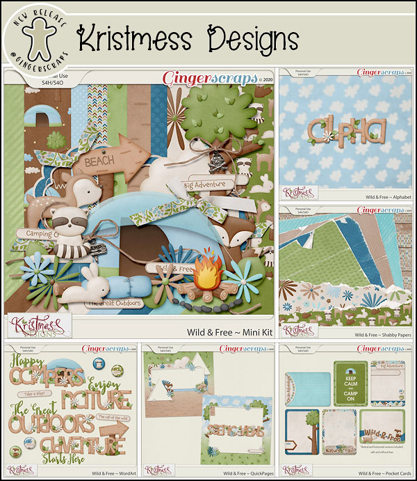
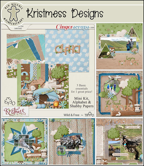
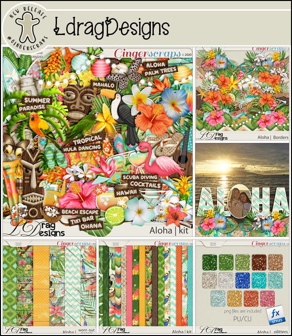
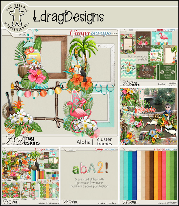
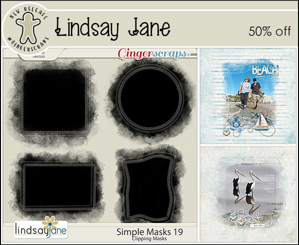
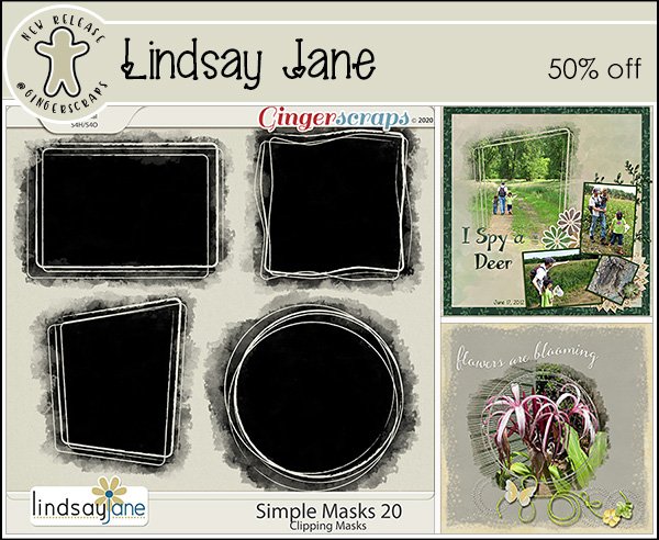
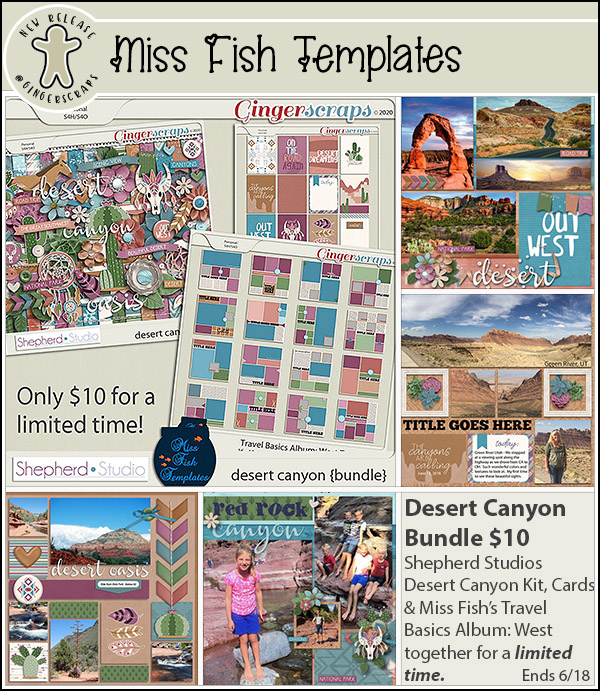
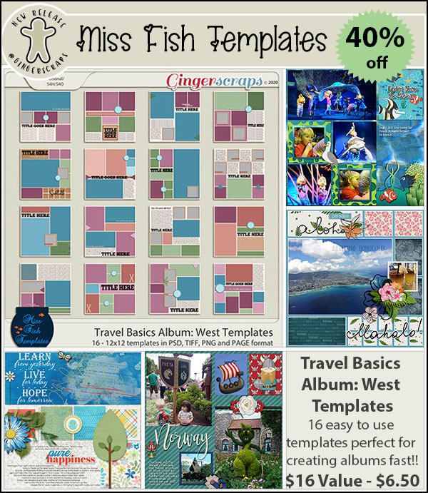
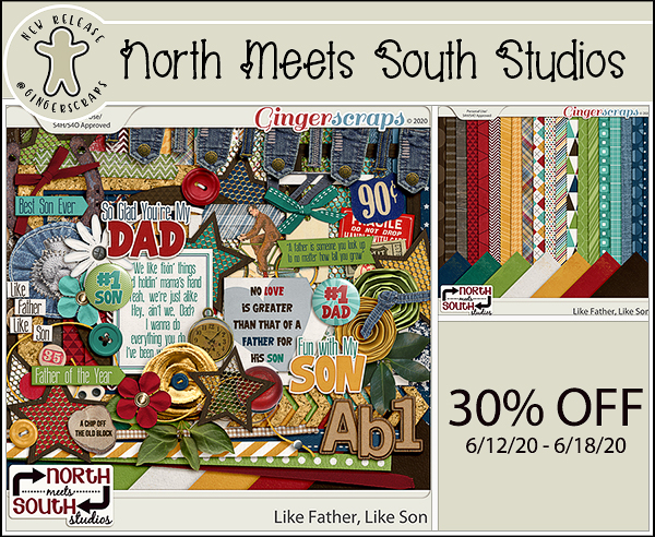
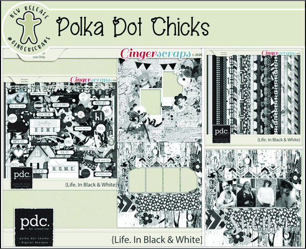
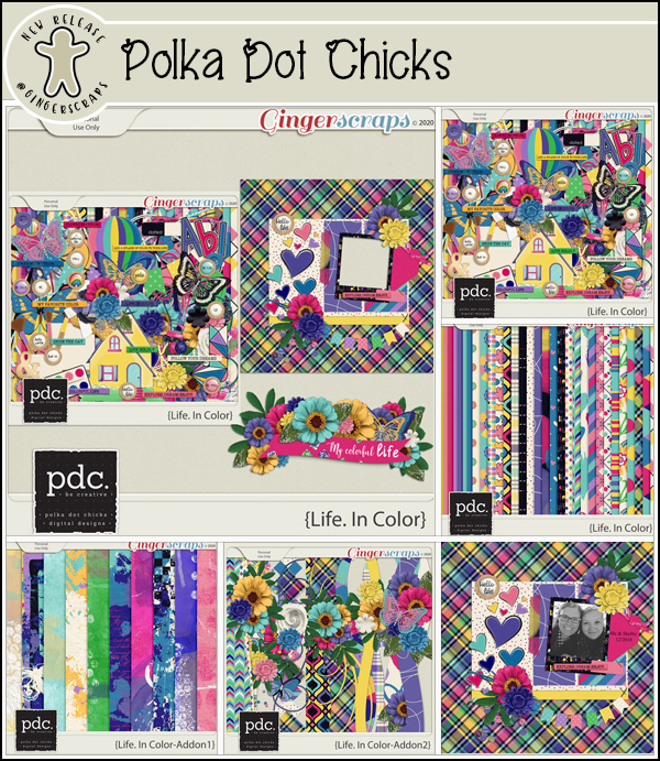
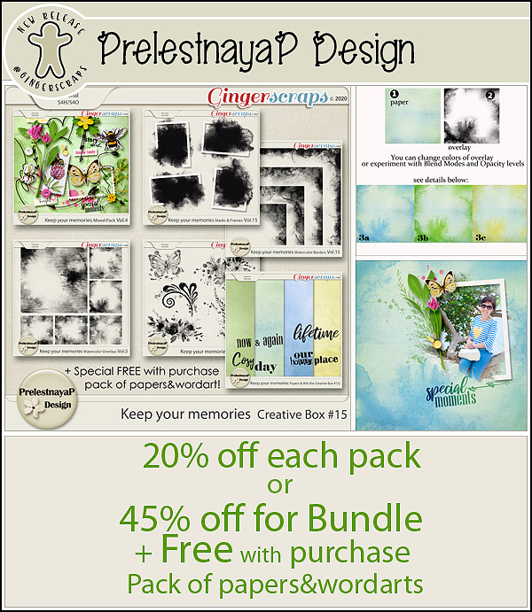
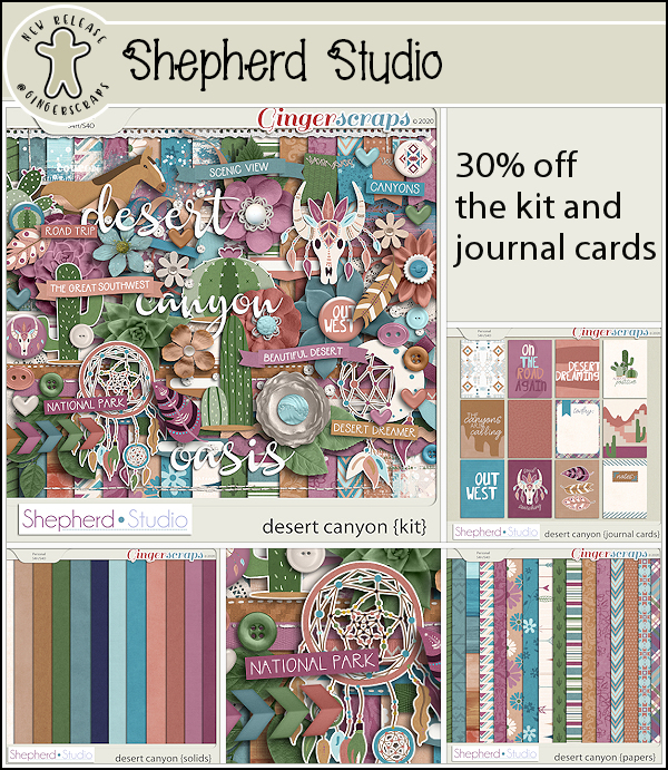
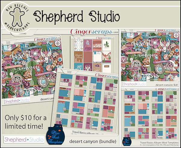
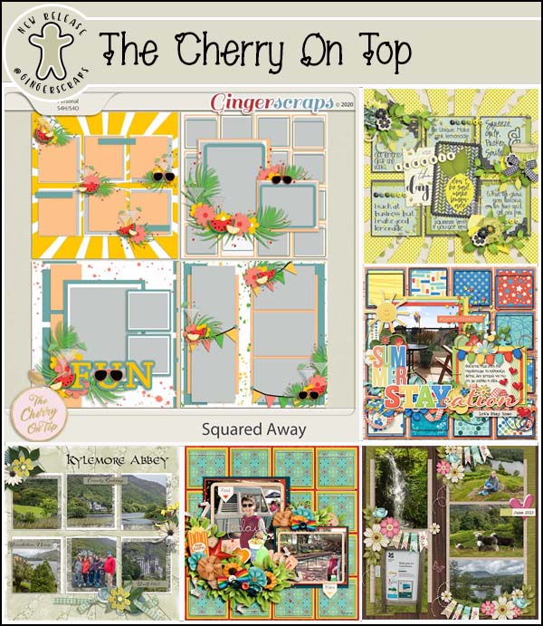
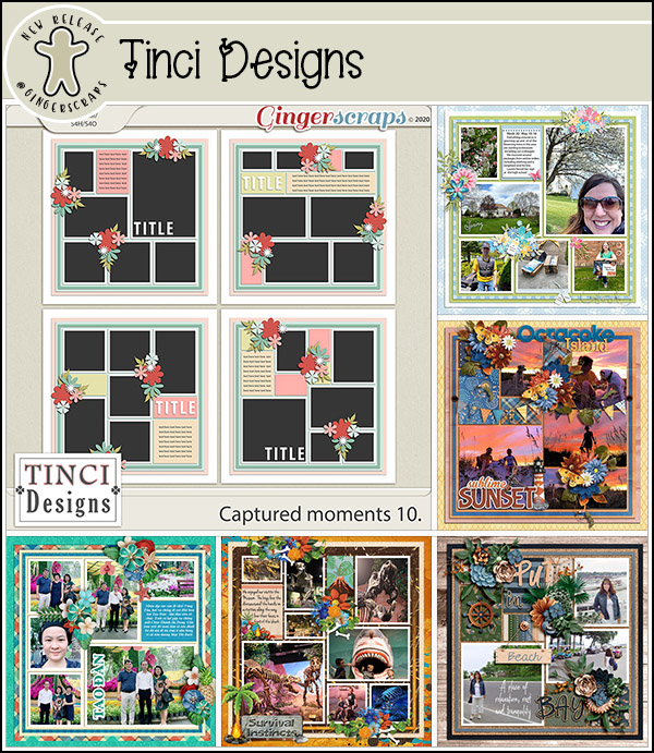
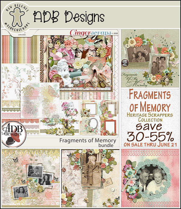
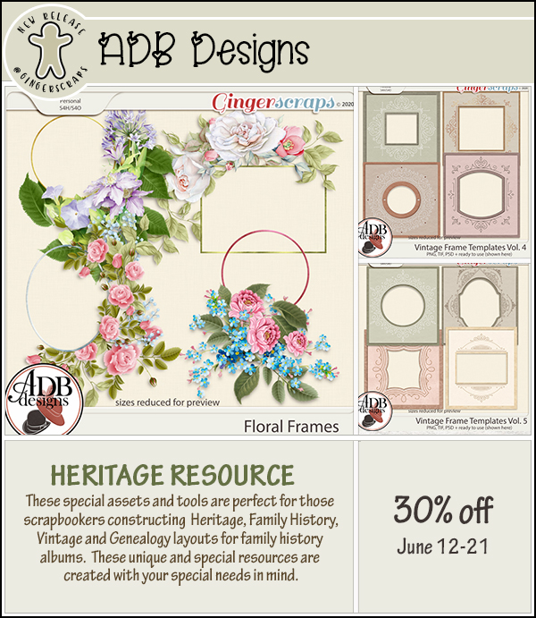
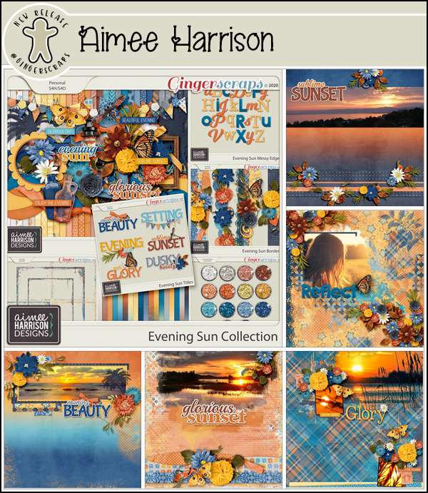
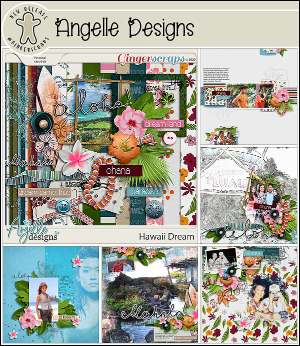
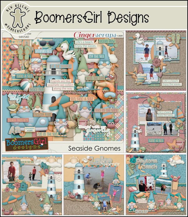
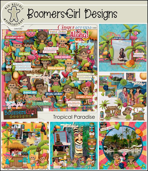
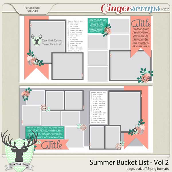
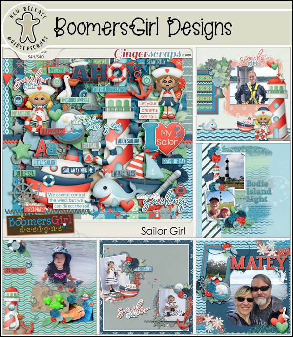
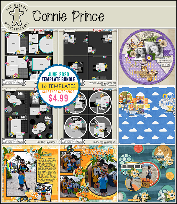
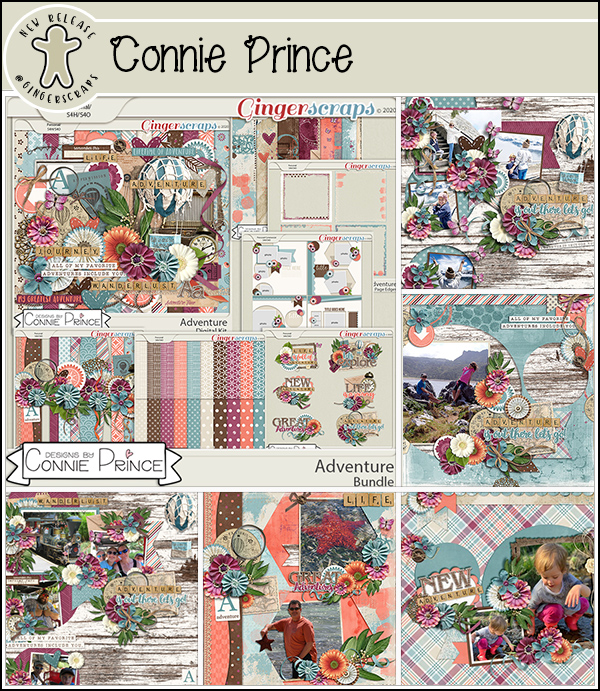
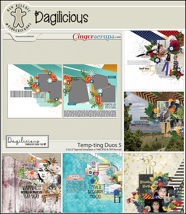
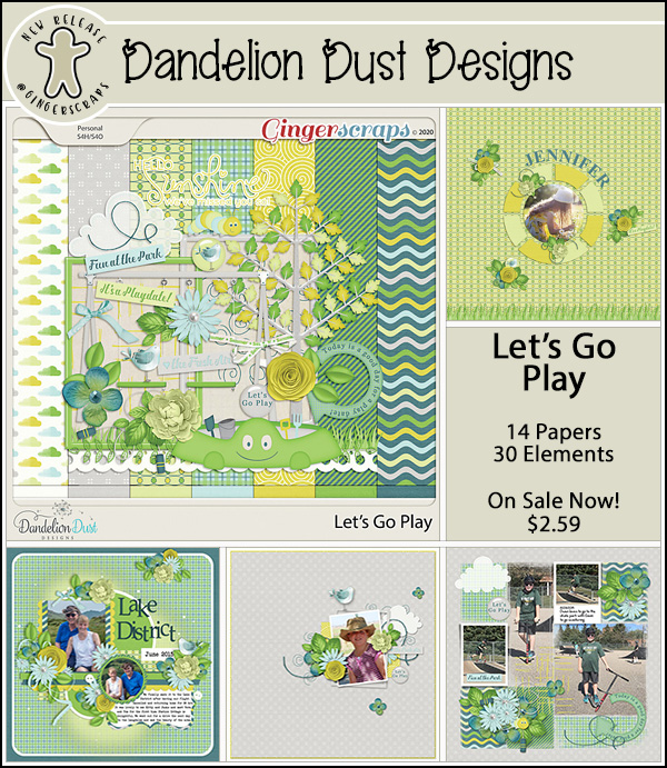
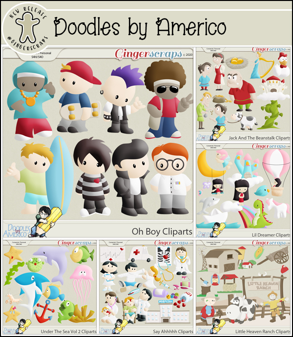
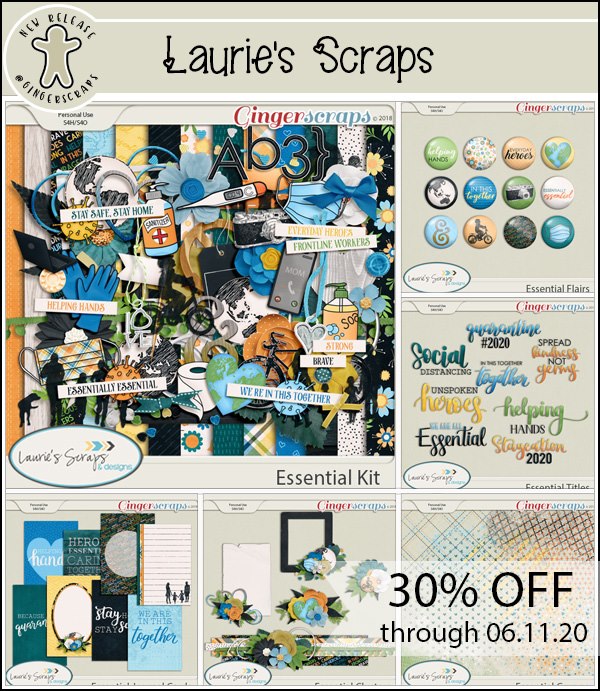
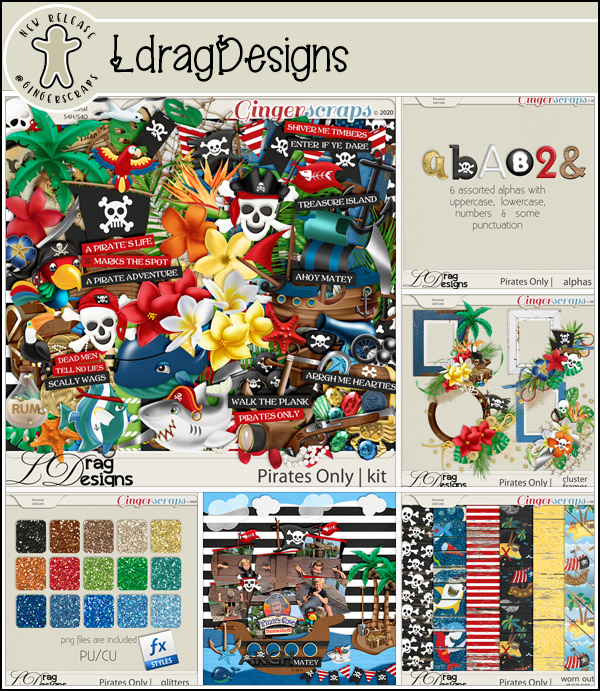
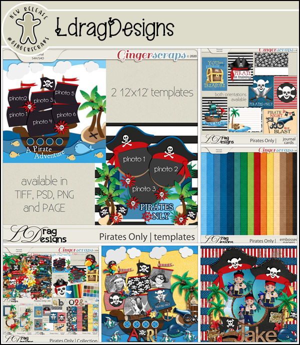
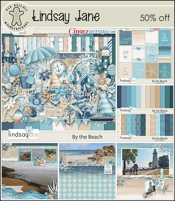
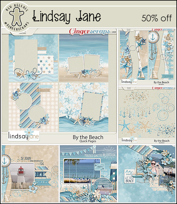
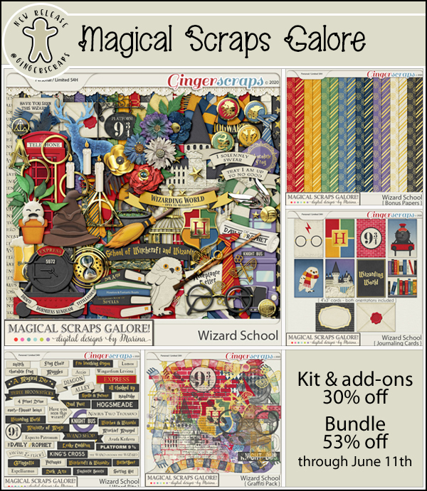
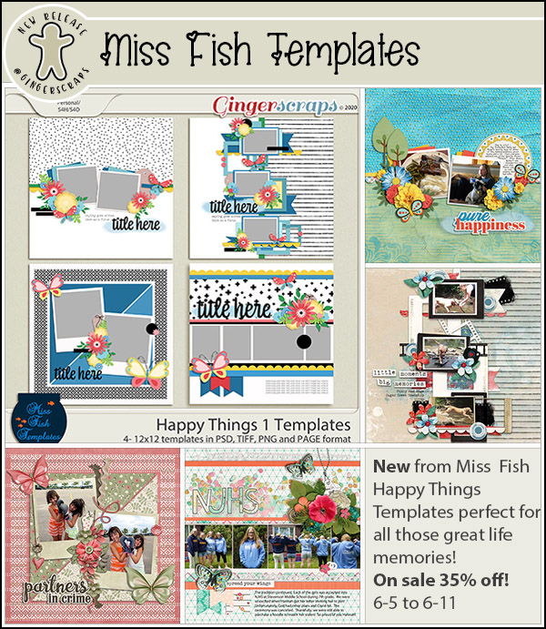
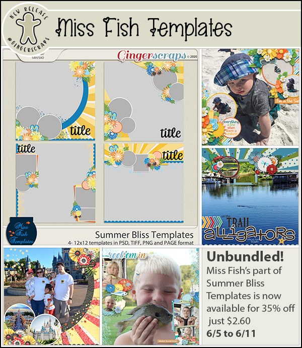
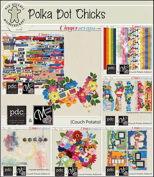
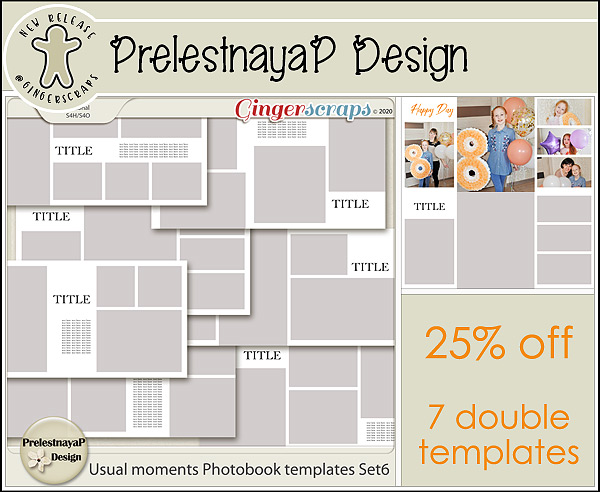
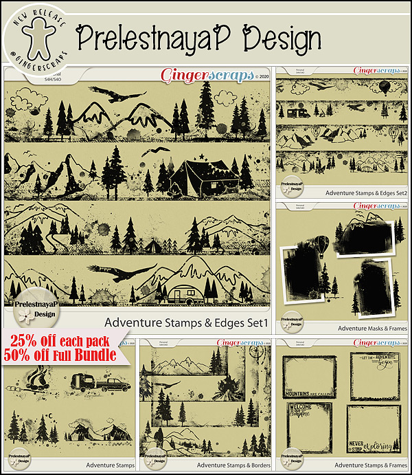
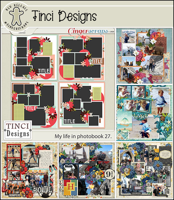
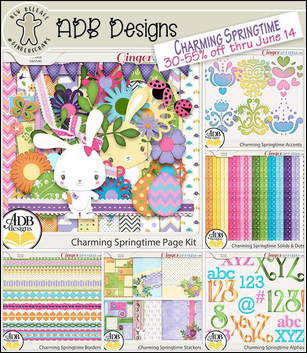
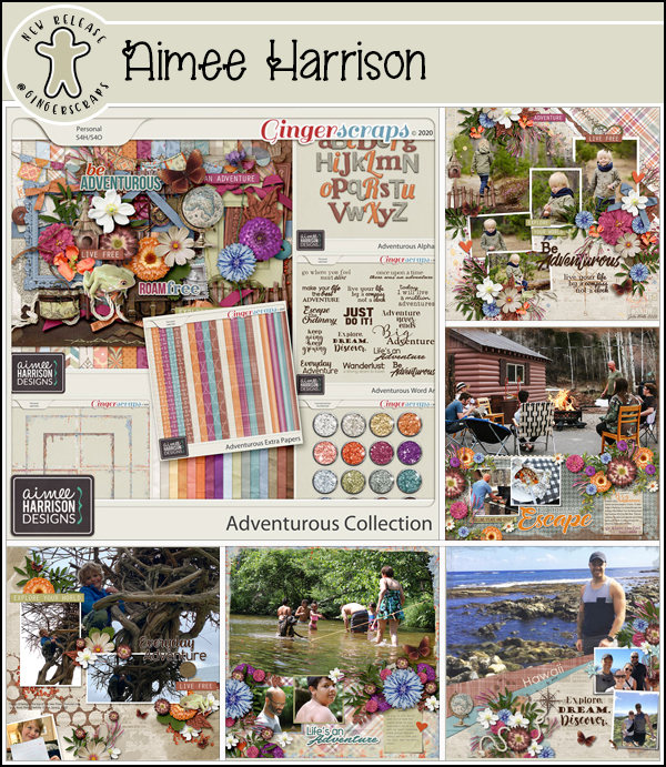
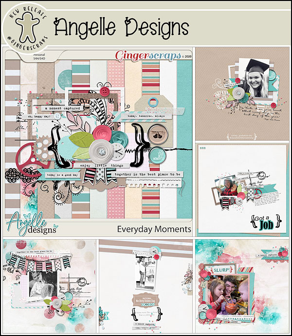
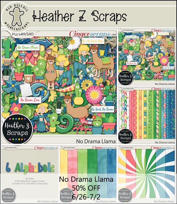
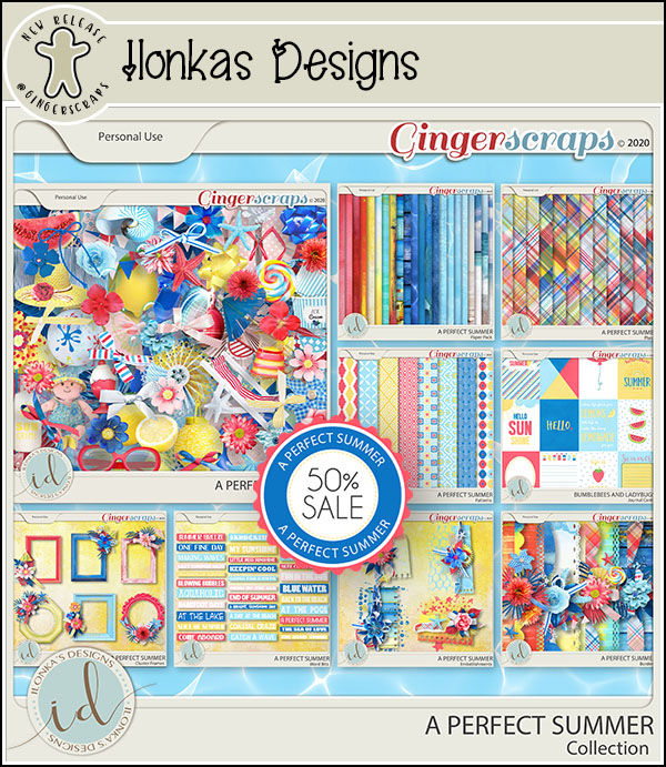
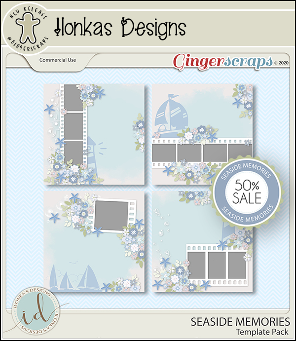
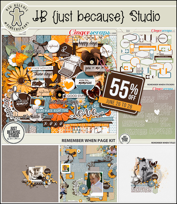
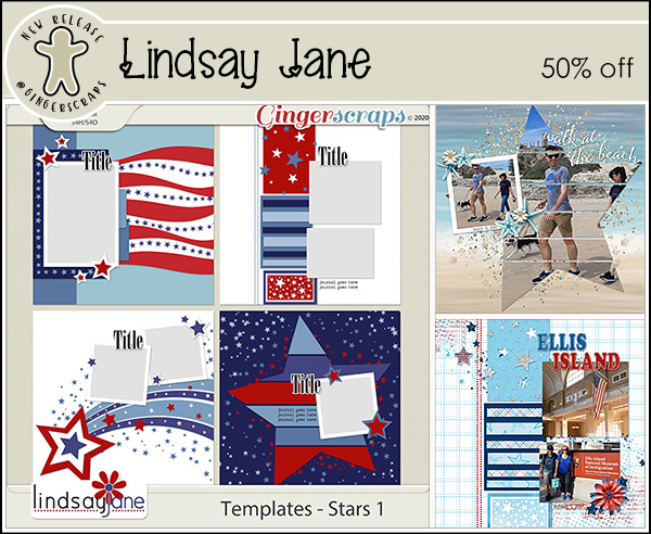
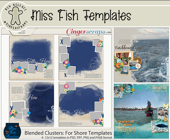
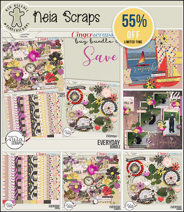
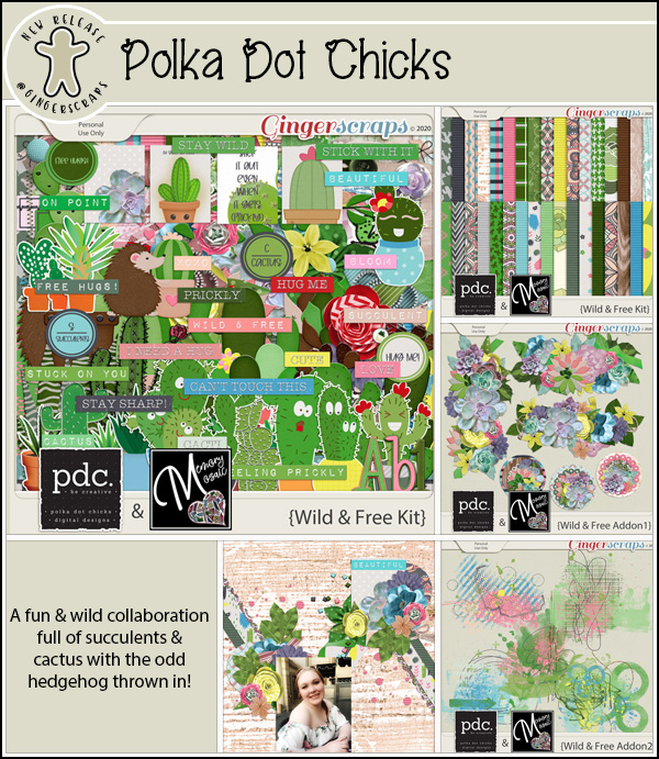
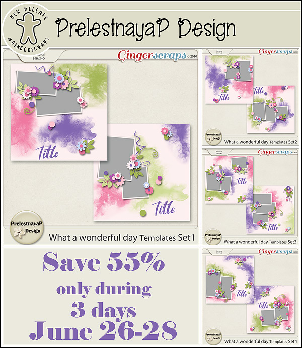
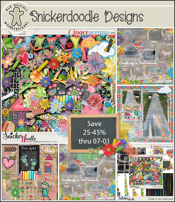
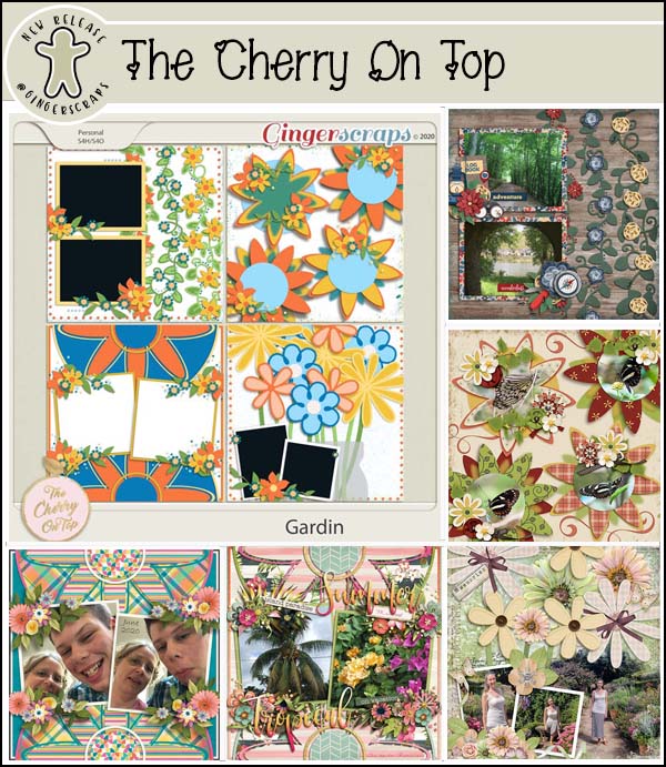
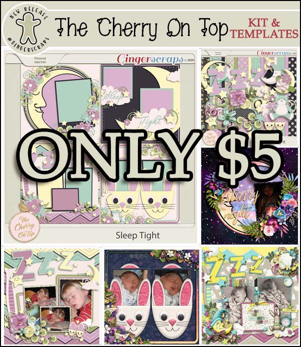
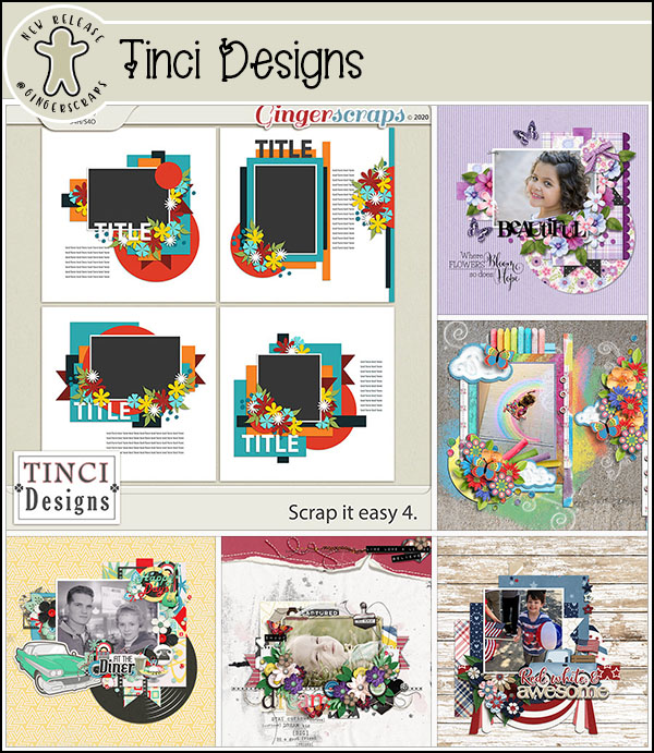
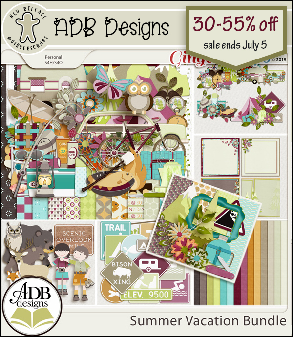
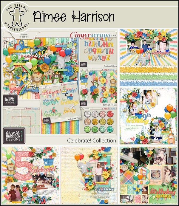
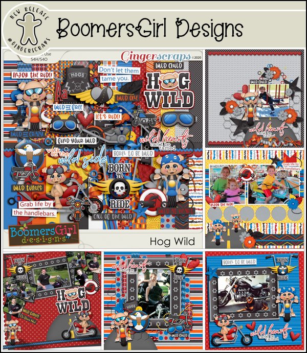
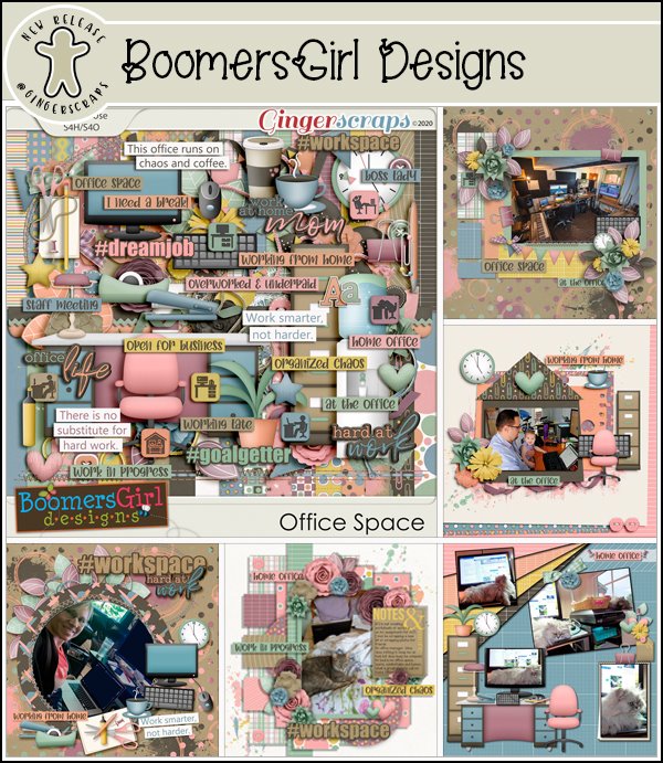
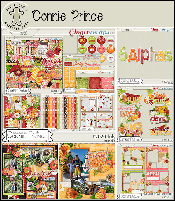
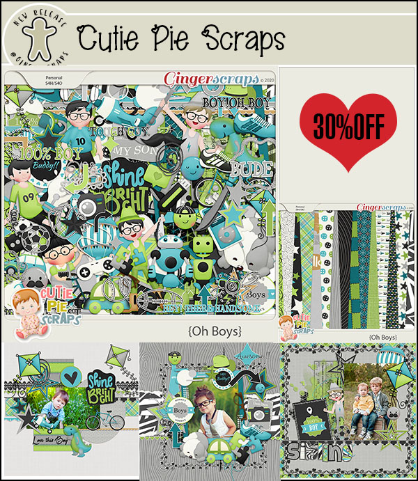
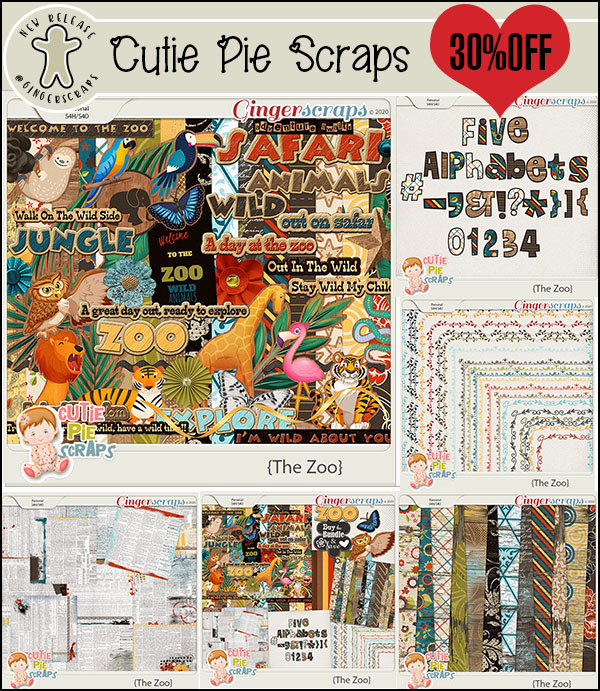
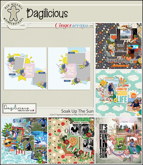
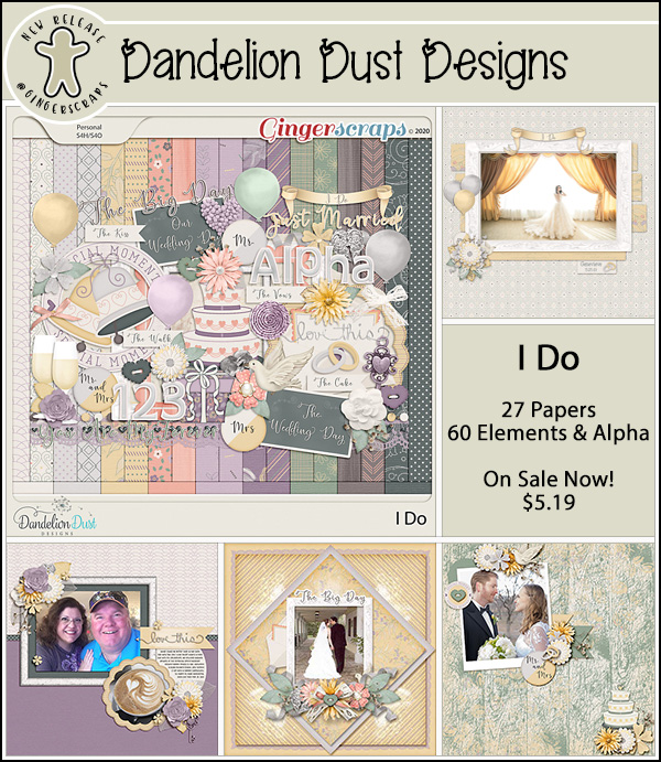
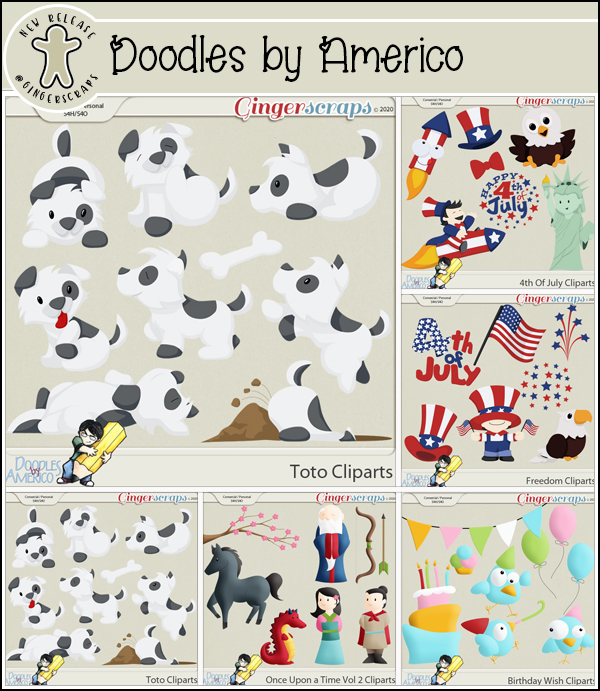
Let’s see what our designers have new in the store.

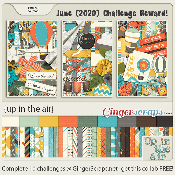
Make sure you get your challenges listed in the forum. Complete any ten challenges and you get this full kit.

Tutorial Tuesday (Celebrations!)

Plan Your Holiday Photos NOW!

I took a look at the calendar this morning and got a bit of a shock. (I’m sure I’m not the only one losing track of days and dates…) It’s going to be JULY next week! My granddaughter’s second birthday is on Monday, her cousin’s birthday the next day and her big brother’s birthday is the day after that. And of course it means that Canada Day and Independence Day are also next week. So that got me thinking… maybe I should talk about planning your celebration layouts now, so you get the best photos. Even though many of the big events usually held on these national holidays have been cancelled this year due to the pandemic, I’m sure there will be events worthy of documenting. Don’t forget, you can always come back to this post next year for a reminder too. I try to have a rough idea of which shots I’d like to get so I went to Pixabay and had a look for the basic themes for Canada Day and the Fourth of July: parades, flags, food, family gatherings and fireworks. (The photos I found were all Fourth of July – we Canucks are a little less exuberant on our national holiday, but these tips are easily adapted for a made-in Canada celebration too.)

Let’s start with parades, since they’re often in the late morning or early afternoon, and kick off the day’s events. Try to think of interesting scenes you can photograph. Look for people in costumes and try to find a camera angle that will give you an interesting composition. This photo,  taken by the contributor beccajanef, caught my eye because of the Liberty hats. I’d love to have seen the crowd afterward, with all those hats on heads everywhere.

BigBearVacations gave us this shot. What I like about it is that the sun flare conceals the guy walking into the frame on the right, putting the focus on those hero-worshipping kids with Uncle Sam. At first I thought the photobomber should be cropped out, but a second look told me doing that would take away from the scale of the stilt-walker. I always wanted to learn how to walk on stilts, didn’t you?

The amazing Jill Wellington took this photo, which speaks to how patriotism is learned early. The sun flare adds a softness to the photo without distracting from the subject. I love her blue-and-white dress and red bloomers too.

There are so many ho-hum ways to photograph flags. But filling the viewfinder with the most recognizable area of the flag, along with the draping of the fabric, elevates this photo by TechPhotoGal to a much more interesting level. It also shows that you don’t need to include the entire object in your image to create a photo with impact.

When I look at this image, credited to OohhSnapp (aka Angelique Johnson), I get the impression of a huge flag and Angelique standing directly underneath it. It has a definite God-blessed-America feel. It’s a visually pleasing image for sure.

Ah! Food!! When you’re documenting the feast, look for perspectives that hint at how good the food will taste and how perfectly it’s prepared. It’s very easy to take boring food pix… but TesaPhotography (Tesa Robbins) captured a true delight for the eye.  I can almost taste the corn now!

Here’s another I-can-almost-taste-it shots. Here, utroja0 uses both composition and depth of field to give us a visual feast. The skewer in the foreground is in sharp focus and the grill is only partly in the frame. Between them they give the impression of lots of food and incredible aromas.

Here in Canada those ice pops (or popsicles, which is actually a trademark…) are called Rockets. And they’re my favourite. (I lived on them, literally, when I was sick last year.) No cookout or picnic is complete without the sweet finish. What makes this photo, again from the camera of Jill Wellington, so successful are the red-white-and-blue colour palette, the scatter of candy and the creamy background. The drips of melting ice cream hint at the heat of the day too, offering another clue to the kind of celebration going on.

Candid photos are almost always more appealing than tightly posed ones. This scene looks so natural and it’s easy to see the kids are enjoying their picnic with their dad. The background suggests it wasn’t taken in July, but that’s not the point… capturing those special moments when the subject isn’t aware you’re shooting them takes a bit of thought and some stealth, both of which Victoria_Borodinovea managed here. But… if you really want to have a formal-ish, posed group photo, try to arrange your people so their faces from visual triangles, allowing those triangles to overlap a bit. Use a small aperture so that your depth of field is large enough to keep all the eyes nice and bright. Another option is to line the kids up, shortest in the front, tallest in the back. If necessary, have them tilt their heads to one side, alternating sides so you can see everyone’s eyes, then snap away. Everybody will be recognizable in the shot, and everybody should be in focus.

Families who have cottages at the lake or on the beach may include a bonfire in their holiday plans. Photos of these can be incredibly beautiful, but can also be just okay. I like this photo by Free-Photos because it tells the story of a campfire through imagery.

I like this shot for the texture in the charring wood, the heat suggested by the flames and the containment of the firepan. flyupmike created his appealing image by getting in close (I’m hoping he zoomed the camera and not the photographer!) and intentionally cropping his shot in the viewfinder. This gives context to the image. Your could add context to your fire photos with silhouettes, or framing the flames in some way. Zooming in even more closely to capture the intensity of the burning fuel would work too.

Is there any better reason to have a bonfire than to make smores?? This tight shot of a toasted marshmallow, taken by skeeze, would immediately make me want to have a smore – and I don’t particularly like them!

Everything about this photo says “Fourth of July” to me: the flag in the background, the sparklers and the hint of a smile on the only face visible. The depth of field has the sparklers in sharp focus – where it should be, softening everything else into background. Free-Photos got it right again!

Doesn’t this photo just shriek JOY? Jill Wellington knows how to use her camera to capture the most captivating images. She has the children in silhouette to draw the eye into the scene and the upflung arms reveal the excitement of seeing the light show. The fast shutter speed she used froze both the girls and the fireworks, while her small aperture got the whole scene in focus.

Photographing fireworks is a real challenge. For more tips on how to get the best shots, Darlene Hildebrandt offers her tips here. The most important ones are the quality setting, figuring out where in the sky the bursts will appear, shooting into the eastern sky with a medium aperture, starting early in the show to avoid the smoke and using a TRIPOD. You want that camera stock still to get the best images. I just checked out the camera on my Android phone and it has some pro settings I’m going to have to play with. Our new house will give us a ring-side seat for any fireworks in our city, since we’re halfway up a mountain with nothing built behind us!

I’ve been gathering ideas for future tutorials and have some great ones lined up, so stay tuned!

Fresh Baked: JUNE 19, 2020

Welcome to another Friday! We’ve had some unseasonably cold and we weather this week, but it should push out for a beautiful weekend.

Have you shopped and gotten this beautiful Free with Purchase yet? Just spend $10 in the store and it’s yours.

Time to see our Fresh Baked goodies!!

Have you grabbed this month’s Monthly Mix? These colors are GORGEOUS!!

Remember, complete any 10 challenges and you get this beautiful kit!

Tutorial Tuesday (Photoshop Elements)

Faking It! Tuck a Corner into a Digital Slit

Sorry this tutorial was derailed. Who knew changing drivers’ licenses from one province to another was going to be an ALL-DAY event? I’m just happy I was able to lay hands on the 8 pieces of identification we were going for the 3 of us to need to get it done and we didn’t have to make another trip. Our house is still a work-in-progress and I haven’t found the right arrangement for my laptop and seating so I can actually work on the fun stuff. Our living room has floor-to-ceiling windows so the light is either in my eyes or being reflected off my screen into my eyes! And my craft space is packed to the ceiling with boxes so it’s not an option right now either. Oh well, all in good time.

The technique I’m going to show you today is one I thought about some time ago but never actually moved on. Don’t be put off by the number of screenshots to follow, because I’ve literally shown EVERY step, and there will be some you might decide to leave out. As well, this technique uses a lot of the same steps I’ve shown you several times before, so for those who are already doing some of the techniques I’ve shown you, this will be a refresher. So let’s get into it! I’m going to show you how to tuck the corner of a photo, or in this example, a journal card, into a slit in your background paper. I’ve used a paper and card from Just So Scrappy’s She Can kit. (Pretty appropriate – I installed a towel bar today, after putting together our new patio furniture yesterday!)

First thing to do is make a Copy: right-click>Duplicate Layer of the journal card. (or CTRL/CMD>J)

Now turn off visibility of one or the other of the cards. It doesn’t matter which.

Now rotate the card you can see to about 45° from the vertical. This will make clipping the corner of the card off much easier.

Select the Rectangle Marquee tool.

Click and drag out a rectangle over the corner you plan to put into the slit.

Click on Edit>Cut (or CTRL/CMD>X) and the corner will disappear.

Like that!

Turn the invisible card back on so you can align the two cards. Rotate the card with the cut-off corner back so that it sits exactly on top/underneath the UNCUT one.

Like this….

Turn the UNCUT card back off again for now. Time to put the slit into the background paper.

You can do this step with black, but I choose to use a brownish gray colour. I’ll use the same colour later for my custom drop shadow.

Zoom in on the cut corner as much as you can and still see both ends of the cut-off area. Click on the Pencil tool and set the Size to quite small – 5 pixels works well.

Recently I reminded you how to draw a straight line with the Pencil tool. Here’s a reminder for you. Click on where you want your line to start. Then hold down the Shift key and click where the line will end. That’s it. It takes longer to explain it that it does to do it. 😉

I forgot to mention that this step is done on a new blank layer.

There’s the slit!

After looking at it, I decided it was jut a bit too dark, so I dropped the Opacity down to 45%.

Then change the Blend Mode to Color Burn.

Go back and turn on the UNCUT card layer, and turn off the CUT layer. You need to be able to see where the card’s corner is to get this step done.

If you were doing this technique with a real card and real paper, when the corner is tucked, there will be a vague suggestion of the contours of the card visible on the paper layer. This contour will have areas that are highlighted and areas that are shadowed. To make this work digitally, use the Dodge tool set to a small diameter (I used 16 pixels at 50% Opacity) to highlight inside the edges of the corner, working with the background paper layer active. This is done just like drawing that straight line, but you’ll be taking the corner too. Click at the start of the first edge, hold down the Shift key, click right at the corner and then click again at the opposite edge of the card. Click-click-click! Make these Dodged lines just inside the edge of the card.

Then go back over the corner with the Dodge tool and a larger diameter (24 pixels) and lower Opacity (21%). Make your highlights a bit more inside the edges than the first round, which will give the appearance of a gradient to your highlight.

To create the shadowed area where the paper dips over the edges, use the Burn tool. But this time you’ll go just a hair outside the edge of the card.  I used 11 pixels and 21% for this step.

See how the background paper seems to hug the edges of the card?

I went back over the shadowed area again to just add a bit more visual gradient, but you might not see the need for it.

The effect is pretty subtle, but realistic.

Now the UNCUT card layer can be deleted. Either right-click>Delete Layer or use the Delete key.

Last step is to add a custom shadow. This is one of my quick-step custom shadow techniques. Click on the layer thumbnail for the card to select the edges.

The shadow needs to go on its own layer. Here I’ve shown it above the card and will move it down below the card in a second. Using the Paint Bucket tool, fill the selected area with your shadow colour.

Then I moved the shadow UNDER the card. Image>Transform>Skew is chosen to allow for some tweaking of the shape. With this tool you can move all four corners of your bounding box in whatever direction you want.

If you look closely you’ll see I moved the upper left corner out and up, the upper right corner down and in and the lower left corner over and in.

Remember when you’re creating shadows that you’re deciding where the light source is and estimating how much light will be able to get UNDER your object. Where is the object touching whatever it’s sitting on? I use the Smudge tool to further adjust my shadows. I like to use a BIG diameter and a very light touch. This is how I obtain a curved look to my shadow where the card or paper touches down in some spots and lifts away in others.

Once you’re happy with the shape of your shadow, it’s time to soften it up a bit. Harsh shadows aren’t attractive! The best way to do this is with the Filter>Blur>Gaussian Blur effect.

If the Preview Pane pops up and all you see is solid colour, you can shift the area in that Preview Pane just by clicking on an edge. Then you can see how much blur is enough.

Almost done! The last task is to lighten up the shadow a bit. I dropped the Opacity to 45%.

Changing the Blend Mode to Color Burn lets more of the underlying paper’s colour show through in the shadow, so that’s what I’ve used.

After looking at the end result for a few minutes I decided the slit needed to be a little longer – it looked really tight! All I had to do with it, since it’s on its own layer, was to stretch the line a bit at either end.

And then I was done! I like how it turned out.

I’m still getting the hang of the new time zone here, and I apologize for being so late! I’ll try for better next week.


Tutorial Tuesday

Jan regrets to announce that life took over her agenda today and the tutorial that normally appears here at this time will instead appear tomorrow. But it’s a good one!

$2.00 Tuesday & $1.00 Bake Sale NOW OPEN @ GingerScraps!!

 Hello Scrappers!

We have some AWESOME deals for you! Our $2.00 Tuesday AND $1.00 Bake Sale are both happening NOW at GingerScraps! You will not want to miss these deals!

$2.00 Tuesday!

Each Tuesday we feature digital scrapbooking products that you can pick up for just $2.00 each!

This sale will end promptly at 11:59pm (Eastern Time) on Tuesday night. 

$1.00 Bake Sale!

BakeSale

This sale will end promptly at 11:59pm (Eastern Time) on the 20th of the month.

Remember when you spend over $10.00 you will receive this collab!

Fresh Baked: JUNE 12, 2020

Happy Friday! I hope you all have had a great week.

If you spend $10 or more in the store you get this gorgeous full kit.

Let’s get a look at these great kits that are new to the store this week.

Remember, if you complete in 10 challenges, you get this great kit for free.

Tutorial Tuesday (Fabulous Fonts)

Ten Fonts for DAD!

It’s almost Father’s Day already, and that means the year is nearly half over. I know staying home and feeling hemmed in has made it seem like time has really been dragging, but it really hasn’t. I know many of you have been scrapping your little hearts out to keep busy, and that Father’s Day this year (like Mother’s Day and so many other special occasions) will be a little different than we’d like. Personally, I haven’t had time for much, but that’s gradually sorting itself out. For this week’s tutorial, I have a question for you… “Do you have some great fonts for your masculine layouts?” I did a little looking around for some manly (and FREE!) fonts that will add the finishing touches to your layouts about Dads. These are the Top Ten on my list.

First I looked at dafont.com, which is my go-to for free fonts.

Chunk Five is a basic poster-type font, but a sturdy one.

Reisenberg comes in a variety of styles. It’s an all-caps font with limited punctuation. It’s clean and bold, so it will make awesome titles.

Galactic Vanguardian has a slightly futuristic look to it.

Black Hawk is a marquee-style font that would be perfect for layouts showcasing vintage photos.

Here’s another spacy font, Galaxy 1. I think it’s ideal for dads (or sons, or brothers) who love the Star Wars franchise, Space Balls, Star Trek, Battlestar Galactica… You know who they are!

This grungy font Capture It still has a lot of presence, even though it looks pretty rough.

Then I moved on to fontspace.com, another source for fabulous free fonts. Permanent Marker is a handwritten font you could use for both titles and journalling.

I like this one, Trajanus Roman, for its formal and spare look.

The next site I checked out was 1001fonts.com, where I found a couple of keepers.

Marlboro is reminiscent of the old cigarette ads that used to fill up magazines. But it’s also a strong, rugged font.

I saved the best for last… I LOVE Saucer!! I can think of so many ways I can use this one.

What are YOUR favourite fonts for layouts about the men in your lives?

Fresh Baked: JUNE 5, 2020

Happy Friday. Not sure about you, but it’s been a long week. I think I’m glad to see the end of this one. How about you?

If you spend $10 or more in the store you get this gorgeous full kit. Great for all those memories we are making by spending so much time with our loved ones recently.

Now it’s time to  see what our fabulous designers have for us this week.

Remember, if you complete in 10 challenges, you get this great kit for free.

It’s all {up in the air}.

Tutorial Tuesday (Photoshop Elements)

Building Strong Borders with Brushes

Woo hoo!! I’m BACK!! Did you miss me?? Our move went pretty well, despite the challenges of COVID-19 and all that entails. We’ve been in the new house a month and are gradually sorting out our lives, finding out how to get to the stores we like and settling in. The dogs have made meeting our new neighbours pretty easy – they don’t have any hesitation or social-distancing skills at all. Everybody has been very welcoming to both them and us. Getting down to work writing a new tut has made me feel more like myself too. So let’s get after it!

Awhile back I asked for some topic suggestions on the GingerScraps Facebook page. This is one of those, from Shana, who asked for some tips on using brushes to create custom borders for her layouts. This might not be what she was expecting, but here goes!

The area around our new house is quite natural and there are so many wildflowers in bloom right now, so the concept for this border will build on the photos I’ve taken in the last month. I went through my stash and found a kit that will work beautifully with them, it’s CathyK Designs‘s Back to Nature. This solid paper is from the kit.

The colour I chose for my brushes is a medium brown. Don’t be too concerned about the colour choice you make, because changing the Blend Mode later might give you something unexpected, or you can always change it to something you like better later.

When I set up my “new” laptop several months ago, I discovered that I’d forgotten how to keep my brush library built in to Elements 2019, so I’ve changed my workflow with brushes, only loading the ones I want to use. Not sure how to load brushes? Click on the little icon that looks like 4 short horizontal lines at the upper left of the Brush control menu. Then select “Load Brushes“. Click on the set you want to add then click on Load. I put all of my brushes into a dedicated folder so I don’t have to hunt for them.

I might sound like a broken record, but this is VERY important. ALWAYS put your brushes on their own layers! If you forget and put the brush directly on the layer you’ve got active, there’s nothing you can do with it other than Undo. On their own layers they become “Smart Objects” and can be manipulated in many ways.

Because I put them on their own layers, I usually make them as big as possible, and then size them to fit my vision. I downloaded this set of free floral corner brushes from Brusheezy.com which is one of my favourite sources for free goodies.

I then positioned and sized my corner brush to be slightly less than 1/4 of the available area.

Then I made a Copy (CTRL/CMD>J) of the brush layer, grabbed one of the side “handles” (the little open square on the bounding box) and flipped the whole brush horizontally. I used to make myself crazy trying to get the exact dimensions with my mouse as I worked, but soon figured out that it’s much easier and more precise to just start the process, then tell Elements what I want! The Transform menu, which activates when you start the flipping process, has boxes for both height and width, so you can type in whatever you want there.

I decided I didn’t want to have upside down bows on my layout, so I went with a different corner brush for the ones on the bottom.

This one I just rotated 180°, resized and slid into place.

Another Copy, Rotate and slide for the opposite corner and it was time to tie the corners together. For this task I used a set of floral divider brushes I also got from Brusheezy.

I liked the look of this butterfly divider, but didn’t like that it messed with the bows at the corners. That’s easy to fix, and because it’s on its own layer, I won’t be mangling anything else.

I wasn’t sure if the butterfly would work at the bottom, but just in case, I made a copy of the layer before I altered it in any way.

I flipped the second butterfly layer vertically, moved it out of the way and then turned the visibility for it off.

Using the Eraser tool on the original butterfly layer, I erased all the areas that impinged on the corner brush layers.

Like that!

On to the bottom of the paper. Mmm. Nope. Upside down butterflies don’t work any better than upside down bows. I turned that layer off for now but it’ll be deleted.

I picked this divider brush from the same set and it works much better. Just had to remove the parts that overlie the corner brushes.

But….. it needs to be tied together at the sides too.

I like this divider brush, also from the same set.

It needed to be rotated 90° to work with the corners.

This time I didn’t need to have the brush where it was going to live to erase the extra stuff.

It fits in the gap so neatly!

I made a copy of it and flipped it horizontally to slip it into the other side.

Once I was happy with where everything sits and how it looks, I went ahead and Merged all the brush layers into one piece.

Now for the really fun part! I actually tried ALL the Blend Modes. Some of them turned my brown border to a beautiful red, but that wasn’t in keeping with my vision. I decided I liked Darker Color.

But instead of playing with the Opacity, I copied the border then applied a paper style I bought at Creative Market to the bottom layer.

After some experimenting I realized I needed to put a thin stroke around my upper brush layer, and the reason for that will become apparent in a minute. I put the stroke on its own layer too. To do that I added a new blank layer above the brown brush layer, then clicked on the thumbnail of the border layer to Select the outline. Applying the Stroke to that selection on the new layer gives me a perfect outline of my border.

I used the same brown and went with just 2 pixels’ width, applied to the outside of the selection.

Just like that.

I turned visibility for the layer I added the paper style to off so I could concentrate on what was happening to the brown layer. I changed the Blend Mode to Soft Light and like it a lot more.

It looks so different, but it’s pretty good!

Once I brought the Opacity down to 85%, I could see a hint of the paper texture and the border looked more like it belongs on the base layer. I like the way it came out, so I saved it both as a .psd (with editable layers) and a .jpg so I can use the paper for my layout.

Hopefully I’ll have time to get my layout together soon so you can see the full effect!