Archives for September 2020

Tutorial Tuesday (Photoshop Elements)

The Photoshop Elements No-Diet Weight Loss Plan


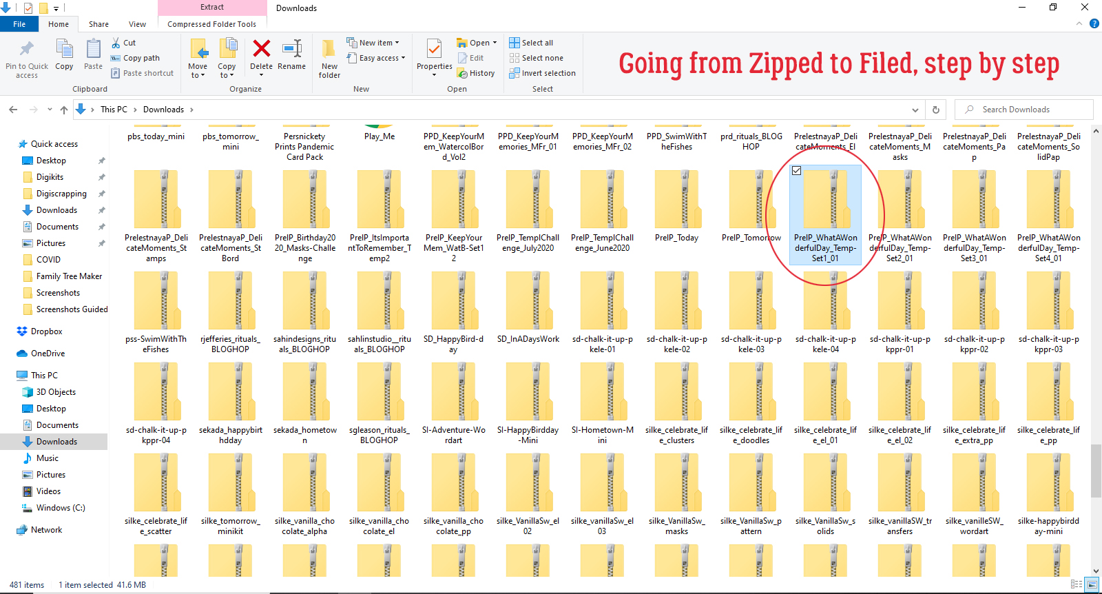
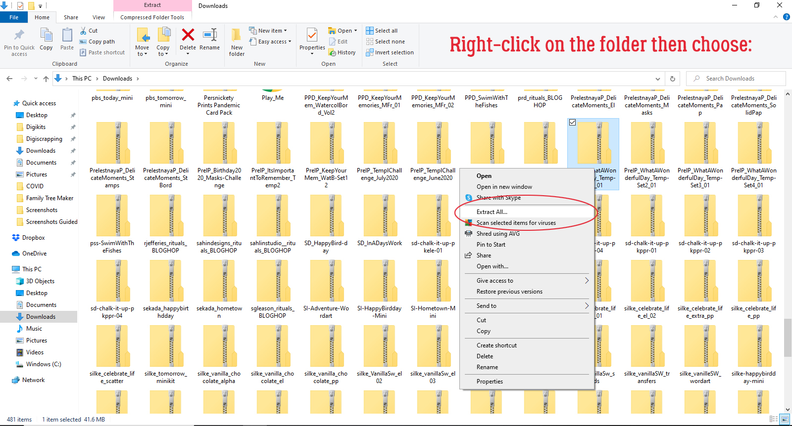
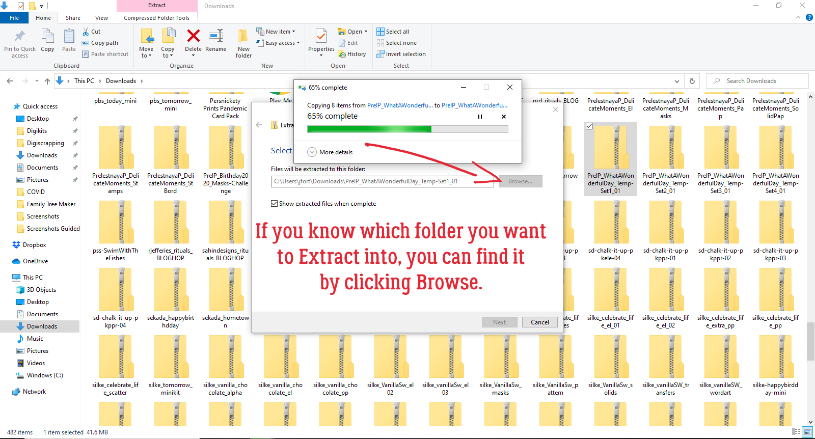
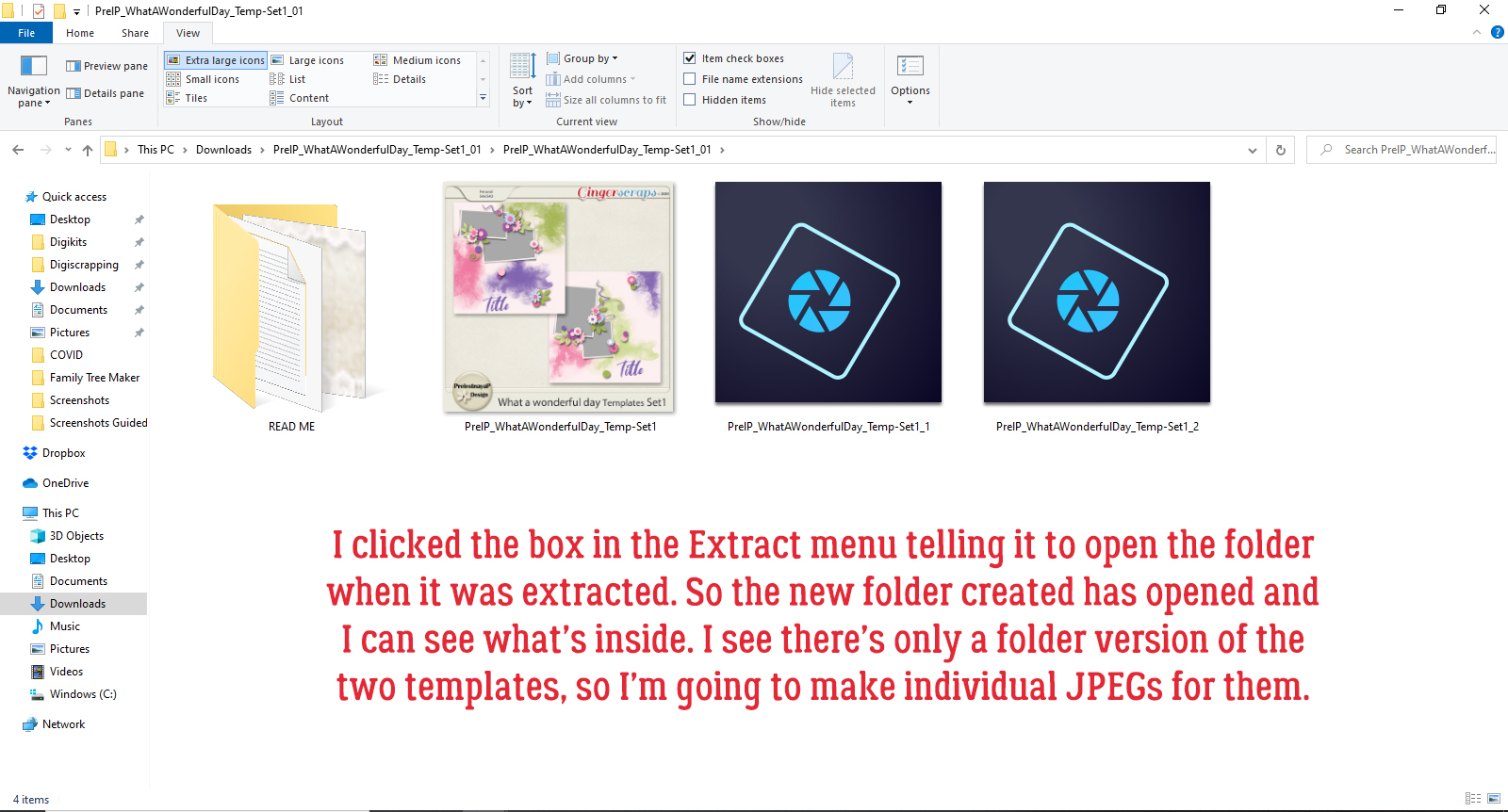
Take THREE! Today’s really starting to feel more like a Monday than a Tuesday… WordPress isn’t playing nice again this week. But I’ll persevere, because I really want you to have this little weapon in your arsenal. Kim Kern asked in the comments after last week’s post if I knew how she could slim herself down a smidge in a photo she otherwise liked. So I dug out a photo of yours truly that didn’t make me cringe so I can show you how to lose 10 pounds without dieting.

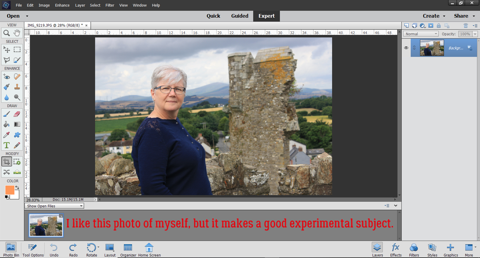
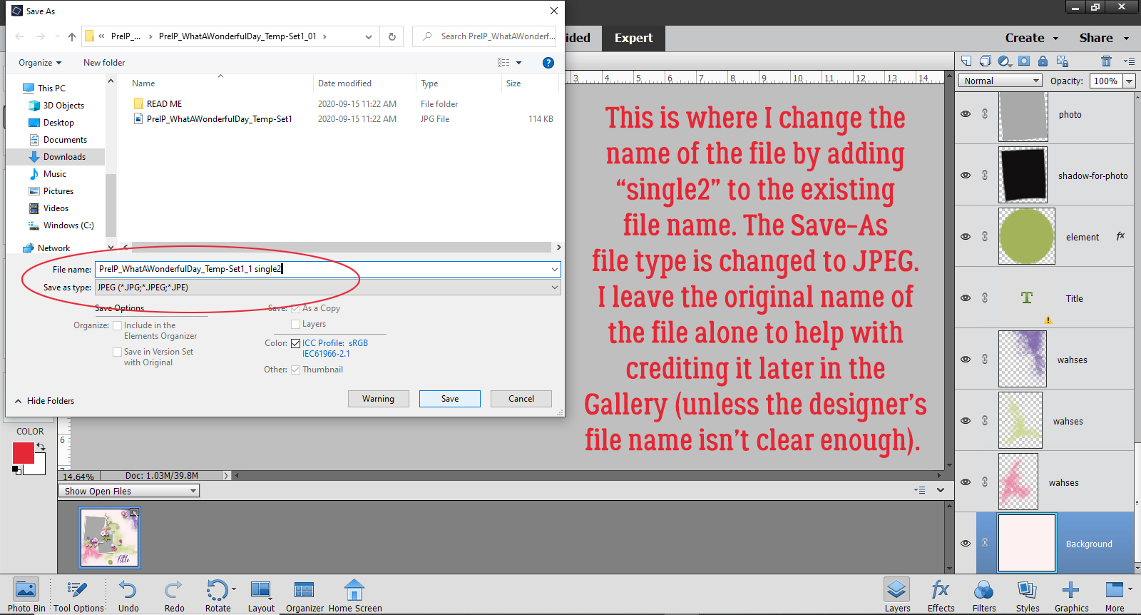
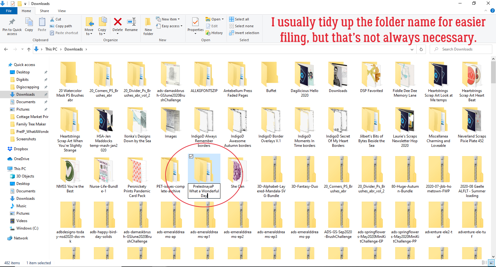
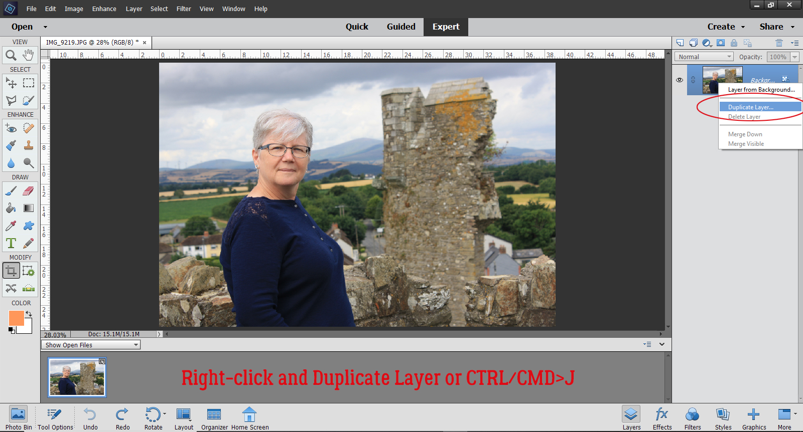
First things first. I made a Copy of my photo so I could do all my experimenting on the Copy layer and lot the original. This is a good habit to get into when you’re photo-editing because if you’re not thrilled with your efforts, you can go back to that background layer and start over. To add a Copy layer, right-click on the photo layer in the Layers Panel and select Duplicate Layer, or use the keyboard shortcut CTRL/CMD>J.

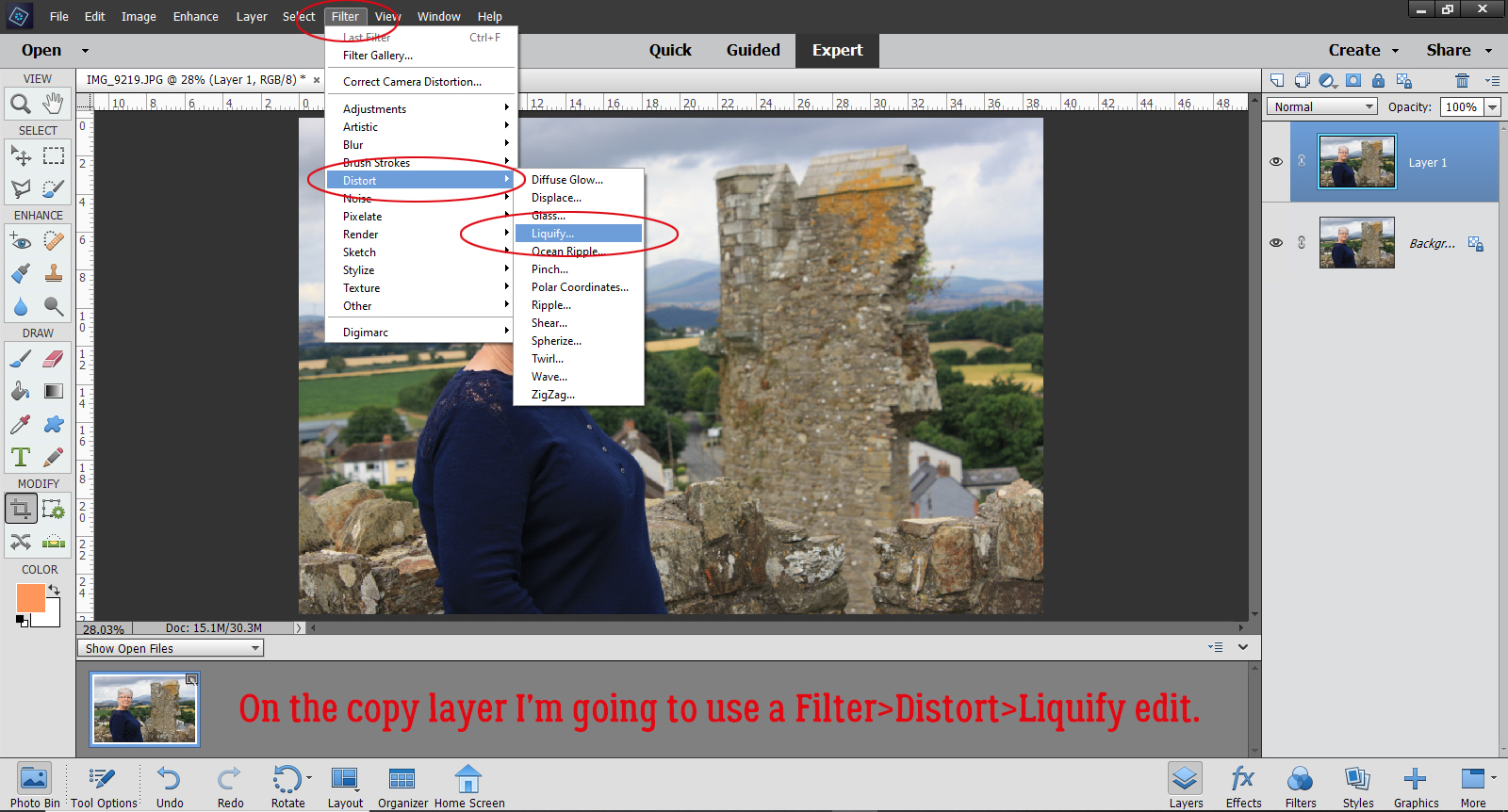
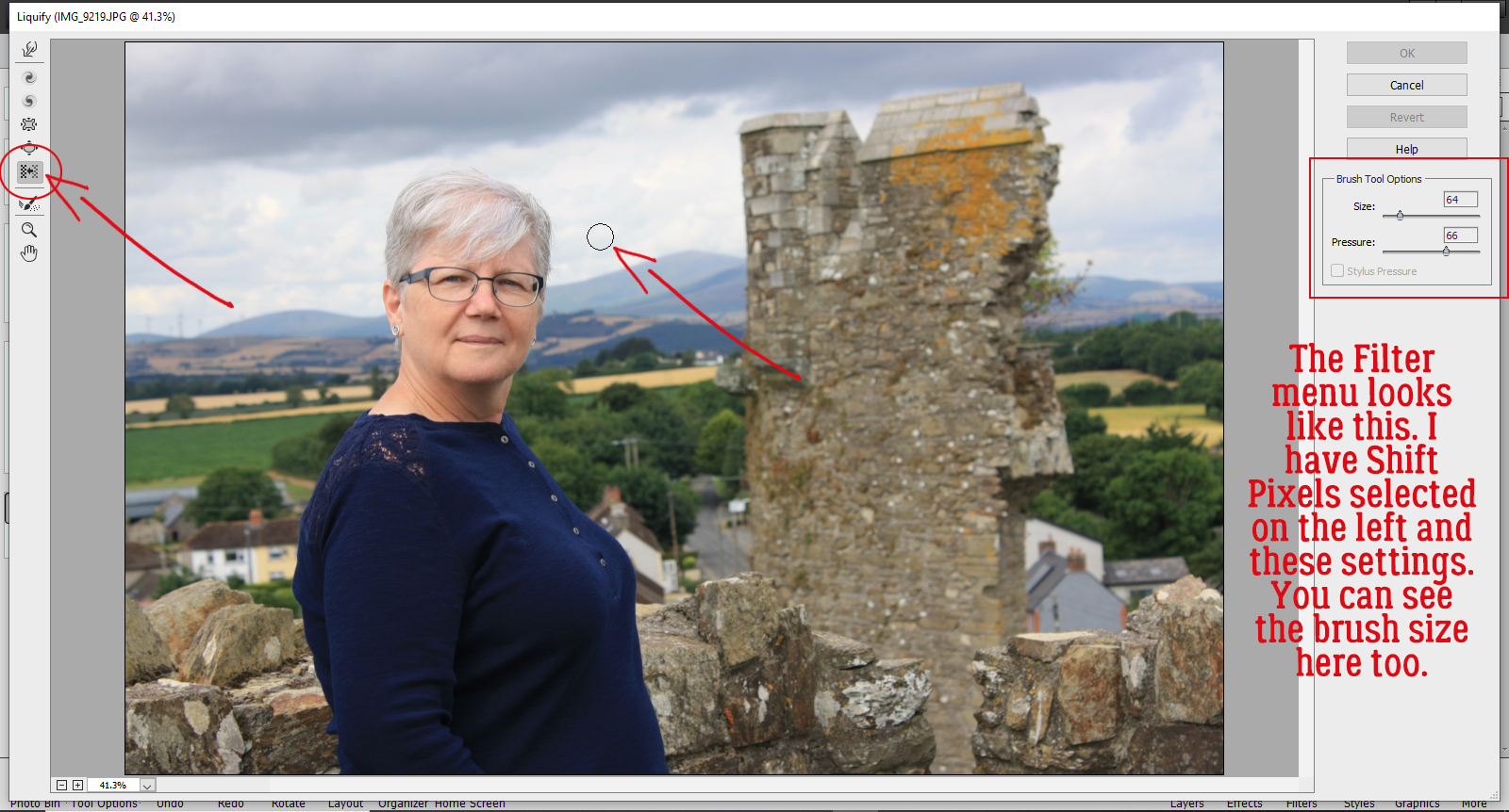
Now, to that Copy layer, I’m going to apply a Filter. Click Filter>Distort>Liquify.

The Filter menu looks like this. The Tool options are along the left hand side of the workspace and the settings are on the upper right. For this edit I’m going to use the Shift Pixels option, the one with the icon that looks like two parallel brick walls with an arrow in between them. The brush I’m using is a soft, 64 pixel basic brush with a Pressure of 66. A light hand and a soft touch will give you the best results with the least backtracking.

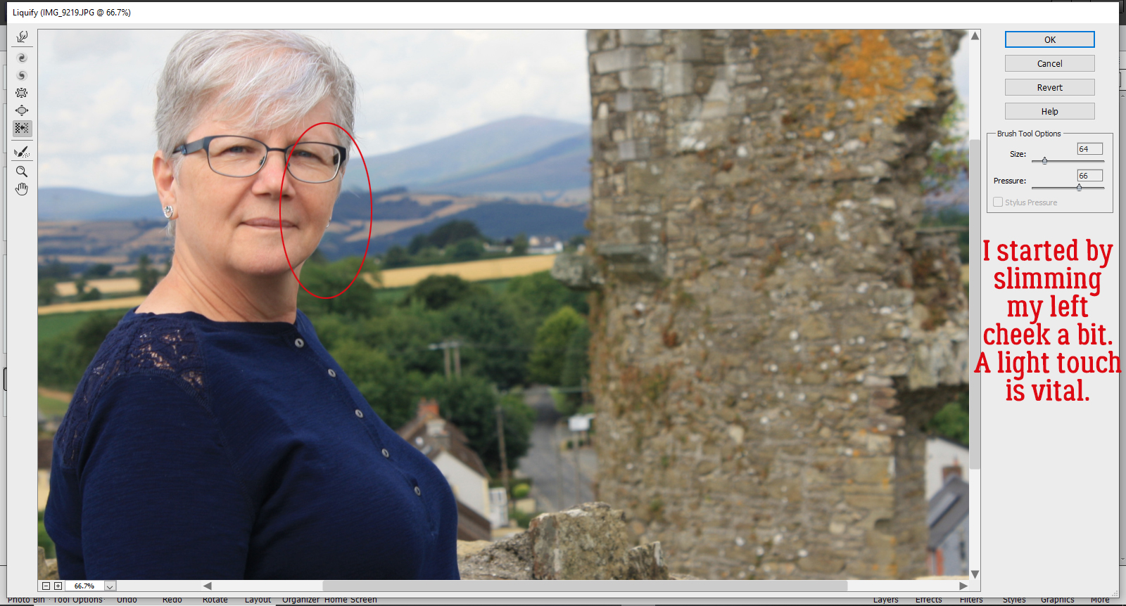
I started my weight loss by gently slimming my left cheek. There’s no obvious clue for which direction to move your brush, or at least I didn’t find one. I started near my chin and very gently brushed upward until I got to the top of my ear. Just a tiny change is all that’s needed.

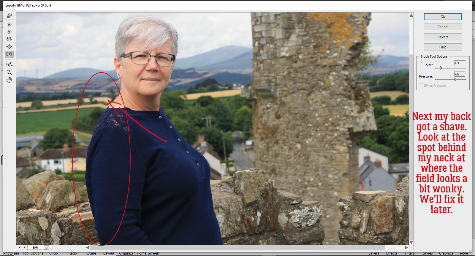
Then I took on my back fat. For this part, I started at my neck and brushed toward my bum. This is where you can see the distortion that happens in the background. It’s something I’ll fix later.

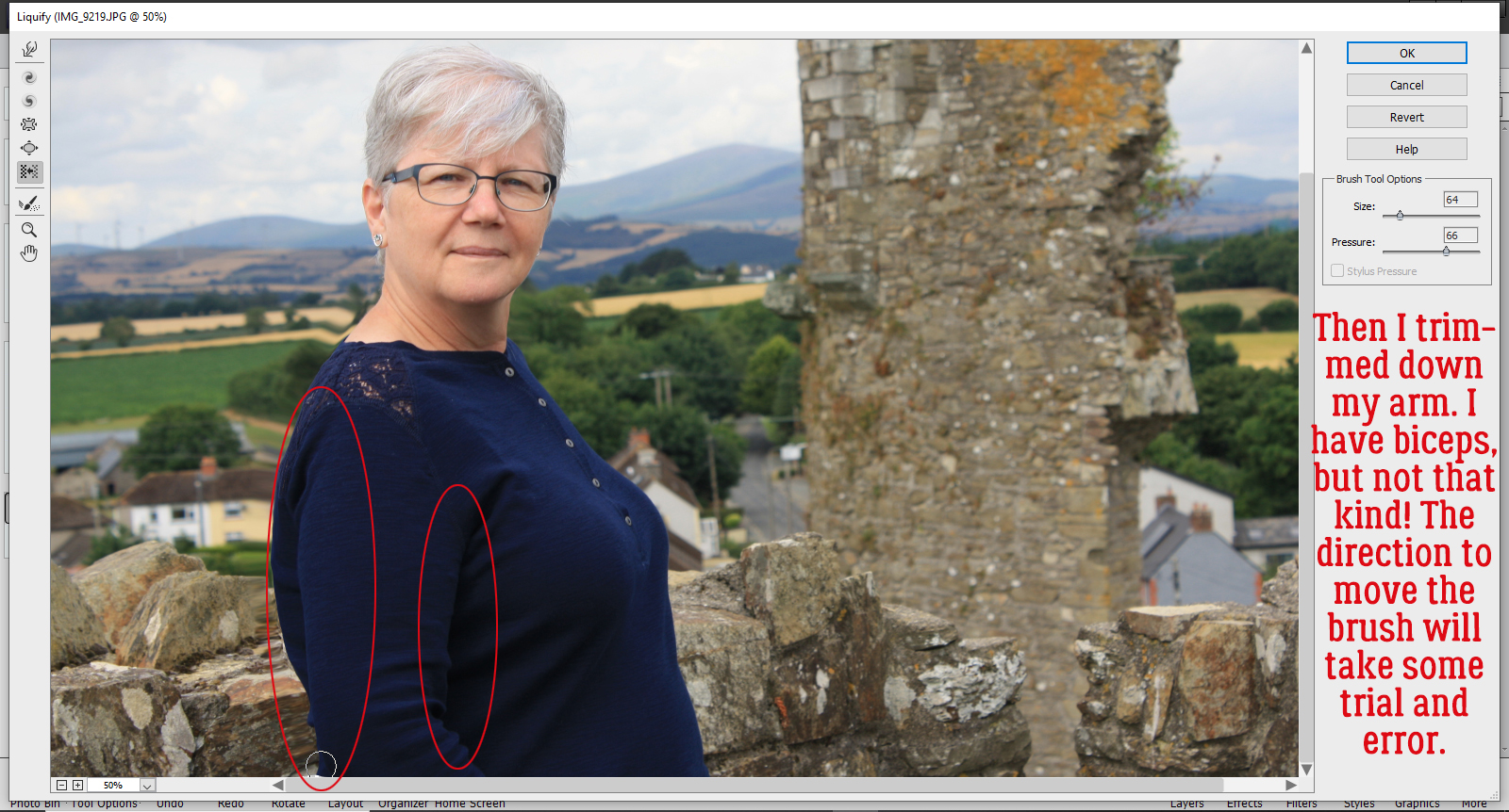
I moved on to making my arm look less meaty. I went elbow-up on the back of my arm and shoulder down on the inside.

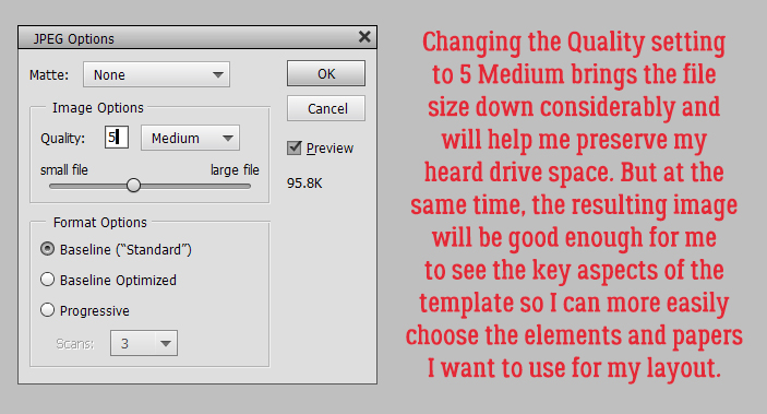
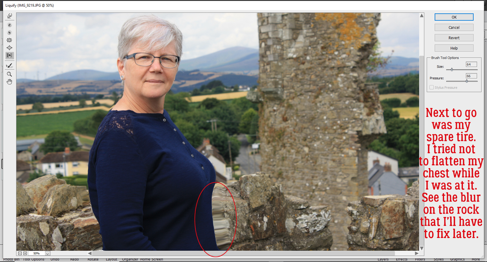
Muffin top was my next zone. It too worked better going bottom up. It took me a few small adjustments to get to where I felt thinner, and I was careful not to flatten my chest. It’s really easy to see the blurring on those stones!

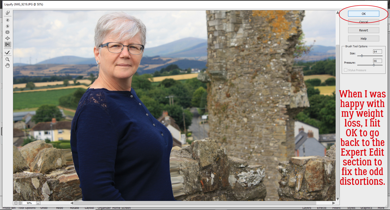
Once I was satisfied that I’d successfully slimmed but didn’t go overboard, I clicked on OK to go back to the Expert Editor.


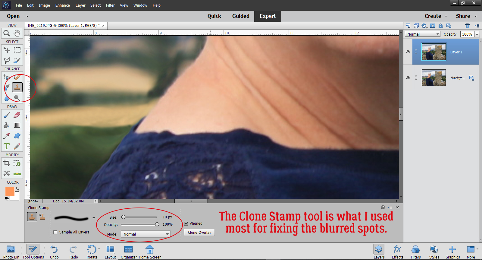
Now to fix the weird spots. I started with the Clone Stamp tool and Zoomed in a lot so I could make my adjustments minutely. For this part, it’s best to use a fairly small soft round brush, at least at the beginning. Never used the Clone Stamp? Decide what part of your image is going to make the least visible correction and hold down ALT then click on that spot. Move your cursor to where you want your change to happen BEFORE you click again to apply that area you just Cloned. If you’re too close to the source, you’ll end up with a muddy mess. I worked on that bit of field behind my neck.

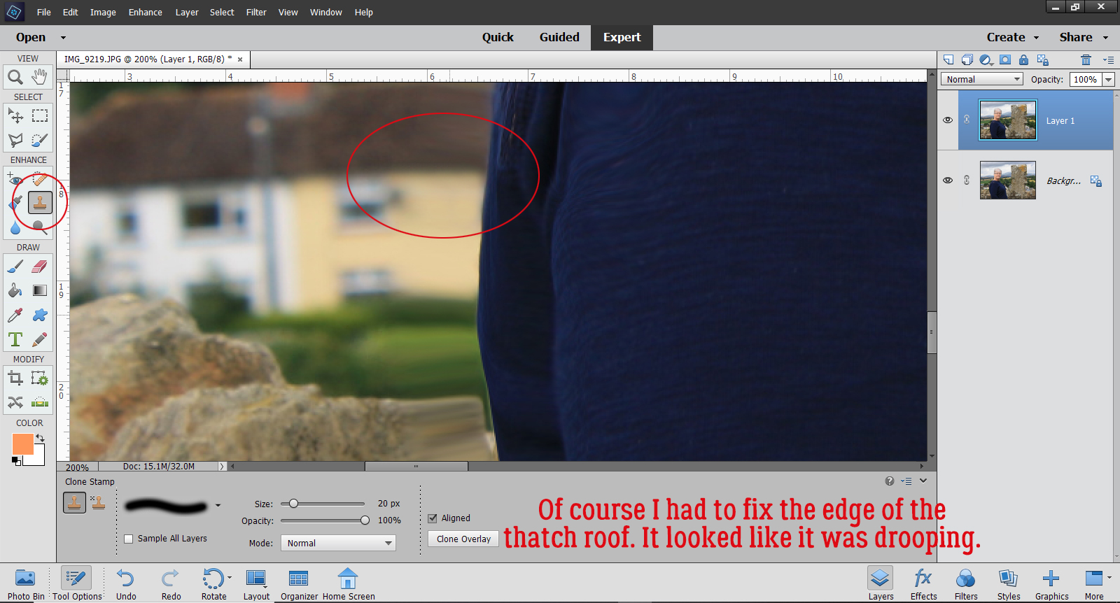
Then I moved on to remove the droop from the thatched roof on the yellow house at my back. For this kind of fix, if you click for your source with your cursor right over the straight edge of the object, Elements will give you a nice continuous straight line when you move the cursor over. To avoid visibly blurring an area that should be sharp, like where my sweater overlaps the wall, I switched my brush tip to a hard-edged one.

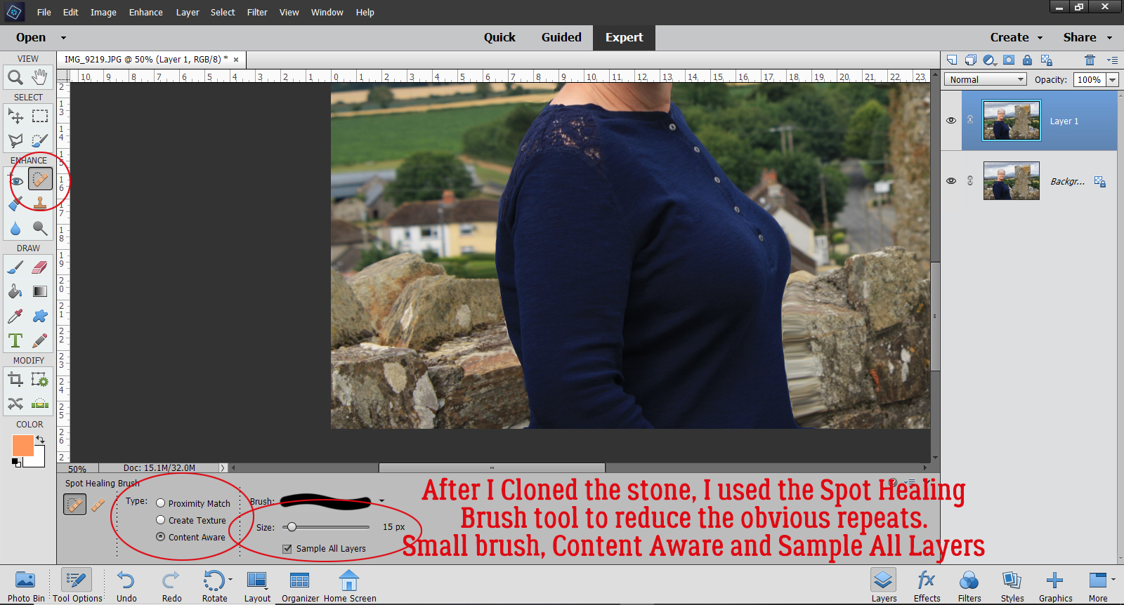
One disadvantage to using the Clone Stamp tool is that it reproduces patterns exactly, so as you move along, you’ll end up with some visible pattern repeats and that will look unnatural in most cases. That’s where the Spot Healing Brush comes into the game. For this fix, I used a small, hard-edged brush, selected Content Aware and Sample All Layers in the controls and randomly clicked on the stones to break up that repetition. If I noticed that my Spot Healing looked too sharp, I swapped out my brush tip back to a soft one.

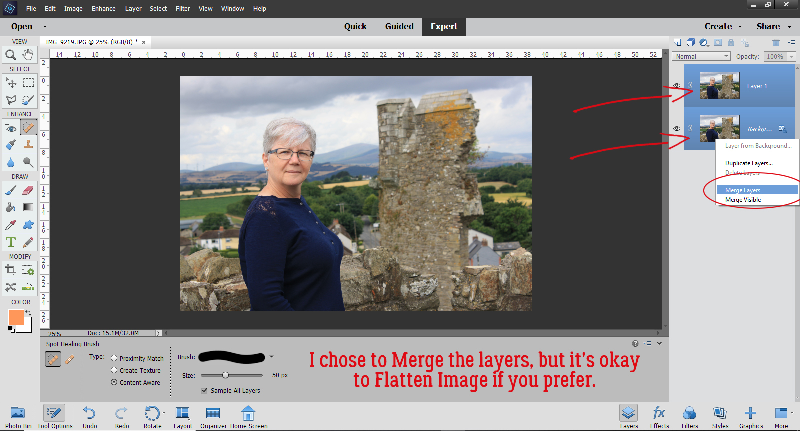
I moved on to the blurry stones to my left and followed the same steps. After I’d cleaned that area up, I Zoomed out and looked closely at the entire image to see if there were any glaring areas that still needed retouching. Then when I was satisfied with the whole image, I selected both layers, right-clicked and Merged them. But it’s just as appropriate to right-click and Flatten Image.

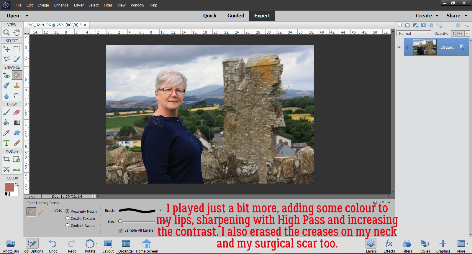
That’s it! That’s how I lost 10 pounds without even giving up jelly beans. My final image got a bit more adjusting: First I smoothed out the wrinkles in my neck and erased the scar from my parathyroid surgery. I Duplicated the image and sharpened it with a High Pass filter. That layer’s Blend Mode was changed to Overlay. I made yet another Copy layer then I changed the Blend Mode on that new layer to Multiply and dropped the Opacity to 25% to add some more contrast to the clouds (both are discussed in a previous tutorial). Overall, I’m really pleased with the way it came out. I look like me, only better!

Mm-kay. Let’s see what else I need to do to this post to get it right. I might even make my deadline! See you next week.


Fresh Baked: September 25, 2020

Here we are at another Friday. Weren’t we just at Friday? This week has flown by. We hope you are all hanging in there. Mother Nature is sure wreaking havoc. If you’ve been affected by any of the crazy weather, just know we are thinking about you all!

Remember, spending $10 in the store gets you this wonderful kit for free.

Let’s check out some of our new kits for the week.

You still have a few more days to get those challenge layouts uploaded and tracked. This fun kit is your reward for completing 10 challenges.

Designer Spotlight

Meet ADB Designs!

This month we have two designers in the Spotlight, Karen Schulz (formerly known as Snickerdoodle Designs) and ADB Designs. It was my pleasure to chat with Diane of ADB Designs and learn all about her creative process. She’s one of my very favourite designers EVER!

J: How long have you been designing?

D: Since 2001

J: What made you decide to design?

D: Working for my husband in his professional photography studio after retirement

J: What led you to decide to design together?

D: We have been digi friends for a very long time and are very comfortable with each other, our design styles, and work ethic. I admire Karen’s talent!

J: What do you use to create your designs (program, additional tools, etc.)?

D: Photoshop.

J: Describe your design workplace.

D: I have a messy office in the my home. The cat lives there (hubby allergic) and one of our English setters comes and spends the day with kitty and me.

J. What motivates and inspires you as a designer?

D: My family history-genealogy passion <Jan whispers, “ME TOO!!”>

J: What is your favorite kit currently in your GS store and why?

D: My all time favorite is Patriots & Loyalists to help scrap Revolutionary War era family history work (though it works for many other pages too)

J: If you could only eat one meal for the rest of your life, what would it be?

D: Oh dear….not sure

J: What is your favorite game or sport to watch and play? 

D: prefers not to respond

J: What did you want to be when you were small?

D: A psychologist

J: Aside from necessities, what one thing could you not go a day without?

D: Family

J: Who would you want to play you in a movie of your life?

D: Emma Thompson
J: If you had a warning label, what would yours say?

D: “Does not suffer fools well”

J: What celebrity would you like to meet at Starbucks for a cup of coffee?

D: Kamala Harris

Thank you for sharing this with us! Thank you too for the DISCOUNT COUPON you’re offering for this month. Karen‘s coupon code for 25% off your purchase (bundles excluded – they’re already a phenomenal bargain!) is ks-dd-sept-2020 and Diane‘s code, also for 25% off your purchase, is adb-dd-sept-2020. Both coupons are in effect until 11:59 pm Eastern time on September 30, 2020. Ooh, and don’t forget to grab the Daily Download!! It’s SOOOO stinkin’ cute! (Links are found here on the GingerScraps Blog.)

Tutorial Tuesday (Index)


Huh. I was devoid of inspiration for today’s Blog post so I did a quick Pinterest search for Photoshop Elements tutorials I could adapt… it turned up quite a few very familiar tuts! (Mine!) So lacking that bolt from the blue that would give me the juice I needed, I thought, “I should see if there are any requests for help in the GingerScraps Forum that I could use. What I discovered was that none of the “here’s-a-tutorial-about______” threads I’d posted in the Forum had links to the tutorials any more. Ginger thinks the server upgrade back in the spring must have eaten them. What alarmed me is that I hadn’t been spending much time in the Forum while we were moving and getting settled, and there were a number of posts there looking for those missing links. FAIL!! So… I went through all of those threads and updated them. Instead of preparing a new tutorial. Then I updated the Blog post where I indexed all the Tutorial Tuesday posts (there are now 190 of them!) and this is where you can find it: Tutorial Tuesday (Tutorials!)

I also discovered that I’ve neglected my OTHER Blog post, which I’ll be remedying right away.

That brings us back around to my initial question: What topics are GingerScrappers interested in right now? Is there a tip, trick or technique that you’ve tried to figure out and just need a bit of help to get it right? Help me to help you!

Fresh Baked: September 18, 2020

 Welcome to another Friday. Do you have any plans for this weekend? I have several things I need to catch up on, but we’ll see how it goes. I always have big plans, but then get to the weekend and just want to chill. Anyone else do this?

Remember, any $10 spent in the store gets you this fall kit for free!

Now let’s see what our designers have been up to.

Have you grabbed this month’s Monthly Mix? More wonderful fall papers and elements to use.

How are you doing on your challenges this month? Any 10 completed challenges gets your this full kit as a reward. I love some of the word bits I can see in the preview.

Tutorial Tuesday (Windows)

Taming the Wild Template


I know there are many of you out there facing serious challenges with from fire or hurricane, so I want to thank you for popping by to read this Blog post. We’re a long way from the nearest fire in the western part of the continent, but due to an air inversion happening high above the Earth, we’ve been socked in with smoke for three days straight. My throat is sore, I’m coughing, my eyes are burning and I have a headache… and can only imagine how much worse it is for those in much closer proximity. I just saw a news report from Pensacola and am praying hard that those in the path of this storm are safe and dry. As if 202o hasn’t been bad enough…

Onward. After last week’s tutorial went live, DebS posted a comment that I’d like to share with you. “I have a question I’ve been hesitant to share as it isn’t a creative question, but one of organization, that I’d LOVE to see some input on. I’ve always created my own pages from scratch… at the same time, I have collected a rather substantial body of templates over the years (hundreds, in fact!) but not used them… sad, I know!! Some are clearly labeled — such as 2 pagers, some are just a date — Sept 2019 template. Many are completely nondescript — jbrt.08… all stashed in a folder called templates, and many, many others are attached to the bundles they came with, filed by designer or topic. My biggest issue is that if I have a page I want to place say 5 photos on, I can spend more time rifling through templates than I might spend simply creating the page myself from a blank slate, and so I continue to stash templates while creating pages myself. I’m an incredibly organized, detailed person, who is running out of time to create pages myself, and whose lack of a good system for organizing templates for easy access is driving me nuts. I’ve never seen input on this topic, but would love some help!

Before I launch into a step-by-step guide to my system for organizing templates, I’d just like to say a couple of things. First, there is no such thing as a “dumb” question. Asking questions is how we all learn new things. Asking questions is so much better in a lot of situations than guessing and being really wrong (looking at you, nursing!). Digital scrapbooking is more than just pretty layouts, as her comments show. If we never talk about the logistics, the mundane aspects of it, we might miss out on some good tips for making it more fun and less work. DebS’s problem is one I struggled with too, and led to me looking for solutions. The method I’m going to expand on below is what I came up with; it works really well for me but you might have your own, much better methods. So my disclaimer is this: if you have a system for organizing your templates that works for you, don’t reinvent the wheel! Second disclaimer: I work on a PC, and have ZERO Mac knowledge, so if you’re an Apple fan, this tutorial isn’t for you.

Let’s go! As usual, I’m going to show all the steps, in case there are readers who are very new to our wonderful hobby. Feel free to fly by the stuff you already know/do. I’m going to start with the very basic unzip/extract of downloaded content. (Please ignore the huge collection of zipped folders I have on my laptop… I’ve been busy setting up house. I’ll get all this stuff sorted out soon! 😉 ) The highlighted folder below is one containing templates from the lovely Irina, also known as PrelestnayaP Design. They’re part of her What a Wonderful Day template bundle.

The easiest way to unzip a file in Windows is to right-click on the folder and select Extract All from the pop-up menu. We’ve looked at some software apps that unzip multiple files in a previous tutorial; for the sake of brevity we’re just doing a single folder so we’re using the easiest method.

There are so many ways you can make your software do some of the work for you. If you’ve already got a folder ready for the contents of your zipped folder, you can tell Windows to find it for you by clicking on that Browse button. Then you can transfer the contents of that folder right into the target folder. I use this trick all the time when I’ve downloaded brushes, word arts and mini-kits for the GingerScraps challenges. I just make a bunch of folders in my GS Challenges master file and move them into their new homes in one step.

In the Extract menu there’s a box just under the destination folder block that says “Show Extracted File When Complete“. This command opens your newly-extracted folder right after it’s unzipped. I usually leave this box checked all the time, but there are times when you might not want to to that. For example, if you’re manually extracting a bunch of subfolders inside a folder and want it to be done quickly, unclick it. But for this exercise, I WANT the folder to open so I can see what’s in it, since I’m in an organizing mood. This is what was inside my extracted folder. Some template designers create 600×600 pixel preview JPEGs of their templates and some do what Irina‘s done, creating only a folder preview. With time you’ll know which designers have the JPEG previews and which don’t. For my method to work for me, I need to have a thumbnail image, so I’m going to create some.

I opened the template in Photoshop Elements so I could create my preview JPEG.

There are a few criteria for these previews. They should be small enough so they don’t eat up hard drive space, but sharp enough that you can easily assess the template’s suitability for your layout. When I’m creating a preview I just resize the whole template to 600×600 pixels, either by clicking Image>Resize>Image Size or by using the keyboard shortcut CTRL/CMD>Shift>I. (Trust me, you’ll get really good at using keyboard shortcuts once you start. For me they’re almost automatic now!)

This is the Image Size menu. The boxes at the bottom are always selected for me, as presets. Having presets makes everything so much less work! I can just change the size of the image from 3600×3600 to 600×600 by typing the digits in. This is exactly how I save my finished layouts for Gallery posting. It’s important to Scale Styles so your shadows and other styles retain the appearance they have on your original layout. But I digress!

Because all I’ve done to this template is to shrink it, I’ll need to change the file format from PSD to JPEG as I’m saving it. So I’m using Save As, which prompts me. There are two ways to reach this function, either by clicking on Edit>Save As or by CTRL/CMD>Shift>S.

Here is where I change the file format to JPEG. But I also change the FILE NAME. I leave the name the designer gave the template alone, but I add a descriptor to it. This template has 2 photo spots and it stands alone, so it now becomes “PrelP_WhatAWonderfulDay_Temp-Set1_1 single2“. There are other descriptors I sometimes use: if the photo spots are square, for example, or round, or if they’re masked spots. You are welcome to choose whatever descriptors work with your brain.

Once I click Save, this menu pops up. Remember, I don’t want my previews to gobble up my hard drive space, so I drop the Quality of this image down to 5. (I usually edit a whole bunch of template folders at a time so I just leave all the settings until I’m done.)

I Saved the preview to the same folder as the template, and there it is!

I went through the same process to shrink, rename and save a preview of the second template in the folder. Now both preview thumbnails are in the folder. I don’t save the terms of use more than once, and I have no need for the folder preview that was already in there, so I just delete both.

Then I usually tidy up the name on the folder itself before moving it to its permanent home. It isn’t always necessary, but I want to know who the designer is, which store it belongs to and what the kit’s name is. This step is optional – you do you!

Now to show you how my method works to speed up workflow on top of organizing my stash. I’m going to let Windows Explorer find the templates I just previewed. Over on the right side of the screen there’s a search box. (I’m still in my Downloads folder here, but it works globally too.) I type “single2” into the search box and click the blue arrow.

Windows takes a deep breath and goes hunting. Because I’ve only unzipped a handful of zipped files in my Downloads, it didn’t take long to turn up the three previews with that tag on them. With my view setting at Extra Large Icons, I can easily see the basic details of the templates I’ve located.  Then I can choose the one I think will work best for the layout I have in mind.

Getting back to the folder with the template I want to use is easy too. I right-click on the thumbnail and roll down almost to the end of the menu to where it says Open file location. Windows will take me right to it! It’s literally that simple.

Just so you don’t think I’ve led you down the garden path, I’ll show you a search in my Digikits>Templates folder, which has thousands of files in it. (I’ve used this search feature to find files anywhere on my 2TB computer.) I used the same search term, “single2” and turned Windows loose.

Explorer is still going, but it’s already turned up all these files!

Here are just a few of the “single2” templates I have. Guess I should get some layouts done, eh?

Do YOU have a good way of organizing and finding your templates? When I talked about the topic for this tutorial with Resident IT Guy, he asked why I don’t use a spreadsheet. Humph! I’m not great with Excel or any other spreadsheet software either, for that matter. For me it would be way more work than it would be worth. But maybe somebody out there has one they might share with the class. Please tell us how you manage your templates!

Fresh Baked: September 11, 2020

Hello scrappers, I hope you all enjoyed our birthday festivities last week! I sure loved seeing you all in the forum and gallery! We have a wonderful bunch of fresh goodies for you this week! 

Remember when you spend $10 or more in the store you will also get this fun fall kit for free!

Now on to the new releases this week!

 When you complete ten challenges in the forum, you get this wonderful full kit!!

Tutorial Tuesday (Potpourri)

Scrapping in the Time of COVID

With apologies to Gabriel García Márquez… Let’s talk about why we scrap our memories. I think we all agree that we’re scrapbookers because we want to have tangible proof of events in our lives to take out and hold years from now when the events we’ve memorialized have been all but forgotten. Mostly, we want to hold onto the good times. But I really think we have to also honour the hard times. It’s those hard times that truly shape us and make us stronger, better humans. If we pretend the bad stuff didn’t happen, we’re not letting our future selves have pride in our resilience.

It seems every generation has an “event” – which is often a prolonged period and not just a brief moment in time – that changes everything. From war to natural disaster to pandemic, we’re forced to adapt to world-altering changes, otherwise the human race would die off. When I think of all the trials our ancestors endured, I marvel that we’re even here at all! COVID-19 is our crucible, our chamber of fire. In six short months our world looks completely different. My Facebook feed is filled with back-to-school photos, as it always is this time of year, but with a few major differences. Kids are wearing masks. Kids are learning their lessons through a computer screen. Some might see masks and think “awful”, “sad”, “ridiculous” or “overkill”, but I see humans adapting to a new environment and learning to evolve and survive. With that in mind, I decided to take a stroll through the Gallery to share some very hopeful and life-affirming layouts I found there.

8-24-2020 is a layout from MrsDebReynolds where the virus isn’t even mentioned. It’s there, but it’s not the focus. She mentions all the things the pandemic is bringing out in people: strength, courage, kindness, hope, love. And look at how this young lady totally rocks her mask!

2020 by dricamendes is another example of saying a lot without saying the words. I love the colour palette she chose for this, letting the sunflowers complement the girl’s t-shirt and the purple makes the photo pop. Life is different but it’s still beautiful.

I really love how the boys in knclarke‘s layout Best Buddies are just living life. With a few adjustments.

The kiddos in beatricemi‘s layout Checkers at the Fort haven’t let a pandemic get in the way of having fun. I bet they’re having a lot of giggles making faces at each other behind their masks, knowing that they can really only guess at what’s going on.

roxana has created a layout that I hope was cathartic for her. Dream Job Interrupted says it all, even without a translation for the journaling.

Air travel has probably changed forever, yet again. And this time it’s an invisible threat, rather than a shoe bomber… briannascrapper talks about how an Early Morning Flight that turned out not to be, and has photos of how different the airport looks with virus protocols in place.

Even having babies has changed, but the photos of new families can still be beautiful. AJsRandom has a new granddaughter and is celebrating her arrival in Little Blessing.

I love how Madison ignores the pandemic but embraces it at the same time. bkasko‘s photo makes me laugh.

One thing about humans… there will always be those who see a need and find a way to fill it. People like msbrad, who sewed more than 500 fabric masks and donated them to places where they were desperately needed.

We wouldn’t be human if we didn’t want to know when this will end. I think we’re not really going to see an “end”, we’ll just adapt over time and develop a New Normal, as stacsmiley has described. There’s still so much we don’t know about this virus, but we’re learning all the time.

What I really like about Princess Pi is that EvelynD2 totally ignores the mask on her face. It truly doesn’t make her any less beautiful!

It’s weirdly appropriate that my post will end with emscraps‘ layout Stay Safe. (It wasn’t intentional, just how my computer saved the layouts and then how WordPress ordered them.) Battle fatigue is setting in for everybody, but most especially for our essential services – health care, law enforcement, retail staff, service workers, delivery people. But we can’t give up now! Stay safe, everyone… and don’t let COVID-19 ruin our memories.

🎂GingerScraps Birthday Bash, SALE & Fresh Baked!!🥳

Happy Friday!!! I hope you remember out little teaser from Tuesday’s Buffet newsletter. Are you ready to party? 🥳🎂🎉 Let’s see what kind of fun we’re going to have for the next week!

Remember when you spend $10 or more in the store you will also get this fun fall kit.

Let’s see what the designers are releasing this week.

When you complete ten challenges in the forum, you get this wonderful full kit!!

Are you excited about all the fun?

Tutorial Tuesday (Photoshop Elements 2019)

Another Guided Edit – Multi-Photo Text

September first.. ALREADY?!! That got me thinking about other firsts. Like first birthdays and first days of school. My oldest grandson started first grade about 10 days ago and it seems like it was only a few days ago that he was sleeping in his stroller while his parents and I toured the botanical garden. Time flies too quickly but we scrapbookers know we can hold onto those memories. This Guided Edit I want to show you today can be adapted so many ways. Sadly it didn’t appear until Elements 2019, but it’s possible to create the same effect in previous versions, it’s just a lot more work.

Drop a photo or a paper into your Photo Bin then click Guided Edits>Fun Edits>Multi Photo Text. If you don’t have a photo or paper in your Photo Bin, Elements will prompt you.

For my example, I’m using a series of photos from Pixabay; the photographer is Tim Kraaijvanger. This photo of a birthday cake is a great background photo. For a back-to-school version, you could have a photo of the school bus with the door open or driving away, your kiddo walking into the school or maybe the school itself. Along the right side of the screenshot you can see the menu for the Edit.

When I clicked on the Text Tool bar, the background photo became very translucent. The Text Tool bar takes you to your font library. The default font is Impact, but you can choose any font that will give you a suitable spot to attach photos.

I chose to use KG All of the Stars for this one. It’ll work well. The foreground colour doesn’t matter because Elements will turn your text into clipping masks.

You have total control over the size and placement of your text, but the software developers kindly included two automated options. You can automatically centre it horizontally across your background, as shown, by clicking the optional Fit button.

Or you can click the Fill button and have it fill the entire space.

But I want mine to be in the upper right area of my background where the banner is. So I moved it there and sized it accordingly. Then I clicked on the Create Frames button and the text disappeared, sort of.

I dragged and dropped my photos onto the canvas from my Photo Bin. Those thoughtful software developers included an option to pull a photo from the Photo Bin, or to grab it from a folder on my computer. I clicked on the spaces one at a time to make them active and added my photos.

The photos can be manipulated, resized, repositioned or rotated as needed to obtain the best look. I wanted to be able to see her face and her cake in all of them and I wanted to be sure the photos filled the frames. That middle one needed a bit of rotation.

Moving down the menu, there’s an optional step to change the background. This can be useful. Having a transparent background would let me move just that photo-filled text onto my layout.

Or I could pull a colour from one of the photos and use that as the background by clicking on the Color button and using the Color Picker.

Solid white might work for you.

Or solid black.

Another optional step is to add a bevel and drop shadow to the text. This sample shows the Small setting.

The Medium setting looks like this. I think it takes away from the photos, so I’d not be using this one!

Or this one! Large is just too, too, too!

I went back to the Small setting. Then I clicked on Next.

A new menu opened up that allows me to Save my work, or go on to Edit some more, Share or be Done.

When the Expert Editor opens you can see all the layers Elements created while I was working through the Guided Edit. Some of the layers are Locked, and can’t be altered. Some are invisible and others are completely editable. It gives us a peek into how the Edit works.

I wanted more of the background photo to be visible so I adjusted the Opacity of the adjustment mask (the active layer with the mask outlined) to 75%.

Then I added some more text for context and it’s ready to Save, or to use as part of a layout. If I’d used a transparent background, I could put that text into a layout anywhere. I could crop that background photo to a square and have an image I could turn into my entire 12×12 layout, and then add some embellies to it for fun. So many options!

What would you like me to show you next week?